Layout Thoughts: GQ March 2015
About the blur: I'm only writing about these pages based on details in layout. I don't want to accidentally infringe on anyone's copyright, hence the "content" itself is blurred whenever there's a paragraph or more. If you are the content owner and want me to take these down, I completely understand.

Loved the single-page on snoring. It's an infographic that handles cliches in a way that made me smile. As a snorer myself, I'm a sucker for any advice or remedies people have. Unfortunately, most of it's total snake oil.

I've un-blurred enough of the text on this page to show how a poor colour choice can affect not only readability but enjoyment of what should be a very easy and basic idea: reminding men (as monthly men's mags have to do) how to do this thing they really should be better at by now. The bright blue is distracting and the "stubble" background adds nothing. I have to squint to even make out the words.

I think these pages only exist in the digital version. Each word is a hyperlink, and it's a nice breather in between content. GQ is struggling with the same thing many digital magazine producers are: how do you show where the reader is in the story when there's no physical giveaway? GQ includes more markers of progress. It's not a bad idea.
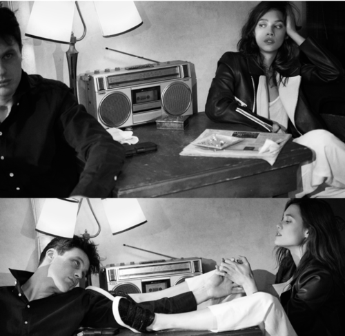
Lastly, an ad. Simple. Glamorous dinginess. A progression of time in a small moment. The two photos work so much better than either one of them would have alone.