Here are the unredacted graphs from "
Tell Me What 'Average Is Over' Looks Like."
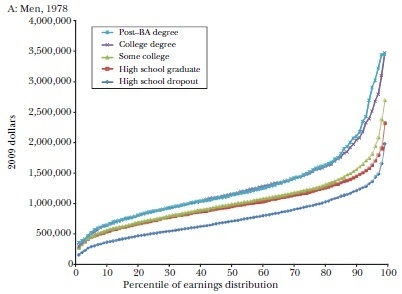
Graph #1 is from 1978:

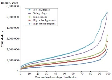
Graph #2 is from 2008:

What's equivocal? Although the 2008 graph definitely has more inequality, the 2008 labor market consistently offers more
continuous rewards for achievement. In 1978, "some college" was rarely more lucrative than "high school only," and "post-BA degree" was rarely better than "college degree." The two lines virtually overlap until the 80th percentiles. In 2008, in contrast, the
marginal payoff for jumping up a single educational category is visible throughout the entire distribution.
Think about it this way: In 1978, there were effectively only three educational levels. By 2008, there were clearly five. If "
average is over" means moves toward bimodality - as Tyler has often claimed in personal conversation - then 1978 fits his story
better than the world of today.
(3 COMMENTS)
Published on January 03, 2014 21:08
