How to Self-Publish a Book, The N.E.W. Way (Part 3)
I haven’t scared you away yet?
Yay!
That means you are ready to self-publish, bless your doomed heart.
But first, if you haven’t read them, you might want to start with Part 1 of this blog post series. Or, you know, go get a degree in English or something. Really, learning from me will just teach you how not to do it. Or how to do it badly.
Regardless, here’s the continuation of how I managed to self-publish three books.
Step 6 — Cover DesignYay! The really fun bit! Designing your cover.
Okay, I know not everyone thinks this is the fun bit, but I do. I love playing with cover ideas for my books. When writing my tales, I always imagine the scenes a certain way. And trying to capture the mood in my head onto a cover can be tricky, but so satisfying when it works out.
You, as a writer, cannot be expected to have the graphic artist skills to professionally create your cover. But you should have a clear idea of what your cover should convey. You’ll need to know these things whether you create the cover yourself or end up hiring someone.
So, what do you need to convey with your cover?
Two of the things I think your cover should evoke in a reader are: genre and theme. At a glance, they should have an idea of whether they are in for a mystery, thriller, or fantasy. Or even more basic: fiction or non-fiction. And they should get a sense of whether this will be an adventurous, seductive, or contemplative tale.
Take the time to review the covers of some of your favorite books that match the genre and theme of your book. What colors do they use? Do they have a white or dark background? Do they have illustrations or photo-realistic pictures or graphics? Are the main characters depicted or not?
Jot down the things you like about those cover and that you think do a good job of conveying what sort of story the reader is in for. Also, keep a file with the covers you like so you can either refer to them in your design or give to a graphic artist as a starting point when they develop your cover.
Great. Now you’re ready to create the best cover, right?
Hold just a second!
In my mind, there are two other things a cover must absolutely do without fail. You can get the genre wrong. You can get the theme (or promise of the read) wrong. The colors can be horrendous. But above all else: clearly present the title of your book and the author’s name.

I know, I know. The last two seem like a no brainer. But how many times have you looked at a tiny thumbnail of a book cover on your phone and squinted, wondering what the heck the title said and what the author’s name was?
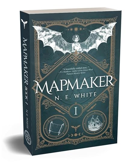
Notice my book cover there on the right? It should show up tiny on your screen. Can you read the title? How about my pen name? Are they clear?
They should be!
Throughout the entire process of developing the cover with my graphic artist, I checked time and time again to make sure I could read both items at a “standard” thumbnail size (usually around 150px by 150px, but it varies by site).
As someone with poor eyesight, take it from me. If I can’t read it, I’m not buying it.
Which brings me to…
Font choice.
You may be thinking: What the font? (Ha – that’s a thing.)
Or maybe: Oh, how boring.
Or possibly you’re just like me and have been wading through this entire blog post series until I got to this.
Sorry to disappoint, but choosing a font for your cover should probably be left to the professionals. If you’ve hired a graphic artist, let them pick it and only disagree if it is unreadable or doesn’t fit your genre.
If you are choosing it yourself, get ready for the hard truth: fonts cost money. Sometimes, the good ones cost a lot of money. If you’re on a budget, maybe that fancy TEFF Lexicon (over $3,500!) probably isn’t the best choice.
There a many many fonts out there free for commercial use. Use them. Pick one that speak to your genre (i.e., if your story is a fantasy, maybe pick a font with some interesting cap letters) and that you like. Because, in the end, your cover is not only a reflection of your story, but you as an author, too.
But, above all else, be sure it’s (all together now) clear and readable.
Oof. Well, it has happened again. I’ve waffled on for too long. Next steps: the dreaded Blurb (and other topics).
Until then, write like the fonts are biting at your heels.


