Hermit Diary 42. A Greek Hillside,Pigments, and a Thorny Problem
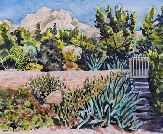
Greek Hillside with Blue Agaves. Watercolor in sketchbook, 11.5" x 8.5".
The painting above is where I ended up after working more on the previous sketch (below).
![16020214543910[14806]](https://i.gr-assets.com/images/S/compressed.photo.goodreads.com/hostedimages/1602401758i/30222195._SY540_.jpg)
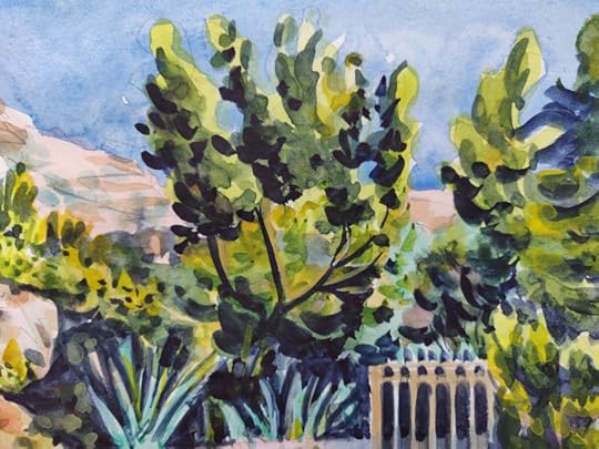
Here are a few details closer to life size:
![IMG_20201008_153258-03-01[14835]_b](https://i.gr-assets.com/images/S/compressed.photo.goodreads.com/hostedimages/1602401758i/30222197._SX540_.jpg)
A regular reader here asked, a while back, if I'd post about my palette and what colors I'm using. Unlike the compact travel box I often use at home or outdoors, I used my large studio watercolor palette for this one.
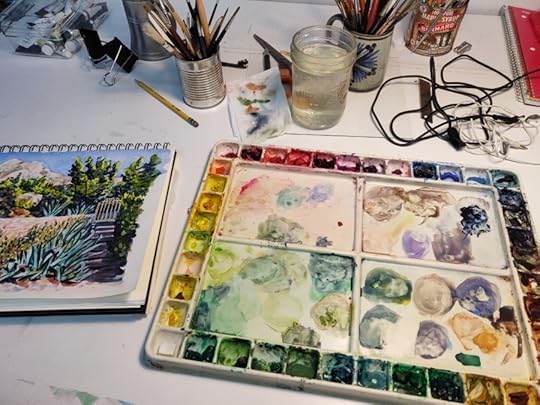
However, as is often the case, I didn't use more than a few colors! But some of them were different from what I'd normally have on hand when traveling. Here they are:
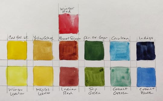
I don't usually use cobalt green, but with the addition of a little cerulean blue it gave the perfect pigment for the agaves. The painting was begun with very transparent washes using highly dilute Winsor red, Winsor yellow, sap green, cobalt green, and other greens/yellows/olives/ochres mixed using Winsor yellow, cobalt blue, yellow ochre. I find that in order to unify the colors across a landscape painting, it helps to use the same blues as the sky (cobalt blue here) and to continue mixing the greens and earth colors with a limited pigment palette, rather than using raw colors "out of the tube," as one-off appearances on the page. The olive colors are made with blue and yellow, with the addition of a little red -- a much livelier and more transparent way to get greyer greens than by using a opaque green like the chromium oxide, which is an enormously useful color, but it can get muddy immediately when other colors are added to it.
The darks were all mixed with Indigo as a base; Indanthrone blue would have been another choice, whcih kept these areas quite transparent and luminous. A slightly dirtied (greyed) cerulean blue was used for the shadows on rocks and hills.
As the under layers begin to build up, then you can add some opaque pigments along with the more transparent pigments ones. Here I chose chromium oxide green, Indian red, cadmium yellow, and Naples yellow. If you look at this detail of the vegetation in the foreground of the painting, you can see the opaque mixtures on top of the darks -- but those have to be added when the dark areas are quite dry!
![IMG_20201008_153258-03-01[14835]](https://i.gr-assets.com/images/S/compressed.photo.goodreads.com/hostedimages/1602401758i/30222200._SX540_.jpg)
I added some pencil lines for texture and form.
This sketch seems to be another example of my lifelong obsession with the thorny problem of how to depict the varieties of natural vegetation and growth which often form an almost abstract pattern that also teems with life. It's often what draws me to a particular scene, and that certainly was the case with this hillside. Van Gogh is the only artist who went after this problem, in both drawings and paintings, in a way that I identify with. Somehow, I keep going back to it, and maybe I should just give in and pursue that challenge as obsessively as he did. It's particularly difficult to capture in watercolor, but the spontaneity of the medium also mimics life in a way that none of the others can do.