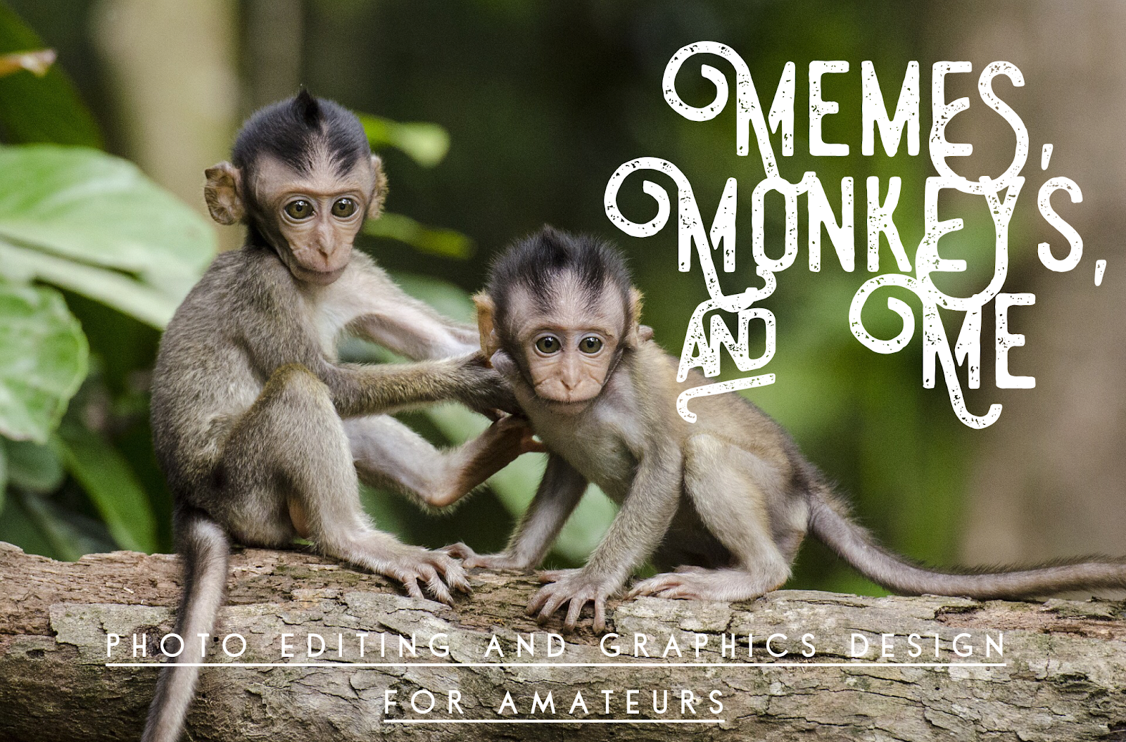
Memes, Monkeys, and Me: Photo Editing and Graphics Design for Amateurs
by Pam Hillman
This post first appeared in Seekerville in 2013, and at the time some of us didn't know what a meme was, and others thought it was pronounced memE (ahem). Assuming some of us might need a refresher, let's start at the beginning.
What’s a meme? Our current society considers a meme as an image or video that is passed electronically from one internet user to another. All those cute little pictures with captions that we see on facebook and Pinterest? They’re memes. We’ll get to the monkeys in a minute, but first, my graphics design credentials.
I became an amateur graphics designer many, many years ago. And I do mean amateur. My first foray into design was of the cut-and-paste nature. A co-worker’s son was having his 3rd or 4th birthday party and his mother found cute action figure plates, cups, and napkins for the party. We designed invitations, cut out the action figure from one of the plates, and taped it to the invitation and made copies on a black and white copy machine. Hey, this was the dark ages, but the invitations were still cute as a button and his son loved them, so that was what counted.
One thing led to another, and I started a cottage business called Celebrations, DTP (desktop publishing). I created logos, business cards, and letterheads for small businesses. Since the internet was unheard of (yes, there was such a time), I ordered font packages, clip art, and software to install on my computer. I also begged the local newspaper for all their old clipart books that they were going to throw away. HUGE books with tons of clip art that could be used in all manner of advertisements.Okay, enough about that. Fast forward to today….
We’ve come a long way. Professional graphics designers wouldn’t be caught without the latest digital software, graphics, and fonts at their disposal. I’m not a professional, but I still need promotional pieces here and there, and usually too quickly to contact a professional designer. I don’t want to buy new software that has a huge learning curve when I’ll only use it a few dozen times a year. I want something easy, fun, and cheap. Free is even better!
So today isn’t about buying anything fancy. It’s just a few quick, easy examples that you can implement to promote your books, yourself, your brand, etc. I’m going to use the *free picture editing software called PicMonkey to show you what you can do in a few minutes. You really can’t mess this up!
My interests lean toward cowboys, sepia-toned pictures, country, rural areas, horses, steeples, churches, rustic barns, cattle, etc. So we’re going to use a picture I took of my home church. This particular picture was taken with my iPhone. I prefer my digital camera, but I worked with what I had at the moment. I took several shots at different angles, and at first glance, this one might not be the best choice to use, but it appealed to me. I could already visualize the type of design I wanted if the pictures turned out okay. See the vehicle in the bottom left-hand corner of this picture?
 Steeple In Shadow Original Photo - Taken with an iPhone at Dusk White Plains Holiness AssemblyPam Hillman 2013After uploading my original picture Steeple in Shadow to PicMonkey (just click “Edit a Photo” and follow the directions. It’s easy!), I started playing with it.
If you just want to add text, click on the “P”, pick a font and type your text. You can change fonts, sizes, colors. Just play with it until you're satisfied with the results. Obviously, since this picture was dark with a lot of shadow, I needed to use a contrasting white/cream-colored font.
Wait!! Stop the Monkey!! The sky is blue…ooohh, blue font… Be right back. I’m playing in PicMonkey as I type this. What fun!!! And…more playing. Visually, this font needs to be right-adjusted because of the shape of the pink crepe myrtle bushes that are in shadow… Let’s see how this looks…
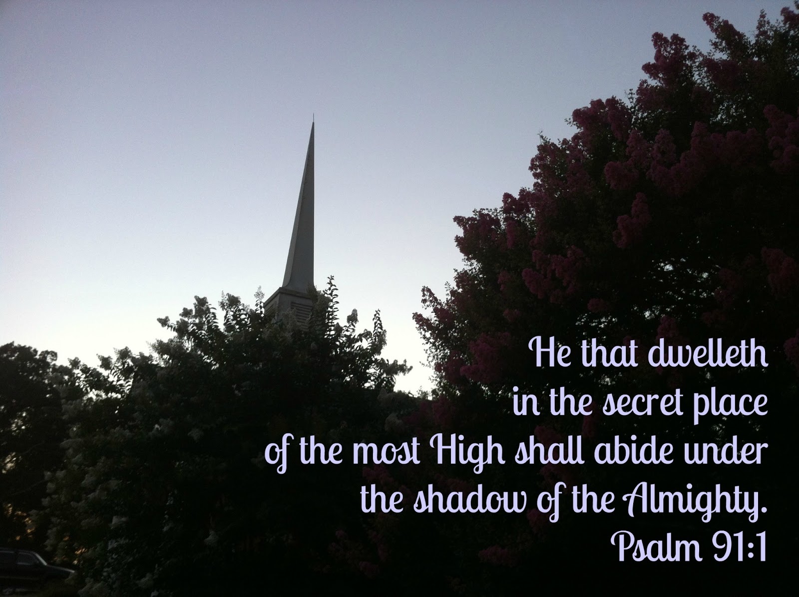 Steeple in Shadow - Blue Text Only ChangeI haven’t done anything to the picture itself at this point. Just added the text, decided it needed to be pale blue, and right-adjusted. That’s it. Then I saved it. You could run with that. But let’s play just a bit more and see what we can come up with. I’d like to get rid of that car in the corner.
I could crop the picture, but I don’t want to. I like where the steeple is, just off center, so I’m not going to do that. Some kind of soft edging appeals to me for this pic. Let’s try that first...
 Steeple in Shadow - Blue Text and Faded Edges. Nice!Yep, that works! Simply select Dark Edges under the Effects tool BUT move to white (or a creamy color) on the color wheel. Again, with all these shadows, I don’t want to make it more dark. The car is almost completely gone. In some cases you can use the Clone tool to get rid of something, but in this case, I chose the soft edges option instead. Worked okay and makes a nice enough meme.One final picture of my Steeple In Shadow because I simply can’t resist, and the final result is exactly what I had in mind when I took this picture...
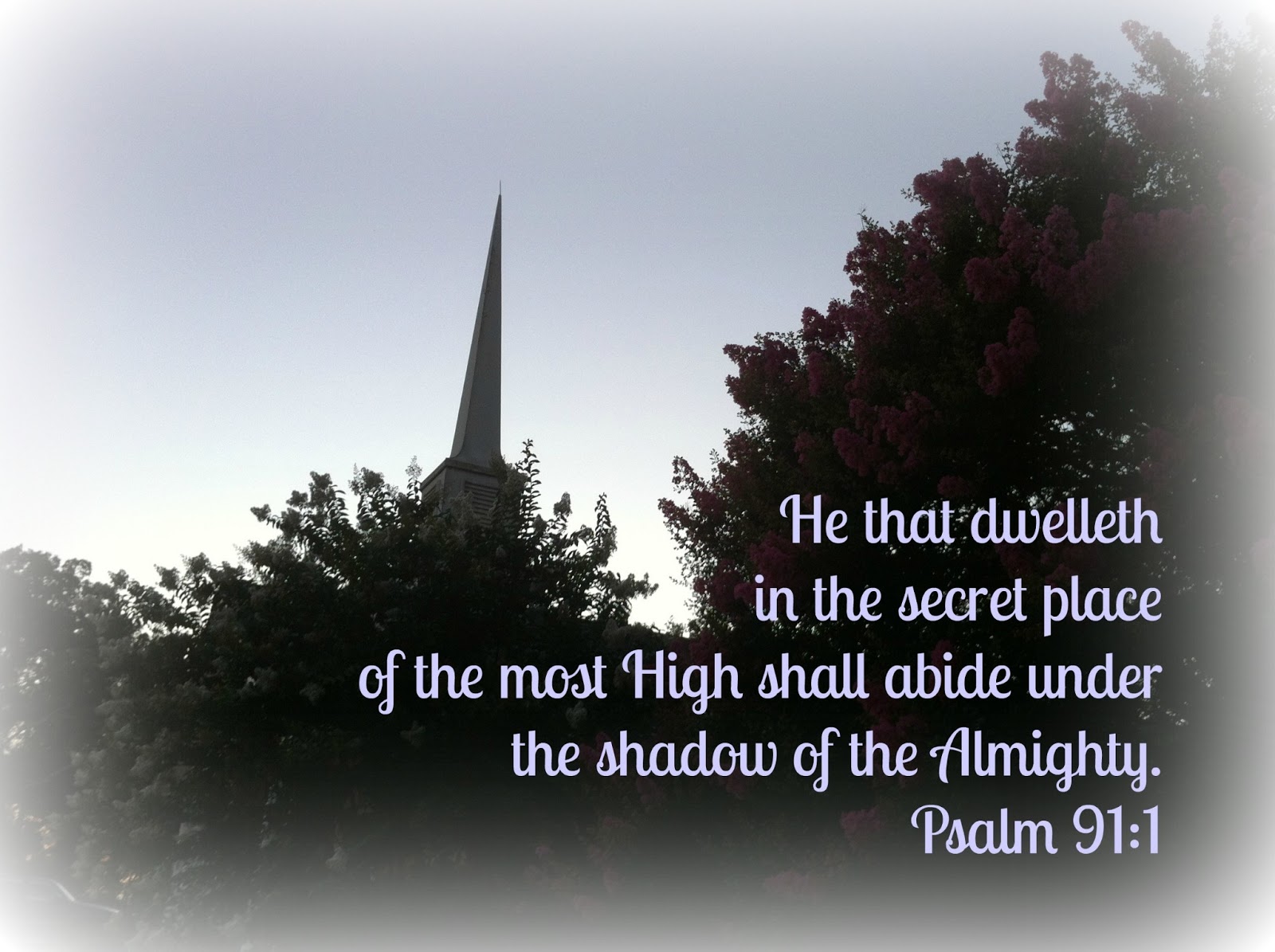
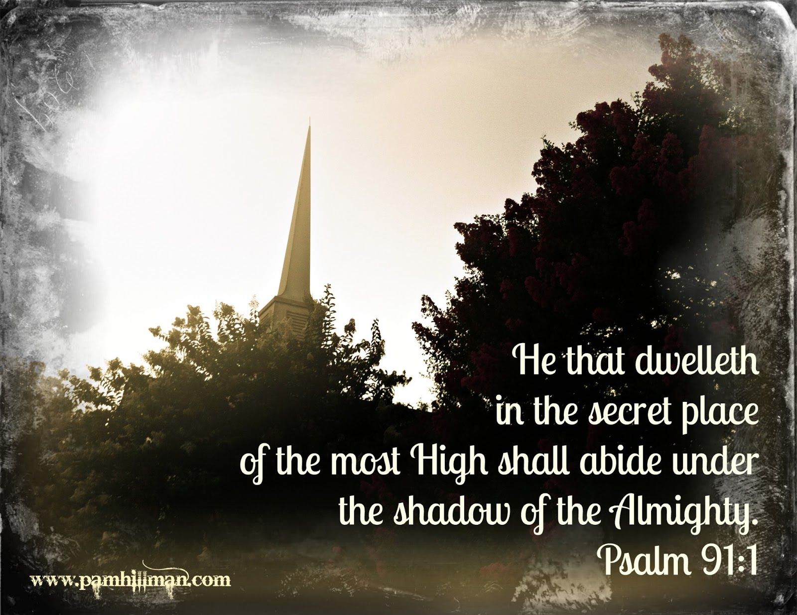 White Plains Holiness AssemblyIn the Shadow of the Steeple
To achieve the meme above, I used Daguerreotype frame with Effects / Sunglow applied. Notice that since this version fits my personal style of old-fashioned photos with an antique flair, I’ve added my website in PicMonkey’s Bleeding Cowboys font. Small, understated, and unobtrusive. ~ ~ ~ Here are some more before and after examples I’ve created with picMonkey. I wanted to show you these pictures side-by-side, but the blog feed is too narrow for that.
White Plains Holiness AssemblyIn the Shadow of the Steeple
To achieve the meme above, I used Daguerreotype frame with Effects / Sunglow applied. Notice that since this version fits my personal style of old-fashioned photos with an antique flair, I’ve added my website in PicMonkey’s Bleeding Cowboys font. Small, understated, and unobtrusive. ~ ~ ~ Here are some more before and after examples I’ve created with picMonkey. I wanted to show you these pictures side-by-side, but the blog feed is too narrow for that.At the original posting of this article, ACFW was having a sale on all their conference CDs until the conference. So, I went into action. I grabbed my CDs, my pink iphone, pink earbuds, made a glass of raspberry tea and staged it all on my front porch. I took about 15 digital pictures, then uploaded them to my laptop. I jotted down 2-3 that I thought would be perfect to promote the sale. I needed a good sharp picture that showed the CD case, but also left room for text. I’ll try to point out all the options I used.
 ACFW Original Photo Taken mid-day with Kodak DX6490 Uh...My Front PorchFirst, I decided where I wanted the text to be, placing it where it was visually the most appealing. I rotated the price just a bit clockwise. Then, thinking about the pink earbuds, I decided to use that to give some eye-popping color. Fun, flirty pink font at the bottom and at the top for the price. Next, I used the contrast and clarity tools to brighten the picture. I found the sunglasses in Overlays, made them pink and faded them out. The coup de grace was when I discovered the bright sunlight feature in Effects. I popped it over the top left-hand corner and added even more color with the yellow Summer Sale text. Use color and contrast to achieve the effect you want.
 Final version of ACFW CD Sale AdvertisementI’m going to share a SECRET TIP with those of you who want something just a little more advanced. Sometimes you want a shadowed font, but oftentimes free software doesn’t give you that option. I haven’t found shadowed fonts in PicMonkey, but you’ll see that I have some in the ACFW CD sale. The words “Summer Sale” and the “$89.95” have a dark gray shadow behind them. Here’s how I created that.
First add your text to your photo, formatting it as you would like it to appear.
Next, create a new text box and copy/paste the original font into the new text box. Make sure it’s the exact same size and shape as the original. The tool box will help you with this.
Reverse the font color so that it contrasts with the original, but also doesn’t blend into the background too much. If your reverse/shadow text box is in front of your primary color, use the Layer toolbox to Send backward.
And then shift your shadowed text box off-center just a little. Not much. You want the illusion of shadow, not something that jumps out at the viewer. That should give you a shadowed text. But don’t use shadows in long strings of text, only for emphasis and for contrast. ~ ~ ~I mentioned clarity earlier.
Sharpen and clarity are your friends.
Just be aware of what happens when you use these features, so work to get the mix just right. In some cases, too much can be ...uh... too much. Check out this picture that I posted on July 4th. I cropped out the date, of course. Used the Effects / Sharpen and Clarity tools to create eye-popping color.
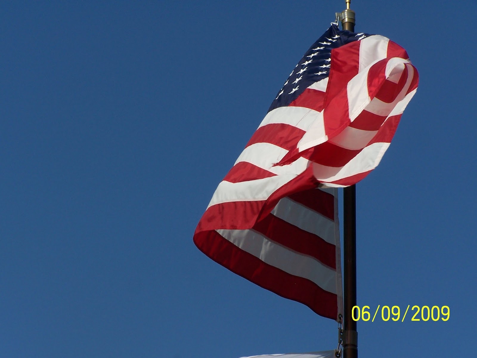 Original Photo taken on perfectly windy morning in June 2009 Hardy Manufacturing, Philadelphia, MS Pam Hillman, Kodak DX6490
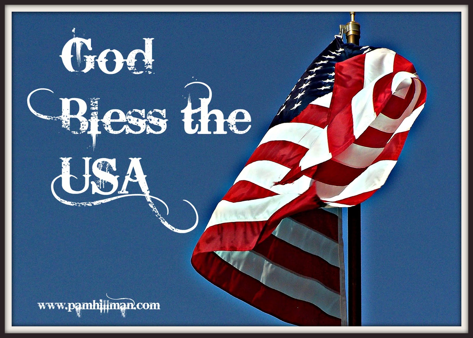 American Flag - God Bless America!Can you see the difference?
You might have to click on the pictures to see. The white is brighter, the red deeper, and there is a slight glow all around the flag. This is a good example of what a difference sharpen and clarity can make. I ended up putting a basic picture “frame” around this.
~ ~ ~Sometimes it doesn’t take much to create a PicMonkey masterpiece….
 Black Angus Bull - iPhone Broken Ended FarmsPam HillmanI took this shot with my iPhone while helping My Cowboy work cows. I was standing inches away, and the big guy was in the chute, so it wasn’t like he could get me. And he’s pretty gentle anyway...most of the time. I used Daguerreotype / Shiro and the picture needed no other work. I popped my website in the spot at the top where that piece of treated lumber was, and the words “I’ve got My Eye on You, Cowboy!” along the side. Pink font just felt right for some reason. Again, contrast.
 Black Angus Bull - Broken Ended Farms Bull's Eye!~ ~ ~Final tips:
Make sure you RENAME your creation when you’re done. You don’t want to override your original picture, and then have nothing to work with if you goof up.
Take your own pictures, purchase them, or at least make sure they are in creative commons. Get creative with your own shots. If you can shoot it, do it, then you can add your own website or name without concern.
Make sure you use proper grammar, check your spelling, and don’t leave words out. Nothing is more frustrating than seeing a meme on the internet with errors. No matter how cute or catchy, I will not share it.
Don’t just upload your masterpieces to Facebook, Twitter, and Pinterest. Sometimes this is okay, but even better, upload them to your blog and then pin them to Pinterest from your webpage or blog. That way it’s linked back to you. Instagram is such an amazing place for memes of all kinds, and the cool apps on mobile phones makes it all so easy.
PicMonkey is a quick, free (there is a paid version*) way to create a little buzz, and when I first wrote this blog post, you had to create and finalize your meme in one sitting. In addition, once you edited and saved your photo, then logged out of your online PicMonkey profile, you couldn't go back and edit or rework your creation. However, that's changed. With the paid version, PicMonkey offers something called the Hub. With the Hub, you can start a project, save it to the hub, then go back later and work on it some more. This is really cool because it never fails that I find something I want to change about a project.
*PicMonkey has a free version, but there is also a $33 yearly paid membership that gives more options. Some of the tools that I've used in these pictures come with the paid membership. If you're unsure of how much you might use the site, then opt for the free version until you're sure.Me? I knew I was going to enjoy it and signed up after about thirty minutes of playing. I hope you've enjoyed today's post as much as I enjoyed putting it together for you. Now, go out and have some fun with monkeys!
Next month I'm going to share about an app I have on my iPhone called Word Swag. I love, love, love Word Swag and it's my latest on-the-go, go-to design app that I use on my PHONE for all kinds of stuff. Yes, I still use PicMonkey (and sometimes use both on the same project if needed), but PicMonkey is like going to a sit-down restaurant to dine. Word Swag is ... fast food. And I'll have some fast food tips on making Word Swag work for you on the fly. Psst... the first meme in today's post was made using Word Swag. It took minutes!


No comments have been added yet.