Dataviz: Interactivity Increases Understanding
Maybe 20 years ago I could forgive laziness with data visualizations. After all, the “best” tools of the time weren’t nearly as powerful, affordable, and user-friendly as they are today. It’s a big emphasis in The Visual Organization and I feel as strongly about it as I did when I first penned the book.
In my analytics course CIS450, I devote an entire class to dataviz midway through the semester. In it, I cover the good, the bad, and the ugly. I conclude the class with an exercise. For about 20 minutes, I let the students find horrible examples of charts and graphs online. (To avoid duplication of efforts, I ban the first ten results of Google.)
Invariably, the students will find something along these lines:
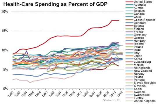
Terrible, right? The figure above manifests only one thing: The U.S. spends far more on healthcare than just about any country. That’s it.
A Better Tool Yields Better Understanding
Consider how much easier it is to understand interactive dataviz tools such as the one below from The Chronicle.
At a high level, a dataviz should convey, not confuse.
For perhaps thousands of schools, I can easily compare faculty salaries against a number of benchmarks. I can break down salaries by type of faculty and assess how schools value different positions. I could spend hours with this tool because it sates my curiosity and increases my understanding of how universities pay their faculty members.
Simon Says
With a nod to George Carlin, a dataviz should convey, not confuse. Rather than launch a static, incomprehensible tool, why not devote the time and resources to building one that accomplishes its goal?
Feedback
What say you?
The post Dataviz: Interactivity Increases Understanding appeared first on Phil Simon.