
Picking the Right Paint Color and New Website Reveal!!
Hi Friends. I hope you all had a wonderful week! It has been so exciting at Segreto with renovating a warehouse and our showroom and getting a whole new look on our website!!

When you opened the blog this morning you can see it has a whole new look! Loving her work I asked Jo Neiter with Neiter Creative to help with developing a beautiful new site. Super creative, spunky and easy to get along with, I felt she and her company was my perfect fit!! She did not disappoint so….at the end of the post I’ll show you the new website. Getting my picture taken for me is like pulling teeth, but friend and photographer Julie Soefer did a wonderful job with both my photo and my staffs!! Thanks Julie!

Architectural consultant Sarah West- Witmer Designs- Parkerhouse Builders
As you know Segreto provides finishes on walls, floors ceilings, beams and cabinetry, however, finding the right color palette is where most finish designs begin. Choosing the right paint colors and finishes can be an overwhelming decision. There are thousands of colors available, each with different tones and intensities, and the perfect combination of paints is so critical to the overall success of the design. Here are five helpful tips on selecting colors for your own home.

Step 1: Look through magazines and books to determine your own personal design style. (hehe could be mine). As you flip through the pages, pay attention to different color combinations of floors, walls, trims and ceilings. Notice whether the pictures you like have bold contrast or a lack thereof.

Triangle Interiors-Goodchild Builders
Some rooms may have distinct colors that set apart the walls, trim and ceiling……….

Kara Childress Interior Design, Newberry Architecture
………………….. while others may have similar tones and each surface blends effortlessly into the next. Which look do you prefer? Do your favorite rooms have strong colors on the walls or in the fabrics, art and accessories instead?
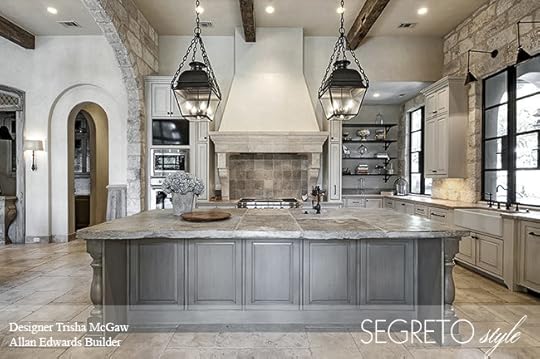
Designer Trisha McGaw- Allan Edwards Builders
Step 2: Think about which elements in your home are permanent. Your counters, backsplash, flooring, rugs or fabrics can serve as great starting points to dictate your palette. In an existing home, the perfect paint color can highlight tones you love in a countertop or rug and downplay less desirable hues in these elements so that they will work in the new design scheme.

Elizabeth Garrett Interiors- Cupic Custom Homes
Step 3: Make a list of your home’s best and worst architectural features. The proper paint combinations and finishes will not only enhance the aspects in your home that you love but also disguise your least favorite attributes. For instance, by using the same color as the walls on elements like fur downs, smaller trim pieces, spaces with too many angles, and doors, you can make these unwanted details disappear.

To emphasize the elements that enhance the room’s design such as furniture-like built-ins, interesting ceiling details, elaborate crown moldings or paneling, choose a contrasting color, sheen or specialty finish.

Rather than painting smaller rooms a light color, give them a warm and cozy feel with rich, deep tones and……..

……….. let your big rooms expand with lighter hues.

Step 4: Look through your closet! One of the best ways to determine which colors and styles make you feel the most comfortable is to study your own wardrobe. In what colors do you think you look the best? What are you wearing when you feel the most beautiful? Do you tend to incorporate pop colors in jewelry and accessories or do you layer different textures in the same color? Are strong colors worn on a daily basis or just occasionally? You can apply these same principles to your paint selections.

Step 5: Pick up a color wheel from two of your favorite paint stores. Lighting has a powerful effect on color so it is important to always choose the final paints in the space. Armed with your answers and insights from the steps above, you are now ready to select!

Starting with the main parts of the home, pick a color that blends in and uses the tones of all the surfaces. The background color of fabrics, tiles or counters is generally a safe color direction. Depending on how much contrast you like, the trim and ceiling hues can come from the same color strip, just lighter or darker than the wall color. Special cabinetry, interesting ceilings and adjoining rooms are ideal for coordinating or pop colors.

Brooke McGuyer Interior Design
By establishing a particular mood, well-chosen paint colors and finishes form a beautiful backdrop for fabrics, art, furniture and accessories. Through these five steps, you can develop a palette that showcases your home’s architecture, flatters your own color tones and gives your surroundings an ambiance that makes a house feel like your home.

The new site is easy to use and has some fun interactive ways to see our products and hear all about our company! It has much more information about finishes and is beautifully done, thanks to Jo and her gal Becky! I couldn’t be happier with the end result! If you still have a bit of time- visit the home page, take a look around and let me know what you think! I do know I had to clear my browser history for it to work properly on my computer. If you need help with that please email me at leslie@segretofinishes.com.
Have a wonderful week! Till next time.

The post Picking the Right Paint Color and New Website Reveal!! appeared first on Segreto Finishes.


