
8 User Control UI Patterns Worth Using

When it comes to helping users manipulate on-page content, we see a few popular UI patterns persist through the years.
In this piece, we’ll explore examples and best practices for the following patterns:
Drag & Drop Actions
Flagging/Reporting
Discoverable Controls
Overflow Menus
Context Menus
Direct Manipulation
WYSIWYG Editors
Let’s explore popular techniques for letting users manipulate content the way they need.
1. Drag & Drop Actions

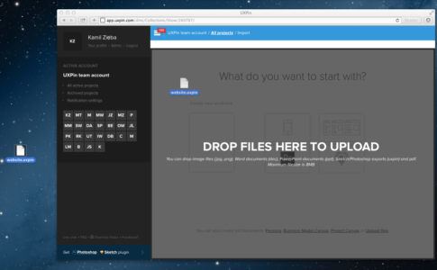
UXPin ( Photoshop & Sketch integration )
Problem
Moving and organizing content is too much effort.
Solution
The drag-and-drop functionality is a preferred method of organization for most users: it’s intuitive because it’s based on reality, and often something user try instinctually when first using a UI.
Drag-and-drop provides a level of direct manipulation that other methods can’t match. While it’s more organic with the gesture controls of mobile, it has already become ingrained on desktop sites as the most effective way to rearrange items in a list, or move documents from one place to another.
Tips
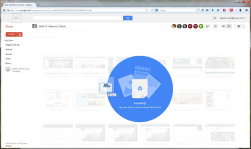
Give some visual indication that drag-and-drop is available. This could be something obvious like Google Drive’s large notification, or it could be more inconspicuous, such as changing the colors of the window’s borders.
For responsive web apps, the drag-and-drop action in the desktop version helps create a snappier design and strengthens consistency across mobile devices.
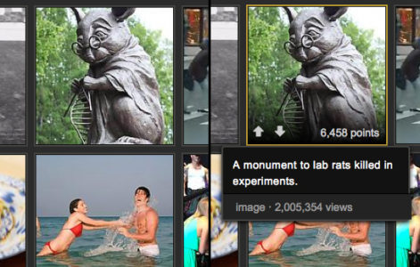
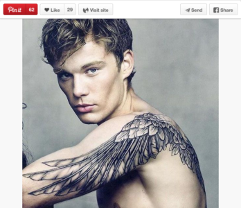
2. Flagging/Reporting


Problem
Inappropriate content gets in the way of user task flows.
Solution
Let users report inappropriate content (or other users) for administrator review and removal. Inappropriate content could mean a variety of things:
Obscene content, whether images or text
Offensive, insulting, or bigoted content
Content that is mislabelled, misplaced, or categorized incorrectly
Spam and solicitations
Violations of site policy
Copyrighted work
Descriptions/solicitation of illegal acts
This pattern takes the pressure off you to regulate every piece of content that comes through your site, and gives the users themselves some authority, which they appreciate.
Tips
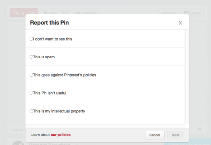
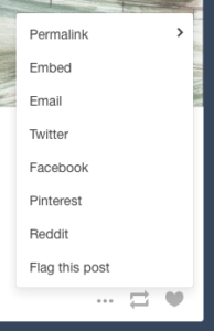
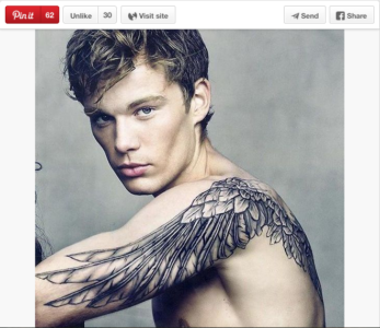
The option to flag or report is essential for sites with user-generated content, but it doesn’t have to be stand out. Having a small flag icon in the corner (Pinterest), or even tucking the option in a pull-out menu (Tumblr) are acceptable.
If the questionable content was posted directly on the user’s page, the action of flagging/reporting can also double as removing it, saving them an extra steps.
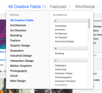
3. Discoverable Controls

Problem
Displaying controls for each piece of content clutters the screen.
Solution
Hide the controls until they’re needed. Discoverable controls (a.k.a., hover or hidden controls) are one of the most useful UI patterns, and widely adopted. They are so popular, in fact, that if users are confused, they will now hover over questionable items expecting something to appear.
Discoverable controls are an effective space-saver without sacrificing user functions.
This pattern also makes the controls more comprehensive, especially together with the card grid (a common pairing). Discoverable controls make it clear which card the controls apply to. Universal controls can get confusing with multiple posts, so having the controls appear within the post itself clears this up.
Tips
A practical necessity for the cards layout, when the user is able to interact in multiple ways with each card. Controls reveal themselves upon hover for desktop and tap for mobile.
Avoid using discoverable controls for essential actions, as they’re always a chance they’ll go undiscovered. As a rule of thumb, ask yourself if users can still enjoy the interface without these controls — if so, it’s safe to hide them.
For more information, interaction design expert Dan Saffer discusses modern solutions for discoverability.
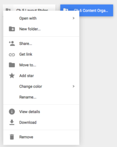
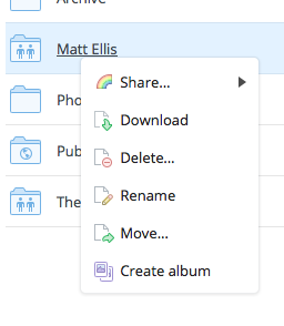
4. Overflow Menus
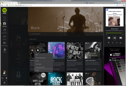
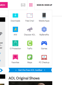
Problem
Too many options are cluttering the screen.
Solution
Move the extra options to a second menu. Overflow menus are a smaller, more manageable alternative to slideouts.
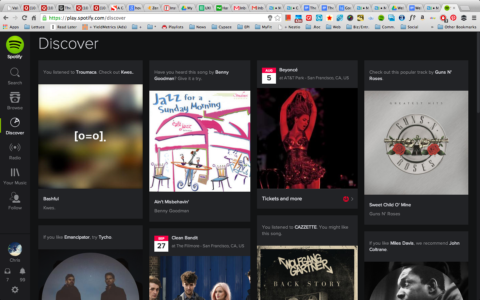
Overflow menus present all the secondary options that aren’t necessary and keep them hidden unless they’re needed. These could hide links (like the extra page links in AOL’s grid icon) showcase controls, as with Spotify or more detailed features (like the advanced search in Behance).
In fact, Behance demonstrates the ideal use of the overflow menu: detailed search is a useful but not primary feature, and so can be hidden from the main screen.
Tips
Animating the appearance of an overflow menu, such as sliding out, adds weight to it and reinforces the connection with the triggering element.
Treat overflow menus as slideouts, but smaller. The same rules apply to both, such as only including secondary content and using recognizable icons.
Grab design ebooks created by best designers
All for free
 Download
 Download
 Download
 DownloadDo you want to know more about UI Design?
Download 'Free Ebook: Web Design Trends 2016' FOR FREE!
Download e-book for freeClose5. Context Menus
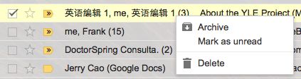
Problem
Certain contextual controls clutter the screen view.
Solution
A specific kind of hidden controls similar to overflow menus, context menus offer contextual controls, specific to certain types of content. These are typically activated by right-clicking.
The controls within context menus change depending on the content.
Tips
Use common tasks for the site so that the user does not have to return to the toolbar every time they wish to use them.
As a default, CRUD (create, read, update, delete) functions work well
Join the world's best designers who use UXPin.Sign up for a free trial.Your e-mailTry it for free!
6. Morphing Controls


Problem
Some controls don’t need to be displayed at the same time, and clutter the screen.
Solution
Morphing controls save screen space and make a more logical interface. The most obvious example, from YouTube and almost every video site, is the play button that becomes a pause button — the play and pause functions never need to be displayed simultaneously.
This pattern works great for usability, as related but opposing functions are located in the same space, which matches how the user perceives and therefore search for the actions.
Tips
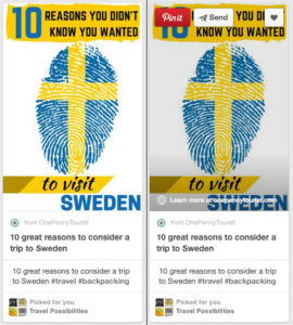
This works well with undo functions, such as Pinterest’s Like and Unlike.
Be consistent with both functions’ appearances, i.e., don’t change the font or text size.
7. Direct Manipulation of Content & Data


Problem
There are too many steps to manipulating content.
Solution
Eliminate extra steps by allowing users to edit, delete, or add content in the same mode. Essentially, the less steps the user takes, the better, so this pattern is about increasing efficiency.
Twitter users can drag photos into the tweet without opening the Media menu, and Wunderlist users can edit the names of their tasks by simply clicking on them.
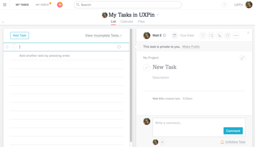
Asana, though, handles this pattern the best. Without opening a new menu or switching screens, the user can add a new task, edit an existing task’s name or details, assign a task to a project, change the task’s privacy settings, comment on the task, unfollow it, or reorganize the order of tasks.
Tips
To see where in your UI you can implement direct manipulation, try listing out the steps of a given task and analyzing them for redundancies. For example, to send an email, a user might click the new email button, click in the content menu, and start typing. A shortcut would be to have the user already in the content menu after clicking the new email button, saving them an extra step.
8. WYSIWYG Text Editor
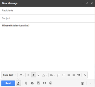


Problem
The user is unsure about how different text formats will appear.
Solution
A WYSIWYG text editor shows the users precisely how their text will look when finished, eliminating all the confusion about different formats and superseding markdown formatting, preview modes, or HTML code.
Just like the direct manipulation pattern above, WYSIWYG text editors save steps and time. Seeing the final product as they write it combines steps, which is why this pattern is implemented in almost all blogging and email platforms.
Tips
Don’t neglect fonts — if your site uses a specific font, have that as the default.
Use this pattern for sites in which users will spend time scrutinizing content (e.g. portfolio template sites, blogs, etc.)
Next Steps
If you found this post useful, check out the full length e-book Web UI Patterns 2016 Volume 1.
The guide explains 140+ examples for 38 useful UI patterns.

The post 8 User Control UI Patterns Worth Using appeared first on Studio by UXPin.


UXpin's Blog

- UXpin's profile
- 68 followers

