And We Have a Winner…….
As you may recall, I wanted a branding logo for my book imprint and ran a little contest. It took a while for submissions to roll in and we got some very creative ones.
I wanted animals that are Florida regional.
I wanted something that would be both elegant and menacing.
Endearing was a thought I had to let go of, unless you’re particularly fond of grumpy alligators.
We got some really great submissions: Sly Panthers, Alligators reclining, alligators chasing other animals, alligators holding a fork and knife.
I realized I really had to decide on name for the imprint to make it work and it seemed the alligator was a must have for a Florida regional series.
It’s a P.I. series…so another animal that is stealthy and brave would work well.
The Great Blue Heron came to mind. A majestic bird, he’s brave enough to tread the banks of some of the most hostile waters in Florida. He’s elegant and quick, with a sharp eye. Sharing space with one of the most menacing animals in the State, he fears nothing. I have seen them sitting on the backs and heads of gators in the wild. That’s when the name hit me.
Brave Blue Heron Books.
I got some feedback on the name and it seemed a good start.
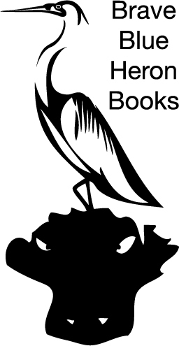
Illustrator Dean Kealy stepped up to the plate with an awesome submission that hit the mark. A little tweaking and we had a winner!
What I like about it:
The heron looks stealthy, elegant, abstract, but with realism in detail.
He’s perched on a gator’s head. That’s brave.
The gator, also a bit abstract, has menacing eyes with his face just above the surface of the water.
At first glance, it sort of appears the gator is a mound of earth the bird is standing on. At second glance, you see it is a gator. That’s clever.
The whole image without the text was too tall and slender for my screen printer and he suggested we use text to square/rectangular it off.
Of course, the image of a book imprint is much smaller than you see here. We had to get the image down to 25% and cut out white space to have it fit on the title page at the bottom. I was afraid we might lose too much detail and another artist/typesetter made a vector image that won’t lose too much detail in resizing. It will look more like this on the page:
I think Dean Kealy did a fine job with the concept in creating this beautiful, yet mildly menacing image.
If you have a project for him please feel free to contact him. He’s super friendly and easy to work with, quick to respond, and delightfully imaginative.
Blog: https://deankealy.com/
FB: https://www.facebook.com/Deanzdoodlez...
Twitter: @DEANKEALY
Filed under: Marketing, My Novels, Publishing Tagged: art, book imprint, Brave Blue Heron Books, contest, Dean Kealy, logo


