
Use Color to Up the Ante on Your UI Cards
Thanks in part to the growing popularity of Material Design, card-style interfaces are popping up everywhere. This trendy and functional aesthetic uses container-style design elements to hold a variety of information. If you want to take advantage of this highly versatile approach, your cards need to stand out.
One way to do that is with color. Great color choices, exciting color palettes, and interesting combinations can be used to create emphasis, enhance usability, and draw users into your design projects.
Card-Style Design Primer
There’s a lot to know about designing with cards, which can feature various kinds of data (such as images, text, buttons, links, comments, or video) that all relate to one link or piece of information.
Designed to mirror the look of old-school playing or trading cards, these clickable containers include an area for some sort of visual and a small block of text or a button. The advantages to a card style interface are that users tend to easily grasp how they work, making them an ideal solution for aggregated content or e-commerce. Plus, they’re easy to browse and are highly shareable and versatile.

Photo credit:

Photo credit: The Clymb
To start using cards, begin by learning the basics of card design in UX Pin’s “Web Design Book of Trends 2015-2016.”
You’ll also want to follow these seven best practices from “The Complete Guide to Effective Card-Style Interface Design”:
Negative space. Use sufficient borders and padding to avoid clutter.
One card, one concept. Cards simplify your site’s structure. Don’t undermine that by making each card overly complex.
Suitable images. Card images tend to be small, make sure you use clear pictures that are appropriately cropped to suit where they’ll be used.
Simple typography. Because text also tends to be small, simple typography is most legible. Choose simple and elegant fonts, avoiding decorative typefaces.
Get creative. Make an extra effort to stand out from the crowd, using elements such as animated effects, video, round frames, or new color schemes.
Use an open grid. A standard grid helps maintain the same spacing while respecting various sizes and breakpoints.
Implement Fitts’s Law. As we described in Interaction Design Best Practices , Fitt’s Law (as applied to cards) suggests that the entire card be clickable—not just the text or the image. This makes interaction easier for the user.
Light vs. Dark Cards
The first decision you have to make is whether you prefer a light or dark color scheme. There are pros and cons to each; white or light schemes are most common, but darker colors are becoming increasingly popular for mobile apps.
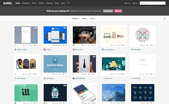
Photo credit: Dribbble
Dribbble’s cards are easy to see, sort, and click to learn more about an individual project. Its design uses white cards against a light background, with a content area below each image to display work. The light color scheme works particularly well on desktops and is easy on the eyes.

Photo credit: SB Joinery
SB Joinery chose a much darker color scheme—reverse type on a dark background—and uses a tinted overlay on images to put visual emphasis on the text and ghost buttons. The pop-out menu also uses this darker theme. Thanks to bolder fonts and high-contrast colors, this dark card aesthetic is readable and highly usable.
Bright Color Schemes
Material Design has been a major influence in the use of cards—and for good reason. The design style emphasizes mobile usability, borrowing from flat design and minimalism to follow an aesthetic and techniques that users are growing accustomed to.
This style incorporates a color palette of bright, saturated hues ranging from blues to greens to reds. While you don’t have to abide by these color suggestions, the idea is a good one. Adding bold, bright color elements can create emphasis and facilitate usability.

Photo credit: Helbak
How can you make the most of bright color?
Use for headers, buttons and call-to-action elements.
Use as a background that adds meaning—such as colors associated with different types of cards. (Like this example from Helbak.). Note that even pastel or light colors can work beautifully in this way.
Use color for primary text elements to assist readability.
Overlay images with bright color or use a duotone technique to guide users through cards.
Color for Emphasis
Finally, bold color choices can be a great tool to emphasize specific elements. For example, color elements can break up visual monotony and increase interaction.

Photo credit: Mayors Challenge 2016
The Mayors Challenge design makes the most of material concepts without feeling like a Google product. Color is bold and bright, while cards are somewhat simple and “undefined.” Pulling it all together are hints of bold color in iconography, text, and links that guide users through actions to take on the site.
One of the criticisms of card-style design interfaces is that elements can start to look too much alike—so have fun and think outside the box.
Takeaways
Color can be just the thing that helps your card-style design stand out from the crowd. Think about how color best compliments your brand and serves users, as you choose which techniques to use.
For maximum impact use color for a specific purpose and to draw users through the design and stir them to action. Whether you go with light versus dark, or bright colors and trendy combinations, color can influence how users feel about and interact with your design.
The post Use Color to Up the Ante on Your UI Cards appeared first on Studio by UXPin.


UXpin's Blog

- UXpin's profile
- 68 followers

