
5 Ways to Avoid the Drawbacks of HD Web Design
There was a time when 72 pixels per inch may have been enough, but those days are coming to an end.
Studies are showing a quickly accelerating rise in HD devices (220 ppi or higher), with Apple’s retina displays and the ensuing technology war. Today, designers have two options: either implement HD, or else risk getting left behind.

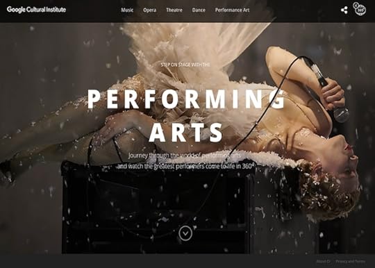
Photo credit: http://www.wonderfullywild.co.uk/
On the bright side, there are strategies for getting around the performance drawbacks of HD design. In this article we’ll talk about how to have your cake and eat it to: implementing HD while sidestepping the problems.
The Problems with High Definition
The revolution of resolution may be great for users, but it’s causing designers some headaches. Naturally, the higher resolution means more data, which means longer loading times. The other major factor is how standard 72 ppi visuals look on HD devices.
At best, they fall flat, especially in comparison to other sites who’ve already adapted to HD.

Photo credit: https://flipboard.com/
Additionally, HD visuals, whether video or images, just plain cost more. That means you’re paying more for content that takes longer to load. Even if you’re providing your own content, the tools necessary to create HD visuals are still expensive.
So, are all these drawbacks worth it? We say yes – even if you can still get by with standard definition at the moment, the popularity of HD will only continue to grow. The sooner you adapt, the better you’ll be prepared for the future.
Besides, there are ways around the drawbacks. Let’s look at 5 tactics designers have already discovered for getting around these problems.
1. Scale Vector Graphics
The rise of HD displays impacts more than just the popularity of HD backgrounds, but the way we think about design altogether, specifically between uploading images in raster or vector formats.
Before, raster formats like .jpg, .gif, and .png were preferred as a way to compress images and hasten loading times. These simply translated the image to the screen pixel-for-pixel. But with HD displays, this images appear blurry, with the same amount of image pixels displayed on twice as many screen pixels.
The shift is leaning towards scalable vector formats (SVG), which allows the same image to appear at its best on different screen resolutions. By using connected points and lines instead of pixel-for-pixel, vector formats allow the image to accommodate various resolutions without changing the file. To see vectors at their best, go to Les Jardins de la Poudriére below and play with the window size.

Source: Les Jardins de la Poudriére
HD web design requires rethinking and using vector formats, which is a newer concept when it comes to the internet. (Coincidentally, print designers have been doing it for ages.) That’s where the Scalable Vector Format, or SVG, comes in. As with other vector graphic formats, SVG graphics use connected points and lines, rather than pixels, to create images that can be scaled to any size without a loss of quality.
But that doesn’t make vectors a cure-all solution. Photographs, for example, are limited only to the resolution they were taken in, so vectors won’t change how they’re rendered on larger or smaller screens. For that reason, we recommend the following guidelines:
Use vector for original graphics
Use raster for photographs and graphics whose pixels can’t be changed
With this in mind, use the highest resolution possible when selecting or taking photographs for your site.
2. HTML5, CSS3, and JavaScript Rendering
Traditionally, images are rendered in the browser, which is where some of these problems arise. If you render your images in HTML (width & height attributes), CSS (properties), or JavaScript (properties), however, you gain more control over how they’re viewed, and can sometimes avoid that unsightly blurriness.
The easiest solution is to set the image’s size to be half of what it actually is, so that when converted to HD, it’s displayed normally. For tips and tricks on the coding of this – including media queries to change the dimensions according to the device – Paula Borowska explains the details in this piece for DesignModo.
3. “Still” Video
With the growing popularity of HD video backgrounds, designers are looking for creative solutions to alleviating the loading strain. One of the most creative is simplifying not the quality of the video, but the content.
The fine compromise is to have HD video with little movement and/or composed of mostly static elements. The slight motion will still have a positive effect on the user experience, but will not overtask the loading of the video.

Photo credit: http://bellroy.com/live-life-outside
A good example of this is Bellroy, maker of wallet covers. Emphasizing their product’s durability and quality, they use a simple HD video to showcase it surviving unscathed in the harsh elements. Only the falling snow moves in the video, making the scene closer to a still image than video.
From a technical standpoint, we can see some smart decision-making at play. First, the entire background uses a fairly limited color palette, which naturally improves load times. Secondly, because the video renders in .mp4, the moving snowflakes have mostly soft edges while only the still wallet image has hard edges (again, improving load times).
The end result is a visual compromise that works just as well as it looks.
Grab design ebooks created by best designers
All for free
 Download
 Download
 Download
 DownloadDo you want to know more about UI Design?
Download 'Web UI Design Patterns 2016' FOR FREE!
Download e-book for freeClose4. Unfocused Imagery
In the same vein of simplifying content instead of quality, more designers are appreciating the flexibility of the “unfocused” style of videography. Like the “Still” HD video, this adds some of the visual delight of HD video, without so many drawbacks.

Photo credit: http://fernando.is/all-about/
Fernando Maclen’s site lives up to its “superb simplicity.” Users are still able to discern movement, which invigorates and enlivens the atmosphere, and the artistic style masks the more practical benefit of reducing load strain, not to mention responsive design (the video is only 640 pixels wide, but it looks fine on larger screens thanks to the blur effect).
This strategy has a few other additional benefits, as well. Crisper elements, such as links, buttons, or text, attract more attention and therefore have more force behind them. This is an excellent way to emphasize certain elements over others.
5. Less Visuals
This is a bit of a last resort solution, but will work in a pinch. Simply reduce the amount of your images, animations, and videos on the screen. You get the benefit of HD with some of your visuals, without the drawbacks on loading time, or having to buy too much HD content (which can get real expensive).

Source: Oh Deer Games
With minimalism itself being another timeless design trend, the benefits of this strategy extend beyond just loading times. Your site will feel more sophisticated and you’ll emphasize more of the existing content (which provides a smoother experience when executed properly).
Takeaway
The transition to HD might seem scary to some designers who are set in their ways, but those who embrace the new opportunities will better position themselves in the future. Just like when sound and then color was added to movies, there is an adjustment period followed by one of experimentation, and ultimately a renaissance. The heightened visuals of HD will, in the end, give the designers more power, not less. The key is to get in on this fantastic new movement while it’s still in its early phases.
As fast-growing web design trends, modern HD backgrounds and photography have a variety of techniques and best practices to get the most out of them. If you’re interested in learning the specifics of these 2 trends — and 8 other current web design trends — download the free ebook Web Design Trends 2015-2016. You’ll find 166 hand-picked examples from companies like Adidas, Intercom, Apple, Google, Versace, and others. To help speed up the design process, there’s also a curated list of 100 free resources.

The post 5 Ways to Avoid the Drawbacks of HD Web Design appeared first on Studio by UXPin.


UXpin's Blog

- UXpin's profile
- 68 followers

