
UXpin's Blog, page 68
January 11, 2022
Balancing Desirability, Viability, and Feasibility: A Design Review Template

A design review evaluates a new product design to see if it meets specific criteria. Stakeholders want to know if they have an innovative solution to a human problem. According to IDEO, a truly innovative product must have desirability, viability, and feasibility for sustainable long-term growth and success.
The design thinking process involves research, or a design review, to determine what product and features will serve your customers the best. A successful design review identifies a problem your competitors aren’t solving that will benefit both your end-users and the business.
But, where do you start? How do you find this competitive edge? And how do you know if it’s a viable business model that serves users and the organization?
This article explores research during the conceptualization phase of design thinking and how to identify an idea that meets three key criteria:
DesirabilityViabilityFeasibilityDoes your design tool provide you with features to take a product from concept to design handoff? UXPin is an advanced end-to-end design, prototyping, and testing tool to create the best user experiences for your customers. Sign up for a free trial to explore how UXPin can enhance your UX workflows and digital product design.
What are Desirability, Viability, and Feasibility in Design?Desirability, viability, and feasibility is a design thinking methodology to test ideas, concepts, and hypotheses to determine if you have a unique value proposition (aka unique selling point) and whether it’s worth pursuing.
Without checking all three boxes, you increase the risks, costs, and potential for failure. You could say desirability, viability, and feasibility are a risk analysis methodology for ideas – a toolkit to find that innovation sweet spot.
By applying this methodology, you can pinpoint the weak points in your design concepts, do further research or scrap the idea and move on.
Where Does this Methodology Originate?IDEO, a global design company, conceptualized the desirability, viability, and feasibility design thinking methodology in the early 2000s as a way to test ideas.
IDEO recognized that the best ideas succeed when they fulfill this trifecta. Conversely, “great ideas” often fail when they miss one or more of these three criteria.
Let’s look through these three lenses to understand how this trifecta fits together.
DesirabilityThe first box designers must check is desirability. If your product idea has no market value and people don’t want or need it, it won’t sell.
Researching desirability will also tell you whether your product is a want or a need. For example:
You need to get to work which you can do by walking, taking public transport, driving, carpooling, etc.You want a car to get to work because it offers convenience, and maybe more luxury than public transport.A need is something your customers cannot live without, while a want is often a more desirable option to fulfilling that need. Both check the box for desirability, but a product that fulfills someone’s need is far more valuable than something someone wants or is “nice to have.”
To find a desirable product, you must research your customers and identify pain points (wants and needs) that you can fulfill.
Does your product solve someone’s problem?Do your competitors offer a solution? Do you have a better idea? What makes your idea unique, and why would someone choose yours over the competition?How will your product make end-users feel?Is your product so desirable that people will tell their friends?Will your product be something that once people try it, they won’t want to live without it?When researching desirability, the intention is to stress-test your idea to find the gaps that need fixing. The more gaps you fill, the stronger your product and the better it will stand up against rigorous stakeholder questioning and customer satisfaction.
ViabilityViability tells you whether or not your product makes business sense. Even if you have the most desirable product in the world, if it’s too expensive or isn’t profitable, then it’s not a good business model.
A truly viable product idea makes business sense in the short-term and into the future. The quicker and longer it can deliver a positive return on investment, the higher the viability of your design idea.
A fantastic example of viability is how Coca-Cola designed a beverage formula in 1886 that’s still one of the most consumed drinks in the world today! That initial investment created massive wealth for its inventors and still delivers incredible returns for shareholders more than 135 years later.
Viability is also about societal and environmental impact—the ethical aspect of your design. Will your digital product provide a positive gain for society? In 2021, Facebook whistleblower Frances Haugen released documents showing that the social media giant’s internal research showed that Instagram creates anxiety, depression, and suicidal thoughts among teenage girls.
Instagram might deliver high financial returns in the short term, but is this harm to teenagers sustainable long-term? And what will governments do to regulate Facebook and Instagram?
Facebook is a massive company with the resources to overcome societal controversy, fines, and lawsuits. But, a smaller company or startup will mostly like fold when confronted with similar pressures.
So, when we look at viability, it must provide value for the business, customers, and society. Some questions you might want to consider include:
What has to be true for this design to work?What will it cost to turn your design into a functioning product?Do you have the capital investment to build the new product or feature?What is the pricing model? And, can the business make a profit?How long will it take to see a positive return on investment?Is the product sustainable?How does the product impact society?Like desirability, viability requires you to research, analyze, and stress-test ideas to ensure they’re viable and sustainable.
FeasibilityFeasibility looks at your current resources to determine if you’re capable of developing the product in the foreseeable future. Designers must consider how the product will impact the business.

Some feasibility factors include:
Technical constraintsFinancial constraintsProduct’s impact on branding, marketing, customer support, and other areas of the businessEstimated time-to-marketOperational capabilitiesIdeally, you want to design a new product or feature within the company’s current capabilities using available resources. When you have to build infrastructure to support a new product, you increase the risks and costs.
Here are some feasibility questions you might want to consider when designing a new product or feature:
Does the current design system have the components to develop the new product?How long will it take to design and develop the product?Do you have enough product designers, UX designers, and engineers to build and scale the new product?Can our technical constraints support the new design?Will the organization need to hire new talent?If you have to extend the organization’s capabilities, how can this benefit future products?What impact will the product have on the brand?Will the product’s release impact other areas of the organization, like marketing, sales, and customer support? And do these departments have the capacity for more work?Using Desirability, Viability, and Feasibility in a Design ReviewOrganizations conduct a design review during the early stages of a product design to evaluate the design against specific criteria. The goal is to identify any problems with the design or prototype before developing it–which carries the costs of infrastructure, marketing, sales, customer support, and more.
Essentially, the organization wants to know the product design’s desirability, viability, and feasibility.
A UX Design Review TemplateApplying the desirability, viability, and feasibility design thinking methodology will give you the insights and data to present a comprehensive and objective design review to stakeholders.
Below is a structure or template you can use to present your design review so that it’s easy for stakeholders to read and digest.
The problem: State the problem succinctly. The design and business teams will build a shared understanding from this foundation.
The system (current state): Show how the current system works (if it’s an existing product) to help put the problem in context. Later, you can show how the system could work with your proposed experience.
The Jobs To Be Done (JBTD): A shared understanding of what motivates your customers is crucial for a design review. As Tony Ulwick defines JBTD: “a lens through which you can observe markets, customers, user needs, competitors, and customer segments differently, and by doing so, make innovation far more predictable and profitable.” This lens helps stakeholders understand how customers decide whether to “hire” or “fire” your solution.
The business objective: State the business value and ROI for solving this customer problem.
The metrics that matter: You can’t improve what you don’t measure. These metrics should enable you to quantify the business and customer value you’ll create through your new product design.
The proposed experience: Summarize the proposal in a sentence. Make it clear and understandable. The people in the room need to understand how this proposal relates to the problem you’ve previously articulated.
The implications of your proposal: How will your proposal impact other parts of the business? Maybe you don’t know. Understanding this early in the product design process is critical to achieving balance in desirability, viability, and feasibility.
Basic experience design: Present your wireframes, mockups, prototypes, or minimum viable product (MVP) so that stakeholders can visualize how a customer might find the product desirable.
With UXPin, you can use built-in design libraries to quickly build high-fidelity prototypes and MVPs and present these to stakeholders during the design review. Sign up for a free trial and build your first UXPin prototype today!
Insights informing the design: What led you to choose this design? What were the insights, hypotheses, etc.? Show your depth of thought in a few bullet points.
Hypotheses about the new design:
What are your hypotheses about the new design? How did you arrive at this hypothesis? How can you align these hypotheses to the metrics you believe matter?These should be clear and testable. By conducting tests with clear pass/fail metrics, these hypotheses should also give you a strong foundation for measuring the incremental progress you’re making.
The team’s collaborative focus: Why are you all in the room? What input do you need from stakeholders? This section of the design review template helps set a clear context and focus for the stakeholders responsible for the product’s success.
The post Balancing Desirability, Viability, and Feasibility: A Design Review Template appeared first on Studio by UXPin.


January 10, 2022
Design Handoff: What it Looks Like with UXPin Merge
 Table of contentsThe Handoff Limitations of Vector-Based Design ToolsDeveloping ComponentsCreating InteractionsPreparing Design SystemIs this Design Handoff Efficient?What Does Design Handoff Look Like with UXPin Merge?How Does Handoff with Merge Help Developers?How Does It Help Designers?Prototype Developer Handoff Using MergeImprove Design Handoff With UXPin Merge
Once the prototypes are ready for production, the designer hands them off to developers. Such a process can be troublesome for some teams – the right tool stack being a part of that. There are quite a few design tools that help with design handoff, but what’s the difference between them when handing off prototypes to the developer?
One of the major differences between popular design tools is their approach to the final product of the designer’s work – the prototype of the product. Some of them render prototypes to vector graphics, while others to code. Let’s explore it.
With UXPin Merge, designers can build fully-functioning interactive prototypes with the exact components used in the final product. It syncs fully coded components from a GitHub repository or Storybook to UXPin’s editor. Request access to Merge and see how it can make you release coherent products.
The Handoff Limitations of Vector-Based Design ToolsHere is a prototype that is going to be handed off from the designers to the developers. Let’s say that it is created in a vector-based design tool. It means that all the components are vector based while the interactions only mimic code.
Developing ComponentsLet’s focus on components first. Some of them might be new, which means that the developer has to make them from scratch. Others are existing components that this engineer may need to modify.
Creating InteractionsWhen getting a prototype built in a vector-based design tool, the interactions might not even exist in the code, so the developer has to create them, or else, call for more designer-developer meetings to understand exactly what is needed and manage the designer’s expectations.
Preparing Design SystemThis is a system where designers and developers are creating the source of truth for a design system. They are the ones creating the documentation of the reusable master components, and how interactions should work.
Is this Design Handoff Efficient?This approach works but it might be a bit frustrating, time consuming and tedious. Not everyone will notice that it’s broken or feel an urge to fix it. They don’t have to do that. But, is this the best way to run things?
If you look at it from the perspective of what more can we do to make this better for both designers and developers, I think there is a lot we can discuss. This approach has issues based on where the source of truth is coming from, which is the vector-based documentation and what is handed off to the developers.
What Does Design Handoff Look Like with UXPin Merge?We’ve taken this perspective of what we can do better during the developer handoff when we were creating UXPin Merge.
No longer are you designing with vector-based components and mimicked code interactions. You’re actually designing with live React components. You can copy and paste the components’ code into your application.
Imagine if the documentation was created by the designer and developer in tandem but the single source of truth for component design and interaction was the actual component code itself. Meaning when the designer is creating prototypes, they are using components that have already been coded, in a live production-like environment with real components.
The components have all the design tokens, interactions and editable properties already defined. Finally, when the prototype is made you can handoff the component code iself.
How Does Handoff with Merge Help Developers?Imagine how much time is saved when you don’t have to imagine or have meetings with the designer to understand what components they’ve used or what interactions they’ve designed.
The developer handoff is simple, they give you a prototype, you copy and paste the JSX code, which includes the components, component properties and their coded interactions that already exist in the source code.
This is possible because the source of truth is the code itself, the source code.
The only component properties the designer can edit and how they can edit are specified in the source code by the developer, so no unexpected designs are handed your way.
If the designer wants a new interaction added, new properties or changes in the styling of something, they can explain to the developer, then change the source code. There’s no more guessing or wasted time in unnecessary meetings.
How Does It Help Designers?This sounds great for developers but designers often feel that when they are given components with limited properties to design with, it’s limiting their creativity, right? I don’t believe so, so let me explain.
Imagine playing and designing cool spaceships or castles with your lego back in the day with your friends, or maybe now and alone. No judgement here – lego is cool at any age. You’re all given the same pre-built building blocks, how they connect to each other and how you can use them are already defined and yet each person can create an amazing spaceship, completely different from all the others.
Instead of focusing your creativity on making building blocks and then figuring out how to use them, you’re purely focusing on the latter. Imagine having to create the lego blocks first and figure out how they are meant to work, then build a spaceship.
That’s insane and yet that’s the current accepted state of designing prototypes.
Yeah, I understand designers have to create the components initially with both vector components but developers have a harder time with them. Whereas if you’re using code-based components, both parties only have to create it once, so we’re all happy.
It leaves designers more time to spend on other super cool tasks instead of continuously making adjustment meetings with developers.
Prototype Developer Handoff Using MergeFor the prototype shown earlier, let’s start with copying the JSX code from the MergeHeader component, created by the designers into our React application, exactly how the developer handoff will work.
As the source of truth is from the source code itself then you can just copy and paste, with a few adjustments such as adding data to objects and the component imports, then you’re ready to view your app in the browser.
Now, all that’s left to do is the same with the rest of the prototype… and VOILÀ! You have a fully working production React app, within minutes, exactly the same as the designer made.
So, in the end, which design process do you think is better?
Improve Design Handoff With UXPin MergeUXPin Merge can help you improve a lot more than just the handoff process. Visit our Merge page to discover more benefits of designing in code and request access to start the integration process. Go to our documentation to read more about integrating Merge with your organization’s design system components.
The post Design Handoff: What it Looks Like with UXPin Merge appeared first on Studio by UXPin.
January 6, 2022
Design ROI – How to Calculate the Value of Design Investments?
 Table of contentsWhat is ROI of Design?How to Calculate ROI of Design Projects?3 Ways to Increase Design’s Business Value?
Due to its subjective nature, UX design is not simple to quantify and measure. UX also indirectly affects other areas of the business, namely sales, marketing, support, and engineering. But, for UX design to succeed within an organization, design leadership must demonstrate the value of its design investments.
A 2016 report from Forrester, The Six Steps For Justifying Better UX, found that “…on average, for every dollar you spend on UX, there’s a 100X return!” So, design leaders need a way to identify and measure that ROI.
Forrester’s report also found that when companies used UX based on excellent design systems, their websites:
Converted 400% more consumers.Improved the willingness of customers to recommend products by 16.6%.Increased customer willingness to spend money by 14.4%.Increasing conversions by 400% grab your attention?
It should! And it actually makes sense. UX design is about understanding users and fulfilling their needs. If your UX department maximizes value for users, then it makes sense that this would translate to higher conversions and profits.
Does your current design tool provide you with a comprehensive end-to-end solution to maximize value for your customers? UXPin is the world’s most advanced code-based user experience design tool. Take your prototyping and testing to the next level with UXPin’s enhanced fidelity and functionality. Sign up for a free trial today!
What is ROI of Design?In business, ROI is a performance measurement usually presented as a percentage. It calculates the direct return relating to an investment – hence the acronym return on investment.
You calculate ROI as follows:
ROI = (gain from investment – cost of investment) / cost of investment
While you measure the ROI of design similarly, it’s a little more complex than the standard measurement. You must financially separate:
The gain from UX.The gain from all other efforts – for example, the development of new features.One of the challenges when calculating these gains is that stakeholders might perceive these calculations as biased or that you’re cherry-picking the most favorable results. To overcome this, we’ll demonstrate how to calculate design ROI properly later in this article.
ROI of Design Examples
Here are some ROI of design examples:
Increase sales/conversionsReduced tech support callsCustomer loyaltyCustomer satisfactionCustomer retentionReduced time-to-market (how this impacts design & development)Reduced rework or errorsEmployee retentionLabor cost savingsChoosing a KPIWhen talking about ROI, another acronym we often see is KPI (key performance indicators). KPI is also a performance measurement but relates to the benchmarks or milestones that track progress towards the desired goal.
Examples of KPIs include:
ProfitCostTimeCustomer Lifetime Value (CLU)Employee-Turnover Rate (ETR)Employee productivityHow to Calculate ROI of Design Projects?ROI of design calculations vary depending on what you’re trying to measure. In an informative webinar Aaron Powers, Principal Design Researcher at Athena Health, demonstrates how to Calculate UX ROI with Financial Models.
Aaron also shows how ROI of design calculations draw from different fields, including:
Finance: Textbook financial modeling, including complex formulas.Decision Models: Textbook models for simulating & guiding decision making.Marketing Analytics: Many similar goals in connecting user behavior to business results.Machine Learning: Regression modeling can cut through the noise and build models between user behavior and business results.These are not simple calculations, so for the financial modeling, you might want to use a website Human Factor that provides online UX ROI calculators, for:
Increased productivityReduced reliance on help desksIncreased conversion rateReduce costs on formal trainingDecreased drop-off rateReduced learning curveWe also highly recommend the book Cost-Justifying Usability by Randolph Bias and Deborah Mayhew. The book looks at calculating how much of an investment you should fund. And how to sell usability to others.
3 Ways to Increase Design’s Business Value?Now that you have an idea for identifying and measuring design’s return on investment, here are three ways to increase the value of UX across the organization.
1) A Design System Makes Your Projects More EfficientOne of the ways to increase design’s business value is by building a design system that serves your customers and the organization.
Building a design system takes time and requires a considerable investment of resources. So, you must prove its value. This calculation includes presenting the potential ROI and the KPIs for stakeholders to track the design system’s success–all of which we outline above!

Here are some ways to present the benefits of a design system for your organization.
A comprehensive design system means design teams don’t have to start from scratch for every project. They can go to the design system and grab what they need to start building prototypes using approved:
Color schemesIconsUI patterns & componentsDesign system documentationAssets (images, videos, logos, etc.)InteractionsWith a design system in place, the business can benefit from:
Faster time-to-market for new products and featuresFewer errors because designers all use the same building blocksEasier onboardingBetter collaboration between teams and departmentsImproved consistency resulting in a better customer experienceKPIs to Measure a Design System’s ValueMeasuring the value of a design system is crucial to getting buy-in from designers and stakeholders. There are three important KPIs you’ll want to measure to track a design system’s performance over time:
Team efficiencies – measure how long it takes teams to build a new product using the organization’s design systemSpeed to market – measure how long it takes teams to build and test prototypesEffect on code – measure how much code developers change with each releaseYou should first measure these metrics without a design system to get a baseline and then with a design system to calculate its impact.
2) How DesignOps can Create Business ValueThe primary goal of DesignOps is to optimize design workflows and find ways to reduce inefficiencies. So, it’s another way you can increase the design department’s business value.
Another function of DesignOps is to collaborate with other departments to create partnerships and maximize design’s impact across the business. The goal is to find quantitative data from other departments to trace back to DesignOps efficiencies.
So, not only does DesignOps create efficiencies and value, but it actively looks for examples of this inside and outside of design.
In an informative webinar hosted by UXPin, Patrizia Bertini, Associate Design Operations Director at Babylon, provides a framework for measuring DesignOps’ impact on design, business value, and the organization.
3) Using the Right UX ToolsCreating design efficiencies is the best way to reduce costs and produce a higher ROI, which you can achieve by using the right UX tools. PayPal revolutionized its design and development process by switching to UXPin Merge–creating massive efficiencies and value in the process.
PayPal’s challenge was to scale UX without scaling the design department or hiring new designers. As Erica Rider, Senior Manager for UX – Developer tools and platform experience at PayPal, put it, “to scale design effectively, we had to include developers and product managers in the design process.”
By switching to UXPin Merge, PayPal empowered its product teams to build new products and features eight times faster than experienced UX designers using traditional vector-based design tools.
Merge helped PayPal:
Create a single source of truth between design and developmentSignificantly reduce time-to-marketReduce errorsIncrease product qualityImprove consistency and overall user experienceEmpower non-designers to design, prototype, and test new productsIncrease collaboration between UX, product teams, and developmentAllow UX designers to focus on creating value through larger UX initiatives that impact the organization globallyHow Does UXPin Merge Work to Create This Value?Merge allows you to sync UXPin’s design editor to a repository hosting your organization’s design system. Because UXPin is a code-based design tool, these design system components have the same functionality and fidelity as those in the repository.
Designers can use these code components to build fully functioning high fidelity prototypes that usability participants and stakeholders can interact with like they would using the final product.
Designers, product teams, and developers all use a single design system hosted in a repository (via Git or Storybook integrations). Any changes to the repo automatically sync back to UXPin’s editor and notify team members of the updates, thus creating a single source of truth.
Using a single, code-based design system allows designers to quickly drag-and-drop components to build fully functioning prototypes for testing.Usability participants can interact with the prototypes like they would the final product resulting in higher quality testing and meaningful feedback.At design handoffs, engineers can copy/paste components from the repository and make slight JSX/CSS changes to build new products and features.Quality assurance produces fewer errors because prototypes and the final product have the same fidelity and functionality–meaning less rework, reduced labor costs, fewer usability issues, and fewer support tickets.Ready to optimize design with a tool that delivers significant value for the entire organization? Find out more about UXPin Merge and how to request access to this revolutionary technology.
The post Design ROI – How to Calculate the Value of Design Investments? appeared first on Studio by UXPin.
January 5, 2022
Product Design Trends for 2022
2022 product design trends focus on human-centered innovation, sustainable design, experimental fonts, minimalism, and immersive animations. We’re going to explore each of these and more in greater detail to inspire your next design project.
Skeuomorphism was one of last year’s biggest design trends. Skeuomorphic design describes the technique of making UIs look like real-world objects. The most common examples are the toggles, switches, and dials we see in many user interfaces.
Designers also got more personal in 2021, allowing users to customize their experience with colors, sounds, and layouts–a feature we see in Google’s Material Design 3 with Dynamic Color.
UXPin’s code-based design tool continues to evolve, with Auto-Layout and Storybook for Merge product releases in 2021. Why not make code-based design your 2022 trend with a free 14-day trial?
13 Inspiring Product Design Trends for 2022There are so many unique, quirky, and engaging graphic design trends this year that we battled to narrow them down. Here are our top 13 product design trends for 2022.
1) Code-Based DesignAs proud code-based evangelists, we’re excited to see more organizations making the switch to code-based design tools like UXPin. 2022 is a particularly exciting year for UXPin users with our Merge-MUI integration.
Designers can use MUI’s React UI library (inspired by Material Design) to build fully functioning prototypes in UXPin. Designing with production-ready components not only improves usability testing but eliminates product drift and streamlines design handoffs.
Try this revolutionary code-based technology for free with UXPin’s 14-day trial.
2) Material Design 3With the release of Material Design 3, Google’s flagship UI library continues to be the preferred choice for many product designers. The comprehensive and fully customizable UI kit allows designers to quickly design, prototype, and scale products.
Material Design 3 comes with three new features:
Dynamic Color is a perfect example of how brands are giving more control to users with user-generated color schemes through wallpaper selection and other customization settings.Google released UI design patterns for foldable mobile devices , including postures, reachability, hinge, and screen divider components. Design tokens allow designers to create CSS variables for repeated styles like color, typefaces, measurements, and more.3) TypographyTypography is crucial for creating on-brand UI design and delighting customers with unique experiences, but it can also adversely impact usability.
As noted by leading digital asset provider Envato, “global businesses, including Uber, Santander, and Badoo, have moved towards simpler, friendlier brand identities with type that reflects a more inclusive aesthetic.”
Typography will likely follow other 2022 trends of inclusivity, accessibility, and sustainable design, with designers opting for legible, UX-friendly typefaces using subtle quirks and eccentricities to separate themselves from the competition.
4) Sustainable Web Design TrendsIn 2021 designers and engineers made conscious efforts to move towards more sustainable web design and product development practices, which continues to gain momentum.
Some of the biggest sustainable web design trends include switching to green hosting providers, using lightweight content management systems, optimizing UX workflows, and buying refurbished equipment.
5) A New Approach to MinimalismWith a shift to sustainability, it’s no surprise that designers continue to favor minimalist and simplistic UIs. Minimalism not only looks cleaner, but it’s better for a product’s user experience.
Minimalist UIs play a critical role in UX design psychology, accessibility, and inclusive design. Reducing components and CTAs makes it easier for users to digest interfaces and find what they need.
Minimalism also enhances design consistency and makes building and scaling a design system easier–creating more efficient end-to-end UX workflows.
6) Dark ModeAlthough it’s not a new trend, dark mode is one way users reduce blue light from screens. Some people prefer dark mode for accessibility reasons because it puts less strain on the eyes and makes content easier to read.
Popular UI libraries like Material Design, iOS, MUI, and others offer dark mode alternatives. Many digital products and websites provide users with a dark mode switch, which reiterates one of 2022’s popular design trends of user personalization.
7) Motion Graphics and MicrointeractionsDesigners continue to innovate UIs with motion graphics and microinteraction experiences. These immersive animations increase engagement while providing users with context and system feedback.
Designers also use microinteractions as creative distractions to disguise screen transitions and page loads for a seamless user experience.
UXPin’s code-based interactions feature an extensive list of mobile and desktop triggers. Designers can use advanced animations and Javascript-like conditional formatting to enhance prototype fidelity. Sign up for a free trial and design your first interactive prototype with UXPin today!
8) Thumb-Friendly Mobile NavigationIn keeping with 2022’s human-focused inclusivity theme, designers optimize websites and digital products with thumb-friendly mobile UIs. Thumb-friendly designs provide more accessible navigation for users with only one hand while benefiting others who are preoccupied, on the go, or holding a child.
Using a prominent CTA as a floating button for mobile devices allows users to take action without scrolling. Thumb-friendly designs also help with conversion optimization for eCommerce.
One of Shopify’s most popular mobile-first themes, Streamline, uses a floating footer menu for the main navigation. Streamline’s designers have made a conscious effort to optimize every page for thumb-friendly navigation so users can browse and checkout using one hand.
 9) Voice User Interface (VUI) Design
VUI is one of the fastest-growing and exciting UX design trends–that’s right, Alexa, Siri, Bixby, and Google Assistant are here to stay! According to Statista, the number of voice assistant devices will exceed 8.4 billion units by 2024-more than the world’s population.
Accessibility and industry-standard VUI design patterns are still areas where voice design is lacking. We’ll likely see more innovation and standardization for VUI over the coming year.
There are also exciting things happening with machine learning and artificial intelligence (AI) in the VUI space, which could see more personalized user experiences, new products, and possibly less screen interaction as the demand shifts to voice-first design.
10) Ecosystem Design TrendDigital product ecosystems allow users to effortlessly switch between applications and devices for greater productivity and efficiency. The most famous example is Google Workspace which features a vast suite of Google apps complemented by third-party applications through its Marketplace.
11) VR UX & The MetaverseFacebook’s rebrand to Meta and shifting its focus to the Metaverse will likely mean increased VR product demand for gadgets like HTC Vive, Oculus Rift, and Google Cardboard, to name a few.
There are currently three VR user experiences product designers create:
Virtual Reality (VR): A fully artificial environment with total immersion using a headset and other hardware.Augmented Reality (AR): Virtual object overlays in a real-world environment using mobile devices or glasses.Mixed Reality (MR): A mixed real-world and virtual environment.VR UX design follows a similar design thinking process; however, the viewports and environments are significantly more complex. Much is happening with VR and the Metaverse; it’s difficult to pin an exact trend, but we could see a push for more work-related VR products over the next 18 months.
If you’re new to VR product design and want to know more, this article from UX Planet goes into more detail about Designing User Experience for VR Applications. Also, check out UXXR’s article about human-centered design principles for VR.
12) Glassmorphism, Aurora, & Holographic NeonThere are three background/graphic trends that we see a lot:
Glassmorphism: Semi-transparent objects with colorful blur backgrounds made it into Apple Mac OS Big Sur and Microsoft Windows 11 UIs.Aurora: Colorful blur backgrounds, similar to those used on the Material Design 3 document pages and a few new UI components.Holographic Neon: This holographic look incorporates abstract shapes with bright colors and hologram textures.We often see these colorful designs for hero headers or blurring the background for overlays.
13) Cardboard Eco-LookThe cardboard effect is a popular design trend for brands wanting to align themselves with sustainability and eco-consciousness. Designers often use big, bold san-serif typefaces, earthy tones, circles, and rounded edges to complete the eco-friendly cardboard cutout aesthetic.
Take Your Product Design to New Heights With UXPinCode-based design is revolutionizing UX workflows and changing the way designers approach design. With UXPin’s advanced features, product teams can create high-fidelity prototypes that accurately replicate code-based products.
Here are four UXPin features that designers can use to enhance prototypes:
States: Apply multiple states to a single element or component, each with different properties, interactions, and animations.Interactions: Create complex interactions with advanced animations and conditional formatting.Variables: Capture and store user inputs and use that information to take actions or personalize a user experience.Expressions: Create fully functioning forms, validate passwords, update shopping carts, and more with Javascript-like functions.With our new MUI integration, you can take product design and prototyping to a whole new level. Designers can use React components like date pickers, charts, data tables, and more to create complex prototypes in minutes.
Sign up for a free trial and see how UXPin can optimize design processes, enhance prototyping and testing and create beautiful product experiences for your customers.
The post Product Design Trends for 2022 appeared first on Studio by UXPin.
January 4, 2022
Coding is Designing
Designers and developers collaborate for a common cause–to build products and experiences their customers want or need. Their shared purpose is to serve their users.
To achieve this common purpose and collaborate effectively, designers and developers should understand the other’s discipline. Designers don’t have to become coders, but understanding the basics of code and its limitations is incredibly beneficial.
Just like an architect must understand building materials to design a structure, UX designers need foundational knowledge of front-end code like HTML, CSS, and a little bit of Javascript–the building blocks of product design!
UXPin is a code-based design tool bridging the gap between design and development. Sign up for a free trial to experience how code-based design can revolutionize your UX workflow, reduce time-to-market, and increase a shared understanding between designers and developers.
Benefits for Designers Knowing CodeDesigners who learn code have nothing to lose and everything to gain. The benefits far outweigh the time it’ll take to put your head down and learn a new skill.
We took inspiration for these benefits from Vanessa Jaramillo, who writes about her experience of learning to code as a designer.
Vanessa sums up her experience at the end of the article, “A digital designer won’t need to use their coding skills every day, and we definitely don’t all need to be full-stack developers. But, having an understanding of the basics makes us more flexible when working within a multidisciplinary team.”
Better Collaboration With DevelopersWhen designers have a fundamental understanding of code, they can communicate with developers significantly better. They’ll also earn developers’ respect, who in turn might make more of an effort to understand design.
Design handoffs are always sticky between designers, product teams, and engineers. Why? Because they speak different languages with different constraints. By learning to code, or at least the basics, designers can better understand code constraints and limitations, making it easier to solve problems collaboratively with engineers.
Understanding Development LimitationsWhen designers know how to code, it’s easier to understand the limitations and fix problems, especially during quality assurance (QA) after the handoff. For example, designers can use the browser’s developer tools to inspect an element’s HTML and CSS if something doesn’t look right in the browser.
Understanding technical limitations can also save designers significant time during the design process because they know what is and isn’t possible-avoiding design decisions that exceed technical constraints.
Improve PrototypingImage-based design and prototyping tools don’t offer the fidelity or functionality of a coded product. Limiting the testing and problem-solving designers can do during the design process.
Designers who know HTML and CSS can build functioning prototypes that outperform image-based design tools.
With a code-based design tool like UXPin, designers don’t need to code to build fully functioning prototypes that accurately replicate the final product. Sign up for a free trial to experience code-based design with UXPin today.
Increase Your ValueThe tech industry is an exciting landscape with new roles and opportunities constantly emerging. By learning to code, UX designers can take on bigger roles, transition to new careers, and increase their value to prospective clients or employers.
Which Programming Languages Should Designers Learn?Learning HTML (Hyper Text Markup Language) and CSS (Cascading Style Sheets) is a fantastic place to start for designers who want to learn code. You could describe HTML as the wireframe of the internet while the combination of HTML and CSS is the equivalent of a design mockup–except with greater degrees of fidelity and functionality.
Most of the properties panel in a design tool is CSS-sizing, color, spacing, typography, grids, shadows, etc. So, understanding the language will help you visualize and understand your designs in code. Plus, you can communicate better with devs.
In a code-based tool like UXPin, designers can use CSS instead of the panel to set properties for elements on the canvas.
Designers usually stop at HTML and CSS because this is all you really need to build most mockups and prototypes. But Javascript will allow you to take things to the next level.
Beyond the BasicsJavascript is another excellent front-end language. It’s a little more challenging to learn but will allow you to enhance a basic HTML and CSS prototype significantly. This is why most front-end developers recommend designers learn HTML, CSS, and some Javascript.
Javascript is also beneficial because it is the foundation for many popular front-end frameworks like React, Vue, Angular, and others. Learning a front-end framework is significantly more challenging and time-consuming, so designers don’t need to go down this path unless they truly enjoy the coding experience.
How to Design in Code Without Learning CodeOne of the primary reasons designers want to learn to code is to build better prototypes. The prototypes generated from most image-based design tools lack fidelity and functionality. Designers can’t test every aspect of the user experience, and errors invariably end up in the final product.
Designers need a design tool that generates HTML, CSS, and Javascript–which is precisely what UXPin does!
On the surface, UXPin works like any other design tool, but instead of generating vector graphics like other leading tools, UXPin renders HTML, CSS, and Javascript.
UXPin enhances prototype fidelity with states, code-based interactions, conditional formatting, variables, data capture and validation, functions, and more. The result? Your prototypes work exactly like the final product.
Taking Prototyping to the Next Level With MergeYou can take prototyping one step further with UXPin Merge–a technology that syncs code components from a repository to UXPin’s editor.
With UXPin Merge, designers are designing with code! The components look like any other vector-based element, except they have the same functionality and fidelity as those in your final product.
Designers can drag and drop design system code components to build fully functioning prototypes, limited only by the capabilities of your front-end framework!
Merge syncs directly to Git for React, or you can use our Storybook integration for other popular frameworks like Vue, Angular, Web Components, Ember, and more.
Find out more about Merge and how you can request access to this revolutionary technology.
Two Parts of the Same TeamUX designer Jenny Reeves wrote the second part of this article. She explores how design and development aren’t as different as you think and how developer experience can improve a design approach.
First, let’s look at two development best practices and their design equivalent.
1) Create Modular Code to Increase EfficiencyJust like designers strive for component-based design, programmers apply reusable elements and efficient use of CSS. The lego-block methodology to development scales incredibly well (especially for complex products).
Consider this scenario: a client has a contact form and wants to add a feedback form. If the developer has already created a class for general forms, adding a new one is not that big of a deal. Since developers are innately thinking in this manner – they are inevitably aware of ideas in which different aspects of a user interface or application can be reused or re-appropriated in terms of functionality or UI.
2) Create Flexible Code for ScalabilityLike designers build design languages that survive a growing product suite, developers seek to write code that doesn’t require complete re-writing for significant changes.
Much like a designer’s UI kit, a developer creates a code pattern library that is even more flexible in the long run.
Change one element, and the update occurs everywhere.
The modular approach is the same – it’s just expressed differently.
How Developer Logic Strengthens the Design SkillsetOf course, not all designers need to code. In today’s Agile teams, we should embrace the power of specialization.
That being said, code-savvy designers tend to understand technical implications better (especially useful for enterprise products). They also gain a more structured framework for problem-solving. I say that from personal experience as a developer turned designer.
Learning to code in grad school gave me a chance at an entry-level web development job, which led to programming roles, which finally grew into a UX career.
My development experience disciplines my design process like nothing else. Coding opens our eyes to new ways of thinking and unlocks hidden parts of the creative process. Thinking logically within coding parameters brings the design problem into focus.
For example, at the start of a recent project for a data analytics product, the only requirement I faced was to “reinvent our interface, inspire our company, and stand out in the marketplace.”
With such unclear requirements, I needed to blend design thinking and code thinking into three parts.
1) Identify the Situation as a Non-Traditional Exploration ExerciseFirst, I listened intently.
Is the client mainly concerned with the user interface? Not so, in this case.
Sure, their interface needed updating, but the deeper problem was presenting data in a meaningful way beyond icons and colors.
2) Reframe the Initial ThinkingAs a developer, I’ve approached similar problems in the past by laying out a data model to support a richer experience.
I applied the same understanding to the client’s needs on this project.
When the client said they’d like to surface a specific piece of data on a particular screen, I understood it as so much more. They were essentially drawing a connection between the significance of this piece of data to the adjacent components.
Furthermore, I now understood that two specific pieces of data are more powerful together and was able to find opportunities to implement this type of “design relationship” throughout the application.
The client’s problem was much deeper than “we need a new design.”
To support such a complex product, they must prepare for a high degree of collaboration and flexibility.Based on my past developer experience, I knew that the client would surface more data and capabilities as we went along. They were just preoccupied with too much work to communicate everything at once in a traditional “requirements gathering” stage.So, I reframed my thinking: the entire design process must be treated as ongoing requirements gathering. Everyone needed to be flexible in their work, or the project would fall apart.
In short, Photoshop, Adobe XD, or Figma weren’t going to cut it!
3) Create a Sustainable FrameworkThis approach to segmenting the interface is code thinking at work.
When approaching an interface development project, developers usually start by creating a framework: in broad strokes, defining areas where smaller pieces will live and grouping these smaller pieces in a way that makes sense.
A developer’s job becomes complicated if this organization doesn’t exist before they start diving into the details (such as specific CSS implementation and smaller components).
Similarly, I first sketched a “UI framework” to designate some broad user goals for the design problem. We keep the look and feel consistent by outlining the general principles as we dive deeper into specific interactions.
When moving into the prototyping, I was able to dedicate the necessary time to perfecting the UI components since the overall vision was clear. Since the prototype elements were treated as modules, the transition from vision to detailed crafting was much easier.
ConclusionCoding is an essential part of the design process, a launchpad to modular and scalable thinking, or a valuable design tool.
To ensure that code-thinking is part of the design process, consider the following:
Include a developer or two at different checkpoints during the project planning and design activities.Collaborate with a developer about prototyping techniques that will benefit the project at hand.Discuss a modular approach with the development team to understand how the bits and pieces of information can positively influence the design.Design in Code With UXPinLearning code is a valuable skill.
But designing in code can significantly enhance your UX workflow, produce meaningful feedback from usability participants and stakeholders, increase prototype fidelity, and facilitate better collaboration with developers and other teams.
Sign up for a 14-day free trial to experience code-based design with UXPin.
If you found this post helpful, get more advice in the free guide UX Design Process Best Practices .
The post Coding is Designing appeared first on Studio by UXPin.
January 3, 2022
Design Workflow with Code Components – What Do You Need to Know?
 Table of contentsThe Standard Design WorkflowThe Challenges of a Standard Design WorkflowAn Introduction to UI Code ComponentsCode Component Design WorkflowBenefits of Designing With Code; MergeGetting Started With UXPin Merge
Developing a design workflow that supports designers, developers, and the end-user is a challenge every organization must overcome. With the progression of DesignOps, design workflows have improved significantly, but there are still many challenges designers and engineers battle to get from concept to handoff.
Unfortunately, with popular image-based tools, it’s impossible to overcome some of the barriers between design and development. The most obvious being that designers work with vector graphics while developers use code.
A seemingly impossible obstacle that UXPin and Merge technology has successfully overcome .
We’re going to explore the challenges of a standard design workflow and how Merge can enhance the design process by bridging the gap between design and development.
If you’re ready to dive straight in, you can find out more about UXPin Merge and how to sign up to request access.
The Standard Design WorkflowA standard UX design workflow follows roughly eight steps – for some organizations, it’s more, while for others, it might be less.
Defining the business needConducting research and gaining insights (research)Analyze research and ideate (research)Creating information architecture & user flows (design process)Lo-fi prototyping (design process)Hi-fi prototyping (design process)Testing (design process)Design handoff (develop and release product)Within the design process, designers will follow an iterative process before they get to the final design handoff:
DesignPrototypeTestIterateIn short, the standard design process separates design and development until designers are ready to hand off their final mockups and prototypes.
The Challenges of a Standard Design WorkflowThese are some common challenges organizations experience using a standard design workflow. This list is by no means exhaustive, but it highlights the disconnect between design and development.
Designers prototype and test ideas using image-based tools that lack fidelity and functionality, limiting what they can test and how participants interact with prototypes. Ultimately, many usability issues slip through the cracks into the final product.Support and product teams attending to tickets from users regarding usability issues that image-based prototypes couldn’t expose during testing – potentially losing customers!Designing a code-based digital product using image-based tools will invariably result in design drift. Even the best design teams using the most sophisticated image-based tools experience this. For example, if you can’t capture and validate user data during an onboarding flow, how can you thoroughly test it with participants to identify pain points?As a result of design drift, designers and engineers spend countless hours reviewing work or explaining what interactions, components, animations, and other UI design elements are “supposed to do.”Designers and engineers have to overcome different challenges and constraints. Designers have to make prototypes behave like code-based interfaces while engineers battle browsers, operating systems, and code constraints.Designers and engineers have separate versions of the same design systems. DesignOps and DevOps waste time syncing versions rather than improving the product and user experience.An Introduction to UI Code Components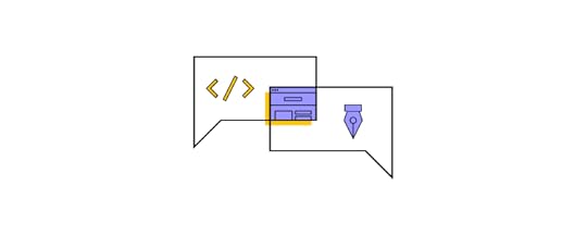
Ok, so we’ve talked about the problems and challenges. Now let’s explore UXPin Merge’s solution, starting with an introduction to UI code components.
Integrating Your Preferred Front-End FrameworkYou can sync Merge using two methods:
Git integration – React onlyStorybook integration – React, Vue, Angular, Web Components, Ember, and others (see Storybook’s website for the complete list)Due to its component-based framework, React is the easiest library to integrate directly with UXPin, while Storybook acts as a fantastic intermediary for other popular technologies.
Single Source of TruthThe immediate benefit of syncing UXPin’s editor to a code repo is that designers and developers work with exactly the same design system, thus creating a single source of truth.
When developers change components in the repository, it automatically updates in UXPin. Additionally, UXPin notifies team members of the changes.
What Functionality do Code Components Have in UXPin?UXPin is a code-based design tool. When you draw a rectangle on the canvas, UXPin renders HTML, CSS, and Javascript in the backend. The same rectangle on an image-based tool renders a PNG or SVG element.
The best example to compare fidelity is a date picker. A seemingly rudimentary UI component for engineers is impossible to recreate in an image-based design tool–without designing hundreds or thousands of frames. With UXPin Merge, you can sync a fully functioning date picker from a repo that users can interact with like they would in the final product.
So, when you sync code components to UXPin’s canvas, you’re essentially working with the exact same component that exists in the repository. Engineers can even create props that designers can manipulate using the properties panel in UXPin, or switch to JSX and edit the props directly.
Code Component Design Workflow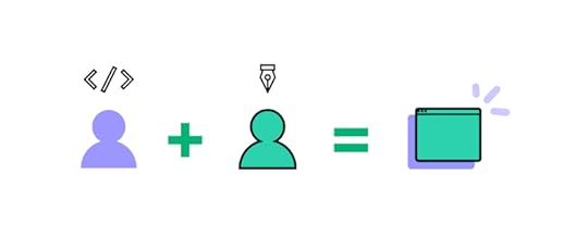
When they hear about Merge, designers often ask, “do I have to learn code?“ The short answer, no. While there are some changes to how you edit a component, designing with UXPin Merge is fundamentally the same as using any image-based design tool, just much easier and faster!
A great example is how PayPal’s product teams (who had little or no experience with using design tools) build all of the company’s internal user interfaces using UXPin Merge. They simply drag-and-drop code components onto UXPin’s canvas to design new products.
The product teams complete around 90% of the work, with UX designers finishing off the most challenging bits. A one-page user interface that takes an experienced designer over an hour to build takes PayPal’s product teams less than 10 minutes–with full fidelity and functionality!
“Product teams were able to create layouts with fixed margins and components, so everything looked and worked the way it was supposed to. Designers didn’t have to police anything or step in to design products.” Erica Rider, Senior Manager for UX – Developer Tools and Platform Experience at PayPal.
Designing With CodeMerge creates a drag-and-drop design environment where designers grab the elements and components from the organization’s design system to build interfaces.
Each component already has its size, colors, typography, content, interactions, animations, and states, so designers only focus on product design rather than the extra details that slow the design process.
Benefits of Designing With Code & Merge
Designing in code means designers and developers deal with the same constraints and speak the same language. Here are some other key benefits of designing with a code-based tool like Merge.
Design consistency: The entire organization works with the same design system-a single source of truth–eliminating design drift and inconsistencies.Maximizes design system usage: Teams have no choice but to use the organization’s design system to build products. Everyone must follow the company’s design system governance to make changes and updates.High degree of fidelity & functionality: Prototypes have the same fidelity and functionality as the final product resulting in accurate usability testing and meaningful feedback from stakeholders.Faster time-to-market: Designers drag-and-drop components to design user interfaces fast. Less testing is required because designers work with thoroughly tested components. Design handoffs run smoother because engineers understand the prototypes and copy/paste JSX changes to build the final product quickly.Image-based design systems require designers to add interactivity for every prototype they build, which is time-consuming and increases the potential for errors and design drift.
UXPin Merge prototypes feature fully interactive UI components, giving designers one less step in the design process and eliminating the margin for error. Additionally, Merge interactions are code-based, limited only by Javascript! Image-based tools have very limited fidelity and functionality in comparison.
UX designers, product teams, and developers work with the same components and constraints, facilitating better collaboration between departments while eliminating friction during design handoffs.
One of the most significant benefits is how Merge can save UX designers time to focus on increasing business value and improving the user experience. At PayPal, product teams do most of the work building the company’s internal products freeing UX designers to work on bigger UX goals.
“My design team spends 50% of their time supporting various product teams, and the other 50% is spent on larger UX initiatives that impact the organization globally.” Erica Rider, Senior Manager for UX – Developer tools and platform experience at PayPal
What does your long-term UX strategy look like ? And what if your UX designers had more time to focus on achieving long-term goals much faster?
Getting Started With UXPin MergeEngineers can read more about integrating Merge with your organization’s design system components in our documentation. The complete integration of a design system can take a little as two hours or up to four days.
Ready to get started with Merge?
Visit our Merge page to read more about the benefits of designing in code and how to request access to start the integration process. UXPin’s onboarding support team will guide you through the process to ensure your repo is set up correctly and syncs to our editor without any issues.
The post Design Workflow with Code Components – What Do You Need to Know? appeared first on Studio by UXPin.
December 28, 2021
Top UX Design Blogs That Will Inspire You
 Table of contents1. Career Foundry2. UX Planet4. UXPin4. The Nielsen Norman Group5. Smashing Magazine6. UX Collective7. The UX Blog
Whether you’re an experienced UX designer or brand new to the industry, there’s always something to learn. And what better way to do that than reading free quality online design resources. Yes!
In this digital age of free information, quality UX design blogs can provide you with a lot of knowledge and help you get the lay of the land about the industry if you are willing to learn. But going through the myriad of blogs can be a time-consuming and frustrating process.
Why Should You Read Industry Trends Related Blogs?A few of the most important reasons to follow UX design blogs are to learn stuff on a daily basis, keep up with industry trends and updates, and along the way, find inspiration for your next project. Why? This will facilitate fresh and innovative project ideas instead of stale, average work.
On the other side, quality blog posts like guides, step-by-step processes, or tutorial videos, often gain popularity and give people that are new to UX an exact roadmap to follow, so they don’t feel overwhelmed.
1. Keep up with Industry Trends and UpdatesUX/UI design is a field that requires innovation because user behavior is ever-evolving. You can keep track of what’s new in the UX world by reading UX blogs. By making time to do that, you can improve your own skills and know what kinds of design trends you should incorporate into your future projects and thus design digital products that will solve existing user problems.
2. Improve and Learn More about User ExperienceIf you want to get started in UX Design, it’s important to get familiar with the design elements and theories. The best place to start is either learning from an experienced mentor, which means taking an introductory UX design course that costs money, or reading blog posts, tons of it!
 3. Find Inspiration for Your Next Project
Just like any other profession, user experience design (UX design) is constantly growing and evolving. You need to keep up with trends, learn new techniques, and find inspiration for your work. If your mental blocks are holding you back from doing great work, reading UX articles can help you clear them away.
On that note, we thought of helping you find the best UX blogs on the internet.
So, let’s deep dive!
List of Top UX Design Blogs Every Designer Should Read1. Career FoundryThinking about making a career out of UX? Career Foundry’s blog is worth a visit. Anything from basic design principles, guides and tutorials to breaking down the advanced aspects of a UX design process, this blog is your one-stop resource. Be it conducting UX and user research, usability, creating user personas, low and high-fidelity wireframes, or even top-notch prototypes on paper or with the help of industry-standard design tools, you will find everything there.
Also, if you’re passionate about human-computer interaction and want to learn how to create amazing user experiences, there’s no better place than this platform to learn it all. The advice you seek comes straight from industry experts and professional designers.
2. UX PlanetUX Planet offers anything you need to start your journey in graphic design and user experience, including career advice articles among standard stuff. In addition to this, they address every level of designers with their informative blog posts. Be it for experts, regulars or even absolute beginners.
 4. UXPin
What about the exact blog you’re reading right now? UXPin’s blog covers everything that involves code-based design, UX process, and shares quite a few tips and tricks about creating high-fidelity prototyping. Aside from the regular articles, UXPin has an extensive library of ebooks that will level up your design skills, one of the recent ones is about DesignOps 101.
4. The Nielsen Norman GroupThe Nielsen Norman Group is a highly respected UX design firm led by Don Norman and Jakob Nielsen, two well-known figures in the industry. The Nielsen Norman Group is the leading authority on user experience, and their articles provide a lot of useful information for newbies as well as food-for-thought for advanced UX designers.
You can find a clear explanation of the topics with no beating around the bush, great details about tools and techniques in UX design, and some advanced topics like accessibility, the role of human psychology in UX design, and more.
5. Smashing MagazineIt’s one of the recognized online publications for UX/UI designers and front-end engineers. It’s committed to sharing practical articles. They share best practices, tutorials, checklist and essays that will help anyone become better at creating digital experiences for the web.
6. UX CollectiveUX Collective is one of the leading publications on Medium where you can read some really good opinion pieces by UX professionals regarding strategy which might challenge your way of thinking. It’s indeed a treasure trove of UX design knowledge that will contribute to your personal growth. The whole idea behind this blog is a simple one: delivering top-notch, relevant blog pieces to their readers.
7. The UX BlogYes, the name may be a bit generic, yet the content is anything but. The UX Blog is a Medium publication, bringing you the latest articles on UX research, user testing, ux strategy, design thinking. They even have their own podcast. You can learn more information about the podcast on their website.
SummarySo, here it is, our list of the 7 most popular UX design blogs. They range from beginners to experts and provide a diverse and invaluable resource for designers and developers alike. On the other hand, if you’re interested in learning how to bridge the gap between developer and design teams and the tool behind it, you can try out UXPin for a free 14-day trial and practice your skills.
The post Top UX Design Blogs That Will Inspire You appeared first on Studio by UXPin.
December 21, 2021
2021 Wrap-Up & New Year’s Announcements at UXPin
 Jump straight to:Code components in design are getting popularAuto Layout is hereUXPin’s Blog HighlightsRead Top 3 ArticlesRecent Highlights on the BlogUpcoming Events for 2022On our watchlistTry UXPin today
What will you remember about 2021? It was definitely an intense year for us at UXPin. We had a couple of exciting product updates, webinars, and articles. Let’s go through a few highlights of 2021 and see what is coming up next in the prototyping world.
Now it’s a good time to test UXPin and see how code-based prototyping streamlines your developer handoff, improves collaboration within product teams, and improves UX test quality. Sign up for a free trial and explore all the features.
Code components in design are getting popularThe debate, “Should designers code?”, seemed to be unresolvable until technology like UXPin Merge appeared. Now, designers don’t need coding skills to leverage a code-based approach to design. They just need Merge.
UXPin Merge allows designers to use code components to design interactive prototypes. You can import coded components from Git and Storybook and use them to create prototypes in UXPin Merge.
What do you get when using Merge?
Design responsive prototypes with – UXPin Merge speeds up your design process for multiple screens at once. You can make your designs responsive almost by default. That’s something that vector-based design can’t promise you. See live prototyping with UXPin Merge – Watch how Anthony Hand from PayPal builds fully interactive prototypes using Merge technology. Learn how to scale the design work. Merge changed one of the PayPal team’s design processes – It decreased time-to-market and made them get higher quality feedback. They overcame the challenges of scale and consistency – all of that because of UXPin’s Merge.UXPin Merge is available upon request. 2022 will bring us even more exciting Merge-related news, so stay tuned. Request access to Merge right now.
Auto Layout is hereOne of the greatest features of 2021 was UXPin’s Auto Layout feature. Now it takes you just a few seconds to adjust the size, placement and distribution of multiple elements at once. No need for adjusting them one by one, Auto Layout does it automatically.
Read more about it: Bringing Auto Layout to UXPin
UXPin’s Blog Highlightshttps://t.co/qJNMJLHePh 🤔 Have you tried out padding option in the Auto Layout feature? Cut down on the time you need to design a new project. pic.twitter.com/yuwaxvsMSm
— UXPin (@uxpin) December 20, 2021
Product news wasn’t the only thing that is worth mentioning here. 2021 was full of interesting content pieces. We’re close to publishing our thousandth article in the studio. That’s a lot, isn’t it? Let’s feature some of them, shall we?
Read Top 3 ArticlesTop 8 Design System Examples – Design systems simplify decision making and give every designer a single point of reference. We chose 8 design systems that you should definitely see when building your own system or updating an existing one.The Best React Design Patterns You Should Know About – Have you heard about stateless components, conditional rendering, and the like? Read the blog post and discover all design patterns that you may come across in your work. Design Handoff – Creating a Better Experience for Designers and Developers – Check how to improve the process of handing off your design to development. There’s definitely room for improvement.Recent Highlights on the BlogROI of DesignOps: All You Need to Know About Quantifying DesignOps’ Impact – DesignOps is one of the hottest topics in the design world. We invited Patrizia Bertini to tell us about measuring the efficiency and effectiveness of DesignOps in an organization. Use it to show the ROI of DesignOps.Top 5 Prototyping Tools – A curated list of tools you should try for your next project. In that article, we also tell you more about the differences between UXPin and the rest of them. Highly recommended.Aside from written content, we had a few inspiring sessions in 2021. For example, the webinar with Johnson & Johnson about Interactive Design Systems. Let’s watch it now.
Upcoming Events for 2022We’re planning a lot of new things for 2022. We set a date for a new webinar in which Carola Cassaro from Work & Co tells us more about defending your design system. She helped IKEA and other companies implement their design system. Sign up today.
What other events would you like to see on your calendar? We have a ready-to-go conference list for 2022. Scroll through it to find a conference for you: Best Design Conferences You Can’t Miss in 2022.
That’s not everything. We don’t want to spoil the fun for you, so instead of listing all of them now, sign up for our newsletter and stay up to date with the things we want to share with you.
On our watchlistThere are two YouTube reviews of UXPin that we would like to feature here. Jesse Showalter reviewed UXPin’s advanced features that you may be interested in.
Ania Kubów, on the other hand, reviewed UXPin Merge and she filmed her video from a developer’s perspective. What was her opinion of the software?
Try UXPin todaySign up for a free trial and see UXPin’s powerful features up close. Build prototypes that feel like a finished product with states, variables, interactions, and expressions. Get quality feedback and speed up your workflow. Try UXPin now.
The post 2021 Wrap-Up & New Year’s Announcements at UXPin appeared first on Studio by UXPin.
December 17, 2021
A/B Testing in UX Design: When and Why It’s Worth It
 Table of contentsWhat is A/B Testing?Why is A/B Testing Important in UX?How to Conduct A/B Testing Just RightA/B Testing ToolsStop Guessing, Start Testing!Try UXPin for Free
A/B testing (split testing) is a quantitative method of finding the best performing version of CTA, copy, image, or any other variable. To start A/B testing, prepare two or more versions of a single element, randomly split your user group in two, and see which version performs better. Great tools for A/B testing are Unbounce, VWO, or Optimizely.
Designing a digital product brings about numerous dilemmas: which font reads best? What call-to-action copy converts more? The multitude of options to choose from can give designers a headache. Sure, following best practices and gut feelings is a good place to start, but it won’t take you far in a business setting, and bad design choices can negatively impact your revenue stream. So, what should you do? Base all your UX decisions on solid data. Where do you get them from? Use A/B testing. Continue reading to learn all about it.
What is A/B Testing?An A/B test – also called split testing – is a simple experiment where users are shown two variants of a design (e.g. background image on a webpage, font size or CTA copy on a homepage, etc.) at random to find out which one performs better. The variant that makes the most users take the desired action (e.g. click the CTA button) is the winner and should be implemented, while the alternative should be discarded.
What can be tested using this method? Well, pretty much everything – from text or phrasing on buttons, through different sizes, colors, or shapes of buttons, to button or CTA placement on the page.
You can also test using different images in the project, compare using photography vs. illustration, test different tones of voice for the copy, as well as different form lengths, labels and placement, and so on.
Why is A/B Testing Important in UX?As mentioned, A/B testing allows you to base your product design decisions on data rather than on an opinion or a guesswork. It both democratizes design and allows your users to participate in your decision-making. A/B testing can help you learn how small changes influence user behavior, decide which approach towards design to implement, and confirms that a new design is going in the right direction. Using A/B testing for different elements of your digital product will also improve the overall user experience over time, as well as increase your conversion.
Importantly, a good UX will make users stay on a website or in the app – or will make them visit it again – while bad UX will do the opposite. So, running A/B tests is a great way of conducting UX research while your product is live, and deciding what works and what doesn’t work for your target users. It’s a much more effective approach as it saves your time and resources spent on the expensive, environmental testing conducted before bringing a product to market.
How to Conduct A/B Testing Just RightYou need to base your A/B test on an educated guess – try to figure out what could be your target users’ pain point, i.e. what could be preventing them from taking a desired action. To conduct an A/B test you need to define a goal (e.g. I want my “Request a demo” page to generate more leads), formulate a solid hypothesis (e.g. I think that changing the CTA copy from “Contact us” to “Book demo” will engage our website visitors more and increase the number of leads), and two versions of a variable (e.g. Book demo and Contact us). The latter are called the altered test (test B, the variable), while the controlled test (test A) is what you compare your altered test against.

Create the two versions of a single variable and make your prototype ready to share for testing. Then monitor it to make sure the test is running correctly. For high-traffic websites, test the smallest change possible; for low-traffic websites you can go bigger and test e.g. two completely different versions of a web design.
Your test should run long enough to provide you with meaningful, statistically significant results. The bigger the sample size and the more information you collect, the more reliable your test results will be. Remember to only analyze the results of a completed A/B test and only implement the clear winner into your digital product. And what should you do with a “no difference” result? Well, be glad about it, as it proves that you can implement the design you prefer with no risk!
Remember: don’t be afraid to formulate different hypotheses and test them. In A/B testing there are no stupid questions! Just make sure you prioritize your tests according to what you know from your customer research.
A/B Testing ToolsThere are a lot of tools dedicated to A/B testing out there. Among the most popular are:
Unbounce – a drag-and-drop landing page builder that allows you create and publish them without the need to use coding. It is an easy-to-use and fast tool for getting more conversions from your traffic.VWO – the world’s leading web testing and conversion optimization platform. It allows you to conduct qualitative and quantitative user research, build an experimentation roadmap and run continuous experiments on your digital products.Optimizely – an experimentation platform that helps build and run A/B tests on websites. The service allows you to create and run a variety of experiments for making design choices that will increase your conversion rates.Stop Guessing, Start Testing!As you can see, A/B testing is not brain surgery and you can get it started all by yourself. It will give you valuable data to base your UX decisions on – also when it proves that your design assumptions were wrong.
A/B testing is a powerful addition to any UX designer’s toolkit. Using A/B testing on a regular, coherent basis with end-users in mind will incrementally make your digital product much more user-friendly. And that will have a very positive impact on your bottom line.
Try UXPin for FreeReady to start designing your digital product in the UXPin prototyping tool? Get started with a 14-day free trial to experience its powerful features!
The post A/B Testing in UX Design: When and Why It’s Worth It appeared first on Studio by UXPin.
December 16, 2021
ROI of DesignOps: All You Need to Know About Quantifying DesignOps’ Impact
 Table of contentsWhy is it Important to Track DesignOps ROI?How to Pick the Right Metric to Measure DesignOps’ ROI?Define the Problem: Efficacy vs. EfficiencyDefine the Area for Improvement in 3 Steps4 Considerations When Quantifying the Impact of DesignOps1) Every design team has inefficiencies2) Inefficiencies change constantly3) Measure inefficiencies and define clear metrics4) DesignOps needs partnershipsSummaryFree Webinar & Further ReadingSign up for Defending Your Design System – January 18, 2022DesignOps 101
Quantifying the impact of DesignOps is crucial for managers to solve problems and get buy-in from stakeholders. But how do you measure DesignOps? And, how do you know which metrics and methodology to apply?
This article summarizes Patrizia Bertini’s webinar, Measuring DesignOps Impact, hosted by UXPin in December 2021. In it, Patrizia shares valuable insights about estimating the impact that DesignOps has on design, business value, and the organization.
“DesignOps is about transforming reality. This is why measuring the status quo, and the impact of every initiative is so critical. It’s critical for everyone, and it’s critical for the success of DesignOps practice.” Patrizia Bertini – Associate Design Operations Director at Babylon.
One of the keys to solving DesignOps inefficiencies is adopting the right tools. UXPin is an end-to-end code-based design tool that streamlines UX workflows, fosters collaboration, enhances prototyping, and bridges the gap between design and development. Sign up for a free trial to explore all of UXPin’s advanced design, prototyping, and testing features.
Why is it Important to Track DesignOps ROI?According to Voucherclub’s 2020 study, a leading UK money-saving brand, the average UK office worker is only productive for 2 hours and 53 minutes per working day.
In a 2019 survey from Korn Ferry in the United States, 67% of respondents said they spend too much time in meetings/calls, with 34% saying they spend between 2-5 hours a day in meetings that don’t accomplish anything!
Now, think about the times you’ve had to pay design teams overtime to meet deadlines. If your designers were more productive, would you save money on overtime and missed deadlines?
Organizations don’t hire designers to complete admin work or sit in meetings – regardless whether those meetings are productive or not. Designers must do what they do best, design!
DesignOps is supposed to relieve these design-related inefficiencies to create more productive designers. The problem is that many inefficiencies are invisible but have tangible effects on design teams’ productivity.
Here are some examples of inefficiency cause and effect.
Causes:
Inconsistent end-to-end workflowsPoor cross-functional collaborationInconsistent tool usageInconsistent templatesLack of processesPoor engagement modelsEffects:
Long working hoursHigh rate of reworkDelaysPoor outcome qualityHigh team churnLow level of engagementThe only way to tell whether DesignOps is effective is by using KPIs and metrics. Stakeholders want to quantify the impact of DesignOps to measure the return on investment – for DesignOps and UX as a whole.
How to Pick the Right Metric to Measure DesignOps’ ROI?
DesignOps managers use inward-facing metrics that measure the design team’s performance and behavior. These operational dimensions allow managers to assess the impact teams create through workflows, design processes, and project execution.
Define the Problem: Efficacy vs. Efficiency
When choosing how to measure DesignOps, it’s essential to recognize the difference between efficacy and efficiency, because you evaluate these differently.
Efficacy is about behavior – doing the right things. It produces qualitative results that are often subjective. Some efficacy example metrics include:
Empathy and ongoing user engagementIdeation and experimentation cycle timesComposition of teams’ skills (skill matrix)Design skills’ distributionPerceived value of design by cross-functional partnersDesigner satisfaction and retentionEfficiency, on the other hand, is measurable and quantifiable using numbers, percentages, and ratios. It’s about the processes and doing things correctly. You can set a baseline or status quo marker and measure DesignOps’ impact against that metric.
Some examples of measuring efficiency include:
Tools’ ROI (cost/engagement/adoption)Testing and prototyping lead time (time)Number and type of quality reviewsTeam productivity (resources utilization)End-to-end delivery time (time)The key takeaway when defining the problem is that you’ll have qualitative and quantitative data for measuring DesignOps. Measuring efficiency is vital because it gives you a clear picture of cause and effect.
Define the Area for Improvement in 3 StepsDefining the area for improvement in DesignOps is similar to following the design thinking process. Patrizia Bertini identifies the user and finding the areas for improvement with two triangles.

First, you need to know and define your main users. How is experiencing the biggest pain point? In the first triangle, you have:
BusinessDesign teamDesign leaderWhen you identify a problem, you must recognize how it affects these three primary stakeholder groups. It’s a balancing act where DesignOps must find ways to satisfy all three!
The second step is defining the dimensions that matter. What aspects can you improve to affect efficiencies and improve performance? In your second triangle, you have:
QualityCostTimeIn the last step, you play impact where there are three possible areas of intervention for each user.
For example, the design team is unhappy because they spend too much time doing rework. The first step is to discover how much this rework time is costing the business. You learn that the rework rate is 28% which means every project costs a third more than it should! The result is extra work and churn.
Patrizia’s three-step methodology is an effective way for a DesignOps manager to identify a design problem and its impact on the business.
4 Considerations When Quantifying the Impact of DesignOpsIn our free webinar, Measuring Design Impact, Patrizia Bertini shares four key takeaways DesOps managers must consider when quantifying the impact of DesignOps.
1) Every design team has inefficienciesAcknowledging that there are invisible inefficiencies is the first step towards efficiency. A DesignOps manager must look for problems to solve, which means talking to designers and stakeholders.
2) Inefficiencies change constantlyWhenever you solve a problem, there is a cause and effect. Inefficiencies and efficiencies often propagate. As you solve a problem in one area, issues tend to pop up somewhere else. And vice versa, efficiencies propagate as you create more efficiencies.
DesignOps managers must Apply Systems Thinking to get a holistic view of design and thus be able to identify the propagation of efficiencies and inefficiencies as they arise.
3) Measure inefficiencies and define clear metricsIf you cannot measure the inefficiencies and the impact, you haven’t framed the problem properly yet.
It takes time. It’s about framing the problem correctly and identifying the metrics that will help you get the buy-in from stakeholders and prove the impact DesignOps has on the rest of the team.
4) DesignOps needs partnershipsDesignOps is cross-functional – you need partnerships to solve problems. Because of design’s cross-functional and collaborative nature, solving the design team’s inefficiencies will create efficiencies across the organization.
Use this domino effect to create partnerships and maximize design’s impact across the business. The goal is to find quantitative data from other departments that you can trace back to DesignOps efficiencies.
SummaryIt’s crucial to measure the impact of the efficiencies DesignOps creates so that managers can present this value to stakeholders.
DesignOps managers must recognize the difference between efficacy and efficiency when identifying the problem because only the latter produces quantifiable data we can present to stakeholders as numbers, percentages, and ratios.
Lastly, DesignOps is about collaboration and finding partners to solve problems. A DesignOps manager must look beyond UX to formulate these partnerships and identify ways design creates efficiencies in other parts of the organization.
Free Webinar & Further ReadingThis article summarizes a few key points from UXPin’s webinar on Measuring DesignOps Impact with Patrizia Bertini, Associate Design Operations Director at Babylon. We encourage you to watch the 1-hour webinar where Patrizia shares her wealth of knowledge and actionable tips for DesignOps managers.
Sign up for Defending Your Design System – January 18, 2022We’re excited to announce our next webinar titled, Defending Your Design System live on January 18, 2022. Our keynote speaker is Carola Cassaro, who helped implement IKEA’s Design System. Carola’s primary topic of discussion is getting stakeholders to understand design system value.

Sign up for Defending Your Design System streaming live on January 18, 2022.
DesignOps 101If you’re looking for more DesignOps knowledge and insights, you can also check out our free eBook, DesignOps 101: Guide to Design Operations. This free guide features six chapters, each written by DesignOps industry leaders. Topics include:
What is DesignOps?The Importance of DesignOpsThe Impact of DesignOpsHow DesignOps WorksHow to Get Started With DesignOps in Your CompanyDesignOps ToolsUXPin is proud to provide this free content to help develop and evolve DesignOps practices. We welcome you to learn more about our revolutionary code-based technology Merge – a tool that solves many DesignOps challenges by bridging the gap between design and development.
The post ROI of DesignOps: All You Need to Know About Quantifying DesignOps’ Impact appeared first on Studio by UXPin.
UXpin's Blog

- UXpin's profile
- 68 followers

