
UXpin's Blog, page 67
January 27, 2022
What Is MUI and What Do You Need to Know About It?
 Table of contentsWhat is MUI?Why Would You Use a Component Library Like MUI?What Makes MUI Stand Apart From Other Component Libraries?MUI – Interesting Facts and FiguresUXPin’s MUI 5 KitSyncing a Component Library With UXPin Merge
One of the questions organizations ask themselves at the start of a new project is, “do we adopt a component library or start from scratch?” There are pros and cons to weigh, and it depends on the project’s scope and priorities.
One of the most popular component libraries is MUI – a comprehensive React UI library modelled at first on Google’s Material Design UI.
We’re going to take a look at MUI, why you’d want to use it, what makes it different from other component libraries, and how you can get started designing your next project.
Have you ever wondered what it would be like to design in code? UXPin Merge is a revolutionary technology that syncs code components to UXPin’s editor from a repository. This powerful tool allows designers to create fully functioning code-based prototypes without writing a single line of code! Find out more about Merge and how to request access for your next project.
You can also try how it is like to design with code components during UXPin’s trial. UXPin has a MUI 5 kit available during trial, so you can experience MUI up close. Sign up for a 14-day free trial and use MUI.
What is MUI?MUI is a massive library of UI components designers and developers can use to build React applications. The open-source project follows Google’s guidelines for creating components, giving you a customizable library of foundational and advanced UI elements.
MUI also sells a collection of React templates and tools, giving you ready-made user interfaces to tweak for your project.
Why Would You Use a Component Library Like MUI?Designers often use UI kits to build new products or feature add-ons for existing projects. These libraries allow designers to drag and drop the components they need to design interfaces quickly.
Let’s explore 7 reasons why you would want to use the MUI component library.
1. Faster Time-to-MarketIn today’s highly competitive tech landscape, time-to-market is a metric that organizations always seek to optimize. A component library gives designers and developers a massive headstart with thoroughly tested UI elements ready to go.
https://t.co/9wnbY7f2jp 📣Look how easy it is to adjust your components' color, content, padding, size. Use MUI 5 kit and join code-based design revolution.#uxpin #uxpinmerge #react #frontenddev #MUI #productdesign pic.twitter.com/8BNkJLjMgx
— UXPin (@uxpin) January 22, 2022
Designers can drag and drop elements to build user interfaces and customize components to meet product and branding requirements. Design teams can spend more time designing great customer experiences rather than getting bogged down building and testing UI components from scratch–a process that increases time-to-market significantly!
Usability testing is much faster because designers can prototype, test, and iterate quickly. If a user interface isn’t working during testing, they can make changes on the fly, drawing from a massive library, to get instant feedback from participants and stakeholders.
When it comes to the design handoff, engineers can install the component library and copy/paste changes from prototypes and style guides to develop the product without starting from scratch.
2. A Single Source of TruthOne of the biggest design system governance challenges is maintaining a single source of truth. It’s not uncommon for product teams, UX designers, and developers to have out-of-sync design systems–resulting in errors, rework, and massive headaches and challenges for DesignOps.
Using MUI’s component library can significantly reduce these challenges while creating a single source of truth between design and development. Designers and engineers will still have separate design systems (image-based for designers and code for engineers), but MUI gives them the same starting blocks.
When using Merge with UXPin’s code-based editor, designers and engineers use the same design system components synced via a single repository. Any updates to the repo sync back to UXPin, notifying designers of the changes. You can connect Merge using Git for React component libraries or Storybook for other popular technologies.
3. Design ConsistencyConsistency is vital for user experience, building trust, and brand loyalty. Using the same UI components allows designers to increase consistency while minimizing errors and rework.
4. Scalabilityhttps://t.co/dFxCtSn8PW ⚡Reach higher fidelity than ever with code-powered design. Create prototypes with MUI 5 kit i n UXPin. Sign up for a trial. ⚡ pic.twitter.com/bar2uvzlqR
— UXPin (@uxpin) January 24, 2022
Scalability is another vital product design factor. If you’re building a design system from scratch, designers must design, prototype, and test new components before scaling the product.
With MUI’s comprehensive UI library, designers can search for the components they need to prototype and scale right away. Engineers can copy/paste the identical React components from MUI and customize them to the designer’s specifications.
MUI X includes a library of advanced React components teams can use to scale complex products even faster, including data grids, date pickers, charts, pagination, filtering, and more.
5. Easy MaintenanceA component library like MUI comes with detailed documentation for installing, using, updating, and customizing components. Designers and engineers can use this framework to maintain the organization’s design system, making it easier to establish governance systems and protocols.
MUI also provides how-to guides for migrating from one version to the next. So, organizations can take advantage of the latest UI styles, technologies, and trends whenever MUI releases an update.
6. Accessibilityhttps://t.co/OoMuzMpoMf 🚀MUI is a powerful library with extensive documentation. Check out how easily you can access the documentation in UXPin Merge. 🎉 Request Merge access and use MUI.
— UXPin (@uxpin) January 27, 2022
Many thanks to @MUI_hq 🙌#uxpinmerge #mui #reactlibrary #FrontEndDevelopment pic.twitter.com/CtAq2Y9bmJ
Those experienced with setting up a design system will know the time and money it takes to ensure every component passes accessibility standards. MUI’s designers have taken great care in designing components to meet WCAD 2.0 accessibility guidelines – reducing the work for researchers and designers.
It’s important to note that even when you design interfaces using accessible components, you must still test navigation and user flows to ensure the product as a whole meets accessibility standards.
7. Skills EmpowermentMUI’s open-source component UI library empowers startups and young entrepreneurs to build new products–especially in developing nations where they don’t have the same access to education, mentoring, and skills transfer.
The library is also incredibly beneficial for charities, non-profits, NGOs, and similar organizations who want to develop products and tools but don’t have the budget to invest in a design system.
Anyone can leverage the skills of MUI’s talented designers and developers using the same component library used by Fortune 500 companies to develop sophisticated digital products and compete in a global market.
What Makes MUI Stand Apart From Other Component Libraries?Google’s Material Design UI is arguably one of the best and most comprehensive design libraries in the world. By building on top of Material Design, MUI delivers a React component library to match.
The ability to easily customize MUI using its Theming feature and the libraries’ excellent documentation make it accessible to build products for multinational corporations or a single developer with a product idea.
Because MUI is so widely used, there is a massive global community of designers, researchers, and developers to reach out to for guidance and support. Added to the fact that React is one of the most popular front-end frameworks, makes MUI an attractive component library.
MUI – Interesting Facts and FiguresHere are some interesting MUI facts and figures:
Note: MUI’s stats continue to climb. These facts were accurate as of Jan 2022.
MUI started in 2014 as Material UI but decided to change its name to differentiate itself from Google. Many people assumed Material UI was a Google product.MUI has over 2,200 open-source contributors.There are over 2,3 million NPM downloads of MUI per week.Over 73,700 stars on GitHub.Of the 1,488 respondents to MUI’s 2020 survey, 35% of developers worked in an organization with less than five people.In the survey, 27% of developers use MUI for enterprise applications, while 20% use the library for admin dashboards.UXPin’s MUI 5 KitUsing UXPin Merge’s MUI integration, you can leverage the power of prototyping with UI React components.
MUI helps you create designs with fully functioning code components. With a single source of truth, designers, developers, product teams, and others can collaborate more effectively with fewer errors and friction.
Higher fidelity means better usability testing with meaningful feedback from participants and stakeholders. The result? A better overall user experience and increased business value.
Find out more about UXPin’s MUI kit and how you can sign up to request access to this revolutionary code-based design technology: MUI library in UXPin: Design Faster.
Syncing a Component Library With UXPin MergeWith UXPin Merge, you can can sync code components from Git repo, Storybook or MUI and build fully functioning high-fidelity prototypes with real code.
Complex UI components like menus, forms, tabs, data tables, date pickers, accordions, and more have the functionality in UXPin’s code-based editor. Designers drag and drop the MUI components they need to build user interfaces. They can adjust the component’s properties panel as they would with a standard image-based design tool.
The beauty of UXPin Merge is that designers don’t have to learn a new skill set or know how to code to design with code-based components. The workflow doesn’t change, but the prototype fidelity and functionality increase significantly!
Even when designers use UXPin without Merge, they have access to advanced code-based features like States, Javascript-like Interactions (including Conditional Interactions), Variables, Expressions, Auto-Layout, and more!
The post What Is MUI and What Do You Need to Know About It? appeared first on Studio by UXPin.


January 26, 2022
Quick Guide to Inclusive Web Design
 Key Takeaways:Inclusive design aims at taking perspectives of diverse user groups when designing a digital product.It considers temporary and situational factors that may play into user’s experience of a product.There are 8 principles of inclusive web design that designers may use when creating inclusive experiences.One of an exercise for designing inclusive web products is Microsoft’s inclusive design thinking.
A common misconception is that inclusive web design is an interchangeable term for accessible design. While there is a link, it’s important to recognize that accessibility is one component of inclusive design where we look at a feature or product from the perspective of multiple demographics.
Unfortunately, the word inclusivity is highly politicized, confusing designers about how to apply an inclusive midset. This article looks at inclusive web design, what it is, what it isn’t, and how design teams can build more inclusive user experiences.
Test product experiences on diverse user groups using code-based high-fidelity prototypes and get meaningful feedback with UXPin. Sign up for a free trial today!
What is Inclusive Design?Inclusive design is a UX methodology where designers consider the environment and circumstances of diverse user groups and demographics to ensure products are accessible to everyone rather than a narrow set of users.
Following an inclusive design process encourages UX designers to think of permanent, temporary, and situational factors which prevent someone from using a digital product as intended.
Designers must avoid bias or assumptions when considering inclusive design like gender, age, race, and other generalized demographics. To view such broad demographics as limitations is biased (and potentially offensive) and could do more harm than good.
Inclusive Design vs. Accessible DesignThink of inclusive design as an umbrella term that encapsulates accessibility. Where accessibility focuses specifically on users with disabilities, inclusivity extends to other factors where users might feel excluded, such as language barriers, physical limitations, technical constraints, and even internet connectivity.
Accessibility addresses permanent limitations or disabilities, while an inclusive design approach looks at temporary and situational factors.
Permanent, Temporary, Situational Considerations of Inclusive Design
There are three categories UX designers use when considering inclusive web design:
PermanentTemporarySituationalWithin each of these categories are several disabilities, limitations, or constraints:
VisualDexterityHearingCognitiveSpeechDesign teams often make the mistake of only thinking about permanent disabilities when designing for accessibility/inclusivity, like someone with a permanent hearing impairment.
But what about those with temporary or situational hearing impairments?
Permanent: Someone who is permanently deaf or hearing impaired.Temporary: Someone who has temporarily lost hearing ability due to injury.Situational: Someone who cannot hear because of the environment, like a busy commuter train with no headphones.Often when you design for a permanent disability, temporary and situational users benefit too. But designers must look at each situation independently to ensure the experience is fully inclusive.
In this hearing impairment example, video subtitles would benefit all three categories. Still, designers might consider starting the video muted, so the busy commuter train user (situational) doesn’t disturb people around them.
The Importance of Inclusive Web DesignInclusive web design is not only a good idea from a social perspective; it’s also critical for business value. Products that exclude certain human beings create missed revenue opportunities for companies.
Let’s say you’re designing an app for the US market and assume that everyone speaks English when in fact, 41 million native Spanish speakers live in the United States; it’s more than 10% of the population.
In another example, you assume that only people with a physical disability can’t use their hands. But what about someone who has injured their arm? Or the parent who’s holding a child and only has one hand available?
When you extrapolate disability, limitation, and constraint possibilities, you see the importance of an inclusive design approach and how it affects the business and its customers.
8 Principles of Inclusive Design
inclusivedesignprinciples.org lays out eight principles UX designers can use to create inclusive experiences for their users.
Provide comparable experienceConsider situational challengesConsistencyGive users controlOffer choicePrioritize contentAdd valueGet diverse perspectivesMany designers might already apply these principles to designs, but understanding how they enhance inclusivity might encourage you to look deeper and find even more room for improvement.
1) Provide Comparable ExperienceA user interface should enable all users to accomplish tasks with comparable value, quality, and efficiency. A great example is how we use alt text for icons, images, and other graphics so visually impaired users can digest visual content.
UX designers must also consider how technology might exclude users. Can someone complete the same tasks on desktop and mobile devices? Are there any differences between Android and iOS?
2) Consider Situational ChallengesHow does someone’s environment impact their user experience? When designers empathize with users and test using digital products in various conditions, they can design solutions to meet situational challenges.
For example, designing a train ticketing app so that users with only one hand can buy a ticket also helps the busy able-bodied commuter purchase a ticket with only one free hand while walking to catch a train.
3) ConsistencyDesign consistency is vital for any digital product experience, but it’s even more critical when considering inclusivity. Users with cognitive issues often struggle to navigate user interfaces, so inconsistent designs or naming conventions could further confuse and frustrate people.
Building a design system is one way organizations can maintain consistency and create the foundation for accessibility. With an accessible design system, UX teams can spend more time solving core usability issues rather than using style guides to build UI components from scratch for every project.
With UXPin, you don’t need plugins, addons, or extensions to build, host, and share a design system. Sync your organization’s design system to all users, set permissions, and even add documentation for each element and UI component. Sign up for a free trial and build your first design system with UXPin today.
4) Give Users ControlA good design gives people the features to control their user experience. You also want to avoid overriding browser and device settings, such as orientation, font size, zoom, and contrast.
Users with disabilities often require specific settings to use a digital product. Overriding these will impede their usage and exclude them from the user experience.
Designers should also consider how they apply UX patterns and animation. Infinite scroll is a challenge for users who only use a keyboard or screen readers. Adding a “load more” button gives users control while providing the same level of convenience.
5) Offer Choice
UX designers must balance convenience with choice. For example, swiping is quick and convenient but not always possible for everyone. Providing a button or link to achieve the same task makes the feature accessible to all users.
6) Prioritize ContentPrioritizing content and layouts can help users complete core tasks and find information effortlessly. Designers can also use UI components like accordions to hide content that users don’t need right away.
For example, using an accordion for an FAQ section helps screen readers quickly find the answer they need rather than going through every Q&A. Other users also benefit from this FAQ format because they can scan each question to find the one they want.
7) Add ValueUX designers must leverage device features to increase value for users. A device’s microphone, camera, vibration, and geolocation are helpful tools that benefit a wide range of people.
For example, optimizing your product for voice search and commands not only benefits screen readers but people using Alexa, Siri, or Bixby.
There are many circumstances where UX designers can employ a device’s features to improve a digital product’s user experience and create more value for everyone.
8) Get Diverse Perspectives
UX designers must seek diverse perspectives from stakeholders and usability participants. Research and testing must include participants who might fall outside your user personas.
Maybe people with disabilities or limitations aren’t using your product because it excludes them. So, if you only conduct tests based on customer data and analytics, you might be unknowingly excluding people.
Applying Inclusive Design ThinkingMicrosoft’s inclusive design toolkit outlines a design thinking methodology for UX designers:
Get oriented: Start by educating yourself about user disabilities and limitations and how different people interact with technology.Frame: Look at your designs through the lens of human limitations.Ideate: Identify the mismatches between your designs and the limitations from step two. Recognize that there is no one-size-fits-all for product design.Iterate: Build and test concepts with prototypes.Optimize: Look at how inclusive design solutions impact the product experience, is it feasible, and how will it translate in real-world use?Inclusive Web Design With UXPinPrototyping and inclusivity testing during the design process is challenging. How do you test cognitive load or accessibility issues with image-based prototypes? How do you know whether the UI or prototype’s lack of fidelity and functionality is the cause of someone’s cognitive overload?
Designers must eliminate accessibility and inclusivity issues during prototyping and testing, or these end up in the final product, causing adverse effects for users. The problem is that image-based prototypes lack the fidelity and functionality for accurate testing. UX designers also struggle to get meaningful feedback from stakeholders.
UXPin is a code-based design and prototyping tool, giving UX designers the ability to create high-fidelity prototypes with final product functionality. Designers also get UXPin’s built-in accessibility tools to test color and contrast against Web Content Accessibility Guidelines.
UXPin’s high-fidelity, fully functioning prototypes allow UX designers to perform accurate tests during usability studies for meaningful results from diverse user groups, including those with impairments and disabilities.
Design teams can also impress stakeholders with immersive prototype experiences that prove design concepts and get buy-in from decision-makers.
Four code-based prototyping features you won’t find in popular image-based design tools:
States : Apply multiple states to a single element or component, each with different properties, interactions, and animations. Interactions : Create complex interactions with advanced animations and conditional formatting. Variables : Capture and store user inputs and use that information to take actions or personalize a user experience. Expressions : Create fully functioning forms, validate passwords, update shopping carts, and more with Javascript-like functions.Sign up for a free trial and start designing more inclusive user experiences with UXPin’s advanced end-to-end design tool.
The post Quick Guide to Inclusive Web Design appeared first on Studio by UXPin.
January 25, 2022
Top React Component Libraries
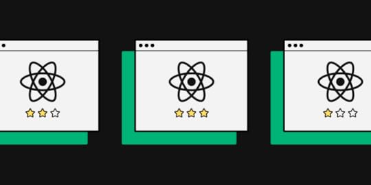 Table of contents6 Things to Consider When Choosing a React Component Library1) Popularity2) Issues3) Documentation & Support4) Customization5) Browser/Device Compatibility6) Accessibility5 Top React Libraries1) MUIMUI – ComponentsMUI – Theming & CustomizationMUI – Documentation2) React-BootstrapReact-Bootstrap – ComponentsReact-Bootstrap – Theming & CustomizationReact-Bootstrap – Documentation3) Semantic UI ReactSemantic UI React – ComponentsSemantic UI React – Theming & CustomizationSemantic UI React – Documentation4) Ant Design (AntD)Ant Design – ComponentsAnt Design – Theming & CustomizationAnt Design – Documentation5) Chakra UIChakra UI – ComponentsChakra UI – Theming & CustomizationChakra UI – DocumentationDesign Using React Components With UXPin Merge
Modern websites and apps rely on front-end frameworks to develop, maintain, and scale user interfaces. React’s Javascript library is arguably the most popular front-end framework with many component libraries to build digital products.
We’re going to explore the top React libraries and how to choose the right one for your next project.
With UXPin Merge, you can sync a React component library from a Git repository to the design editor so designers can build fully functioning prototypes using code components. Find out how this UXPin Merge is changing UX design and request access to this revolutionary technology.
6 Things to Consider When Choosing a React Component LibraryBelow are six things to consider when choosing a React library for your next project. This is by no means an exhaustive list, and some of these factors may not apply to the product you’re building.
1) PopularityGitHub’s star rating allows you to quickly compare each React library’s popularity. The weekly downloads on NPM also show how many people use the component library. Generally speaking, a React library’s popularity means it’s well established and serves its purpose.
2) IssuesLike star rating, a library’s GitHub issues can tell you a lot about its popularity and how well it’s maintained. Even if the library has minimal issues, do any of these affect the product you’re trying to build?
3) Documentation & SupportDocumentation is an important consideration when choosing a React library. You want to avoid running to Stack Overflow every time you run into trouble or want to know how to use specific components. Good documentation is updated regularly and gives you a comprehensive understanding of the library.
You also want to know if the React library has support directly from the creators or via a dedicated community forum. There are times when you need expert advice to overcome challenges. The ability to reach out for help (even if that means paying) is crucial to get issues sorted quickly and keep the project moving.
4) CustomizationOne of the downsides to using a component library is its constraints and lack of customization. For some projects, customization isn’t a factor, but if you’re looking to develop a unique UI, the ability to build your own design system is vital.
Explore the library’s documentation to see if they offer instructions for customizing the components and how easily you can achieve your desired results.
 5) Browser/Device Compatibility
Depending on the app you’re designing, you’ll want to know the component library’s browser and mobile compatibility. The quickest way to research browser/device compatibility is by searching GitHub’s issues or Stack Overflow.
6) AccessibilityAccessibility is a time-consuming but necessary consideration for digital product design. If a React library hasn’t considered accessibility when designing components, then it’s something you’re going to have to do yourself, which takes us back to points 3 and 4–documentation and customization.
5 Top React LibrariesThese are our five best React libraries for 2022.
Note: Information regarding GitHub stars and NPM downloads are accurate as of Jan 2022.
1) MUI GitHub Stars: 73.8kWeekly NPM Downloads: 2.3MOfficial website: mui.com
MUI is one of the most comprehensive and widely used React component libraries. The library is built on Google’s Material Design UI, one of the most extensive UI kits in the world.
MUI – ComponentsMUI has a massive component library for designers to build everything from mobile and web applications, websites, and even wearable apps.
MUI Core features fundamental UI components you see in everyday digital products, while MUI X offers a list of advanced React components for building complex user interfaces, like data tables, data pickers, charts, and more.
For those of you who would like to try design with MUI code components, sign up for a UXPin trial and get 14-day access to UXPin. Read more about MUI 5 Kit in UXPin.
MUI – Theming & Customizationhttps://t.co/dFxCtSn8PW ⚡Reach higher fidelity than ever with code-powered design. Create prototypes with MUI 5 kit i n UXPin. Sign up for a trial. ⚡ pic.twitter.com/bar2uvzlqR
— UXPin (@uxpin) January 24, 2022
One of MUI’s biggest appeals is the ability to theme and customize components. Designers can use MUI as a foundation to scale designs fast but also adapt the library to build a custom design system for their product or organization.
Designers can also take advantage of Material Design and MUI’s comprehensive guidelines to avoid usability issues when customizing components.
MUI also has a template marketplace to purchase React theme templates for dashboards, eCommerce websites, landing pages, and more.
MUI – Documentationhttps://t.co/9wnbY7f2jp 📣Look how easy it is to adjust your components' color, content, padding, size. Use MUI 5 kit and join code-based design revolution.#uxpin #uxpinmerge #react #frontenddev #MUI #productdesign pic.twitter.com/8BNkJLjMgx
— UXPin (@uxpin) January 22, 2022
MUI’s documentation is as detailed and comprehensive as its component library. Its curators have taken great care to provide designers and developers with step-by-step instructions and guidelines for installation, usage, customization, accessibility, and more.
There are also tons of videos on YouTube from MUI’s large community of users and contributors offering best practices, tutorials, tips and tricks, how-to guides, and more.
2) React-Bootstrap GitHub Stars: 20.3kWeekly NPM Downloads: 879,780Official website: react-bootstrap.github.io
Founded in 2011, Bootstrap is one of the oldest and most popular open-source CSS frameworks for websites and web applications. Bootstrap was one of the first CSS frameworks to prioritize mobile-first web development, allowing designers to build and scale responsive websites quickly.
React-Bootstrap replaced Bootstrap Javascript while ditching resource-heavy dependencies like JQuery to build a comprehensive but simplistic React component library.
React-Bootstrap – ComponentsIf you’re familiar with Bootstrap, then you’ll instantly recognize React-Bootstrap’s generic-looking component library. Like its CSS predecessor, React-Bootstrap features UI components that favor web design rather than mobile applications.
React-Bootstrap – Theming & CustomizationReact-Bootstrap is very generic with minimal styling, making it easy for designers to tweak and customize. Bootstrap’s defined classes and variants make it easy to select and customize components using CSS.
Due to Bootstrap’s long history and wide usage, you can find tons of free and premium React-Bootstrap themes and templates for everything from admin dashboards to multiple purpose websites, eCommerce, landing pages, and more.
React-Bootstrap – DocumentationReact-Bootstrap has excellent documentation, albeit not as detailed and comprehensive as MUI. React-Bootstrap’s simplicity and naming convention make it one of the easiest React libraries to understand, use, and customize.
Bootstrap is also featured extensively on Stack Overflow, so you’ll likely find answers to most issues. There are also loads of blogs and YouTube videos offering advice, tutorials, design projects, and more.
3) Semantic UI React GitHub Stars: 12.6kWeekly NPM Downloads: 218,320Official website: react.semantic-ui.com
Semantic UI React is a popular alternative to React-Bootstrap. Like React-Bootstrap, Semantic UI started as an open-source CSS framework that its contributors used to build React components.
Semantic UI React – ComponentsSemantic UI React offers an extensive range of UI components for websites and web applications. The components provide cleaner, more modern styling than Bootstrap while remaining minimalist and simplistic.
Semantic UI React uses the FontAwesome icon set, including over 1,600 free icons and 7,864 Pro (paid).
Semantic UI React – Theming & CustomizationSemantic UI uses an intuitive, straightforward naming convention that makes it easy to customize components. The documentation also provides a step-by-step guide for theming with Semantic UI React. Unlike MUI and React-Bootstrap, Semantic has very few template options.
Semantic UI React – DocumentationSemantic UI React’s interactive documentation provides you with CodeSandbox examples to inspect the code and play around with components.
The docs also allow you to switch between an example, code, and props to visualize the component from multiple angles.
4) Ant Design (AntD) GitHub Stars: 76.6kWeekly NPM Downloads: 681,434Official website: ant.design/docs/react/introduce
Ant Design (AntD) is another popular, widely used React component library developed by Ant Group–parent company to Alibaba, China’s biggest online marketplace. Like MUI, AntD offers a vast component library for both web and mobile applications.
AntD is the only React library featured in this article that uses TypeScript – a form of Javascript.
Ant Design – ComponentsAntD has a massive component library for desktop and mobile, including UI patterns like infinite scroll and pull-to-refresh for mobile devices. Ant Design ProComponents offers a range of advanced React UI elements ( similar to MUI X) for building complex interfaces.
You can also find a vast library of pre-made templates and scaffolds to kick start your project and build UIs much faster.
Ant Design – Theming & CustomizationAntD uses design tokens or variables for devs to customize and theme components. The UI library uses Less and provides a complete list of all AntD variables in GitHub.
Ant Design – DocumentationAntD’s comprehensive documentation provides step-by-step instructions for using and customizing. You can also inspect each component in CodeSandBox, CodePen, or StackBlitz.
5) Chakra UI GitHub Stars: 22.8kWeekly NPM Downloads: 182,166Official website: chakra-ui.com
Chakra UI is a Nigerian-based React component library founded by Segun Adebayo. You can choose between Chakra’s free component library or Chakra UI Pro, which offers pre-made complex UI components to build interfaces faster.
Chakra UI – ComponentsChakra UI’s component library caters to web-based applications and websites. The library offers the choice between TypeScript or Javascript React components, depending on your preference. Chakra’s designers follow WAI-ARIA standards, so every element is accessible.
The stylish UI components look similar to Semantic UI, with dark and light options available.
Chakra UI – Theming & CustomizationChakra’s designers created the UI library to be fully customized using variables to meet product and brand requirements. Charka also integrates with Create React App, Framer Motion, React Hook Form, and React Table to extend the library’s usage and customization.
Chakra UI – DocumentationChakra UI has excellent documentation with guides, video tutorials, examples, FAQs, links to connect with core team members, and an active Discord community.
Chakra’s users are extremely passionate and enthusiastic about the React library, and there’s always someone to connect with to ask questions.
Design Using React Components With UXPin MergeOne of the challenges of using a React library is that although designers and developers use the same components, they have separate design systems.
Designers use a vector-based design system while developers use code-based React components. Some libraries don’t offer a UI kit for design tools, so designers either have to recreate the library or find a third-party creator.
With UXPin, you can fork the React library from GitHub and sync the repo to the design editor using Merge. Designers use code components from the repo to build fully functioning prototypes. When devs update the repo, the changes automatically sync back to UXPin, thus creating a single source of truth–no more separate design systems!
Find out more about UXPin Merge and how to request access. You can also use Merge with our Storybook integration for more front-end frameworks like Vue, Web Components, Ember, and more.
Discover MergeThe post Top React Component Libraries appeared first on Studio by UXPin.
January 24, 2022
Sustainable Web Design: Can You Lower Design’s Environmental Impact?
 Table of contentsWhat is Sustainable Web Design?What Are the Benefits of a Sustainable Website?How Do You Create a Sustainable Website?1) Optimizing Visual Content & Lazy Loading2) CSS Sprites3) Reducing Emails4) Optimizing Design Workflows5) Mobile-First Design6) Minify HTML and CSS Resources7) Choosing a Content Management System (CMS)8) Hosting9) Choose Fonts Wisely10) Hierarchy, Navigation & Links11) Use Fewer Web Pages12) Buy Refurbished EquipmentDesign Better User Experiences With UXPin
Sustainable web design is a growing movement as organizations look for every opportunity to reduce emissions and minimize their carbon footprint. If you follow responsive web design and mobile-first practices, you’re already on the way to reducing your environmental impact with greener digital products.
According to a March 2020 BBC article, Why your internet habits are not as clean as you think, the internet accounts for “3.7% of global greenhouse emissions.”–which includes devices, websites, apps, data centers, and all the supporting infrastructure.
This article looks at how designers, engineers, and businesses can do more to reduce emissions by making eco-friendly digital products and websites for their customers.
Create a greener UX workflow by reducing time-to-market with UXPin. PayPal used UXPin Merge to scale design and create massive efficiencies without adding more staff or resources. Find out more about this revolutionary code-based UX design technology and how to request access to UXPin Merge.
What is Sustainable Web Design?Sustainable web design is the process of optimizing digital products and websites to reduce bandwidth and power consumption. Organizations must access several key emission-reducing strategies, including:
DesignWeb DevelopmentContent & MarketingHostingProject ManagementBusiness OperationsAs you can see, sustainable web design extends beyond the design and development for a holistic impact assessment to reduce greenhouse gas emissions.
What Are the Benefits of a Sustainable Website?Designing a sustainable website or digital product isn’t just beneficial for climate change; it also creates business value and reduces costs. One of the most significant savings is hosting.
Most hosting plans bill you for the amount of server space plus the number of monthly users or bandwidth. Reducing the size of your website saves server space while lowering bandwidth and requests. Companies that self-host require smaller data centers and save on energy bills.
Website performance also correlates to conversion increases, and page speed is one of Google’s rank factors.
So, businesses that optimize website and application performance benefit from cost savings and higher revenue, leading to a more sustainable business model.
How Do You Create a Sustainable Website?Here are 12 sustainable web design tips that improve performance, save money, increase the user experience and reduce your website’s environmental impact.
1) Optimizing Visual Content & Lazy LoadingAccording to HTTP Archive, “Images are the most popular resource type on the web” and makeup 50% of the average web page size. WebP instead of JPEG or PNG can reduce file size by 25-35% while increasing page speed performance. Switching icons and logos to SVG format can also significantly reduce page weight.
Designers should use WebM instead of MP4 and GIF for video content. WebM is smaller and optimized for the web.

Lazing loading is another way designers can optimize image and video content. Instead of loading all of these resources simultaneously, the browser only loads what’s above the fold and then fetches additional images and thumbnails as the user scrolls.
2) CSS SpritesCSS sprites is an old video game trick for loading multiple images with only one HTTP request. Instead of uploading each file individually, you stack the images vertically and combine them with a gutter between each one.
Developers use CSS to set the position and dimensions, hiding the rest of the stack, making it look like a single page image. CSS Tricks has an informative article about how to use CSS sprites, including package managers for automating the process.
3) Reducing EmailsAccording to a BBC article, “If every adult in the UK sent one less ‘thank you’ email, it could save 16,433 tonnes of carbon a year – the equivalent to taking 3,334 diesel cars off the road.”
Organizations should audit correspondence and eliminate wasteful emails. For example, how many emails does a customer receive when they complete a sale? Can you combine these into one?
According to marketing guru Neil Patel, marketers should purge email lists regularly. If you’re sending emails to inactive accounts or customers that don’t open or engage with your content, then you’re wasting money and adding unnecessary carbon emissions.
Also, consider whether it’s necessary to include images in your emails. A regular text email is 4g CO2, whereas an email with a photo is 50g CO2.
4) Optimizing Design WorkflowsOptimizing design workflows can reduce rework, errors, and usability issues. These problems often put a strain on resources affecting departments beyond UX.
DesignOps can help organizations optimize UX workflows and create design efficiencies. Building a design system can also help reduce errors and time-to-market while improving the user experience with cleaner user interfaces that load faster.
5) Mobile-First DesignMobile-friendly websites must be lighter to load faster on smartphones. So, adopting a mobile-first design strategy means designers create value for their users while saving the environment.
UXPin provides designers with predefined canvas sizes for web, iOS, and Android devices. Adaptive Versions allows designers to create multiple layouts for each viewport, like mobile, tablet, and desktop. Sign up for a free trial to experience mobile-first design with UXPin.
6) Minify HTML and CSS ResourcesMinifying code removes unnecessary whitespace, reduces file sizes, and increases page speed. Developers can also combine resource files, so browsers have fewer requests.
There are loads of free tools for minifying HTML and CSS, including plugins for code editors and package managers. Minifying Javascript is a little more complicated, so leave this for a qualified developer to handle.
7) Choosing a Content Management System (CMS)Choosing the right CMS can also significantly impact the size of your website and page speed. WordPress is often the most popular choice, but it’s bulky, outdated, and unnecessary for most websites.
Here are some lightweight alternatives for popular website use cases:
Ghost: A lightweight headless CMS designed for content creators, excellent for blogs, publications, and subscription websites.Gatsby: Great for most websites, including eCommerce, single-page layouts, landing pages, web applications, portfolios, company websites, and much more.Strapi: An open-source modern headless CMS alternative to WordPress. Build everything from one-page designs to eCommerce and complex mobile and web applications.8) HostingAccording to the US Energy Efficiency & Renewable Energy Office, data centers account for 2% of US electricity usage. So, switching to a green web host provider can help reduce energy consumption.
The Green Web Foundation has a hosting directory of 342 green hosting providers in 26 countries (figures correct as of December 2021). Green hosters use renewable energy like wind, solar, and hydro. In some circumstances, hosting providers generate more green power than they need, which they feed back into the grid.
You’ll be pleased to know that many big names, including AWS, A2 Hosting, Firebase Hosting, and Siteground, are listed as US-based green hosting providers.
9) Choose Fonts WiselyFonts are known to slow page speed, particularly custom, self-hosted fonts. Consider designing your website with one of 18 web-safe fonts compatible with all browsers–meaning the browser doesn’t need to download additional files.
If you are using a custom font, make sure it’s in WOFF or WOFF2 format so browsers can read and download it. You’ll also need to include a web-safe font in your font stack, or the browser will load New Times Roman if it can’t process the WOFF file.
Developers can also use other tricks for custom fonts like pre-loading and CSS optimization.
10) Hierarchy, Navigation & LinksHierarchy and navigation play a crucial role in helping users find content and complete tasks quickly. Designers should prioritize essential navigation in the header (4-5 max) and secondary links in the footer.
Hierarchy helps users identify important content and complete tasks quicker. Visual hierarchy is also a crucial factor for user experience and website accessibility.
Teams should conduct regular website audits for broken internal and external links to ensure users never waste server requests with dead-end 404 errors. Use 301 redirects for internal links and find new resources for broken external links.
11) Use Fewer Web PagesEvery new page visit requires the browser to send a request to the server, which returns the page’s content and resources. The more page visits you have, the more work (and energy consumption) the server must do to serve content.
Designers should assess each project to determine how to reduce or consolidate pages. A single-page design is often enough for most portfolios, landing pages, corporate websites, local businesses, SaaS, and apps, to name a few.
Single-page designs are good for the environment and provide a better user experience for visitors on mobile devices who only have to scroll to find what they need.
12) Buy Refurbished EquipmentBusinesses and designers should also consider buying refurbished equipment whenever possible. In an interview with Forbes, co-founder of UK-based Wholegrain Digital web design agency and author of Sustainable Web Design, Tom Greenwood points out that the lifetime carbon footprint of a 13″ MacBook Pro laptop is 185kg CO2, 80% of which is initial manufacture and transport.
So, buying refurbished equipment can significantly reduce your company’s carbon footprint.
Design agencies Wholegrain Digital and Mightybytes partnered on sustainablewebdesign.org, which provides companies with strategies organizations can implement to deliver more sustainable web design projects. The website also has a carbon calculator which shows you how to calculate your digital emissions.
Design Better User Experiences With UXPinBuilding a sustainable website starts during the design process. UXPin’s code-based design tool lets designers create fully functioning prototypes to eliminate costly usability issues before the design handoff.
Sign up for a free trial to see how the world’s most advanced code-based design tool can optimize design workflows and enhance your website’s performance for a greener end-to-end design process.
The post Sustainable Web Design: Can You Lower Design’s Environmental Impact? appeared first on Studio by UXPin.
January 19, 2022
New MUI library in UXPin: Design Faster

MUI is one of the top React component libraries that help front-end developers and designers create consistent user interfaces for their products. It contains a collection of ready-made building blocks that significantly speeds up prototyping. If you want to take the MUI for a test ride, you can try MUI Core 5 with UXPin Merge. Here’s how to do it.
Table of contentsUXPin Merge’s RevolutionTry Open-Source Libraries with UXPin MergeThat’s Why We Added MUI to UXPin MergeBenefits of Using MUI for PrototypingCode-powered Prototyping Gets You Even MoreHow to access MUI on trialHow to access MUI in UXPin MergeTest UXPin Merge with MUIUXPin Merge’s RevolutionUXPin with Merge technology allows teams to prototype faster, because it uses real code components with built-in interactions, states, and variables. Engineers can integrate a React-based library or Storybook with UXPin Merge. Then, designers create digital products with the exact building blocks that engineers developed, and if needed, they can introduce global changes to components’ look and feel.
Such designs are powerful. Not only do they look like a finished product – they behave like one. Which means that designers get higher quality feedback from usability tests, product teams get stakeholder’s buy-in, and the collaboration between design and development gets stronger. No more gaps between product team members in the process.
You can use your own React components in UXPin. But what if you don’t have enough resources to build your own component library right now? There’s a solution – try one of the fully-fleshed libraries that sync with UXPin.
Try Open-Source Libraries with UXPin MergeUsing pre-built libraries, such as MUI, added to UXPin editor thanks to Merge technology can advance prototyping even more. Developers can use a widely-accepted library that has been documented and tested. Designers, on the other hand, can rest assured that it follows best UI practices.
As for product teams, they can release products faster and scale effectively the design process with an improved developer’s hand-off stage.
Ready libraries include pre-built components, such as buttons, navigation bars, containers, text fields, but also colors, typography, spacing, and grid system which can be adjusted.
The most popular libraries are open source, such as Bootstrap or MUI.
That’s Why We Added MUI to UXPin MergeMUI is one of the most popular React component libraries for building responsive products. It is based on Material Design – a well-respected Google’s specification for designing for the web. It contains tips about how different elements should be displayed on the screen.
The MUI creators took those guidelines and they created an open-source code UI library on top of them. Everyone who wants to follow Material UI best practices for creating user interfaces can use the MUI library and save their time.
Benefits of Using MUI for PrototypingAs one of the largest libraries of UI components, icons, and styles, MUI offers tons of advantages for designers, developers, and product managers. It makes their jobs easier than before.
Here are 5 benefits of using MUI for design.
Based on real best design practices – It’s a UI library that was developed with the most widely accepted design guidelines at its core.Accessible UI library – Since it follows Material Design guidelines, MUI has accessibility built into it, so your products can be used universally.Customizable – You can adapt code components and slightly adjust them to your design.Helps at optimizing design systems – Its efficiency makes it a great tool for implementing an accessible, mature design system at a fraction of time.Well-documented – With a great, ready-to-help community comes heaps of documents you can access. They’re all written in a clear, easy-to-follow manner.Creating prototypes based on MUI has many potential benefits for teams of any size. Since UXPin is a code-based prototyping tool, you can really leverage the power of MUI and get even more benefits of prototyping with code components – the kind that only code-powered prototyping tool can offer.
Code-powered Prototyping Gets You Even MoreAside from the benefits above, teams can achieve a greater efficiency of work using React-based code component libraries in a prototyping tool.
True functional fidelity – Because you design with real code components, you can test the actual experience that customers have when using your product.Faster and risk-free delivery – Developers can ship products and features faster when the components are fully coded without compromising quality of work.Design interactions you want – Oftentimes your interactions are not fully presenting what you had in mind when using vector-based tools; code-powered tools help you avoid that.How it worksThe MUI library gives you fully interactive building blocks to design with right on trial. Sign up for a 14-day free trial and see how easy it is to design with code components in UXPin’s editor. It gives you plenty of time to explore the library’s components in UXPin.
How to access MUI on trialCreate a trial account – MUI kit is available for 14 days.Open a new prototype from the UXPin Dashboard.Go to Design System Libraries in the Toolbar on the left.The MUI library is named “MUI 5” among other libraries.Drag and drop interactive components from the library and preview how they behave.View and copy the code in the Spec Mode.MUI will be available until your trial ends.How to access MUI in UXPin MergeTo design with code components from MUI, you need access to UXPin Merge. If you’re a UXPin Merge user, sign in to your account and you’ll see MUI 5 as one of the libraries.
If you haven’t tried UXPin Merge yet, just request access to UXPin Merge and use the MUI Core v5 to build fully interactive user interfaces you can test with users or hand off to engineers. The development team can then use the code, and designers have building blocks ready to create a fully interactive UI for their products.
UXPin Merge integrates with Storybook and Git repository to bring a coded design system into UXPin. More on that in the blog post, Meet UXPin Merge.
Test UXPin Merge with MUIThe MUI library is one of the most popular React libraries for building interactive experiences for the web and digital devices. Design high-fidelity prototypes in a matter of minutes with MUI as your code component library. Developers, on the other hand, can use the code of the components you use to create the final product.
Try UXPin Merge with MUI and save time on designing fully functional prototypes.
The post New MUI library in UXPin: Design Faster appeared first on Studio by UXPin.
Responsive Design: Best Practices & Examples

Designing a mobile-friendly website is a critical factor for modern website design. The highest priority for designers is to maintain consistency across multiple viewports.
Table of contentsWhat is Responsive Web Design?Why is Responsive Web Design important?The Responsive-Design ApproachBreakpointsVisual Content10 Best Practices for Responsive Web Design1) Flexible Everything2) Modify Images3) Use Scalar Vector Graphics (SVGs)4) Pay Attention to Breakpoints5) Consider Card Interfaces6) Minimalism Matters7) Mobile-First Design Approach8) Prioritize and Hide Content Appropriately9) Large Clickable Area for Buttons10) Research Competitors & Industry LeadersResponsive Web Design ExamplesThe GuardianSmashing MagazineLookoutSummaryWhat is Responsive Web Design?Responsive web design is the process of designing a mobile-friendly website that adapts depending on the visitor’s device–desktop, tablet, smartphone. Developers use CSS media queries to set breakpoints for each screen size so that users can browse a website within the constraints of their device.
These media queries change column layout, typography sizes, image sizes, or hiding and revealing content. The website’s functionality remains the same, but the content and structures adjust to different screen sizes.
Why is Responsive Web Design important?UX design is about creating the best user experiences; this includes optimizing interfaces to adapt to someone’s device. Designers must create a consistent experience across different devices and viewports.
Responsive web design is essential if you want search engines to index and rank your website. Google’s mobile-first indexing prioritizes responsive websites for mobile search results.
According to Google Search Central, “In the USA, 94% of people with smartphones search for local information on their phones. Interestingly, 77% of mobile searches occur at home or at work, places where desktop computers are likely to be present.”
In short, most people use their mobile devices to search the web. They’re also shopping for products and services, so your website must be mobile optimized to take advantage of these customers.
Designing great website experiences starts with ensuring you and your team have the right tools. UXPin is an end-to-end design, prototyping, and testing tool for organizations to build responsive websites and applications. Sign up for a free trial today!
Google offers a free Mobile-Friendly Test that evaluates whether your website is optimized for mobile devices.
The Responsive-Design Approach
There are two essential factors designers must consider for responsive web design:
BreakpointsVisual ContentBreakpointsDesigners must identify these breakpoints and optimize layouts to match multiple devices during the UX design process. In most cases, designers only have to consider three viewports:
Smartphone/mobileTabletDesktopBut, for a website to be fully responsive, designers should also consider both portrait and landscape layouts for mobile and tablet for a total of five breakpoints:
Smartphone/mobile–portraitSmartphone/mobile–landscapeTablet–portraitTablet–landscapeDesktopVisual ContentVisual content includes images, videos, and GIFs. These visuals take up a lot of resources and can take a long time to load on mobile devices, so designers must compress and optimize visual content to reduce the file size.
10 Best Practices for Responsive Web Design1) Flexible EverythingFlexibility is crucial for responsive website design. Layouts, images, text blocks, components, everything must all be responsive.
2) Modify ImagesResponsive images are essential for mobile-friendly design, including sizing and cropping. Smaller screens might require you to crop certain images to retain their impact. For example, creating square versions of landscape images for mobile devices.
Mozilla has an excellent article on responsive images, including considerations for designers and developers.
3) Use Scalar Vector Graphics (SVGs)Try to use SVGs in place of raster graphics, especially for icons and logos. Unlike raster graphics, SVGs alter their resolution based on image paths, not pixels, so they remain the same at any size.
4) Pay Attention to BreakpointsEach web page should have a minimum of three breakpoints (mobile, tablet, and desktop). As mentioned above, we recommend five breakpoints for maximum device flexibility. In rare circumstances, designers might also need to consider how websites perform on iOS vs. Android devices.
5) Consider Card InterfacesCard UI patterns act as content containers that are easier to move around, saving you a lot of time. With UXPin’s Auto Layout, you can automatically resize, fit, and fill designs to make cards and other components more responsive. UXPin’s auto-layout works on flexbox principles, making it easy for engineers to copy/paste CSS during design handoffs.
6) Minimalism MattersHere are three reasons why minimalism is an essential best practice for responsive web design.
Reducing content creates less clutter making it easier for users to read and digest.A minimalist UI design makes it easier to create consistency across multiple devices and different screen sizes.Web pages with less content, HTML, CSS, and Javascript load fast, creating a positive user experience for your website visitors and enhancing your SEO.7) Mobile-First Design ApproachMobile-first design means you start with the smallest screen size and scale to your largest viewport. Designers who start with the largest screen first often have to delete elements or make compromises as they scale down.
Learn more about this approach in our free eBook, Responsive & Adaptive Web Design, where we analyze ten major companies, including Facebook and Hulu.
8) Prioritize and Hide Content AppropriatelyWith limited space on smaller screen sizes, designers must identify which content is always visible and what they can hide. The most common example is using a navigational drawer for the main navigation on mobile devices.
Designers can also use progressive disclosure to hide non-critical content and information for a cleaner, more minimalist user interface on all devices and screen sizes.
For example, most eCommerce websites hide size guides using modals, tabs, or accordions to reduce visible content and create cleaner layouts. Shoppers can still access these guides by clicking a link.
9) Large Clickable Area for ButtonsFitts’s Law (explained in Interaction Design Best Practices: Book I) states that buttons with large clickable areas make it easier for user interaction. Designers must also create enough whitespace between links and buttons, so users don’t accidentally click the wrong one–which can be frustrating!
10) Research Competitors & Industry LeadersOne of the best ways to learn and stay on top of the latest responsive web design trends is by researching competitors and industry leaders. For example, if you’re designing an eCommerce website, look at how major global brands Nike, Asos, H&M, and others design their stores. These brands spend millions researching and testing best practices, so why not leverage that R&D to your advantage.
Responsive Web Design ExamplesWe’re going to deconstruct three globally recognized websites that do responsive web design right! Keep in mind that some of these websites might look different from the screenshots below, as brands continuously update their UI design. But, the principles of responsive web design are still relevant.
The GuardianThe Guardian is a famous British newspaper with a strong online presence and an excellent example of mobile-first design consistency.
In keeping with our mobile-first approach, let’s start the Guardian’s analysis with the smallest screen:
Smartphone View
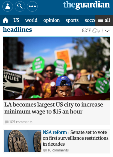
The smartphone view is cohesive and inviting, with all the essential elements presented in a clear visual hierarchy.
At the top, the necessities are in the banner, with login, search, and the site’s title.Directly below are the most popular navigation categories (home, “US,” “world,” etc.) for easy access. The Guardian hides additional navigation links behind the hamburger menu (following the principle of progressive disclosure). The features story takes up most of the room with its enticing image, showing that it’s the most important element. The user can access multiple secondary stories making headlines with a quick scroll, thus facilitating browsing and giving users control.No space is wasted on the mobile version, too–even the whitespace opposite the “headlines” title features weather information, providing extra value to mobile users.
Tablet View
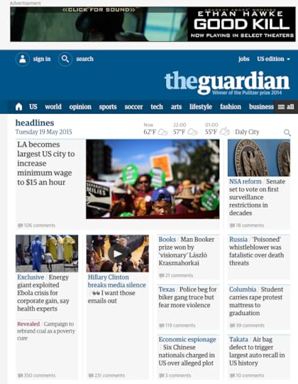 Above the user interface on the tablet view, the Guardian includes an ad for business value.At the top, the banner remains the same, but the tablet view offers more room for additional elements (“jobs” and the country edition), labels for the icons, and the Guardian’s subheading below the logo. The hamburger menu remains, but there are more visible categories than the mobile version.The most significant difference is that the tablet shows more stories and increases from a single column to four. This creative use of the card UI pattern allows the designers to prioritize stories using a size hierarchy.
Desktop View

The desktop view reveals the true mastery of the Guardian’s website. The site is consistent across all three screen sizes, giving readers the same user experience no matter what device they’re using.
Each version is scroll-based, uses the same card components with similar header navigation and branding. The only significant difference is the number of stories per screen size.
Smashing MagazineSmashing Magazine does well to follow its own advice on creating better mobile experiences with a fully responsive website.
Smartphone View
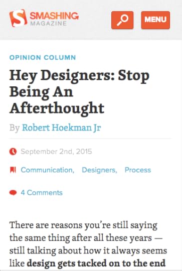 The header is simple with the brand’s logo, search icon, and clearly labeled menu to open the navigational drawer.Smashing Magazine shows its latest article with relevant metadata, and except.Smashing Magazine makes it obvious that you must scroll to see more content on the home page.
Tablet View

Smashing Magazine’s content remains the same, but the menu icon disappears, revealing the site’s full navigational links. Smashing Magazine also displays content categories for quick access to related content. The tablet view also includes a sidebar with search, newsletter signup, and promotional lead magnets–thus increasing the design’s business value.
Desktop View

Smashing Magazine’s desktop view is almost identical to the tablet view, but the main navigation and content categories move to the left.
One thing that remains consistent across all devices is the content. As a leading blog, Smashing Magazine wants its content to be the hero, no matter what device the visitor is using.
LookoutUnlike our first two examples, Lookout is a service-based website that wants to onboard new customers. This time we’ll explore the website from desktop down to mobile.
Desktop View & Tablet
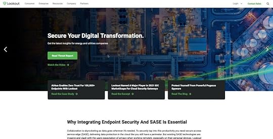
Lookout maintains the same view for tablet and desktop users. The navigation, login, sales CTA, and search icon are all visible, albeit more whitespace, on the desktop viewport.
Lookout wants to generate more leads, so they use an eye-catching green CTA for multiple lead magnets.
Smartphone View
 Lookout hides the main navigation behind a standard hamburger icon with login, sales CTA, and search still visible and accessible for users.Lookout maintains the same design strategy for its mobile website with a prominent, eye-catching CTA to the company’s lead magnet.
All three of these websites are excellent examples of UI design consistency and prioritizing content as you scale from desktop down to mobile.
SummaryResponsive web design is no longer something designers “should consider,” you must embed it in your standard best practices and workflow.
In fact, you should prioritize mobile over your desktop experience with a mobile-first or progressive enhancement design approach.
Consistency in the design itself and design drift are also challenges designers must overcome–a problem UXPin Merge can solve!
Merge allows you to sync code components to UXPin’s design editor from a repository. Designers can simply drag and drop these fully functioning code components to build user interfaces that look and work like the final website or application.
The result? Designers can use high-fidelity prototypes to improve usability testing and design better customer experiences. By using code components, engineers have less coding to develop the final website, thus reducing errors and time-to-market.
Find out more about UXPin Merge and how you can request access to this revolutionary technology.
The post Responsive Design: Best Practices & Examples appeared first on Studio by UXPin.
January 18, 2022
Material Design UI: An Introduction to Features like Motion and Interactions

Material Design is a comprehensive design library that both designers and developers can build mobile apps, websites, web applications, and other digital products. The documentation is excellent, with lots of information that’ll benefit even the most experienced of designers.
Table of contentsWhat is Material Design?Benefits of Material DesignMaterial Design FeaturesMotionInteractionMaterial Design 3Create Prototypes with Material DesignGoogle’s Material Design UI is one of the most popular and widely used design libraries in the world. If you use Google’s products (Gmail, Meet, Docs, etc.) or an Android device, you likely interact with Material Design UI daily.
Material Design is more than your average design library. It’s a masterclass for user experience design with excellent documentation, principles/best practices, and tutorials.
With Material Design built into UXPin’s design editor, you can get started building high-quality mockups and prototypes right away. No plugins. No importing files. Everything is ready to go. Sign up for a free trial and start building your next project using Material Design in UXPin.
What is Material Design?Material Design is a design library developed by Google, including UI components, icons, typography, and more. Google even includes guidelines and tutorials to help designers and developers get the most out of Material Design.
Google launched Material Design in 2014 at Google I/O Conference. The goal was to create a “tangible” design library based on ink and paper. “… unlike real paper, our digital material can expand and reform intelligently. Material has physical surfaces and edges. Seams and shadows provide meaning about what you can touch.” Matías Duarte – Google’s Vice President of Design.
Material Design distinguishes itself through its focus on interaction as the core function within a design system. And that’s precisely why more designers are embracing Material Design.
Benefits of Material DesignOne of the biggest advantages of Material Design is that you’re using a design library that Google’s UX designers have tested every element and component–saving you hundreds of hours of testing and iterations.
Material is also familiar to billions of users, so most people can jump in and start using your product without learning a new design system – a massive benefit for design psychology and reducing cognitive load.
Another significant benefit of designing with Material Design is speed. Designers can drag and drop Material elements and components to build user interfaces again, saving you time starting from scratch.
Lastly, Material Design is open-source, which means you can customize the design library to match your brand and product requirements. The system is available for Android and iOS, allowing you to use one design library for both operating systems.
Most design tools require you to install Material as a plugin or extension. With UXPin, you get several popular design libraries, including Material Design, built into the editor. Just select the library you want to use and drag and drop components to start building. Easy! Sign up for a 14-day free trial to see how quickly you can design mockups and prototypes with UXPin.
Material Design FeaturesMaterial Design has tons of features to help you build just about any product you can imagine. We’re going to explore some of Material Design’s most notable features that help designers build user interfaces.
ComponentsMaterial Design has a massive library of components and UI patterns across 17 categories, including buttons, app/navigation bars, menus, date pickers, cards, image lists, and more!
Google has thought of every possible component you need and offer the flexibility to customize each one to suit your needs. For example, Material’s Bottom Navigation explains usage, anatomy, behavior, placement, states, and theming options so designers can customize every facet of the component.
UXPin’s editor allows you to easily resize Material Design’s UI components. When using the components, you can seamlessly adjust their size, alignment and spacing between the components in whatever way you like with an Auto Layout feature. You can also add Auto Layout to the material design component and push it back to your library in UXPin to keep its properties.
Additionally, Google provides developer implementation for every component so engineers can copy/paste the HTML and CSS starter code.
Material Components for the Web was designed specifically for websites and web apps. Developers can also find Material libraries for React, Vue, Angular, and more. However, it’s important to note that the Material Design team does not maintain these unofficial libraries.
IconsMaterial Icons has more than 2,000 icons in five styles:
OutlinedFilledRoundedSharpTow toneYou can download Material Icons for the web in SVG or PNG format or use code snippets for Android, iOS, and Flutter. You can also install the Material Icons stylesheet from GitHub directly to the header of your website project.
TypographyTypography is a crucial part of UI design and branding. Material Design’s default typefaces for Android are Roboto and Noto Sans. The latter supports more than 150 scripts and 800 languages, so you can easily translate your Material Design product while maintaining aesthetics and integrity–a massive plus for organizations with a global user-base.
Of course, you have the freedom to use Google’s vast library of fonts or install a custom font.
Material Design Motion & InteractionsSometimes the smallest parts of the design are the most important. Microinteractions, those tiny parts from alarms to text messages to notifications of almost any kind, are vital in our everyday lives.
Designing microinteractions in the roots of Material Design can help you understand the how and why of creating something your users want to interact with.
Microinteractions help in several ways:
Communicate clarity and system feedbackProvide guidanceIndicate or prevent errorsEncourage engagement and sharingEnhance the branding experienceWhile microinteractions are everywhere, Material Design nails the concept, spelling out that any responsive interaction prods people to go deeper. While microinteractions can offer delight and surprise, the ultimate goal is to encourage users to explore further.
Material Design offers detailed guidelines for Motion and Interaction.
MotionMotion is the UI animation that responds to user interactions. As Google puts it, “Motion helps make a UI expressive and easy to use.” Material Design outlines three principles for Motion:
Informative: Helps to inform users by highlighting relationships between elements, action availability, and action outcomes.Focused: Shows users what’s essential without creating unnecessary distractions.Expressive: Celebrates moments in user journeys, adds character to common interactions, and can express a brand’s style.Material’s Motion documentation is a masterclass for UX designers which includes:
The motion system: a set of transition patterns that can help users understand and navigate an app.Speed: How adjustments make transitions smooth and responsive.Choreography: a coordinated motion sequence that holds the user’s focus while an interface adapts.Customization: How to customize Motion to express your brand’s style.InteractionMaterial Design’s Interactions define the movement and animations triggered by user interaction.
Gestures: let users interact with screen elements using touch.Selection: how users indicate specific items they intend to take action on.States: visual representations used to communicate the status of a component or interactive element.Material Design takes a deep dive into how designers should use these interactions within each of these categories, including common errors or misuse.
For example, Material responds to gestures in real-time to express direct user control over touch interactions. A person’s touch should control how fast or slow an animation occurs to deliver an authentic user experience.
Material Design 3In May 2021, Google announced the new and improved Material Design 3, which Google calls its “most expressive and adaptable design system yet.” Material Design 3 was first released on Android 12 and Google Pixel devices and will roll out to other technologies later in 2021.
Here are three new features in Material Design 3.
Dynamic ColorDynamic color is a new feature for Material Design. The feature allows users to customize their visual experience through wallpaper selection and other customization settings.
Dynamic color is an algorithm that scans a user’s wallpaper to generate five tonal palettes of accent and neutral colors. The device then uses these colors for settings, menus, and Android applications.
Foldable DevicesAnother Material Design 3 feature provides UI considerations for foldable devices. A notable UX addition is Postures, a screen configuration unique to foldable phones indicating when the device is folded or unfolded. Postures can extend to unfolded landscape and unfolded portrait, which each display a different screen size and aspect ratio.
Other foldable Material Design features include:
Reachability: What happens when users can’t reach parts of an unfolded device.Center hinge: Hinges that create space between the screen’s fold and content.Dividing the screen: Layouts for open foldable devices.Design TokensDesign tokens allow you to store style values such as color and fonts to be applied across designs, code, tools, and platforms. The goal is to help organizations streamline building, maintaining, and updating design systems. It’s a fantastic feature that ensures designers and engineers apply the same colors and fonts to avoid design drift.
Avoid Design Drift With UXPin MergeAnother way you can avoid design drift is with UXPin Merge – and to a significantly higher degree than Material’s Design Tokens! Merge lets you sync UXPin’s design editor with your organization’s design system stored in a repository–either via Git or Storybook integrations.
Designers can use fully functioning code components to build new products and user interfaces. Developers can also set props that appear in UXPin’s properties panel so designers can manipulate and edit the components.
Find out more about UXPin Merge and how you can sign up to request access to this revolutionary technology.
Create Prototypes with Material DesignIf you’d like to try building something with Material Design, sign up for a free UXPin trial and start building straight away! UXPin also has several other popular design libraries, including iOS, Bootstrap, Foundation, and User Flows.
The post Material Design UI: An Introduction to Features like Motion and Interactions appeared first on Studio by UXPin.
January 17, 2022
Design System Accessibility: Check What You Need to Know

An accessible design system makes it easier for designers to create products that don’t discriminate users with disabilities. Design a system that is accessible in the first place, test it with available tools, and audit it from time to time to ensure it fits the standards. Let’s see how.
Table of contentsThe Importance of AccessibilityAccessibility Improves User ExperienceHow Design Systems Can Help With AccessibilityMaking Components and UI Patterns AccessibleA Holistic Accessibility ApproachTesting Accessible Design SystemsTools to Test Design System AccessibilityAccessibility Testing With ParticipantsAuditing Design Systems for AccessibilityUsing Atomic Design Methodology for a Comprehensive Accessibility AuditNon-Text Content Clear Labels, Alerts, and MessagesSummaryImproving Design System Accessibility With UXPinDesign system accessibility is the first step towards creating inclusive customer experiences for all users. Organizations must also recognize the business value of making accessible products and websites.
More than a billion people live with disabilities globally – that’s 15% of the world’s population. If your products don’t cater to people with disabilities, you’re handing a competitive advantage to your competition!
We’re going to explore how you can make your products more accessible by starting with a baseline – your design system. With an accessible design system, you can quickly scale accessibility to pages, interfaces, navigation, user flows, and other areas of your designs.
Managing a design system is a challenging, time-consuming task, but it doesn’t have to be! UXPin provides organizations with the tools and features to build and manage a design system. Sign up for a free trial to see how UXPin can save you time and streamline your UX workflows while creating better user experiences for your customers.
The Importance of AccessibilityThere’s a misconception that users with disabilities make up a minority of online users. We tend to relate accessibility only to people with assistive technologies or visual impairments like color blindness. But design teams must also consider how people with cognitive disorders and dyslexia experience digital products.
According to the United States’ 2012 census, “56.7 million Americans (18.7% of the US population) have some type of disability, and out of this number, an estimated 38.3 million (12.6%) have a severe disability.”
How US citizens’ disabilities relate to technology:
19.9 million (8.2%) have difficulty lifting or grasping, thus impacting their use of a mouse or keyboard.15.2 million (6.3%) have a cognitive, mental, or emotional impairment, affecting focus, absorbing content/instructions, and cognitive load.8.1 million (3.3%) have a vision impairment, requiring screen readers or magnifiers to view content. Visual impairments also include color blindness disabilities. 7.6 million (3.1%) have a hearing impairment, relying on transcripts and captions for video and audio.Making digital experiences inclusive for all people is essential. However, when looking at the numbers above, organizations must also consider the business value people with disabilities offer.
Accessibility Improves User ExperienceMaking designs accessible benefits all users. A great example is a web page’s table of contents and headings (hierarchy) for articles and documentation.
These accessibility features allow users with screen readers to absorb content and find what they’re looking for quickly. Other users can use the same features to scan a page’s header tags or use the table of contents to move around the page with minimal scrolling.
How Design Systems Can Help With Accessibility
When an organization builds accessibility into its design system, teams are free to develop product experiences knowing that designs are consistent and conform to web content accessibility guidelines (WCAG).
From a business perspective, design system accessibility saves time while increasing consistency, thus creating positive experiences for all users.
Making Components and UI Patterns AccessibleOrganizations should treat design system components as the baseline for accessibility. This baseline includes colors, typography, spacing, sizing, and other component-based factors.
The goal is to take baseline accessibility decision-making away from designers so they can focus on design. Designers must still be aware of accessibility, but they’re not starting from scratch every time.
A Holistic Accessibility ApproachDesign system accessibility is just the baseline towards making user interfaces accessible. Designers must still conduct accessibility tests on interfaces, navigation, and user flows.
Testing Accessible Design Systems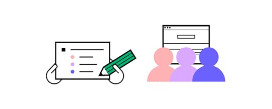
Testing is critical to ensuring your design system is accessible. UX designers should always start by testing design system components using tools, followed by live tests with participants to confirm these results.
Tools to Test Design System AccessibilityAccessibility tools are excellent for testing design systems for visual impairments. UXPin’s built-in accessibility features allow UX designers to check color and contrast without leaving the design editor.
Our color contrast checker evaluates UI components against WCAG standards for AA and AAA levels. With the contrast checker activated, UXPin creates two lines on the color picker, so designers can identify where they need to be on the spectrum to meet either AA or AAA levels.
Level AA: requires a contrast ratio of at least 3:1 for text not smaller than 24px (18px if bolded) or 4.5:1 for text smaller than 24px.Level AAA: requires a contrast ratio of at least 4.5:1 for text not smaller than 24px (18px if bolded) or 7:1 for text smaller than 24px.Designers can also use UXPin’s color blindness simulator to experience user interfaces from this demographic’s perspective, including:
Red-green color blindness (Deuteranomaly, Deuteranopia, Protanomaly, Protanopia)Blue-yellow color blindness (Tritanomaly, Tritanopia)Complete color blindness (Achromatomaly, Achromatopsia)Accessibility Testing With ParticipantsOnce components pass accessibility tests using tools, designers must conduct live usability studies with relevant participants. For example, people with visual/hearing impairments, cognitive challenges, and those using assistive technologies.
Industry experts like Fable and Deque can facilitate testing to help companies find the right participants and conduct accessibility tests that produce meaningful, actionable results.
Auditing Design Systems for Accessibility
If you have never done a UX audit, we highly recommend completing this before moving on to solving accessibility issues! Conducting a UX audit will ensure you eliminate fundamental usability issues and design system inconsistencies.
For example, many organizations discover that design system components have inconsistent color palettes because designers use the wrong hex codes. You’ll want a clean slate before you audit for accessibility, or you may end up doing double or unnecessary work.
Start your design system accessibility audit by listing every component, UI pattern, color, icon, asset, typeface, and other UI items. This way, you have a step-by-step checklist of everything you need to audit.
You can use this list to cross-reference the relevant Web Content Accessibility Guidelines. WCAG provides a helpful quick reference UX designers can use to audit their design systems. This reference includes guidance for WCAG 2.0 and WCAG 2.1.
Using Atomic Design Methodology for a Comprehensive Accessibility AuditFollowing Brad Frost’s Atomic Design Methodology, consider breaking your design system down into atoms, molecules, and organisms so you can audit both the parts and wholes.
Atoms: The most basic building blocks that can’t be dismantled further. Like form labels, inputs, buttons, icons, and other singular building blocks.Molecules: Simple UI components that function together. Like a search form with an input, label, and button.Organisms: Groups of atoms and molecules that make up complex UI components. Like a standard website header with a logo, navigation links, and search form.By breaking your design system down to its core, you can start with the basic building blocks and scale your accessibility audit to more complex UI components.
Non-Text ContentIcons and other assets should help users with explicit alt text so screen readers can identify them correctly. WCAG provides designers with guidance on how to make Non-Text Content accessible.
Clear Labels, Alerts, and MessagesMessages, labels, and alerts must be helpful and provide context for users with assistive technologies.
For example, if you have multiple required fields on a form but you only have one error message saying “This field is required,” how will someone with a screen reader know which field you’re referring to? Each required field must have its own error message; “First name is required,” “Email is required,” and so on.
Designers must also use labels for every element and component so that screen readers can provide users with context and instructions. For example, you might label each element of a search form with an icon and input field as follows:
Search icon: label=”Begin search”Input field: label=”Search query”A screen reader knows what each element does so the user can interact with the UI component to search a product or website.
SummaryCreating an accessible design system promotes inclusivity and gives designers a baseline to scale accessibility to user flows, navigation, page layouts, and other areas quicker and easier.
Designers no longer have to worry about colors, typography, contrast, hierarchy, and other factors, because that work is already done! They only have to evaluate what happens when you combine these elements to design user interfaces and navigational flows.
Improving Design System Accessibility With UXPinWith Design Systems in UXPin, you can build and manage your organization’s design system all in one place-no plugins or addons required! Sync your design system to all teams and even set permissions to preserve consistency and integrity.
Sync your design system to all team members so designers only use colors, typography, assets, and UI patterns that conform to your organization’s accessibility standards.
Use descriptions to add documentation and guidelines (including accessibility instructions) for every UI component in your design system, so designers and developers are all on the same page.
Ready to start building more inclusive user experiences for your customers? Sign up for a free trial to discover how the world’s most advanced code-based design tool can revolutionize your organization’s product design.
The post Design System Accessibility: Check What You Need to Know appeared first on Studio by UXPin.
January 14, 2022
7 Advanced Prototyping Features That Help You Build Better Prototypes
 Table of contents1. Auto Layout2. Merge3. Components4. States5. Variables6. Expressions7. Using Real DataBONUS – Design SystemsThe Importance of Advanced PrototypingSummary
The quality and fidelity of your prototypes can significantly impact the design process and the final product. With advanced prototypes (that look and function like the final product), UX designers can get better results from usability testing and fix any issues before they get to the design handoff.
The problem? Most leading vector-based design tools don’t have the fidelity or functionality for designing prototypes that can accurately mimic the final product.
With the advent of code-based design tools, designers now have the ability to build advanced prototypes that look and function like the final product.
This article explores seven advanced prototyping features offered by code-based design tools and how they help designers build better prototypes for testing and sharing with stakeholders.
UXPin is leading the code-based design revolution. Sign up for a 14-day free trial and discover how advanced prototyping with UXPin can help you build better user experiences for your customers.
1. Auto LayoutAuto Layout is a helpful feature for designers to distribute, size, and align elements fast. Designers can make significant changes to a user interface layout simply by changing a few auto-layout properties.
Most design tools offer auto-layout, but with UXPin’s code-based tool, it’s a little more advanced.
https://t.co/qJNMJLHePh 🤔 Have you tried out padding option in the Auto Layout feature? Cut down on the time you need to design a new project. pic.twitter.com/yuwaxvsMSm
— UXPin (@uxpin) December 20, 2021
UXPin’s Auto Layout works on Flexbox properties and principles – which means designers and developers speak the same language. This cohesion is most beneficial for design handoffs because engineers can simply copy/paste the CSS from UXPin as a starting point for development.
UXPin’s Auto Layout has five properties:
Direction: Set whether you want to order the auto-layout frame: vertically or horizontally.Distribute: Choose different distributions of elements to set how you want them laid out along the cross axis.Gap: You can set a fixed spacing between elements in the group with Auto Layout.Wrap: Wrap the elements depending on the groups’ width or height.Align: Align the elements along the main axis (defined by direction: vertical or horizontal) in the container.Additionally, you can change other properties to the auto-layout group, including fill, border, padding, radius, and size. Designers can use Auto Layout for a single component or groups of components and elements.
2. MergeUXPin’s proprietary Merge technology is revolutionizing UX design workflows while solving many DesignOps challenges. Merge allows designers to build products and interfaces using fully functioning code components hosted in a repository.
This exciting technology means that designers can build prototypes with the same components used in the final product. They can also change the component’s properties to match the new design.
You have two options for connecting Merge:
Git integration for React components.Storybook integration for several other technologies, including Vue, Angular, Web Components, Ember, and more.Any changes engineers make to code components in the repo will automatically sync to UXPin’s design editor. Designers also get a notification informing them of the new update–perfect for syncing the entire organization’s design system for a single source of truth!
Learn more about UXPin Merge and how you can request access.
3. ComponentsDesigners can create reusable components to save time and maintain consistency. You can also save components in your design system so that the entire organization can access the same parts.
UXPin Components comprise of two aspects:
Master Component: Defines the component’s properties.Instance Component: Copies that mirror the Master.Any changes you make to the Master will automatically sync to all of its Instances. Designers can override Instances if necessary. For example, you might want to change the background color for several Instances in a grid. You can also reset your overrides to revert to the Master.
If you make any changes to a Master Component, UXPin will display a notification in the Properties panel saying This Component is out of sync. The same message will appear if someone else in your organization has adjusted a design system component. UXPin gives you the option to push or pull component changes accordingly.
If you don’t want team members making changes to your design system, you can set Permissions in the Design System’s Dashboard.
4. StatesStates allow you to set different properties for an element or component based on user or system triggers. For example, a single button can have default, hover, active, and disables states, much like they would in the final product.
Your Base State is the element or component’s default. If you make changes to a Base State, UXPin will only adjust the properties common to all states–allowing you to make changes without updating each state individually. You can also Reset all changes to revert to the Base.
States are also useful for designing complex components like drop-down menus, accordions, carousels, and navigation, thus increasing the fidelity and functionality of your prototypes.
5. VariablesWith vector-based prototypes, data input and validation are simply not possible. Participants and stakeholders have to “imagine” that they’ve entered their details in a signup form, or designers have to build a personalized prototype.
UXPin’s Variables allows you to capture user inputs and take actions using that information. For example, you can simulate an onboarding flow by capturing the user’s name and then using it for a personalized welcome on the next screen or display the details on their profile page.
With UXPin’s Variables, designers can create a dynamic, customized, immersive experience that changes depending on the user. Something vector-based design tools cannot do!
6. ExpressionsTake your prototyping one step closer to a coded product using UXPin’s Expressions. This powerful feature lets you create Javascript-like programming, including form/password validation, updating a shopping cart, or modifying the text from a user input.
A great example is validating an email address. If the input doesn’t include the @ symbol, the prototype can display an error message telling the user to type a valid email address.
Designers can also use Expressions to create an authentic eCommerce checkout experience where the user can update their cart and calculate the actual value at checkout. If they delete something, the product will disappear, and the total will update accordingly. You can even capture their payment information and display it on the confirmation page before confirming the order!
7. Using Real DataAnother time-saving UXPin feature is the ability to use real data inside your prototypes. You can use your own data from JSON, CSV, or Google Sheets or use UXPin’s Fill with Data feature to populate fields with relevant dummy content and Unsplash images.
Google Sheets is probably the quickest and easiest way to get your own data into UXPin. Make sure your column heading matches the layer name, and UXPin will automatically populate the relevant fields. If you make changes to your data (JSON, CSV, or Google Sheets), you can Refresh Data, so the layers repopulate–extremely helpful for making quick changes during usability testing or presenting to stakeholders.
BONUS – Design SystemsAs a bonus, we thought we’d give you a quick intro to UXPin’s Design Systems. You can create a design system from scratch or use one of several built-in design libraries to start building prototypes straight away.
Design systems (including those from Merge) appear in UXPin’s left navigation so designers can drag and drop the components they need to build prototypes. With a good design system, you can go from concept to high-fidelity prototype in no time at all!
The Importance of Advanced PrototypingBuilding advanced prototypes is vital for designers to conduct quality tests to solve usability issues. Image-based design tools don’t offer the fidelity or functionality UX teams need to provide usability participants with prototypes that mirror the final product experience.
The problem with these prototypes is that many usability issues end up in the final product resulting in costly errors and delays–often causing tension between designers and developers who don’t fully understand each other’s constraints.
Image-based design accentuates UX, product, and engineering silos because each team is working to overcome different challenges.
UXPin’s code-based editor renders HTML, CSS, and Javascript, which means designers work with advanced prototypes in a language engineers understand! Design handoffs run smoother because developers can visualize what the prototype is supposed to do, and they can copy/paste starter code to begin building the final product.
SummaryUX designers design code-based products, but they use vector-based tools for prototyping and testing. Without the same fidelity and functionality, how can you expect to achieve accurate testing?
Advanced prototyping starts with using the right tool for the job. Most leading design tools are excellent at designing vector graphics, but they’re poor at prototyping and meaningful usability testing.
With UXPin, designers can build fully functioning prototypes that accurately test the user experience and solve issues vector-based tools can’t.
Ready to experience advanced prototyping with UXPin? Sign up for a free trial and install one of our free App Examples that introduce designers to UXPin’s advanced prototyping features.
The post 7 Advanced Prototyping Features That Help You Build Better Prototypes appeared first on Studio by UXPin.
January 13, 2022
Join Our Free Webinar “Defending Your Design System”
 How do you create support for your design system?
Most designers agree that design systems provide a host of benefits, from ensuring design consistency to making design onboarding faster. It’s worth creating one for any project for sure. It’s relatively easy to show other designers the value of design systems, but how to convince stakeholders and co-workers who do not understand the ins-and-outs of design that a system is necessary?
We’re hosting a webinar with Carola Cassaro, who showed IKEA how to implement their design system. The webinar is called, Defending Your Design System, and Carola will share her tips on convincing non-designers of the design system’s value and getting stakeholders’ support for growing it.
Carola has over 10 years of experience leading the strategy, design, and delivery of digital products across retail, media, travel, and tech industries. She knows everything about establishing DesignOps practice at various companies who go through digital transformation or want to improve operations.
You’ll learn about :How to find the right framework and vocabulary to communicate a design system’s impact.Ways to convert more stakeholders (especially non-designers) into system evangelists.Methods to secure the resources to further evolve and grow the system.There will be a Q&A session at the end, so prepare your questions for Carola.
Date: January 18, 2021
Time: 9 AM PST / 6 PM CET
Register for the webinar here.The post Join Our Free Webinar “Defending Your Design System” appeared first on Studio by UXPin.
UXpin's Blog

- UXpin's profile
- 68 followers

