
UXpin's Blog, page 66
February 16, 2022
Web UI Design Examples and What You Can Learn From Them
User interface design (UI design) is crucial for aesthetics, usability, and branding. It’s a balancing act of form and function, where designers must push the boundaries of creativity while designing a functional, cohesive user interface.
This article looks at some creative web UI design examples and what makes them great. We also include a checklist of 16 UI design principles designers can apply to create great customer experiences.
Creating exceptional customer experiences starts with comprehensive prototyping and testing. UXPin’s code-based design editor allows designers to build high-fidelity website prototypes that look and function like a coded website. Sign up for a 14-day free trial and experience code-based web design with UXPin.
What is UI Design?UI design is the process of adding color, fonts, icons, images, and other content to convert wireframes or sketches into mockups. UI designers are also responsible for adding interactive design and animations to turn mockups into functioning high-fidelity prototypes.
UI Design PrinciplesBefore we dive into our website design inspiration, we thought it would be helpful to understand essential user experience principles designers use as a guideline for UI/UX design.
Focus on the user: Make sure you base every design decision on user research and testing. Start by empathizing with users to define the problem you need to solve—next, ideate and prototype before testing and iterating. Good designers recognize the user’s needs and design products and features to fulfill them.Be consistent: Consistency is one of the keys to a good user experience. Design elements, components, and interactions must be consistent across every user interface. A design system is an essential tool for developing product consistency and cohesion.Easy to digest: UI design and content should be easy for users to understand. Use basic language so users can absorb and understand how to use your web application or website.Don’t make users think: Your website navigation and content should be obvious to use. Someone shouldn’t have to think about what elements and components are supposed to do. Try to use industry-standard UI patterns to create familiarity and reduce cognitive load.Points, lines, and planes–understand visual grammar: Points, lines, and planes are the building blocks for design. Great UI/UX designers understand these principles and how they affect user experience.Identify the problem first: UX designers must study research and user feedback to find the root cause of a problem. Avoid designing on intuition and assumptions–always test these hypotheses to make informed design decisions.Simple language is best: Further to point 3, avoid using jargon and insider language that exclude users. Use obvious labels for UI elements, so users always know what to expect if they interact with your design.Have empathy for your audience: Empathy is the heart of human-centered design. Designers use empathy so they can relate with users, their struggles, and their environment. When you fully understand your users, you can design an intuitive experience that solves their problems.Provide feedback: UI designers must use microinteractions and animations that provide users with feedback and context. Users should always know what’s happening, and error messages should help users solve the issue.Don’t forget business value: UI designers must identify ways to solve user problems while increasing business value. For example, optimizing an eCommerce checkout benefits both the user and the company.User testing: Designers must constantly test user interfaces and design decisions with real users, especially when adding new UI elements, components, and patterns to a design system.Visual hierarchy: Designers use color, contrast, scale, typography, and grouping to create hierarchy and help users identify critical elements and content.Accessibility: Website UI design must be inclusive for users with impairments and disabilities. Designers should also optimize UI elements and layout for multiple viewports so users can access the website from any device.Give the user control: Users should always have control to opt-out or change their minds. UI design must allow for these options with explicit icons, text, and buttons. For example, adding a “back” button in an eCommerce checkout flow or making a subscription’s “cancel” button prominent on the user’s account page.Design handoff: UI designers must ensure they document their work and provide style guides so engineers can understand and develop the final website.Reevaluate and revise: Once a website project is live, designers should use tools and analytics to evaluate their designs and look for improvements. How do users interact with your designs? What happens if you A/B test different colors or language for CTAs? You should always look for ways to test and improve. Designers might also need to update interfaces to align with new trends or legislation.9 Web UI Design Examples to Inspire Your Next Website ProjectWith an understanding of the principles, let’s explore some UI design inspiration you can apply to your next design project.
1) Boost’s On-Brand User Experience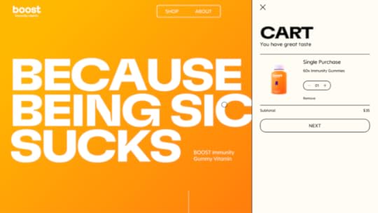
Boost does a fantastic job of aligning UI design with the product. Everything is on-brand, simple to navigate, and allows users to get to the checkout flow in no more than three clicks!
The product page uses minimal text with large button components to choose a single purchase or subscription plan. The bright orange ADD TO CART button on a white background screams “CLICK ME.” As soon as users click add it cart, the cart slides out so the shopper can begin the checkout process.
Boost’s website is an excellent example of UI design that helps users while providing significant business value through an engaging visual design and optimized checkout process.
2) Illuminating Radioactivity’s Creative Content Cards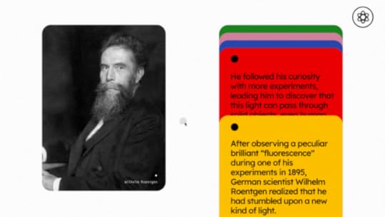
Users often scroll mindlessly without reading the content on a page. The Illuminating Radioactivity website solves this issue by designing content cards with a parallax effect. Scrolling causes the cards to move down slowly, drawing your attention to the content.
It’s a simple concept but a creative and engaging way to get users to read important information. If you’re designing an informational website that relies on users to spend time reading your content, a scroll effect like this could help engage more users, reduce bounce rates, and increase click-through rates–all essential factors for SEO.
3) An Engaging and Entertaining Menu From Lunchbox
Lunchbox’s designers had a lot of fun creating an engaging and entertaining UI design experience. Lunchbox helps restaurants digitize their menus, so everything is food-themed.
The designers have changed the pointer to a chef’s knife and literally created a hamburger from the hamburger icon to access the main navigation. The menu has a strike-through hover effect, so it looks like the blade is cutting it in half.
Lunchbox’s entire website is filled with these immersive experiences that beg you to explore and read the content. If you’re looking for a lesson in how to use UI animation to sell a product, Lunchbox is definitely worth a visit!
4) Bennet Tea’s Engaging Color and Page Transitions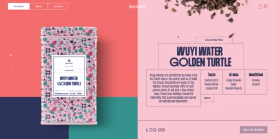
Like Boost, Bennet Tea’s UI is wonderfully on-brand with a striking color palette to match the product’s packaging. Even with lots of colors, Bennet Tea’s designers have done an excellent job of drawing the user’s attention to important content and CTAs.
Bennet Tea uses an immersive scroll effect giving you the illusion of staying above the fold while only the product images and description change as you scroll. It’s a clever way always to have a product and CTA in full view, enticing users to add to cart and checkout.
Bennet Tea’s theatrical page transitions feel like someone is pulling back the curtain to reveal a new visual experience. The three-page navigation is always visible in the top right of the screen (on desktop), making it easy for shoppers to explore the site.
5) Bauwerk’s Search Filter UI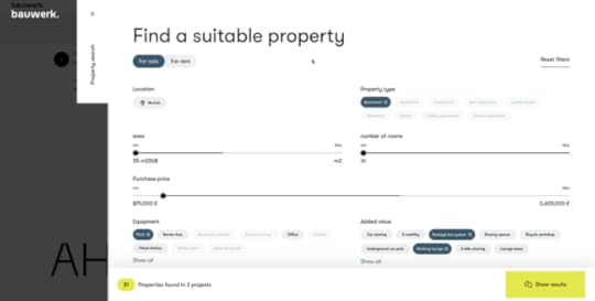
Bauwerk’s immersive and intuitive property search filter helps users narrow their search to find exactly what they’re looking for. The UI does an excellent job of highlighting the user’s selection and the ability to remove any field by clicking X–providing the user with clear feedback and control to change their mind.
The bottom left also shows the user how many properties they can expect with their current selection, thus managing expectations. Designers have cleverly used different, bright colors for the number of properties UI element and the “show results” button to attract users’ attention.
6) Apple AirPods Max Immersive Scrolling Experience
What do you do when you’re trying to sell a $549 pair of headphones in a highly competitive market? Create an immersive UI experience that uses animation and effects to wow shoppers into buying your product!
Apple’s AirPods Max landing page is a masterclass in how UI design can showcase and sell a product. As you scroll, designers take you on an immersive product experience using typography, animation, color, images, and video. Apple has done an incredible job of using UI elements and movement to help tell the AirPods Max story, why these are the best headphones, and why you must have them!
By the time you get to the bottom of the page, you’ve learned every aspect of the product and why it’s worth $549. If you’re going to sell a high-ticket item, find a way to create an immersive UI experience that will convince users of your product’s value.
7) Glide’s Clear CTA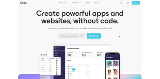
Glide lets you create web applications using Google Sheets. The goal of their website home page is to get you signed up. Glide uses a luminescent blue for the CTAs throughout the home page, and a “Sign Up” button in a sticky header.
Glide also does an excellent job of using color, images, GIFs, and typography to explain their product and the problem it solves–giving non-tech people the ability to create an application. As you scroll through the website and learn about the product, that luminescent blue CTA is always prominent; yelling CLICK ME!
Websites and landing pages with a single CTA work best. Users don’t have to think about where they should go next or choose between different options. Great UI design can help facilitate that call to action by using color and contrast to make important buttons and links stand out.
8) ETQ’s Responsive UI DesignOne of the biggest challenges of responsive design is maintaining consistency between the desktop and mobile experience. ETQ’s minimalist responsive layout complements the brand and user experience consistently across multiple viewports.
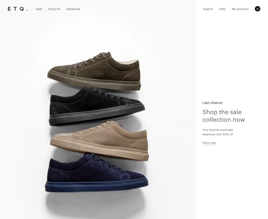
Designers have used hero images and titles that maintain the same focal point on desktop and mobile. Their clever use of white space on the desktop website draws your eye to important content and images. Designers have done well to translate this same experience on mobile, creating a premium, luxury appeal that aligns with the brand.
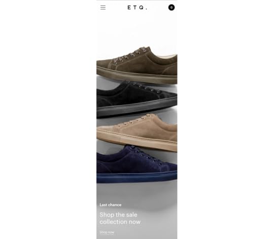
Maintaining consistency across desktop and mobile helps build familiarity, trust, and brand loyalty. Users know they can access your website on any device without compromising on features or usability.
9) Vintageria’s Helpful Cookie Policy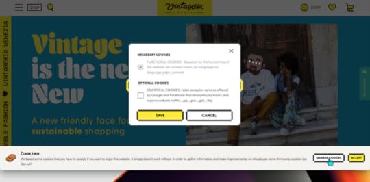
While GDPR does a lot of good, it’s also spawned the annoying cookie popup! For most websites, it’s pretty irritating, and many don’t offer a straightforward way to decline cookies. You have to accept and use the website.
Vintageria’s cookie policy is transparent, entertaining, gives the user control, and uses language most people can understand–all fundamental UI design principles.
Improve UI Design With UXPinAre you feeling inspired after reading the examples above? UXPin’s code-based design tool allows designers to build prototypes with significantly higher fidelity than any vector-based design tool.
With UXPin’s code-based design tool, you can enhance prototype fidelity with states, Javascript-like interactions, conditional formatting, variables, data capture and validation, functions, and more.
Get started with a free UXPin trial and discover how to create better customer experiences with code-based design.
The post Web UI Design Examples and What You Can Learn From Them appeared first on Studio by UXPin.


February 15, 2022
VUI: Designing for Voice UI
 Table of contentsVUI Use Cases – Does Your Product Need Voice?How Do VUIs Process Information?How VUIs Talk to Users8 Considerations for Voice User Interfaces1. User Personas2. Devices3. VUI Microinteractions and System Status4. VUI Triggers5. Giving Users Control6. VUI Accessibility7) Graphical User Interface (GUI) Integration8) VUI Design PatternsFinal ThoughtsEnhancing the User Experience With UXPin
Just about every product features a voice user interface (VUI), from phones, wearables, and speakers to your car and even the fridge. According to Statista, the number of voice assistant devices will exceed 8.4 billion units by 2024-more than the world’s population.
As of May 2019, over 90,400 smart home devices supported voice assistants, more than 60,000 of which were for Amazon’s Alexa alone! It’s hard to say whether VUIs will replace screens, but there’s no denying the ever-growing demand for voice products.
Designing VUIs and the accompanying information architecture is a complex and exciting challenge for UX teams. This article looks at VUI design and how designers can create better voice experiences for their customers.
UXPin’s code-based design tool lets UX designers build complex high-fidelity prototypes that accurately replicate the final product. Sign up for a free trial to discover how UXPin can streamline and enhance your product design.
VUI Use Cases – Does Your Product Need Voice?Just because any device or application can work with voice doesn’t mean it should. Designers must evaluate each product individually to assess whether voice commands, a screen UI, or a combination of both will best serve users.
For example, do you want an app dealing with sensitive data like finance or health blurting out your personal information? Designers must consider both ethics and legislation regarding this sensitive data.
VUI’s best use cases are providing users with hands-free assistance during cooking, driving, exercising, and other activities that require attention, focus, or use of someone’s hands and body.
Thorough research and user interviews will help designers determine whether voice will effectively solve user pain points or help people complete tasks better and faster.
How Do VUIs Process Information?
VUIs use a mix of artificial intelligence/machine learning, speech recognition, sound effects, and text-to-speech (TTS) to interact with users.
How VUIs Talk to UsersVoice design expert Guillaume Privat Siri Manager Apple says, “VUI designers should differentiate between a prompt and a statement” because each requires a different authoring strategy.
Prompts: Questions from the VUI, like “What can I help you with today?”Statements: VUI answers, comments, and other communication that don’t necessarily elicit a response. “Hello, Jane.” or “Playing Hit Me Baby One More Time by Britney Spears on Spotify.”Prompts present a few challenges for designers because they need to manage users’ expectations while posing questions that favor system constraints. For example, open-ended prompts expose AI to the complexities of human communication, whereas closed-ended questions are easier to handle.
Designers can optimize prompts by limiting options to a maximum of three, which usually correspond to frequently used features. For example, in a banking app, the VUI might ask, “Would you like to check your balance, pay a bill, or something else?”
Designers must also consider how to program re-prompts to incase the user doesn’t respond right away. Re-prompts should sound natural and conversational, like the way you would talk to a loved one if you thought they hadn’t heard your question.
Statements provide users with answers to their questions, but they also confirm their instructions followed by a prompt. For example, “You want to pay your $20 to the electric company (statement). Is this correct? (prompt).”
8 Considerations for Voice User InterfacesManaging user expectations is one of VUI design’s biggest challenges. Without proper error handling or clarity from the voice assistant, users often abandon the product with the view that it doesn’t work.
Designers must also overcome background noise, accents, clarity, volume, and other vocal nuances. Never mind the complexities of language itself!
We’ve researched several leading UX designers who’ve shared their successes in overcoming VUI design challenges.
1. User Personas
As with any design project, personas play a crucial role in empathizing with users. VUI user personas must include additional details like the tone of voice, common word choices, and sentence structure. Designers must also consider cultural differences–like how people talk in California, USA vs. Yorkshire, UK.
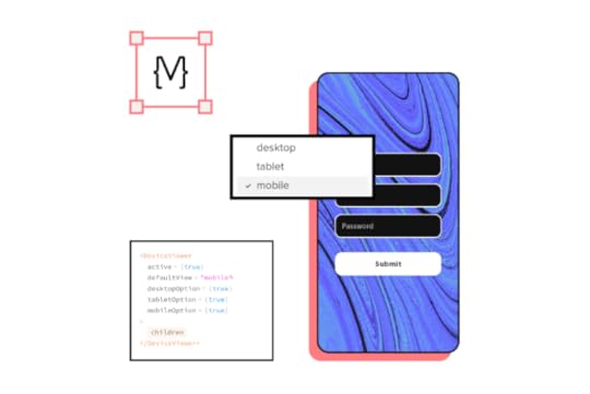
2. DevicesMost visual UI design focuses on mobile, tablet, and desktop experiences, while a voice interface is far more complex with many possibilities, including:
SmartphonesTabletsDesktopsTVsSmart speakersHome theatre systemCar stereosWearablesHeadphonesInternet of Things (IoT)Home appliancesIn some instances, a single VUI must work on several devices, impacting how the user and system interact. Designers must consider these factors and maintain a consistent user experience across multiple devices and environments.
3. VUI Microinteractions and System StatusMicrointeractions provide reinforcement and feedback to enhance the user experience and provide feedback. Designers have a choice of sound effects, screen animations, haptic feedback, and LED illumination to show system status and states.
An essential VUI microinteraction is the “wake up” after the user says “Hey Siri” or “Hey Alexa.” Designers must indicate that the VUI is ready for the user’s instruction. Designers might have to use a specific LED for speakers and devices without a display to show the VUI is listening–like the illuminating bezel on the Amazon Echo.
4. VUI TriggersDesigners can use several VUI triggers to enhance a user experience and add value to users. Here are a few examples and use cases:
Voice: The primary trigger for activating and interacting with the VUI.Touch: Using UI components or physical buttons. Motion: Some wearables and smartphones can detect specific movements to activate the VUI or features.Time: Dates and times for reminders and events can trigger VUI responses or system actions.Location: VUIs can use geolocation to trigger reminders or actions.Machine learning opens a whole world of possibilities for VUI triggers and could provide life-saving feedback and advice. For example, if you’re driving through an unknown city, a voice assistant can alert you before entering high-risk crime areas or inform you of an accident up ahead.
5. Giving Users ControlGiving users control is a crucial user experience factor. Designers should consider how VUIs might force a user into listening to a long list of content, like “all the restaurants within a mile.” Users should be able to interrupt or add specific details like “with wheelchair access” without starting from scratch.
6. VUI AccessibilityDesigners must also consider how to make VUIs accessible. Shaky voices, speech impediments, and second-language speakers are some voice recognition challenges designers must overcome.

Cognitive disabilities and hearing impairments often make it difficult to digest information. One solution is to include the option to repeat slower or louder for the user. Designers must also consider keeping VUI prompts and statements succinct with the option to “add more context” or “elaborate.”
While adding wit, sarcasm, or slang might seem fun, designers should avoid ambiguous language that could confuse second-language speakers, people with disabilities, or cognitive challenges. Technical jargon, abbreviations, and acronyms could also make users feel marginalized.
Designers must use whole words and natural language so that information is easy to absorb and interpret.
7) Graphical User Interface (GUI) IntegrationHome management systems and IoT often come with a GUI touch screen or mobile app to support the VUI. GUIs can also help solve accessibility and usability issues by providing users with another option to interact with the voice assistant.
8) VUI Design PatternsVUI is still in its infancy compared to visual interfaces, so there’s still a lot of work needed to develop industry-standard VUI patterns and accessibility guidelines. Still, you can find helpful information and guidance from Amazon, Samsung, Google, and Apple.
In Amazon Alexa’s Developer Documentation, the eCommerce giant divides its design patterns into four sections and summarizes each as follows:
Be adaptable: Let users speak in their own words.Be personal: Individualize your entire interaction.Be available: Collapse your menus; make all options top-level.Be relatable: Talk with them, not at them.Here are links to leading voice assistant documentation to get more ideas about VUI design patterns:
Apple’s Siri: Siri for DevelopersAmazon Alexa: Alexa Design GuideGoogle Assistant (Google Home): Actions on GoogleSamsung’s Bixby: Samsung DevelopersMicrosoft: Voice Assistants DocumentationFinal ThoughtsVoice user interface design is an exciting and ever-evolving field. AI and machine learning allow users to develop human-like bonds with virtual assistants and include them as part of the family–a unique quality other digital products do not share.
In one review on Amazon’s Echo Dot, a happy customer had this to say: “Artificial intelligence? Perhaps. But people rarely make me smile or laugh. Alexa rarely fails to do so. And the enjoyment I get from having her in my home is anything but ‘artificial.'”
UX designers must look for creative ways where VUI technology can excite users and enhance the human experience. When designed correctly, voice assistants can reduce the time people spend physically interacting with screens and devices.
Enhancing the User Experience With UXPinNo matter what project you have in mind, iterative improvement is the foundation of great design. When your design team has the tools to stay coordinated and aligned, they can reduce time-to-market, make smarter design choices, and amaze users with incredible product experiences.
UXPin is an end-to-end code-based design tool that fosters creativity and collaboration. UX designers can design, prototype, test, and iterate faster with higher fidelity and functionality than other leading design tools. Sign up for a free trial and see how the world’s best design tool can enhance your UX workflows and improve customer experiences.
The post VUI: Designing for Voice UI appeared first on Studio by UXPin.
February 11, 2022
UXPin Merge vs. No-Code Website Builders
 Jump to the sectionWhat is a No-Code Website Builder?What is UXPin Merge?How Developers and Non-Designers can Leverage Merge TechnologyCombining UXPin With No-Code BuildersHow Merge Bridges the Gap Between Design and Development
It feels like a new low-code, no-code application emerges every month. Organizations use no-code, low-code builders rather than allocating valuable resources to develop a simple app or API. These platforms also offer solopreneurs and cash-strapped startups an opportunity to validate an idea or build a minimum viable product (MVP) to pitch for investment.
As a code-based design tool, people often mistakenly lump UXPin Merge into the low-code, no-code category–probably because Merge makes design accessible the same way website builders do for development.
While Merge is not a no-code website builder, there are opportunities for designers, developers, startups, and organizations to leverage both technologies to build websites, applications, and other digital products.
UXPin’s MUI integration lets you build prototypes using MUI’s comprehensive React component library. Sign up for a free trial to start designing with MUI and UXPin today!
What is a No-Code Website Builder?No-code builders are tools that make designing and developing a website or digital product more accessible. The platform provides you with a theme of UI components and layouts, which you drag and drop to build a website or application.
Popular no-code website builder examples include Shopify, Elementor (WordPress), Squarespace, Webflow, and Wix. There are also no-code web and mobile app builders like Bubble, Appsheet (Google), Glide, and Buildfire.
While these platforms make it easy for anyone to build a website or application, they limit creativity and innovation. You usually have to sick within the limitations of the application’s design theme and technological constraints.
Most of these platforms offer hosting services so that you can deploy your website or app immediately once complete.
No-Code Builder Pros and ConsPros:
Perfect for creating basic websites, landing pages, and applications without coding experienceLow learning curve–you can design and develop a website after reading the documentation or watching tutorialsPre-made UI component library for you to build pagesYou control the design and development–no waiting on designers and engineersYou can make changes and deploy updates at any time–albeit with limitations and constraintsCons:
Lack of flexibility to build an innovative product or technologyYou’re constrained by the platform’s constraintsLimitations to advanced customization and scalabilityPlugins, apps, and add-ons increase functionality but affect performanceDifficult to improve performance-some platforms offer premium hosting, but it’s often expensiveYou don’t own the code and are confined to the platform–especially on platforms like Squarespace, Wix, Shopify, and most app buildersYou must use the same themes and templates like everyone else–so your designs lack originalityWhat is UXPin Merge?UXPin Merge is a code-based design technology that lets you build interfaces and prototypes using code components hosted in a repository. Like no-code builders, you drag and drop UI elements to design websites, applications, games, SaaS, and other digital products–but this is where the similarity ends.
Unlike no-code builders, Merge is a professional digital product design and prototyping tool with endless possibilities and no platform constraints. You are only constrained by your component library–which you have complete control to configure and scale.
Developers can create and override their own constraints by editing the components hosted in the repo. Any changes made to the repo automatically sync to UXPin’s editor.
While Merge allows you to design using code components, you must still develop the product or website once complete.
UXPin Merge Pros and ConsPros:
An end-to-end digital product design tool, including wireframes, mockups, prototypes, testing, versioning, and design system managementHigh-fidelity prototyping with code-like functionalityComplete control over design and layouts limited only by your imagination and abilitySet your own limitations and constraints via UI components–perfect for managing cohesion and consistency in large teamsDesign anything from basic websites to complex enterprise products, games, web/mobile applications, etc.Solo and enterprise design & prototyping solutionSync any design system or UI elements hosted in a repository–either your design system or a pre-built component libraryShare projects with team members using comments to collaborate and assign tasksSeamless design handoffs where engineers can interact with prototypes and copy starter code to begin developmentSupports enterprise project management models like Agile developmentCons:
Requires an understanding of graphic and UX design but includes comprehensive documentation and examples to ease the learning curveNot a website builder–you must still develop and host the website or product on an external platformHow Developers and Non-Designers can Leverage Merge TechnologyUXPin works like any image-based design with the tools and features to build elements and components from scratch. Excellent flexibility for skilled designers but probably a bit too advanced for developers and other non-designers.
With built-in design libraries or a Merge design system, developers and non-designers can drag-and-drop components to create professional-looking mockups and prototypes.
While Merge doesn’t come with templates like an app or website builder, you can copy any website or application using design system components. This flexibility allows non-designers to achieve so much more creativity, possibilities, and innovation.
With Merge, you have the added benefit of designing in code, so your prototypes have the same fidelity and functionality as the components hosted in the repository–the result–prototypes that look and function like a fully developed website or digital product.
These fully functioning prototypes improve usability testing because participants can interact with the product exactly as they would using the final product. Merge prototypes also elicit better feedback from clients or stakeholders, and they can use UXPin’s comment feature to deliver feedback or ask questions–perfect for remote presentations.
Combining UXPin With No-Code BuildersDesigners, developers, and even non-designers can leverage the benefits of UXPin and no-code builders. Here are two scenarios you can combine these revolutionary technologies.
Design in UXPin, Develop Using No-Code, Scale With MergeExperienced designers, startups, devs, or solopreneurs can design a project in UXPin, either from scratch or using a built-in design library.
Once complete, you can use a no-code app or website builder to develop your project. Try to find a platform that offers the most flexibility and customization, like CSS injection. UXPin generates CSS for you to customize elements and components.
You might need to make some compromises and adjustments, but you will achieve more customization and originality than using a standard platform template.
Once you complete your project, you’ll have custom elements and components you can use to scale designs or add new features. Experienced developers can create a design system and sync it to UXPin using Merge.
If you’re a non-developer, you will have to hire someone to help build your design system and sync it to UXPin, which shouldn’t be a problem if you’re ready to scale!
With your design system complete, you can scale your project, moving away from no-code solutions to a front-end framework like React, Angular, Vue, or other technology.
Improving Developer WorkflowsDevelopers often use a component library to build prototypes and minimum viable products. While these libraries reduce writing code, it’s still time-consuming to make changes and customize components.
With Merge, developers can use MUI (built-in code library that UXPin integrates with) or fork their preferred UI library and sync the components to UXPin’s design editor to build layouts.
Instead of writing code, you drag and drop elements and make adjustments via UXPin’s properties panel. A significantly faster workflow than writing and editing code.
But there is some familiarity for developers…
With Merge, UXPin allows you to view a component’s JSX presets and make adjustments in code–creating a familiar workflow for developers. Once you complete your project in UXPin, simply copy any JSX changes to customize your design system components and begin development.
How Merge Bridges the Gap Between Design and DevelopmentMerge is most helpful and best utilized in bridging the gap between design and development. Designers use the same components as engineers, and any changes to the repo automatically sync to UXPin’s editor, notifying teams of the update.
This single source of truth eliminates drift and inconsistencies while streamlining design handoffs and reducing time-to-market. Merge also reduces friction between teams and provides stakeholders with realistic prototypes, improving buy-in and confidence in design decisions.
Scaling Design With MergeAnother significant benefit of Merge technology is that it requires fewer designers than an image-based workflow as a product scales. PayPal proved this when they scaled their design process using Merge without increasing payroll.
PayPal’s Senior Manager for UX – Developer tools and platform experience, Erica Rider, had a challenge–with only five UX designers, she had to scale around 100 internal products without hiring more staff.
Merge’s drag-and-drop workflow combined with UXPin’s intuitive UI provided PayPal’s product teams with a low learning curve to design and test prototypes with little or no input from UX designers. In fact, PayPal’s product teams do 90% of the work, with UX designers stepping in to fix complex usability issues or provide coaching and support.
Not only does UXPin Merge allow PayPal to scale products with less cost and greater efficiency, but it enables UX designers to focus on important UX initiatives.
“My design team spends 50% of their time supporting various product teams, and the other 50% is spent on larger UX initiatives that impact the organization globally.” – Erica Rider, PayPal
Ideate, design, prototype, develop, and scale with UXPin Merge. Start building interfaces using our MUI integration to experience the world’s most sophisticated code-based design tool. Sign up for a free trial.
The post UXPin Merge vs. No-Code Website Builders appeared first on Studio by UXPin.
February 9, 2022
Looking for Inspiration: Where to Get Ideas When You’re Experiencing a Designer’s Block
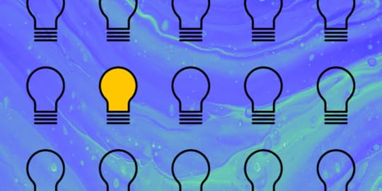
This is a guest post written by Shuffle.dev. Head on to their site to browse through the catalog of categorized UI components and get inspired. Let’s see what they say about eliminating writer’s block.
All of us have experienced designer’s block at some point. It’s not a pleasant place to be in, but don’t worry, you’re not the only one affected by it. Even the most creative designers and the most established people in the industry have been there. And they will most likely find themselves there more than once in the future.
In fact, you could even say that designer’s block is an integral part of the creative process. That’s why you need to approach it with reason. A temporary interruption in the supply of ideas does not mean that you have stopped being creative. It means that your mind is working, but looking for new ideas.
How to Overcome Designer’s Block and Get the Creative Juices GoingThere are a bunch of ways to look for breakthroughs and each one is good as long as it works. However, we don’t all respond to them in the same way, so we have another idea for you to deal with your block.
1. Move Around a BitSounds absurdly simple, but who among us hasn’t forgotten to do this when working long hours at the computer? This is the easiest and most intuitive way to deal with designer’s block. Take a walk, do a series of squats and bends, anything that makes you break out of your environment. Your mind literally works differently when you walk, and we have the research to prove it!
 You don’t have to go to such a creatively stimulating place, but walking is a good idea!
source: https://unsplash.com/photos/JxSLigoB-6A2. Try New Things
Let’s not kid ourselves, not every moment is good for a walk or workout. The next classic way to deal with a designer’s block is to try new things. Try doing your task, but with a different type of tool than the last time you did it.
It might be starting from a different starting point. It might be a new plugin in your favorite editor. You might try assembling a collage of your project from just pre-made elements.
By working in a different way, you will achieve different results. This is another truism that we forget. So really try working in a different way and you’ll be surprised how it changes the end result.
3. Do Things Intentionally WrongWhether you’re at the beginning of a project or in the middle of it, designer’s block usually means you can’t find a good solution. But what if you know what won’t work? Try making a project consisting of solutions that don’t fit.
 source: https://knowyourmeme.com/memes/youre-...
In doing such a project, you may experience a whole series of enlightenments about how it should look. You may also be surprised to find that seemingly bad ideas in the process turn out to be pretty good after a small series of tweaks.
And once you have a version, you can always improve it. Such evolutionary work is often easier than starting with the one and only right idea.
4. Get InspiredYes, I know, you’ve tried. But we have a unique set of inspirations for you. Whether a designer’s block happened at the beginning of a project (which is predictable), or you’ve locked yourself in the middle on a particular element – a catalog of over 3900 components, divided into categories and style libraries will help you to find a new approach.
Don’t have an idea for a footer? Here are 150 different footer examples!
Additionally, if your developer tells you that it can’t be done and something can’t look exactly like that, you have good arguments to convince him that he is wrong. All the examples you’ll find in Shuffle have ready-made code under them, so you can even show him how to do it by showing him Tailwind Components, or in another framework.
A Few Words About Where the Designer’s Block Can Come FromWe can be afraid of specific actions, because we know that if they don’t succeed, some things won’t happen in life. If you don’t like the project, you will have to do it from scratch, which involves additional work time or delaying other projects.
In my experience, it is more common that we are afraid to fail because we can’t handle the unknown. Fear of failure does not mean fear of its consequences, which are tangible. Being late with a deadline is disruptive, but it happens to everyone. Scarier is the sheer uncertainty of what will happen when we fail to get something done.
Read an article on how to deal with fear of failure: “if you are particularly anxious about failing, it’s the uncertainty about whether you will do so that bothers you more than the actual consequences”
For my part, I would say that it’s good to remind yourself that a deadline is just a social construct. Internalizing the idea that “better done than perfect” also helps fight the downtime of working to prove the next project. Every roadblock eventually passes :)
The post Looking for Inspiration: Where to Get Ideas When You’re Experiencing a Designer’s Block appeared first on Studio by UXPin.
February 8, 2022
Join Our Free Webinar “Holistic Design Operations”
 Learn how DesignOps can create a collaborative work environment
Dave Malouf is a household name to every person interested in Design Operations. He co-authored two books on the topic and helped many organizations set up and grow DesignOps teams. We asked him to share his experience with you during an upcoming webinar.
We’re meeting on February 17 to hear Dave’s presentation on Holistic Design Operations, which means transforming design’s role into a unifying force that helps design, dev, and product teams produce great outcomes together. If you feel that you need more unity, understanding, and collaboration in your organization – this talk will give you insights into how to make it happen.
You’d love the webinar no matter if you’re just learning about DesignOps or you’re looking for a ways to optimize it. At the end, we have a Q&A session with Dave where you can ask him questions. If you have any questions now, share them with us over Twitter of Facebook.
Key Takeaways for YouDave will be talking from experience about the various aspects of DesignOps. He will help you understand:
How holistic design raises design’s value. How DesignOps makes design integral part of the organization. How to create your own impact instead of following product teams’ rules.Date: February 17, 2022
Time: 9 AM PST / 6 PM CET
Register for the webinar here .The post Join Our Free Webinar “Holistic Design Operations” appeared first on Studio by UXPin.
February 7, 2022
Best Signup Page Examples That Will Make You Want to Redesign Your Own
Many people underestimate the importance of a signup page and use a generic template to onboard new users. Signup pages are your organization’s first point of contact with a new customer, so designers should focus on the user experience just as carefully as they do with any other user interface.
We’re going to explore some of the internet’s best signup forms and why they matter. We’ll also show you how to build and test your signup forms using our code-based design tool.
Can your image-based design tool capture user inputs and validate that data? The problem with image-based design tools is they lack fidelity and functionality. With UXPin’s code-based prototypes, designers can capture user inputs, validate emails and passwords, create conditional formatting, and more! Sign up for a 14-day free trial and discover the endless possibilities with code-based design from UXPin.
Why Your Signup Page Matters?Signup pages are a way for organizations to attract new leads or sales. It’s usually the first time a potential customer will interact with your brand, so it’s critical that you impress and delight new signups.
Signup forms are probably the least complicated UI element to design but the most challenging to entice people to take action. Designers must understand their target audience and UX psychology to overcome hesitancy and increase conversions.
There are no rules to creating the perfect landing page. A/B testing is crucial for registration form optimization.
Top 10 Signup Page ExamplesHere are 10 excellent signup form examples to inspire your next landing page.
1) GetResponse
GetResponse is an industry-leading email marketing and lead generation software with landing pages, forms, and other tools. You would expect such a company to have an excellent registration page, and they do!
GetResponse ticks all the boxes when it comes to UX design principles; it is consistent, accessible, easy to digest, uses simple language, and provides feedback, to name a few. The page only has three form fields:
Full NameEmailPasswordThink of each form field as another reason why someone won’t sign up for your product or service. By reducing form fields, you increase conversion rates.
GetResponse also highlights its benefits on the signup page, reminding customers why they need this product and the problems it’ll solve.
One feature you won’t often find on a signup page is an accessibility button to change the form’s background color marketing it more accessible for visually impaired users to read. GetResponse must know that their brand’s blue didn’t contrast well for people with visual impairments, so they added an accessibility button to fix it.
2) Flux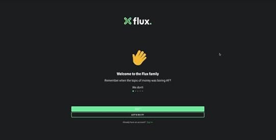
Flux uses a full-screen signup form to onboard new customers. This strategy allows the user to focus on completing a single task without distractions. Even though Flux only requires users to complete three form fields, they break these up into steps, with a separate page for name, email, and password.
Flux also includes a list of requirements below the password field, so users know what length and characters they must use. As they complete each condition, it turns from red to green with a checkmark, so the user knows they have fulfilled it correctly.
3) Leadinfo
The quickest way to get signups is to make it easy, which is precisely what Leadinfo does on its home page signup form. All Leadinfo require to onboard a new customer is an email address. While there is a risk that they might not complete the signup process right away, you have an email address to nurture the lead into a customer.
Leadinfo’s UI design uses typography and color to highlight a problem and how the product can solve it. The clever use of color draws a visitor’s attention to the effortless signup form or the live chat to engage with a sales representative–giving users options and making them feel in control.
4) Cleo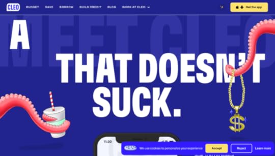
Cleo is an app-based product, so users can only signup via the iOS or Android apps. If a potential customer finds Cleo’s website using a desktop, they need to funnel that customer to download the app.
Cleo makes this easy with a dropdown animation revealing a QR code redirecting users to their preferred app store. They also provide links to Apple’s App Store or Google Play.
While Cleo’s example isn’t a signup page, it’s a great example of creating an immersive, on-brand experience for users to find your product and sign up.
5) Designmodo
Managing users’ expectations and providing context are crucial for good UX design. Designmodo does this well with a three-step signup sequence that displays a progress bar above the form.
Users know what each step requires and approximately how long it will take them to complete the process. Another intelligent strategy about Designmodo’s signup page is to first ask for the user’s email. If the user abandons the signup sequence, they can try to win them back through an email sequence.
6) Salesforce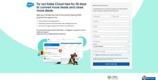
Salesforce is the world’s leading CRM platform with an extensive suite of tools and products. The company requires a lot of information during signup, including company name, email, phone number, to name a few. Still, they offer a 30-day trial in return–with no credit card or obligation.
Salesforce uses compelling copy to highlight the product’s primary benefits and remind customers that they’re getting 30 days free. The CTA button even says START MY FREE TRIAL, so users know there is a reward for completing Salesforce’s lengthy form.
If you’re asking customers for a lot of information during signup, use value to incentivize the process. Most free trials last 7 to 14 days, so by offering 30 days, Salesforce creates a lot of value. They’re also an established brand with a lot of prestige, so customers are more willing to spend time completing Salesforce’s signup form.
7) Typeform
It’s impossible to have an article about signup pages without mentioning the master of the form, Typeform. Typeform’s immersive and intuitive forms make completing signups, or any form, an enjoyable experience.
Typeform only requires two fields to complete its signup sequence; email and password. The company also offers two social media options, Google and Microsoft. As Typeform is a business product, offering corporate-type social signup options makes more sense than Facebook or Twitter.
Typeform also offers users the opportunity to customize their data privacy with three options to opt in or out of specific communications below the newsletter signup. As this would create a busy signup interface, Typeform uses a dropdown menu to hide these until the user clicks “See options.”
8) Transmetrics
Providing social proof and testimonials on your sign up page is a fantastic way to tell people how the product or service benefits customers. Transmetrics uses a quote from a prominent European customer explaining the company’s excellent customer service and understanding of the logistics industry.
Transmetrics also uses simple language and bullet points to highlight the product’s key benefits. Lastly, the call to action button says “REQUEST A DEMO,” telling the customer exactly why they are filling out this form.
9) Glide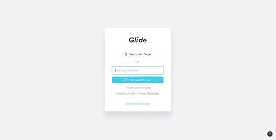
Glide’s email signup form is minimal and effortless. Users can signup using their Google account or email address. The product integrates with Google Sheets, so it makes sense to only offer one social network signup option.
The simple UI design uses a bright blue signup button, immediately drawing users’ attention to the center of the screen. Glide’s signup form can onboard a new customer smoothly and efficiently with two clicks.
10) PayPal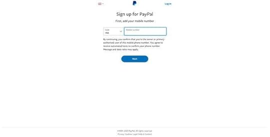
As a financial service, PayPal must collect a lot of personal information during signup. If PayPal had to create a single signup form for its onboarding, it might overwhelm customers, resulting in high dropoffs.
To overcome this problem, PayPal uses a step-by-step process of capturing personal data. The company asks for users’ mobile and email first to follow up if the person drops off.
If you have to collect a lot of information, consider doing it in a step-by-step process and use a progress bar to show customers how many steps they must complete. You should also consider offering the option to save their progress to return later.
Prototyping Signup Pages With UXPinPrototyping forms in traditional vector-based design tools is impossible. These tools don’t offer the functionality to create working inputs users can interact with.
UXPin is a code-based design tool, which means designers can build prototypes that capture and process data like a website or digital product. Designers can create actual signup forms with inputs that check for conditions and provide error messages.
For example, UXPin lets you create email and password validation. If the user forgets the @ or .com in an email input, designers can program an error message for the user to fix the problem. You can also include password conditions, like character count, letters, numbers, and symbols.
Once a user completes signup, you can welcome them with their name on the next page and include their personal information on a profile page. No image-based design tool offers the fidelity or functionality to prototype signup forms like UXPin!
Ready to give signup form prototyping a try? Here’s how in three easy steps:
Sign up for a free UXPin trial.Download our working example of a signup form prototype.Drag and drop the .uxp file into your free UXPin account, and you’re ready to go.Here is a preview of the signup form prototype you can edit and customize in UXPin.
The post Best Signup Page Examples That Will Make You Want to Redesign Your Own appeared first on Studio by UXPin.
February 3, 2022
Customer Journey Mapping Mistakes and How to Avoid Them
One would think that the IT domain is all about numbers, schemes, and prototypes; that functionality means more than empathy when it comes to digital products. In the technological race, where beautiful designs and fancy interfaces rule the day, businesses forget that they create products and services primarily for people. But more and more modern companies are shifting the focus to their audience, trying to align humanity and the development process. That’s how many come to customer journey mapping.
Yet, a seemingly intuitive methodology can be tricky when being put into use. So, if you are going to take this challenge or are curious to learn whether you do everything right, check out the common journey mapping mistakes I listed in this post.
You’re about to read a guest post by UXPressia’s Katerina Kondrenko about the common pitfalls of making a customer journey map.
Why customer journey mappingBefore proceeding to the mistakes part, let’s take a quick look at the customer journey mapping concept. If you are familiar with the concept, just skip this part.
Customer journey mapping is a visualization of how the audience interacts with your product or service. You might ask how this information can be helpful to your business. A customer journey map (CJM) can help you analyze your users’ or customers’ experience, identify flaws in it and opportunities for its improvement, do strategic planning, reshape content marketing, or consider using another template for your online form. And what’s best, these things are merely a fraction of what you can do with customer journey mapping.
There’s another great perk: this methodology helps to engage your team and develop a cross-company understanding of who your customers are and how to approach them. Better cooperation within your team will lead to more efficient work. Nothing but benefits by any stretch.
Common Customer Journey MistakesCustomer journey mapping is like a medicine that you must use properly to achieve the desired effect. And for a project to succeed, it’s not enough to follow best mapping practices. It’s also worth considering the pitfalls that can turn your project into a customer journey mapping failure. Read on to learn the most common of them.
Mistake #1: No goals were setWhat’s wrong: Inexperienced journey mappers are usually tempted to build a CJM just for the sake of building it or want to identify all the flaws in all their customers’ journeys with a single journey map.
Why it’s bad: They say no pain, no gain. I say no clear goal, no result—a doomed initiative instead. Besides, to get approval for the journey mapping initiative, you need to sell this idea to the stakeholders and engage teammates. Without an explicit objective, you won’t be able to do so. And what strategies for CX/UX improvement can you develop, having no idea why you’re building a map?
How to fix it: Every customer journey map starts with research, but even before this part, be sure to answer the following questions:
What and why do you want to analyze? What processes do you aim to enhance?Who should own the initiative?What departments to involve?Are there any specific customer segments to look at?How will your company benefit from customer experience improvement?As a result, you have to set a precise goal. Avoid “all” in the wording, since it means “nothing” and feels like getting on a plane that is going everywhere.
The more explicit goal you set, the more successful your customer journey mapping initiative will be.
Mistake #2: Weak or no researchWhat’s wrong: No CJM can be built in one fell swoop. But sometimes journey mappers decide to play a guessing game. They skip the research part or make it too short, reach out to only a few clients to learn their journey, forget to speak with customer-facing colleagues, use pure assumptions, or worse, read the tea leaves.
Why it’s bad: Almost non-existent research provides non-reliable data, which, in return, covers your customer’s trail and gives you wrong ideas about their journey and how to improve it. Eventually, you put the work in the journey mapping initiative, spend money on your product or service improvements, tire teammates and yourself for nothing.
At the same time, your clients struggle because you mistakenly made things worse at those points of the customer journey that were fine and missed the ones that required attention. And it’s the biggest crime you may commit against your audience because you actually do something but are tilting at windmills.
How to fix it: Take this stage of the CJM initiative very seriously. Unreliable data won’t do any good. After all, customer journey mapping isn’t fiction writing. You have to be hungry for statistics and the fullest feedback from your audience. So:
Conduct interviews;Find and read industry-related researches and whitepapers;Collect customers’ reviews from different platforms and your NPS form; Run polls and surveys;Pay attention to what your customers do;Try to reach out to those people whose journey ended too early.You don’t have to speak with every single customer; keep going until you’re sure that the data you gathered is solid. For instance, identifying behavior patterns that repeat among your clientele is a clear sign of it.
Mistake #3: Wrong perspectiveWhat’s wrong: There are people who build a map, minding their own business. Literally. And stages of their CJM reflect what they think their customers go through. Why bother about customers, right?
Why it’s bad: In short, by approaching customer journey mapping not from a customer’s angle, you try to improve only your own experience and sell your product or service to yourself.
How to fix it: Put yourself in your customer’s shoes. Think like them. A CJM should be built around their journey, thoughts, expectations, goals, channels they use, and steps they take, among other things. You have to check how your service matches the customers’ needs and help them complete their tasks.
 Mistake #4: Poorly developed personas
What’s wrong: They say demographics are key to persona creation. But this is not necessarily the case. Also, some decide that previous experience of personas doesn’t matter. Or they focus only on pains and frustrations, forgetting about goals and motivations.
Why it’s bad: Customer persona represents a particular segment of your clients and allows you to consider many people with similar features as one. Although a persona is an aggregated image of a whole segment of your clients, they need specific characteristics to feel real. Otherwise, you won’t be able to empathize with them. And they, in return, won’t let you try their shoes on.
How to fix it: Take into account different sides of your persona and consider focusing on behavioral traits, as they provide better insight into your customer’s mindset and actions. To dig deeper:
Consider your persona’s expectations;What they want to achieve by using your service or product;What attracts or scares them off;What they say about you and what is left unsaid.Remember that any persona needs personality and the customer profile you will have in the end must feel real, just like a real person.
 A customer persona example built in the UXPressia platformMistake #5: Late start, early stop
What’s wrong: Some journey mappers accept the challenge of building an end-to-end customer journey map. Yet, they ignore all the stages before a customer comes to them and end with the purchasing stage, although there are many further interactions.
Why it’s bad: You consider only the middle part of your customer’s journey, which can be flawless, and you won’t ever understand why your business doesn’t flourish by providing such a great customer experience. Meanwhile, your clients may experience problems when learning about your business or coming back to purchase something again.
How to fix it: Think of all the moments in time when a customer interacts with your product or service. And remember to do it from the customer’s perspective. For you, a customer’s journey begins when they come to you to complete a task or achieve a goal. But their real journey begins earlier: e.g., when they see your online ads. The same goes for the clients who leave you after the purchase. You don’t interact with them directly anymore, but they use your product or share their feedback online and offline. All these interactions are better to be taken into account since each can contain valuable insights.
 Mistake #6: One journey for all personas
What’s wrong: You try to build a single map for all of your customers.
Why it’s bad: Segmentation matters and you create personas not to stir them again. When averaging out your customers’ journeys, you end up with improvement strategies and development plans for no one.
How to fix it: If you have no resources to build separate maps for all personas of yours, choose only the most significant ones and design for them. You can still gather all personas in the same map, turning your CJM into a multipersona customer journey map. Having such a map is useful when you want to compare different personas’ journeys or to analyze interactions between them.
 A multipersona customer journey map example built in the UXPressia platform
Yet don’t forget to consider each persona individually, as every segment of your audience most likely faces different kinds of problems throughout their journeys, and thus requires a unique approach.
Summing upI explored the most common customer journey mistakes that can spoil your mapping initiative and leave you without actionable insights. To avoid them, you have to play by the customer journey mapping rules and remember why you decided to build a CJM in the first place and who you should always aim at during the process. And I think you would agree that the results are worth the effort, as a customer journey map done right helps enhance customer experience and develop any product or service in the best possible direction.
The post Customer Journey Mapping Mistakes and How to Avoid Them appeared first on Studio by UXPin.
February 2, 2022
What is Business Design?
 Table of contentsWhat is Business Design?The Importance of Business DesignHow do you Prototype and Test a Business Model?Final Thoughts about Business DesignImproving Design Thinking With UXPin
When combined with financial modeling, competitor analysis, and other initiatives, business design can strengthen a business plan by testing concepts and reducing risk. Researchers can use business design to test ideas, find a market, and identify a unique value proposition.
Organizations like Spotify, Netflix, and others have recognized the value of design thinking and how innovators can use this methodology to identify, test, and launch new businesses.
Got a business idea for a digital product or service? Design, prototype, test, and iterate with the world’s most advanced code-based design tool. Create high-fidelity, fully functioning prototypes to test design ideas with real users or pitch your minimum viable product to stakeholders and investors. Sign up for a free trial and start designing with UXPin today!
What is Business Design?Business design is a business analysis process that utilizes IDEO’s design thinking techniques to research, test, and prototype business models. Researchers apply a human-centered methodology to align human needs with a profitable business model.
When companies apply the three tenets of design thinking, they can test business ideas and find a USP:
Desirability: Research consumer pain points to find business opportunities. Identify a new product or service that people want. What is the USP, and what will give you a competitive advantage?Viability: Develop and test revenue models, determine what customers are willing to pay, and whether or not the business can generate a profit. When can investors expect an ROI? What are the societal and environmental impacts of the business model?Feasibility: What capital and resources will founders need to start the new business? How long will it take to set up the business? Can the business leverage the founder’s skills to minimize hiring talent?Business design thinking aims to reduce risk by testing ideas before committing capital and resources. Startups can also use business design to acquire seed investments by pitching a proven innovative, tested business model.
What is the Difference Between Design Thinking & Business Design?Design thinking focuses on building products and features for specific end users. It identifies pain points and finds solutions through designing, prototyping, and testing. UX designers iterate over ideas until they find a design that solves the user’s problem that aligns with business goals.
Business design uses a similar methodology but seeks to uncover innovative ideas and competitive advantages entrepreneurs can use to build a sustainable business.
Another significant difference between design thinking and business design is that the former doesn’t always innovate. UX designers often use UX patterns and layouts based on industry and design standards. On the other hand, business design must be innovative to find gaps in the market or create new industries.
There is also a difference in how business designers and UX designers frame questions to participants. UX designers ask, “can you use this product?” while business designers ask, “will you use this product?”
The UX designer’s priority is usability, while the business designer looks for desirability.
The Importance of Business Design
Entrepreneurship is about taking risks. Every successful business leader has experienced failure at some point. We look at entrepreneurs like Elon Musk, Jeff Bezos, Richard Branson, and Sara Blakeley and only see success rather than the many iterations of failure it took to get there.
Traditional business analysis frameworks don’t do enough to test ideas. Founders make decisions on gut feelings rather than data and proven prototypes. Other factors like ego, location, timing, market demand, technology, legislation, and politics can end a fledgling startup as quickly as it launched.
Business design allows entrepreneurs to mitigate risks through thorough research, testing, and prototyping ideas to expose cracks, find innovative solutions, and iterate until you arrive at a sustainable business model with a robust competitive advantage.
How do you Prototype and Test a Business Model?Prototyping a business is similar to product prototyping. Business designers must identify a gap in the market and create an environment to test ideas. Instead of testing for usability issues like a UX designer does during design thinking, business designers prototype for innovation and desirability.
The strategy is to build a prototype based on market research, present it to potential customers, get feedback, and iterate. Once a business designer has a desirable product design, they can begin testing the concept’s viability and feasibility.
It’s an iterative process where business designers return to prototyping whenever they expose viability and feasibility issues. But, the end result is a thoroughly tested business model that’s ready to go from concept to startup.
Here are a couple of ways business designers can use prototypes to test business models and find innovation.
Building a Minimum Viable Product (MVP)An MVP is one of the best ways to prototype a business idea and see how it performs in the real world. Fabricating a physical product is challenging if you don’t have the skills or equipment. In contrast, digital product prototyping is far more accessible–even if you don’t have any design skills.
There are many no-code, low-code tools business designers can use to build minimum viable products. UXPin has several built-in design libraries, including Material Design UI and Bootstrap, that designers can use to build prototypes.
A good MVP solves one core issue. If you were rebuilding a complex platform like Amazon, you start by selling a single product – which is actually how Jeff Bezos founded the company by selling books.
The next challenge is to find willing participants that accurately represent your target market. If you were Jeff Bezos in 1995, you would probably contact book clubs and ask to attend their next meeting to showcase and test your product. Maybe even offer them a free book for their time, collecting their contact details for future marketing efforts.
Building a Landing PageAnother way to prototype a business model is by creating a landing page that describes the product with a simple email form, so people can signup to show their interest. You could even follow up with a survey asking what they liked most about the product and what they’d expect to pay.
You would need some capital to run Google/Facebook ads to your landing page, but you would build an email list and gain valuable user insights using tools like Google Analytics, Crazy Egg, or Hotjar.
You could also use platforms like Kickstarter or Indiegogo to pitch your product idea and see if people are willing to give you their hard-earned cash to see the business come to life.
Face-to-Face PrototypingFace-to-face prototyping requires business designers to go out in public and engage with potential customers. The goal is to find a location frequented by your target market, like a mall, school campus, office park, farmers market, conference, or exhibition.
You can present a product/service idea or have an MVP for users to interact with. Engaging with people face-to-face will allow you to experience their reaction to the product and ask questions, like:
What would you expect to pay?Would you buy it today if it was available right now at that price?How would you use this product?How would you benefit from this product?Business designers can answer a lot of desirability, feasibility, and viability questions simply by going out and engaging with the people they seek to serve with their product offerings.
Final Thoughts about Business Design
Business design is not a replacement for traditional analysis; it’s a process to test and strengthen a business model or idea using design thinking methodology.
Entrepreneurs and business leaders recognize that every pain point is a potential business idea. Instead of testing for usability, business designers prioritize desirability.
How Design Thinking Adds Value to the OrganizationDesign Leaders can use business design and design thinking to prove the department’s value to the rest of the organization.
Instead of waiting to design the product, designers can use design thinking to identify business opportunities and develop a human-centric business strategy that creates value for the organization and its customers.
How Netflix & Spotify Use Design Thinking to ScaleNetflix built its initial business on design thinking and has used a business design process to create new content, design its UI, and introduce features that serve customers while generating significant business value.
Spotify uses “service design” to empathize and understand its global customer base to improve product experiences, design new revenue models, and scale the business.
When designers evangelize design thinking, stakeholders develop a better understanding of UX’s value and the importance of a user-centered mindset.
Improving Design Thinking With UXPinUXPin is an end-to-end design tool with the features to go from idea to high-fidelity prototype fast! Designers can use built-in design libraries to build advanced prototypes with code-like performance, including:
States : Apply multiple states to a single element or component, each with different properties, interactions, and animations. Interactions : Create complex interactions with advanced animations and conditional formatting. Variables : Capture and store user inputs and use that information to take actions or personalize a user experience. Expressions : Create fully functioning forms, validate passwords, update shopping carts, and more with Javascript-like functions.Design teams can run prototypes in the browser or sync to UXPin Mirror (iOS & Android) for mobile applications. Test your prototypes with potential end-users or send them to stakeholders for feedback.
Ready to start designing your big business idea? Sign up for a free trial to design, prototype, test, and launch your product with UXPin.
The post What is Business Design? appeared first on Studio by UXPin.
February 1, 2022
How to Use Enterprise Design Thinking to Scale Design?
Enterprise design thinking was invented by IBM to compensate for the disconnect that enterprises often experience between teams, stakeholders, and end-users. It takes IDEO’s traditional design thinking methodology and changes it in a way to tackle the unique challenges of enterprise-level projects. IBM’s Enterprise design thinking methodology has one major benefit. It prioritizes human connections throughout the entire process. In the end, designers get unique user insights that they cannot get from the traditional empathizing methodology.
Table of contentsWhat is Enterprise Design Thinking?Framework Principles for Enterprise Design ThinkingThe Loop of Thinking and InnovationTeam AlignmentHow Can Enterprise Design Thinking Help Organizations?Focused on User Outcomes With a Real-World Problem to SolveEncourages Collaboration With Stakeholders and TeamsImproves Empathy With RealityIBM vs. IDEO Design Thinking MethodologyHow to Apply Enterprise Design Thinking and Scale DesignHow PayPal Scaled Design Using UXPin MergeSummaryOne of the biggest challenges for large organizations is maintaining a human connection and relationship with their customers. Many companies make the mistake of investing heavily in technology and innovation without stopping to ask, “Does this solve a human problem?” or, “Is this product/feature desirable? Will people want it?”
When organizations lose touch with their customers, they prioritize innovation that fails to meet desirability–a core principle of design thinking.
Apple learned this the hard way with the Apple Newton, a personal assistant device (PDA) the tech giant launched and discontinued in the 90s. Although the PDA was incredibly innovative for its time, it was too expensive, didn’t perform well, and customers saw no purpose for a bulky handheld device four times the size of today’s iPhone 13.
There are many examples of corporations that failed to apply proper research and design thinking to prototype and test products effectively. Enterprise design thinking aims to solve this disconnect by developing a human-centered mindset that extends beyond the UX department so that teams can empathize with customers to solve real-world problems.
One way to improve inter-departmental collaboration and usability testing is by adopting the right design tool. UXPin is a code-based design tool built to enhance communication and collaboration between departments and stakeholders so organizations can design, test, and iterate faster. Sign up for a free trial and start designing better user experiences for your customers with UXPin.
What is Enterprise Design Thinking?Enterprise design thinking is a framework that re-envisions the traditional design thinking model more relevant to modern enterprises. Developed by IBM, “Enterprise Design Thinking is a human-centered framework to solve our users’ problems at the speed and scale of the modern enterprise.”
Framework Principles for Enterprise Design ThinkingIBM uses three core principles to guide its Enterprise Design Thinking framework:
Focus on user outcomes: Drive business by helping users achieve their goals.Relentless reinvention: Stay essential by treating everything as a prototype.Diverse Empowerment Teams: Move faster by empowering diverse teams to act.The Loop of Thinking and InnovationEnterprise Design Thinking replaces the five stages of the design thinking process (empathize, define, ideate, prototype, test) with an iterative loop for designing and prototyping:
Observe: Immerse yourself in the real worldReflect: Come together and look withinMake: Give concrete form to abstract ideasTeam AlignmentLastly, Enterprise Design Thinking uses a scalable framework to align teams towards a common human-centered purpose:
Hills: Align teams on meaningful user outcomes to achievePlaybacks: Stay aligned by regularly exchanging feedbackSponsor Users: Invite expert users into the work to stay true to real-world needs.How Can Enterprise Design Thinking Help Organizations?At its core, Enterprise Design Thinking aims to solve two significant corporate challenges:
Inviting customers into the design process to ensure ideas and innovation stay relevant to solving real-world problems.Breaking down silos between teams, departments, and stakeholders by making collaboration part of the design thinking process.Focused on User Outcomes With a Real-World Problem to SolveThe Keys of Enterprise Design Thinking focus heavily on user outcomes and solving problems with diverse teams. It starts with a Hill–a technique similar to a problem statement for empathizing with users to create a meaningful outcome or goal for teams to focus on.
Teams use three elements to create a Hill statement:
Who: The user persona. Who are you are designing for? The Who must be as specific as possible to create a human connection.What: What are you trying to solve? The user’s need becomes the project’s goal.Wow: Your unique selling point. How is your product different from the competition?As long as the Hill includes these three elements, it doesn’t matter what order they’re in.
Using an example from IBM: “It should take no more than 30 minutes (Wow) for a developer (Who) to build and run an app using IBM and 3rd party APIs (What).”
With a Hill defined, teams have a clear objective to accomplish. This statement prioritizes a human problem over designing features or technological innovation. Instead, solving the problem becomes innovation.
Encourages Collaboration With Stakeholders and TeamsTraditional design thinking doesn’t consider collaboration and stakeholder involvement as a priority. In IBM’s Enterprise Design Thinking, Playbacks bring stakeholders into The Loop to align the organization’s goals with user goals.
In large organizations, it’s not uncommon for stakeholders and project teams to be misaligned, causing friction and frustration. Project teams think that stakeholders are out of touch, while stakeholders worry that the project is heading off-course or doesn’t align with the organization’s goals.
Playbacks encourage stakeholders to meet with team members regularly, share stories about the bigger picture, and exchange project feedback. The goal is to break down disruptive silos and eliminate the “us vs. them” (between teams, departments, and stakeholders) mentality many enterprises experience.
Improves Empathy With RealityEnterprise design often involves designing products for highly skilled professionals or large organizations, like space agencies, medical institutions, government entities, large-scale production, and other industries.
It’s nearly impossible for designers to empathize with these users because they have no context or real-world experience of these complex work conditions, resulting in design solutions that make no sense to the end-users.
Enterprise Design Thinking adds Sponsor Users (industry experts) into the design loop, so designers go beyond empathizing and learn from real-world users with domain expertise. The goal is to find an expert who has a vested interest in the product succeeding. You also want someone who can be there throughout the design process, from concept to final product.
IBM vs. IDEO Design Thinking MethodologyAlthough there is nothing intrinsically wrong with IDEO’s design thinking, IBM needed a methodology that addressed unique enterprise challenges:
Breaking down silos with diverse team collaborationInvolving stakeholders in the design processAdding domain experts to help develop design solutionsManaging with the scale and obscure challenges of enterprise-level projectsHow to Apply Enterprise Design Thinking and Scale Design
In the free eBook Scaling Design Thinking in the Enterprise, author Julie Baher, Senior UX Director at Illumina, outlines a three-step process. While Julie’s process differs slightly from IBM’s approach, the underlying concept is the same–breaking down silos and including stakeholders in the design thinking process.
Step One–Recruit Your Core Supporters: Engage with stakeholders to educate them about design thinking to understand UX workflows and get buy-in.Step Two–Converting the Organization: Use formal and informal events to scale design thinking across the organization.Step 3–Following Through With Lean Startup: Using goals defined during design thinking exercises, start the iterative process of prototyping and testing.Our free 55-page eBook dives deeper into these three topics to help you develop a framework to scale design thinking within your organization. Download your free copy of Scaling Design Thinking in the Enterprise.
How PayPal Scaled Design Using UXPin MergeWith only three designers to over a thousand developers and more than 100 products, PayPal’s Erica Rider, UX design lead for developer tools, had a serious challenge–how could she scale design without scaling the design team?
PayPal’s also had four major issues affecting the design process:
Inconsistent UI and design system usageDepartmental silos that prevent rapid prototypingPoor communication between departments–particularly UX, product, and engineersLittle input and feedback from stakeholders during the design processAfter testing several ideas using image-based design tools, Erica discovered UXPin Merge–a code-based design tool that syncs code components from a repository to UXPin’s design editor.
Product designers (without little knowledge of UX or how to use design tools) drag and drop these code components to build high-fidelity prototypes that look and function like the final product.
Better still, PayPal’s “novice” product designers built these fully functioning prototypes eight times faster than experienced UX designers using image-based design tools.
PayPal also achieved other benefits from UXPin Merge that align with Enterprise Design Thinking methodology:
Better collaboration and communication between UX, product, and development teams.More involvement from stakeholders who interact with fully functioning prototypes and provide feedback on UIs using UXPin’s Comments.Faster time-to-market with less coding to develop the final product.A single source of truth with design teams and developers using the same design system components hosted in a company repo.Meaningful feedback from usability participants because they can interact with fully functioning prototypes.Learn how PayPal used UXPin Merge as the catalyst for a rapid development process to scale products for one of the world’s biggest FinTech organizations.
SummaryEnterprise design thinking adapts IDEO’s traditional design thinking methodology to cater to the unique challenges of enterprise-level projects.
To compensate for the disconnect enterprises often experience between teams, stakeholders, and customers, IBM’s Enterprise Design Thinking methodology prioritizes people and human connections throughout the process.
The result is an end-to-end design thinking process that encourages stakeholders to engage with teams and share stories that give team members a sense of purpose while aligning projects with business goals. By including domain experts, designers get unique user insights that they cannot get from the traditional empathizing methodology.
To get enterprise-level results, you need a design tool that provides enterprise-level solutions for collaboration, speed, and scale. As we saw with PayPal, UXPin Merge successfully bridges the gap between design and development while bringing stakeholders into the design process.
With UXPin Merge’s fully functioning prototypes, designers can follow IBM’s Enterprise Design Thinking Loop of observing, reflecting, and making to iterate solutions and design better customer experiences.
Learn more about UXPin Merge, the front-end frameworks we support, and how you can sign up to request access and join the code-based design revolution.
The post How to Use Enterprise Design Thinking to Scale Design? appeared first on Studio by UXPin.
January 31, 2022
What is Stakeholder Analysis and How Product Teams Should Do It?
 Table of contentsWhat is Stakeholder Analysis?How to do Stakeholder AnalysisImproving Stakeholder Engagement With UXPin
Design projects often come with many stakeholders, each with different interests, priorities, and goals. A stakeholder analysis can help you understand each individual and their potential impact on UX and the project.
Why is understanding stakeholders important?
Not everyone understands the workflows, challenges, and complexities of user experience. UX leaders and professionals must get buy-in from stakeholders for their vision and major design decisions. When you understand the key stakeholders, you can ensure your vision aligns with their expectations.
Even though this article looks at a stakeholder analysis through the UX lens, you can apply these strategies and principles to any business or project.
Designers often have to present ideas and concepts at every stage of the design process. UXPin is an end-to-end design tool that allows UX teams to share concepts and ideas and get feedback from stakeholders using Comments. See how effective collaboration can enhance design projects. Sign up for a free trial.
What is Stakeholder Analysis?A stakeholder analysis is a process of identifying the people who have a vested interest or power to influence a project. The goal is to identify each individual to assess:
Each stakeholder’s role and authority.Their level of influence.Their priorities and expectations.What about the project matters most to them.How each stakeholder might influence the project and UX matters.Understanding each stakeholder will also help you engage and communicate with them better, thus ensuring smoother collaboration.
What is the Purpose of Stakeholder Analysis?Projects often have many stakeholders, each with their own opinions and agendas. Some of these people have authority over you and the project, while others don’t – but they might attempt to influence your department or decisions.
You also need to understand stakeholder relationships. Someone might not have influence over you, or the project, but they work closely with someone who does. Understanding these relationships and dynamics can help you strategize accordingly.
For example, a finance stakeholder might not directly influence a project’s direction, but your C-level stakeholders listen to their advice for business purposes.
Lastly, a stakeholder analysis will allow you to know what information matters most to each individual and prioritize your feedback – essentially you want to speak the same language. For example, a design lead is most interested in design-related matters rather than a lengthy breakdown of budgets and expenses.
Benefits of a Stakeholder AnalysisIt puts the project management hierarchy into perspective.Identifies stakeholders needs and interests.Reduces the risk of conflict and misunderstandings.Allows you to understand how to influence stakeholders.Recognizes who could potentially cause problems for the project.Segments different types of stakeholders into categories for feedback and reporting (a communication plan.)How Often Should You Conduct a Stakeholder Analysis?A stakeholder analysis is a working document that you start at the beginning of every project and update periodically. People tend to move in and out of the company and projects, which means you’ll have to analyze newcomers and re-analyze others.
It’s beneficial to keep track of people’s movements and update your stakeholder analysis as soon as you hear of any changes. You may also consider setting periodic assessments of your analysis to check that your information is still relevant and up to date.
How to do Stakeholder AnalysisStep 1: Identify StakeholdersThe first step is to identify the project’s potential stakeholders. Use a spreadsheet to list each person and consider adding the following columns:
Full nameTheir position in the organizationTheir role on the product or projectEmailContact numberTheir requirements or expectations relating to the projectTheir requirements or expectations relating to your workWhat impact or influence do they have over the projectCategorization (based on mapping in step two)It’s crucial that you complete all of these fields (except categorization) before moving to step two. Completing this first step will determine how you conduct the rest of the stakeholder analysis.
Step 2: Stakeholder MappingCategorizing stakeholders is another critical part of a stakeholder analysis. Categorization will identify the key players and stakeholder interests.
There are two popular methods for categorizing or mapping stakeholders:
Power-interest matrixSalience modelPower-Interest Matrix
A power-interest matrix is the most common stakeholder mapping methodology. Using four quadrants with power on one axis and interest on the other allows you to map stakeholders into a power-interest grid of four quadrants (categories) of importance:
Manage closely (top right)–high interest, high power: These important stakeholders have high authority and are highly vested in the project. You should engage with these people, listen to what they have to say, and make every effort to satisfy their needs and requests.Keep satisfied (top left)–high influence, low interest: These stakeholders aren’t directly interested in the project but have the authority to influence decisions and outcomes. They’ll usually only get involved in the project if it impacts their work. Your job is to keep these people happy with periodic updates and ensure your project doesn’t infringe on their other work and initiatives.Keep informed (bottom right)–high interest, low power: These stakeholders might not have much power over decisions and directions, but they’re interested in the project and its outcome. Make sure you copy these stakeholders on important correspondence, invite them to design debriefs, and share finished design elements like mockups and prototypes for feedback.Monitor (bottom left)–low interest, low power: These stakeholders have little interest and power in your project, so it’s not worth spending too much time engaging with these people. Circumstances could change, and they could move into another quadrant, so it’s essential to monitor these stakeholders.Salience ModelThe salience model is a Venn diagram with three dimensions and eight categories. The four overlapping categories of the Venn diagram are the stakeholders you need to pay most attention to–like the top two quadrants of the power-interest matrix.
The three dimensions of the Venn diagram include:
Legitimacy: The stakeholder’s appropriate involvement in the projectPower: Works similar to the power-interest matrix in assigning a level of authorityUrgency: How quickly you should respond to this stakeholder’s needs and requestsThese three dimensions come together to create eight categories of importance:
Discretionary stakeholders: These stakeholders have legitimate claims, but they don’t have much power or urgency.Dormant stakeholders: These stakeholders have a lot of power but little legitimacy or urgency. Similar to the people in quadrant two of the power-interest matrix.Demanding stakeholders: These stakeholders tend to make a lot of demands (urgency) but don’t have much power or legitimacy.Dominant stakeholders: These stakeholders have high power and legitimacy but mostly little urgency. They’ll usually let you know when something is important to them, in which case you must prioritize their request as urgent.Dangerous stakeholders: These stakeholders have power and urgency, but they have low legitimacy over the project.Dependent stakeholders: These stakeholders have high urgency and legitimacy but little power in the project.Definitive stakeholders: These stakeholders sit in the middle of the Venn diagram with the highest levels of legitimacy, power, and urgency-similar to the “manage-closely” stakeholders in the power-interest matrix. You should engage with these people, listen to what they have to say, and make every effort to satisfy their needs and requests.Non-stakeholders: These non-stakeholders sit outside of the Venn diagram. They have no legitimacy, power, or urgency but might be interested in the project’s outcome.Step 3: Prioritize StakeholdersOnce you have completed step two, you can prioritize each stakeholder and assign them a categorization (as per step one). Your prioritization will vary depending on which stakeholder mapping method you use in step two.
You might also create three stakeholder groups:
Key stakeholders: Individuals with the most power and influencePrimary stakeholders: The individuals most affected by the project or stand to benefit directlySecondary stakeholders: People who are indirectly affected by the project–like customers or minority shareholdersStep 4: Interview Stakeholders to Learn Their Needs and AttitudeNext, according to step three, you want to interview each stakeholder in order of their importance. Touching base with stakeholders in a face-to-face meeting or video call is an opportunity to hear individuals articulate their needs and expectations. You also want to understand how, what, and when they want feedback and reports.
Step 5: Organize and Share Your DataOnce you complete your stakeholder analysis, you’ll want to put this data into a spreadsheet or document to share with your team. Recording and sharing your stakeholder analysis with the team ensures a coherent and consistent communication strategy.
It also helps if a team member needs to take the reins when you’re absent or leave the project/organization.
Improving Stakeholder Engagement With UXPinOne of the most effective ways to get stakeholder buy-in and meaningful feedback during the design process is by sharing high-fidelity mockups and prototypes.
Traditional image-based design tools often confuse stakeholders because they can’t interact with certain features, use forms, or complete user flows. With UXPin’s code-based design tool, designers can build fully functioning prototypes that look and work like the final product.
Stakeholders can access a UXPin prototype to view in their own time, and a comment feature allows designers and stakeholders to give and share feedback.
“Our stakeholders are able to provide feedback pretty quickly using UXPin. We can send them a link to play with the prototype in their own time and UXPin allows them to provide comments directly on the prototypes. UXPin’s comments functionality is great because we can follow along and mark comments as resolved once we address them.” Erica Rider, Senior Manager for UX – Developer tools and platform experience at PayPal.
UXPin’s high-fidelity prototypes don’t only influence stakeholders! The code-based prototypes also result in better testing and meaningful feedback from usability participants.
Why not try UXPin for yourself! Sign up for a free trial to explore UXPin’s powerful design and prototyping features to enhance your digital product’s customer experience.
The post What is Stakeholder Analysis and How Product Teams Should Do It? appeared first on Studio by UXPin.
UXpin's Blog

- UXpin's profile
- 68 followers

