
UXpin's Blog, page 65
March 3, 2022
How to Get Non-Designers to Use and Support the Design System?

Getting stakeholder and organizational support is crucial for ongoing investment and the future success of your design system. The DS team must prove that employees use the design system and that it delivers a positive return on investment.
In our January 2022 webinar, Defending Your Design System, Carola Cassaro talked about the challenges DS teams face, “We’re all dedicated to designing products that change people’s lives, but we don’t always have the right framework and vocabulary to communicate that impact, especially in the design system space.”
And if you want to learn more about building a case for design, join our Design Value Conference. A 1-day event with top industry leaders from the companies like Uber Eats, PayPal, and more, dedicated to learning how to boost design’s impact in the organization. Sign up for free here.
https://t.co/1Ta0EPN5HX 🥳Join our virtual conference & get powerful lessons on maximizing design's impact from top DesignOps leaders at 💥 Uber Eats, 💥 PayPal,💥 SiriusXM, and more! Sign up now! pic.twitter.com/MsN14CJHPi
— UXPin (@uxpin) March 1, 2022
Many designers have a tough time explaining why they need resources to evolve and scale a design system. Tracking the design system’s impact and identifying successes and opportunities can help DS teams get buy-in to improve and scale.
Start from scratch, scale, and mature your design system with UXPin. Sign up for a free trial and discover how code-based design can revolutionize your end-to-end design and development workflows.
Why do You Need Support from Non-Designers?Design systems require time and resources to maintain and scale. The DS team must prove the design system’s value to acquire those resources.
Demonstrating the design system’s value means team members must adopt it. So, the DS also needs to engage with teams across the organization to encourage usage and gather feedback for improvements.
Getting people to contribute to the design system gives them ownership, resulting in wider use, thus building your case for more resources and support.
How to Encourage Adoption of Your Design SystemMany organizations use internal workshops and training sessions to demonstrate the design system, why it was created, how to use it, best practices, and other relevant information.
Invite representatives from all departments so you can generate organization-wide excitement and buy-in. These workshops are also a fantastic opportunity to invite teams outside of design and development to share feedback and ideas. Remember, contribution = ownership = adoption.
Don’t only use workshops to encourage feedback. Set up communication channels (Slack, Asana, Jira, etc.) for teams to submit feedback and ideas.
Once teams start adopting and evangelizing your design system, it’s time to start measuring its impact across the organization.
Getting Support for Design Systems: Three Areas of Focus
The design system team must look at three areas to determine its impact on the product and organization:
Teams: How does the design system improve workflows?Products: What is the design system’s impact on products and business value?End-users: How does the design system impact usability?Let’s look at these three areas in more detail.
TeamsThere are three primary metrics you can use to evaluate a design system’s impact on teams:
Design system adoptionSaved resourcesTime to marketYou can evaluate a design system’s adoption by checking for elements present in repositories and determining the active use percentage–a strategy used by UK Gov Design outlined at GOVDESIGN 2020.
By regularly collecting and plotting this data, you can demonstrate the design system’s adoption over time. You can also plot uptake post workshops to determine their success.
It’s important to measure time on task and other performance metrics before implementing a design system to get a baseline. And then use this baseline to measure the design system’s impact.
PayPal conducted similar tests when switching from image-based design tools to UXPin Merge. Building a single-page prototype using an image-based tool took over an hour vs. eight minutes with Merge–demonstrating an 8X increase in speed resulting in cost and time savings.
Time-to-market is critical for products to compete and stay within budgets. Reducing time-to-market demonstrates to stakeholders that investing and optimizing your design system can provide a competitive edge with fewer resources.
ProductsNext, you want to identify design system wins in product performance. Again, we’ll look at three key metrics:
Component coverageStabilityBrand value alignmentDS teams can test which components are used in products and which are not. These metrics determine the design system’s coverage and relevance across products.
Product stability impacts the entire organization, including the brand itself. DS teams can measure the number and severity of product defects before and after design system implementation to demonstrate how it reduces errors.
Measuring brand affinity is challenging, but in Defending Your Design System, Carola talks about how eBay tested brand alignment by asking customers to rate several brand attributes for page designs pre and post design system. eBay found that design system pages scored higher for overall brand affinity.
End-UsersLastly, and most importantly, how does your design system impact customers and user experience? Here are three examples of end-user metrics relating to your design system:
PerformanceUsabilityCustomer satisfactionLoad time is an excellent way to measure a product’s performance, a vital metric for customer satisfaction and user experience. Design system components are optimized for performance and reduce bloat, so you should notice faster load times after implementation.
DS teams can use time-on-task, conversion rates, and other task-related activities to test the design system’s impact on usability and accessibility. IBM tested user task completion rates before and after design system adoption and discovered a three-fold increase.
DS teams can use surveys, product reviews, interviews, and other customer feedback to create a trend for before vs. after the design system’s adoption. They can also use these metrics to measure the success of usability and accessibility releases to demonstrate how a design system fixes usability issues and increases customer satisfaction over time.
Pitching a Design System to Stakeholders
In our free download, Evangelizing a Design System, we share a proven template for getting executive and stakeholder buy-in. Here is a three-step process to evangelize your design system:
Collect data to validate the design system’s impactIdentify wins and create a compelling storyProject what the company stands to gainStep 1 – Collect DataCollect data as outlined in the Three Areas of Focus above. If you’re unsure where to start, find resources and use cases from successful design systems relevant to your product and company.
Also, check out these resources from our blog for guidance and direction:
Evangelizing a Design SystemOn Design Systems: An Interview with Dan Mall of SuperfriendlyCollecting and analyzing data can be lengthy and time-consuming, but it’s a crucial part of building your design system success narrative.
Step 2 – Identify Wins and Create a Compelling StoryIn our free download, Evangelizing a Design System, we share a 40+ slide template that’s ready for you to present to stakeholders and executives.
We include actual data from successes at Dropbox, IBM, LinkedIn, Atlassian, and others to strengthen your case and demonstrate what the future holds for your organization.
Highlight your wins in the presentation and use storytelling to explain how you used objective testing to arrive at your final results.
Step 3 – Project What the Company Stands to GainTo acquire investment, you must demonstrate what the company will gain from allocating resources to scale the design system, that is finding the return on investment (ROI). Combine future projections with case studies from other successful design systems to show the possible return on investment.
Investing in the Right Design System ToolsInvesting in the right tools can improve many of the metrics outlined in the Three Areas of Focus above. UXPin Merge is a code-based design tool that allows you to sync a design system hosted in a repository to UXPin’s editor so designers can build prototypes using fully functional code components.
This single source of truth increases adoption and collaboration between departments, even among non-designers, as was the case with PayPal. PayPal also noticed a significant reduction in time-to-market and higher quality feedback from stakeholders who were able to interact with Merge prototypes better than previous image-based design tools.
With a single source of truth, companies also achieve higher rates of consistency and cohesion between design and development. Design handoffs are much smoother because designers use production-ready components to build prototypes, making it easy for engineers to copy/paste and begin development.
When the DS team changes the design system or introduces new patterns and components to the repository, UXPin automatically updates the editor and notifies team members of the latest release.
Sign up for a free trial to take your design system and workflows to the next level with code-based design from UXPin Merge.
Remember to join Design Value Conference that’s happening on March 29, 2022. Learn about scaling design, empowering designers to do a great work, and advocating the power of design within the org! Sign up for free here.
The post How to Get Non-Designers to Use and Support the Design System? appeared first on Studio by UXPin.


March 2, 2022
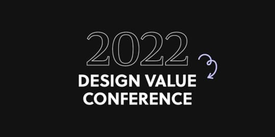
Join “Design Value Conference” & Learn from PayPal, SiriusXM, Uber Eats’ Leaders
Design is much more than creating the look and feel of a product, isn’t it? It has a real impact on the people, processes, and business. We gathered top specialists who have influenced the way things are run in their companies to tell you their stories. It’s all for free!
Sign up and join us March 29th, 2022 to hear what you can do to improve strategic planning, scale and build design teams, and create efficiencies at work.
Let’s Introduce You to Speakers at Design Value Conference 2022!Although the conference is only a one-day long, we invited a quite exciting group of design industry specialists that work on making design more efficient and impactful practice! The speakers include:
Maggie Dieringer , Design Operations Lead at Uber Eats, who helped grow the Design Program Management function at Uber from the ground up, Erica Rider , Sr Manager UX at PayPal, who will talk about how she, together with her team, pioneered the next generation of DesignOps, Salomé Mortazavi , Director of DesignOps at SiriusXM, who will give an overview of how she uses the Design Maturity Index to create business impact, Omkar Chandgadkar , UX Design and Research Lead, who will share how he is reframing UX design as a “product offering” instead of a “process”.Sign up for the Design Value Conference 2022.
What Will You Learn About?how to be a more strategic leader instead of a tactical onehow to elevate design impact on the businesshow to scale design in terms of people and processeshttps://t.co/CjYY3lBijK 🔥 What kind of value can you get from DesignOps? Join our Design Value Conference and hear how top leaders raise design impact in their organizations. Sign up now! pic.twitter.com/ryKcNbyg5r
— UXPin (@uxpin) February 26, 2022
Date: March 29, 2022
Time: 8 AM PST / 5 PM CET
See the list of topic and register here: Design Value Conference 2022.
The post Join “Design Value Conference” & Learn from PayPal, SiriusXM, Uber Eats’ Leaders appeared first on Studio by UXPin.
March 1, 2022
19 Best Practices for Faster UI Mockups

Creating UI mockups is an essential part of the design process. Designers must take basic low-fidelity wireframes and bring them to life before moving on to high-fidelity prototyping and user testing.
This article explores the best practices designers to improve workflows and design better UI mockups. We’ll also recommend some helpful tools to help with guidance and inspiration.
Table of contentsWhat are UI Mockups?1) Sketch Your Ideas First2) Start with Mobile Screens3) Use Wireframing & Prototyping Tools Compatible With Your Mockup Tool4) Review Other Visual Successes5) Remove Unnecessary Elements6) Implement a Grid System7) Take Advantage of Free UI Elements and Icons8) UI Patterns to Improve User Experience9) Use Vectors10) Web-safe Typography11) Color Tools Save Time12) Create Reusable Components13) Use Auto-Layout14) Proper Naming of Files and Layers15) Version Control16) Make Files and Assets Accessible17) Preview on Live Devices18) Test, Test, and Then Test Again19) Elicit the Right FeedbackStart Creating Great Mockups!With built-in icon sets and design libraries, UXPin allows UX designers to quickly build wireframes, mockups, and interactive prototypes. Sign up for a 14-day free trial to experience the versatility, flexibility, and speed of code-based design with UXPin.
What are UI Mockups?
A UI mockup is an accurate visual representation of a final product’s screen. UI mockups are visual elements only; they have no functionality, and nothing is clickable. They’re just static mockups. UI designers use color, typography, assets, and actual content to create a final product or website mockup.
The List of 19 Best practices for UI Mockups1) Sketch Your Ideas FirstSketching is quick, easy, and risk-free.
Before diving into pixels and grid dimensions, sketch your thoughts to develop the first draft and organize your ideas on the page. Spend time brainstorming and experimenting with different concepts to get the creative juices flowing.
Paper is cheap, and you can sketch ideas wherever you feel most creative and comfortable–like a hammock in the backyard! Sketch different compositions and lay the various templates out for a side-by-side comparison to see which direction appeals the most–it only costs a little time and paper to explore ideas this way.
2) Start with Mobile ScreensWhether you’re designing mockups, wireframes, or prototypes, always start with the smallest screen and scale to the largest viewport. If you scale the opposite way, you often end up with unnecessary elements or complex layouts that don’t translate well to smaller screens, invariably taking you back to the drawing board!
Getting into a mobile-first design workflow ensures you prioritize the most content and UI elements first. Mobile-first design is also an essential strategy for responsive web design.
3) Use Wireframing & Prototyping Tools Compatible With Your Mockup ToolIf you’re using separate tools for different aspects of the design process, make sure they’re compatible-ideally you want one tool for wireframing, prototyping, and mockups. You should be able to go straight from mockups into interaction design, adding interactivity, animations, and page transitions to convert mockups into fully functioning prototypes.
UXPin is an end-to-end design tool with features and tools to take you from concept to design handoff fast! The Forms button on the left properties panel lets you choose from inputs, buttons, checkboxes, radios, and more to piece together wireframes in no time at all.

Or, skip wireframes and go straight to mockups with UXPin’s built-in design libraries, including iOS, Material Design (Android), Bootstrap, Foundation, and User Flows. Connect each screen (or Page in UXPin) with advanced interactions to build prototypes that look and function like a coded product. Teams can communicate through UXPin’s Comments, tag coworkers, and even assign comments to specific individuals.
Using a single tool for wireframing, mockups, and prototyping will save time transferring designs while eliminating errors from switching tools.
Sign up for a free trial and discover how UXPin can enhance your design workflow to build better user experiences for your customers.
4) Review Other Visual SuccessesSometimes the best way to learn is to observe.
Luckily, there are tons of resources for designers to find inspiration. Take advantage of these resources to check the latest trends and how designers approach similar concepts differently.
Here are five great resources for design inspiration:
awwwardsDribbbleBehanceSite InspireCSS Design Awards5) Remove Unnecessary ElementsLess is more when it comes to UI design. Cluttered user interfaces overwhelm users and severely impact cognitive load, resulting in a poor user experience.
Designers must design based on user research and only add UI elements, patterns, and components users need to complete a given task.
In The Guide to Interactive Wireframing, design professor Tom Green outlines a user-focused procedure for deciding what stays and what goes:
Build a content inventory of all prospective elements on a pagePrioritize these elements and remove the ones that aren’t necessaryFit the remaining elements into a visual hierarchy based on importanceCreate content blocks based on element categoriesAdd and subtract blocks into layouts according to priority“Sculpt” designs at each iteration until they start resembling interface objects6) Implement a Grid System
An organized grid system lets designs precisely measure alignments, white space, and content hierarchy to the pixel. Grids are also helpful for designing layouts for different screen sizes, maintaining consistency, and making it easier for engineers to develop the final product.
7) Take Advantage of Free UI Elements and IconsStyling each button, icon, and graphic individually will often take longer than the mockup itself. Take advantage of UI kits and icon sets to design mockups faster.
UXPin offers several icon libraries and built-in design systems designers can drag and drop to build user interfaces. There is no need to import external files or install plugins; UXPin provides you with everything you’ll need to start designing mockups right away.
8) UI Patterns to Improve User ExperienceUI patterns are critical for web/mobile apps or website design. These tried and tested patterns solve common usability issues and create familiarity for users to learn the new product quickly.
Designers must apply these patterns carefully and only use them to solve a specific usability problem. Unnecessary UI patterns take up space and could clutter a user interface, introducing further usability issues.
9) Use VectorsVector graphics scale quickly, adapting to high-definition, retina screens at two or three times the size. Designers should use vector files, like SVG format, for logos, icons, and other graphics to ensure that assets are always visually appealing across multiple devices and screen sizes.
10) Web-safe TypographyAlways check your typography is web-safe before you commit to designing mockups. Wherever possible, try to choose from Google Fonts’ massive range of tested web-safe font sets.
If you’re going to use a custom font, make sure it’s web safe and chat to your developers about ways to optimize the delivery using a CDN so that they don’t affect performance.
11) Color Tools Save TimeColor is a significant factor designers must consider for mockups. Choosing the right color takes time, but luckily there are tons of tools to help you find a palette that’s right for your project.
Here are four awesome free tools we recommend for choosing color palettes:
Canva Color GeneratorAdobe ColorColorSpaceCoolersMake sure your colors follow Web Content Accessibility Guidelines so visually impaired users can navigate and read your content. UXPin’s built-in contrast checker and color blindness simulator allow designers to evaluate user interfaces without leaving the design tool.
12) Create Reusable ComponentsReusable components are a massive time saver and help maintain consistency. For example, you might want to use the same CTA button across multiple screens. You can create a component for the CTA and copy/paste it wherever you need it.
UXPin’s Components have two aspects:
Master Component, which defines the properties of the Component.The Instance Component is a single layer that mirrors the content from its master.Any changes you make to the Master, copy to all Instances, thus saving time changing or copy/pasting properties manually.
13) Use Auto-LayoutAnother time-saving workflow is auto-layout. Most design tools have an auto-layout feature that lets you group content to resize, fit, and fill your designs automatically.
UXPin’s Auto-Layout works on Flexbox principles which help developers understand the specifications and layout better at the design handoff.
14) Proper Naming of Files and Layershttps://t.co/RwTWfQ3SfM 🚀 Move a couple of elements at once, adjust their size and placement. It's easy. Try Auto Layout.#autolayout #productdesign #designsystem pic.twitter.com/kj0wevAjM4
— UXPin (@uxpin) December 10, 2021
Layers and files can quickly become a mess, especially if you’re saving individual layer files.
Whether working solo or in a team, develop a naming convention and system for organizing your files and layers. Following a consistent structure will streamline onboarding, handovers, and design handoffs.
Check out this article on naming conventions from product designer Botond Palkó.
15) Version ControlVersion control is critical if you’re working with a shared design system. How do you know when someone updates the design system? And how do you know if you’re using the most up-to-date version?
Version control allows you to see what version of the design system you’re using and even revert to earlier versions if necessary.
UXPin Merge’s version control system gives you the flexibility to manage your library version for each project. You can freely and easily switch between different versions you’ve added.
16) Make Files and Assets AccessibleModern design teams work with remote team members, which means you need to make files, assets, and research materials accessible to everyone. The best option is to use cloud storage like Dropbox or Google Drive–be sure to follow a proper naming convention as outlined above!
UXPin lets you store assets and documentation inside the design tool, making it easier for engineers to find during handoffs. Engineers can also use Spec Mode to inspect properties, measure distances, and view the project’s style guide. By keeping everything in one place, UXPin helps teams reduce the margin for error or the risk of designers forgetting to upload specific files.
17) Preview on Live DevicesLive previews give you a glimpse of what your designs will look like on multiple devices after the development process.
UXPin’s Preview and Share feature lets you view designs in the browser or mobile devices using UXPin Mirror. You can also use the Auto set Preview Feature, which helps you see how your design behaves when you hit certain resolutions by manipulating the browser’s window.
18) Test, Test, and Then Test AgainUX design is about testing, making necessary changes, and testing again. It’s an iterative process to expose and solve usability issues so that they don’t end up in the final product.

While testing static mockups doesn’t provide as meaningful results as prototypes, designers can still get feedback on layouts or ask participants what they would expect to happen if they clicked a link or button. Mockups are also great for accessibility testing with visually impaired users to find out they’ve made the correct accessibility decisions.
19) Elicit the Right FeedbackFeedback can be brutal, but it’s so crucial for UX design. Aside from usability testing, designers should present designs to stakeholders and other team members for feedback. A fresh set of eyes and perspectives could expose things you hadn’t seen or thought of before.
Start Creating Great Mockups!The most important thing to remember when creating mockups is that you’re trying to solve a human problem–not win a design contest! Consistency and cohesion are also significant factors designers must consider when adding color, typography, icons, assets, and other content.
Most importantly, you need the right tools! UXPin is an end-to-end design solution for designers to go from wireframing to mockups, prototyping, and the final handoff. Designers can also keep assets, documentation, and the org’s design system all in one place!
Ready to start designing UI mockups faster than any other design tool? With higher fidelity and more functionality? Sign up for a 14-day free trial and experience UXPin’s revolutionary code-based design tool.
The post 19 Best Practices for Faster UI Mockups appeared first on Studio by UXPin.
February 28, 2022
Landing Page UI – How to Ensure User Friendly Design

Whether you design an ecommerce store or a simple website, landing pages are essential part of web design. They are often the first point of interaction between a potential customer and a brand. And you know what they say about first impressions – you can only make them once!
Therefore, in terms of landing page UI, it’s important that it’s both user friendly and gives visitors a unique feel. In this article, we’re going to discuss how you can design a landing page that is both appealing to the user and drives conversion rates.
What Does a User-Friendly Design Mean?‘User friendly’ means an interface design that’s simple to use.
It all began back in the 1970s.
As computers continued to grow in popularity, a gulf appeared between those who could code – the primary way to design interfaces with a program – and those who couldn’t. With the market reaching a broader audience, it became essential to build programs that these new users could actually use.
Arguably, the biggest jump in user friendly design at that time came with the release of the Apple Lisa, i.e., the first publicly available computer with a graphical user interface (GUI), which is still with us today.
Today, developers, UI and UX design teams continue to perfect the user friendly experience. Especially nowadays when poor or ‘user-unfriendly’ design choices can hurt business.
A refined, user friendly web design should make the experience of using a website easier. Users should have no problems with navigating a website, a mobile app, or a game without having much cognitive load. The website should be fluid, intuitive, uncomplicated, and quick. And a UX design should be seamless and consistent across devices.
This calls for a question:
How to Design Landing Page UI?We’re going to take a look at two stages – UI design and landing page testing. Let’s start with the former, that is the design stage where we will create a landing page.
Master the UI Design StageLet’s say you’re done with UX design. Either you completed this stage or you got help from a UX designer who created the Information Architecture of the landing page based on user research and other factors.
In the UI design stage of creating the landing page UI take care of the look of the landing page and interactions of all UI elements.
1. Trigger the right emotions by using the right color, typography, and imagesYour brand is one of the most important assets you have – a way of differentiating yourself from the competition in a crowded market. Your company’s color palette, slogans, tone should all speak to the user. So should the imaginery, because as you might have heard a picture is worth a thousand words. All in all, a landing page should align with the visuals.
According to design tool Canva, ‘research shows that up to 85% of consumers believe color is the biggest motivator when choosing a particular product, while 92% acknowledge visual appearance as the most persuasive marketing factor overall.’
As you begin figuring out your landing page design, ask:
What message do you want to communicate? What emotions do you want to convey? What personality do you want to display?For example, if your company creates homemade arts and crafts, you’re going to want users to feel warm and cosy. Respectively, if you operate a high-powered real estate agency, color palette, typography, and images will underline the values you want to convey, for example, professionalism, experience, and success.
2. Make sure it’s both desktop and mobile-friendlyThere are around 29 billion connected devices in the world. By 2023, that figure’s estimated to be 31 billion. Your landing page should work on all of them. Not just because, in the US alone, 211 million Google searches were performed on mobile in 2020. Also, not only because ‘unresponsive’ websites harm your SEO rankings. Nor due to the fact that 63% of all organic Google searches are on mobile.
Namely, it’s also because a responsive, mobile-friendly design creates a positive user experience whatever device your users are on.

That being said, mobile responsiveness should be a consideration early on. This gives you time to assess the visuals on your site, like color, images, and even placements to make sure they’ll work or translate to different screen sizes and devices.
3. Acknowledge the power of images on user’s attentionAs visual creatures, we’re drawn to images – particularly faces and moving vehicles; a primal response. Our brains tell us ‘this might be important’, so we subconsciously sit up and take notice.
Use this to your advantage when planning your landing page UI.
You can often direct the user’s attention to a specific part of the page, such as a CTA, with good image choice. One way is to use the image of someone looking in that direction. Our eyes then naturally follow their gaze. Just the same way that, when you see a chap on the street staring up at the sky, you’ll instinctively look up, too.
However, this isn’t always a fool-proof method for website design page UI. Some designs can have the reverse effect. This is particularly apparent when websites use an image to break-up the interface, which can also break the flow.
4. Use common UI elementsFamiliarity is a really good way to keep your designs user friendly. Your design language should be consistent across your site or an ecommerce store, which makes it a lot easier and more efficient for users to navigate your page or site.
As tempting as it is, there is no need to reinvent the wheel. Instead, think of it like ‘levelling up’ the user. By deploying UI design principles like this, you can essentially ‘educate’ to in use skills across your entire site, not just your landing page.
If you don’t have it already, build a comprehensive UI kit with all the elements, so you can keep your design consistent and re-use the same elements instead of building them from scratch all of the time. Follow our guide on UI kits for creating quicker mockups.
5. Choose the right interface elementsYou’ll want to use familiar interface elements, too. Think of the humble search bar or the hamburger menu. Users see these components every day, on millions of websites and ecommerce stores, so they already know how to use them and the expected outcome.
There are plenty of interface elements you can use, including:
Input controls like text fields, radio buttons, toggle switches, and date fieldsNavigational components like breadcrumb trails, tags, and paginationsInformational components like icons, notifications, and progress barsContainersOn occasion, you’ll come across two elements that both achieve the same objective.
For instance, you could use radio buttons or drop-down lists to gain information from a user. At this point, you’ll need to assess how each element impacts the user friendliness of the landing page. A drop-down list may save space on the web page, but it does make the data more difficult to parse.
If you need a landing page design template, see our blog post that goes through the elements of the best LP designs, such as designing testimonial boxes and other ingredients of a perfect landing page: Landing Page Design Trends That Increase Conversion.
6. Use the right UI design toolsYou’re probably fizzing with ideas. You can’t wait to crack on with creating new design projects that have a positive impact on your users. To make sure your vision aligns with the end-product, use UI software that simplifies the process – from that initial idea to the on-going improvements. Let’s be honest, there is always feedback to listen to and changes to make. Choosing the right UI software helps speed up this part of the process.
UXPin is a great product design tool for creating interactive UI designs (among others, it offers states, conditions, interactions, and variables). You can keep all your designs and manage the entire design process through the tool (from simple wireframes all the way through to fully-interactive prototypes).
UXPin also offers Merge technology, which helps designers prototype with fully interactive components, meaning that you don’t have to design from scratch and add interactions over and over again. You can design interfaces using the same components that devs build products with. This means easier design-development handoffs, as both sides already have the components in the code, removing the need for constant back-and-forth communication.
Tips for Landing Page TestingBest designers know that the work doesn’t stop with launching the site. You need to test the landing page to know if it works or not. The most popular way of doing that is through conducting A/B testing or compiling data via heatmaps or session recordings.
1. Run A/B testsOnce your design is up-and-running, it’s time to see just how user friendly your landing page UI really is. That means creating two versions of your page, running tests with users, and seeing which shows better conversions, sign-ups, or whatever goal you have.
If you feel conversions are too low, no-one is signing up to your webinar, requesting that ebook, or downloading a mobile app, A/B tests may tell you what’s behind that. There are a lot of things you can test, be it headers, imagery, colors, but remember to test one element at a time to get best results.
Continue running tests. Refine the ‘winning’ A/B test, create two more versions, and again, let users determine which one really works for you (they know best, after all). If you need any tips on running an A/B test, check our recent guide A/B testing in UX Design.
2. Use heatmaps and session recordingsAs part of your testing, make use of heatmaps and session recording tools. These give you amazing insights into how users are viewing and using your landing page. It may be hard to take at first – especially when you’ve spent so long on a design – but know that this data will help you build a stronger, more successful end-product.
Look for trends and patterns. If users are spending too much time looking in the wrong places, and ignoring the elements with real business value, such as a CTA button, then see where changes can be made.

Not all landing pages perform poorly based on UI design alone. But using heatmap and recording tools will give you a better idea of where the issue lies, and how to fix it. It may be that you’re asking for a credit card and your users aren’t ready to commit to purchase yet or maybe the header is too big and it pushes the CTA button way too low on the page.
What’s now?In today’s digital marketplace, creating user friendly experiences is critical, this also includes product page UI. With so many options just a click, tap, or app away, users are free to find the experiences that suit them.
As customer expectations continue to rise – and 58% of global users say they’ll ditch a brand that doesn’t meet these expectations – it’s the perfect time to place users at the heart of everything you do. This is as much a cultural shift as a technological one. A shift you can start today with UI software that delivers on your users’ expectations.
Begin your UI journey with a single, unified vision. A design that has a clear look and feel, aligned to your own brand; a design that conveys a clear message; a design that’s as easy to use whether your users are old enough to remember buying the original Apple Lisa, or they’ve only just bought their first smartphone. If you’re looking for a tool that will help you create unforgettable user experiences, then request access and check out UXPin Merge.
The post Landing Page UI – How to Ensure User Friendly Design appeared first on Studio by UXPin.
February 24, 2022
What’s the Difference Between Web Design and Development?

People often use web design and development to describe both design and development disciplines. In the early days of the internet, this description might have been accurate, but nowadays, these disciplines are as distinct as architect and builder.
This article will explore the difference between a web designer and a web developer and what modern website design and development looks like. We also look at various design and development job titles to understand the different disciplines.
UXPin bridges the gap between design and development with a revolutionary code-based design tool. Instead of rendering vector graphics, UXPin renders HTML, CSS, and Javascript so designers can build high-fidelity prototypes with the same functionality as a coded website. Sign up for a free trial to get started with code-based design today!
Table of contentsWhat is Web Design and Development?What is Web Design?What is Web Development?Web Design Job Titles and Career PathsUX DesignUI DesignProduct DesignDesignOpsWeb Design & Development ProcessEnd-to-End Design With UXPinDesigning With MUI in UXPinWhat is Web Design and Development?Web design and development is a blanket term for describing the end-to-end process of building a website. The web designer creates a visual representation of the website, which they hand off to a developer who turns it into HTML, CSS, and Javascript.
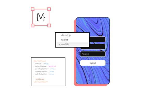
What is Web Design?Web design involves creating the visual elements, pages, and navigation of a website. Web designers are responsible for color, assets (images, logos, icons), typography, and components you see on screen. They must also decide how a web page must look across multiple devices, including desktop, tablet, and mobile–also known as responsive design.
Web designers work with design tools that produce a graphical representation or prototype of the website. Unfortunately, most design tools don’t render code, so developers must recreate the website following the designer’s mockups and prototypes.
What is Web Development?Web development is the process of writing HTML, CSS, and Javascript to create a functioning website. Web developers are also responsible for web servers, databases, security, and other elements that users don’t see–also referred to as the back-end.
There are two separate web development disciplines; some developers do both (full-stack developers), while others specialize in one or the other.
Front-end developer : develops everything the user sees (client-side) and interacts with, including websites and applications. They’re responsible for writing the HTML, CSS, and Javascript to turn a web design into a functioning website or app. Front-end developers must understand how different browsers and devices render information and write code to allow these differences. Back-end developer : engineers server-side environments to make the website or application function. Users don’t see the back-end developer’s work, but it significantly impacts the website or application’s functionality and performance. Back-end developers must be competent in many programming languages, like Python, PHP, and Java, because they deal with servers, APIs, and even AI/machine learning so users can send and receive data from the website or application.If you would like to know more about the history of web design and development, this fascinating timeline takes you on a journey from 1990 to 2017, highlighting each significant moment in time.
Web Design Job Titles and Career Paths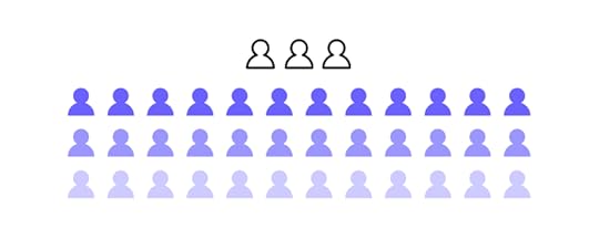
Web design is a broad term encapsulating many roles and disciplines. We’re going to four of the most popular web design disciplines, including:
UX designUI designProduct designDesignOpsUX DesignUX designers (user experience designers) focus on the usability and accessibility of a website or application. They conduct user research and create personas to empathize with customers, and design a website or application to meet their needs.
UX designers follow a design thinking process to fully comprehend a user’s problems and how to solve them. The five stages of the design thinking process include:
Empathize – Discover what your users needDefine – Determine the problem you want to solveIdeate – Develop possible solutions to users’ problemsPrototype – Create prototypesTest – Test your prototypes with users & stakeholdersSome of a UX designer’s responsibilities include:
User researchDesigning wireframes and mockupsPrototyping and testingCompetitor and market researchInformation architectureNavigationDownload our free eBook, UX Design: The Definitive Beginner’s Guide, for more about UX design, best practices, and expert advice.
UI DesignUI design (user interface design) is a UX designer specializing in creating the visual design elements and interactions for a digital product or website–buttons, color, icons, typography, images, forms, and other elements and components. Additionally, UI design is concerned with interactivity like animations and microinteractions.
UI designers also follow the design thinking methodology, but they focus more on what users do and how they use their devices. Here are some other skills specific to UI design:
Graphic designInteraction designIllustratorsThis article goes into greater detail about the differences between UX vs. UI design.
Product DesignProduct designers perform many of the same tasks as UX designers, except that they work with existing products. A large part of a product designer’s job is to develop a product to grow its revenue while ensuring the brand stays relevant and competitive.
Instead of designing elements and components from scratch, product designers use an existing design system to build new features and interfaces. Like UX designers, product designers must build prototypes for usability testing and design handoffs.
This article explains the difference between UX design and product design, and we also have a free eBook on Enterprise Product Design.
DesignOpsDesignOps is the youngest of these four disciplines but has grown in popularity and significance during the last decade. Rather than focusing on design itself, DesignOps looks at optimizing design processes and workflows.
DesignOps is a role, but it’s also a mindset. A company can implement DesignOps without someone managing it. As a company grows, a DesignOps leader can help to scale design, reduce inefficiencies, and improve collaboration.
Our free eBook, DesignOps 101: Guide to Design Operations, includes six chapters written by DesignOps professionals from around the world. It’s a fantastic introduction to DesignOps and its impact on an organization. We also outline DesignOps and its role in design here.
Web Design & Development Process
Here is a typical end-to-end web design and development process:
Designers and developers receive a brief for a new website or product.Designers start by conducting user, market, and competitor research. They create personas and user journey maps to empathize with users and understand the core problems.Next, designers come up with design ideas with sketches and paper prototypes. These hand sketches make it easy for designers to collaborate and develop many ideas quickly.After a few rounds of paper prototyping, designers create wireframes of the website or application. They use wireframes to design the information architecture and test navigation.Next, designers create mockups and high-fidelity prototype replicas of the product or website for usability testing and sharing with stakeholders.Once testing is complete, designers prepare their mockups and prototypes with documentation for the design handoff–the process of handing the designs over to the developers.Developers must use the designs as a reference to build the website or application using HTML, CSS, and Javascript. They might use a front-end framework to help develop the digital product faster.Front-end and back-end developers use packages, APIs, and other tools to enhance the website or application’s functionality or connect it to other products (both internal and external).Once developers complete the development phase, designers conduct a quality assurance process to ensure the digital product looks and functions correctly.Check out this web development checklist which includes 10 characteristics of a successful website.
End-to-End Design With UXPinDesigners can use UXPin during every phase of the design process to create user flows, wireframes, information architecture, mockups, and prototypes. With Preview and Share, designers can use prototypes for testing or share ideas with stakeholders. Designers can use UXPin Mirror to share and test prototypes on any iOS or Android device when designing mobile applications.
UI designers can create beautiful icons and UI components with advanced interactions to create immersive user experiences for your customers.
Unlike other design tools that render image-based designs, UXPin is code-based, giving your prototypes higher fidelity with more functionality. Here are four code-based features you won’t find in traditional image-based design tools:
States: Apply multiple states to a single element or component, each with different properties, interactions, and animations.Interactions: Create complex interactions with advanced animations and conditional formatting.Variables: Capture and store user inputs and use that information to take actions or personalize a user experience.Expressions: Create fully functioning forms, validate passwords, update shopping carts, and more with Javascript-like functions.UXPin also allows you to create, manage, and scale a design system alongside your design projects. You can even set permissions and add documentation and guidelines for product and design teams.
Designing With MUI in UXPinNot sure where to start designing elements and components? With UXPin’s new MUI integration, you can use MUI’s interactive React components to create fully functioning high-fidelity prototypes.
Designers can customize MUI components to meet brand and product requirements. At design handoff, developers copy the component’s props from UXPin to develop the final product.
Store your custom MUI components in a repository and use Merge to sync your new design to UXPin’s design editor for designers to design new features.
Ready to get started with web design and development in UXPin? Sign up for a free trial and experience how one code-based design tool can revolutionize your design projects.
The post What’s the Difference Between Web Design and Development? appeared first on Studio by UXPin.
Web Design and Development
People often use web design and development to describe both design and development disciplines. In the early days of the internet, this description might have been accurate, but nowadays, these disciplines are as distinct as architect and builder.
This article will explore the difference between a web designer and a web developer and what modern website design and development looks like. We also look at various design and development job titles to understand the different disciplines.
UXPin bridges the gap between design and development with a revolutionary code-based design tool. Instead of rendering vector graphics, UXPin renders HTML, CSS, and Javascript so designers can build high-fidelity prototypes with the same functionality as a coded website. Sign up for a free trial to get started with code-based design today!
Table of contentsWhat is Web Design and Development?What is Web Design?What is Web Development?Web Design Job Titles and Career PathsUX DesignUI DesignProduct DesignDesignOpsWeb Design & Development ProcessEnd-to-End Design With UXPinDesigning With MUI in UXPinWhat is Web Design and Development?Web design and development is a blanket term for describing the end-to-end process of building a website. The web designer creates a visual representation of the website, which they hand off to a developer who turns it into HTML, CSS, and Javascript.
What is Web Design?Web design involves creating the visual elements, pages, and navigation of a website. Web designers are responsible for color, assets (images, logos, icons), typography, and components you see on screen. They must also decide how a web page must look across multiple devices, including desktop, tablet, and mobile–also known as responsive design.
Web designers work with design tools that produce a graphical representation or prototype of the website. Unfortunately, most design tools don’t render code, so developers must recreate the website following the designer’s mockups and prototypes.
What is Web Development?Web development is the process of writing HTML, CSS, and Javascript to create a functioning website. Web developers are also responsible for web servers, databases, security, and other elements that users don’t see–also referred to as the back-end.
There are two separate web development disciplines; some developers do both (full-stack developers), while others specialize in one or the other.
Front-end developer : develops everything the user sees (client-side) and interacts with, including websites and applications. They’re responsible for writing the HTML, CSS, and Javascript to turn a web design into a functioning website or app. Front-end developers must understand how different browsers and devices render information and write code to allow these differences. Back-end developer : engineers server-side environments to make the website or application function. Users don’t see the back-end developer’s work, but it significantly impacts the website or application’s functionality and performance. Back-end developers must be competent in many programming languages, like Python, PHP, and Java, because they deal with servers, APIs, and even AI/machine learning so users can send and receive data from the website or application.If you would like to know more about the history of web design and development, this fascinating timeline takes you on a journey from 1990 to 2017, highlighting each significant moment in time.
Web Design Job Titles and Career PathsWeb design is a broad term encapsulating many roles and disciplines. We’re going to four of the most popular web design disciplines, including:
UX designUI designProduct designDesignOpsUX DesignUX designers (user experience designers) focus on the usability and accessibility of a website or application. They conduct user research and create personas to empathize with customers, and design a website or application to meet their needs.
UX designers follow a design thinking process to fully comprehend a user’s problems and how to solve them. The five stages of the design thinking process include:
Empathize – Discover what your users needDefine – Determine the problem you want to solveIdeate – Develop possible solutions to users’ problemsPrototype – Create prototypesTest – Test your prototypes with users & stakeholdersSome of a UX designer’s responsibilities include:
User researchDesigning wireframes and mockupsPrototyping and testingCompetitor and market researchInformation architectureNavigationDownload our free eBook, UX Design: The Definitive Beginner’s Guide, for more about UX design, best practices, and expert advice.
UI DesignUI design (user interface design) is a UX designer specializing in creating the visual design elements and interactions for a digital product or website–buttons, color, icons, typography, images, forms, and other elements and components. Additionally, UI design is concerned with interactivity like animations and microinteractions.
UI designers also follow the design thinking methodology, but they focus more on what users do and how they use their devices. Here are some other skills specific to UI design:
Graphic designInteraction designIllustratorsThis article goes into greater detail about the differences between UX vs. UI design.
Product DesignProduct designers perform many of the same tasks as UX designers, except that they work with existing products. A large part of a product designer’s job is to develop a product to grow its revenue while ensuring the brand stays relevant and competitive.
Instead of designing elements and components from scratch, product designers use an existing design system to build new features and interfaces. Like UX designers, product designers must build prototypes for usability testing and design handoffs.
This article explains the difference between UX design and product design, and we also have a free eBook on Enterprise Product Design.
DesignOpsDesignOps is the youngest of these four disciplines but has grown in popularity and significance during the last decade. Rather than focusing on design itself, DesignOps looks at optimizing design processes and workflows.
DesignOps is a role, but it’s also a mindset. A company can implement DesignOps without someone managing it. As a company grows, a DesignOps leader can help to scale design, reduce inefficiencies, and improve collaboration.
Our free eBook, DesignOps 101: Guide to Design Operations, includes six chapters written by DesignOps professionals from around the world. It’s a fantastic introduction to DesignOps and its impact on an organization. We also outline DesignOps and its role in design here.
Web Design & Development ProcessHere is a typical end-to-end web design and development process:
Designers and developers receive a brief for a new website or product.Designers start by conducting user, market, and competitor research. They create personas and user journey maps to empathize with users and understand the core problems.Next, designers come up with design ideas with sketches and paper prototypes. These hand sketches make it easy for designers to collaborate and develop many ideas quickly.After a few rounds of paper prototyping, designers create wireframes of the website or application. They use wireframes to design the information architecture and test navigation.Next, designers create mockups and high-fidelity prototype replicas of the product or website for usability testing and sharing with stakeholders.Once testing is complete, designers prepare their mockups and prototypes with documentation for the design handoff–the process of handing the designs over to the developers.Developers must use the designs as a reference to build the website or application using HTML, CSS, and Javascript. They might use a front-end framework to help develop the digital product faster.Front-end and back-end developers use packages, APIs, and other tools to enhance the website or application’s functionality or connect it to other products (both internal and external).Once developers complete the development phase, designers conduct a quality assurance process to ensure the digital product looks and functions correctly.Check out this web development checklist which includes 10 characteristics of a successful website.
End-to-End Design With UXPinDesigners can use UXPin during every phase of the design process to create user flows, wireframes, information architecture, mockups, and prototypes. With Preview and Share, designers can use prototypes for testing or share ideas with stakeholders. Designers can use UXPin Mirror to share and test prototypes on any iOS or Android device when designing mobile applications.
UI designers can create beautiful icons and UI components with advanced interactions to create immersive user experiences for your customers.
Unlike other design tools that render image-based designs, UXPin is code-based, giving your prototypes higher fidelity with more functionality. Here are four code-based features you won’t find in traditional image-based design tools:
States: Apply multiple states to a single element or component, each with different properties, interactions, and animations.Interactions: Create complex interactions with advanced animations and conditional formatting.Variables: Capture and store user inputs and use that information to take actions or personalize a user experience.Expressions: Create fully functioning forms, validate passwords, update shopping carts, and more with Javascript-like functions.UXPin also allows you to create, manage, and scale a design system alongside your design projects. You can even set permissions and add documentation and guidelines for product and design teams.
Designing With MUI in UXPinNot sure where to start designing elements and components? With UXPin’s new MUI integration, you can use MUI’s interactive React components to create fully functioning high-fidelity prototypes.
Designers can customize MUI components to meet brand and product requirements. At design handoff, developers copy the component’s props from UXPin to develop the final product.
Store your custom MUI components in a repository and use Merge to sync your new design to UXPin’s design editor for designers to design new features.
Ready to get started with web design and development in UXPin? Sign up for a free trial and experience how one code-based design tool can revolutionize your design projects.
The post Web Design and Development appeared first on Studio by UXPin.
February 23, 2022
Codifying Design System – Why & How to Do That?

Codification is an integral part of evangelizing a design system and getting adoption from teams. A design system’s documentation must educate teams about usage, company policies, best practices, governance, and branding with examples and tutorials.
Enhance collaboration between design and development while creating a single source of truth with UXPin Merge. Sign up for a free trial to explore UXPin’s revolutionary Merge technology through our MUI integration.
What is Codifying a Design System?The Cambridge Dictionary defines codification as “the act or process of arranging something, such as laws or rules, into a system.”
Codifying a design system or design system codification is the process of organizing a design system’s components into a searchable archive or hub with guidelines, principles, documentation, tutorials, governance procedures, and more.
This centralized hub serves as a working document for team members to reference when building new products or searching for the correct component and how to use it–for example, proper color usage and header tag sizing.
The hub will also outline the design system’s governance procedures teams must follow to introduce new elements or promote patterns. Like Github’s Primer, some design systems display a release history so designers can learn what’s new and a design system roadmap for future releases.
Why Do You Codify a Design System?Like any digital product, a design system needs documentation to learn and understand how to use it. Having a design system is one thing, but team members will invariably use its components based on opinion and interpretation without proper direction.
It Provides Clear InstructionsFor example, if you purchase a 1,000 piece Lego set without instructions, there are endless possibilities. But, if you follow the instruction manual, you’ll use every piece as intended to build a single structure, consistently the same, every time.
Design system codification ensures every team member follows the same guidelines for designing new products. So, no matter who the designer is, they should always get the same result.
It Streamlines OnboardingAnother reason you want to codify your design system is to streamline onboarding. Instead of someone sitting with new team members to teach them about the organization’s design system, they can visit the documentation and learn everything they need to know without oversight.
11 Tips to Codify a Design SystemThere is no standard “how-to” guide for documenting a design system, but there are several things you must consider. Here are eleven tips for codifying a design system.
1. Overview with Design PrinciplesEvery design system must include the organization’s core principles and values–preferably on the home page, so it’s the first thing team members see. These principles answer the why behind your design system and choices.
For example, Salesforce outlines four core principles in its Design Guidelines Overview:
Clarity: Eliminate ambiguity. Enable people to see, understand, and act with confidenceEfficiency: Streamline and optimize workflows. Intelligently anticipate needs to help people work better, smarter, and fasterConsistency: Create familiarity and strengthen intuition by applying the same solution to the same problemBeauty: Demonstrate respect for people’s time and attention through thoughtful and elegant craftsmanshipWe have a complete guide about design principles and how to establish them for your company here.
2. Brand Style GuideA brand style guide provides teams with direction on how to represent the brand through design and copywriting. Some companies, like Stack Overflow, also include the correct usage of its name.

You should also include your logo in multiple sizes, contrasts, and formats so team members can download and use the same files throughout your product.
 3. Writing Style Guide
Some design systems include the writing style guide as a subheading in the branding guidelines. But, if you have a lot of writing or branding instructions, it’s best to keep these separate.
The writing style guide should provide instructions for all copy, including content, marketing, ALT text, and UX writing. Some points you might want include:
Voice and tonePrinciples (writing grade, slang/jargon/joke policies, language to avoid, etc.)GrammarStructure (for long-form content like articles and landing pages)UX messages (error, success, warning, etc.)Labels (including forms, checkboxes, radios, etc.)4. Best PracticesBest practices include recommended (and mandatory) methods, tools, and processes for your organization’s design system. What image formats must teams use, how do they name them, and where do they store these assets to make them accessible to the whole organization?
You might separate your best practices by the department to avoid confusion–for example, design best practices vs. engineering best practices.
The goal of your best practices is to ensure cohesion and consistency in the way teams work so anyone can step in and take over someone’s work when they’re absent or if they leave the organization.
Stack Overflow includes a list of FAQs that explains some of the design system’s best practices (likely based on questions from team members), for example:
Why do we have to write CSS inline?If CSS is inline, why do we need a style tag?What is preview text?5. Easy, Searchable NavigationDesigners must approach a design system the same way you would any other product–with a user-centered design approach. Your design system should serve users by providing easy, searchable navigation.
Separating your design system into menus and submenus can help teams narrow down precisely what they need. Note how Shopify Polaris uses simple submenus to categorize its design system.
Many design systems use a standard dashboard layout with category links on the left with primary navigation and a search form in the header. GitHub Primer, Salesforce Lightning, Shopify Polaris, and others use this format for their design system documentation.
 6. Contributing and Governance
Managing and scaling a design system must be a democratic process where team members can contribute and make suggestions. Most leading design systems allow feedback and outline the governance procedures for making contributions.
GitHub Primer outlines various scenarios for team members to voice their opinions and suggestions:
 Participate in discussions: Provide channels for teams to start and participate in dialogue through forums, Slack channels, Zoom calls, etc.Propose a new pattern: Setup a specific channel or ticket for proposing new patterns and outline the processes and protocols to manage employee expectations.Documentation improvements: As a working document, your documentation must be open to evolving with the product and technology. As GitHub Primer puts it, “we’re always trying to make it better and more useful.”Bug reporting: Bugs adversely impact usability, so you should have a line of communication for teams to report issues so the DS team can fix them fast.Contributing: Some designers and engineers love solving problems and want to be a part of the product’s evolution. Contributing gives team members ownership of the design system and recruits more evangelists to promote its benefits.7. Component Library
Your component library forms the core of your design system documentation, and it’s where teams will likely spend most of their time. Here are some things you want to consider including in your component library:
An example of each componentInteractivity guidelinesCode snippetsPage and layout templatesDark/light variationsUse casesDos and don’tsSizingThis list is by no means exhaustive; you may have to include more detail based on your product and team dynamic.
Also, use images to complement explanations, no matter how simple they may be. Look at this example from GitHub Primer, where the DS team uses images to explain dos and don’ts–even though you might assume capitalization would be obvious to interpret.
 8. Colors
Color is one of the most common inconsistencies. When Slack set up its design system and documentation, the DS team discovered 136 colors across its products and UIs.
The problem is that team members use screenshots or color pickers to grab hex codes from other UIs, often a shade or two off. Over time this results in multiple shades of the primary color palette.
To avoid color inconsistencies, design system documentation must include color palettes in multiple formats, including:
Visual swatch or example of the colorHEX codeRGB codeDesign token or CSS variable (if applicable)9. IconsInclude a complete list of approved icons (whether you have a custom or stock set), their usage, and guidelines. Remember to include examples for multiple scenarios, for example, outline, circular, color, etc.
10. TypographyYour typography should include approved typefaces with examples for the various styles, like bold, semibold, regular, light, italic, etc. You should also stipulate when and how to use each font and style–for example, bold for headings and regular for body copy.
Other typography considerations include:
Desktop vs. mobile sizesScale, letterspacing, line height, weightAlignmentFont stack or family (for CSS)CDN linkFile downloads for various applications – TFF, WOFF, OTF, etc.HierarchyColor contrastAccessibilityLocational rules – alerts, navigation, body, footer, etc.11. ToolsYou should include a list of approved tools and workflows with onboarding instructions for new team members. These tools include:
Design toolsDevelopment toolsAccessibility toolsCloud storageEnhancing Design System Management & Collaboration With UXPinUXPin has a design system solution no matter where your organization is in maturity. With UXPin’s Design Systems feature, teams can build, manage, and scale a design system from scratch.
Organize your design system into four categories:
ColorsTypographyComponentsAssetsInclude documentation using descriptions for each element, including links, examples, usage, and more. You can also set permissions to prevent team members from making unauthorized changes.
A Single Source of Truth Using MergeWith UXPin Merge, you can sync an existing design system hosted in a repository to UXPin’s editor so design teams can build mockups and prototypes using code components–creating a single source of truth across the organization.
Any updates to components in the repository automatically sync to the design editor, and UXPin notifies teams of the changes. You can sync React components directly to UXPin via Git or use our Storybook integration for other popular technologies like Angular, Vue, Ember, HTML, and more.
Sign up for a free trial to experience code-based design with UXPin.
The post Codifying Design System – Why & How to Do That? appeared first on Studio by UXPin.
February 22, 2022
Digital Product Development Guide – How to Build Great Products & Boost Team Collaboration
 Key Takeaways:Product development process involves 7 steps: ideation, research, prototyping, UI design, validation, development, launch; nevertheless, it’s not a linear process.Before you jump into developing ideas, you need to build a strong strategy to guide your vision; figure out what you need to create and how you will measure its effectiveness.Creating prototypes is essential, they help you refine the final product and they are here to make sure you’re developing the right product.Another important aspect of product development is collaboration and transparent communication. Pick tools and a team model that supports those two things.You may encounter a few challenges along the way, involving continuous iterations, finding the balance between requirements and key objectives, etc.Table of contentsUnderstanding Product Development – A Step-by-Step Approach to Developing ProductsProduct Development Process – 7 Main Steps ExplainedStep 1: IdeationStep 2: Research & Idea ScreeningStep 3: PrototypingStep 4: Detailed DesignStep 5: Validation & TestingStep 6: DevelopmentStep 7: LaunchHow to Come About Creating a Product Development Strategy?1. Figure out what problem you want to solve2. Understand how you’re going to solve it3. Visualize your masterpiece4. Measure successHow to Create Effective Product Prototypes? Four Tips Worth FollowingEngage in some prep-workRemember about wireframingCollect user feedbackUse the right toolsHow to Build an Effective Product Development Team?Hiring Leadership Internal Processes Career ProgressionHow to Remove Silos Between Your Design and Development Teams?1. Determine which setup your team most closely resembles2. Make sure designers have a voice3. Give designers the right tools Product Development and Design – Improving Design Workflow and OperationsWhat can you do to enhance your design workflow and operations? 1. Let designers focus on what they do best – design2. Come up with good collaboration routines3. Work towards the same goal 4. Use the right tools What Product Development Tools are Worth Using? Three Top CategoriesHow to Develop a Product – Summary
Did you know that as many as 49% of companies don’t follow a consistent product management process? No wonder that 21% of them fail to create products that meet customer needs! Developing products is challenging, which is why it’s crucial to approach them in a logical way, i.e., to follow a well-thought-out plan.
In this guide, we’re going to discuss what it takes to develop a digital product that customers will use for many years to come. We’ll begin by explaining the key elements of the product development and design process, and how you can build out a bullet-proof product strategy. We’ll also discuss the right approach to prototyping, how you can build the best team, and make the most of your product’s potential.
Buckle your seatbelt and let’s begin!
Understanding Product Development – A Step-by-Step Approach to Developing ProductsBefore we take a deep dive into the product development and design process, allow us to first provide you with a bit of context. Namely, each product goes through its own “journey”, known as the product life cycle. It’s built around five key stages:
Introduction, when you first bring the product to the market and promote it among potential buyers (i.e., ideally, those who align with your ideal customer profile.)Growth, which comes once you’ve established awareness and continuously grow your customer base. You can think of it as the time you’re riding the wave and making the most of your product’s sales potential.Maturity, when your product is at its peak and has reached its full capacity. Your goal here is to keep the good fortune going for as long as possible.Decline, when the product sees a continuous decrease in users. At this stage, you can either withdraw it from the market or redefine it entirely in an effort to stay afloat. All products come to an end, though there are many factors that will influence whether it happens within a year, ten, or in a hundred years!Now that you’re aware of these steps, let’s look at what happens before you bring your product to the market, as well as in its early development stages.
Product Development Process – 7 Main Steps Explained
While you’ll find a number of different approaches online, it’s important to know the most important elements of the product development process. These are:
Step 1: IdeationAs the name implies, it’s the process of generating and brainstorming ideas. The key here is to get together as a team and allow yourself to truly unravel your creativity.
Here are the top three methods you can use:
Problem analysis, where you seek to understand customer pain points, goals, and challenges,Benefit structure analysis, which comes down to first identifying the key benefits of a product concept, and comparing which idea ticks the most boxes,SWOT analysis, where you analyze the strengths, weaknesses, opportunities, and threats behind each idea.Step 2: Research & Idea ScreeningOnce you’ve shortlisted your ideas, it’s time to engage in the initial research. We particularly recommend:
Running surveys to validate market demand for your product idea,Launching a PPC campaign to check if you can genuinely intrigue people and get click-throughs, andCreating a landing page, where you can see user on-site behaviour and if they’re interested in the solution.Step 3: PrototypingThe first step where you generate visual concepts. Prototypes come in two forms – low fidelity (lo-fi) and high fidelity (hi-fi). Lo-fi prototypes have a very simplified layout, navigation, and interactivity (if any). They can be generated quickly, as they lack visual detail.
Meanwhile, hi-fi prototypes are much more sophisticated, with more interactivity, colors, and branding. We discuss them in the next step.
Step 4: Detailed DesignHigh-fidelity prototypes closely emulate what your real-life product could look and feel like. Here’s where you try to distinguish your solution from any competitors on the market.
While they take more time to develop, there’s also a possible workaround – namely, using a tool like UXPin Merge, which allows your designers to create interactive designs by using production-ready code components (coded and built by developers).
 Step 5: Validation & Testing
At this stage, you engage in final validation of your product concept. One of the best ways is to do usability testing. You can, for instance, run remote usability tests, where you observe how people move around and comment on your product as they complete assigned tasks. Alternatively, you can engage in in-house tests, where you ask users to walk you through the product in their own way. The goal here is to give testers independence and see how they use your solution.
Step 6: DevelopmentA traditional step known as the “developer handoff”. Your designers hand over designs and specifications, and your software developers use them to bring them to reality. As mentioned earlier, there are tools that could start design–developer communication earlier, allowing programmers to code the solution directly from the prototype’s component and copy-paste code, a process that is made possible with UXPin Merge.
Step 7: LaunchFinally, you prepare a go-to-market strategy and launch the product to the market. Here’s where you start analyzing real-life statistics, user engagement metrics, and continuously improve upon your idea.
There’s much more to say on each of the stages above. If you’d like a deeper dive, we highly recommend giving our product development process article a read!

Every successful product development process requires a strategy, i.e., a blueprint that will guide your actions and decisions regarding product development. There are three main reasons why you need to put one in place:
To develop and communicate your vision – unless you want to build the product by yourself, it’s worth sharing your idea and plan of action with the rest of your team. It will help you get them on board, and ensure you’re all going in the same direction.To spot problems and prepare for them – let’s be honest, developing products is risky. Creating a product development strategy will not only allow you to identify potential threats but also better prepare yourself to tackle them. To define and measure success – success means different things to different people. You need to find out what your definition of success is, and what metrics you’ll use to measure it.How to Come About Creating a Product Development Strategy?Let’s now take a look at a few tips that will be a good starting point to guiding your strategy.
1. Figure out what problem you want to solveTo develop a product and to successfully launch it, you first have to understand the problem you want to solve. This will require detailed research. Dig into your social media, Google Analytics, talk to your prospects, check what people say about competing solutions. You get the idea. Every decision you make has to be backed up by data.
2. Understand how you’re going to solve itYou identified the problem, now you need to come up with a solution. To develop a product, create a product roadmap that will list all features necessary to effectively tackle your target audience’s problems. Decide on each feature through the prism of functionality, usability, and desirability.
3. Visualize your masterpieceYou have to go through four stages:
Ideate – create concept drawings and prototypes to quickly identify strong and weak sides of your potential product, Prove – make sure there really is a business case for it by collecting feedback. The key is to focus on the right target audience, otherwise, all the conclusions you’ll draw might be irrelevant,Refine – based on the information you’ve gathered, you can start modifying your product to better meet users’ needs. Remove all unnecessary features which only clutter the user experience,Build – you can finally start building your product. The success at this stage will depend on having the right team and making sure both developers and designers can effectively collaborate. 4. Measure successYour product development strategy shouldn’t be set in stone, quite the opposite. Depending on your product’s performance you should continuously modify it. However, first, you have to understand what success means and how to measure it. It is the number of downloads, NPS score, or maybe your retention rate?
How to Create Effective Product Prototypes? Four Tips Worth FollowingNow that you know the main product development stages and how you can approach creating a strategy, it’s time to zoom in on creating prototypes.
Here are several tips that will help make the prototyping stage successful.
Engage in some prep-workBefore you proceed with prototyping, make sure that you can answer the following questions:
What will the purpose of the prototype be?Is the prototype for users or stakeholders?How will testing out the prototype help us get business-oriented answers?What team setup and skills do I need to execute our vision?Once you’re clear on your goals and visions, we recommend turning to the Durability, Aesthetics, and Functionality triangle to identify your top priorities.

If you know that your prototype requires real-time updates and live data to be effective, prioritize Durability.
If the goal is to test our new or improved features, your top objective should be Functionality.
Respectively, if you’re going to evaluate visuals and branding, focus on Aesthetics. However, don’t jump to high-fidelity prototypes straight away, which brings us to the next point.
Remember about wireframingTempting as it may be, hi-fi prototypes should be developed only after you’ve thoroughly tested out your concepts, such as user journeys or informational architecture. As lo-fi prototypes are quick to develop, you can get a large number of testers in a relatively short time. As a result, you’ll know if each functionality or concept is not only understood by users but is also appealing to them.
Collect user feedbackThere are a number of ways you can test out your prototypes, including surveys, live session recordings, and focus groups. This is the stage where you should value honesty and get comfortable with the uncomfortable. While collecting feedback might potentially delay your product launch or turn the entire vision upside down, ultimately, you’ll end up with a more user-centric solution.
Use the right toolsWithout the right software, you’ll have no way to design, share, and collect feedback on your prototypes. While there are a number of prototyping tools on the market, from simple wireframing web editors to complex desktop apps, we can confidently say that one solution stands out – our very own UXPin Merge.
It functions as the link between your designers and developers. How so? Merge technology lets your designers create prototypes using ‘live code’ components, (in simple terms, the parts of software that your developers have already coded for the product).
As they’re using the latest version of the product to further improve upon their designs, it’s easy for design and software teams to collaborate and discuss project requirements.
Now that we’ve mentioned developer–designer communication, it’s worth giving the topic a bit more focus in the next section.
How to Build an Effective Product Development Team?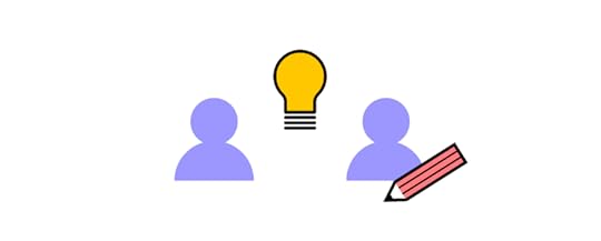
There are four areas worth focusing on while building a product development team: hiring, leadership, internal processes, and career progression. Let’s take a look at each in more detail.
HiringWhether you achieve success highly depends on the team you hire. Here are a few things worth keeping in mind:
Hire for both soft and hard skillsBuild a skills inventory – identify the skills you have as well as those that you lackOpt for the right skills assessment methods Stay proactive – don’t expect the best talent to come to you, reach out first before someone else doesLeadershipLeaders play a crucial role in making sure that their product development team achieve their full potential. Not only are they responsible for building an innovative culture, but they also set the direction for the entire organization and ensure that everyone works towards one goal. The best leaders give their talent room to grow, trust them to make their own decisions, and stay away from micromanagement.
Internal ProcessesIn order to allow for smooth cooperation, it’s necessary to put the right internal processes in place. Here are a few aspects you should pay attention to:
Selecting the appropriate team structure – you can choose from a centralized, embedded, or flexible structure. We will discuss each one in more detail in the next section. Use the right tools to boost dev-designer collaboration – you can consider Miro to facilitate your brainstorming session, and turn to UXPin Merge to make product prototyping smoother,Writing product briefs – to make sure that everyone involved in the project knows what’s expected of them, it’s worth creating project briefs to define the scope of work,Set up regular meetings – the best way to ascertain that progress is made and that everyone is on the same page is by meeting up regularly. Consider daily stand-ups, one-on-one’s, and team meetups. Career ProgressionAs you’ve put a lot of effort into hiring your team, you have to give them room to grow if you want to keep them engaged. This involves designing career paths. Make sure that they align with your employee’s aspirations – not everyone wants to become a team leader. Therefore, it’s advisable to also include lateral career paths.
Now that you know how to build a team, let’s move on to another critical organizational question:
How to Remove Silos Between Your Design and Development Teams?How designers communicate with software developers largely depends on the product development team setup. There are four key structures (if you’ve worked for a number of companies, high chances are, you’ve seen all of them!):
Centralized
Designers work on a number of projects under the same manager, who, themselves, report to the UX or Design Director. This structure is good for maintaining a cohesive product vision, but tends to be slow when it comes to roadmap execution.
Embedded
These teams are cross-functional, i.e., they have members of different departments (developers, designers, QAs, and others) on the same project. This model is popular, as it creates a sense of common purpose among employees from different disciplines.
Flexible
Each member reports to their direct manager (for example, the Design Team Leader), but collaborates with the project manager on a daily basis. This can disrupt work, as employees might hesitate which topics should be raised to their superiors, and which ones should be brought to the attention of the PM.

Contractual teams are built of external contributors, who report to a specific in-house employee who oversees the project. These individuals might be in touch with one another, but ultimately, it’s the project lead who makes the final call.
As you can see, certain models are more prone to silos than others. That being said, there are some tips that will help ensure the right collaboration among teams, regardless of their setup. These are:
1. Determine which setup your team most closely resemblesHow many designers are there on the team? How often do they communicate with developers on tasks? Consider where the current structure performs well and which areas require improvement. Don’t be afraid to question the status quo, and consider reorganizing the project structure.
2. Make sure designers have a voiceUsually, designers are outnumbered by developers on projects (just as in PayPal’s case). As a result, their opinions might not resonate strongly with the team. In the long run, this will not only lead to silos but also push user-centricity to the back seat. This would be catastrophic for your product. Leaders should advocate for all perspectives, even from single team members.
3. Give designers the right toolsTo ensure effective collaboration with developers, it’s important that designers use UX, UI, and prototyping tools that help them find common ground with tech team members. Here’s where UXPin Merge will work amazingly well, as it allows your designers to use real-life code components imported from Git or Storybook. This will result in at least two benefits:
Your designers will speed up their work on designs, as they won’t have to create visuals from scratch,The visuals will be more relatable to devs, as they’ll be based on the code they’ve developed.To learn more on the subject, take a look at our dedicated product development and design collaboration resource, where we share more tips and examples from world-class brands.
Top 3 Challenges in Product Development and How to Overcome Them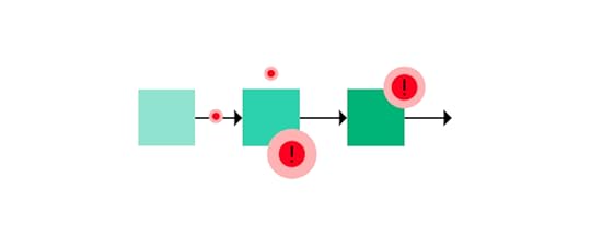
Product development and design can prove challenging, there is no shame in admitting that. To show you that you’re not alone in your struggle, we’ve decided to talk to a few business experts to share the problems they had to face. Here is what they said:
Sep Niakan from Condoblackbook says that identifying your customer’s pain points is a challenge he faced while developing products. He believes that product goals should revolve around the needs of your target audience. While it might sound obvious, Sep claims that many companies do the opposite, i.e., engage in market research post-product-launch which is counter-productive and costly. Product testing should take place early in the development process and shouldn’t end at product launch.
Finding balance between immediate product requirements and long-term business objectives is a pain point that Robert Johansson from imgkits has shared. He says that it proves problematic to decide how much to invest in initial product development to still be able to meet long-term objectives. For this reason he recommends not skipping market research and prototyping as this will ensure that your money is well spent!
Michael Varga, Senior Designer at Creative Navy UX Agency, points to another common challenge – the need to adapt the product continuously. He says that sometimes, the team discovers a piece of insight that challenges the product vision. While it might be tempting to disregard it and stick to the original plan, he advises against it. It’s important to realize that the design process, despite being systematic, also comes with its set of uncertainties. A successful product will make up the time spent on its numerous refinements.
For more insights from experts, take a look at our product development challenges piece, in which 10 experts discuss the challenges and how to overcome them.
Product Development and Design – Improving Design Workflow and Operations
It’s safe to say that DesignOps is a crucial element of effective product development. It’s about improving processes, people, and technologies to boost product design and create more business value.
What can you do to enhance your design workflow and operations?Let’s now take a look at a few tips that will help you improve your Design Operations.
1. Let designers focus on what they do best – designIt’s quite common to see designers performing a variety of tasks including UX research, creating design architecture, UX writing, etc. While this scenario might be unavoidable at a smaller company with a limited budget, it’s best to be avoided. Designers should be given enough time and mental space to focus on design work, as that’s what they’re competent in and what they were hired for.
2. Come up with good collaboration routinesIf you want to improve your design workflow, then you have to ensure smooth collaboration between designers and developers. This calls for putting in place some collaboration routines including weekly meetings, and daily standups to make sure that all team members are on the same page.
3. Work towards the same goalClearly communicate company objectives – your product development team has to know what goal they’re working towards and how they can contribute to achieving it. It’s best to put everything in writing. Following the OKR methodology will make the entire process more transparent and easier to execute.
4. Use the right toolsIt’s hard to do your job well and to collaborate effectively without having access to the right tool stack. UXPin is one of the tools worth adding to your list. It significantly shortens the time spent on prototyping as designers can design directly with elements made with real-life code. We discuss tools in more detail in the subsequent section.
We’ve created an entire article dedicated to enhancing your design workflow and operations. If you’re hungry for more tips then be sure to give it a read.
What Product Development Tools are Worth Using? Three Top CategoriesThroughout this guide, we’ve already mentioned a few tools worth using to ensure product success. In this section, we’d like to put them into three key categories.

These are:
UX, UI design & prototyping. These tools let you translate concepts into visuals. While UX design tools let you evaluate workflows and layout, with UI prototyping software, you can test branding, interactivity, and more sophisticated design concepts. Some tools, like UXPin Merge, allow you to use code components in designs (i.e., live code from the product). This greatly helps maintain the full consistency of the end product.Product testing & feedback collection. There are a number of tools that let you collect product feedback – from surveys and usability testing, to live session recordings and product analytics. Ultimately, the insights you collect help you continuously refine your product before and after the launch.Communication and collaboration. The key to successful projects also lies in transparency and proper teamwork. There are a few types of software you should use – from communicators to Kanban boards and advanced workflow planning software.If you’d like to read about the exact tools on the market, take a look at our product development software piece, where we share our top 10 recommendations.
How to Develop a Product – SummaryAs we’ve discussed in this guide, while product development is a complex process, it doesn’t have to be difficult if you know how to approach it! We hope that you’re now excited to embark on your product development journey. If you’re looking for a way to facilitate teamwork and set your digital product up for success, be sure to try out UXPin Merge – learn more about the solution and request access.
The post Digital Product Development Guide – How to Build Great Products & Boost Team Collaboration appeared first on Studio by UXPin.
February 21, 2022
Choosing the Right UI Design Software – Top Features to Look for
 Table of contentsTop 8 Features to Look For in UI Design Tools1. Image-based vs. code-based prototyping tools2. Level of functional fidelity3. Collaboration (working on the same document at the same time)4. Easy developer handoff (Spec mode in UXPin)5. Saving time – Auto layout6. Using real data inside the project7. Possibility of creating a design system8. AvailabilityWhat’s Your Choice?
I bet most of us have at some point in our careers heard a UI designer complaining about the final product being very different from the one they designed. There are at least two potential culprits here – a lack of proper designer-developer communication and the use of the wrong UI design tools. Luckily, both of these challenges can be tackled by using the right design software.
In this piece, we mention the top 8 features you should look for in your design software – from the ability to set and re-use UI design templates, all the way through to seamless design handoffs and automatic layout resizing.
Top 8 Features to Look For in UI Design ToolsHere are the most important features you should consider when choosing a tool that will help you build user interfaces. Beginners may find it useful to know that UI design is created on top of UX design that consists of many stages, including the discovery phase in which you build user flows and other things and usability testing in which you see if your digital product is intuitive for the users.
1. Image-based vs. code-based prototyping toolsDesigners for many years used Photoshop to create digital designs. Yet, even though Adobe has an excellent tools for creating illustrations and animations, it’s not perfect for creating complex UI designs that need to communicate transitions between pages and user flows.
That’s why a suite of different tools were created to fill that gap. Adobe came up with Adobe XD, but also there emerged tools like Figma, Axure, InVision that are what we call image-based tools for building user interfaces.
While that’s great for getting across a concept at creation point, these tools are limited when taking a product design further. Because no matter how close a UI designer gets to the real deal, image-based tools can’t give UX/UI designers the feel and opportunity to build a fully-functional prototype.
When a developer gets the design during the handoff phase, and begins to code micro-interactions, animations and the rest of the elements, there’s no true consistency. The tools can’t communicate, so designs can’t ever be precisely replicated in full and testing is all but impossible.
Instead of mashing square pegs into round holes, move to code-based user interface design tools. This delivers:
More accurate, highly interactive prototypesProducts that work as designer envisioned them to workFaster deployment and easier collaborationPart of the problem here is cultural mindset. Designers create static images, and it’s up to developers to turn them into something more tangible (and functional). Some tools, such as Framer, Zeplin or Sketch, act as intermediaries between design and development, and aim at making the handoff process easier. Yet, it means that UI designers and developers need to employ another design tool.
It’s been this way for so long, it can be hard to break the mindset – the dangerous cry of ‘it’s always been done this way’ can stop creativity in its tracks, killing much-needed innovation across design and development teams alike.
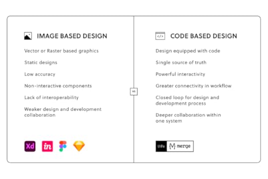
Nevertheless, there are design tools on the market that can handle the jobs of many plugins and design tools and help designers create wireframes, low-fidelity prototypes, high-fidelity prototypes, and help with the handoff process. They are code-based design tools and one of them is UXPin.
2. Level of functional fidelityA prototype that looks like the finished product is good. A prototype that acts like it is great. And that means using tools like UXPin Merge, which let teams create designs using ready code components – the same interactive components developers use to bring creations to life.
Raising the level of functional fidelity brings real benefits to your teams. First, by cutting down on morale-sapping back and forths between design and development, and the endless tread of iterations that eventually do what’s needed.
Second, when developers receive UI design templates, they can immediately work them up, since the prototype functions as it should. The prototype already features interactions and states coded by the dev team. Which leads to the third major benefit: consistency. From interactive prototype to end-product, the vision is maintained (well, until it comes to user testing, when all bets are off).
3. Collaboration (working on the same document at the same time)The theme of modern life is this: communication.
We’re messaging, and posting, and texting, and sharing – and that’s as true in business as it is at home. Or the bar. Or wherever else you last checked in on Facebook.
Making it simpler for teams to work together, to discuss projects, and share updates is essential. Especially when overseeing design and dev teams.
The relationship between design and development teams is a lot like that of a movie director and producer. The dreamer dreams, before being brought crashing down when told, ‘That’s just not how it works’. Rising frustrations have, on one or two occasions, been known to occur.
Using cloud-based design tools like UXPin helps bring team members closer together – working on the same designs at the same time, in real-time. This is especially important in the age of remote work, where online collaboration is fast becoming the norm. Teams cannot meet in front of a whiteboard anymore, but the need for real-time collaboration is still here. So is the need to share libraries, feedback, and conduct efficient remote brainstorming sessions is essential to delivering a final digital product that matches the original vision.
Are you facilitating a collaborative design process?
4. Easy developer handoff (Spec mode in UXPin)The handoff is one of the most important moments in your design process. The finished prototype is complete, and it’s time for the devs to work their magic.
It’s essential, then, that UI/UX designers can communicate their expectations of the final product, and developers can ask burning questions about the project. The idea, refined. Remember, the most successful handoffs begin long before they happen. Don’t include any nasty surprises in the developer handoff. Your solutions should have already been agreed upon by all teams.
Productivity hack, anyone? 🤷
— UXPin (@uxpin) February 9, 2022
Enter the spec mode & copy the production-ready code with a click of a button. Definitely a time saver for devs! 💪
Discover #UXPinMerge & optimize design handoff👉 https://t.co/HRWrIZHAeg#MergeHint #frontdev pic.twitter.com/U2vDX2GKgl
Achieving that level of consistency usually demands pages and pages of dry documentation, created by designers and read, cover to cover, by the development team.
A woeful use of oh-so-precious time when you can save hours with automated design handoff tools that put everyone on the same page.
5. Saving time – Auto layoutWhen looking for features in your UI design software, anything that saves time is a must. One of the most common bottlenecks in the design process is the designs themselves. A designer sits down, creates an impressive mock-up of an app screen, and then…
Well, at least it looks good.
The team can visualize the concept.
But it doesn’t do anything.
It’s just a static design.
Which means, at some point, that work is going to be repeated. Or constantly tweaked to accommodate fresh thinking – different text on your call-to-action button, for example, or additional options on the menu. And don’t forget to keep the changes consistent across all on-screen elements.
If this bottleneck sounds familiar, streamline the design process with UXPin’s intuitive Auto Layout tool.
https://t.co/RwTWfQ3SfM 🚀 Move a couple of elements at once, adjust their size and placement. It's easy. Try Auto Layout.#autolayout #productdesign #designsystem pic.twitter.com/kj0wevAjM4
— UXPin (@uxpin) December 10, 2021
So, let’s say you’re changing that call-to-action text. It’s longer now. But instead of having to go in and alter the size of the button to accommodate the new length text, the element (and every other affected element), automatically resizes on your UI design template.
See how easy that was?
6. Using real data inside the project‘Why are we using that foreign language?’
Ever heard that before after lobbing a few lines of Lorem Ipsum into your design?
Ideally, your prototype should test the idea for the finished product. Thus, it should mimic real interactions as closely as possible. But many prototypes and mockups look exactly what they are – and that can really harm stakeholder buy-in for any proposed solution or even take people out of the moment. They can’t ‘see’ how the finished article should (or would) really look because what’s presented to them feels inauthentic.
Great UI design tools let you import real-world content – from avatars to high-quality stock images – to help make concepts feel real.
For example, UXPin offers the ability to import data from CSV, JSON, and Google Sheets docs in a single click. Fields can be instantly filled with the names and addresses of people in your database, immediately displaying a concept closer to the end-product.
7. Possibility of creating a design systemThink of a Design System as a constantly evolving product and web design bible. It’s your company’s ‘design truth’. A communication tool that informs designers and developments of the tools to use, the assets to deploy, the patterns to adhere to, even the values and beliefs of your brand. Anything, in fact, that offers clear, unambiguous direction and guarantees consistency between teams.

It’s critical to keep everyone on the same page throughout the creation of any product. It helps maintain consistency between design and development. But a Design System isn’t a static document. You’ll find that it’s built to adapt, to change, sometimes unexpectedly, as you take on new user interface design projects, or as fresh challenges or opportunities present themselves.
Your chosen UI design software tool must let you build a dynamic Design System that meets the brief of each individual project, so your brand always shines through.
8. AvailabilityThe best UI design tools offer extended availability – i.e., the number of different device types the platform is available on. Design and development teams will all have their own preferred ways of accessing the tool, depending on how they use it and how it fits into their workflow.
That means factoring in availability from the outset. Your UI design software will need to be accessible on Windows and macOS, at the least. You should also consider a mobile app, so you can preview prototypes built for phone screens. If your teams are working remotely, the option to access the tool via a web browser should also be high on your list of requirements.
Choosing a tool with the right availability isn’t strictly about making it accessible to your entire team – although it’s incredibly important. It also means you can see how your prototype correctly behaves across different systems that your users are using. Let’s say, in preview, you notice that smaller screen sizes are cutting out elements or otherwise functioning as you, and the user, expect.
With a tool like UXPin, featuring availability across Windows, Mac, iOS, and Android platforms, you can quickly identify and rectify these errors – no matter what device you use, and before you roll out your product to the wider public.
What’s Your Choice?Choosing the right UI design software is more than just what program to install. It’s about finding a tool that brings designers and developers closer together than ever before. Help your teams communicate ambitious ideas and create complex, consistent concepts that can be brought to market at lightning speed. If you are looking for a tool that will make working on your user interface design projects more effective and faster, then try out UXPin.
The post Choosing the Right UI Design Software – Top Features to Look for appeared first on Studio by UXPin.
February 17, 2022
React Native vs. Reactjs – Understand the Difference

Understanding the difference between ReactJS vs. React Native helps designers communicate with engineers better, avoid costly technical issues, and minimize friction during design handoffs.
Designers don’t have to learn code or get into the technical details of Javascript or React to understand the fundamental differences between the two. The most significant difference that concerns designers is the different component libraries and their choices when designing web-based products vs. native mobile applications.
With UXPin Merge, you can sync React UI components from a Git repository to UXPin’s design editor, so design teams build fully functioning code-based prototypes. This single source of truth eliminates design drift, reduces time-to-market, and creates better cohesion between designers and developers. Visit our Merge page for more info and how you can request access to this revolutionary technology.
What is ReactJS?ReactJS, more commonly referred to as React, is an open-source Javascript library for building web-based user interfaces. The component-based frontend framework enables engineers to develop and scale websites and web applications quicker and easier than writing vanilla HTML, CSS, and Javascript.
ReactJS allows developers to create reusable tags or components from basic buttons to complex charts and data grids which they can call with a line of code. Much like designers build a master component and copy/paste it to other parts of the user interface.
ReactJS ExamplesFacebook developed React in 2011 for all of its web-based products and still uses the frontend framework for the web versions of WhatsApp, Messenger, Facebook, and Instagram.
Aside from Facebook, many global organizations and Fortune 500 companies use React for their websites and web applications, including:
NetflixSalesforceNew York TimesRedditCloudflareTeslaPayPal (read how PayPal scaled design using UXPin Merge synced to a React repository)What is React Native?React Native is the mobile equivalent of ReactJS used for cross-platform mobile Android and iOS apps, as well as web-based applications. Like ReactJS, React Native provides devs with reusable components to develop and scale mobile apps.
One of the biggest technical differences is that React uses the virtual DOM (Document Object Model) to render code in a web browser, while React Native uses native APIs to render UIs on mobile devices.
Why Did Facebook Create React Native?Before React Native, developers had to create two separate native apps for iOS and Android using Apple XCode or Android Studio, respectively. React Native allows developers to develop a single application that automatically renders native code for iOS and Android.
React Native ExamplesFacebook uses React Native for its native mobile applications, including Instagram, Facebook, Facebook Ads Manager, Oculus, and others.
Many global organizations also use React Native for their cross-platform native applications, including:
CoinbaseShopifyDiscordSkypeBloombergPinterestBaidu MobileThe Differences Between ReactJS and React Native
One of the most significant differences is that React is a Javascript library while React Native is a Javascript framework.
A library is pre-composed code that makes it easier for engineers to develop websites and applications.A framework is more complex, consisting of libraries, templating frameworks, APIs, and session management to build websites and applications.Here are some other notable differences between ReactJS vs. React Native:
ReactJS uses Javascript and CSS for animation, while React Native uses an animated API.ReactJS renders HTML in the UI, while React Native renders JSX.Developers primarily use ReactJS for web development and React Native for mobile application development.ReactJS uses React-router for navigating web pages, while React Native has a built-in Navigator library.Understanding React Can Help You Design Better Prototypes
Here are some of the ways designers can approach React projects.
Component-Based Design ApproachReactJS and React Native used a component-based framework to build UIs. Designers must use a similar component-based design mindset. For every UI you design, ask yourself, “how can a developer break this down into its core components.”
If you’re designing for a React product, create components and reuse these consistently throughout your product design. Try to avoid changing font sizes and spacing within components, as this will require engineers to build a new component or write additional styling.
Adopting a Component LibraryBuilding a design system for ReactJS or React Native from scratch will always present challenges and drift between design and development. Organizations overcome these challenges by adopting a customizable React component library.
Designing with a React component library enables designers to understand the limitations and constraints engineers face when converting designs into a final product.
Based on Google’s Material Design UI, MUI is one of the most comprehensive and widely used component libraries. Designers can use MUI as a foundation to build a design system for websites, web apps, and native applications.
UXPin’s MUI integration allows designers to use React components to build UIs. Designers can customize MUI components in UXPin’s properties panel to meet brand and product requirements. Sign up for a free trial and start designing with React components in UXPin.
Motion and AnimationMotion and animation often cause friction between designers and developers, particularly for native applications. ReactJS allows engineers to recreate design animation with relative ease while achieving the same results in React Native can be challenging or impossible without additional tools and packages. These additions cost time and money, which may exceed your project’s constraints.
Always discuss motion and animation with engineers at the start of your project to determine what’s possible to avoid friction at the design handoff.
Designing With React and UXPin Merge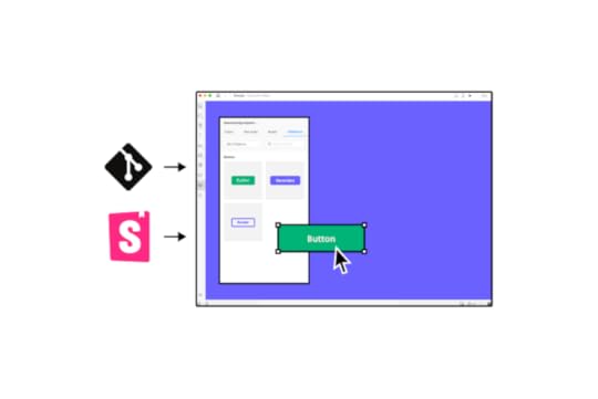
With UXPin Merge, designers can build fully functioning prototypes using React components. Designers use the React components like any other design tool but with significantly higher fidelity and functionality because they’re the exact components found in the final product.
While it’s not necessary to understand React to design with UXPin Merge, it can help you create prototypes with higher fidelity and functionality while improving communication and collaboration with engineering teams.
React PropsReact components use props to define properties like color, typography, border, shadow, etc. Merge automatically recognizes props and displays them in the Properties Panel for designers to edit. Designers can also switch to a JSX to view and edit in code.
Props allow designers to make changes, but they also set constraints defined by the design system, like brand colors and typefaces. These constraints help maintain consistency and prevent team members from making unauthorized changes.
Because UXPin renders code instead of vector graphics, developers can simply copy/paste any changes designers made to a component’s props to quickly develop UIs.
Greater Fidelity and FunctionalityDesigning with React components allows designers to build exact replicas of the final product. For example, a functioning date picker is impossible to create in a traditional image-based design tool. But with UXPin Merge, you can prototype with any React component engineers add to your repository, including date pickers, charts, data tables, graphs, and more.
Defined InteractionsInteractions and animations can add significant time to a design project. Designers must recreate these interactions for each project, which can introduce errors and inconsistencies.
Merge allows you to prototype with functional and interactive elements generated from production code. Designers can change animation settings to match the new interface and components using props.
With animations embedded in the design system, designers can save time during prototyping while eliminating interaction inconsistencies.
More Frontend Frameworks With StorybookWith Merge, you’re not only limited to designing with React. Our Storybook integration enables you to sync other popular frontend frameworks like Vue, Ember, AngularJS, Web Components, and more.
You can use Storybook components exactly like React components to design high-fidelity prototypes. Instead of using props, you use Storybook Args to change properties, slots, styles, inputs, etc., in UXPin.
Design With CodeReady to start designing with fully functioning React or Storybook components to enhance your prototyping and testing? Here are two ways to get started:
Sign up for a free 14-day trial. This will give you access to our MUI integration to design UIs using MUI’s React component library.Alternatively, you can visit our Merge page to request access to our Git integration for React or Storybook for other popular technologies. A member of our support team will contact you to facilitate the onboarding process.The post React Native vs. Reactjs – Understand the Difference appeared first on Studio by UXPin.
UXpin's Blog

- UXpin's profile
- 68 followers

