
UXpin's Blog, page 64
March 21, 2022
Design System – Principles of Success

On the surface, building a design system is a matter of designing a collection of elements, components, text styles, and colors. But the truth is it’s a more complex procedure. Building, managing, and scaling a design system requires principles and direction.
This article was inspired by the webinar about Design System with Carola Cassaro, which outlined the process of building a design system, including the principles that guide teams and decision-making. We have another webinar coming up in May! We will talk about building and scaling enterprise design systems with Amber Jabeen. Join the webinar for free.
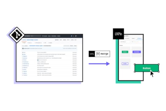
In Defending Your Design System, we feature our revolutionary code-based design technology, UXPin Merge. Merge allows you to create a single source of truth between design and development by syncing code components from a repository to UXPin’s editor. Sign up for a free trial and see Merge in action with our MUI integration.
What are Design System Principles?Principles define the why and purpose of building your organization’s design system. These principles guide decision-making and explain how the design system’s creators want team members to use the system.
A design system’s principles also streamline onboarding by helping new team members understand the company’s vision and priorities.
“Design principles are the guiding light for any software application. They define and communicate the key characteristics of the product to a wide variety of stakeholders including clients, colleagues, and team members. Design principles articulate the fundamental goals that all decisions can be measured against and thereby keep the pieces of a project moving toward an integrated whole.” – Luke Wroblewski, Product Director at Google
Carola Cassaro, Director of Product Management at Work & Co, and part of the team responsible for building and launching IKEA’s design system Skapa, broadly outlines design system principles as:
Single source of truth: Centralized resource that’s easy to access and relevant to its usersInclusive & collaborative: Speaks to a wide audience, uses shared terminology, and fosters the exchange of ideasModular & reusable: Solves the majority (80%) of UX problems so that teams have more time to innovateLiving & breathing: Evaluated and evolved over timeWhy Do You Need Design System Principles?Building a design system is like building any other product. Without a set of principles guiding your decisions, you end up with the same problems your design system is supposed to solve, like design drift, conflicting opinions, and team friction.
With clearly defined principles, team members work together to solve design problems with shared purpose and consistency.
A Guide to Establishing Principles for a Design System
Back in 2015, UXPin used a five-step process to define its design system’s principles. The process is still relevant today.
Step 1 – Find product analogiesTo avoid copying direct competitors, look for inspiration from successful products and brands outside your product category. The goal is to identify core values and qualities you want your product to have. What do you want people to experience when using your product?
For example, a red Ferrari might represent wealth, speed, exclusivity, status, and innovation. List these analogies and your reasons for choosing each one.
Step 2 – Find design principles in analogous productsGo through your list of product analogies and identify the qualities that make these products successful. Also, why do you want your product to have these qualities?
For example, a red Ferrari represents status. How does it do that for people? A simplistic answer would be its cost. But there’s so much more that gives a Ferrari status, like craftsmanship, quality parts, attention to detail, rarity, personalization, Formula 1, and the brand’s legacy.
Step 3 – Make the list real with existing user researchConnect the reasons for your choices with your product’s user research. Do user pain points contradict what you want your product to be?
For example, you want your product to be as simple and intuitive as an iPad, but users complain that they battle to use features or complete tasks.
Step 4 – Build value statementsSort your analogies and reasons, prioritizing those most frequently mentioned by users to make value statements.
We want our product to be like [complete with your product analogy] because it [complete with the reason] and it’s important to [our users/me/us].
Using one of Marcin’s examples: “We want our product to be like a white Porsche 911 from the 80s because it brings the feeling of timeless quality and it’s important to us.”
Step 5 – Abstract your principlesNow remove the product references from your value statements to make them applicable to your design system.
For example, “we want our product to bring a feeling of timeless quality.”
From this five-step process, UXPin’s team developed seven design principles:
1. No distractions. Every redundant piece of the interface (lines, buttons, shadows, animations) is a source of distraction. As such, it should be eliminated to empower users’ creativity with a well-architected and inspiring design tool.
2. Design-centric. Users’ designs should lie at the center of UXPin. Our interface should be unobtrusive to the point of transparency.
3. Adaptive interface. UXPin’s interface should act according to the context of use. All the ‘inactive’ features should remain completely hidden until the user can use them (no inactive buttons and links!)
4. Space. UXPin’s interface should create a peaceful atmosphere, triggering users’ creativity. This ambiance can be shaped by leaving a lot of space around every piece of interface. The cluttered interface is the source of stress that produces cortisol and adrenaline; both block our creative powers.
5. Inspiration. UXPin design should inspire and, as such, can’t be a derivative of design of other SaaS apps. We should strive for an original aesthetic inspired by the best products ever created (some of the sources of our inspiration: Fountain Pen Pilot Vanishing Point Matte Black, speakers Harman Kardon Sound Stick, record player Pro-ject, speakers DALI Zensor).
6. Interactive Consistency. Interface components, icons, and fonts should be consistent to create a predictable experience.
7. Predictable Architecture. UXPin’s architecture must be predictable and natural. Features should be placed in the right context for new users to discover easily. Example of predictable architecture: canvas settings should be placed next to the canvas.
Over the years, UXPin has found these principles prevent:
Endless subjective discussionUnclear design requirementsInconsistency at the most fundamental levelFinding Inspiration and Examples From Adele
Adele is a UXPin initiative that features an A-Z Design Systems Repository. Inspired by the 70’s design system pioneer Adele Goldberg, Adele by UXPin aims to encourage people to develop principle-driven design systems using inspiration from the world’s leading organizations.
The directory breaks each design system down into 31 categories, including components, framework, brand guidelines/principles, color palette, typography, grid, accessibility, documentation, and more.
Adele also provides links to each of these categories (where applicable), so you can quickly find references and inspiration. For the purposes of this article, we’ll outline the principles from four established design systems.
Estonia – Brand EstoniaAs a country that’s marketing itself as “the world’s most digitally advanced society” and strategies to attract startups and remote workers like e-Residency and its Digital Nomad Visa, it’s no surprise that Estonia has one of the world’s best governmental design systems.
Brand Estonia comprises of three core messages or principles that designers must use to introduce Estonia:
Digital society: Estonia is the first country to function as a digital service. Our citizens and e-residents can get things done fast and efficiently.Independent minds: Estonia’s biggest asset is our people.Clean environment: Estonia has a lot of untouched nature and a low population density. This is very rare in today’s world. We know how to care for our environment and we are proud of it.Estonia also has 11 primary industries or products, each with its principles that align with the country’s three core messages.
Coupled with messaging are Brand Estonia’s copy and design guidelines which define the country’s character in three words: Nordic, Surprising, and Smart. The visual language must always be:
Clean: as in uncluttered with unnecessary information and confusing typographySimple: because we like to leave enough space around text and images – making them more legible and emphasizing only the essentialBrand Estonia is a wonderful example of how designers can use the nation’s values (or company culture) to define its design system’s principles succinctly.
Atlassian Design SystemAtlassian’s design language resource provides teams with guidelines “to create simple, intuitive and beautiful experiences.”
The design system team has separated the guidelines into six categories:
Brand: reflects who we are and how we want our users to feel when they use our productsFoundations: the visual elements needed to create engaging layouts and end-to-end user experiencesContent: covers our voice and tone, and the mechanics of our grammar, and styleComponents: each component meets a specific interaction or UI need, and has been specifically created to work together to create patterns and intuitive user experiencesPatterns: best-practice solutions help users achieve their goals and help ensure consistency across experiencesResources: a collection of tools, kits, plugins, and guides to help simplify the creation process for our usersWithin each category are several subcategories where Atlassian uses a sentence or two to reinforce the company’s principles. For example, under Brand, they have Mission: Our mission is to unleash the potential in every team.
Atlassian demonstrates that with clear design system principles, you can develop a complex suite of products with remarkable consistency and seamless integration.
Salesforce – Lightning Design SystemDesign system professionals often point to Lightning as an example of simplistic cohesion and consistency. Lightning’s guidelines are as comprehensive as the design system itself, with documentation for every component and layout.
Salesforce outlines four code principles behind its design system:
Clarity: Eliminate ambiguity. Enable people to see, understand, and act with confidenceEfficiency: Streamline and optimize workflows. Intelligently anticipate needs to help people work better, smarter, and fasterConsistency: Create familiarity and strengthen intuition by applying the same solution to the same problemBeauty: Demonstrate respect for people’s time and attention through thoughtful and elegant craftsmanshipSalesforce’s goal for Lightning is to create a design system that allows team members to focus on their core tasks and responsibilities:
“The Salesforce Lightning Design System includes the resources to create user interfaces consistent with the Salesforce Lightning principles, design language, and best practices. Rather than focusing on pixels, developers can focus on application logic, while designers can focus on user experience, interactions, and flows.”
If you’re having trouble defining your design system’s principles, start by identifying a high-level goal and working your way down from there.
Stack Overflow – StacksStack Overflow divides Stacks’ guidelines into four categories: Product, Email, Content, and Brand. Under Brand is where the company outlines its design system’s principles.
Stacks emphasizes four brand principles that “represent the approach and opinion all things Stack Overflow should have.”
Focused: Designs should focus the person on what’s important at hand. Designs should focus on the central goal, pushing distractions and interruptions to the side until the stated goal is completed.Welcoming: Our designs shouldn’t feel “members only,” but inviting and approachable. Designs should be intentional and intuitive, not be some secret codex for users to decipher. While the subjects developers talk about may seem impersonal, our design approach shouldn’t be.Purposeful: Everything in its right place. Our designs might be packed with information, but everything should be purposeful. Don’t add extraneous data or ornamentation, as it might distract people from the central goal at hand.Five percent fun: We’re quirky, not corny. We enjoy the long joke. Our humor is dry and pops up in unexpected, but appropriate, places. We’re “business in front, party in the back.”Stack Overflow also provides its teams with guidelines for copywriting and visuals. The design system team does a fantastic job of using simple language to describe the company’s principles, including images and graphics to clarify messaging.
UXPin Merge – The Ultimate Design System Tool
Building a design system is one thing. Managing and scaling it takes governance and proper tools. UXPin Merge lets you sync your design system from a repository to the design editor so designers can build fully functioning prototypes using code components.
This single source of truth means all teams, including product, design, and development, use exactly the same design system components to build products. When engineers update the repository, UXPin automatically syncs the changes and notifies all teams.
Build, manage, and scale your design system with the world’s most advanced design system technology. Sign up for a free trial to experience UXPin and Merge with React components from MUI.
The post Design System – Principles of Success appeared first on Studio by UXPin.


March 17, 2022
How to Work With the Development Team on a Design System?

Developing a design system is not about aesthetics and making things look pretty. It’s a powerful design tool that improves cohesion and consistency, reduces time-to-market, and enhances collaboration between teams.
In our free eBook, Design Systems: Step-by-Step Guide to Creating Your Own, we succinctly define a design system and its purpose as follows:
“The primary purpose of design systems is to increase efficiency in product development. With a consistent design language in place, it becomes easier to design products at scale that are consistent in aesthetics, user interface, and user experience. Design systems also promote collaboration, since handoffs across distributed teams become easier.”
Enhance team collaboration and streamline handoffs with UXPin’s code-based design tool. Build a design system from scratch or sync an existing one using UXPin Merge. Experience the power of code-based design with UXPin by signing up for a free trial.
Design System vs. Style Guide vs. UI KitDesign system, style guide, and UI kit are not the same. Let’s explore differences between them.
Design SystemAn entire system including pattern libraries, components, iconography, typography, style guides, design principles, guidelines (design/copy/code), governance, assets, and other documentation.
Design systems usually include a UI kit for designers and code snippets for developers. With UXPin Merge, designers and developers use a single code-based design system hosted in a repository creating a single source of truth across the organization.
Style GuideA style guide comprises of written guidelines and visual references for a product, including typography, color, UI components, assets, and other elements. Simply put, a style guide tells you how to use a design system’s UI elements.
UI KitA UI kit is an image-based version of a design system or component library that designers use to build user interfaces. UI kits have no functionality, but designers can use its elements and components to build prototypes.
Why Engineers & Designers Must Collaborate to Develop a Design SystemOne of the most significant benefits of a design system is optimized workflows for designers and developers.
Designers drag-and-drop components to build UIsEngineers copy/paste code snippets to develop the final product
Design handoffs go much smoother because engineers are familiar with components and require less explanation to understand the UIs.
A fully-integrated design system eliminates design drift, reduces friction, and streamlines QA processes, significantly reducing time-to-market. All of which benefit designers and developers.
Bridging the GapDesigners and developers often use separate naming conventions or references–a button is a visual component to a designer and a few lines of code for a developer. Design systems provide designers and engineers with a single design language.
For example, design tokens define values for typography, color, spacing, and other UI elements, so designers and engineers speak the same language. Instead of using HEX or RGB codes for the brand’s color, team members reference a design token, e.g., brand-primary.
Aligning ConstraintsWhen designers and engineers work together on a design system, they factor in one another’s constraints. So, when designers design a new product or interface, they don’t have to worry about drift or exceeding technical limitations.
Design System GovernanceImplementing a system of governance is crucial for a design system to scale and evolve. Designers and engineers must work together to develop the processes and protocols teams must follow to update the design system.
These processes are especially important for products that must sync separate design systems for design and development–one image-based for designers and the other code components for engineers.
Design System MaturityThe ultimate goal is to have a single design system that automatically syncs design and development. Nick Elliott talks about the stages of design system maturity and its impact on design and development in his article, Re-Imagining Iress Design Tools.
Nick says the ultimate goal is to reach stage four: “a single source of truth where designers and engineers are using the same design system components.”
Tools like UXPin and Storybook can help bridge the gap between design and development, so the entire organization uses a single design system.
Building and Scaling a Design System With UXPin & StorybookUXPin Merge and Storybook are the ultimate design system tools. With this combination, you can create an end-to-end, fully integrated design system:
Design UI elements and components from scratch in UXPinEngineers convert designs to code and set up a Storybook (available for React, Vue, Web Components, Angular, and more)Use UXPin Merge’s Storybook integration to sync the design system to UXPin’s editorDesigners build new products and features using the Storybook design system in UXPinAt design handoff, engineers copy/paste components to begin development Starting from Scratch
Designers design UI elements and save them as Components to a Design System in UXPin. Features like Auto-Layout allow designers to automatically resize, fit, and fill designs making editing and scaling designs much faster.
With UXPin’s Spec Mode, developers can inspect a component’s properties, measure distances between UI elements, and access a style guide with colors, typography, assets, and supporting documentation.
Set up a StorybookEngineers can use this information to convert designs into code components. They can then set up a Storybook that allows teams to view and test components in isolation.
Engineers can even invite designers to Storybook to perform QA and collaborate to make necessary changes.
Sync to UXPinOnce designers and engineers have completed the initial QA, they can sync Storybook to UXPin. Once the initial sync is complete, all future updates are automatic. Any changes you make in Storybook automatically update in UXPin’s design editor, and team members get notified.
Giving Designers Control Through ArgsEngineers can use Storybook Args to give teams control but also set constraints. For example, engineers can create four states for a button and define multiple properties so designers only select default, primary, secondary, or disabled.
These constraints make it easy for designers to create consistent designs that meet the design system’s specifications.
Streamline Design HandoffsDesign handoffs are effortless with UXPin and Storybook. Engineers can replicate any changes to the component’s Args in Storybook and invite designers to perform QA.
Next, engineers can update the repository, and the changes automatically sync to UXPin.
Iterate and ScaleIf the design system team wants to make changes, designers can start from scratch in UXPin and repeat the process. It’s quick and easy to scale with UXPin and Storybook because the DS team only needs to manage one design system using two tools!
Scaling Design With UXPin MergeIn our January 2022 webinar, Defending Your Design System, keynote speaker Carola Cassaro (Product Manager at Work&Co and part of the team that developed IKEA’s design system) summarized the benefits of a design system beautifully…
“Design systems have evolved to be more than just components and tools. They democratized design processes and best practices to empower product teams and businesses to ship great work at scale .”
How PayPal Scaled Design With MergeEven though PayPal used Microsoft’s Fluent design system, they battled with inconsistencies. Using image-based design tools meant designers and engineers had separate design systems, “The result was a range of usability and design consistency issues-no two products looked the same!”
PayPal also had a disproportional designer/developer ratio with five designers and over 1,000 engineers across 60-100 internal products. To put that into perspective, an NN Group survey found that most companies operate on a 1-to-10 designer/developer ratio.
And PayPal wasn’t prepared to scale its design team. Erica Rider, Senior Manager for UX – Developer tools and platform experience at PayPal, had to figure out how to scale design without adding to the payroll!
After trying several solutions, Erica decided to give UXPin Merge a try. PayPal used Fluent’s React front-end framework, which they connected to UXPin using Merge’s Git integration.
With everything set up, PayPal decided to test UXPin Merge with a side-by-side using an image-based design tool. One of PayPal’s experienced UX designers built an identical one-page prototype using each tool–the results far exceeded expectations:
Image-based design tool: Over an hour with limited functionality and fidelityUXPin Merge: Eight minutes with fully functional code componentsPayPal’s small team of UX designers taught product teams (who had no experience using design tools) how to use UXPin. They now design and update all of PayPal’s internal products, with UX designers only stepping in to fix challenging usability issues and provide mentoring.
PayPal’s product teams now complete and deliver a product in the same it used to take to design a mockup–significantly reducing time-to-market! Some of the other benefits include:
From concept to prototyping immediatelyBetter feedback from stakeholdersImproved team/stakeholder collaboration using UXPin’s CommentsStreamlined end-to-end workflowDramatic improvement in qualityEnhanced user testing with the ability to make quick changes on the fly and get immediate feedbackUX designers have more time to focus on PayPal’s “larger UX initiatives that impact the organization globally.”Build and Scale Your Design System with UXPinWhether you’re a fledgling startup or a multinational enterprise with hundreds of products, UXPin has a solution to build and scale your design system.
With our free trial, you can explore UXPin’s incredible code-based design technology and even experience Merge in action with our MUI integration. Sign up for a 14-day free trial today!
The post How to Work With the Development Team on a Design System? appeared first on Studio by UXPin.
March 16, 2022
Key Characteristics of Good UI Design – According to 8 Experts

According to Emizentech, in 2021 there were as many as 3.48 million apps available on Google Play, with 2.22 million in the Apple App Store. Suffice to say, good UI design isn’t an option; it’s a necessity.
Now, the big question is: what does ‘good UI design’ actually mean? We’ve reached out to eight design experts and asked them for their take on the matter. Here’s what we’ve found.
8 Traits of the Best UI DesignWe asked leading experts and compiled 8 traits of the best UI design. Those are universal pieces of advice and will come in handy no matter if you are designing a mobile app, landing page or other digital product.
1) Good UI Design is IntuitiveDaniel Florido, Chief Web Development & Designer, Director of Pixelstorm

The best UI design can be picked up quickly and easily by the people using it, without being too complex or long-winded for them to understand what you’re trying to say with your mobile app for Android, iOS or website design, etc. Let’s take icons for example. They are in every UI kit. They should have concise labels as well as being visually representative enough of the actual task they are replicating to allow for user intuition.
It’s also worth considering users who have various levels of tech-savviness; great UI design should be concise enough so that technologically illiterate people can still get to grips with using your design after just a short amount of time. After all, usability is something that cannot be compromised by UI design.
I consider this necessary because it saves the user time and effort. Using an intuitive design means that they’re not going to get lost in the structure of your webpage, app etc., and struggle to find what they want.
2) Familiarity is KeyGeorgi Todorov, Founder of ThriveMyWay

Many designers aim to create ‘intuitive’ interfaces. But what does ‘intuitive’ actually mean? It refers to something that may be grasped and comprehended readily and instinctively. But how can you make things understandable? Good UI is about making things ‘familiar.’
Something that looks similar to something else you’ve seen previously is called familiarity. You know how something acts and what to expect when you’re familiar with it. Identify items that your users are acquainted with and include them in your user interface. You can do that during user research phase.
Why is familiar UI design Important? Instead of learning a new system, people may start using your product straight away using their existing mental model. That shortens the time needed for onboarding.
Because there is no learning curve and the user can execute their work without difficulty, users will continue to use your product rather than the competition’s solution that looks and acts foreign to them. As the user utilizes a well-known solution, cognitive strain is reduced, allowing the process to go more quickly.
So, how to create a familiar UI? When a person grows dissatisfied with a website or an Android or IPhone app, they will most likely seek out another much easier to use and comprehend. The simplest method to avoid interface problems is providing simple instructions to learn and an interface that is pleasing the eye. It will assist your guests in getting to where they need to go. It is particularly true if their mental models are erroneous or wrong.
3) Good UI needs to be responsiveAmiel Alcala, Technical Lead at ExaWeb Corporation

Nowadays, website visits come mostly from mobile devices, which is hardly surprising, given that it’s convenient to use an IPhone or an Android product. In 2019, Google has considered prioritizing mobile indexing as part of their top search ranking factors. Suffice to say, you need to have a responsive user interface.
By having a mobile-responsive website, you encourage users to stay on your website longer, which also reduces your bounce rate. If you’re building a website or app, it’s important to build an interface that can adapt to any screen size to ensure an optimized browsing experience. Nevertheless, responsiveness comes in many forms and mobile responsiveness is just one of them.
Responsiveness also means fast. In the industry that I work in, optimizing websites is one of our priorities. We make sure that every website we improve from a user experience design perspective also meets Google’s standards, and we use tools to help us give an idea on how to improve a website’s speed and performance. These solutions give us metrics that come in handy when we want to achieve both good UI and fast performance.
4) Consistency and Clarity Play a PartMatt Weber, Founder of Weber & Co.

Here are the top two elements that can make or break UI design:
ConsistencyGood UI design requires consistency. It is a fundamental rule to ensure that the application is easily learned and used. This includes both the visual and behavioral aspects of the design. The user interface shouldn’t be inconsistent with itself or its content and other design elements.
Consistency in UI design ensures an intuitive understanding of how different parts of an app interact. It allows for speedier navigation through menus and less time looking at tooltips to find out what happens when you do a specific action within your application’s environment.
The main goal behind this pattern is to make sure that all elements work together seamlessly so users can learn them more quickly; they should look like they belong together, and behave as a cohesive unit.
ClarityClarity is one of the most important features in UI design. It signals to your users that you know what you are doing and that the app they are using is trustworthy. Clarity in UI design can come from consistency, simplicity, and truth in messaging.
If you are consistent with your design, it will be clear to users. For example, if all of the text is left-aligned and in the same font on every page, then that’s very consistent and easy for people to read through quickly without getting distracted by other things.
On the other hand, if there are multiple fonts or alignment changes between pages, this does not convey a sense of clarity because it confuses users about what they should expect next time they come back to use the app again.
Clarity also comes from simplicity both in how clean a user interface design looks and of its interactions. Something like a button should look simple and be easy to interact with in a visual design layout, make it easy for users to complete a specific task. You can measure the clarity of interaction through usability testing.
5) Empathy is Necessary for Good UI designGreg Findley, Designer, Mantra Design

User journey mapping is usually considered a UX issue, rather than a UI design challenge. But, when the UI becomes too focused on conversion with little or no empathy for new users, it can become a bigger challenge for the UI. So often we see marketing teams setting out the journey for a new user, especially when it’s a new product or service. Whether it’s an app focused on a trial sign-up, or a website funneling an ecommerce checkout, conversion rates become the benchmark.
As emotional creatures with shortening attention spans, we can often forget how challenging it can be to keep a new user engaged with the UI and the steps we’re guiding them through. Truly understanding the audience and their intent allows UI to engage with metrics beyond conversion.
How does the user interface design make the user feel the first time they interact, the second time, the fiftieth time? How does the UI evolve to support the user experience at different moments of the product cycle? Discovering how a user interface truly makes an end-user feel, can be the difference between good UI and intuitive UI design that resonates at an emotional level.
6) The Best UI Design Calls for an Invisible UIMarc Bromhall, Head of Product Design at Beginner Surf Gear

Your UI should, of course, be visible, but it should be ‘invisible’ when it comes to disruption in user experience. In other words, your UI design ethos would be centred around absolute minimalism. Simply put, you should only keep essential elements on the page, and get rid of everything else that can cause friction with functionality.
7) Minimalism is Key in User InterfaceKarla Fernandes, UX/UI & Digital Product Designer at Vitamina K
 Good UI 5
Every product or SaaS created wishes to help users complete a task or achieve a goal that was discovered during the user experience research. A minimalist user interface will express itself using typography, ratios, colors to create an expressive design hierarchy retaining high attention due to proportions and spacing.
Doing more with less and using repetitive visual design patterns will ensure the user knows what they are supposed to do and that it will work in ways that they expect it to work, thus, it doesn’t overshadow user experience.
#8 Best UI design is about InclusivityCatinca Varga, senior UI designer at Creative Navy UX/UI Agency
By designing inclusively, designers acknowledge diversity. Not all users have the same needs. A good graphical user interface should be easy to use and understand for everyone.
A first step to designing inclusively is getting to know the users and understanding their needs. This helps UX designers create a product that is flexible, functional, and enjoyable for all. Here are some general principles all designers should use to create an inclusive design:
Use standardised ways to measure colour compliance. Calculate the colour contrast of two overlapping layers to ensure that the digital stimuli is perceived by all users; Choose highly legible typefaces and text sizes to make sure you can communicate what you intend to;Use your space wisely to create visual hierarchy that guides users and reduces their cognitive load;Use written cues, colours, and symbols when giving user feedback;Avoid using icons as stand-alone elements. Icons can be abstract and they are up for interpretation. The better approach is to use both icons and written text. SummaryMaking sure that your app is not only pleasing to the eye but also easy to navigate around is a must if you want to have high user retention. There are a number of factors that contribute to the best UI design, including your digital product be user-friendly, inclusive, functional, etc.
One of the methods of working effectively on your UI designs is using the right UX and UI design tools. Here’s where UXPin Merge clearly stands out, offering your UX and UI designers the option to prototype solutions using UI components that your frontend developers use while turning designs into product.
A design tool like UXPin Merge simplifies the handoff. Engineers and designers can finally speak the same language and get a clear understanding of what the final product’s look and feel be like once it’s in production. They can finally merge their workflows together.
The post Key Characteristics of Good UI Design – According to 8 Experts appeared first on Studio by UXPin.
Key Characteristics of Good UI design – According to 8 Experts
According to Emizentech, in 2021 there were as many as 3.48 million apps available on Google Play, with 2.22 million in the Apple App Store. Suffice to say, good UI design isn’t an option; it’s a necessity.
Now, the big question is: what does ‘good UI design’ actually mean? We’ve reached out to eight design experts and asked them for their take on the matter. Here’s what we’ve found.
8 Traits of the Best UI DesignWe asked leading experts and compiled 8 traits of the best UI design. Those are universal pieces of advice and will come in handy no matter if you are designing a mobile app, landing page or other digital product.
1) Good UI Design is IntuitiveDaniel Florido, Chief Web Development & Designer, Director of Pixelstorm
The best UI design can be picked up quickly and easily by the people using it, without being too complex or long-winded for them to understand what you’re trying to say with your mobile app for Android, iOS or website design, etc. Let’s take icons for example. They are in every UI kit. They should have concise labels as well as being visually representative enough of the actual task they are replicating to allow for user intuition.
It’s also worth considering users who have various levels of tech-savviness; great UI design should be concise enough so that technologically illiterate people can still get to grips with using your design after just a short amount of time. After all, usability is something that cannot be compromised by UI design.
I consider this necessary because it saves the user time and effort. Using an intuitive design means that they’re not going to get lost in the structure of your webpage, app etc., and struggle to find what they want.
2) Familiarity is KeyGeorgi Todorov, Founder of ThriveMyWay
Many designers aim to create ‘intuitive’ interfaces. But what does ‘intuitive’ actually mean? It refers to something that may be grasped and comprehended readily and instinctively. But how can you make things understandable? Good UI is about making things ‘familiar.’
Something that looks similar to something else you’ve seen previously is called familiarity. You know how something acts and what to expect when you’re familiar with it. Identify items that your users are acquainted with and include them in your user interface. You can do that during user research phase.
Why is familiar UI design Important? Instead of learning a new system, people may start using your product straight away using their existing mental model. That shortens the time needed for onboarding.
Because there is no learning curve and the user can execute their work without difficulty, users will continue to use your product rather than the competition’s solution that looks and acts foreign to them. As the user utilizes a well-known solution, cognitive strain is reduced, allowing the process to go more quickly.
So, how to create a familiar UI? When a person grows dissatisfied with a website or an Android or IPhone app, they will most likely seek out another much easier to use and comprehend. The simplest method to avoid interface problems is providing simple instructions to learn and an interface that is pleasing the eye. It will assist your guests in getting to where they need to go. It is particularly true if their mental models are erroneous or wrong.
3) Good UI needs to be responsiveAmiel Alcala, Technical Lead at ExaWeb Corporation
Nowadays, website visits come mostly from mobile devices, which is hardly surprising, given that it’s convenient to use an IPhone or an Android product. In 2019, Google has considered prioritizing mobile indexing as part of their top search ranking factors. Suffice to say, you need to have a responsive user interface.
By having a mobile-responsive website, you encourage users to stay on your website longer, which also reduces your bounce rate. If you’re building a website or app, it’s important to build an interface that can adapt to any screen size to ensure an optimized browsing experience. Nevertheless, responsiveness comes in many forms and mobile responsiveness is just one of them.
Responsiveness also means fast. In the industry that I work in, optimizing websites is one of our priorities. We make sure that every website we improve from a user experience design perspective also meets Google’s standards, and we use tools to help us give an idea on how to improve a website’s speed and performance. These solutions give us metrics that come in handy when we want to achieve both good UI and fast performance.
4) Consistency and Clarity Play a PartMatt Weber, Founder of Weber & Co.
Here are the top two elements that can make or break UI design:
ConsistencyGood UI design requires consistency. It is a fundamental rule to ensure that the application is easily learned and used. This includes both the visual and behavioral aspects of the design. The user interface shouldn’t be inconsistent with itself or its content and other design elements.
Consistency in UI design ensures an intuitive understanding of how different parts of an app interact. It allows for speedier navigation through menus and less time looking at tooltips to find out what happens when you do a specific action within your application’s environment.
The main goal behind this pattern is to make sure that all elements work together seamlessly so users can learn them more quickly; they should look like they belong together, and behave as a cohesive unit.
ClarityClarity is one of the most important features in UI design. It signals to your users that you know what you are doing and that the app they are using is trustworthy. Clarity in UI design can come from consistency, simplicity, and truth in messaging.
If you are consistent with your design, it will be clear to users. For example, if all of the text is left-aligned and in the same font on every page, then that’s very consistent and easy for people to read through quickly without getting distracted by other things.
On the other hand, if there are multiple fonts or alignment changes between pages, this does not convey a sense of clarity because it confuses users about what they should expect next time they come back to use the app again.
Clarity also comes from simplicity both in how clean a user interface design looks and of its interactions. Something like a button should look simple and be easy to interact with in a visual design layout, make it easy for users to complete a specific task. You can measure the clarity of interaction through usability testing.
5) Empathy is Necessary for Good UI designGreg Findley, Designer, Mantra Design
User journey mapping is usually considered a UX issue, rather than a UI design challenge. But, when the UI becomes too focused on conversion with little or no empathy for new users, it can become a bigger challenge for the UI. So often we see marketing teams setting out the journey for a new user, especially when it’s a new product or service. Whether it’s an app focused on a trial sign-up, or a website funneling an ecommerce checkout, conversion rates become the benchmark.
As emotional creatures with shortening attention spans, we can often forget how challenging it can be to keep a new user engaged with the UI and the steps we’re guiding them through. Truly understanding the audience and their intent allows UI to engage with metrics beyond conversion.
How does the user interface design make the user feel the first time they interact, the second time, the fiftieth time? How does the UI evolve to support the user experience at different moments of the product cycle? Discovering how a user interface truly makes an end-user feel, can be the difference between good UI and intuitive UI design that resonates at an emotional level.
6) The Best UI Design Calls for an Invisible UIMarc Bromhall, Head of Product Design at Beginner Surf Gear
Your UI should, of course, be visible, but it should be ‘invisible’ when it comes to disruption in user experience. In other words, your UI design ethos would be centred around absolute minimalism. Simply put, you should only keep essential elements on the page, and get rid of everything else that can cause friction with functionality.
7) Minimalism is Key in User InterfaceKarla Fernandes, UX/UI & Digital Product Designer at Vitamina K
Good UI 5Every product or SaaS created wishes to help users complete a task or achieve a goal that was discovered during the user experience research. A minimalist user interface will express itself using typography, ratios, colors to create an expressive design hierarchy retaining high attention due to proportions and spacing.
Doing more with less and using repetitive visual design patterns will ensure the user knows what they are supposed to do and that it will work in ways that they expect it to work, thus, it doesn’t overshadow user experience.
#8 Best UI design is about InclusivityCatinca Varga, senior UI designer at Creative Navy UX/UI Agency
By designing inclusively, designers acknowledge diversity. Not all users have the same needs. A good graphical user interface should be easy to use and understand for everyone.
A first step to designing inclusively is getting to know the users and understanding their needs. This helps UX designers create a product that is flexible, functional, and enjoyable for all. Here are some general principles all designers should use to create an inclusive design:
Use standardised ways to measure colour compliance. Calculate the colour contrast of two overlapping layers to ensure that the digital stimuli is perceived by all users; Choose highly legible typefaces and text sizes to make sure you can communicate what you intend to;Use your space wisely to create visual hierarchy that guides users and reduces their cognitive load;Use written cues, colours, and symbols when giving user feedback;Avoid using icons as stand-alone elements. Icons can be abstract and they are up for interpretation. The better approach is to use both icons and written text. SummaryMaking sure that your app is not only pleasing to the eye but also easy to navigate around is a must if you want to have high user retention. There are a number of factors that contribute to the best UI design, including your digital product be user-friendly, inclusive, functional, etc.
One of the methods of working effectively on your UI designs is using the right UX and UI design tools. Here’s where UXPin Merge clearly stands out, offering your UX and UI designers the option to prototype solutions using UI components that your frontend developers use while turning designs into product.
A design tool like UXPin Merge simplifies the handoff. Engineers and designers can finally speak the same language and get a clear understanding of what the final product’s look and feel be like once it’s in production. They can finally merge their workflows together.
The post Key Characteristics of Good UI design – According to 8 Experts appeared first on Studio by UXPin.
March 15, 2022
MUI 5 Customisation – What Is the Best Styling Method?
MUI is one of the most popular and robust React component libraries. Developers use MUI to put together user interfaces for React apps. MUI is also useful for prototyping. Using this library, a designer can create high-fidelity prototypes that are fully interactive and ready for usability testing or even the handoff in practically no time.
If you want to try prototyping with MUI, sign up for a free trial. You’ll be able to use the MUI kit for 14 days. See how close to the real product your prototypes can get when you use a design tool that renders code instead of vector graphics. Explore the full potential of designing with MUI with UXPin Merge. Request access to UXPin Merge.
https://t.co/OoMuzMpoMf 🚀MUI is a powerful library with extensive documentation. Check out how easily you can access the documentation in UXPin Merge. 🎉 Request Merge access and use MUI.
— UXPin (@uxpin) January 27, 2022
Many thanks to @MUI_hq 🙌#uxpinmerge #mui #reactlibrary #FrontEndDevelopment pic.twitter.com/CtAq2Y9bmJ
A ton of teams use MUI as a ready-made component library for their design systems. It’s an open-source library, documented and maintained by a large community, so it makes a lot of sense to take advantage of it, instead of wasting resources on building a React library from the ground up.
MUI components are customizable. In this article, we will go through a simple overview of different ways to style MUI v5 components, and why you should consider those styling methods.
How to Customize MUI v5 Components – Choosing the Right MethodWhen discussing the customisation of MUI components, it mostly comes down to how they are styled, with so many in-depth articles on this topic already, we’ll quickly go over the best styling methods.
1) ThemeProviderThe first styling method of MUI would be the ThemeProvider which is a HoC wrapping other components. It injects custom styling, allowing the user to override styles and props.
You’d want to use this to create an easily usable style across most of all of your components, for example, to build a branded library. Since it isn’t a tutorial but a really simple and quick showcase, see a Button component and pay attention to the way you can override styles and start developing a branded component.
2) createStyledThe second way of MUI customization is the styled method. It is a function extended from the styled utility. I found that method very useful when needing to apply styles that aren’t used very often, but they were important enough to spend time on making them reusable.
For instance, if you have a highly used component, but only 25% of the time you need to give it a certain style such as no padding or margin then add a corresponding prop to enable styles in these use cases. Shown in the image below, is a case where you need to remove the padding on a MenuItem component on occasion.
const stylesFromProps = { shouldForwardProp: (prop) => prop !== 'disablePadding',};const MenuItemM = styled( MenuItem, stylesFromProps,)(({ theme, disablePadding = false }) => ({ ...(disablePadding && { padding: 0, }),}));3) sx={…} PropWith the newly released MUI 5, the prop sx has been introduced, which is a quick way to define custom styling that has access to theming and it’s variables or any valid CSS you can think of.
This is very useful when you have a component that is being used in multiple places, but you need to have very specific styles or fix a niche issue for a single case, for example, the previously described issue of having to remove the padding on a MenuItem component.
4) Component WrappingNext, you could try wrapping the component and passing in props to change styles. It’s a possibility, but I found it quite prone to having duplicate props and just generally problematic.
5) Unstyled ComponentsAnother way of customizing MUI components is using the very new and not fully implemented Unstyled Components. It is said to support more components in the coming months.
This seems to be a great solution, as Unstyled Components can be used to create a component library that is not based on Material Design, which is a reason for some not to use MUI. It seems great for avoiding CSS conflicts.
6) MUI Box ComponentOne option that I’ve only just found out about is using the Box component to override styles. The documentation is continuously being updated, so I’m eager to find out more information about how it works..
In conclusion, these are the recommended methods to customize the MUI v5 components. Those methods provide a lot of possibilities and even allow you to create a unique branded library when using Unstyled Components.
Sync MUI with UXPin MergeWith so many styling methods, you need to give MUI a go. Once you’re ready to create interface design with it, see how UXPin Merge can help you.
It’s a revolutionary solution that allows you to design with full interactivity and functionality of MUI components, and then use those components in the production phase, without the need to translate your design into code with third-party tools. Finally, your design and development teams can share a single source of truth.
Discover MergeThe post MUI 5 Customisation – What Is the Best Styling Method? appeared first on Studio by UXPin.
March 14, 2022
Mobile UI – What it is & How to Ace Mobile App Design

With an estimated 14.1 billion smartphones globally, and 350 billion mobile apps downloaded in 2021, getting your mobile UI design right is paramount. The trend is clear: with almost half of all devices connected to the net being mobile, the desktop is no longer king. People like using apps – they like the speed and functionality, and they appreciate the “do anything anywhere” ethos.
With that in mind, we’d like to shed more light on what mobile UI is, how it’s different from desktop design, and how you can make sure your designs stand out from the crowd. Let’s begin.
What Is Mobile UI?A mobile user interface, or mobile UI, is the display or screen on a mobile device. It’s the space where users can interact with what’s on the screen – from menu buttons to text fields (and everything in between, depending on whether users can tap, scroll, swipe, type, or just see it).
Most of these user interactions are touch-based and happen on colorful touch screen displays that are bursting with high-level interactions. Naturally, basic mobile UI design principles differ from those of a traditional desktop UI. After all, users are, by definition, on the move; control is limited, giving new meaning to the phrase ‘all thumbs’. Actions and information need to be big, bold, clear, and simple.
Why Is Mobile App UI Design Important?As mobile adoption continues to rise year-by-year, it’s time to develop a mobile-first strategy, embraced by the likes of Facebook or other social networks, who make sure their iOS and Android apps offer a polished user experience on hand-held devices.
After all, when users have more choice and freedom to find mobile applications that work for them, a poor user experience can easily devalue your brand, hurt your revenue, and disengage your users.
Aside from investing in mobile applications, many ecommerce stores see the increase of purchases coming from mobile. If an online store doesn’t optimize checkout experience, usability or their mobile app design, they may lose market share or even render themselves obsolete.
8 Mobile UI Design Tips Every Designer Should FollowTo help you navigate the mobile UI realm, we’ve created a list of some of our top mobile app design tips.
1. Ensure that there’s a clear vision of the mobile appLet’s start with some UI basics that you probably figure out during the early stages of the product design process: the vision.
The vision is what’s shared right at the start of your mobile app design. It should be clearly (and, if possible, visually) communicated to all key stakeholders, so that everyone, regardless of department, knows the purpose and goal of the project.
This stops people from working on what they think the vision is or should be, pulling in different directions, adding more and more features (and missing all those deadlines).
In short, with a clear vision, the entire design and development process is made more efficient. Everyone understands what success will look like, their roles on the project, and what’s required of them.
There are loads of different factors that will inform your overall vision, including business objectives, user needs, competitive landscape, etc.
2. Improve your product design in iterations‘Progressive enhancement’ is a way to continually refine your design until it’s at the level you need it. So, instead of spending time, money, and other precious resources trying to create the perfect version in one go, you start with a basic concept– it may be in a form of a wireframe, mockup or lo-fi prototype that your team can refine until it matches the overall vision of the mobile application.
It’s not any different to the way software developers approach developing modules. Bit by bit. Little by little. That’s not as difficult as it might seem at first.

Using design tools, such as UXPin Merge, you can quickly begin prototyping mobile apps with fully interactive code components that look and act as the real Android or iOS app. Not only does it ensure the speed and efficiency of work, but it also come in handy when you run usability tests.
You can quickly put together prototypes that look and feel like a real mobile app, test the user experience design, and iterate based on tests. The UI elements you use for prototyping are live code. That means, these components look and act the same as the ones used by your development team for production.
3. Uniformity is keyYour designs should be consistent across the board, from buttons and icons to brand colors.
Visit Amazon on your mobile. It’s a masterclass in consistency for mobile app UI design. Every design aspect is uniform, from the color palette to page layout, whether you’re buying a new microwave oven or a second-hand book.
This isn’t just because it’s pleasing to the eye. It’s about helping users familiarize themselves with the app, so that eventually, they won’t even need to think about what they’re doing. Every action will be intuitive and engaging.
To ensure uniformity, you might find it useful to add a mobile UI kit to your design system.
Be specific where necessary. For example, are all your call-to-action buttons in a particular color? Must certain fonts be used or avoided? Ask yourself those questions before you need to answer them.
4. Make sure your splash screen is flawlessA splash screen should grab the user’s attention – and fast. While your app boots up in the background, you can use your splash screen to engage your users. Because, let’s face it, in the age of instant-everything, no one wants to sit, wait, and do nothing.
Eye-catching illustrations. Unmissable headlines. Brand promotion. User tips. These can all keep users engaged and stop them from quitting and uninstalling at the first hurdle. Consider adding a progress bar, especially if your app takes a while to load. Users like to know something is happening.
Just don’t overdo it.
Your splash screen should be simple. The app name, your logo, a background image – it doesn’t need to be fancy to make a great first impression.
5. Present stats in the clearest way possibleLayout is an important mobile UI design factor – especially when presenting stats and data. If these are a core part of your app, then take time to identify ways to make them easy to read, interpret, and extrapolate.
Ask: Is the text readable? Can users easily parse charts and graphs? Are icon meanings clear?

It might also be useful to consider how users can get that information off the app and onto other devices, for example, when using an accounting app.
6. Design for fast page loadingUsers today are more impatient than ever. How often do you get tired of waiting two whole seconds for a video to play? Or a website to load? Because almost everything online happens instantly and in real-time, we have a low tolerance for slower-loading pages and apps.
In general, you should design for minimal page loading, which is about three seconds. Any longer than that, and your users start walking away.
What does that look like?
Ensure a clear visual hierarchy and navigationMake sure images are small (and there aren’t too many of them)Use contract, color, and whitespace to improve visibility and convey the right emotionsTypography is important – use font sizes 11pt or higher and limit the use of fonts to just twoMake every element count – can you replace text boxes with icons? That background image might look pretty, but is it necessary?Remember, 94% of mobile users are using portrait mode, so you have to communicate a lot of information along a very narrow plain.
7. Remember about mobile accessibilityAccessibility is more than just a buzzword. It’s a whole design ethos. Microsoft is a great example of this, where accessible design (across computing, gaming, and mobile) essentially informs the entire company culture. And it’s something worth adopting in your own team. After all, it’s a great way to reach a broader audience, and show you value all your users.
But what does accessible design really mean for mobile users?
One of the most common features is ‘color-blind mode’. You’ll also often see options to increase the size of texts or interactive elements. This has a dual advantage, helping those with motor disabilities to navigate your app, as well as helping those with visual impairments. This, in particular, is useful for those countries with an aging population.

Conversely, your accessible designs will be different if your target users are children. Kids have very different physical and cognitive abilities to adults (and even to each other). And while, on the face of it, this seems more a concern for a UX designer, your UI design team needs to consider aspects such as fonts, colors, and other visual interactive elements.
This doesn’t mean you have to alter your entire mobile UI design. You can include accessibility options within it, such as color-blind mode. Just make sure to alert users to its presence in the settings menu. However, it’s best to use tools that have accessibility features built in, like UXPin, to create mobile UI designs that work for everyone.
8. Follow the UI design principlesUI design principles keep designs efficient and user-friendly. Designers don’t have to fumble with elements. Guessing, experimenting, leaving it all to chance. By adhering to predictable, and probably successful, mobile UI design principles, you can create experiences your users love.
UXPin’s Basic Principles of User Interface Design helps you improve the way you work and the way your users interact with your mobile app, be it an app on an Android or Iphone device (hint: it’s about making life easier for them).
Let’s take an onboarding as an example of the place where you can apply UI design principles. Onboarding screens have a clear purpose: they walk users through the major functions of the app. They also familiarize them with an app UI. The principles of designing a mobile UI for onboarding include providing clear signposts and keeping things simple.
What about the home screens? One of the UI design principles for mobile apps’ home screens is to have a clear visual structure.
Check out also: UX Principles of Mobile App Design!
Design a Mobile UI in UXPinWith more and more people connecting via mobile devices (and more and more apps being developed every year), getting your mobile app UI design right the first time is critical to attracting and retaining users. A great user interface should be simple to use, clear to navigate, and so completely intuitive and natural it’s almost invisible to the naked eye. UXPin can help you create digital products that work for designers, developers, and (most importantly!) mobile users. We have a bunch of tutorials for mobile UIs, templates and design inspirations.
The post Mobile UI – What it is & How to Ace Mobile App Design appeared first on Studio by UXPin.
March 10, 2022
How to Evangelize a Design System?

Adopting and scaling a design system is challenging. You must get buy-in from the entire organization, which means evangelizing your design system to persuade stakeholders, product managers, development teams, and designers of its value.
Building a design system is just the first step; scaling and reaching optimal design system maturity costs a lot of time and money. Evangelizing a design system means you have to prove it will help teams be more efficient, productive, and free to tackle complex challenges.
When ExxonMobile created its design system, Unity, the company built more than 50 web apps in 10 months. Your goal is to demonstrate how your design system will create business value and deliver a return on investment (ROI).
This article explores how to get organizational buy-in, including practical resources to help pitch your design system to stakeholders and investors.
Whether you’re starting from scratch or have an existing design system, UXPin offers solutions to build, scale, and mature your design system using a single platform without plugins and extensions. Sign up for a free trial and see how UXPin’s code-based design tool can enhance your UX workflow to build better product experiences for your customers.
Why Do You Need to Evangelize a Design System?Many stakeholders see building and managing a design system as a costly distraction from designing and optimizing revenue-generating products. They can’t see how a design system will generate ROI.
Designers also face the challenge of convincing other design teams, product managers, and engineers to adopt a single design system. When Spotify built its design system, Encore, in 2018, they had “22 different design systems floating around.” (And by around, they’re talking about spread across multiple continents!).
So, designers must evangelize a design system for two primary reasons:
Business value for stakeholdersReducing workload and increasing productivity for designers, product teams, and engineersWho’s Responsible for Getting Design System Buy-In?
Who is responsible for getting design system buy-in depends on the organization and the structure of your design department. The call can come from a product manager, web manager, design lead, DesignOps leader, or a lonely UX designer in a startup.
Eightshapes founder Nathan Curtis identifies three common design team structures and how they are responsible for scaling a design system:
Solitary Team Model: You typically have a lone UX designer who might work with contractors and freelancers in a startup environment. They might pitch the need for a design system to manage consistency and minimize contractor (and future employee) onboarding.Centralized Team Model: A typical team setup in medium to large organizations with a centralized team making design decisions. They often manage the design decisions for multiple products.Federated Team Model: An enterprise structure where a committee of designers from across platforms and product lines collaborate to make design decisions collectively for a set period–similar to representatives in the US Senate.When Do You Pitch a Design System to Stakeholders?The longer you delay building a design system, the more time and money it takes to implement one. The problem is that most organizations (including multinationals like Airbnb and Spotify) realize this too late, which ends up costing a lot of money.
“Here’s the simple truth: you can’t innovate on products without first innovating the way you build them.” – Alex Schleifer is the VP of Design at Airbnb
When UXPin spoke to Dan Mall of design system specialists Superfriendly, we asked what size company benefits from a design system. Dan replied, “I don’t think that there’s any particular size that I can pinpoint, but I think it’s about how many digital properties they maintain or intend to maintain.”
Without a design system, the software development process gradually slows, and user experience suffers. You cannot hire more designers to scale design. More designers mean more “cooks in the kitchen,” resulting in a chaotic design process, inconsistencies, and design drift.
Here are some questions to ask:
Are you satisfied with the speed of product development?Do our interfaces share the same design patterns, colors, typography, and other styles?Do we always have enough time to deliver a quality product to meet KPIs?How do departmental silos impact design?How much time and money do we spend on redundant design or code tasks?How much time and money do we spend cleaning up design or technical debt?Answering these questions and highlighting design problems will help you build a case that your organization is ready for a design system.
How Do You Evangelize a Design System?
In our free toolkit, Evangelizing a Design System, we provide you with a proven template for getting buy-in from designers. You must conduct internal research to identify the problems your design system will solve and how it will deliver an ROI.
Here are 5 steps to prepare your presentation and evangelize your design system.
Step 1 – Conduct ResearchThe first step is to conduct research to discover your company’s design pain points. You should look at the facts objectively; perhaps your organization isn’t ready for a design system. Maybe a UI kit or style guide is a more realistic and cost-effective solution?
This approach might sound counter-intuitive, but remember that you’re likely to face resistance and scrutiny from stakeholders and other team members. Your goal is to ensure you have explored every avenue to prepare yourself for difficult questions.
Your research should also include interviews with product managers, design leads, customer support managers, engineers, and other team members to understand the problems and challenges they face.
What is the rework rate?What are the issues with design handoffs?How many support tickets relate to usability issues? And what is the effect on users?How often does design and development experience drift?The goal is to identify problems a design system can solve and deliver a positive ROI. Most importantly, how do these internal issues impact your customers?
Step 2 – Prepare a Presentation Based on Your ResearchWith over 40 slides in four sections, our Evangelizing a Design System template has everything you need to build a strong presentation for implementing a design system.
Our presentation template includes:
An introduction with facts from use cases and surveysAn outline of what a design system is and how it worksA template to calculate and present your ROIA section for the next steps and how you plan to implement your design systemYou’ll also need a system of governance and a design system team to maintain your design system’s consistency and integrity. Otherwise, you end up like Spotify with 22 design systems spread across the globe.
The size of your design system team will depend on your company and the number of products. Here is an example design system team that Superfriendly usually recommends for a centralized team model (see who is responsible for getting design system buy-in? above):
Product OwnerDesign ManagerTech DirectorSenior DesignerSenior EngineerSenior AnalystContent StrategistAssociate DesignerAssociate EngineerQAIn smaller companies and startups, you might only fill 2-5 of these roles.
Step 3 – Finding Allies and Educating the TeamIt’s essential to educate team members before you approach stakeholders. The more team members you get behind the project, the better your chances of convincing stakeholders.
Jordan Staniscia, a Senior Product Designer at Abstract, recommends finding “allies” from other departments who share your passion and vision for a design system. These ally evangelists can teach you how different departments will use a design system and how best to appeal to these team members. Employees from SurveyMonkey, HubSpot, and WeWork have all used this strategy to educate teammates.
You may gain further insights during this process to strengthen your presentation to stakeholders.
Step 4 – Presenting to StakeholdersDuring your presentation to stakeholders, it’s important to present the following:
How design systems have helped other companies and competitorsThe problems and pain points affecting your companyThe cost of these inefficienciesThe current effect on customersFeedback from team membersHow your design system can reduce or eliminate these inefficiencies and associated ROIThe benefits specific to your companyA basic outline of the proposed design system’s structureSummary of the design system’s team and governanceOur free template, Evangelizing a Design System, provides space for you to present these points succinctly to stakeholders.
Step 5 – Continuous Evangelism & OutreachLike the design system itself, your evangelism and education are an ongoing evolution process. The design system team must continue to engage with team members.
Identify pain points and solutions to fix themEncourage input, suggestions, and ownershipEducate teams about updates, scaling, and best practicesAs you scale your design system, you’ll need more funding and resources. So, it’s crucial to evangelize your design system to stakeholders continuously:
Demonstrate how the design system has improved inefficienciesFeedback from team membersShare feedback from user research related to the design systemHow the design system improves usability and accessibilityThe ROIYour design system roadmap and how future changes will deliver business valueBuilding, Scaling, and Maturing a Design System With UXPin
Start your design system with minimal investment using UXPin’s Design System’s feature. Start your design system from scratch with Colors, Assets, Typography, and Components. You can also manage your design system with documentation and set permissions for your new components to prevent unauthorized changes.
UXPin also offers solutions for scaling and mature design systems with UXPin Merge. Merge allows you to sync a design system to UXPin’s design editor from a repository. Designers can simply drag and drop fully functioning code components to build new products and user interfaces.
With Merge, UX designers, product teams, and engineers all use exactly the same code components, thus creating a single source of truth across the organization.
Sign up for a free trial to start building a design system from scratch with UXPin, or for mature design systems, visit our Merge page for more information.
The post How to Evangelize a Design System? appeared first on Studio by UXPin.
March 9, 2022
Improve Your Prototyping Skills with These Features

The prototyping and testing phase is always a challenge for UX designers. Without the fidelity and functionality of code, image-based prototypes don’t produce accurate results during usability testing. They often result in design drift and friction with devs during the design handoff.
With code-based design tools like UXPin, that’s no longer the case. Designers can create immersive prototypes with fidelity and functionality that accurately represent a fully developed product. You can even personalize the experience, capture data, create functional signup forms, validate passwords, and more!
This article explores some of UXPin’s advanced features, including States, Variables, Expressions, APIs, and code-like interactions designers can use to create fully functioning prototypes.
If you haven’t got a UXPin account, sign up for a free trial and discover how code-based design can significantly enhance your prototyping and testing skills.
Code-Based vs. Image-Based PrototypesWhile most leading design tools offer fantastic features, including interactions and animations, they do nothing to enhance prototype fidelity or functionality.
These image-based tools combine static artboards to create prototypes–which doesn’t make much sense when the final product is code. How do you test user inputs, onboarding flows, or a checkout experience?
Instead of static artboards, UXPin renders HTML, CSS, and Javascript. So, elements like form inputs work the same as in code. Designers can use Variables to capture data and use it elsewhere in the application–like personalizing the welcome sequence or populating a user’s account page.
With Expressions, you can take your prototypes to the next level by setting a username and password during signup and then asking the user to reenter those credentials to log in to the application–a standard sequence that’s impossible to replicate using artboards.
Even something as simple as changing an element’s state is unachievable using image-based tools. Designers often have to use GIFs, videos, or multiple artboards to simulate an experience that UXPin can accomplish with a few clicks.
8 Advanced Code-Based Features to Enhance your PrototypesNow that you understand the fundamental differences between code-based and image-based design tools let’s dive into eight of UXPin’s advanced features to understand how they enhance prototyping.
1) Process Real Data with VariablesVariables alone put UXPin on a level above other image-based design tools. With variables, prototypes feel like an authentic product experience, operating on data or actions by users.
For example, you can collect information, like the user’s name and email address, and pass it to another page, like a greeting message–“Welcome John, thank you for signing up!”
You set UXPin Variables exactly as you would in Javascript by using a name–either camel case or underscore. So, for our signup form’s name input, we might use userName or user_name. We recommend using the same naming convention as your engineers to create cohesion between design and development.
Find out more about UXPin Variables here.
2) Code-Like Interactivity With StatesStates are important considerations for developers. They must set each component’s default state when the UI loads, and then program changes based on system changes or user interactions.
States give UXPin prototypes immersive interactivity with changes to the UI as a user hovers, clicks/taps, swipes, and other triggers. The most common example is a button’s default, hover, active, and disabled states.
But you can also use States for more complex interactions like content carousels, dropdown navigation, or switching the interface between light and dark modes.
3) Conditional InteractionsConditional Interactions allow designers to set Javascript-like “if-then” and “if-else” conditions to validate the information.
For example, an if-then conditional interaction can check if the user has entered a valid email format (including @ and domain extension) or verify a password (character inclusions/exclusions, length, etc.) when creating an account. If everything is correct, the user can proceed to the next screen or log in.
If-else conditions allow designers to program what happens if a user doesn’t meet the if-then requirements—for example, setting a button’s state to disabled until the user completes the signup form correctly.
4) ExpressionsWith Expressions (basic Javascript functions), designers can extend UXPin prototypes even further, like advanced form validation or building computational components like a functional shopping cart.
UXPin allows you to write Expressions using:
NumbersStringsVariablesContent of elementsFunction (Numbers, text, date, Regex)Boolean valuesA typical example of how you might use a text-based Expression ensuring you capitalize a person’s name using an input variable. Returning to our signup form above, let’s assume the user entered their name in lowercase: john, and we captured that input using the userName variable. To capitalize the first letter of John’s name, you would write the following expression: capitalize(“userName”).
5) Scrollable ContentWhether you’re designing a website or application, scrolling is a significant part of the user experience. With just a few clicks, designers can set horizontal or vertical scrolls to any piece of content.
Side note–With UXPin’s Content and Data feature, you can fill elements with real data from JSON, CSV, Google Sheets, or Unsplash with one click. You can even use , which recognizes keywords (like photo, date, time, login) and populates the fields with relevant content.
6) Use APIs to Communicate With Real ProductsAnother benefit of a UXPin’s code-based design tool is the ability to make API requests (GET or POST) to third-party services and applications. Like posting or fetching data from Google Sheets or a database. This feature is especially useful for prototyping an application to control smart devices, like a home lighting system.
Incorporating APIs into your prototypes extends the functionality and provides usability participants with a real-world user experience.
7) Improve Accessibility with Built-in FeaturesAccessibility is a time-consuming yet essential part of the design process. Most design tools require designers to test UIs using external applications or plugins–adding time and sometimes costs to the UX workflow.
UXPin offers built-in accessibility features with a contrast checker and color blindness simulator so designers can check UIs on the fly without leaving the design canvas.
8) Leverage Built-in Component LibrariesUXPin features built-in design systems and a React component library through our MUI integration. Every component is completely customizable via UXPin’s properties panel. Designers also have the choice of switching to JSX to edit React components.
The benefit of designing with code components is that your prototypes have the same fidelity and functionality as a final product or website. You can also use MUI’s library as a foundation to build and scale your own design system.
With UXPin’s Storybook integration, you can import any public Storybook design systems, like Shopify Polaris, Salesforce Lightning, IBM Carbon, and many more.
Building a Signup Form Using UXPin’s Prototyping Featureshttps://t.co/e0vG0Ma30C 👈 Bring fully interactive components from Storybook and design 10x faster ⏰ pic.twitter.com/GCAXz2RLzm
— UXPin (@uxpin) July 21, 2021
We’ll use this simple Signup form example to demonstrate some of UXPin’s advanced prototyping features, including States, Conditional Interactions, interactive inputs, and logic.
The template has two pages, a signup form, and a confirmation page. The signup form has three states:
Base: The static default stateEmpty: Displays a red error message when the user clicks the SIGN UP button, and either of the inputs is blank. The error reads, “Can’t be blank.”Incorrect: Displays an email error “Incorrect email” if the user doesn’t use @ or a domain extension. It also shows an error for the password field if there are less than eight characters, “Must be at least 8 characters long.”
To get to the confirmation page, the user must meet all four conditions:
Email must not be emptyPassword must not be emptyEmail input matches regex: ^\w+([-+.’]\w+)*@\w+([-.]\w+)*\.\w+([-.]\w+)*$Password matches regex: 8If the user doesn’t meet these conditions, the UI displays either an Empty or Incorrect error message below the relevant input field.
The confirmation page uses a variable from the email field to personalize the verification message. For example, if we used example@uxpin.com, the email message would read, “Confirm your email. We sent a verification link to example@uxpin.com.”
With this simple email form, you can begin to see the endless possibilities of prototyping in UXPin’s code-based design tool.
If you found this introduction helpful, check out the walkthrough of our Calming App template, where we explore Components, Interactions, Media (images, video, audio), and States.
With UXPin’s free trial, you can play with any of our interactive UI patterns or the four app examples. You also get a taste of Merge with our MUI integration. Sign up for a 14-day trial to experience code-based design with UXPin.
The post Improve Your Prototyping Skills with These Features appeared first on Studio by UXPin.
March 8, 2022
How Can You Create a Design System Roadmap?

Building a design system is a time-consuming and costly exercise. But, as many organizations have shown, the benefits far outweigh the costs. A design system roadmap allows team members and stakeholders to monitor the design system’s maturity, milestones, and timeline.
Whether you’re just getting started or want to grow an existing design system, this article provides insights about how to convince stakeholders of the design system’s impact, promote its value and drive its adoption.
UXPin makes it easy to build a design system from scratch or sync an existing UI component library using Merge. Sign up for a free trial to explore the world’s most advanced code-based design tool.
Table of contentsWhat is a Design System Roadmap?Why do you Need a Design System Roadmap?What is the Difference Between a Release Plan and a Roadmap?How to Build a Design System RoadmapStep 1 – Establish GoalsStep 2 – AuditStep 3 – ResearchStep 4 – Define BuildStep 5 – PrioritizeStep 6 – Build & TestStep 7 – Maintain7 Best Practices for Creating a Design System RoadmapCreating and Scaling a Design System With UXPinBuilding From ScratchUXPin Merge for Design System MaturityWhat is a Design System Roadmap?A design system roadmap is a high-level working document charting the timeline, tasks, milestones, and deliverables. Like a product roadmap, it’s a strategic plan in timeline format for team members and stakeholders to visualize each initiative and milestone, thus creating transparency and managing expectations.
The design system team (or DesignOps) typically organizes the roadmap into quarterly releases so that everyone can see what’s coming up over the next few months.
A typical design system roadmap includes:
Recent releasesWhat teams are currently working onWhat teams will work on nextFuture releases (6-12 months in advance)Why do you Need a Design System Roadmap?A design system roadmap serves several purposes for the team and stakeholders.
Allows teams to plan and prioritize design system rolloutA design system roadmap enables stakeholders to monitor progress and measure the ROI of releasesTeams can use the roadmap to plan product releasesImproves communication and collaboration across teams and departmentsDefines roles and responsibilitiesMaintains consistency and prevents team members from duplicating workWhat is the Difference Between a Release Plan and a Roadmap?A roadmap is a high-level overview that outlines the design system’s release stages and milestones, whereas a release plan is a detailed view of the specific steps teams must take to meet each stage and milestone.
Teams use the design system roadmap to communicate with stakeholders and customers who aren’t necessarily interested in the release plan’s granular details and individual tasks.
A design system release plan is most beneficial for leaders to align with other teams and departments.
Every design system roadmap must have a roadmap and release plan, as each document serves a specific purpose. This article from Productboard provides more detail about the difference between a release plan and roadmap and a helpful tool to visualize and manage your roadmap.
How to Build a Design System Roadmap
We’ve used this article from Nielsen Norman Group as a loose guide for outlining the seven steps to build a design system roadmap.
Establish goalsAuditResearchDefine buildPrioritizeBuildMaintainStep 1 – Establish GoalsThe first step is to establish the purpose for building your design system and creating the roadmap. These goals will guide you through the process and help prioritize your design system roadmap later.
Step 2 – AuditAudit your product and user interfaces to list every style, element, and component. This audit is an excellent opportunity to identify inconsistencies and errors.
You can separate your audit into four categories:
Styles: Colors, fonts, sizing, spacing, etc.Assets: Images, videos, icons, logos, and other visual design elementsUI Components: Buttons, CTAs, cards, forms, modals, breadcrumbs, etc.Interactions: Animations, microinteractions, and other motion items
Use this as a guideline; your organization might have different names or categories for the parts of your design system.
Step 3 – ResearchNext, interview the design system’s users (UX designers, product teams, and engineers) to learn about current workflows, identify pain points, and how they might benefit from a design system (or how to improve an existing design system).
You will also want to gather copies of existing artifacts. For example:
Previous roadmaps and design system documentationDesign system governance documentationUser journeysInformation architectureStyle guidesBacklogs (design & development)UX strategyUX AuditsThe purpose of gathering these documents is to ensure you don’t duplicate work and that your new design system roadmap aligns with current strategies, processes, and protocols.
Step 4 – Define BuildUsing your audit and research, define the parts of the design system you need to build. Separate your design system parts into the categories you used during the audit.
Nathan Curtis from EightShapes uses a whiteboard and sticky notes first to identify the “parts to build” in five categories and then arrange them by “now, sooner, later, & wait.”
The goal is to define and list every part of the design system you need to build or fix.
Step 5 – PrioritizeOnce you have listed all the parts you need to build, it’s time to prioritize and create a timeline for your design system roadmap.

If you’re building a design system from scratch, prioritize your basic styles and elements first. We recommend using Brad Frost’s Atomic Design methodology to break your design system down to the smallest parts and scale.
For an existing design system, prioritize the elements and components relating to usability and accessibility issues as your most urgent.
Step 6 – Build & TestWith your roadmap in place, it’s time for designers to start building the design system. Based on our experience developing UXPin and interviewing 40+ design and engineering leaders, we’ve created a step-by-step guide to building a design system.
The 12-step process includes cataloging UI inventory, getting organizational buy-in, assembling a design system team, establishing design system governance, standardization, additional resources, and more.
Before release, UX designers must test new components to meet usability and accessibility standards. Implementing a system of governance will ensure teams follow the correct processes and protocols before releases.
Designers can use UXPin to create high-fidelity prototypes with code-like functionality to provide accurate testing before releasing new design system components. Use advanced interactions, states, variables, and expressions to create prototypes that look and function like the final product. Sign up for a free trial to explore code-based design with UXPin.
Step 7 – MaintainA design system is never complete. It evolves with your product, going through several stages of design system maturity until you reach a single source of truth between design and development.

Your design system roadmap is also never complete. Design teams must revisit and revise the roadmap at least once a quarter to keep the organization and stakeholders updated.
7 Best Practices for Creating a Design System RoadmapBuild a cross-functional team including UX designers, product managers, and engineers to create and manage your design system roadmap. A cross-functional team will ensure you have design system advocates from multiple departments to increase the likelihood of buy-in and usage.Define the problem you’re trying to solve with your design system and roadmap. Each product and organization will have unique issues and priorities. By defining the problems, you know where to start and how to prioritize your goals.Set goals and milestones for your design system and roadmap so that teams have a target and know when they have completed each task correctly.Encourage feedback and contributions from the entire organization, particularly from UX designers, product teams, and engineers. This input will increase buy-in and give teams ownership of the design system.Use soft launches and test projects with internal teams to get early insights before releasing and scaling your design system. These soft launches allow you to identify pain points in a controlled environment making it easier to implement changes and fixes.Find tools to help manage your design system and roadmap. Using the right tools can optimize workflows and automate time-consuming administrative tasks, thus increasing the ROI of your design system.Implement design tokens and a standardized naming convention before you even start designing your first component. These design tokens will help maintain cohesion and consistency as you scale your design system.Creating and Scaling a Design System With UXPinUXPin provides solutions for organizations to build a design system from scratch or manage an existing design system at any stage of maturity.
Building From ScratchCreating a design system is simple with UXPin. You can build, share, manage, and scale your design system from one user interface–without external tools or plugins.
Each Design System consists of four sections: Colors, Typography, Assets, and Components. Designers can also include descriptions for documentation and set permissions to prevent team members from making unauthorized changes.
Sign up for a free trial and see how easy it is to build your first design system component with UXPin.
UXPin Merge for Design System MaturityUXPin Merge is the perfect solution for organizations with mature design systems. Merge allows you to sync code components from a repository to UXPin’s editor so UX designers and product teams can build fully functional prototypes.
Merge solves many DesignOps challenges while creating a single source of truth by bridging the gap between design and development because you only have to maintain one design system. Any updates to the repository automatically sync to the editor, and UXPin notifies design teams of the changes.
You can sync React components using our Git integration or Storybook for other popular frontend frameworks like Vue, Angular, Ember, Web Components, and more.
Find out more about UXPin Merge and request access to this powerful code-based design technology.
The post How Can You Create a Design System Roadmap? appeared first on Studio by UXPin.
March 7, 2022
UI and UX Design Trends that Dominate 2022 and Beyond

We all thought we knew how it would go.
As 2020 drew to a close, UI/UX design trends in 2021 were heading in an exciting new direction. One where simple interfaces met with high-powered, high-performance trends like AI, 3D, as well as Virtual Reality and Augmented Reality.
Then the pandemic came along – and with it, a whole new base of users reliant on easy-to-use technology and tools. Designers were forced to shift gear. Accessibility became the priority. Simple navigation, large typography, and clear directions were critical (even life-saving).
And while we haven’t seen the last of 2021’s UI and UX design trends, the impact of that accessible Covid-centric approach is likely to be felt across the UI/UX world for some time.
Table of contents10 UI and UX Design Trends Worth Inspiring Yourself With in 2022 and Beyond1. Turning to Lottie Animation2. More apps & sites will feature dark mode3. Voice user interface is on the rise4. Microinteractions are key5. Strong emphasis on usability continues6. Inclusivity is at the forefront7. Simplifying user journeys & information architecture 8. Design closer to development: moving away from image-based tools9. Localization of content and user experience10. Custom fonts (bold and simple)UI UX Design Trends – What’s Worth Remembering?10 UI and UX Design Trends Worth Inspiring Yourself With in 2022 and BeyondLet’s take a look at the latest UI and UX trends that will dominate this year and get you your users’ attention, as well as impact your design style.
1. Turning to Lottie AnimationAs the digital marketplace becomes more competitive every year, designers are looking for new ways to catch the consumer’s eye and retain their custom.
But sometimes, the old ways are just as effective – as the recent uptick in animation proves. In 2022, animation is set to become one of the best ways to reach users (we’re super-visual creatures, after all).
One of the more prominent trends that can be observed among UI/UX design teams is Lottie Animation. According to Exploding Topics, searches for this animation method have skyrocketed by 2300% between 2017-21.
 image: Lottie Files
This open-source, JSON-based tool is built to give designers the ability to build, test, and display animations quickly. These are not simply GIFs – they’re a lot smaller than that, while featuring superior image quality.
2. More apps & sites will feature dark modeDark mode has been around, in one form or another for a long time, but it was Apple’s 2018 Mojave update that really brought it to the mainstream. Since then, not only is it available in iOS, but it’s been implemented by ecommerce leader Amazon, as well as Microsoft, Google, and many more. And for those apps and platforms where it’s not available, users can just download a browser tool like Dark Reader to force the switch.

There are tons of great reasons to introduce (or smarten up) your dark mode feature. For instance, it can help improve the battery life of devices and help reduce the dreaded ‘blue light’ that keeps our brains awake at night.
On the UI UX design side, dark mode’s high contrast has the advantage of making texts more readable. It can also help enhance colors and details in images and videos. It also reduces eye strain, making it a compassionate feature which is also useful for user retention.
That being said, it’s not as easy as running with a negative palette swap. Designers need to account for the fact that black-colored text featured on images can disappear if the user switches on Google Chrome’s dark mode.
3. Voice user interface is on the riseAnother UI UX trend worth paying attention to is voice search. User Interface Design goes beyond visual screens. It starts to incorporate other senses.
Voice user interfaces (VUI) have already hit the mainstream, thanks to Siri, Amazon Alexa, and the Google Nest devices. According to MarketsandMarkets report, the speech and voice interface market is set to grow to almost $25 billion by 2025. But in 2022, voice is set to become even more relevant.
It’s not hard to understand why. People want speed and convenience, and Voice User Interface makes that possible without having to even touch a device, let alone spend time navigating to a specific app or typing out a message. Any time, any place (although, maybe not in a loud voice at the back of the bus). This is especially true for younger users who aren’t just familiar with VUI; they expect it.
4. Microinteractions are keyWe know that animation is coming in a big way, but microinteractions will also be a major tool in your UI and UX design kit, especially for those working in the mobile realm.
Small-scale graphics and animations, such as loading bars, are proving an excellent way to engage users. Want to show them that you’re processing their request? Add a loading bar. Need to point them in the direction of a new message? A ringing bell notification might be just the ticket.
You can use microinteractions to grab users’ attention, inform users, and direct them where they need to be (or where you want them to go).
5. Strong emphasis on usability continuesYou’re not the only one thinking about how to improve the user experience. Google is also considering how to enhance UX, revealing three new usability metrics. Known as Core Web Vitals, it’s ‘an initiative by Google to provide unified guidance for quality signals that are essential to delivering a great user experience on the web.’
The three metrics are:
Largest Contentful Paint (LCP)LCP measures loading times – with 2.5 seconds being the maximum effective amount of time a user should have to wait.
First Input Delay (FID)FID checks how long interactions take to engage – so, the time between someone clicking the ‘Add to Cart’ button and the product actually being added (and the user informed). 100 milliseconds or less is best.
Cumulative Layout Shift (CLS)CLS focuses on visual stability, with your pages maintaining a CLS or 0.1 or less.
6. Inclusivity is at the forefrontDiverse. Inclusive. Accessible. These are the true UI/UX buzzwords of 2022. Building on the success of the tech sector in the face of a global pandemic, designers will want to continue strengthening those features to reach a broader user demographic.
This means approaching the design and development of web pages and mobile apps with an ‘inclusivity mindset’. Look for areas that might need improvement – flowery (but ultimately unreadable) typefaces, small fonts, and hard-to-hit buttons are all surefire ways of alienating impaired users.
Gather real-world feedback and test wherever possible, to ensure you don’t exclude anyone.
Accessible designs don’t have to be difficult to craft. UXPin’s accessibility features, for example, help teams create digital product designs that work for everyone – without compromising on quality.
7. Simplifying user journeys & information architectureKeep it simple.
Since the start of the pandemic, we’ve seen plenty of companies introduce new features and services to help users. But the unpredictable nature of the pandemic meant that designers and developers had to act fast and deliver quickly. So, while these are functional, they don’t always provide the best user interfaces.
As the world gets back on its feet, 2022 offers a chance to finally refine these additions, making them as aesthetically pleasing as they are usable – rather than some bolted-on Frankenstein’s monster of a feature. The challenge, then, will be adding more services and features, without impacting the overall experience. Indeed, it’s not enough to simply maintain. Apps and pages need to be streamlined, simplified, and uncomplex (at the front-end, at least).
8. Design closer to development: moving away from image-based toolsOne of the trickiest aspects for UI and UX teams is the chasm between design and development. It’s the age-old battle, like that of movie director and producer, between what looks right and what’s actually feasible.
You have a vision for your product. Then the development team says it can’t be done – at least, not your way…
And that’s just not efficient or tenable in the always-on, always-instant online world. Because of this, 2022 will see design and development working closer than ever before. As part of this shift, expect to see a move away from image-based tools that present great-looking concepts that, unfortunately, lack functional fidelity.
Software like UXPin’s Merge helps you form a more cohesive design/dev process. The tool lets designers quickly create interactive prototypes built with live code. This means that what the design team creates works exactly as it should, because it uses the same components used by developers, who can just as quickly implement ‘the end-product vision’. The tool allows you to design anything you like, be it an app, web page or any digital product.
9. Localization of content and user experiencePersonalization is key to creating those inclusive experiences – and, in the age of globalization, that means localization. Your teams should be ready to meet this challenge, offering customization options across your platform.
Back in the olden days, many users would turn a blind eye. The internet was built largely on American companies, and the rest of the world had to accept it. Users beyond the borders would ignore US English spellings and left-to-right interfaces, and other obviously non-localized experiences.

Now, they expect their own preferences and online-cultural norms to be followed. The internet, after all, is for everyone. Take this into account when designing for broader audiences. For example, your ‘Add to Cart’ button might, for British users, become ‘Add to Basket’. Your login page might request an email from Western users, but switch to a mobile number, which is the default in certain Asian countries.
Take time researching different markets, to identify what and where localization is needed.
10. Custom fonts (bold and simple)Time for one of the leading UI design trends, which is bold typography that makes you stand out. In the crowded digital marketplace, you need to make an impact.
You need to identify yourself.
You need to become recognizable and distinct from the competition (and everyone else online).
Custom fonts are proving a popular way to do this. They can be expensive, taking up a lot of resources designing fonts that are totally yours – then implementing them across your website, app, and everywhere else.
However, they say that good branding means being able to recognize your firm’s assets even when the logo has been stripped away. Whether serif or sans-serif ones, custom fonts are an excellent way of achieving this uniqueness.
UI UX Design Trends – What’s Worth Remembering?Creating accessible experiences for all users should be your top priority in 2022 – whether you’re attracting worldwide users, creating apps that work for users of all abilities and ages, or just simplifying the design/dev process for your team.
At the same time, you’ll want to focus on crafting attention-grabbing on-screen spaces. Use animated components, bold and clear fonts, and simple designs to draw users in. UXPin Merge helps you build digital products’ designs with real-life code components.
The post UI and UX Design Trends that Dominate 2022 and Beyond appeared first on Studio by UXPin.
UXpin's Blog

- UXpin's profile
- 68 followers

