
UXpin's Blog, page 63
April 7, 2022
What Should the Designer-to-Developer Ratio Be and How to Scale?

The industry average for designer to developer ratio is between 1:10 and 1:20. Some of the biggest tech companies operate with much lower ratios between 1:5 and 1:8. Many factors influence the designer to developer ratio, and there is no secret formula early-stage startups can apply. Companies can take steps to optimize design workflows to make high designer to developer ratios more efficient.
Jump to the section:What is the Designer to Developer Ratio?Company Size & Maturity – Designer-to-Developer RatioThe Rise of Design ThinkingHow Design Tools Impact Designer to Developer RatiosThe Benefit of a Design SystemThe Impact of DesignOpsOptimize Design With UXPin MergeIn a quest to manage limited resources, many startups ask, “what is the ideal ratio of designers to developers?” While it’s a valid question, the answer isn’t that simple.
This article explores designer to developer ratios and what you can do to improve your design team’s productivity and efficiency. We also look at some of the biggest tech companies and how their designer to developer ratios have changed radically in the last decade.
Improve your design teams’ productivity and efficiency with UXPin Merge. A design tool that streamlines UX workflows and increases collaboration between designers and developers. Sign up for a free trial to experience the world’s most advanced code-based design tool.
What is the Designer to Developer Ratio?An NN Group study that surveyed 557 people found “that half of respondents (50%) reported having at least 1 designer for every 10 developers at their organization.”
Here are the results of the NN Group’s survey in greater detail:
1 designer to 100 or more developers – 4%1 designer to 51-99 developers – 4%1 designer to 21-50 developers – 12%1 designer to 11–20 developers – 16%1 designer to 6-10 developers – 25%1 designer to 5 or fewer developers – 25%Unsure – 13%Another study from Measuring U found similar results for 150 respondents in 2016/2017:
1 designer to 71 or more developers – 13%1 designer to 51-70 developers – 7%1 designer to 21-50 developers – 12%1 designer to 11-20 developers – 21%1 designer to 6-10 developers – 18%1 designer to 5 or fewer developers – 10%Unsure – 19%Measuring U also looked at the researcher:designer:developer ratio and found that many companies in their study operate on 1:5:100.
While these surveys provide helpful insight into the industry averages, there are many factors companies must consider, including:
Company sizeCompany maturityProduct design complexitiesProduct team ratiosUX team structure (researchers/designers)User research methodsDesignOpsTech stackDesign system governance and maturityB2B vs. B2C productsProject management methodology–i.e., Agile, Scrum, KanbanMeasuring U makes an excellent point in the closing of their article, saying, “The number of UX staff you “need” depends on the needs of your product and organization. Ratios themselves might not be the right metric to determine whether you should hire a new designer or researcher.”
If you’re a startup looking for an industry-standard ratio or formula to make a decision, unfortunately, there isn’t a clear-cut answer. However, we can look to mature tech companies to see how their designer to develop ratios evolved.
Company Size & Maturity – Designer-to-Developer Ratio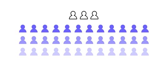
Measuring U’s survey found that 61% of small companies (less than 10k employees) have a lower designer/developer ratio, with fewer than one designer for every 20 developers.
A 2017 article from TechCrunch demonstrated a similar finding when they examined how designer/developer ratios changed as the organization’s scaled and matured. It’s important to note that at the time of writing the TechCrunch article in mid-2017, the industry was experiencing a shortage of UX designers, and some companies expressed a goal of a 1:3 designer/developer ratio.
Atlassian
2012: 1 designer to 25 developers2017: 1 designer to 9 developersDropbox
2013: 1 designer to 10 developers2017: 1 designer to 6 developersUber
2017: 1 designer to 8 developers (design team grew 70x from 2012 to 2017)IBM
2012: 1 designer to 72 developers2017: 1 designer to 8 developersAlex Schleifer, VP of Design at Airbnb, says to “Grow design’s headcount in step with engineering and product hires.” Alex suggests a ratio of 1 designer for 6-8 developers. He says it’s important to set a baseline early on to help maintain consistency as the team scales.
Maturity also has an impact on designer/developer ratios. Measuring U found that 71% of companies in the initial and growth stages had fewer than one designer for every 20 developers vs. 40% for mature organizations.
The Rise of Design ThinkingThe TechCrunch article also claims that factors other than size and maturity have impacted designer/developer ratios at big tech companies.
Companies have found that focusing on design thinking and user experience has proven to deliver excellent business value. People often quote a famous 2016 2016 Forrester report that claims, “…on average, for every dollar you spend on UX, there’s a 100X return!”
When you look at the numbers from the tech giants we mention above, it seems that companies are placing more emphasis on design than they did in the past.
A mature company like IBM, which has been around for decades, went from 1:72 to 1:8 in five years–mirroring the trend of its younger peers. So, even if you’re a startup or small business, investing in design could deliver a good ROI.
How Design Tools Impact Designer to Developer Ratios
Design tools also impact designer/developer ratios. An excellent example of scaling design without increasing employees is how PayPal used UXPin Merge to scale its design process.
PayPal had a disproportionate designer/developer ratio of 1 designer for every 200 developers. The entire design department had five designers with 60 products and over 1,000 engineers. Erica Rider, Senior Manager for UX – Developer tools and platform experience at PayPal, had the task of scaling design without growing the design team itself.
After much trial and error, Erica came across UXPin Merge–a tool that allows you to sync code components from a repository to UXPin’s design editor.
PayPal uses the Microsoft Fluent UI for its internal products. They synced Fluent’s React component library from a Git repo to UXPin, so design and development teams were using the exact same components to develop new products.
UXPin Merge’s drag and drop design process meant that PayPal’s product team could take over designing, prototyping, and usability testing, completing 90% of the work, leaving UX designers to focus on more high-level UX initiatives.
By switching to a code-based design tool and utilizing an existing component library, PayPal’s product teams were able to build fully functioning prototypes eight times faster than experienced UX designers had previously.
This significant boost in productivity meant that PayPal’s disproportionate designer/developer ratio no longer influenced the product development process. And, with such an impressive ROI, Erica was given resources to grow the UX department to scale user experience initiatives.
The key takeaway from PayPal’s case study is that tools could help companies scale design, even with low designer/developer ratios. Sign up for a 14-day trial to experience Merge using our MUI integration.
The Benefit of a Design System
Another way to increase productivity and consistency is through a design system. If you can’t afford to build and scale a design system, consider customizing a component library as PayPal did with Fluent UI.
Design systems allow designers to focus on building mockups, prototypes, and usability testing rather than designing from scratch every time. They also achieve a much higher degree of consistency and streamline design handoffs.
This increased efficiency means you need fewer designers to developers. The faster time to market also gives your company a competitive edge.
The Impact of DesignOpsDesignOps has proven to optimize UX workflows, scale design, and influence designer to developer ratios. Many organizations experience increased productivity, resulting in fewer designers completing more work.
“We were able to decrease the amount of investment required for rote design work by 75% after implementing DesignOps at a Fortune 100 financial company. This freed up considerable resources to invest in mission-critical UX research, design thinking, and product innovation.”
Theresa Neil, Founder of Guidea and co-author of DesignOps 101: Guide to Design Operations
Startups and small companies often don’t recognize the need for DesignOps because they see it as a “nice to have” added expense. But, the benefits of DesignOps mean that your design team is more productive. If you can’t afford the designer to developer ratios that the tech giants above achieve, setting up DesignOps could help increase productivity with less cost.
Optimize Design With UXPin Merge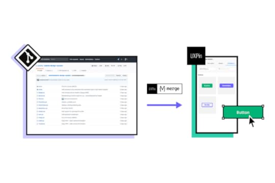
Hiring designers to scale your design operations is costly and unrealistic for many small businesses and startups. As demonstrated with the PayPal case study, UXPin Merge can significantly increase productivity and reduce time to market–even with a higher ratio of designers to developers.
You can sync React components to UXPin directly through Git or use our Storybook integration for other popular front-end frameworks like Vue, Angular, Ember, Web Components, and more.
Prototype, test, and deploy faster while creating better experiences for your customers with UXPin Merge. Sign up for a 14-day trial and get a taste of Merge through our free MUI integration.
Discover MergeThe post What Should the Designer-to-Developer Ratio Be and How to Scale? appeared first on Studio by UXPin.


April 6, 2022
The Ins and Outs of Design System Ops
 Key TakeawaysDesign System Ops is a way of operationalizing and standardizing design systems and its componentsIt can help teams reduce inefficiencies, optimize workflows, evangelize design system, and make it easy to scale the system.Anyone can start Design System Ops, just find out who your users are, define the Design System Ops issue you want to get rid of, implement a solution, and measure its impact.A good tool for Design System Ops is UXPin Merge that helps you import UI components from your design system and use them to create prototypes in the design editor.
More Ops roles appear as companies and departments look for efficiencies and reduce operational costs. You’ve probably heard of DesignOps, but what do you know about Design System Ops?
We have based this article on UXPin’s 2017 webinar Design System Operations with keynote speaker Kaelig Deloumeau-Prigent, who was working on Shopify’s Polaris design system at the time.
Find out what design system Ops does and how you get started in your organization. We highly recommend our free eBook DesignOps 101: Guide to Design Operations, which covers DesignOps fundamentals.
Optimize your design system with UXPin–the world’s most advanced end-to-end design tool. Whether you’re a startup with a team of one or a multinational organization with thousands of employees worldwide, UXPin has a solution to meet your needs. Sign up for a free trial to explore what UXPin has to offer.
What’s the Purpose of a Design System?A design system must provide designers and engineers with the tools to build and scale products quickly, coherently, and consistently.
More than a collection of components–a design system provides users with documentation, best practices, principles, and guidelines to ensure team members ship products that meet brand and usability requirements.
What is Design System Ops?Design System Ops seeks to optimize the processes and standards for taking new design system components and templates from design to release.
The aim is to reduce “decision fatigue” with a frictionless delivery process through tools and protocols. This optimization allows the design system team to spend more time on creativity, innovation, and quick delivery rather than operational procedures and decision-making.
Why Operationalize Design Systems?
As UX and design system expert Nathan Curtis famously said in a 2016 Medium post: “A Design System isn’t a Project. It’s a Product, Serving Products.”
Design System Ops must reduce workflow inefficiencies to serve its users and products while bridging the gap between design and development. The goal is to implement tools and processes that ensure new releases mirror the original design’s fidelity, functionality, and usability.
Who is Responsible for Design System Ops?A design system Ops manager must be someone experienced with design and development. They must understand both processes to identify and fix problems effectively.
Design system knowledge and experience are also essential. An Ops manager cannot optimize the operations without a fundamental understanding of building, managing and scaling a design system.
Unlike traditional DesignOps, which focuses on design, and DevOps, which focuses on development, design system Ops straddles these two disciplines providing support to designers and engineers.
How Design System Ops Supports Developers
To ensure releases meet design specifications, design system Ops spends a lot of time creating tools to support developers. The operations look at the end-to-end development process to find inefficiencies and provide solutions.
Here are some examples of how Ops supports developers:
Design Handoffs – Optimizing Designs for PerformanceOps must define what happens to an image or asset from design to development. If they must convert an asset from PNG to webp, how do they do that–is there a tool, or do they do it manually?What’s the best way for engineers to load assets?What format do engineers use for assets (PNG, JPG, SVG, etc.)?Do developers optimize images during the build, or do they use a CDN?Standardizing and optimizing HTML and CSS markup for assets to deliver the best performance.How do engineers use fonts for various platforms, including the web, iOS, Android, etc.?The Developer ExperienceLocal development environments must be fast to set up so engineers can start building immediately. For example, creating a new project should be as simple as yarn start, npm start, or whatever your tech stack uses to initiate.Linter configuration–The standards and practices for writing code.Ops must answer the question, “how do you build a new component?” What steps must developers take to ensure maximum consistency and efficiency?Releasing updates should be effortless, preferably a quick single-button release–how does Ops implement such a process?TestingOps must assess how devs run tests locally and how long that process takes. If necessary, they look for tools and methods to streamline testing so engineers don’t waste time waiting for tests to run.Visual regression testing–how do changes to a component impact the design system, and how do devs test?How can Ops optimize and automate accessibility testing? For example, using tools to inspect code for ALT tags.These are just some examples of the design system Ops approach to supporting engineers. The overarching theme is “how do we make reduce decision-making so engineers can ship releases faster?”
The design system team and its users should never have to ask, “how do I do this?” or “where do we find that?” Ops’ goal is to maximize design system efficiency and reduce time-to-market for releases.
Design System Ops–Where to Start?1. Who Are Your Users?To implement design system ops, you must start with user research. The first question you need to ask is what tools and languages are team members using?
For developers: What is the current tech stack, and what IDEs do engineers use?For designers: How do UX designers create wireframes, mockups, and prototypes?When Ops understands how teams work, they can find and fix inefficiencies. The goal is to find bottlenecks and roadblocks in the design system release process.
2. Define the ProblemOnce Ops identifies an issue, it’s crucial to define the problem to implement the correct solution. Is there something wrong with the process, or is it a matter of better training?
3. Implement FindingsOnce Ops finds a solution for a specific problem, they need to implement it. Implementation might include providing training, workshops to promote usage, updating documentation, etc.
4. Measure and Monitor ResultsDesign systems Ops uses various tools and metrics for monitoring and measuring a design system and its users. If you have a website for your design system, tools like Google Analytics can track clicks, downloads, and other metrics to see how people use it.
Ops also want to monitor critical metrics to identify issues and bottlenecks, including:
Build time: How long does it take developers to build new components–from design handoff to release?MTTR (mean time to repair): How long does it take to fix design system issues?Quality: Error and rework rates. Frequency of usability and accessibility issues.As Kaelig Deloumeau-Prigent mentions in UXPin’s Design System Ops webinar, “Success should be measured by the problems you solve rather than the tools you put in place.”
In other words, don’t be quick to fix something that isn’t broken. Design systems Ops isn’t about introducing tools; it’s about finding and fixing inefficiencies.
Optimize Your Design System With UXPin Merge
Bridging the gap between design and development has never been easier than with UXPin Merge.
Merge allows you to sync a design system hosted in a repository to UXPin’s editor so designers can build prototypes with fully functioning code components.
Sign up for a 14-day trial to experience UXPin Merge with MUI integration.
The post The Ins and Outs of Design System Ops appeared first on Studio by UXPin.
April 4, 2022
How to Improve Feedback Loops in Design Process
 Key TakeawaysFeedback loops have three stages, that is action, effect, and feedback.They are used to understand users, validate design ideas, build information architecture, as well as improve usability.Feedback loops solve problems and answer questions, but they can be either positive (increase an input action) or negative (decrease an input action).
Understanding feedback loops is crucial for designers to create engaging user experiences. This feedback is also beneficial for failure-proofing design concepts so designers can avoid wasting time and resources building products and features users don’t need or won’t use.
These feedback loops aren’t always obvious, so designers must study data and use active listening methods to get to the heart of the problem.
To improve feedback loops in the design process, designers must learn to recognize these patterns throughout the real world. Everything is a feedback loop.
Our brains are constantly assessing the world through a series of feedback loops. This feedback is crucial for learning about the world and developing appropriate reactions.
We see these feedback loops in digital products too. The best designers understand these feedback loops are a critical part of UX design psychology and the overall user experience.
Improve your user experience design with advanced prototypes for improved testing. Sign up for a free trial to discover how UXPin can enhance your digital product design.
What are Feedback Loops in Design?Feedback loops happen in three stages:
ActionEffectFeedbackThe most common example in digital product design is when a user posts something to social media:
Action: A user posts a photoEffect: Other users comment and likeFeedback: Affirmation that people like your contentIn this feedback loop example, a social media user gets the reward of affirmation from other users incentivizing them to repeat this action.
In an enterprise application, a user might use a digital product to streamline a workflow to complete tasks faster and more efficiently:
Action: A user completes a mundane task using a digital productEffect: The product saves them timeFeedback: The user’s boss praises them for their efforts, or they have more time for other more important workThis powerful design psychology keeps users engaged and makes digital products more enjoyable to use. The more enjoyable the experience, the more likely people will continue using your product or website.
How Do Feedback Loops Apply to Product Design?Designers use feedback loops throughout the UX design process to understand users and solve their needs.
UX research: UX designers use a human-centered design approach to look for behavioral patterns and problemsUX design: Designers create feedback loops with microinteractions, system messages, etc. to help users complete tasks successfully or provide context to errorsUsability testing: Researchers study users to identify reactions when completing tasksWhy is a Feedback Loop Important in Design?Understanding feedback loops in product design is vital for several reasons.
Cause and Effect RelationshipsFeedback loops help UX designers understand cause and effect relationships for specific tasks and features in a digital product. Some of these relationships are immediate and obvious, while others have long-term impacts on users and society.
For example, social media is an addictive experience for teenagers. The immediate effect is that teens get a dopamine hit from likes and positive comments. They use the social media platform more, creating business value. But the long-term effects of teenage social media use are bad for mental health.
Not only is this bad for society, but it could result in fines or legislation, making it harder and more costly for the company to do business.
UX designers must constantly evaluate products and test ideas to fix or prevent adverse effects from feedback loops. For example, Instagram removed like counts test the impact on mental health. The idea is that people wouldn’t measure themselves against other users and feel less liked or important.
Idea ValidationUser feedback helps designers validate ideas and hypotheses–how does the user react to a new component or feature designed to solve a specific problem?
For example, a UX designer might make error messages clearer and more helpful if users have trouble completing forms, providing a feedback loop to guide people through the process. These feedback loops might include an error message telling the user a password must be a certain character length or correct formatting for the email address.
Understanding Users BetterFeedback loops help UX designers understand users and behavioral patterns. By identifying what satisfies and frustrates users, UX designers can build better user experiences.
For example, users might express frustration when they cannot cancel a paid plan. Many product designers intentionally hide this feature, making it difficult in the hopes that the user gives up.
The problem with this strategy is that you damage trust in the brand by frustrating the user, making it less likely they’ll return as a paying customer in the future. Making the cancelation process easy satisfies the user, making it easier to nurture them back to a paid plan.
When UX designers understand human behavior and satisfying feedback loops, they can build positive product experiences that keep people coming back.
Prioritize Information Architecture and LayoutsFeedback loops and patterns help designers identify content and features that matter most to users. This information is crucial for organizing information architecture and prioritizing layouts.
A great example is how designers place the most important CTA above the fold on a website or prioritize navigation in the header vs. the footer. Designers can only achieve this by understanding user behavior and how they interact with a digital product through feedback loops.
Improve UsabilityFeedback loops provide insights for designers to make usability and accessibility decisions.
Positive vs. Negative Feedback LoopsThere are two types of feedback loops:
Positive feedback loopsNegative feedback loopsUnderstanding whether a feedback loop is negative or positive is crucial for designers to take the correct course of action.
It’s important not to get confused by the connotation of negative and positive; these titles don’t refer to feedback loops being either good or bad. Rather it’s a response to change, i.e., less or more.
Positive Feedback LoopsPositive feedback loops cause an increase in the input action. For example, if someone posts something on social media, they’re rewarded with affirmation and repeat the action.
In a more simplified example, adding a hover state to links and buttons tells users it’s a clickable UI element, thus increasing clicks and resulting in a positive feedback loop.
Negative Feedback LoopsNegative feedback loops cause a decrease in the input action. For example, if someone can’t find what they’re looking for on a search engine, they might get frustrated and use another service, resulting in less of the input action–searching.
You might think you need more positive feedback loops and fewer negative feedback loops to create a good user experience, but there are times when you might prefer one over the other.
For example, suppose you’re designing a productivity application that helps users organize and automate email tasks. In that case, your product will decrease the action of checking emails–which means your product is successful even though this is a “negative feedback loop.”
Best Practices to Improve Feedback Loops in the Design Process 1. Collect and Analyze Data
Data and analytics can tell you a lot about user behavior and feedback loops. If you’re redesigning a product or website, you can use various metrics to monitor its success.
2. Conduct Usability TestingData combined with real-life user interviews can help designers understand and pinpoint problems.
During usability studies, UX designers use empathy maps to put themselves in the user’s shoes. Empathy maps tell UX designers what someone thinks, feels, says, and does–which are essentially feedback loops resulting from interaction with a product.
3. Use Feedback Loops EthicallyUX design psychology and feedback loops have powerful effects on users and could potentially reshape society. A great example is how the world changed post social media.
UX designers and organizations have an obligation to use design psychology ethically and not manipulate users with feedback loops designed to encourage unhealthy behavior.
4. Feedback Loops Must Solve Problems and Answer QuestionsUX designers must find solutions to common problems and questions. Here are some examples of questions a user might ask while interacting with a digital product:
How long will this take?: Using a progress bar during onboarding or checkout flow tells users how many steps they still have to complete.Can I click this?: Designers must use color, states, hierarchy, and other UI methods to tell users what they can and can’t click. Is this working?: Providing system feedback is crucial for users to understand when something is loading. You can also use error messages or haptic feedback to alert people to a problem that needs their attention.Create Enjoyable User Experiences With UXPinPrototyping and testing are crucial stages of the design thinking process. Prototypes allow designers to test and validate ideas with end-users. The problem is that most design tools cannot replicate the fidelity and functionality code.
UXPin is a code-based design tool with powerful features that allow design teams to build high-fidelity, fully functioning prototypes. Better prototypes result in meaningful feedback from usability participants and stakeholders, giving design teams accurate insights to make changes and iterate.
Sign up for a free trial to see how UXPin can enhance UX workflows and design product experiences your customers will love.
The post How to Improve Feedback Loops in Design Process appeared first on Studio by UXPin.
March 31, 2022
Top 10 Design Handoff Tools to Try in 2022

Design handoff tools help facilitate smoother transitions from design to development. These tools provide engineers with practical documentation, high-fidelity prototypes, and features to communicate and collaborate effectively.
Without an effective design handoff process, designers and engineers spend hours, days, or even weeks of back and forth trying to bridge the gap between design and development.
Reduce friction and streamline your design handoffs with the world’s most advanced code-based prototyping tool. Sign up for a free trial to discover how UXPin can enhance your end-to-end design process.
Jump to section:Why are Design Handoffs so Challenging?Unrealistic ExpectationsPoor Image-Based Tools for Rendering CodeTechnical ConstraintsToo Many Design Handoff ToolsTop 10 Tools for Better Developer Handoff in 20221) UXPin Merge2) Zeplin3) Marvel4) Sympli5) Avocode6) InVision7) Framer8) Spectrr9) Adobe XD10) FigmaBetter Design Handoffs with UXPin MergeWhy are Design Handoffs so Challenging?One of the biggest design handoff challenges is prototype fidelity and functionality. Designers must use various tools and methods to replicate code-based features–for example, GIFs and videos to display transitions and animations.
Unrealistic ExpectationsThe problem with these methods is that they don’t have technical constraints, creating unrealistic expectations for designers and product teams. They’re also not part of the actual prototype, so engineers have to go from a prototype to an external file to watch the video animation and see how it all fits together.
Poor Image-Based Tools for Rendering CodeAnother issue is converting a design to code. Most image-based design tools offer plugins or applications that generate an HTML template with accompanying CSS. Designers think this is sufficient, but engineers can’t replicate the designs with this code–the two teams are speaking different languages with insufficient interpretation.
Technical ConstraintsAnother cause of design drift is the rendering engine of the browser or device displaying your product. The most common example is the drift between colors and gradients from mockups to final code.
Too Many Design Handoff ToolsAnd lastly, design handoffs often include multiple tools for design files, prototypes, documentation, assets, and collaboration. With everything spread across different locations and platforms, handoffs are prone to mistakes and errors.
These are just a few common design handoff challenges that cause friction between design and development. Many of these issues will be familiar if you’re experienced with the handoff process. Luckily, there are design handoff tools to help expedite and streamline the process.
Top 10 Tools for Better Developer Handoff in 20221) UXPin MergeUXPin is a code-based tool that renders HTML, CSS, and Javascript rather than vector files like traditional image-based design tools. The benefit for designers and developers is less drift and realistic designs and expectations.
With UXPin, you can design everything from basic wireframes to immersive UI designs and code-based high-fidelity prototypes using our proprietary Merge technology.
UXPin Merge allows you to import UI components to UXPin, so designers can build fully functioning interactive prototypes. This single source of truth enables designers and engineers to work with the same UI elements.
You can sync your company’s design system or a front-end component library like MUI. Designers use these components as they would in any image-based design tool, but with code-like fidelity and functionality, including interactivity and animations. You simply drag and drop code components to build user interfaces and high-fidelity prototypes.
Engineers can help designers to edit components using React props (or Args for UXPin’s Storybook integration) which appear in the properties panel of UXPin’s design editor, but with a brand new Merge Component Manager, designers can manage the props in UXPin. See how Component Manager works.
#MergeHint 📎 Take UI components from @storybookjs & use them in UXPin's design editor. Just paste your Storybook link in the integration box, and you're ready to design with code 🎇 Discover #UXPinMerge.
— UXPin (@uxpin) March 17, 2022
Request access: https://t.co/Wg4WkPmeBR pic.twitter.com/h6JGBIGs4n
Any changes designers make to components render JSX, so engineers only need to copy and paste to apply the changes. With both teams using the same UI elements, there’s no drift, and engineers can copy components from the repository to start development.
UXPin also includes design documentation, Spec Mode (with style guide), comments (for annotations and real-time collaboration), and asset download, keeping the entire developer handoff on one design platform.
With UXPin Merge, designers can build prototypes with fully functional date pickers, forms, charts, data grids, navigational components, and other UI elements designers battle to recreate using image-based design tools.
#MergeHint ☀️ With UXPin Merge, your prototypes look and feel like a finished product! Use complex code components & 🔬 test your prototype's functionality by allowing users to interact with the prototype, not just look at it! Discover #UXPinMerge 👩🔬 https://t.co/fJ2YQKIKme pic.twitter.com/NKhbvLOy6q
— UXPin (@uxpin) March 25, 2022
Check out Design Handoff: What it Looks Like with UXPin Merge for a detailed look at how Merge can optimize your design process and handoffs.
Sign up for a free trial to test UXPin’s Merge technology with MUI components via our Storybook integration. You can also sync React components directly to UXPin through Git or import them easily with Component Manager.
2) ZeplinZeplin is a popular design handoff tool making it easy for designers, engineers, and other team members to communicate and collaborate effectively. You can also integrate Zeplin with tools like Jira, Slack, Trello, and Microsoft Teams for improved collaboration.
With Zeplin, designers can create user flows with annotations to provide engineers with context. A style guide allows designers to save colors, text styles, spacing/layouts, design tokens, and components.
The tool also includes code snippets for web, iOS, and Android applications with CSS, Less, SASS, and other styling so engineers can copy/paste to start development.
3) MarvelMarvel is a popular end-to-end design, prototyping, and testing tool with similar design handoff features to Zeplin. You can use Marvel-generated mockups to build prototypes or import from other popular design tools.
Marvel automatically generates starter code and CSS for your mockups and prototypes to save time and bridge the gap between design and development.
Engineers can inspect each component and download assets from Marvel, avoiding miscommunication and switching between tools.
4) SympliSympli is a purpose-built version control and design handoff tool. You could say that Sympli is the designer equivalent of the component directory Storybook.

Designers can use integrations from popular design tools to sync components, mockups, and even a design system to share with engineers and stakeholders. Teams can review and collaborate on different elements to provide explanation and context.
Engineers can also view a style guide, spec mode, and specs and assets to start the development process. One of Sympli’s biggest benefits is its ability to sync with IDEs through plugins for Xcode and Android Studio for mobile app development.
5) AvocodeSync your design tool with Avocode to create a handoff file for the development team. Avocode’s “one-click” integrations save designers time by generating downloadable assets, spec mode, and snippets for ten code languages.
Another great feature is Avocode’s design review, allowing designers to invite other teams and stakeholders to critique designs and provide feedback. Designers can iterate on feedback and resync the changes creating a new version so that everyone is aware of the updates.
Design teams and stakeholders can also use Avocode’s review feature to discuss inconsistencies and fixes during the QA process.
6) InVisionInVision is another end-to-end design, prototyping, and testing tool with similar features to UXPin. Invision lets you prototype from InVision Studio designs or import files from other popular image-based design tools.
Inspect is InVision’s design handoff tool that automatically generates design specs and code snippets. Designers and engineers can also communicate via comments to keep collaboration and feedback in one place.
With Inspect’s Storybook integration, InVision will inform engineers which components exist in code repositories, saving time searching libraries and preventing accidental rework.
InVision also integrates with software like Jira, Confluence, Trello, and others to sync communication and project management tasks.
7) FramerFramer is an advanced design and prototyping tool with a code editor to sync and edit React components–a fantastic feature for developers but doesn’t help designers with limited code knowledge and experience.
Designers can’t edit the component’s props in the properties panel as they would in UXPin. Instead, they have to make changes in Framer’s code editor–again, not ideal for those with limited code knowledge.

Designers can, however, use these React components for prototyping and testing, giving designers better fidelity and functionality than other popular image-based tools.
Framer’s high fidelity and functionality make design handoffs smooth and efficient. Engineers can copy code from React components to build new products and UIs.
While Framer’s code-based design technology is excellent for React products, it lacks features for other popular front-end frameworks that UXPin’s Storybook integration provides.
8) SpectrrSpectrr is a design specification tool with automated annotations for engineers to inspect components and layouts, including colors, fonts, spacing, and more.
Designers can include notes for each component and instructions for creating responsive layouts. Spectrr also generates a complete CSS file for the project, giving engineers an excellent starter template to begin development.
9) Adobe XDAdobe XD is a widely used UX design and prototyping tool. Designers can hand off to engineers via Adobe XD’s Share feature, including specifications and CSS starter code.
Designers and engineers can collaborate using comments and Adobe XD integrates with popular project management software like Jira, Slack, Microsoft Teams, and others.
Adobe XD’s Share feature is limited by comparison to other design handoff tools, but you can sync designs to Zeplin for more features and better collaboration.
10) FigmaFigma is arguably one of the most popular design tools. The original release was similar to Sketch but has since evolved to offer prototyping and testing functionality.
In Figma’s Share Mode, engineers can inspect elements and generate code snippets for web, iOS, and Android. You can also install third-party plugins to generate code for frameworks like React, Flutter, Vue, Ember, Angular, etc.
Figma allows you to add “developer seats” to your design projects, so you don’t have to pay to invite and collaborate with engineers. They have complete access to the project and provide feedback through Figma’s comments feature.
Better Design Handoffs with UXPin MergeWhy use multiple design handoff tools when you can do everything with UXPin Merge? Streamline design workflows, build fully functioning prototypes, enhance collaboration, and improve your product’s user experience with a single tool. Try Merge and see how easy product development gets when everything is connected. Request access now.
Discover MergeThe post Top 10 Design Handoff Tools to Try in 2022 appeared first on Studio by UXPin.
March 30, 2022
Transitioning from a Product Designer Role into DesignOps
DesignOps is a fast-emerging and exciting UX discipline born from the success of DevOps for engineers. There are loads of opportunities to enter DesignOps as a leader or program manager at some of the world’s largest organizations.
This article will give you an introduction to the role of a DesignOps leader, the skills required, and how to land your first job.
As a DesignOps leader, it’s your job to find tools to streamline UX workflows. Sign up for a free UXPin trial to discover the world’s most advanced collaborative design tool.
What is a DesignOps leader?The primary objective of DesignOps is to streamline processes and remove obstacles and distractions so that designers can focus on design.
A DesignOps leader works closely with a design leader to implement the systems and processes for the organization to achieve its design goals. This inward-looking role focuses on team performance and optimizing the end-to-end design process.
In Measuring DesignOps Impact, Patrizia Bertini, Associate Design Operations Director at Babylon, summarizes the roles of a design leader vs. DesignOps leader as follows:
DesignOps Leader:
Inward looking and process-oriented
Mission: the How / the performanceFocus: End-to-end design process & teamsKPIs: Team health, spending, & performance metricsDeliverables: Operations roadmap & strategySkills: Change managementDesign Leader:
Outward looking and product-oriented
Mission: the What / the productFocus: Product/service vision & individualsKPIs: Product & experience metricsDeliverables: Product roadmap & design strategySkills: Influence & negotiateWhat is a DesignOps Leader’s Responsibility?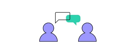
In DesignOps – How to Improve Your Design Workflow and Operations, we go into great detail about the DesignOps role. Here are some key roles and responsibilities of a DesignOps leader:
Operations management: Creating an operations roadmap with long-term goals and identifying the training required to achieve milestones and objectives.Process design: Creating the systems, processes, and tools teams need to complete their work, including frameworks for collaboration across the organization.Project management: Managing UX workflows, assigning tasks, setting deadlines, and removing bottlenecks. The DesignOps leader also organizes and facilitates design sprints.Communication strategy: DesignOps leaders ensure design teams communicate effectively among themselves and across the organization. They also create systems for storing and sharing data to be accessible to everyone.Onboarding: Hiring new employees and providing the orientation and training to ensure they integrate with the team.Culture: Organizing team-building activities to instill company culture and individual development.Budgeting: A DesignOps leader must outline the design team’s operational expenses with justification for costs. They’re also in charge of assigning budgets and managing design operations’ cash flow.Legal: Working with the legal team to create legal documentation like NDAs for usability participants.Design procurement: Managing all purchasing decisions with the financial department.IT & security: Working with the IT department to ensure compatibility and security of design tools.DesignOps Skill SetChange management is one of the core skills of a DesignOps manager or leader. They often introduce teams to new tools, processes, and workflows. As Patrizia Bertini puts it in Measuring DesignOps Impact, “DesignOps changes the existing reality to bring more value. It’s a very transformative discipline.”
DesignOps leaders have excellent project management skills, capable of leading teams towards a shared path and goals. Understanding design processes, software, and technology is vital for DesignOps leaders to manage team members effectively.
A DesignOps leader is an excellent communicator and collaborator. They must be capable of engaging with everyone from an entry-level UX designer to C-level management and stakeholders. They must also be confident public speakers to host workshops, design sprints, and other presentations.
DesignOps also requires excellent business acumen to manage budgets, communicate with stakeholders (HR, technical, finance, legal, IT, etc.), and develop strategies that align with the organization’s long-term business goals.
What Companies Have DesignOps Teams?
You’ll typically find DesignOps teams in large organizations where bureaucracy, silos, and other inefficiencies impede the design process. But any company can apply the DesignOps mindset without a dedicated team or leader.
Chapter one of DesignOps 101: Guide to Design Operations explores the DesignOps mindset teams can apply with or without a leader. The Nielsen Norman Group defines DesignOps in three primary areas:
How we work together: Organize teams, collaborate, and humanize environments and gatherings for more efficient work.How we get work done: Standardize processes, harmonize a shared understanding of design intelligence, and prioritize projects.How our work creates impact: Measure work to create accountability, socialize as a tool to educate others on the value of design, and enable the use of design thinking and related activities.Find out more about the DesignOps mindset here and read Airbnb’s article on the topic “How we manage effective design at scale.”
For insights on how DesignOps works in a large organization, we recommend reading Dave Cunningham’s article documenting his first six months as a DesignOps manager at Co-op Digital in the United Kingdom.
What is the Skills Matrix?A skills matrix visualizes a team’s skills and competency to pair the right members for a given project. DesignOps leaders will use a skills matrix for three primary purposes:
Design skills pairing for projectsIdentify skills gaps and arrange relevant trainingSourcing and hiring talent with a specific skill set to complement the teamYou can learn more about the skills matrix and a step-by-step process for creating one here.
Where to Look for a DesignOps Job?
The first place to start is within your current job. In chapter five of DesignOps 101: Guide to Design Operations, we outline How to get started with DesignOps in Your Company so you can pitch the idea to management and stakeholders.
You can also find DesignOps jobs on all the popular job boards, including:
IndeedGlassdoorLinkedIn JobsZipRecruiterWe recommend checking out DesignOps Assembly (DOA), founded by experts Elyse Hornbacher and Meredith Black. DOA helps people interested in DesignOps to learn and grow. They have chapters across the United States, South America, Australia, and Europe.
Solving DesignOps Challenges With UXPin MergeBy bridging the gap between design and development, UXPin Merge solves many DesignOps collaborative and workflow challenges. Merge allows you to create a single source of truth by syncing a component library or design system from a repository to UXPin’s design editor.
With Merge, DesignOps leaders don’t have to worry about syncing design systems for designers and developers or managing multiple tools for storage, communication, collaboration, and documentation. Everything is in one place for the entire team to access at all times.
Sign up for a free trial and discover how UXPin Merge can optimize your UX workflows and enhance collaboration between design and development.
The post Transitioning from a Product Designer Role into DesignOps appeared first on Studio by UXPin.
March 29, 2022
Checklist What to Do After Launching a Design System

Like any digital product, launching a design system is just the first step. The next step is about supporting, evolving, and scaling your design system as it matures with your product(s) and technology.
The design system team must also gather user feedback for system improvements, bug fixes, and new components. There are no right or wrong ways to go about scaling and maturing a design system, but there are some guidelines your team can adopt to improve its success.
UXPin provides you with the tools and features to develop, launch, scale, and mature your design system. Sign up for a free trial to experience the world’s most advanced code-based design tool.
Checklist of Tasks to Do After Launching a Design System1) Be Open to User Feedback2) Design System Governance3) Flexibility to Scale4) Share Your Roadmap & Releases5) Promoting a Design System6) Using KPIs to Measure ValueScaling and Maturing a Design System with UXPin1) Be Open to User FeedbackOne of the keys to evolving and scaling a design system is user feedback. The design system team must create channels to engage with the design system’s users.
Here are some examples:
Form submissions: Most design systems offer a contact page with a form for users to submit feedback. This makes it easy for teams to contact the DS team if they spot an issue. Stack Overflow’s Stacks design system includes a form at the footer of every page where users can upvote, downvote, send a message, or file an issue on GitHub.Workshops: Design system workshops are great for educating teams about usage and best practices, but it’s also a fantastic opportunity to listen to users and get feedback.Message channels: Creating dedicated channels on platforms like Slack or Jira is a great way to make the DS team accessible and encourage feedback from users. Consider setting up several channels for different purposes, for example, #design, #development, #bugs, #documentation, #releases, etc.Videocall Q&A sessions: Video Q&A sessions are crucial for face-to-face engagement with remote teams. The DS team can use these sessions to answer questions and share their screen to explain complex issues or solve problems together. 2) Design System Governance
Opening these channels of communication is vital for design system governance and evolution. “Design system governance is the process and protocols for maintaining and updating a product’s design system.”
To maintain the design system’s integrity, teams must follow procedures and protocols to make updates and changes. A standard method of governance starts with a decision tree that takes users through a series of questions until they arrive at a suitable instruction–for example, “propose an amendment to an existing pattern.”
Common amendments and procedures include:
Introducing new elements: The workflow and procedure for adding new elements.Promoting patterns: Procedures for implementing one-off or best new practice.Reviewing and adapting patterns: A review process ensures that new elements meet design principles and standards.Releasing design system updates: A release schedule keeps updates consistent and ensures team members follow correct QA procedures.Each new UI element or component must undergo rigorous design, prototyping, and testing as the original design system. The DS team must also include procedures to update the design system’s style guide and documentation to align with releases.
3) Flexibility to Scale
While governance is essential to ensure integrity and consistency, the DS team must include the flexibility for teams to scale the design system and its products.
Salesforce Lightning achieves flexibility through Variations and States, which gives users multiple versions of a component. This proactive approach gives Salesforce’s teams the tools to innovate and scale without time-consuming governance procedures for basic component changes.
4) Share Your Roadmap & ReleasesThe DS team must set up channels to communicate design system changes to users and stakeholders.
Design system roadmapA roadmap outlines the design system’s timeline, tasks, milestones, and deliverables, providing transparency and managing user and stakeholder expectations.
A typical design system roadmap includes:
Recent releasesWhat teams are currently working onWhat teams will work on nextFuture releases (6-12 months in advance)Release Notes or ChangelogYour design system should include a “What’s New” section informing users of your latest releases, including notes and links to updated documentation.
 Version Control
Linked to releases is versioning which gives users control over how and when they upgrade to the latest design system version. UXPin Merge’s Version Control allows teams to manage design system versioning for each project. Designers can also switch between versions, which is helpful for fault finding or updating old UIs.
5) Promoting a Design SystemFor many people, the benefits of a design system are obvious, while others need more convincing. The DS team and advocates must find creative ways to promote the design system and increase its usage across the organization.
Create a Design System SandboxCreating a sandbox environment is a fantastic way for users to interact with your design system. You could include a couple of test projects or ask people to copy a UI from one of your products so they can get real-world experience.
Make your sandbox a little more exciting by offering monthly prizes for who can build a prototype the fastest using your sandbox environment.
Demonstrate a Side-by-Side ComparisonWhen PayPal switched to UXPin Merge, they did a side-by-side using Merge vs. an image-based design tool. PayPal’s designer created a one-page prototype eight times faster using UXPin Merge.
Demonstrations like this help prove your design system’s ability to streamline workflows. You can record these sessions and use them during presentations to stakeholders for further investment in your design system.
Design System MeetupsCommunication is one of the essential factors of scaling and maturing a design system. The DS team must be open to receiving feedback, as well as actively engaging with users to increase adoption.
Hosting face-to-face meetups is crucial to achieving organization-wide implementation and adoption. Isha Kasliwal, who spent 8+ years on Salesforce Lightning’s DS team, reiterated this point at a Clarity Conference 2017 speech:
“For the Lightning Design System, we focus heavily on adoption and implementation across the entire organization. We reach out to people through office hours twice a week where anyone can ask us about the Design System. We hold brown bag lunch meetings. When I say these out loud, I feel like they’re no-brainers, but there are a ton of people who don’t realize how frequently you have to do this in-person outreach to be there as sounding boards for them.”
6) Using KPIs to Measure Value
Acquiring future resources requires the DS team to demonstrate the design system’s return on investment. It’s crucial to measure KPIs before implementing your design system to have a baseline to measure performance.
There are three essential KPIs to track a design system’s performance over time:
Team efficiencies – estimate how long it takes teams to build a new product using the organization’s design systemSpeed to market – measure how long it takes teams to build and test prototypesEffect on code – measure how much code developers change with each releaseOther areas where you might experience improvements after implementing a design system include:
Increase sales/conversionsReduced tech support callsBrand satisfactionReduced rework or errorsEmployee retentionLabor cost savings7) Maturing a Design SystemYour long-term goal is to achieve a design system maturity level where designers and engineers have everything they need to develop new products. Achieving this level of maturity takes a considerable amount of time and resources.
Global Software developer Iress identified four stages of design system maturity. The final stage is a fully integrated single source of truth between design and development–a process that started in 2015 and Iress only achieved in 2022!
Scaling and Maturing a Design System with UXPinUXPin gives you the features to go from concept to a fully integrated design system using a single design tool. We also provide space for your design system’s style guides and documentation, so designers never have to leave UXPin.
UXPin Merge allows you to take your design system to the next level, where designers and developers use the same components to create a single source of truth across the organization.
Merge lets you sync a design system hosted in a repository to UXPin’s design editor, so designers use fully functioning code components to build mockups and prototypes. You can choose between our Git integration for React components or Storybook for other technologies, including Angular, Vue, Web Components, Ember, and many others.
The DS team can use component props (for React) or Args (for Storybook) to give designers the flexibility to make changes according to the design system–for example, adding states, interactions, sizes, and color options to a button component.
Merge design handoffs are much smoother because engineers are already familiar with components. Any component changes render JSX, so engineers can copy/paste to begin development.
Ready to give code-based design a try? Sign up for a free trial to explore UXPin’s intuitive design editor. We also include a 14-day trial of Merge using our MUI library integration. Build, manage, and scale your design system with UXPin.
The post Checklist What to Do After Launching a Design System appeared first on Studio by UXPin.
March 28, 2022
The Ultimate Guide to An Effective UI Design

Did you know that as many as 88% of users will not come back to an app or site after just one bad experience? This only goes to show the importance of UI design, which goes way beyond aesthetics and has a crucial impact on user experience.
In the following guide, we’ll cover everything you need to know when designing a user interface – from explaining “what is UI?” and discussing the key elements, all the way through to sharing the newest UI trends for 2022 and beyond.
What is UI design?UI design which stands for User Interface design refers to the process of creating a digital product’s graphical layout to support the final look and feel of the application. It includes a variety of elements that users interact with such as images, animations, sliders, text fields, buttons, etc. Good UI design translates into a friendly user experience, which is why it should be part of every software development process.
Let’s now take a look at the elements that you can use while designing an interface.
UI Design – UI Elements that Every Designer Should be Familiar WithThere are a variety of UI elements, which you can use while designing a user interface. We can split them into three categories:
Input elementsInput elements are the most popular category. They require users to provide all sorts of information, such as, their age, reason for purchasing, etc. The input can come in a variety of formats including text, graphics or audio. Input elements can take the form of:
DropdownsCombo boxesButtonsTogglesText/password fieldsDate pickersCheckboxesRadio buttonsConfirmation dialoguesOutput ElementsOutput elements are the outcome of the actions you take with input elements. Their character is never neutral – they display alerts, warnings, success or errors. For instance, if you upload an image whose format is unsupported, you’ll get a message saying “unsupported image” and you’ll immediately know that you have to provide an image in a different format.
Helper ElementsThe third category falls into an umbrella term for all the elements that can’t be placed within the output or input categories. As the name indicates, they assist the user in understanding the contents of a site and/or finding their way around the interface.
Helper elements can be further broken down into three subcategories:
Navigational, that helps you navigate through the interface. Some examples include menus, breadcrumbs, link lists, etc.Informational, that tells you which step of the user journey you’re currently at, or which processes the website is currently running. Progress bars, icons, and toolbars are all great examples.
 Source: StackOverflowContainers/groups, which keep various UI components together. These elements most often come in the form of pop-ups, side bars, and widgets. A great example are newsletter sign up boxes like the one on the image below:
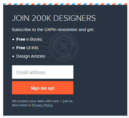 The box has a clickable CTA “sign me up” element, an input box and some text which provides information.Why is it important to understand the differences among UI design elements?
As you can see from the three groups above, output, input, and helper elements all serve different purposes. That being said, UI designers should also properly distinguish among elements falling within the same group.
To give you an example, let’s imagine you’re adding a filter on an online grocery store page. You want your search results to display “vegan” products only.
From a UI standpoint, you could be looking at a number of input elements:
To know which one to choose for your UI, you need to understand the goals of your users, and make it as simple and convenient for them to complete them!
Speaking of user goals and simplifying interactions, this leads us to the next section:
Best Principles of UI DesignWhat is UI design? Making life easy for your users.
That’s the key principle to successful UI design. By making users central to your ongoing design processes, you can increase engagement and retention. It’s about understanding how users think while using data to learn how they act. The result is a more refined product that meets your users’ needs and expectations.
And expectations are high. As users spend tons of time online, they have become more demanding than ever before. They know what a great user interface looks and feels like – even if they don’t realize it or call it ‘UI design’.
Because what happens when a user struggles to navigate your app or site?
They X out. It’s uninstalled.
So, it’s business-critical that you apply the right principles to simplify the user journey. To start, you should:
1. Minimize Actions and Steps Per ScreenUsers should be able to get where they need to go in as few clicks or taps as possible. This is especially important when designing a user interface for devices with smaller screens, where space is at a premium and navigational techniques need to be big and bold, and thumb-friendly.
Keep designs focused – both in aesthetic and intent. It should be clear what the page or screen is about, what users need to know, and what they need to do. Take the Amazon checkout page as an example. The focus is on your items and price, your details and delivery options are auto-filled, and all you need to do is hit ‘buy’.
Time is precious, and with so many firms vying for a user’s attention, you can’t risk ‘losing the crowd’ to competitors without streamlining tasks and actions.
2. Reduce Cognitive LoadRemember the Million Dollar Homepage? It’s an incredible example of cognitive overload. Your eyes flicker across blobs of bright colors and barely legible words. You might be able to pick out a business – a casino, maybe, or a small retailer – but not before another flashy pixel ad else catches your eye, and you’ve forgotten everything that came before it.
Cognitive load is the amount of information taking up bandwidth in your brain. And the goal, when designing an interface, is to cut back on distractions your users don’t need, while making it easy to interact or parse the information they do need.
A common example is switching the color of a link a user has already clicked on. Instead of having to remember which pages they’ve visited, a user can see at a glance where they’ve been.
Great UI design means people don’t have to think. The action is intuitive, with users unaware of your savvy behind-the-scenes design skills that enable them to complete their tasks.
3. Ensure Dialogs Should Result in ClosureThink of the last time you bought an item online. There was a clear ‘narrative arc’ in three acts. In the beginning, you’re browsing different products. In the middle, you’ve selected your product and you run through the checkout. In the end, you receive an order confirmation.
That’s satisfying – our brains get a big kick out of cause and effect because it’s the easiest way to make sense of the world. If I throw this ball against the wall, it will bounce. If R2D2 holds the blueprints, then Luke can destroy the Death Star. If you click ‘buy’, you’re notified that the product is in your basket.
Apply the ‘three-act structure’ to user actions, adding feedback, like ‘Added’ notifications, at each step.
4. Provide a Clear Next StepHow often have you scrolled to the end of a webpage, only to find it as barren as Arrakis? Your journey has abruptly stopped, leaving you to scroll up, click back, or close the tab.
Make sure your app or site doesn’t make the same mistake. You’ve helped users get where they wanted, but what happens next?

A core part of UI design is guiding users through a journey. Subtly (or not-so-subtly) telling them where to go next, or what to do. Consider the location and function of call-to-action buttons. Use the data to focus on user intent and placement to maximize engagement.
Find out more in our guide The Basic Principles of User Interface Design
Top 3 User Interface Design Mistakes and How to Avoid ThemDesigning a user interface also comes with a set of risks and potential mistakes. As many of them can be easily avoided, we’ve reached out to several experts, asking them to share their observations. Here are three of the eleven user interface design mistakes we’ve gathered.
1. Putting Creativity over UsabilityJosh Wright, CEO of CellPhoneDeal said that frequently businesses try too hard to stand out which has a negative impact on usability. While it’s recommended to design a UI which is memorable, cluttering it with too many images or animations is never a good idea. It can make your app or your website too hard to use. And instead of attracting attention, it might discourage users from using it, and push them into the hands of competitors. Focus on usability instead, and make sure that your UI is not only pleasant to the eye but also intuitive.
2. Relying too Heavily on Design TrendsDeepasha Kakkar, Founder at CRACKITT quite rightly pointed out that companies often fall victim to trends. And as we all know, trends come and go, which is why following them blindly without any initial evaluation is a mistake. Take a look at your performance metrics and see if it’s necessary to make any changes; if it’s not then don’t do it just because everyone else does. If you decide to modify your product based on a newest trend, then first check if there is any data which supports it, otherwise you might waste a lot of time and money.
3. UI Design Style over SubstanceAnother common obstacle is putting “style over substance”, as told us by Arek Nowakowski, Product Designer at spacelift.io.
Throughout his career, Arek has seen quite a few examples of designers wrapping up a useless (or non-existent) UX into beautiful branding. Such projects are set up for failure, as they only ‘look’, and do not ‘perform’.
A good analogy is thinking of a car without wheels – the jaw-dropping exterior and interior won’t matter if the vehicle can’t do the very basic thing it’s intended to and take you places.
To tackle this mistake, Arek suggests starting off with the website or app’s flowchart, and validating your hypotheses among potential clients. If your assumptions are proven true, you can then consider including them into your UI. The key here is to be consistent. So, what does design consistency mean? Let’s discuss this next.
Best design consistency practices for UI and UX designersWhat is Design Consistency?Design consistency is all about keeping visual and functional elements uniform across all platforms. You might even call it ‘design predictability’ – when your user performs X action, Y always occurs, whether on mobile, tablet, or desktop.
A simple example: your app places a green ‘Yes’ on the right and a red ‘No’ on the left of a dialog box. Users become familiar with this, the action becomes – as every UI designer craves – instinctive. But on certain screens, the placement is flipped. Suddenly, the user is selecting the wrong option. They eye every future choice with suspicion, thumb hovering a second too long over each interaction.
Inconsistent design shatters the contract between you and your user.
Best Design Consistency Practices1. Perform User-Centric UI and UX Design ResearchBegin your research by answering two questions.
What does your user want? What does your user expect?Before you can design a solution, you need to get into the user’s mindset. They’ve downloaded your app, clicked on your site. But why? UI and UX is awash with a cocktail of data and empathy.

Once you’ve identified the user’s need, focus on the user’s expectation. This means building on design familiarity. Google determined how we search online. Facebook influenced how we connect with friends. Amazon defined how we shop.
Where’s the homepage button on this page? Top left. No hesitation. Pure online consistency.
2. Define Product Design PatternsThe ‘rule of three’ helps you maintain consistency. You want to keep user actions down to a minimum. That means no more than three taps or clicks from where they are to where they want to be. You can do this in several ways.
Design hierarchy: direct users’ attention, making the most-used sections stand out. Branding: your branding is what makes you stand out, from your color palette to your tone of voice. It’s all you, always.Components: the various interactive elements should behave uniformly. A progress bar is always a progress bar.Template: standardize layouts across all platforms, templates are an efficient way to maintain consistency. 3. Build Consistent ActionsYou want users to just know how your product works. Consistent actions create an easy-to-use design flow – once a user knows that X action results in Y, they take that knowledge across your product. They won’t even need to think about it. Draw on existing influences and your own designs when building consistent actions.
4. Create Consistent ContentKeep your copy consistent. The way you ‘talk’ to users should be maintained across the product, especially when you’re using specific terminology. Consistency creates clarity, maintaining the user’s flow. On the branding side, it prompts users to remember they’re with you, not someone else.
Content should be presented and behave in a standardized way. When designing these, place user goals to the center.
5. Maintain CommunicationThe value of communication just can’t be understated. When users perform an action, they like acknowledgment – a chime, for example, when making a selection. The progress bar is the perfect example. The internet has taught us that patience is a virtue, if it isn’t instant, users want to know what’s going on.
Users shouldn’t be left wondering whether they’ve ‘done it right’, or if the product’s behaving correctly. Wondering leads to wandering.
Consistency also depends on internal communication. Everyone on the team is working towards a single vision – and how their roles help to build it. Strengthen your design consistency from ideation to implementation using code-based UI tools like UXPin. These allow cloud collaboration between designers crafting experiences with the same ‘live code’ elements used by your devs, so the product matches your vision.
Learn more about maintaining a consistent design in our Design Consistency Guide: Best Practices for UI and UX Designers
What does ‘good UI design’ mean according to expertsNow that we’ve covered the principles of UI design and discussed some common mistakes, let’s look at what characterizes good design according to experts:
Designing a User Interface Requires ResponsivenessTechnical Lead at ExaWeb Corporation emphasizes the importance of responsiveness, especially after Google made mobile indexing part of their top search ranking factors in 2019. While building an app or a website, it’s absolutely vital to make sure that it adjusts to different screen sizes to guarantee a good user experience irrespective of the device. Responsiveness, however, goes beyond screen size optimization, and also involves speed and performance. For this reason it’s key to abide by Google standards, and make sure that your UI design meets them on every device.
UI Design Needs to be EmpatheticGreg Findley, Designer at Mantra Design, says one of the most important good UI design traits is empathy towards the users’ needs. While one might think that it’s primarily a UX-related issue, he argues that we can’t forget that it’s the UI users interact with – not the processes behind it.
Greg says that the UI needs to reflect common people behavior, for instance, our ever-shortening attention spans. If the interface or its messaging is too focused on conversion, the user might abandon the site or app, feeling pushed towards the purchase way too early in their journey.
He suggest asking yourself the following:
How does the interface make our users feel when they first see it?How do they experience it the second, tenth, and fiftieth time around?How does the UI support maintaining empathy in all the stages of the product life cycle?In essence, as Greg sums up, how an interface feels and resonates emotionally can make all the difference between a decent and great UI design.
These were just a few of the good UI characteristics designers have told us about – be sure to give our dedicated piece a read for more.
Good UI Design Should be MinimalisticKarla Fernandes, UX/UI & Digital Product Designer at Vitamina K says that the purpose of every product should be to help users resolve a problem or achieve a goal which was identified during the user experience research. A minimalistic UI design will do so by using colors, font, and proportions that not only have visual hierarchy, but also promote user attention and reduce informational overload. This, among others, can be achieved by spacing and a careful selection of images and animations.

Karla also underlines that people love familiarity. When you use a repetitive pattern or element, you can rest assured that they’ll know how to find their way around. In the end, this positively impacts your product’s usability and reassures its role in peoples’ lives.
For more advice from experts, give our dedicated good UI design piece a read.
Best Practices for Mocking Up User Interfaces Fast1. Sketch itTime – we never seem to have enough of it, so you don’t want to waste it digitally working up concepts that may be doomed to fail (or totally unworkable, anyway). Sketching is quicker and cheaper, ideal for creating faster UI mock-ups. Just grab a pen and paper. It may be low-fidelity, it won’t look, feel, or function like the finished product. But it’ll give the team a clear idea of your vision, and how best to approach it.
2. Mobile-FirstStart small – in this case, the small screen. Mobile is where a huge chunk of your audience is, so it makes sense from a business perspective. However, the mobile-first approach brings practical design benefits, too, whether you’re making mock-ups, prototypes, or wireframing your latest brainchild.
By creating for mobile-first, you’re including only the most important content (because space is at a premium). You’ll then find it easier to scale up, adding additional content for larger screens, rather than cutting, which usually leads to back-tracking and complicating designs.
3. Grid SystemsGrid systems remain somewhat controversial, like all the best things in life. But there’s no denying they’ve grown in popularity in recent years, becoming an essential tool for designers who need to build efficient and consistent mock-ups. Grids let you bring order to what might otherwise be chaos. The organized grid system helps you determine the best spacing, sizing, and hierarchy of your content. Horizontal grids are most common, but if you’re concepting typography, you may find it handy to implement a vertical grid.

Get more tips by reading our article on the 19 Best Practices for Faster UI Mockups and in our ebook on Web UI Design Best Practices.
Responsive Design or Adaptive Design: Which is Best? What is Responsive Design?Responsive design fluidly adapts to whatever screen size the user is on. It uses multiple CSS media queries to determine the display or size of the device and alters the style in response.
What is Adaptive Design?Adaptive design presents a static layout based on breakpoints. So, if your user is on a 760-width screen, they’ll always see the 760 layout. Most adaptive design teams create adaptive designs for six screen sizes:
32048076096012001600Pros and Cons of Responsive and Adaptive DesignAdaptive designs need more work to start – designers need to design for at least six screen sizes. But responsive design comes with complications, vulnerable to display issues if the proper media queries aren’t used.
This is most notable when sites deliver the full desktop experience. We’ve all come a cropper of this one. If we’re lucky and the site loads, it slows to a crawl. Deploying media queries can help, but responsive sites are never as quick as one designed specifically for a mobile screen size.
When taking the adaptive path, choose a UI tool like UXPin, which lets you introduce multiple breakpoints to maintain on-screen consistency across devices. You can see how easy this is yourself with a free trial.
What’s Better – Adaptive or Responsive Design?With all that in mind, what’s the best choice for designers?
Your design choice starts with your users. Answer: Who are your users? What devices do they use? Equipped with this knowledge, it’s easier to create a design that meets their needs. When most of your users are accessing your site on a 960 screen, you know which screen width to prioritize and optimize the content.
Your decision will also be influenced by whether or not you have an existing site. In the design world, responsive has become the go-to choice – adoption rates almost match dedicated mobile sites, with around 1/8 sites running a responsive design.
But popular doesn’t always mean good. One pretty clever test showed out-of-the-box responsive designs seriously impact your site load times. That means rigorous optimization is an absolute necessity. Adaptive designs require more investment, but will typically be the better choice for any mobile-first operation, since it only loads what the user will see, precisely how the user should see it. Find the right design choice for you in our showdown Responsive Design vs. Adaptive Design: What’s the Best Choice for Designers?
Now, we have a pretty clear idea of using the principles of UI design and responsiveness to efficiently craft brilliant user journeys. So, it’s time for a more granular look at how to perfect your mobile and landing page UI.
Mastering Mobile UIWhat is Mobile App Design?The mobile UI is everything displayed on the mobile screen. If a user can see it, tap it, swipe it, or do anything else, then it’s part of the mobile user interface.
There are almost 17 billion mobile devices operating worldwide. Over 300 million smartphone users in the US, spending more than $330bn a year. It’s a huge market that can’t be ignored, and in the high-competitive (dare we say, cut-throat?) digital space, it’s vital to make the right impression.
Mobile design isn’t without its challenges. With smaller screens and touch-based interaction, the principles for designing an interface on mobile diverge from traditional desktop design.
Tips for Designing a Mobile Interface1. Present a Clear VisionEvery project should start with a vision. A clear objective communicated to the team and key stakeholders. Be specific, and use visual aids where possible.
Everyone working on the project should leave that meeting understanding what your vision is and what’s required of them to deliver it. Counter any factor that might influence the end-product at this stage. For example, how will your idea gel with the brand colors, or the development tools you use?

Kicking off your project this way helps make the design and development process more efficient; the end goal isn’t a shifting interpretation filtered through multiple departments, with more and more features added with every regeneration.
2. Iterate Your Designs‘Progressive enhancement’ describes the way you continually refine a design to its perfect point.
Creating a product takes up just about every resource a business can spare (and a few they can’t). Instead, you want to iterate an idea, working it up into a high-fidelity prototype the same way devs progressively develop modules. It’s a lot easier to start small, see what works (and what doesn’t), and build a product that really matches that initial vision.

UI design software like UXPin’s Merge offers a great way of achieving efficient progressive enhancement. No more endless back-and-forths or redesigning elements every time. By using fully interactive ‘live code’ components, designers can create designs that look, feel, and function exactly the way the final product will.
3. Stay UniformMobile interfaces need to feature consistent designs. You could even argue that mobile design consistency is more important than it is in desktop design – at least our brains are switched when we’re sitting at a computer.
Keep buttons, icons, and colors uniform. The placement of key actions should also remain consistent. When we’re scrolling through our phones, half-watching the TV, we don’t want to think about what our thumbs are tapping. It should be instinctive. Find out more about Mobile UI.
Understanding Landing Page UIHow to Create a User-Friendly Landing Page UITrigger emotionsYour brand colors, tone, and imagery are a core part of your business personality. They’re what makes you you. Whether you’re a start-up or a veteran firm, these should all hold meaning for the user – and they should be reflected on your landing page.
At the earliest stage of design, determine:
The message to communicateThe emotions to conveyThe personality to presentYour answers will inform the shape of your design.
Let’s say you offer online meditation services. Your landing page needs calming colors, soothing tones, a lightweight design with plenty of breathing space.
Don’t dismiss the power of color psychology, either. According to Canva, ‘85% of consumers believe color is the biggest motivator when choosing a particular product, while 92% acknowledge visual appearance as the most persuasive marketing factor overall.’
Use imagesImages are insanely powerful when you want to attract your users’ attention. We’re drawn to images – it’s part of our DNA. Moving vehicles and human faces are especially effective at catching (and holding) the eye. So effective, in fact, that users will naturally follow the gaze of a person in a photo.
Use these tricks in your landing page designs to direct a user to look somewhere, or perform an action. However, make sure your image placement doesn’t break the compositional flow of the page.

 Source: WordstreamRun A/B tests
A/B tests are one of the best ways to gauge the user-friendliness of your landing page. This sees you create two versions of your page, with different call-to-action copy, for example. Half your users will see page A, the other half will see page B. Now, you can see which generates more clicks or sign-ups, and so on.

Once you have a winner, you can continue creating A/B tests, refining the design as you go until you have an unstoppable landing page. For additional user testing, run your designs through a focus group of other UI designers and average users.
Check out our guide on Landing Page UI.
Choosing Your UI Design SoftwareBest UI Design Tool Features1. Image-based or Code-basedWhen selecting your software, you’re likely to come across a lot of image-based tools. They’re pretty common in the design world because designers can mock-up interfaces fast. It’s the software equivalent of a pad and pencil; great for getting that initial spark of an idea out of your head and onto the screen.
But they can’t go much further than that. You’re dealing with images, not functional elements. They only look awesome, too raw to develop into a tangible product.
Code-based UI software lets you craft sweet designs just like an image-based tool. But it uses UI components built from the same code used by your developers. Designs retain consistency from start to finish, and by easing the design and development process, deployments are faster.
2. Functional FidelityStruggling through handoffs with the devs? Tired of explaining ‘but it needs to look like this…’? Embarrassed seeing a finished product that’s only more or less like what you envisioned? Then it’s a sign you need to boost the level of functional fidelity in your designs.
Low-fidelity designs only give a sense of appearance. This makes it difficult for developers to translate into a working model – assuming it’s feasible.
High-fidelity designs, like those created in UXPin, look and act like the real thing. By harmonizing the components used by both design and development, everyone’s on the same page. The vision – along with everything else – remains consistent.
3. Working TogetherIn our connected world, communication and collaboration have never been easier to accomplish. Make sure your UI software isn’t the odd one out.
Your tool should be geared towards making it simpler than ever to work together, share the latest updates, and chat about projects. Cloud-based design tools bridge the gap within teams and across departments. Emphasizing the collaborative approach, UXPin enables teams to work on the same designs in real-time, access shared libraries, collect feedback, and conduct remote brainstorming sessions. From mock-up to handoff, you’re able to manage the whole design process in a single online tool.
To make an informed choice, read our guide on UI Software Tools.
Top UI and UX Trends in 2022What does 2022 hold for UX and UI design? See top trends in the user interface design industry.
1. Lottie AnimationThe popularity of Lottie Animation continues to rise. One study shows searches for the animation technique rocketing 2300% over the last four years.
Lottie Animation is an open-source, JSON-based tool that lets you make animations really quickly. But don’t mistake these for mere GIFs. Lotties are smaller, while featuring far better image quality. It also offers greater control over your designs, letting you build and test each one before you display them on your site.

With animation experiencing a resurgence in UI design recently, and businesses keen to irresistibly attract users’ attention, expect Lottie’s user-base to grow.
2. Code-based toolsDesign and development teams don’t always see eye to eye, right? Design wants a product that looks like this, but development knows it won’t work that way…
Ironing out these issues, especially when working remotely, is tricky since often it’s a case of communication breakdown. No one’s talking in the same language.
Because of frustrations in the process, teams are shifting to code-based design tools. Unlike image-based software, which can only accurately represent the look of a product, code-based UI tools use live code components. Designers are free to craft interactive, high-fidelity prototypes using elements built with the same code used by your developers. This means prototypes behave just like they would on your site or app, and devs are already familiar with how each element functions.
3. Voice UIIt’s easy to think of UI and UX in strictly visual terms – that’s where it manifests itself most commonly, after all. But don’t sleep on voice user interface.
Google, Amazon, and Apple have all helped mainstream VUI with their AI-powered smart speakers. Almost every modern smartphone now has voice capabilities. And by 2025, the speech and voice interface market will hit nearly $25 billion.
Designing for an audio audience is a major shift, bringing fresh opportunities (and a few challenges). However, users are increasingly familiar with and comfortable using voice UI. 2022 might be the right time to explore a new approach for interacting with your product.
Design User Interfaces in UXPinWhile designing an interface can be a challenging process, it’s crucial for creating good experiences for your users (and so, your brand’s success). The good news is, this guide has given you all you need to know to begin on your UI design journey!
If you’re looking for a tool that will support your designers and developers in their product development, be sure to check out UXPin!
The post The Ultimate Guide to An Effective UI Design appeared first on Studio by UXPin.
March 24, 2022
Version Control for Design – Why Is it Worth Having it?

Version control has been a software engineering best practice for decades. A version control system (VCS) allows engineers to collaborate efficiently while working independently.
With the rise of design systems, version control has become an essential part of cross-functional collaboration and maintaining a single source of truth across the organization.
UXPin Merge’s Version Control System gives you the flexibility to manage your library version for each design project and effortlessly switch between each version. Sign up for a free trial and discover how UXPin can revolutionize your product design process and enhance cross-functional collaboration.
What is a Version Control?Version control is a method of maintaining a historical record of each update and release for data sets, software, documentation, and other projects.
The practice dates back to 1962 with IBM’s OS/360 IEBUPDTE software update tool, which many people consider the precursor to version control systems.
Version control is most commonly associated with software development, but we see these systems in many other tools, including spreadsheets and word processors.
For example, Google Sheets’ Version History records changes, including who made them and the date. You can also switch between versions which are especially helpful if you’ve made a mistake and can’t remember what changes you or a collaborator made.

The most popular and widely used example of software version control is Git. Git is a version control system that keeps a historical record of software changes while enabling multiple engineers to simultaneously work on the same project.
Every Git version records code changes, who made them, and the date. An excellent example of this version history in action is viewing the releases on a GitHub repository like this one from UXPin Merge Tools.
 What is Source Code Management?
Source code management (SCM) refers to version control tools like Git, Subversion, CVS, Perforce, and ClearCase. SCM tracks code changes and assists with conflicts when merging branches. If there is an error, you can easily switch to a previous version. You can also use SCM to manage permissions, preventing unauthorized changes.
When working with hundreds or even thousands of engineers tracking updates can be chaotic. Basic version control isn’t enough to facilitate this volume of work. For example, if developers make conflicting changes to a CSS file, SCM identifies these conflicts and prevents overwrites.
Atlassian has an excellent article on SCM if you wish to dive deeper into the topic.
Git Tags vs. BranchesGit Branch: Software has a master or develop branch and multiple “checkout” branches for feature updates and bug fixes. As developers complete checkout branches, they merge with the master to become part of the software.Git Tag: Tags are a snapshot or reference to a commit on a branch. You can have multiple tags on a single branch to reference each release.Dev Community breaks down tags vs. branches in this article.
What are the Three Types of Version Control?These are the three types of version control and their differences.
Local Version Control System: Every project version is stored locally on an individual’s computer. There is no central repository, so team members must share the entire repository directly rather than syncing to a master repo. Local version control is most effective for solo projects or where teams don’t have to work simultaneously.Centralized Version Control System (CVCS): Uses a centralized server to host the master repository. When engineers commit changes, they update a branch on the centralized repo.Distributed Version Control System (DVCS): Each engineer downloads the entire repository and version history. Whenever they commit changes, they only update their local repository. When engineers complete their work, they push (upload) the entire repository to the centralized master.Centralized and distributed version control systems both have a master repo; they just make commits and updates differently. GeeksforGeeks breaks down this topic with pros and cons here.
What is the Difference Between Version Control and Backup?Version control includes a master file with multiple versions. A backup is a copy of the master file stored elsewhere. Backups are essential because you don’t lose the entire project if something happens to the master file’s location.
For example, you might have a project stored in a repository like GitHub for everyone to access with backups on your local server and another cloud-based option. If for some reason, GitHub goes down, your team can switch to the backup and continue working.
How Version Control Helps Designers?Traditional local-based UX design tools made it difficult for designers to collaborate the same as engineers. There was no centralized version control for design teams to commit changes.
Cloud-based design tools changed that. Designers can now collaborate on the same project and sync changes to centralized cloud storage, usually hosted or linked directly to the design tool.
UXPin’s Iterations feature is an excellent example of version control within design files. Designers can retrieve, delete, and create iterations of a prototype. While you can’t merge iterations, this feature helps maintain a version history and allows designers to collaborate on the same design file simultaneously.
Version control also helps with onboarding or handoffs to new teams. New team members can view a product’s version history to see how the product has evolved and what the previous team has already tried.
Version Control for Design SystemsDesigners also use version control for design systems by creating different versions for each component library update. Depending on the design tool, these updates will occur either automatically or manually.
If designers use image-based design tools, the design system team will need to maintain two copies of the system, one as a UI kit and the other as a component library.
In a fully integrated design system, designers and engineers sync to the same component library hosted in a repository. Any changes to the repository automatically update for all teams.
A Fully Integrated Design System With UXPin MergeUXPin Merge is an excellent example of a fully integrated design system with version control. Merge allows you to sync a component library from a repository to UXPin’s design editor, so designers and engineers use the same design system.
Merge components have the same interactivity and functionality as those hosted in the repo–giving designers the ability to create high-fidelity mockups and prototypes that accurately replicate the final product.
You can sync React components to UXPin directly using Git or other front-end frameworks via our Storybook integration. When the design system team makes changes to the repository, UXPin automatically sends an update to the design editor, notifying design teams of the new version.
This single source of truth allows designers and engineers to collaborate better while facilitating smoother design handoffs with little or no drift.
Using Branches and Tags in UXPin MergeUXPin Merge gives designers two version control options:
Branch: Prototypes will only automatically update when there is a change to the branch you’re using. Using the Branch option means you’re always working with the latest design system version.Tag: Prototypes will always reference the tag version unless you switch to Branch or another tag. Using the Tag option gives designers a choice to upgrade versions when they’re ready.Designers can also use the “Latest” checkbox to update prototypes with the newest components automatically. This feature can streamline design workflows because designers don’t have to update prototypes manually.
With UXPin Merge and version control, teams can work independently with less non-productive communication, like “what’s the latest design system?” or “can you send me your design files.” This independence allows companies to scale and iterate quicker–speed-to-market being a crucial competitive advantage.
Tips for Implementing and Improving Version Control for DesignBuild a Design SystemScaling design is challenging. For most organizations scaling design means hiring more designers. A design system allows organizations to build products faster with fewer designers.
Design systems also allow teams to implement an effective version control system that benefits design teams and the entire organization. With version control, designers, engineers, and stakeholders can view design system updates, what’s changed, and why.
This version control is especially important for monitoring the progress of a design system roadmap and keeping teams informed of the latest releases.
Incorporating GovernanceA version control system is only effective with proper design system governance. Governance ensures a design system maintains its integrity with scheduled and controlled version releases.
With proper governance, each version release goes through processes and protocols to ensure new components and patterns meet certain quality and usage requirements.
Scheduling ReleasesCreating a release schedule is crucial for managing version control effectively. The design system team can ensure that quality assurance and documentation updates are followed correctly with a strict release schedule.
A regulated release schedule also keeps teams notified of the latest version. For example, designers and engineers know to expect design system updates every Friday. The release schedule will also appear on the design system roadmap, managing expectations for teams and stakeholders.
Improve Version Control With UXPin MergeMany design systems claim to have a single source of truth. But, unless you have a fully integrated design system with designers and engineers using the same component library, your version control requires manual updates for UI kits and design files.
With UXPin Merge, you can scale design without increasing your payroll while enhancing collaboration between design and development. Check out our Version Control documentation to see how Merge can optimize and automate releases for designers and engineers.
Sign up for a free trial to experience UXPin and Merge with an MUI component library via our Storybook integration.
The post Version Control for Design – Why Is it Worth Having it? appeared first on Studio by UXPin.
March 23, 2022
Web Form Design Best Practices: 5 Useful UI Patterns
 Key Takeaways About Web Form DesignThere are a couple of rules that help design better forms, such as using step forms, leveraging autocomplete, or descriptive labeling; follow those rules and see how they increase your conversions.We gathered 5 inspiring web forms from top companies to show you how to design a web form for best results.UXPin has a great sign-up form template that will speed up your web form design.
Let’s face it, forms are annoying! But they’re a critical conduit between you and your customers. Web form design has evolved dramatically over the years to enhance the user experience and facilitate faster, more intuitive data capture.
From a technical standpoint, forms are easy. A dollop of HTML, a dash of CSS, a serving of your favorite back-end code, and you’re ready to go. But your users aren’t.
User experience requires more than beautiful visuals with robust code. Web forms must guide users along a path, hint at what’s expected, and deliver on what’s promised. We’re going to explore some web form design best practices with examples from Amazon, Slack, Typeform, UXPin, Wistia, and Stripe.
UX designers can design, prototype, and test fully-functioning forms with UXPin. Sign up for a free trial to experience the endless possibilities of code-based design.
Web Form Design Tips to Create Better FormsHere are some UI design tips for creating amazing web forms for your customers.
Less is MoreWhile collecting as much data as possible enriches user personas, long forms can be overwhelming, resulting in high dropoff rates. Reduce fields and only ask for information necessary to complete a task or action. Avoid using optional form fields that clutter UIs and frustrate users.
If you only need an email and password for onboarding, don’t include redundant optional fields like “first name” and “last name.” Only use required fields to keep user interfaces clean and easy to navigate.
Leverage Form Field TypesText fields, dropdowns, radio buttons, checkboxes, date-pickers, toggles, and other field types have specific use cases and help users complete forms quicker.
Use Step FormsAccording to cognitive psychologist George A. Miller, “The Magical Number Seven, Plus or Minus Two: Some Limits on Our Capacity for Processing Information.” If your form has more than seven fields, consider breaking it into manageable chunks with steps of 5 or fewer to minimize cognitive load.
Use Geolocation and DefaultsUsing tools like geolocation can help complete form fields, like the user’s country for a billing address. If most of your users are US-based, you can set this as the default.
Another strategy is to place your four most used options at the top of a long dropdown. For example, placing the United States, Canada, United Kindom, and Mexico at the top of your counties.
Match Keyboard to Input for MobileConsider displaying a numeric keyboard for number-only input fields like credit card numbers, phone numbers, CVCs, dates, and others for mobile apps and responsive designs. This small gesture helps users complete number fields without switching keyboards.
Autocomplete Whenever PossibleAutocomplete saves users time, especially on mobile devices. For example, country and state/province fields should always have autocomplete.
Use Explicit Names and LabelsButtons must tell the user what will happen when they click it. Avoid using the generic “Submit Button” across your website or application. Even subtle differences like “Buy” or “Pay” could be confusing. Buy would be best for “add to cart,” while Pay indicates the final payment.
Labels must be short while being as specific and descriptive as possible. For example, “Name” is ambiguous if you only need a first name.
5 Inspiring Web Form Designs (Plus a Bonus)Stripe Payment FormStripe are arguably the masters of credit card form design. Before Stripe, credit card forms were uninspiring, slow, and often had limited card options. Now, most eCommerce stores, including Shopify, use Stripe to process credit card payments.
One of the keys to Stripe’s success was its trendy, intuitive web form design that turned payments into an immersive experience. You can check out several Stripe form examples with links to view the source code on GitHub.

Our key takeaways from Stripe’s credit card forms:
Firstly, Stripe recognizes the device you’re using to offer express checkout with GPay or Apple Pay. These options not only serve users but increase conversion rates with fewer dropoffs.Placeholders provide implicit instructions for how users must complete the form, thus reducing cognitive load.The processor’s logo appears as you enter your credit card details, so the user doesn’t have to select it manually, eliminating a form field.Lastly, the confirmation button tells the user exactly what will happen when they click (Pay) and the cost ($25) to avoid surprises.UXPin Sign-Up Form ExampleUXPin has several interactive UI patterns and app examples, one of which is a mobile app sign-up form. To create an account, the user only has to enter their email address and password. You can preview the prototype here.


Key takeaways from the UXPin Sign-Up Form:
The minimalist UI allows users to create an account or log in. Both CTAs are bright green to grab the user’s attention. The form uses color and helpful messaging for error handling so users know which fields they must fix.If you would like to play around with this form or use it for your next design, sign up for a free trial, download the template and upload it to a new project in UXPin.
Wistia Corporate Account Registration FormOffering social media login options helps streamline onboarding, particularly for corporate registration forms, which typically require more than just a username and password.

Wistia allows users to sign up with Google or Microsoft, both applicable corporate social media accounts. It’s essential to use relevant social media logins. For example, Google or Microsoft wouldn’t be the best choices for a dating application–Facebook, Instagram, or Twitter would be better options.
Key takeaways from the Wistia Sign-Up Form:
Excellent use of whitespace draws attention to the sign-up form and task at hand. This layout also translates to mobile for a consistent experience across multiple screen sizes.Wistia uses the password placeholder to prevent errors by instructing users about the minimum character count.Amazon’s Step FormStep forms are excellent for capturing large amounts of data. They break the process into manageable steps while providing context for the user in the journey.
Amazon is constantly updating its checkout forms, so this one might be a little outdated, but the concept is still relevant. The form uses progress indicators to show shoppers the steps to complete checkout. Progress indicators help manage expectations and keep users engaged in the process–as recommended in Interaction Design Best Practices.

Key takeaways from Amazon’s step form:
Step forms are excellent for capturing large amounts of data or dynamic outcomes–like different forms for international and domestic shipping.More steps don’t mean more fields! Entering large amounts of data is taxing for users, even with stepped forms. Eliminate unnecessary fields and form elements to minimize the user’s cognitive load.Consider using a steps left pattern or completeness meter to show users how long they have to complete the task.Typeform’s Step FormTypeform is a unique example in that they use multiple steps for every form with a single action per step. The smooth microinteractions and beautiful UI makes form filling enjoyable and exciting.

This style is excellent for dynamic website forms where one step can influence the next. For example, an event registration that changes depending on the venue or if you plan to attend the afterparty.
Key takeaways from Typeform’s step form:
A single action or input per step allows users to focus on one thing at a time to complete online forms quicker.Typeform enables users to use the enter key to move to the next step, so they can keep their hands on the keyboard without reaching for the mouse. This strategy is more intuitive than using the tab or arrow keys.Forward and backward buttons give users control to see what they still need to complete or go back to make changes.Typeform shows estimated form completion times at the start, so users know what they’re committing to before starting.Slack’s Contact/Support Form IntegrationCompanies are always looking to reduce tickets by diverting users to FAQs and other resources. Slack provides users with several topics to start a conversation. The next step displays relevant FAQs with links to documentation.

Most importantly, Slack still allows users to contact support with a message box and file upload. Users can send a message via email or start a live chat.

Key takeaways from Slack’s contact form:
If you handle high volumes of customer support tickets, provide links to FAQs to help users before they submit a question.Avoid using FAQs as a barrier to contacting your support team. Slack uses a two-step process with a message input to share feedback–showing that they’re there to serve their customers.Create Code-Like Form Prototypes in UXPinUXPin’s code-based design tool allows you to build fully functioning prototypes. Design web forms that capture data and use Variables to create personalized experiences during usability testing.
With Conditional Interactions, you can create dynamic experiences similar to that of Typeform–something you cannot achieve using an image-based design tool.
Expressions allow you to take your forms to the next level with password validation, check email formatting, simulate credit card capture, or even update computational components like shopping carts.
Get accurate results and meaningful feedback from usability participants and stakeholders to improve and iterate form designs.
Experience form design with UXPin today:
Sign up for a free trialDownload our free Sign-Up Form TemplateImport the template to a new project, and you’re ready to go!The post Web Form Design Best Practices: 5 Useful UI Patterns appeared first on Studio by UXPin.
March 22, 2022
Top 11 User Interface Design Mistakes and How to Avoid Them

The reality is that humans lack patience. In fact, according to Microsoft, our attention span has dropped to just eight seconds. When you look at it through the prism of digital product design, it gives you very little time to impress your users. This means one thing – you can’t afford any user experience or UI design mistakes!
To help you prevent them from happening, we’ve reached out to product and design team experts. We’ve asked them to share their examples of user interface design mistakes. Here’s what they’ve said.
Top 11 Design Problems in User Interface Designs#1 Prioritizing library organization over UI designMichael Varga, senior UX/UI designer at Creative Navy UX Agency
As much as we’d like product design to be a rigorously defined design process that is predictable from end to end, it is actually a semi-structured process which is prone to several heuristics and design problems.
In recent years, many UI or UX design mistakes seem to come about from overcompensating for process errors, one of them is prioritizing library organization over design. Before the age of design systems, designers had messy files and even messier documentation.
Then we got to a point where we created a collection of reusable components that can be combined, alongside guidance in the form of written standards. With a design-centric approach to designing interfaces, we managed to be more organised and deliver faster. But now we’ve reached a point where we’re biased towards organizing libraries rather than focusing on actual prototyping and perfecting our UI design.
One of the most frequent mistakes is disproportionate focus on design organization instead of dedicating resources towards innovation. We have seen many design systems with clean libraries and tidy components which produce an ultimately unusable design. Functionality, information architecture, and testing the design in the real world, should be prioritised over web design aesthetics and design system organization.
#2 Not testing the website design enoughJoan Siopes, Digital Marketing Director, Herrman and Herrman PLLC
Designing a website can be a fun and creative process, but it is critical that product designers thoroughly test their graphical user interfaces to avoid any pitfalls in interaction design. Creativity can get in the way of the user experience if designers do not test prototypes and go for shortcuts. Sometimes the most simple design is the most successful—for example, Craigslist and Google. Unchecked artistic effects and aesthetics can hinder the user experience and lead users to leave the page altogether.
#3 Inconsistent designBram Jansen, Chief Editor of vpnAlert
In design, consistency refers to making sure that repeatable user interactions and interface elements look and act the same. To explain, let’s refer to some UI design examples of animations on a web page. If one team member’s face turns around before showing the “about me” text, the rest of the team members’ faces should spin around as well. If the first H3 subheading is in dark gray Helvetica with an 18px font size and a 30px bottom margin, the remainder of the h3 subheadings should be the same.
Planning ahead of time is one of the simplest methods to keep your design consistent. Simply make a list of all of your actions and classify them into groups with comparable or identical visual elements. Finally, choose one UI element and a consistent alignment for each group. Other styleguide elements, such as the same typography, styles, colors or other visual cues, and even the same phrasing and hover effects, should be assigned as well.
#4 Focusing too strongly on standing out rather than on usabilityJosh Wright, CEO of CellPhoneDeal

A big mistake that I’ve seen many businesses make when it comes to their user interface designs is that they focus more on trying to stand out or being creative than they do on the usability of their site. While you definitely want to stand out in some way or another, it doesn’t mean you need to go overboard with graphics and interesting little easter eggs on your website to keep your audience engaged. In fact, having too much going on could make your website harder to use and could cause your audience to become frustrated and move on to your competitors’ sites.
So, rather than focusing solely on the design of your website, you need to remember to focus on things like the usability, intuitiveness, and flow of various actions. This will help you to create a well-rounded experience for your audience and keep them engaged when they’re on your site.
#5 Confusing navigationSean Nguyen, Director at Internet Advisor

The top user interface designs mistake that I’ve experienced (in-fact we had this issue when we first started our website) is having confusing navigation. Companies always seem to think that they need to put as much information into their websites as possible and have a variety of webpages for visitors to navigate to. The problem with this is that, while it may seem logical to you, it might not be logical to everyone else.
Confusing navigation can be a website killer. Consumers don’t want to spend most of their time trying to figure out what page matches their needs and they will leave your website quickly if they decide it’s too confusing. It’s important to do your research before deciding how your navigation is going to work, as this will give you insight into what your specific consumers expect from you and what aspects of navigation can be simplified for your business.
#6 Too Many WordsDaniel Foley, SEO Manager at MCS Rental Software

Visitors may be oblivious to the website message if there is too much text on the page. After all, if a reader is overwhelmed by a large number of words and paragraphs, he or she will either abandon the endeavor to read or abandon the attempt after a gallant effort.
In any case, irritation, a missed message, and a lost prospect are the end results. So, express what you need to communicate in as few words as possible, or teach this vital rule to your client. Use more images and less text: in digital design, a picture is always worth a thousand words. Along with your graphics, make sure to utilize headers, subheadings, bullets, and boxes.
#7 Putting style over substanceArek Nowakowski, Product Designer at spacelift.io

Designing user interfaces is all about creating an engaging user experience, helping users accomplish their tasks, and increasing conversions. While doing so, you might make one, two or twelve interface designs mistakes. It’s essential to learn how to go around it to deliver a usable product. One of the most common mistakes designers make is putting style over substance. Sadly, a beautiful UI design with a useless UX will not stand the test of time and will not achieve its goals.
First, try to think about the application/website’s flowchart. Validate your ideas with target users, then consider wrapping functional solutions into beautiful UI. Creating a consistent UI is a challenge for every designer. Imagine that your application has several hundred screens, and each of them should use one library of components that have been prepared in a common visual harmony. It may sound obvious, but it can be tricky in real life.
When creating a component library (Design System), ensure you plan every move. Let’s think about whether a given component can be reusable. Don’t close the door behind you.
#8 Failing to address your target users’ needsNate Torres, Founder at Imaginated.com

For one of my digital marketing clients, I worked with a UX specialist to design a strategy for SEO optimization. When creating a website, it’s not enough to make it look pretty. The theme, style, and tools must be in line with the needs of your target market.
At first glance, one would think there was nothing wrong with our client’s website, yet their website conversion rate was low. The website was creative; it used bold colour contrast and an easy booking process. However, the business provided services targeted towards senior citizens. The design and layout did not match the mood and tone of the services offered or the target market, making the site almost uncomfortable for users.
Moreover, going overboard with creativity and information is never a good sign. Customers are likely to feel overwhelmed by the overload of information and cluttering on the web page that they don’t complete the transaction. Hence, no matter how good your design is, if it does not cater to your target market, it might as well be a dump.
This leads us to the next point below.
#9 Forgetting to be inclusiveMichelle Grewe, Author, Graphic Artist, & Mom at MichelleGrewe.com

Another example of user interface design mistakes is the lack of inclusiveness. I have a blind friend who blogs. Imagine how horrified I was to share my website with her, and THEN realize I wasn’t too ADA friendly in my design! While a huge work in progress (several sites here), I have made it a goal to improve the UI for diversability in general.
One major change is my alt text. The alt text should be descriptive, colorful and entertaining. A good writer can create imagery via words. But also, the bulk of my branding is very visual. And I need to brand myself in my alt text just the same because that’s how people using screen readers see.
My blind friend could hit my website, and hear, “Photograph of Michelle Grewe.”
OR she could, instead, hear, “A black and white photo of Michelle Grewe, a white woman in a gray hooded sweater that ties across the top under the neck as if her fashion was trying to mimic the false innocence of Little Red Riding Hood. Reinforcing that look, she is also wearing a silver pendant of Christ. Her dark brown hair sits just below her shoulders, and her wide eyes are looking to the left and at you at the same time like a creepy portrait in a haunted castle from a rejected Scooby Doo episode. Her smile looks like the Cheshire Cat is trying not to smile.”
See. I just branded myself in screen readers.
#10 Following design trends blindlyDeepasha Kakkar, Founder at CRACKITT
The thing about design trends is that they come and go. Just when you think you’ve mastered user interface design, a new trend emerges that forces you to reevaluate your previous strategies. While, as a web developer of mobile apps, you must assess each trend, keep in mind that you will not and do not need to adopt them all.
Do not follow new user-interface trends simply because everyone else will be doing the same thing. Rather, reevaluate your performance metrics and determine whether or not the transition applies to web or mobile app.
Several trends may not be supported by sufficient data, resulting in a waste of your money and time on their behalf. Investigate each new trend with caution to ensure that it is the most appropriate technique for your application.
#11 Insufficient feedbackEdyta Garcia, Content & Marketing Manager at EuroFlorist

One of the most serious, yet very basic interface design mistakes is insufficient feedback. Especially when booking tickets, ordering products online, and processing online payments, insufficient feedback can have huge consequences. When users do not get immediate feedback, they are not sure whether the action was registered correctly. They might bounce at the checkout stage, or, they may try again, which can result in creating multiple orders by mistake. It would be a shame to lose those users at the last step.
Feedback should be immediate, subtle & easily understandable for the user, so they can flow smoothly through the checkout process.
Create Great User Interface Designs!After reading this piece, you surely have a clearer idea of what mistakes you should avoid to ace your interface designs. Among others, make sure to:
Pay attention to user feedbackMaintain design consistencyApply accessibility guidelinesCreate simple user journey paths and navigationIf we were to add our own tip to the list above, it’s to use the right user interface design tool, i.e., one that promotes collaboration. Here’s where UXPin’s Merge might be the perfect solution.
Good luck!
The post Top 11 User Interface Design Mistakes and How to Avoid Them appeared first on Studio by UXPin.
UXpin's Blog

- UXpin's profile
- 68 followers

