
UXpin's Blog, page 62
April 26, 2022
UX Engineer Tools that Make The Job Easier
A UX engineer’s (UXE) toolkit includes design and engineering tools. They are engineers first, so most tools apply to development, but they also use a fair share of design tools.
Table of contentsWhat Does a UX Engineer do?UX Engineer’s Design ToolsUI Design ToolsPrototyping ToolsOther Design ToolsUX Engineer’s Development ToolsIntegrated Development Environment (IDE)Component-Driven Development ToolsVersion Control – GitPackage ManagerWebpackChrome Developer ToolsAccessibility ToolsWhy Code-Based Design Tools are Important for UX EngineersWhy Code-Based Design is DifferentAdvanced Code-Based Prototyping with UXPinIncrease Fidelity & Functionality With UXPin MergeWorking between product design and development means that UX engineer tools must allow for collaboration between both disciplines. They must also work with DesignOps and DevOps, meaning UXEs also have many operational tools.
UXPin is a code-based design tool UX engineers use to bridge the gap between design and development. From advanced UI design and prototyping to design systems and component library syncing, UXPin enables UX engineers to work and collaborate more effectively. Sign up for a free trial to experience the world’s most advanced code-based design tool.
What Does a UX Engineer do?Before we get into UX engineer tools, it’s important to define what a UX engineer does so we understand their diverse toolkit.
UX engineers work primarily in front-end development, collaborating with the design team throughout the end-to-end design process–effectively making them hybrid designer/engineers. They have limited design skills, predominantly focused on UI design, interaction design, and prototyping.
Working across design and development means UX engineers work with a stack of tools for each–more than the average UX designer or engineer.
UX engineers work with design tools when collaborating with designers, and development tools for their engineering work.
For this reason, we’ve split UX engineer tools into two categories:
Design toolsDevelopment toolsUX Engineer’s Design Tools
UX engineers collaborate with designers from ideation to design handoff. Their role is to look at ideas through an engineer’s lens and give technical advice and support during the product design process.
UI Design ToolsRather than designing UI elements and assets, UX engineers use design tools to collaborate with designers.
For example, if they’re using a design tool like UXPin, UX engineers use UXPin’s Comments to share feedback and collaborate on wireframes, mockups, and prototypes (low-fidelity and high-fidelity). Many design tools have a similar feature, allowing designers and UX engineers to collaborate throughout the design process.
Prototyping ToolsUX engineers rarely use traditional image-based prototyping tools. Instead, they use HTML, CSS, and Javascript (or a front-end framework) to build fully functioning prototypes.
The problem with prototyping in code is that it’s time-consuming and isn’t accessible for designers to collaborate–they must rely on the UX engineer to build the prototype and make changes.
With UXPin Merge, designers and UX engineers can drag-and-drop components from a repository to build fully functioning prototypes in UXPin.
Sync React components directly to UXPin using Git or Storybook for other technologies like Vue, Ember, Angular, and more.
With Merge, UX engineers benefit from a fully functioning prototype without the time and effort of writing code. Once prototyping is complete, UX engineers can copy components from the repository, plus changes in UXPin, to start the development process.
Other Design ToolsWhile UX engineers collaborate with designers throughout the design process, they tend to provide feedback and advice rather than actively researching, designing, and user testing.
A UX engineer will have access to many of these tools, but they’re more interested in the results and analytics than conducting user research and usability testing.
UX Engineer’s Development Tools
UX engineers complete most front-end development, leaving data integration, APIs, performance, analytics, and other technical “non-UI” work to front-end engineers.
Integrated Development Environment (IDE)UX engineers use an integrated development environment (IDE) to write code and collaborate with the engineering team. Visual Studio Code is a widely used IDE with tons of extensions to help streamline the development process.
Engineers can choose from a wide range of IDEs, including native applications like Xcode for iOS and Android Studio for Android.
Component-Driven Development Tools
Storybook allows engineers to build UI components, layouts, templates, and user interfaces in isolation. The open-source tool is popular for engineering teams that use component-driven UI or Brad Front’s Atomic Design approach to building digital products and websites.
UX engineers use a tool like Storybook to share new components with engineering teams for reviewing and editing before release. Developers can also use Storybook to build and test user interfaces before committing to development.
Version Control – GitGit is the most widely-used version control system. It allows engineers to track code changes while enabling development team members to simultaneously work on the same project.
Git is crucial for UX engineers because they often collaborate on customer-facing UIs with front-end developers.
Package ManagerUX engineers use packages to build and scale digital products. They can use privately-hosted packages or public repositories like NPM for Node.js apps or pub.dev for Flutter.
UX engineers must use the command line to interact with these repositories and, therefore, must be competent with working in the terminal.
WebpackFront-end developers use multiple APIs, plugins, and dependencies to build websites and web applications, each with separate CSS, Javascript, and other assets. Front-end frameworks like React, Angular, and others also come with assets and dependencies.
These assets have a significant impact on performance. A module bundler like Webpack combines these assets into single .js and .css files, optimized for multiple browsers and devices.
Chrome Developer ToolsChrome Developer Tools is a crucial web development tool. UX engineers use Google Developer Tools to inspect the user interface, find issues, and edit code in the browser.
Google Developer Tools allows UX engineers to work on a website or web application without editing code or additional testing tools. Engineers can also use Google Developer Tools to inspect other websites to find inspiration or research competitors.
Accessibility Tools
As UX experts, UX engineers must test their code for accessibility. Here are several standard accessibility tools front-end developers and UX engineers use:
WAVE : WAVE (Web Accessibility Evaluation Tool) is an accessibility tool for front-end engineers. It scans the web page’s code and assets, flagging accessibility issues with suggestions for improvements. WAVE also has a contrast analyzer so UX engineers can double-check designer color palettes. Accessibility Developer Tools : A Chrome extension for Google Developer Tools to test accessibility and performance. Tenon : A powerful front-end tool for automating accessibility testing. Tenon integrates with many IDEs, content management systems, and project management software to optimize accessibility testing and fixing.GitBook’s Front-end Developer Handbook has excellent accessibility tools and other front-end resources.
Why Code-Based Design Tools are Important for UX EngineersDesigners and engineers speak different languages and use separate tools. This disconnect makes it difficult to understand each other and collaborate effectively.
Code-based design tools like UXPin bridge this gap–making it easier for UX engineers and designers to collaborate.
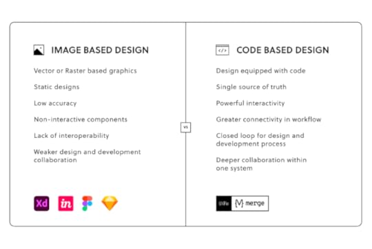
Why Code-Based Design is DifferentTraditional image-based design tools render raster graphics or static images of user interfaces. These tools have little or no functionality, making it difficult for engineers and stakeholders to understand the product’s design.
A code-based design tool like UXPin renders HTML, CSS, and Javascript, allowing designers to create interactive prototypes, accurately replicating the final product.
 Advanced Code-Based Prototyping with UXPin
UXPin’s advanced prototyping features allow designers and UX engineers to build fully functioning prototypes–eliminating the need for UXEs to write code during prototyping and testing.
For example, one of the challenges with image-based tools is that you can’t use forms, making it necessary for UX engineers to develop a prototype for testing a simple onboarding sequence.
In UXPin, forms are fully functional. Designers can build a dynamic onboarding flow that captures user inputs while creating a unique user experience for each individual-like a welcome message or thank you page with the user’s name.
Some of the other high-fidelity prototypes you can only create with code-based tools like UXPin include:
Form validation: Use Expressions to check users enter the correct email format or if a password meets specific requirements.Computational components: Build functioning shopping carts that respond to user interactions, dynamically calculating items, shipping, etc.States: Create multiple States for a single component and switch between those states based on user interaction.Interactivity: Use advanced Interactions with Javascript-like animations and transitions to create immersive experiences that react to users’ clicks, taps, scrolls, swipes, location, and other actions. Variables : Design forms that capture user inputs and take action based on the information–like a personalized greeting or populating a user’s profile page with information provided during sign-up.Increase Fidelity & Functionality With UXPin MergeUXPin Merge is the ultimate UX engineer design tool! Merge allows you to sync components from a repository to UXPin’s editor so designers and UXEs can build fully functioning prototypes.
UX engineers can use a component’s props (or Args for our Storybook integration) to give designers more control or set limitations based on the company’s design system guidelines. Designers can edit props via UXPin’s properties panel or switch to JSX, depending on their preference.
UX engineers simply copy/paste the JSX code at the design handoff to start the development process. Any changes UXEs make to the repository automatically sync to UXPin, notifying designers of the change–creating a single source of truth between designers and developers.
UXPin’s low learning curve makes it easy for non-designers (including UX engineers) to design layouts and prototypes. PayPal proved this point when its product designers could build fully functioning high-fidelity prototypes 8X faster than experienced UI/UX designers.
Sign up for a free trial to experience how code-based design can bridge the gap between designers and engineers. Improve collaboration, iterate faster, and reduce time-to-market with UXPin’s code-based design tool.
The post UX Engineer Tools that Make The Job Easier appeared first on Studio by UXPin.


April 25, 2022
Case Study: How TeamPassword Builds Consistent Design System and Product with UXPin Merge
This article is written in collaboration with TeamPassword , a simple-to-use password management tool that has started using UXPin Merge to design with code components.
__________________________________________________________________
Looking at the leading design systems, you may get an impression that they’re reserved for big brands that have time and resources to build one. Not at all! Today’s solutions allow teams of any size to create, maintain, and support a design system.
TeamPassword is one of such companies. When we met TeamPassword, they had a 2-person development crew with no designers in it. They plan on carrying on without designers, and it’s all thanks to UXPin Merge.
About TeamPasswordTeamPassword is a password manager for teams that keep all the logins and passwords in one place. Instead of passing passwords via email, chat apps, or other less secure communication channels for that purpose, teams can access login details whenever they want via a clean interface which makes sharing simple. The tool is easy to use and pretty straightforward, which makes taking care of access security truly accessible.
ChallengeMatthew Chigira joined TeamPassword as a fullstack developer as one of the two developers on the team. He suggested that the tool should switch to React, as it would be easier to maintain in comparison to the old framework.

He also knew how convenient it is to create an app with a design system that stores and documents building blocks of the interface. There are also many other benefits for brands who use a design system from the very beginning instead of building interfaces with style guides or components that come from many different libraries instead of just one. Some of those perks of having a design system early on include faster work, better handoff, and of course, consistent UI.
Even if you’re building an MVP, consider following a design system. It will make the design process smoother and help you avoid problems with scaling UI when the team is bigger. Moreover, inconsistent look and feel may affect the way potential customers perceive the app.
“Brand is essential in this market.,” says Tony Caccavo, Director of Operations at TeamPassword, “Customers entrust us with sensitive information in their login records. Inconsistencies or an outdated design can cause some customers to question whether we are technologically up to date enough to keep that information secure. Front-end development builds trust and confidence in the backend performance.”
The same goes for feature shipment. If the team doesn’t act fast, someone will beat them to it. Yet, developing a product without designers doesn’t support easy-to-follow, consistent user interfaces.
Many teams are facing a similar problem. They have exceptional engineers on board, but the need to move fast with development, which affects UI consistency and clarity. It doesn’t make it easy to create a powerful brand that stands out from the competition. Brand is essential in this market. Customers entrust the tool with sensitive information in their login records.
Inconsistencies or an outdated design can cause some customers to question whether we are technologically up to date enough to keep that information secure. Front-end development builds trust and confidence in the backend performance.
Hence, a design system was a must-have for TeamPassword, but it wouldn’t solve all of their problems. It would just help them make design decisions. They also needed a tool with which they could create a simple and effective front-end design, and that is where UXPin Merge came in.
Small Team Can Achieve Great ResultsTeamPassword knew about UXPin Merge and its integration with code components libraries, specifically an open-sourced MUI. One of the main selling points was that they could get a themed version of MUI based on their brand from day one. They needed a design tool that would import MUI components and help them create prototypes by just dragging and dropping UI components onto the canvas.
UXPin Merge can bring a MUI library full of React components to the UXPin editor. There are a couple of ways of doing that. TeamPassword could import them from a Git repository or use Storybook integration. Importing coded components is also possible thanks to a code-free import of UI components – Merge Component Manager that you can request access to it here.
As with all of our Merge clients, UXPin scheduled a workshop with TeamPassword to show them how to design with code components. “We had a training session with Jack which was really valuable”, said Matthew, “We learned how to set up the tool and use the editor. The team also showed us how to adjust components.”
With UXPin Merge, TeamPassword doesn’t need a designer to put together a realistic prototype. What’s more important is that the UI design not only looks professional, but it also acts like a developed product, since Merge uses real React components, rather than image representations of the said components that still need to be coded. TeamPassword can truly benefit their single source of truth both in development and design.
Apart from UI designing features, the team has much hope for versioning that UXPin Merge offers. They can quickly update the last version and the prototype gets updated too. Without this feature, they would have to update elements, one by one. Version control also helps to keep track of changes and switch between versions of the design if necessary.
The process of taking the finished design and developing it into a product got way faster, too. It is so rapid to export the prototype with all the specification and production-ready code. The time that the team normally had to spend on writing front-end code is saved.
Plans for the futureTeamPassword has a full game plan prepared for how they want to use UXPin Merge.
They want to start with a website redesign based on a chosen design system – the current website looks a bit outdated which may influence the purchase decision on some of the potential customers. Plus, its design is inconsistent. TeamPassword wants to give it a makeover.Then, they aim to rebuild the interface of the app using MUI and UXPin Merge – the next task is redoing the application’s front-end design. They want to switch to React and use MUI as their component library for the app. Since they use the same building blocks for design and development – React components – the whole task shouldn’t take very long.They will carry on building new features and growing TeamPassword – Their new approach to prototyping will help them design and develop their app that gives a unified user experience and cut down time to marketSummaryUsing UXPin Merge helps TeamPassword to create UI design and export the code behind it in no time. They will finally be able to scale design, organize their workflow, and create consistent interfaces without having to hire a design agency. Small teams get design velocity that allows them to scale at the right pace. It’s a new level of working!
UXPin with Merge technology allows anyone to import UI code components from a library stored in Git, Storybook or via NPM packages. The teams can get a single source of truth for design and development even before they are ready to scale their product and team.
Request access to UXPin Merge and experience how fast prototyping can get. There’s no difference between a prototype and the coded product. It saves tons of time for a team of any size. Bring code components to the design tool and connect design and development workflow.
The post Case Study: How TeamPassword Builds Consistent Design System and Product with UXPin Merge appeared first on Studio by UXPin.
April 21, 2022
What Is a Mockup — The Final Layer of UI Design
 Table of contentsWhat is a UI Mockup?What are Mockups for?When to use UI MockupsAnatomy of a MockupContent LayoutColor & ContrastTypographySpacing3 Types of MockupsGraphic Design SoftwareMockup ToolsCodeBest Practices to Create MockupsMobile-First ApproachAvoid Switching ToolsUse a Component Library or UI KitDon’t Reinvent the WheelAdopt a Minimalist ApproachLeverage Design Tools3 Tips for Collaborating with Developers on Mockups
Designing UI mockups is a critical part of the design process. They’re a visual representation or screenshot of how the final website or product will look. It’s the first time designers get to see their ideas brought to life with color, typography, and content.
By the end of this article, you’ll understand what a UI mockup is, its anatomy, and best practices for designing UI mockups. We also identify three ways designers create mockups, as well as the pros and cons of each.
Whether you’re using a UI kit, design system, or starting from scratch, UXPin’s code-based design tool allows you to design and edit mockups fast. Sign up for a free trial and see how UXPin can optimize your design workflow.
What is a UI Mockup?A UI mockup is a visual representation of a final digital product or website, including layout/hierarchy, color, typography, icons, and other UI elements. While mockups are high-fidelity designs, they are static and have no functionality-like a screenshot.
What are Mockups for?Mockups are a crucial part of the design thinking process because they answer important visual questions (like layout, color, and hierarchy) and allow designers to start high-fidelity prototyping.
Mockups also provide engineers with a visual reference to start the development phase. With UXPin, devs can use Spec Mode to analyze each mockup’s sizing, spacing, grid/layout, colors, and typography.
Mockups also provide:
Meaningful stakeholder feedback: Thanks to the higher fidelity, mockups require less context than low-fidelity wireframes and sketches, giving stakeholders an accurate representation of the final product.Realistic perspective: Mockups reveal problems that might not have been obvious during low-fidelity wireframing–like accessibility considerations, poor color choices, or layout issues.Flexibility: It’s easier to make changes to a UI mockup using a design tool than editing code. If designers work with a design system or UI component library, making changes is as easy as swapping components or rearranging the layout.When to use UI MockupsMockups usually follow wireframes and paper prototyping (the low-fidelity phase) in the design process; however, this is not always the case. Designers using established design systems or UI kits often follow handwritten notes to build mockups, skipping the lo-fi phase entirely.
Skipping the low-fidelity phase and going straight to mockups is an advanced technique and requires extensive experience and familiarity with the product, so we always recommend following the traditional methodology of paper>wireframes>mockups>interactive prototypes.
Completing paper prototyping and wireframing first lets you figure out critical aspects like the number of screens, layouts, CTAs, flows, navigation, and information architecture.
With all these pieces in place, generating mockups and moving onto high-fidelity prototyping is much easier and faster.
Anatomy of a Mockup Content Layout
A mockup replaces a wireframe’s boxes and lines with actual content, like images, UI components, and text. This content often dictates the layout (like F-pattern or Z-pattern), as designers decide how to prioritize and fit everything within the screen’s constraints.
It’s common for designers to use dummy images and text for a mockup’s first iteration, which they replace once they start prototyping and testing.
Color & ContrastColor plays a crucial role in branding, content grouping, hierarchy, and accessibility, while contrast is vital for legibility, usability, and accessibility.
With UXPin’s built-in accessibility features, designers never have to use external tools for color blindness simulation or evaluating contrast against WCAG standards.
Color and contrast can also impact business value. For example, if a CTA doesn’t stand out or is the wrong color, it could adversely affect conversions.
TypographyDesigners must never overlook the importance of typography. Mockups are the first opportunity for designers to visualize font choices in context with the rest of the user interface.
Mockups let you explore your typography size, font, style, and spacing–not to mention structural usage for consistency, like how to stylize captions.
SpacingSpacing and white space are powerful design characteristics. Space improves legibility and helps define visual hierarchy. Designers often use white space to draw attention to important UI elements, like a CTA or product image.
3 Types of MockupsThere are three primary tools for generating mockups–graphic design software, mockup apps, and coded mockups. Each mockup type has its advantages and disadvantages.
Graphic Design SoftwareSome designers still prefer to build mockups using graphic design software, like Photoshop. The problem with graphic design software is that you can’t add animations or interactions, so you have to recreate the mockups in another application to start prototyping.
Mockup ToolsSpecialized user experience design tools like UXPin provide designers with the features to build mockups quickly, especially if they have a component library or design system.
With UXPin, you drag and drop components from your design system or one of our built-in design libraries to build mockups. Designers can also create layouts for different screen sizes like mobile (iOS/Android), tablet, or desktop.
CodeSome technically proficient designers build mockups using HTML, CSS, and Javascript. The benefit of code mockups is there are no surprises at the design handoff. If designers can’t recreate an idea or visual element in code, they can try something else before handing it over to developers.
The downside to code is that it’s time-consuming to build, fix errors, and make changes.
With UXPin’s MUI integration, you don’t have to learn code to design in code. Designers can drag and drop MUI’s React components to build mockups and fully functioning prototypes. Sign up for a free trial and start designing with code using UXPin and MUI’s component library.
Best Practices to Create Mockups
Here are a few best practices for UI design and creating mockups. These principles apply to web design, product design, mobile apps, and other digital user interfaces.
Mobile-First ApproachMobile-first design prioritizes content while reducing unnecessary features and components. Scaling down from desktop down often leads to inconsistencies or designers making compromises to conform to smaller screen sizes.
Avoid Switching ToolsWith comprehensive end-to-end design tools like UXPin, there’s no need to switch apps from wireframing to mockups and prototyping. Switching applications can introduce errors and inconsistencies.
Use a Component Library or UI KitUsing a UI kit or component library can help designers build, test, and iterate mockups much faster than designing from scratch. Once you have a layout that works, you can customize the components to meet your branding and product requirements.
Don’t Reinvent the WheelIndustry-standard UI patterns and UX design patterns enhance the user experience by reducing the learning curve of your product or website. For example, most eCommerce websites follow similar UI patterns and layouts to reduce cognitive load and get customers to checkout faster.
Adopt a Minimalist ApproachCluttered UIs look unattractive and adversely affect the user experience. Designers should always look for ways to reduce UI elements and text to make the most important content stand out.
In The Guide to Interactive Wireframing (these principles also apply to mockups), design professor Tom Green outlines a user-focused procedure for deciding what stays and what goes:
Build a content inventory of all prospective elements on a pagePrioritize these elements and remove the ones that aren’t necessaryFit the remaining elements into a visual hierarchy based on importanceCreate content blocks based on element categoriesAdd and subtract blocks into layouts according to priority“Sculpt” designs at each iteration until they start resembling interface objectsLeverage Design ToolsDesign tools have tons of features to make designing and prototyping quick and easy. Always read the documentation to learn shortcuts and leverage features to build better mockups.
For example, UXPin’s Components feature allows you to save and reuse elements consistently throughout your UI, while Auto-Layout lets you automatically resize, fit, and fill your designs.
 Name Files and Layers Properly
It’s easy to get lost in design files with multiple pages, components, assets, and layers. Adopting an organization-standard naming convention helps keep mockups (and the entire project) organized, making handovers, onboarding, and design handoffs much easier.
Designers should also use a standardized method for file storage and documentation, so that team members always know where to look. UXPin allows teams to store your design system, documentation, assets, and design files inside one tool, giving the entire organization access to the project at all times.
3 Tips for Collaborating with Developers on MockupsUI mockups are essential documents for developers because they determine how to recreate the designs in code. Here are some tips to help smooth the collaboration and handoff process:
Use Brad Frost’s Atomic Design methodology to explain UI elements from their smallest form to more complex components, templates, and page layouts. Simplifying designs this way allows developers to visualize component structures, making them easier to replicate.Highlight interactions and animation and even link to your prototype to give developers clear instructions. Interactivity isn’t evident with static mockups, so context is vital for engineers to develop the digital product correctly.Learning development basics can help designers collaborate with engineers better while reducing friction. You don’t have to learn complex programming languages, but basic HTML, CSS, and Javascript will improve collaboration and your design skills.Ready to get started creating beautiful mockups? Use one of UXPin’s built-in design libraries or start your UI mockup from scratch. Sign up for a free UXPin trial to experience the world’s most advanced code-based design tool.
The post What Is a Mockup — The Final Layer of UI Design appeared first on Studio by UXPin.
April 20, 2022
Tradeoff Between Time and Robust Prototypes? You Can Have Both!
Prototyping is challenging for designers using image-based design tools. These static mockups and prototypes never achieve the fidelity and functionality required to get accurate feedback from testing and stakeholders.
Designers often have to use several tools throughout the design process; one for design, one for prototyping, and another for testing. This workflow is not only disruptive but expensive as companies pay subscription fees for multiple tools and paid plugins to integrate this complicated workflow.
We will demonstrate how code-based tools can simplify your team’s UX workflow, reduce your reliance on extra tools and plugins, significantly enhance prototyping and testing, improve collaboration, and streamline the design handoff process.
Enrich your end-to-end design process with UXPin’s code-based design tool. Sign up for a free trial and start designing better user experiences for your customers.
The Challenge of Prototyping With UI KitsOne of the challenges with image-based design tools is that designers often have to start from scratch every time they start a new project. Even with a comprehensive design system, there’s only so much fidelity and functionality you can save in a static UI kit.
“Imagine this”–an all too familiar scenario…You have to present your designs for a new onboarding flow to stakeholders, but your team didn’t have the time or resources to build a fully functioning prototype.
So, you connect a series of static artboards with some basic transitions and a few GIFs to demonstrate complex interactions and animations. The problem is that the prototype isn’t intuitive, and stakeholders battle to understand how it’s supposed to work.
You find yourself repeating, “ok, now imagine this…” as you guide stakeholders through your prototype. Stakeholders have to jump from static artboard to GIF to preview animations of what your prototype is supposed to do. It’s difficult to follow without your step-by-step instructions, and there are lots of confused faces.
By the end of your meeting, you’ve spent so much time explaining what the prototype should do instead of pitching your team’s innovative design.
Poor Fidelity from Static Prototypes
Many teams are stuck in this scenario where prototypes lack clarity. There simply isn’t enough time and resources to build working prototypes for every idea or flow. Designers have to compromise, hoping they can explain their designs to stakeholders, usability participants, and engineers.
It’s a challenge with stakeholders but even more aggravating during the design handoff, where frustrations boil over between engineers and designers.
Getting accurate results from usability participants is near impossible with these low-fidelity prototypes. Designers are limited by what they can test, usually restricted to basic user flows. They must rely on UX engineers to build code-based prototypes for accurate testing and meaningful results.
Building fully functioning prototypes no longer means you have to rely on developers. UXPin Merge has revolutionized the standard UX workflow, so designers and engineers work with the same component library linked to a repository.
PayPal’s Faster Time-to-Market with UXPin MergePayPal uses Merge to scale design and ship products 8X faster than image-based design tools. Product teams also get better feedback from stakeholders because they don’t have to explain how everything works.
“Our stakeholders are able to provide feedback pretty quickly using UXPin. We can send them a link to play with the prototype in their own time, and UXPin allows them to provide comments directly on the prototypes. UXPin’s comments functionality is great because we can follow along and mark comments as resolved once we address them.” – Erica Rider, Senior Manager for UX – Developer tools and platform experience at PayPal
PayPal’s internal products use the React component library from Microsoft’s Fluent UI design system. They host the design system in a GitHub repository which syncs directly to UXPin’s design editor.
These components include interactivity, minimizing interaction design, and animations designers must do to build interactive prototypes. These interactions also help maintain consistency across projects and teams.
Any changes engineers make to the repo automatically sync to UXPin, so PayPal’s product teams, UX designers, and engineers always work with the same components–creating a single source of truth across the organization.
“With this new UXPin approach, we’re seeing a more collaborative, integrative design process. Rather than separating design, prototyping, and development, UXPin allows us to create an integrated flow where we engage engineering and product teams throughout the process. As a result, the product’s final quality has improved dramatically.” – Erica Rider, Senior Manager for UX – Developer tools and platform experience at PayPal
Iress’ Design System Maturity Using UXPin MergeEvery design system strives toward a fully integrated system where designers drag-and-drop components to build UIs and engineers copy/paste code to complete the development process.
The component-based end-to-end product development process means designers spend more time prototyping and testing than wireframing and designing. At the same time, engineers focus on optimization and innovation rather than writing code.
Iress’ Nick Elliott calls this stage four design system maturity, where designers and engineers use the exact same components for their workflows. Consistency and design drift are no longer issues with a seamless, almost non-existent handover process from design to development.

Nick spent 12 months reviewing design tools to bridge the gap between design and development to achieve level four maturity. UXPin Merge emerged as the clear winner, allowing Iress to develop a fully integrated design system where designers and engineers work with the same component library.
Increase Fidelity and Functionality in a Fraction of the TimeWe learned from PayPal’s case study how much faster designers build high-fidelity code-based prototypes. PayPal tested this side-by-side with Merge vs. an image-based design tool.
An experience PayPal UX designer built the exact same one-page prototype using both tools. The image-based prototype took over an hour, while the Merge prototype (with higher fidelity and functionality) took eight minutes!
Due to Merge’s drag-and-drop workflow, even PayPal’s product managers (who have no experience with design tools) can build the same one-page prototype in under 10 minutes.
Getting the Most out of MergeMerge works best for companies using an existing design system or open-source component library, like the MUI library. Engineers can give designers control to customize components via React props or Args if you’re using the Storybook integration (Angular, Ember, Vue, etc.)
The design system team can also set interactions and states for each component, like default, hover, active, and disabled for a button. Instead of designing interactions, designers simply select one from a dropdown in the properties panel.
Any changes designers make to a component UXPin renders in JSX, so engineers simply copy/paste for front-end development.
As we learned with PayPal, stakeholders can interact with prototypes with little or no explanation in their own time, leaving feedback via UXPin’s Comments feature. The design lead can assign these comments to team members to action and mark them as resolved when the task is complete.
Are you still using low-fidelity static prototypes with poor functionality, GIFs, and excessive annotations? Switch to the world’s most advanced design and prototyping tool to enhance collaboration with engineers and improve feedback from stakeholders.
Sign up for a 14-day trial to explore UXPin Merge via our free MUI integration.
The post Tradeoff Between Time and Robust Prototypes? You Can Have Both! appeared first on Studio by UXPin.
April 19, 2022
An Introduction to the Design Iteration Process
 Table of contentsWhat Is Design Iteration?Why Is Design Iteration A Part of the Design Process?What Are the Benefits of an Iterative Design Process?It Saves ResourcesIt Facilitates CollaborationIt Addresses Real User NeedsFacilitates Regular UpdatesWhere Is Iteration Used?Iteration in DesignIteration in Software DevelopmentIteration in Project ManagementIteration in ResearchWhat Does the Iterative Design Process Look Like?Stage 1: PlanningStage 2: IdeationStage 3: PrototypingStage 4: TestingStage 5: ReviewThe Do’s and Don’ts of the Design Iteration ProcessDo: Fail FasterDo: Be FlexibleDo: Work AsynchronouslyDo: Collaborate and ListenDon’t: Try to Solve EverythingConclusionIterative Design with UXPinWhat Is Design Iteration?
Design iteration is the repeatable process of improving a product (or part of a product) in relatively short but regular bursts, otherwise known as ‘design iterations’. These design iterations can consist of high-fidelity prototypes, mid-fidelity wireframes, low-fidelity sketches, or even simple diagrams such as sitemaps.
Design iteration drives the overall design process forward.
Why Is Design Iteration A Part of the Design Process?Jumping immediately into product development and then trying to validate the end result using research (e.g. usability testing) leads us to design the worst possible version of our product. When this happens, the journey from the worst possible version to the best possible version is a costly one, and not least time-consuming.
A better approach to designing human-computer interfaces is design in iterations. It enables us to learn along the way, using feedback and trial-and-error to collect clues about how the design should look and function. It won’t be a straight road to the finish line, but we won’t end up moving completely in the wrong direction either. In the long run, design iteration awards the design process with more time, insights, and stability.
What Are the Benefits of an Iterative Design Process? It Saves Resources
An iterative design process almost always saves the most amount of time because it regularly provides us with user feedback (or stakeholder feedback, at the very least) that propels us forward at a steady pace.
Although positive feedback can tell us when we’re on the right path, negative feedback can tell us when we’re on the wrong path as well — so we’re constantly moving forward, never truly wasting any valuable time.
With no feedback at all, we risk rushing all the way to the finish line only to fail, which is a huge waste of time and bandwidth. Plus, since time is money, this makes design iteration the most cost-effective option too.
It Facilitates CollaborationAn iterative design process facilitates healthy collaboration too since it awards stakeholders the opportunity to express their feedback and even share their own ideas. This provides us with insights that we’d have never discovered on our own because we’re only able to see things from our own perspective.
It Addresses Real User NeedsWithout a methodic design iteration process (specifically one that incorporates collaboration), designers tend to fall into the trap of working in an isolated bubble. Being siloed causes us to become too introspective, which then leads us to make hasty assumptions and unproductive perfectionist behaviours.
However, implementing an iterative design process ensures that we stay focused on user needs and make decisions in accordance with user feedback. Also, it helps us to prioritize the next best way to improve the design rather than focus on random improvements.
As an added bonus, user feedback can also help to settle any conflicting opinions amongst stakeholders.
Facilitates Regular UpdatesHaving an iterative design process enables us to provide progress updates to stakeholders at regular intervals, as opposed to just dumping the end-result on them and leaving them in the dark until then.
For developers in particular, it means that development can begin even while the design is still in progress (in fact, it allows developers to leverage an iterative development process, so everybody wins).
When working with clients, frequent updates can illustrate the effort that’s going into their product, helping to foster good relationships with them. Regular product updates can even be relayed to customers to generate marketing buzz and acquire public feedback.
UXPin prototypes can be shared with customers and stakeholders within seconds. In just a few clicks, designers can begin acquiring contextual feedback comments as customers and stakeholders test design iterations that look and function like the real thing. When using Adaptive Versions, simulated prototypes will even adapt to their device and screen size. Just remember to use Preview mode to check prototypes for errors and oversights before sharing!
Where Is Iteration Used?
Iteration isn’t only for designers. Software developers can also take an iterative approach to their work, working asynchronously or in tandem with iterative design. On a much larger scale, even entire projects can be methodically managed in iterations.
Iteration in DesignIn design, iteration is a key aspect of many design methodologies such as:
design sprint methodology, human-centered design, design thinking, lean UX, and rapid prototyping approach.Regardless of the methodology used, teams can asynchronously address multiple user needs at once using concurrent iterative design processes as long the necessary resources are available to do so.
Iteration in Software DevelopmentIn software development, iteration is used to facilitate continual improvement, provides a margin for error, and avoids blocking other aspects of the product development process (unlike the waterfall methodology, which is linear and enforces all processes to be done sequentially). In fact, an iterative approach makes it possible for design and development team members to work in tandem (e.g. combine agile UX and agile software development to build out functionalities).
Iteration in Project ManagementFinally, iteration can also work at a higher-level, becoming the overarching theme of the whole product or project management process. Iteration provides project stakeholders with regular updates about the direction of the product throughout its lifecycle, along with data that can be used to measure core success metrics.
Iteration can even be used to improve internal operations (e.g. DesignOps and DevOps), providing a massive boost to the team’s morale and productivity.
Iteration in ResearchIterations should be fueled by research. Whether that’s focus groups in design or browser testing in development, anything learned during research should be used to push us into the next iteration.
In some cases, research can be conducted asynchronously and independently and doesn’t need to result in a ‘designed’ or ‘developed’ deliverable. For example, when figuring out how to label and structure a navigation, designers can iterate through various formative and summative card sorting studies before finally winding up with a simple set of requirements.
What Does the Iterative Design Process Look Like?
An iterative design process can differ from methodology to methodology, but can generally be summarized into 5 distinct stages: planning, ideation, prototyping, testing, and finally, review.
Stage 1: PlanningIteration should be quick but effective, hence a certain amount of planning is required in order to keep iterations focused on a particular user need.
The planning stage is mostly about deciding which problem to solve during the iteration. Occasionally this means listening to stakeholder observations but most of the time it means directly collecting user feedback from previous iterations (or somewhere else such as a feedback form).
Either way, this stage is always fueled by research and driven by a purpose. In many design methodologies problems are reframed as opportunities, and when many opportunities present themselves, methodology states that stakeholders should vote on what appears to be the best opportunity to improve the product. As an example, the design sprint methodology relies on ‘how might we’ and ‘dot voting’ for choosing opportunities.
In short, the planning stage should answer the question: “what should we improve in this iteration?”
Stage 2: IdeationAt this stage in the process the objective is to generate as many ideas as possible no matter how bad they are, usually via sketching. This is an iterative design process in itself where we’ll usually refine our best ideas and put aside the worst ones.
Iterative methodologies exist (e.g. Crazy 8s, Four-Step Sketch, etc.) to ensure that the creative juices remain flowing, and they also enforce time limits to keep the process lean, fun, and productive.
Eventually, we/our team will choose one slightly refined idea to move forward with. Chosen ideas are often phrased as user stories so that the prototyper then has a problem statement, a clearly defined actionable task, and a detailed-enough visual guide.
Stage 3: PrototypingOnce we’re at the prototyping stage the iterative design process starts to feel a little simpler as we’re now focused on a specific idea.
The time limit is usually enforced for maximum productivity, so it’s best to use a design tool that supports your workflow, such as UXPin. Better yet when the product team has a design system at hand and the UX designer understands it thoroughly, it can help tremendously.
Stage 4: TestingThe objective of the testing stage is to find out whether or not the prototype solves the problem we’re trying to solve, and how well it solves it. We won’t be implementing anything or even synthesizing the research, it’s simply about using the right research methods to learn as much as we can about the solution and documenting any feedback, findings, and insights.
Stage 5: ReviewThe final stage — the review stage — is about synthesizing the research and coming to a conclusion about the effectiveness of the solution. A conclusion usually falls into one of the following categories:
“Great” — time to implement“Good, but…” — circle back to prototyping“Flawed” — circle back to ideationThe Do’s and Don’ts of the Design Iteration Process Do: Fail Faster
Adopting a ‘fail faster’ mentality, embrace trial-and-error to learn what not to do even when missing the mark. Failure is inevitable so it’s best to get it out of the way early while making sure to learn from it.
Do: Be FlexibleAlthough design methodologies have strict rules to help us express our creative freedom without spending too long on each iteration, they still allow for a certain degree of flexibility. Ultimately, it’s up to us to decide which opportunities to focus on first, when to iterate or test more, and how many concurrent design iteration processes should be active at once.
Leveraging any data and research available, these decisions largely depend on instinct and experience.
Do: Work AsynchronouslyUtilizing all available resources (tools, teammates, etc.), achieve the most in the shortest space of time by allowing other designers to solve other aspects of the product asynchronously, and developers to begin implementing validated solutions too. Doing both of these will shorten product timelines significantly.
Do: Collaborate and ListenWhich problem should we solve? Which iteration is best? Is the prototype ready for testing? What does all this feedback mean? Acquiring fresh perspective and unique expertise from collaborating teammates gives us the confidence to answer these questions.
 Don’t: Try to Solve Everything
Once the problem we’re solving during the design iteration process has been decided, avoid trying to solve additional problems. Although it’s normal to identify things that can be improved (during testing or through observation), note them down because they might be good starting points for later iterations.
Allowing scope creep (additional problems to creep into our design iteration process) will only distract us, slow us down, and make it difficult to measure the impact that iterations are having on key metrics.
ConclusionNow that we understand the foundations of design iteration, the next step is to choose an iterative design methodology that works for us and our team, and allow ample time for everybody to master it.
However, no design methodology is perfect. If something isn’t working then consider adapting the workflow or simply move on and try another method.
Iterative Design with UXPinUXPin is an end-to-end design tool built to help product teams iterate quickly, collaborate on ideas, acquire actionable feedback, and eventually hand off high-fidelity prototypes that are code-based and give developers much more to work with.
With UXPin, go from validated iteration to production much quicker by letting developers implement prototype specs that are already translated to HTML, CSS, and JavaScript, collaborate on design system documentation, and even import real React components into prototypes using UXPin Merge.
The post An Introduction to the Design Iteration Process appeared first on Studio by UXPin.
April 18, 2022
Design Sprints – Validate Your Hypothesis Within 5 Days
Design sprints have become common strategies for companies to solve big problems fast! Developed by ex-Googler Jake Knapp, the design sprint methodology is about prototyping and testing a product in just five days.
Table of contentsWhat is a Design Sprint?How did Design Sprints Originate?What are the 5 Stages of Design Sprint?What Happens Before a Design Sprint Process? – Sprint PreparationDay 1 – Monday – MapDay 2 – Tuesday – SketchDay 3 – Wednesday – DecideDay 4 – Thursday – PrototypeDay 5 – Friday – TestDesign Sprints With UXPinPrototype and test your design sprint product with UXPin. Built-in design libraries allow you to drag-and-drop components to quickly build high-fidelity mockups and prototypes–even if you’re a non-designer. Sign up for a free trial to explore UXPin for your next design project.
What is a Design Sprint?A design sprint is a rapid methodology to prototype an idea in just five days. This prototype could be for a new product or redesign an existing product.
The five-day process includes a small team of designers, stakeholders, and other members who come together to solve a big problem in as little time and resources as possible.
A sprint incorporates group and individual activities, including brainstorming, designing, prototyping, and testing. By the end of the week, you have a design solution or MVP to start developing.
How did Design Sprints Originate?Jake Knapp developed the design sprint methodology while working at Google in 2010. Jake took inspiration from IDEO’s design thinking, various books, and Google’s product development culture.
In 2016 Jake Knapp co-authored the book Sprint with John Zeratsky and Braden Kowitz, which outlines the process he had perfected during his time at Google. John and Jake also worked with Google Ventures (GV) to perfect and refine the process you read about in Sprint.
Since Sprint’s release, every organizational type, including startups, agencies, colleges, government entities, Fortune 500s, and museums, has used Jake’s sprint framework to prototype ideas.
What are the 5 Stages of Design Sprint?The five stages of the design sprint draw inspiration from the design thinking process. These stages include:
MapSketchDecidePrototypeTestSome design sprint variations complete the process in four days, but most follow the five-day format described in Jake Knapp’s Sprint. Either way, it’s essential to start on Monday and run your sprint consecutively over four or five days without breaks.
There is a crucial step 0, which includes all the planning and preparation to run a design sprint.
What Happens Before a Design Sprint Process? – Sprint PreparationA design sprint will never work without proper preparation. Here are some things you must consider for a design sprint:
Pick a facilitator: The facilitator must be a strong leader capable of promoting dialogue and keeping to a schedule. This person is responsible for the sprint process, most importantly timekeeping, leading discussions, venue preparation, and facilitating discussions.Gather the sprint team: Jake recommends a cross-functional sprint team of seven or fewer. During the first three days, you’ll also need stakeholder input to help with brainstorming and ideation.Invite experts: Experts include people inside and outside your organization with acute knowledge about the product or problem you’re solving. You’ll need these experts on the first day to ask questions to understand the problem and start ideating potential solutions.Pick the Decider: The sprint Decider plays a vital role in a design sprint. This person will decide which idea the team must prototype and test. Examples of a Decider include the CEO, product manager, product VP, or another decision-maker directly responsible for the problem you’re working on.The venue: Find a room that can comfortably hold your sprint team, including space for desks and snacks (which you can place outside of the room too). Check out Fast Company’s article about how to find a sprint “war room” for more details. IMPORTANT: Choose a venue where your team won’t be disturbed during the five days! You need to maximize the time without distractions or people “popping in” to see how the sprint is going.Schedule dates: Block five full days for your sprint and ensure everyone is available for those days. Gathering stakeholders is often tricky, so you might have to have a pre-sprint workshop when they’re available. Check out this short video from red-id for more on prep work.Check out this article from Sprint’s co-authors for a complete sprint preparation checklist. A remote design sprint requires different planning and preparation–check out this article for more info.
Day 1 – Monday – MapDay one of a sprint or mapping is a slow start to the rapid prototyping process. The sprint team spends the first day creating a map of the user experience flow, interviewing experts, and defining the target or goal for the week.
Some of day one’s activities include:
Rules and introductions: The sprint facilitator introduces everyone and outlines the rules and procedures for the week.Set a sprint goal: The sprint goal must be optimistic and answer the question, “Why are we doing this design sprint?” Your sprint goal should align with the product’s long-term goals and business strategy.Identify users: Identify the users associated with your sprint goal and find participants for day five’s testing. You can use your own customers or a tool like User Interviews to find the right target demographic.Create a map: A high-level flowchart from key players (customers) to an end goal with five to fifteen steps drawn on a whiteboard. The aim is to keep your sprint map as simple as possible without too much detail.Interview experts: The sprint team has 15-30 minutes to ask each expert questions about the project, customers, topic, market, vision, and other details. The facilitator will add details to the map during these questions to provide context.How Might We (HMW): The sprint team reframes problems using how might we questions. The purpose of HMW is to generate lots of ideas to begin ideation.Organize HMW: The facilitator adds HMW to one of the steps on the flow chart, grouping similar ideas and identifying themes.HMW voting: Each team member casts two votes on their favorite ideas. The winners get added to the map.Check out this Map Checklist for more information on the first day of a design sprint. Alternatively, read pages 51 – 91 in the Sprint book.
Day 2 – Tuesday – SketchThings get a little more interesting on Tuesday with sketching ideas. The day starts with a group exercise called Lightning Demos, where teams present relevant ideas from other successful products.
The aim of Lightning Demos is to look beyond your industry. For example, if you’re a productivity app, you might look to the automotive or food industry. Team members write these ideas on Post-It notes and stick them on the whiteboard.
After lunch, team members start sketching ideas using storyboarding techniques, including Crazy 8s and Solution Sketch.
At the end of the day, everyone places their sketches face down, ready to decide on Wednesday.
Check out this Sketch Checklist for more information on the first day of a design sprint. Alternatively, read pages 93 – 123 in the Sprint book.
Day 3 – Wednesday – DecideOn day three, the sprint team reviews each sketch in a five-step process:
Art museum: Taping up every sketch for the team to seeHeat map: Each team member reviews sketches silently and puts one to three small dots next to their favorite partsSpeed critique: The group discusses each sketch, pointing out the best ideas and solutions–limited to three minutes per sketchStraw poll: The team silently chooses their favorite idea with a large dot to place their voteSupervote: The Decider reviews each idea and casts a “supervote” for their favorite, and the solution the sprint team will prototype on day fourThe sprint team spends the second half of day three storyboarding and planning for prototyping.
Check out this Decide Checklist for more information on the first day of a design sprint. Alternatively, read pages 125 – 160 in the Sprint book.
Day 4 – Thursday – PrototypeOn Thursday, the sprint team brings the idea and storyboard from the previous day to life. The first step is to choose the right prototyping tool. John Zeratsky and Jake Knapp recommend using a tool that allows you to design and prototype fast!
With UXPin’s built-in design libraries, you can build mockups and prototypes in a matter of minutes, perfect for the demands of a design sprint! You can even use your own design system using UXPin Merge to build on-brand prototypes fast–PayPal’s product team can create a fully functioning one-page prototype in eight minutes!
Once you have chosen the right prototyping tool, it’s time to “divide and conquer.” To accelerate the prototyping process, the sprint team splits into five roles:
Maker: Primarily responsible for arranging UI layoutsStitcher: The person in charge of information architecture and navigationWriter: Writes all the copy for the prototypeAsset Collector: Collects assets like stock images, videos, icons, and other visual assetsInterviewer: Prepares for day five test by compiling the script and user testing questionsYou can separate these roles however you feel will deliver the fastest results. It’s crucial to remember that the sprint team is only building a prototype for a single user flow. Avoid getting sidetracked with redundant pages, UI elements, and features. The goal is to create a prototype that solves a specific problem–like an eCommerce checkout or sign-up form.
Towards the end of day four, the team tests the prototype internally. You might also invite stakeholders to review the prototype and give feedback for improvements.
Make sure you leave enough time for this review process so you can make changes, test, and iterate before the end of day four. If you’re using UXPin, you can send stakeholders a link to your prototype so they can review and add comments remotely. This feature is especially helpful for remote design sprints.
By the end of the day, your prototype is ready for user testing on day five. Check out this Prototype Checklist for more information on the first day of a design sprint. Alternatively, read pages 163 – 190 in the Sprint book.
Day 5 – Friday – TestOn the final day, you get to test and validate your prototype with the real users you identified on day one. According to the Sprint book, five is the magic number for usability participants. These five users will give you enough feedback to identify patterns and create actionable insights.
The Interviewer, from day four, will conduct user interviews while the rest of the sprint team watches from another room. It’s essential to have a camera showing the user’s face for expressions and a screen monitoring application.
The sprint team takes high-level notes using Post-Its to share and discuss these as a group at the end of the interview process. The team then organizes the notes into common patterns labeling them positive, negative, or neutral.
Lastly, the sprint team decides on the next course of action, which may include another sprint, further testing, or refining the prototype for a design handoff.
If the team decides to do another sprint, you can skip days one to three and go straight back into rapid prototyping and testing based on insights from the first design sprint.
Design Sprints With UXPinCreate fully functioning high-fidelity prototypes with UXPin quicker and easier than image-based design tools. With UXPin, you don’t have to compromise on prototype quality during a design sprint and get more meaningful results and feedback from participants.
Sign up for a free UXPin trial to enhance your next design sprint with the world’s most advanced rapid design, prototyping, and testing tool.
The post Design Sprints – Validate Your Hypothesis Within 5 Days appeared first on Studio by UXPin.
April 14, 2022
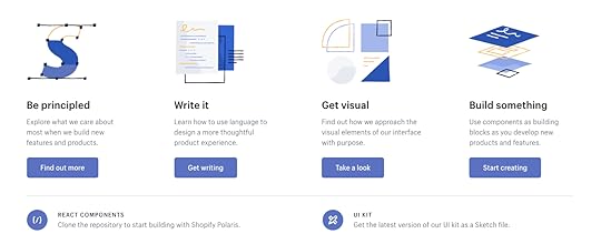
The Difference Between Design Systems, Pattern Libraries, Style Guides & Component Libraries
You’ll often see the terms design system, pattern library, component library, and style guide used interchangeably. While these concepts are connected, they refer to different parts of a whole.
There’s also confusion about a design system vs. a component library. Design systems have component libraries, but a component library is also a stand-alone ecosystem, like MUI, React-Bootstrap, and others.
Confusing? Don’t worry; this article will help define all of these terms and put everything into perspective. We also explore the benefits of design systems and component libraries and how designers and developers use these differently.
Designers can use MUI, the world’s most extensive component library, to build prototypes with code-like functionality. Sign up for a free trial to start prototyping with MUI’s React components without writing a single line of code!
What is a Design System?A design system is a complete set of design standards (style guide) and documentation accompanying a UI tool kit, including UI patterns, UX design principles, and components. When we look at a design system in this context, it incorporates everything designers and developers need to build and scale digital products.
Some other things you’ll find within a design system include:
Brand guidelinesAccessibility guidelinesUI Design guidelinesGovernanceBest practicesDesign system roadmap and releasesCode snippetsCSS variables & design tokensUI kit (an image-based version of design system components)Downloadable assets Pattern Library vs. Component Library–What’s The Difference?
Another big cause for confusion is “the difference between a pattern library vs. a component library.” Most designers use these terms interchangeably. To some extent, that’s not incorrect, but it’s also not completely accurate.
The difference between components and patterns is best explained using Brad Frost’s Atomic Design methodology:
Atoms: The foundational design elements that you cannot break down further. For example, buttons, icons, forms, etc.Molecules: Created by combining atoms to create larger UI components or patterns, like pagination, breadcrumbs, etc.Organisms: Complex UI patterns comprising of atoms and molecules. These patterns shape a user interface with cards, navigation bars, logos, search fields, etc.Templates: Complete layouts and wireframes which include atoms, molecules, and organisms. A template starts to resemble parts of a webpage or mobile application.Page: A page brings everything together on one screen.
Using Atomic Design, we can define patterns and components as follows:
Component library (Atoms): A component is a reusable block of code that can stand alone or form part of multiple UI patterns–for example, a button. A component library is a collection of UI components within a design system.Pattern library (Molecules & Organisms): A pattern is a group of components that designers use to solve usability issues–for example, a navbar with a logo, links, search form, and CTA button. A pattern library is a collection of UI patterns within a design system.What is a Style Guide?And lastly, we have a style guide. A style guide is a piece of documentation that provides context and instructions for a design system’s patterns and components–for example, color HEX codes, typography scales, usage, dos and don’ts, etc.
Design System vs. Component LibraryWhen people talk about component libraries like MUI, React-Bootstrap, and others, things get even more confusing. Aren’t these design systems?
Although these component libraries have extensive documentation and guidelines, they’re not design systems. Designers and engineers can use these open-source component libraries however they choose.
They can edit the library’s components without limitations (so that they’re indistinguishable from the original), build new patterns, combine with other libraries or create custom components.
A design system is different. Designers and engineers must use the components as building blocks. They must follow the system’s guidelines, style guide, principles, and other documentation to design consistent-looking user interfaces–like following the instructions to build a Lego set.
If team members want to change a component or introduce a new pattern, they must follow the design system’s governance procedures. In some cases, the design system team will have the final say about how to build that new component.
Design Systems in Practical SenseDesign systems might seem restrictive, but there’s a good reason for these processes and protocols. Let’s take Atlassian as an example. Atlassian has a suite of business tools with a global userbase.
The company’s biggest selling point is that organizations can use and sync Atlassian’s product suite for a cohesive, consistent experience across the company, from customer support to sales, design, and development.
It’s challenging to achieve that level of consistency when you have a global team of designers, product teams, and engineers. So, Atlassian’s design system stipulates how teams must design its products for a seamless user experience.
In another example, Shopify allows third-party applications, themes, and other integrations. These add-ons come from freelancers and agencies worldwide–which is even more challenging to maintain cohesion and consistency than Atlassian!
Shopify developed its design system Polaris to ensure a consistent user experience, which both internal and third-party developers use to build Shopify products. The design system includes a UI kit for designers and React component library for engineers.
In this case, Polaris is the complete design system of principles, written content, visual properties, and UI components. The style guide is simply the static documentation on the Polaris website which describes how to use the design system. The pattern library is part of the “Components” in the Polaris design system.
The differences are subtle but unmistakably important when it comes to improving product development. A style guide on its own becomes quickly outdated since documentation requires maintenance. A pattern library lacks the instructions and principles for coherent implementation.
The design system ties everything together.
Creating a Design SystemNow that you know what these terms mean and how they work together, let’s quickly review how to build a design system. Here’s a quick overview of the steps involved from our 50-page e-book Creating a Design System: The 100-Point Process Checklist.

1. Create the UI inventory: First list and describe all of the design patterns currently used in your interface and note the inconsistencies therein.
2. Get support of the organization: Present your findings and explain the utility of a common design language to everyone. As explained in our Evangelizing Design Systems templates, estimate the number of design and engineering hours wasted on redundant work and how product coherence can improve NPS scores.
3. Establish design principles: Codify your practices. You’re now starting to work on the style guide for the design system.
4. Build the color palette: When building the UI inventory, we found 116 different shades of grey that needed consolidation. Create the palette and its naming convention.
5. Build the typographic scale: You can optimize the scale to serve existing styles, or you might try to build a harmonious scale using the golden ratio or major second. When building the scale, don’t forget that you’re not only setting the size of the font, but also weight, line-height and other properties.
6. Implement icons library and other styles: Decide which icons from the UI inventory will become part of the design system, then standardize the implementation.
7. Start building your first patterns: This is the task that will never end. Patterns should always either reflect the truth about the product, or reflect the aspirational state of the product in the near future.
Learn More About Design SystemsWe’ve defined and organize the terms design system, style guide, and pattern library into a hierarchical structure. We’ve also quickly described how to build your own design system.
For a step-by-step walkthrough of how to build a design system, download the 50-page ebook Creating a Design System: The 100-Point Process Checklist. All the advice is based on UXPin CEO Marcin Treder’s experience building the internal design system.
Once you build the system, there’s still things to do to ensure its success. We prepared a checklist of things that you should do after releasing a design system at your organization.
On Using a Component Library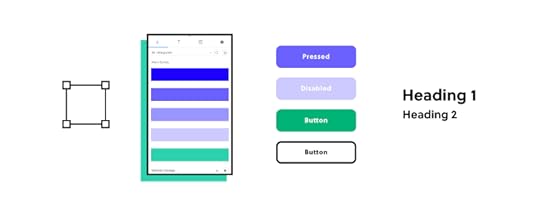
Component libraries provide design and engineering teams with a comprehensive collection of UI elements and components for digital product design.
The most significant benefit is that teams don’t have to start from scratch–they can begin prototyping and testing immediately using a thoroughly tested component library.
MUI (based on Google’s Material Design UI), one of the world’s most comprehensive and widely used component libraries, even provides customization through theming, so you can separate your UIs from competitors–even if they’re using the same component library.
While component libraries are customizable, they also provide a single source of truth between design and development–something particularly challenging, especially in the early stages of a product’s lifecycle.
Using the same components as engineers gives designers some constraints to minimize drift. At design handoff, engineers simply copy the component library’s components and make changes according to the designer’s mockups and prototypes.
Another significant benefit of a component library is that it gives solo engineers and startups professionally styled UI elements to build products and prototypes, making it easier to enter the market and compete.
How Can Designers and Engineers Use Design Systems?Designers and engineers follow the same design principles but the guidelines and documentation differ.
For example, with Polaris, designers and engineers must follow Foundations and Experiences to understand the principles, brand requirements, and approach to designing Shopify products. This knowledge is essential to know before you can start designing and coding.

Polaris also includes a Resources section with a UI kit, Polaris tools (icons set), Polaris GitHub page, links to Shopify’s blogs, additional developer documentation, and forums/communities.
Polaris’ Content and Design is designer-specific documentation for designing Shopify products. The Design section includes a style guide with Polaris’ design language, colors, typography, illustrations, sounds, icons, states, spacing, and data visualization.
Developers must familiarize themselves with Polaris’ design documentation (especially if it’s a solo developer) to understand the reasons behind design decisions and build layouts accordingly, but they have separate documentation under Components.
The Components section includes interactive example components with a code snippet and a link to open it in CodeSandbox. Devs can explore each component and use the snippet as starter code to develop a Shopify product.
Using Component Libraries and Design Systems with UXPin MergeUXPin Merge allows you to sync any design system or component library hosted in a repository to UXPin’s editor. Instead of using a UI kit, designers build mockups and prototypes using fully functioning code components.
The design system team can set constraints and provide flexibility via the component’s props with our Git integration (for React) or Args with Merge’s Storybook integration (Vue, Ember, Angular, and more). Any updates the DS team makes to the repository automatically sync to the design editor, and UXPin notifies teams of the changes–creating a single source of truth across the organization!
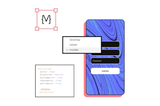
Designers can make adjustments to components via UXPin’s properties panel or switch to JSX to edit code directly–perfect for you designer/developers who want the best of both worlds. At design handoff, engineers copy each component’s JSX properties to develop the final product.
UXPin also generates an automatic design system with interactive components generated from your code. You can also include a style guide and other documentation, keeping your entire design language in one place. Instead of downloading and importing assets and components, design teams grab what they need from the Design Libraries Panel to build layouts.
Try Prototyping with UI ComponentsUXPin has just released a new tool, Merge Component Manager that makes it easy for designers to import and manage UI components that come from a React-based Design System, such as Ant Design, and use them to build interfaces in the UXPin editor. Request access to Component Manager and see how it speeds up your workflow.
The post The Difference Between Design Systems, Pattern Libraries, Style Guides & Component Libraries appeared first on Studio by UXPin.
April 13, 2022
Web Design Inspiration – A Curated List of 6 Sites
If you’re looking for web design inspiration for your next project, then look no further. We’ve scoured the internet to find the most inspirational web design trends in 2022.
Whether you’re building your site on Webflow or using a WordPress theme, this article features several inspirational web design ideas for your new website.
6 Website Design Sources of Inspiration1. Think Outside the Box – Wildcatter Creative Studio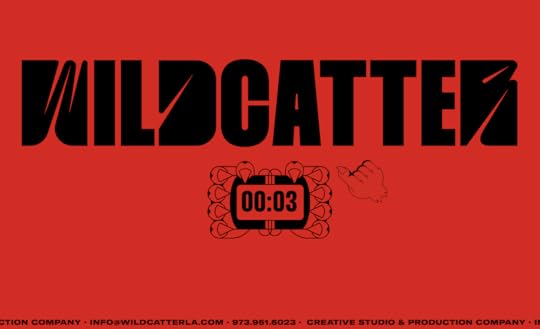
Wildcatter is a US-based creative studio and production company. They’ve worked with some big names, including HBO, EA Sports, Showtime, and Intel, to name a few. The website was awarded “Site of the Day” for February 24, 2022, on Awwwards.
Wildcatter does a wonderful job of creating an immersive user experience with fun animations and page transitions, a custom pointer, oversized bold typefaces, and witty copy. This complex website design is tricky because it often results in poor performance–something Wildcatter has done well to optimize.
Key takeaway: Your website design should embody your brand and the message you want to convey. Wildcatter uses its website to showcase its creative talent and ability to tell a brand story, which they’re trying to sell.
2. Recreating an Experience – LeCrans Wellness Resort
LeCrans is a five-star Swiss Alps-based wellness resort. The website, built on WordPress, showcases the resort’s breathtakingly beautiful surroundings with immersive video and images complemented by smooth animations and elegant typography.
LeCrans’ website designers have done a fantastic job of recreating Swiss Alps luxury with a soft color palette and minimalist layout. The website’s images complement UI design elements and help tell the resort’s story.
Key takeaway: If you’re trying to sell a real-world experience, use your website’s design to give customers a taste of what it’s like to visit your event or property. LeCrans does this well by giving you a sense of peace, tranquility, and five-star luxury.
3. Web & Mobile Cohesion – Emiozaki Web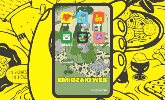
Emi Ozaki is a Tokyo-based graphic designer and illustrator. Her design portfolio includes various global media projects, including product design, advertising, magazines, and branding.
Emi’s website design uses a mobile device frame as a central focus, creating a unique layout while ensuring a cohesive and consistent user experience across all viewports.
Key takeaway: Designers must pay attention to how their web design will translate to multiple screen sizes and devices. Emi Ozaki’s creative approach to responsive design gives mobile users a familiar device OS aesthetic while creating a unique and immersive desktop experience.
4. Immersive Storytelling – L’Atelier (BNP Paribas)
French-based bank BNP Paribas website L’Atelier tells the story of Social Mobility in the Digital Age. The web design utilizes parallax scrolling and animation to tell its story.
While there is a lot of movement and animation, L’Atelier’s designers do an excellent job of making the copy and story the primary focus. They also use different fonts and typography sizing to help break up the text, create suspense, and keep users engaged.
Key takeaway: Web design plays a crucial role in telling a story. Designers must ensure that the visual design and effects don’t impact the website’s usability or distract from the content.
5. Minimalist eCommerce – Juana Skin
Juana Skin is a UAE-based therapeutic beauty brand. The website’s pastel colors, minimalist layout, and subtle animations complement the brand’s natural, “ultra-clean” skincare product range.
Designers use color to highlight the product’s primary benefits and CTAs for each page design. Juana Skin uses arrows with animations throughout the website to draw attention to important content and CTAs.
Key takeaway: Maintaining a minimalist user interface design for eCommerce websites is crucial to keep customers focused on the product. Busy layouts and poor performance can distract users resulting in poor conversion rates.
The Google Store is another excellent example of minimalist design for an eCommerce website.
6. Onboarding Optimized – Ooki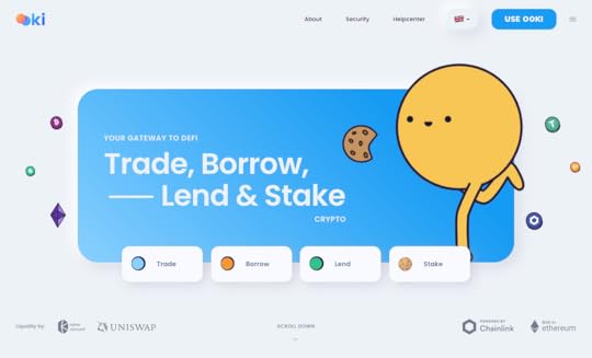
Ooki offers four crypto products for trading, borrowing, lending, and staking. Ooki’s designers use clear CTAs to quickly onboard new customers from the homepage. Clicking the header CTA “Use Ooki” takes users directly to the product, removing the signup process.
Ooki’s streamlined onboarding process lets customers view and interact with the product before signing up and using it.
Key takeaway: Removing roadblocks and giving users a taste of your product could increase signups–especially if you’re in a highly competitive and innovative space like crypto. A free trial is a good option, but it creates an extra step and means users must give up personal information.
More Website Design InspirationHere are some more resources to inspire your next web design project.
Top UX Design Blogs : A collection of industry-leading websites discussing various UX topics and design trends. Design Conferences : 40+ global design conferences for 2022–both live and virtual. r/web_design : A Reddit community of over 570k designers sharing knowledge and information. Behance : A platform owned by Adobe where designers can post screenshots of their design work as well as find web design examples and inspiration. Dribbble : A similar platform to Behance where designers showcase their work. There’s also a marketplace for themes and templates, and you can hire designers through Dribbble. web dev and web design : A Discord channel with 33k members discussing web design and development topics. All Things Web Development : A Discord channel where people share knowledge on programming, IT, computer science, and web design. : A Discord coding community specializing in HTML, CSS, Javascript and PHP. The Design Collective : A Discord web design community. 10 Product Design Slack Channels : A blog post featuring ten product design channels on Slack.UXPin – The World’s Best Website Design ToolWith UXPin’s built-in design system libraries, designers can immediately begin prototyping and testing website layouts. Create immersive user experiences with code-based interactions and animations.
Share your designs with clients or stakeholders for feedback and approval. Stakeholders and team members can use UXPin’s Comments to provide context, ask questions, request changes, or assign tasks.
Engineers can use UXPin’s Spec Mode to inspect designs, copy CSS starter code, read documentation, and view the style guide. They can also download the project’s assets–keeping everything in one place for a simplified handover process and smooth collaboration.
Try UXPin for your next web design project with a free 14-day trial.
The post Web Design Inspiration – A Curated List of 6 Sites appeared first on Studio by UXPin.
April 12, 2022
7 Great Design System Management Tools
Design system tools help drive adoption while making it easier to scale and maintain. But, with so many options on the market, how do you know which one is right for your product?
Having worked with design tools for over a decade, we’ve put together seven of the best design system tools for 2022–including solutions for designers and engineers.
Table of contentsWhat to Look for in a Design System Management Tool?Version ControlStyle GuideComponent StorageAsset StorageDocumentation & GuidelinesFeedback7 Design System Tools for 20221) UXPin2) Zeroheight3) Supernova4) Storybook5) Pattern Lab6) Adobe XD7) Design System Manager – InVisionUXPin is the world’s most advanced code-based design, prototyping, and testing tool. You can also build a design system from scratch and share it across your organization. Sign up for a free trial to explore all of UXPin’s features.
What to Look for in a Design System Management Tool?
Your design system tool must provide a good user experience for your designers and engineers. Here are some essentials to look for when choosing design system management tools.
Version ControlVersioning is a crucial feature every design system must have. Version control creates a new file for every design system release so that teams can switch between versions. Some of the benefits of design system version control include:
Allows teams to update to the latest design system release when they’re ready–preventing interruptions to workflowsAllows teams to work on the same file simultaneouslyTrack changes over timeInforms teams of what’s in each releaseThe ability to switch between versionsHelps with fault findingStyle GuideMost design systems start as style guides (usually PDF) that designers use to design components and UIs. A style guide provides context and instructions for a design system’s patterns and components–for example, color HEX codes, typography scales, usage, dos and don’ts, etc.
Component StorageComponent examples are most helpful for developers because they’re interactive and include code snippets. This is important because it allows engineers to see exactly how the component is supposed to work.
Asset StorageIt’s important to keep all of your design system assets (logos, images, etc.) with your component library and documentation so everything is in one place.
Documentation & GuidelinesDocumentation is the core of every design system. This documentation provides users with principles and guidelines to design products, including:
Brand guidelinesDesign principlesCopy guidelinesDesign system governanceDesign and code best practicesDesign system accessibilityResourcesToolsFeedbackEvery design system must be open to feedback and suggestions. This communication is also crucial for flagging bugs or errors. Including a contact page or comment form in your design system allows teams to submit feedback.
7 Design System Tools for 2022 1) UXPin
Whether you’re starting from scratch or you have an existing design system, UXPin has the tools and features to build, grow and scale.
Designers can create a design system from scratch by saving interactive components, assets, typography, and color. You can then share the design system across the organization and set permissions to prevent unauthorized changes–perfect for managing governance procedures and protocols.

Designers can simply drag and drop the design system’s components and assets to start building layouts–no external files or plugins are required. With everything inside UXPin, you get maximum consistency and efficiency because teams never have to leave the tool to visit design system documentation.
UXPin also makes it easy to link to external documentation for engineers, like a component library hosted in Storybook.
As your design system matures, upgrade to UXPin Merge–a technology that lets you sync a design system from a repository to UXPin’s editor so designers can build layouts using fully functional code components.
With Merge, designers and engineers use the same components, thus creating a single source of truth for your design system. Any updates to the repository automatically sync to UXPin’s editor, notifying designers of the new version.
Teams can use UXPin’s Version Control to switch between different versions of the design system. They also have the freedom to use different versions for each project or prototype.
UXPin offers a 14-day free trial to explore the tool, including Merge with our MUI integration.
2) ZeroheightZeroheight is a hub for hosting your design system documentation to share across the organization. Unlike UXPin, where designers can draw components directly from the library, Zeroheight lets you host design files that team members must download and install.
The platform does, however, allow you to embed your design system’s components from Storybook with code snippets.
Zeroheight offers a standard dashboard layout for your design system, similar to Lightning, Polaris, Stacks, and others, with main navigation on the left and a table of contents to the right. This familiar layout helps with onboarding, allowing teams to navigate the design system to find what they need.
You can store all of your design system’s assets in Zeroheight, and the DS team can embed YouTube, Vimeo, Loom, or Google Drive videos for tutorials and explainers.
3) SupernovaSupernova is an excellent alternative to Zeroheight with a similar layout and features but slightly more functionality.
One of Supernova’s best features is the ability to automatically “convert design data into code or assets for any tech stack.” You can also include starter templates for developers in your product’s formats, like iOS, Android, React, Angular, Flutter, and others, ensuring engineers always have the correct code and assets at the beginning of every project.
Supernova’s VSCode extension syncs your design system to the popular IDE, so developers have everything they need in one place. You can also sync Supernova to popular design tools so designers don’t have to download and import files.
4) StorybookStorybook is a popular tool for engineers who want to build and store UI components in isolation. Storybook also integrates with other design and development tools.
One of those tools is UXPin. With Merge’s Storybook integration, you can sync your library to UXPin’s editor so that designers can access the same components–creating a single source of truth.
A sandbox environment inside Storybook makes it easy for engineers to focus on individual UI components, including states and interactions. The dashboard layout allows you to organize and categorize your Storybook component library, so it’s easy to find what you need.
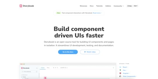
Storybook is a collaborative tool allowing you to review new components with teams and stakeholders to get input and sign-off before publishing. The Chromatic add-on lets you automate visual testing across browsers and gather feedback from QA teams.
Storybook automatically creates basic documentation for each UI component, which you can edit to include your design system’s guidelines, usage, principles, and more.
Storybook is an open-source tool, and it’s free to use. Simply follow the comprehensive documentation to get started. Check out these best practices and Storybook examples for inspiration.
5) Pattern LabPattern Lab is an open-source front-end environment for building, viewing, testing, and showcasing your design system’s UI components. The platform uses Brad Front’s Atomic Design principles that “stitches together UI components” to build patterns and templates.
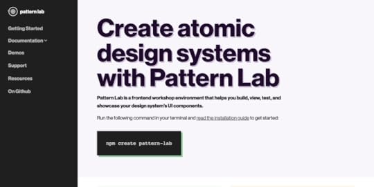
You can build components in Handlebars or Twigs markup and use a separate JSON file to create variations. Pattern Lab automatically categorizes your elements and displays them in a dashboard-style UI.
Users can inspect each element from the dashboard to view the markup and HTML language with CSS classes. You can also include documentation for each component to give users more information and context.
If you’re building a custom design system management tool, Pattern Lab provides an excellent starting environment for you to customize.
6) Adobe XDOut of the box Adobe XD doesn’t provide features for managing a design system, but it does integrate with design system management tools like Zeroheight, Frontify, Zeplin, and others.
Like UXPin, designers can share component libraries and assets from your design system–albeit without the context and instructions of documentation and style guides.
The problem with using Adobe XD for mature design systems, is you have separate components for design and development, one code-based and the other image-based for designers to use in XD. You also need additional tools and plugins to sync and manage your design system.
7) Design System Manager – InVisionDesign System Manager (DSM) from InVision is another popular design system tool. DSM looks and functions very similar to Supernova or Zeroheight with a dashboard layout and intuitive navigation.
DSM syncs to InVision’s design tool so designers can drag and drop components from the design system to build layouts. Like UXPin, this helps keep design teams focused inside one tool.
InVision Inspect allows you to store code snippets in popular front-end frameworks, including React, Vue, Angular, and HTML. Inspect displays an example component with code and state.
Unless you’re using Sketch or InVision Studio, DSM can be limited. DSM has a free plan but only provides the basic features. You have to upgrade to enterprise to get essential design system features like developer integrations and version control.
Instead, go for the design tool that has it all–UXPin is an end-to-end code-based design tool with the features to grow as your scale your product and design system. Sign up for a free trial to experience UXPin and our revolutionary Merge technology.
Which Design System Management Tool Will You Choose?It’s your turn now. Pick a design system tool that fits your needs. Test every tool that we compared here and see which one you like best. Hope to hear from you once you land on the best tool for you and your team. And if you want to learn more about building design systems, see our ebook section or read our blog.
The post 7 Great Design System Management Tools appeared first on Studio by UXPin.
April 10, 2022
UX Research Cheat Sheet
UX research is the bedrock for any design project. UX designers and researchers must gather insights about the market, competitors, and, most importantly, users.
This research continues throughout the design process as designers test ideas and gather feedback from participants and stakeholders. To be a good UX designer, you must be inquisitive and an active listener to truly understand your market and user needs.
In this UX research cheat sheet, we explore the research designers conduct at various stages of the design process and methods to gather and analyze data.
Table of contentsWhat can you Gain With UX Research?Research in the Design ProcessDiscoverExploreTestMonitorQuantitative vs. Qualitative UX Research MethodsWhat Does the Research Process Look Like?Improve Usability Testing With UXPinVariablesStatesInteractionsExpressionsAccessibilityReal Content & DataGet meaningful user testing and stakeholder feedback with code-based high-fidelity prototypes from UXPin. Sign up for a free trial and discover how UXPin can enhance your product’s user experience.
What can you Gain With UX Research?Here are some of the primary benefits of UX research:
Eliminates bias and assumptions to help teams develop objective product designs that meet user needsAllows you to create human-centered strategies and goals for your productsProvides insight into your users’ behavioral and usage patternsReduces the costs associated with inaccurate designs and strategiesHelps develop a long-term vision for the product roadmapProvides data for stakeholders to support design decisions and secure resourcesResearch in the Design Process
UX teams conduct research and test through the design process. These research methods change with each phase:
Discover: Empathize and defineExplore: Ideate and prototypeTest: TestMonitor: Post-implementationLet’s look a look at each of these in greater detail.
DiscoverDiscovery research happens at the beginning of the design thinking process. This early research is called the empathize phase because UX designers must put themselves into the shoes of their users to see the world from their perspective.
Typical research methods during the discovery phase include:
Field research: Observing people in the environment where they use your productUser interviews: One-on-one interviews to understand users’ problemsStakeholder interviews: Understand business needs and constraints Diary studies : Users document using your product over a periodInternal research: Meetings with sales, marketing, support, etc. to gather insights from other teamsReview analytics: User analytics and heatmaps (if you’re designing for an existing product) Usability heuristics : A set of ten principles from the Nielsen Norman Group used during a UX audit to evaluate a product’s usabilityDuring discovery, UX designers must use this research to define user problems your product can solve. This research includes:
Competitive analysis: Identify competitor strengths and weaknesses and determine what their customers like and dislike about the products User journey mapping : A visualization of how customers interact with your product Empathy map : Identifies what users see, hear, think, and feel as they complete tasks or a user journey User personas : A fictional character that represents a user demographicExploreOnce UX designers have gathered and analyzed research, they ideate and prototype to solve users’ problems. Some explore research methods include:
Brainstorming: Use research to develop design ideas and solutions–typically a collaborative effort using a whiteboard and sticky notes.Design: UX designers create sketches, wireframes, mockups, and other visuals to develop ideas for users’ problems. Card sorting : Participants sort cards into categories they find relevant. These categories help UX designers build information architecture and structure page layouts.Prototyping: Designers prototype throughout the design process, starting with low-fidelity paper prototypes to high-fidelity prototypes representing the final product.Stakeholder feedback: Presenting user research and prototypes to stakeholders for feedback.TestTesting is a vital research tool that enables designers to validate ideas developed during ideation. While testing appears to be a separate step, UX designers conduct tests throughout the design process, particularly while ideating and prototyping. Some of these methods include:
Usability testing : Moderated and unmoderated tests with end-users on wireframes, mockups, information architecture, and prototypes.Accessibility testing: UX designers must test prototypes and UIs against accessibility guidelines and users with disabilities.Benchmark testing: Designers use benchmark tests to measure the success of product redesigns and upgrades.Surveys: A quick research method for testing large groups of users with questionnaires.MonitorAfter a release, researchers must monitor the product and users to identify bottlenecks and pain points. The monitoring phase adopts many of the same tests and techniques UX designers use during discovery. Research methods include:
Product analytics: Researchers gather data to measure the releases’ impact on analytics like conversions, sales, funnel drop-offs, navigation, and more.Support data: Researchers can use customer support data to determine if a design solution reduces tickets for the issues they were trying to solve.User feedback: Aside from support tickets, UX designers must make it easy for users to comment, report issues, and ask questions. User feedback is particularly important for enterprise products where users rely on these tools for work.A/B testing: A/B testing is a common research method to measure the difference between two design ideas. It’s also helpful for measuring subtle differences, like a red vs. blue CTA button.Heat maps and screen recordings: Give researchers insights into how users navigate web pages. This data is essential for determining page layouts and hierarchy.Beta testing: An early product release, often to a select group of users. Researchers often combine beta testing with dairy studies to get as much meaningful feedback as possible before the official release.Search log analysis: A product’s search log can reveal a lot about user behavior which can help UX designers restructure layouts so popular items are easier to locate.Business assessment: Aside from user research, UX designers must evaluate a product’s business value performance. This information is important for stakeholder feedback and securing funding for future projects.Quantitative vs. Qualitative UX Research Methods
UX research involves a mix of qualitative and quantitative testing:
Quantitative: Tangible metrics and dataQualitative: Behavioral observations, opinions, motivations, and emotionsQuantitative data is measurable, while qualitative data is subjective and open to interpretation. When combined, these two metrics can put research into perspective.
For example, you notice a drop-off in conversions when you redesign an eCommerce checkout flow. The quantitative data tells you conversions fell from 5% to 4%. From user interviews, you learn that the new shipping methods are confusing. The qualitative data reveals what’s affecting conversions.
What Does the Research Process Look Like?The research process will vary depending on the method, but there are several vital steps UX designers follow:
Hypothesis: Many UX studies start with an idea researchers want to validate. For example, “we will make it easier for customers to find products and increase conversions if we put our best sellers on the home page.”Planning & preparation: A UX research plan defines objectives, determines the correct methodology, the research location, and the information researchers need to gather.Conducting research: Researchers conduct tests or research according to the plan.Compiling & analyzing results: Researchers must organize data to find patterns and opportunities. They might also have to present these findings to stakeholders for further analysis.Take action: Finally, UX researchers must use their results to determine the next course of action.Improve Usability Testing With UXPin
UX designers rely on accurate user testing results. But most design tools lack the fidelity and functionality necessary to get meaningful feedback and test user experiences effectively.
UXPin is a code-based tool. So, designers can create code-like prototypes to provide usability participants and stakeholders with an accurate product experience.
Let’s explore a few of UXPin’s advanced prototyping features.
VariablesMost design tools display a graphical representation of an input field. In UXPin, input fields work just like they would in the final product. Variables allow you to capture user inputs and use that data elsewhere in the application–like a custom welcome message or populating a profile page.
StatesYou can create multiple States for any component in UXPin with different properties for each one. From standard button states to accordions and complex navigational menus.
InteractionsInteraction design is crucial for usability and product experience. UI designers can choose from an expansive list of triggers, actions, and animations to bring your prototypes to life.
UXPin takes things one step further than other design tools with Conditional Interactions, which allow you to create code-like “if-then” and “if-else” conditions which designers can use to validate an email or password. When combined with Variables, you can simulate a sign-up and login process–the possibilities are endless.
ExpressionsExpressions give UXPin prototypes code-like functionality where designers can simulate form validation, build a functional shopping cart, validate credit cards, and more.
AccessibilityUX designers must always check user interfaces to ensure they pass accessibility standards. UXPin offers built-in accessibility tools to streamline testing with a Contrast Checker and Color Blindness Simulator.
Real Content & DataHow many times have you searched “lorem ipsum” for dummy copy or scanned Unsplash for the perfect image? UXPin’s built-in content generator allows you to populate UIs with relevant content like names, dates, numbers, addresses, and more. You can even where UXPin auto-populates data according to naming conventions.
UXPin also allows you to use your own data from Google Sheets, CSV, or JSON, to give users and stakeholders an authentic product experience.
Improve your UX research and testing with the world’s most advanced code-based design tool. Sign up for a free trial to experience the power and versatility of UXPin.
The post UX Research Cheat Sheet appeared first on Studio by UXPin.
UXpin's Blog

- UXpin's profile
- 68 followers

