
UXpin's Blog, page 51
October 17, 2022
Top 6 npm Packages for Component-Driven Prototyping
Component-driven prototyping with UXPin Merge allows designers to build accurate replicas of the final product. Unlike other design tools that render static graphics, UXPin is powered by code so that designers can create high-fidelity, fully functioning prototypes.
UXPin’s npm integration gives designers the freedom to import components and patterns from open-source design systems. They may need a single UI element to create a new pattern for an existing design system or use the npm integration to build a fully functioning MVP during a design sprint.
Table of contentsUXPin Merge: How Does it Work?Storybook and Git IntegrationsImporting Components with Merge npm IntegrationUsing Merge Component Manager (MCM)Choosing an Open-Source Design System to ImportAnt DesignImporting the Ant Design npm PackageBootstrapImporting the React Bootstrap npm PackageMUIImporting the MUI npm PackageSemantic UIImporting the Semantic UI React npm PackageCarbon Design SystemImporting the Carbon Design System npm PackageGrommetImporting the Grommet npm PackageDiscover how UXPin Merge can enhance your design projects with component-driven prototyping. Visit our Merge page to find out how to request access.
Reach a new level of prototypingDesign with interactive components coming from your team’s design system.
Discover UXPin Merge .discover-merge { margin: 40px 8px;}.discover-merge__container { display: flex; max-width: 690px; height: 200px; padding: 20px; padding-left: 24px; border-radius: 4px; background-color: black; box-shadow: 10px 10px #9999ff; align-items: center; justify-content: space-between;}.discover-merge__left { width: 50%;}.discover-merge__left p { margin: 10px 0px !important; color: white !important; font-size: 18px !important;}.discover-merge__heading { font-weight: bold !important; color: white !important; font-size: 18px !important;}.discover-merge__text { margin: 0 !important; line-height: 22px !important;}.discover-merge__button { width: 174px; height: 44px; margin: 10px 0px; border: none; border-radius: 2px; background: white; color: black; font-size: 16px; text-align: center;}.discover-merge__button:hover { cursor: pointer;}.discover-merge__image { max-width: 320px !important; height: 200px; margin-right: -19px;}@media (max-width: 760px) { .discover-merge__container { height: auto; margin: 10px; align-items: left; }}@media (max-width: 500px) { .discover-merge__container { flex-direction: column; } .discover-merge__left { width: 100%; align-items: normal; }}UXPin Merge: How Does it Work?
Before we dive into UXPin’s npm integration and the packages you can import for prototyping, it’s important to understand Merge–the technology that makes it possible.
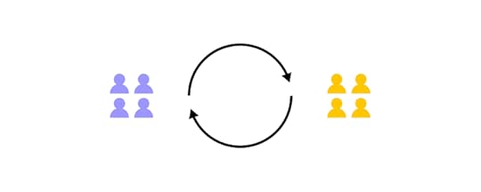
Merge enables companies to sync a design system hosted in a repository to UXPin’s design editor so designers can build prototypes using the same component library as engineers.
These “ready-made” UI elements include properties and interactivity defined by the design system’s code. A component in Merge looks and functions the same as the final product because it’s an exact replica.
Designers use Merge components like building blocks, dragging and dropping to build new UIs, and fully functioning prototypes. They can also use Patterns to combine UI elements and build new components.
Merge’s strongest feature is its ability to sync design and development, creating a genuine single source of truth across the organization via the design system’s repository. Any changes to the repo automatically sync to UXPin, notifying product teams of the change.
Storybook and Git IntegrationsUntil the launch of our npm integration, organizations had two options when importing component libraries:
Git integration: React librariesStorybook integration: Storybook libraries including Angular, Vue, Ember, React, and Web Components, to name a few (complete list on Storybook’s website)Setting up the boilerplate repo and importing a component library requires developer collaboration, code skills, and repository knowledge.
This process makes sense for organizations importing a product design system, but designers need more control and flexibility for prototyping with open-source component libraries.
Importing Components with Merge npm IntegrationIn 2022, we launched the Merge npm integration–giving design teams the control and flexibility they needed to import and manage React components in UXPin without engineering support.
Using the Merge Component Manager (MCM), designers can import individual components and their properties via the library’s npm package. There’s no code required, and setup takes a few minutes.
Designers can use these open-source components to build new patterns for an existing design system or create a minimum viable product (MVP) using fully functioning UI elements.
Using Merge Component Manager (MCM)Merge Component Manager (MCM) is where designers manage npm imported component libraries (MCM doesn’t work with Merge’s Git or Storybook integrations).
You must follow the library’s documentation and naming conventions when importing components, or the import won’t work. UXPin’s npm integration must find a component and its properties using the repository’s naming convention, so if you reference the React props incorrectly, MCM can’t locate it.
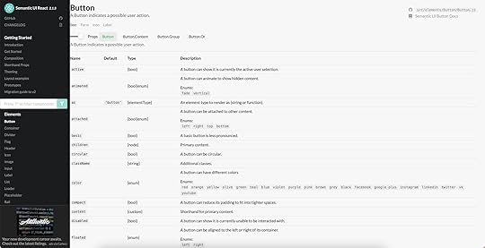
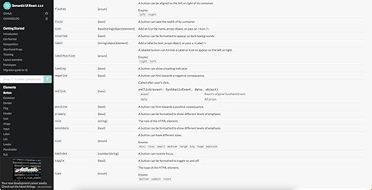
We’ll use a Semantic UI button to illustrate how to reference React props when importing components. You’ll find these React props in the design system’s documentation.
When importing a component’s property, the Property name in MCM must match the React prop name from the documentation.
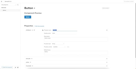
In this case, we’re importing the children prop, which gives a Semantic UI button its label.
The Display name is what designers will see in UXPin’s Properties Panel.
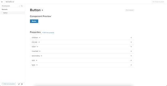
We’ve imported children, circular, color inverted, secondary, size, and type, which you can see in this screenshot.
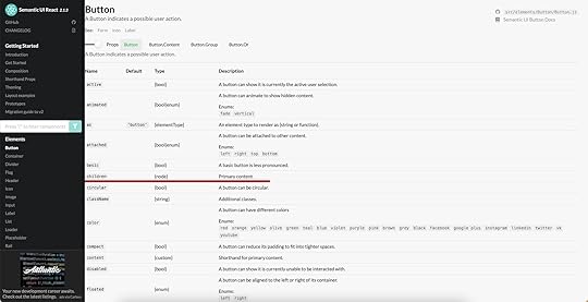
Those MCM Property names correspond to Semantic UI’s documentation which you see in the following two screenshots.
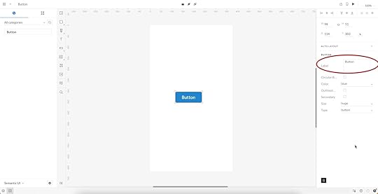
When we add that Semantic UI button to the canvas and select it, those same properties appear in UXPin’s Properties Panel. We can adjust these properties to change the button’s styling instantly.
Choosing an Open-Source Design System to ImportIt’s important to note that designers can only use the npm integration to import design systems with React component libraries, and it must have an npm package.
Next, the design system must serve your product’s needs. Are you designing a B2B product? Are you prototyping a web, mobile, or cross-platform application? Do you want to complement an existing design system or build something from scratch?
For example, if you’re building a website or web application, Bootstrap or Semantic UI are excellent choices, whereas Ant Design is probably better for mobile and cross-platform digital products.
It’s worthwhile researching open-source design systems to ensure the library has the UI elements you need. The library must also have documentation with setup instructions and a list of the available React props. These props will allow you to change a component’s properties like color, shape, interactivity, size, icon, etc.
To get you started, we’ve included five popular open-source design systems you can import using UXPin’s npm integration, including setup instructions and why you might choose them.
Ant DesignAnt Design is an open-source design system developed and maintained by the Chinese tech giant Ant Group. The component library is available for React, Angular, and Vue and includes Ant Design Mobile for building cross-platform and mobile applications.
Ant Design is a fantastic “all-rounder” with components for B2C products, enterprise applications, websites, and cross-platform apps. The design system also features an icon set, dark mode, animations, and interactivity.
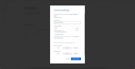
Importing the Ant Design npm PackageAnt Design npm integration Library settings:
Library name: Ant Design NPM – The Library name has no impact on the importPackage details: antd – must correspond to the Ant Design npm registryAssets location: antd/dist/antd.css – required for styling Ant Design React propsLeave everything else as default and click Save Changes.
Further reading: Check out this step-by-step guide for importing Ant Design components via the UXPin npm integration.
BootstrapBootstrap is one of the oldest and largest responsive front-end frameworks. Engineers often use Bootstrap for basic CSS styling and Javascript functionality when building website and web application prototypes.
UXPin’s npm integration uses the React Boostrap, which includes the same out-of-the-box features and functionality as the original Bootstrap. We recommend React Bootstrap for prototyping responsive websites and web applications.
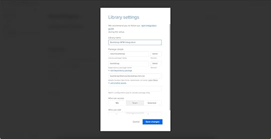
Importing the React Bootstrap npm PackageReact Bootstrap npm integration Library settings:
Library name: Bootstrap NPM Integration – The Library name has no impact on the importPackage details: react-bootstrap – must correspond to the React Bootstrap npm registryDependency package name: bootstrap – React Boostrap requires the Bootstrap dependency to work in UXPinAssets location: bootstrap/dist/css/bootstrap.min.css – required for styling React Boostrap propsLeave everything else as default and click Save Changes.
Further reading: Check out this step-by-step guide for importing React Bootstrap components via the UXPin npm integration.
MUIMUI is a React library built based on Google’s Material Design UI. The comprehensive design system features everything you need to develop an array of digital products, plus more than 2,000 Material Design Icons.
Due to its comprehensive component library, MUI is a popular choice for enterprise products, cross-platform applications, and MVPs.
Importing the MUI npm PackageMUI npm integration Library settings:
Library name: MUI NPM – The Library name has no impact on the importPackage details: @mui/material – must correspond to the MUI npm registryUnlike React Boostrap and Ant Design, MUI doesn’t require dependencies or assets to work in UXPin. Leave everything else as default and click Save Changes.

Further reading: Check out this step-by-step guide for importing MUI components via the UXPin npm integration.
Semantic UISemantic UI is an excellent alternative to Bootstrap. The Semantic UI React framework has a more modern aesthetic, simple features, and highly customizable components. Semantic UI includes FontAwesome built-in–the most extensive icon library in the world.
Like Bootstrap, Semantic UI is best for prototyping websites and web applications.
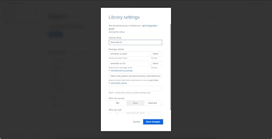
Importing the Semantic UI React npm PackageSemantic UI React npm integration Library settings:
Library name: Semantic UI – The Library name has no impact on the importPackage details: semantic-ui-react – must correspond to the Semantic UI React npm registryDependency package name: semantic-ui-css – Semantic UI React requires the Semantic UI CSS dependency to work in UXPinAssets location: https://cdn.jsdelivr.net/npm/semantic... – required for styling Semantic UI React propsLeave everything else as default and click Save Changes.
Further reading: The Library settings are similar to React Bootstrap. Follow the Bootstrap tutorial for a step-by-step guide, and use the Semantic UI React docs to replace library and component settings accordingly.
Carbon Design SystemCarbon is a design system developed and maintained by IBM with React, Angular, and Vue versions. The simple yet comprehensive design system includes a large component and pattern library, an icon set, pictograms, motion, and instructions for theming.
Carbon is an excellent design system for B2B and enterprise product design. Carbon’s data visualization documentation makes it the perfect choice for product teams developing dashboard and report user interfaces.
Importing the Carbon Design System npm PackageCarbon Design System React npm integration Library settings:
Library name: Carbon NPM – The Library name has no impact on the importPackage details: @carbon/react – must correspond to the Carbon Design System npm registryAssets location: https://unpkg.com/carbon-components/c... – required for styling Carbon Design System’s React props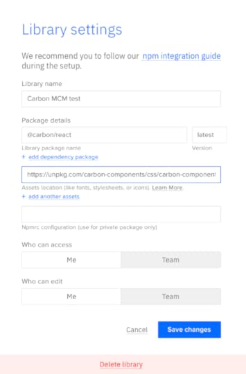
Leave everything else as default and click Save Changes.
GrommetGrommet is a React-based framework that is great for building mobile-first prototypes that are accessible and responsive. Used by Netflix, Uber, Hewlett Packard, this design system is easily themable and you should definitely give it a shot.
Importing the Grommet npm PackageGrommet npm integration Library settings:
Library name: Grommet NPM Package details: grommet – must correspond to the Grommet npm registryAssets location: https://v2.grommet.io/componentsLeave everything else as default and click Save Changes.
Design with npm Components in UXPinHere we outlined 6 npm component libraries that you can try with UXPin Merge. Ready to start prototyping with one of these design systems? Try npm integration to test those packages and experience what component-driven prototyping can give you.
Try npm integrationThe post Top 6 npm Packages for Component-Driven Prototyping appeared first on Studio by UXPin.


Top 6 npm Packages for Component-Driven Prototyping with UXPin Merge
Component-driven prototyping with UXPin Merge allows designers to build accurate replicas of the final product. Unlike other design tools that render static graphics, UXPin is powered by code so that designers can create high-fidelity, fully functioning prototypes.
UXPin’s npm integration gives designers the freedom to import components and patterns from open-source design systems. They may need a single UI element to create a new pattern for an existing design system or use the npm integration to build a fully functioning MVP during a design sprint.
Table of contentsUXPin Merge: How Does it Work?Storybook and Git IntegrationsImporting Components with Merge npm IntegrationUsing Merge Component Manager (MCM)Choosing an Open-Source Design System to ImportAnt DesignImporting the Ant Design npm PackageBootstrapImporting the React Bootstrap npm PackageMUIImporting the MUI npm PackageSemantic UIImporting the Semantic UI React npm PackageCarbon Design SystemImporting the Carbon Design System npm PackageGrommetImporting the Grommet npm PackageDiscover how UXPin Merge can enhance your design projects with component-driven prototyping. Visit our Merge page to find out how to request access.
Reach a new level of prototypingDesign with interactive components coming from your team’s design system.
Discover UXPin Merge .discover-merge { margin: 40px 8px;}.discover-merge__container { display: flex; max-width: 690px; height: 200px; padding: 20px; padding-left: 24px; border-radius: 4px; background-color: black; box-shadow: 10px 10px #9999ff; align-items: center; justify-content: space-between;}.discover-merge__left { width: 50%;}.discover-merge__left p { margin: 10px 0px !important; color: white !important; font-size: 18px !important;}.discover-merge__heading { font-weight: bold !important; color: white !important; font-size: 18px !important;}.discover-merge__text { margin: 0 !important; line-height: 22px !important;}.discover-merge__button { width: 174px; height: 44px; margin: 10px 0px; border: none; border-radius: 2px; background: white; color: black; font-size: 16px; text-align: center;}.discover-merge__button:hover { cursor: pointer;}.discover-merge__image { max-width: 320px !important; height: 200px; margin-right: -19px;}@media (max-width: 760px) { .discover-merge__container { height: auto; margin: 10px; align-items: left; }}@media (max-width: 500px) { .discover-merge__container { flex-direction: column; } .discover-merge__left { width: 100%; align-items: normal; }}UXPin Merge: How Does it Work?Before we dive into UXPin’s npm integration and the packages you can import for prototyping, it’s important to understand Merge–the technology that makes it possible.
Merge enables companies to sync a design system hosted in a repository to UXPin’s design editor so designers can build prototypes using the same component library as engineers.
These “ready-made” UI elements include properties and interactivity defined by the design system’s code. A component in Merge looks and functions the same as the final product because it’s an exact replica.
Designers use Merge components like building blocks, dragging and dropping to build new UIs, and fully functioning prototypes. They can also use Patterns to combine UI elements and build new components.
Merge’s strongest feature is its ability to sync design and development, creating a genuine single source of truth across the organization via the design system’s repository. Any changes to the repo automatically sync to UXPin, notifying product teams of the change.
Storybook and Git IntegrationsUntil the launch of our npm integration, organizations had two options when importing component libraries:
Git integration: React librariesStorybook integration: Storybook libraries including Angular, Vue, Ember, React, and Web Components, to name a few (complete list on Storybook’s website)Setting up the boilerplate repo and importing a component library requires developer collaboration, code skills, and repository knowledge.
This process makes sense for organizations importing a product design system, but designers need more control and flexibility for prototyping with open-source component libraries.
Importing Components with Merge npm IntegrationIn 2022, we launched the Merge npm integration–giving design teams the control and flexibility they needed to import and manage React components in UXPin without engineering support.
Using the Merge Component Manager (MCM), designers can import individual components and their properties via the library’s npm package. There’s no code required, and setup takes a few minutes.
Designers can use these open-source components to build new patterns for an existing design system or create a minimum viable product (MVP) using fully functioning UI elements.
Using Merge Component Manager (MCM)Merge Component Manager (MCM) is where designers manage npm imported component libraries (MCM doesn’t work with Merge’s Git or Storybook integrations).
You must follow the library’s documentation and naming conventions when importing components, or the import won’t work. UXPin’s npm integration must find a component and its properties using the repository’s naming convention, so if you reference the React props incorrectly, MCM can’t locate it.
We’ll use a Semantic UI button to illustrate how to reference React props when importing components. You’ll find these React props in the design system’s documentation.
When importing a component’s property, the Property name in MCM must match the React prop name from the documentation.
In this case, we’re importing the children prop, which gives a Semantic UI button its label.
The Display name is what designers will see in UXPin’s Properties Panel.
We’ve imported children, circular, color inverted, secondary, size, and type, which you can see in this screenshot.
Those MCM Property names correspond to Semantic UI’s documentation which you see in the following two screenshots.
When we add that Semantic UI button to the canvas and select it, those same properties appear in UXPin’s Properties Panel. We can adjust these properties to change the button’s styling instantly.
Choosing an Open-Source Design System to ImportIt’s important to note that designers can only use the npm integration to import design systems with React component libraries, and it must have an npm package.
Next, the design system must serve your product’s needs. Are you designing a B2B product? Are you prototyping a web, mobile, or cross-platform application? Do you want to complement an existing design system or build something from scratch?
For example, if you’re building a website or web application, Bootstrap or Semantic UI are excellent choices, whereas Ant Design is probably better for mobile and cross-platform digital products.
It’s worthwhile researching open-source design systems to ensure the library has the UI elements you need. The library must also have documentation with setup instructions and a list of the available React props. These props will allow you to change a component’s properties like color, shape, interactivity, size, icon, etc.
To get you started, we’ve included five popular open-source design systems you can import using UXPin’s npm integration, including setup instructions and why you might choose them.
Ant DesignAnt Design is an open-source design system developed and maintained by the Chinese tech giant Ant Group. The component library is available for React, Angular, and Vue and includes Ant Design Mobile for building cross-platform and mobile applications.
Ant Design is a fantastic “all-rounder” with components for B2C products, enterprise applications, websites, and cross-platform apps. The design system also features an icon set, dark mode, animations, and interactivity.
Importing the Ant Design npm PackageAnt Design npm integration Library settings:
Library name: Ant Design NPM – The Library name has no impact on the importPackage details: antd – must correspond to the Ant Design npm registryAssets location: antd/dist/antd.css – required for styling Ant Design React propsLeave everything else as default and click Save Changes.
Further reading: Check out this step-by-step guide for importing Ant Design components via the UXPin npm integration.
BootstrapBootstrap is one of the oldest and largest responsive front-end frameworks. Engineers often use Bootstrap for basic CSS styling and Javascript functionality when building website and web application prototypes.
UXPin’s npm integration uses the React Boostrap, which includes the same out-of-the-box features and functionality as the original Bootstrap. We recommend React Bootstrap for prototyping responsive websites and web applications.
Importing the React Bootstrap npm PackageReact Bootstrap npm integration Library settings:
Library name: Bootstrap NPM Integration – The Library name has no impact on the importPackage details: react-bootstrap – must correspond to the React Bootstrap npm registryDependency package name: bootstrap – React Boostrap requires the Bootstrap dependency to work in UXPinAssets location: bootstrap/dist/css/bootstrap.min.css – required for styling React Boostrap propsLeave everything else as default and click Save Changes.
Further reading: Check out this step-by-step guide for importing React Bootstrap components via the UXPin npm integration.
MUIMUI is a React library built based on Google’s Material Design UI. The comprehensive design system features everything you need to develop an array of digital products, plus more than 2,000 Material Design Icons.
Due to its comprehensive component library, MUI is a popular choice for enterprise products, cross-platform applications, and MVPs.
Importing the MUI npm PackageMUI npm integration Library settings:
Library name: MUI NPM – The Library name has no impact on the importPackage details: @mui/material – must correspond to the MUI npm registryUnlike React Boostrap and Ant Design, MUI doesn’t require dependencies or assets to work in UXPin. Leave everything else as default and click Save Changes.
Further reading: Check out this step-by-step guide for importing MUI components via the UXPin npm integration.
Semantic UISemantic UI is an excellent alternative to Bootstrap. The Semantic UI React framework has a more modern aesthetic, simple features, and highly customizable components. Semantic UI includes FontAwesome built-in–the most extensive icon library in the world.
Like Bootstrap, Semantic UI is best for prototyping websites and web applications.
Importing the Semantic UI React npm PackageSemantic UI React npm integration Library settings:
Library name: Semantic UI – The Library name has no impact on the importPackage details: semantic-ui-react – must correspond to the Semantic UI React npm registryDependency package name: semantic-ui-css – Semantic UI React requires the Semantic UI CSS dependency to work in UXPinAssets location: https://cdn.jsdelivr.net/npm/semantic... – required for styling Semantic UI React propsLeave everything else as default and click Save Changes.
Further reading: The Library settings are similar to React Bootstrap. Follow the Bootstrap tutorial for a step-by-step guide, and use the Semantic UI React docs to replace library and component settings accordingly.
Carbon Design SystemCarbon is a design system developed and maintained by IBM with React, Angular, and Vue versions. The simple yet comprehensive design system includes a large component and pattern library, an icon set, pictograms, motion, and instructions for theming.
Carbon is an excellent design system for B2B and enterprise product design. Carbon’s data visualization documentation makes it the perfect choice for product teams developing dashboard and report user interfaces.
Importing the Carbon Design System npm PackageCarbon Design System React npm integration Library settings:
Library name: Carbon NPM – The Library name has no impact on the importPackage details: @carbon/react – must correspond to the Carbon Design System npm registryAssets location: https://unpkg.com/carbon-components/c... – required for styling Carbon Design System’s React propsLeave everything else as default and click Save Changes.
GrommetGrommet is a React-based framework that is great for building mobile-first prototypes that are accessible and responsive. Used by Netflix, Uber, Hewlett Packard, this design system is easily themable and you should definitely give it a shot.
Importing the Grommet npm PackageGrommet npm integration Library settings:
Library name: Grommet NPM Package details: grommet – must correspond to the Grommet npm registryAssets location: https://v2.grommet.io/componentsLeave everything else as default and click Save Changes.
Design with npm Components in UXPinHere we outlined 6 npm component libraries that you can try with UXPin Merge. Ready to start prototyping with one of these design systems? Try npm integration to test those packages and experience what component-driven prototyping can give you.
Try npm integrationThe post Top 6 npm Packages for Component-Driven Prototyping with UXPin Merge appeared first on Studio by UXPin.
October 13, 2022
What are Interactive Components? Bring your Prototypes to Life in UXPin
Interactions are vital for prototyping because they provide usability participants and stakeholders with a realistic user experience. The problem many designers have is building interactive components is time-consuming, and the results are underwhelming in most design tools.
Discover component-driven prototyping with UXPin Merge and how you can use interactive components to create fully functional prototypes to enhance cross-functional collaboration and user testing. Visit our Merge page for more details and how to request access to this revolutionary UX design technology.
Reach a new level of prototypingDesign with interactive components coming from your team’s design system.
Discover UXPin Merge .discover-merge { margin: 40px 8px;}.discover-merge__container { display: flex; max-width: 690px; height: 200px; padding: 20px; padding-left: 24px; border-radius: 4px; background-color: black; box-shadow: 10px 10px #9999ff; align-items: center; justify-content: space-between;}.discover-merge__left { width: 50%;}.discover-merge__left p { margin: 10px 0px !important; color: white !important; font-size: 18px !important;}.discover-merge__heading { font-weight: bold !important; color: white !important; font-size: 18px !important;}.discover-merge__text { margin: 0 !important; line-height: 22px !important;}.discover-merge__button { width: 174px; height: 44px; margin: 10px 0px; border: none; border-radius: 2px; background: white; color: black; font-size: 16px; text-align: center;}.discover-merge__button:hover { cursor: pointer;}.discover-merge__image { max-width: 320px !important; height: 200px; margin-right: -19px;}@media (max-width: 760px) { .discover-merge__container { height: auto; margin: 10px; align-items: left; }}@media (max-width: 500px) { .discover-merge__container { flex-direction: column; } .discover-merge__left { width: 100%; align-items: normal; }}What are Interactive Components?Interactive components (or interactive elements) are reusable UI elements from a design system and include interactivity by default. This interactivity is a game-changer for designers who usually work with UI kits and have to add interactions for every project.
Design teams can set interactions, states, and other animations to create immersive prototypes that accurately represent the final product.
Interactive Components BenefitsHere are several benefits of interactive components.
1. Fewer ArtboardsTraditionally, creating interactions using a design tool required multiple artboards to achieve basic functionality. Designers can achieve the same results with a single artboard using interactive components.
2. Faster Time to MarketCreating fewer artboards means less design work for designers, and interactive components are reusable, so designers only have to set interactions once–saving significant time during the design process.

Once engineers are familiar with the approved components, the design handoff process is much easier, saving further time on project delivery.
The result of all these time savings?–faster time to market.
3. Increased ConsistencyUI kits increase design consistency, but they still leave some ambiguity regarding interactions. Designers must set these interactions themselves, leading to errors and inconsistencies–especially if the project doesn’t specify interactivity guidelines!
Interactive components have interactivity “baked in,” so everyone has the same states, microinteractions, and animations. These baked-in interactions increase consistency while enhancing efficiency because designers have fewer setup tasks and errors to fix.
4. Better Testing and FeedbackUser and stakeholder feedback is crucial for design projects. This feedback drives decision-making to deliver user-centered products that align with business goals.
Most design tools lack the fidelity and functionality to perform simple interactions engineers achieve with a few lines of code. Interactive components make it easier to replicate code functionality, resulting in immersive, realistic prototypes for usability testing and stakeholders.
5. Increase Design System AdoptionOne of the DS team’s jobs is evangelizing the design system to increase adoption. Interactive components are a powerful tool in design system evangelism because they create efficient workflows for product development teams, thus increasing the likelihood of adoption.
 6. Scaling Design
At UXPin, we’ve seen how component-driven prototyping and interactive components help scale design. Our favorite example is how PayPal used UXPin Merge to scale its design process without hiring new staff.
Connecting Merge to interactive components hosted in a repository allowed PayPal’s product teams (with little or no UX/design tool experience) to complete 90% of design projects 8X faster than skilled UX designers previously could.
Interactive components made the design process more accessible to non-designers because they reduced the learning curve significantly.
PayPal’s UX team built an interactive component library, including layouts and templates, and used React props to set design system constraints. Product teams simply drag and drop to build prototypes for usability testing and design handoffs.
Interactive components allow orgs to give more UX responsibilities to non-designers, like product teams (or engineers in the case of another UXPin Merge user, TeamPassword), thus scaling design with growing the UX team.
You can create interactions depending on the conditions like click, hover etc. on the ready components!
How to Incorporate Interactive Components in UXPin Prototypes?To incorporate interactive components into your product prototypes, there are many steps you can take. Make sure that forms can actually be filled out; boxes can be checked; and links can be clicked on.
Make as many components of your design actually workable as you can; this allows users to have the experience of trying to use the product, and it can give you some insight into how your product works and how people will (or want to) use it.
1. Using Interactive Components in UXPinSince the first release of UXPin more than a decade ago, interactive components have been core to our design tool, providing designers with a solution to build prototypes that accurately replicate the final product experience.
UXPin has four powerful features to create interactive components:
States : Create multiple state variants, each with different properties and interactions for a single component. Variables : Capture user input data and use it to create personalized, dynamic user experiences. Expressions : Javascript-like functions to create complex components and advanced functionality–no code required! Conditional Interactions : Set if-then and if-else conditions based on user interactions to create dynamic prototypes with multiple outcomes to accurately replicate the final product experience.One helpful strategy is including pre-built components (called “forms” at UXPin) that you can easily drag and drop in our platform. (No need to design these from scratch!)
Here are some interactive component examples from our examples page to see how you can start. For now, let’s see what you can do with states, variables, expressions, and conditional logic.
Example 1: Button 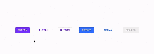
 Example 3: Radio button
 [image error]
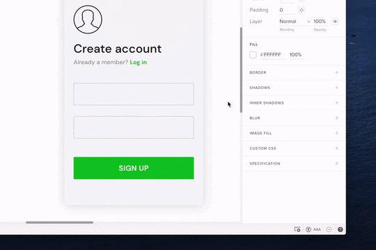
Example 4: An interactive sign-up form
→ Download a ready .uxp file to import into your UXPin account.
Want to create one by yourself? Here’s a tutorial.
2. Interactive Components in UXPin MergeMerge takes component-driven prototyping and interactive components to another level. Instead of designers building components in UXPin, Merge imports a design system library from a repository.
These Merge UI elements are truly interactive components because behind them is code from a front-end framework like React, Vue, Angular, etc. You can import your organization’s design system or use an open-source library.
Designers don’t ever have to see or write code to use Merge components; they only work with the visual elements to build fully functioning prototypes. They also have access to component properties via UXPin’s Properties Panel to make changes within the design system’s constraints.
Learn more about Merge and how to request access.
Designing with Merge Interactive Components Step 1: Grab Components From the Design System
There are three ways to import interactive components into UXPin using Merge:
Git Integration : Connect a React component library directly to UXPin Storybook : Sync front-end frameworks like Vue, Angular, HTML, Ember, Web Components, and more (see the complete list here) npm Integration : Import open-source libraries from the Node Package Manager (npm)–a fantastic DIY option for designers. Read more about the npm Integration and how it works.Imported Merge components appear in UXPin’s Design System Libraries in the left sidebar. Designers click or drag the UI elements they need from the sidebar to appear on the canvas. They can also use multiple design systems and UXPin elements and even combine them to create new components which they can save as Patterns.
Step 2: Make ChangesWhen designers click on a Merge component, its properties appear in the righthand Properties Panel. Those with technical skills can switch to JSX and adjust the code directly–a flexible workspace to match your preferred workflow.
Step 3: Share and TestDesigners can use Preview and Share for usability testing or when sharing prototypes with stakeholders. UXPin’s Comments feature allows teams and stakeholders to collaborate on prototypes and assign comments for team members to action.
 Step 4: Design Handoff
Preview and Share also features Spec Mode, where engineers can inspect elements and click on Merge components to view and copy JSX changes. Designers can also include prototype documentation with annotations explaining each element and user interface.
Check out Design Handoff: What it Looks Like with UXPin Merge for a short tutorial.
Interactive Components UXPin Merge vs. FigmaHere’s a quick overview of how Figma’s interactive components feature compares to UXPin Merge components.
Single Source of TruthFigma’s interactive components allow designers to replicate some fundamental interactions. However, organizations must still manage two design systems–one UI kit for designers in Figma and a separate component library hosted in a repository.
The problem with this workflow is it requires additional resources to manage and update two systems while increasing the likelihood of errors.

With Merge, design teams and engineers pull components from the same repository. Designers see visual elements, and engineers use the code behind them. Any changes to the repository automatically sync to UXPin and notify all teams of the update. Designers can also use Version Control to switch between different design system versions.
Fully InteractiveFigma’s interactive components aim to mimic code, whereas code powers Merge, giving design teams fully interactive UI elements.
With Figma’s interactive components, you’re essentially creating states. With Merge, you get complex functionality like real date pickers, data tables, graphs, inputs, responsive design, and much more!
Smoother Design Handoffs and Cross-Functional CollaborationDesign handoffs are seamless, almost non-existent when using Merge because designers and engineers use the same component library. Design teams can’t make changes outside of properties set by the design system, so there are no surprises for engineers.
Merge significantly reduces development time because engineers can copy/paste production-ready code from the repository and grab component props from UXPin to begin front-end development.
Figma’s components are vector-based artboards. Although many plugins convert Figma design files to code, it’s rarely usable, and engineers must still re-program it to meet their product’s format and structure.
In summary, Merge is a code-based technology that syncs design and development to form a single source of truth. Figma’s interactive components offer basic functionality (mostly state variants) that reduces the number of artboards designers use to create interactions.
Use our Figma plugin to copy Figma designs into UXPin. Reach higher interactivity of prototyping.
How to Get Started Prototyping With UXPin MergeReady to get started with component-driven prototyping in UXPin using Merge? You have two options:
Open-source libraries: Open-source libraries are best for teams who lack an active dev support or they just want to get some basic understanding of how they can work with components before comitting to them.Private design systems: If you’d like to sync your product’s private design system to UXPin, visit our Merge page to request access, and one of UXPin’s technical staff will contact you to help with onboarding.Discover MergeThe post What are Interactive Components? Bring your Prototypes to Life in UXPin appeared first on Studio by UXPin.
October 12, 2022
7 Tips to Help You with Effective User Onboarding
Did you know that 80% of users delete an app if they don’t know how to use it?
They don’t reach out to the customer support team, nor do they research the instructions.
They simply remove it and move on to the next one.
While this is a harsh statistic, it highlights just how crucial the user onboarding experience is. If you fail to properly teach your users how to make the most of your product or service, they will take their business elsewhere.
How can you counter this? In this article, you’ll learn what UX onboarding is and why it’s so important to get it right. You’ll also read about the six tips that will help you create a great user onboarding experience for your product.
Table of contentsWhat is UX onboarding?Why is it important to build an onboarding flow for users?First impressions only happen onceTo help users navigate through the appTo clearly convey your app valueTo extend user lifecyclesTo increase user engagement across the boardHow do you design an onboarding experience?5. Give users the option to skip the onboarding flow6. Create an external onboarding sequence7. Don’t overuse words–swap them with graphicsDesign an Onboarding Flow in UXPinWant to see if your design idea for an onboarding user journey is successful? Use UXPin to build an interactive prototype of your your UX onboarding and see how users respond to it. Iterate on your idea, pass it developers, and enjoy an improved onboarding flow. Try our prototyping tool that makes the work faster.
Build advanced prototypesDesign better products with States, Variables, Auto Layout and more.
Try UXPin .try-uxpin-banner { margin: 40px 0px;}.try-uxpin__container { display: flex; max-width: 689px; height: 210px; padding: 20px; padding-left: 24px; border: 2px solid black; border-radius: 4px; align-items: center; justify-content: space-between; background-color: white; box-shadow: 10px 10px black;}.try-uxpin__left { width: 54%;}.try-uxpin__left p { margin: 10px 0px !important; color: black !important;}.try-uxpin__heading { font-size: 28px !important; font-weight: bold;}.try-uxpin__text { margin: 0 !important; font-size: 18px !important; line-height: 22px !important;}.try-uxpin__button { width: 135px; height: 44px; background: black; margin: 10px 0px; padding: 10px 20px; border: none; border-radius: 2px; color: white; font-size: 16px; text-align: center;}.try-uxpin__button:hover { cursor: pointer;}.try-uxpin__image { max-width: 320px !important; height: 200px; margin-right: -21px; margin-bottom: -6px;}@media (max-width: 760px) { .try-uxpin__container { height: auto; margin: 10px; align-items: left; }}@media (max-width: 500px) { .try-uxpin__container { flex-direction: column; } .try-uxpin__left { width: 100%; align-items: normal; }}What is UX onboarding?
UX onboarding is the process of introducing new users to your product in a way that educates and delights them, setting them up for success from their very first interaction.
Technically, it’s a series of flows after the signup process, usually as screens or contextual cues within the app, that guide the user to the most important product features. This sort of a product tour highlights product’s values, and does so in the most engaging and quickest way possible.
Let’s imagine you’ve just downloaded a new app.
A good UX-focused onboarding flow would be one where you’re guided through each of the app’s core functionalities. The walkthrough would explain how everything works and how you can use these features to improve your life or work.
On the other hand, a poor onboarding experience – especially for a complex product – would throw you in at the deep end. You’d be left to figure everything out for yourself. An app experience like this would likely frustrate you and quickly lead you to give up.
With that in mind, it’s important to understand that an effective onboarding process is about more than fancy video tutorials or pop-up instruction manuals. It’s about reducing any chance of error that could portray your product in a bad light and making the entire adoption process smooth.
Why is it important to build an onboarding flow for users?To answer this question, it’s worth putting yourself in your users’ shoes. If they’re using your product for the first time, they might be feeling any (or all) of the following:
ApprehensiveIntimidatedOverwhelmedExcitedCuriousYour job is to design an onboarding experience that gently eases them into your product so they feel confident, understood, and supported every step of the way.
Make sure this happens the first time they use it. Here are some more reasons why this process is essential.
First impressions only happen onceA study by IPSOS reveals that there are three factors behind what we call a “first impression”. These are relevance, differentiation, and the price paid.

So, your onboarding flow needs to circle around proving that you’re relevant to the user’s needs, goals, and challenges. Secondly, it’s about showing what makes you unique, i.e., explaining what you’re better at than your competitors. The third aspect is subjective – given what they’ve seen, it’s up to your users to decide if the product was worth the price they’ve paid.
To help users navigate through the appAs a product designer, it’s your role to ensure that users can freely move through your app. The more complex the information architecture and the more features, the more important it is to build an effective onboarding sequence.
Let’s refer to the usability testing analogy here. Notice how user testing sessions feature tasks like “Go from the home page to your account settings and change your invoice details” or “Find the option to change the ingredients from US cups to grams”. These questions are important, as designers want new users to ease into the platform. So, it’s important to create an onboarding flow that shows how users can get from point A to point B. Doing so will help prevent confusion and user frustration.
To clearly convey your app valueWhile it might seem like a paradox, the more your app or platform can do, the higher the risk of certain users feeling overwhelmed. This doesn’t mean your app has to be simple and only offer one core feature. You can provide a complex app, but what matters is that your onboarding process makes it easy for them to find what they need and achieve the goal they came here for.
For example, say that you offer a suite of 10+ productivity tools, but a new user has signed up just for the time tracking feature. Upon logging in, they should be able to go right to it, but they might get distracted by all the other modules they don’t need (at least not yet).
Effective UX onboarding will help direct them to the right module quickly, all the while gently inclining that they can get much more value from your full offer.
To extend user lifecyclesA Salesforce study has found that there are two factors that can bring the user lifecycle to an abrupt end. 50% of respondents have admitted that they leave a business that:
fails to anticipate their needsoffers an app that isn’t easy to use.These two risks can be minimized by your onboarding experience. Firstly, a good onboarding flow will showcase how your app can benefit the user. Secondly, it can give them a quick product tour and create a great product experience right after the account creation.
Beside those two points, app onboarding can increase retention rates and prevent churn, two metrics that product teams are concerned about.
To increase user engagement across the boardTaking all of the earlier points into account, a good onboarding experience will improve user engagement. This creates a whole range of benefits. From bringing value to your target user base and increasing conversion rates, to boosting app retention and even reducing customer support costs. Spending time on your onboarding process saves and makes you money.
Overall, it helps your product become as successful as it can be.
How do you design an onboarding experience?With the importance of the UX onboarding experience fresh in your mind, let’s get actionable and talk about the onboarding flow itself. Whatever medium your process is in, these are six tips you have to bear in mind.
1. Understand whom you are onboardingThis is critical for any business decision, especially when we’re talking about UX onboarding. Ask yourself the following questions:
Who is your target user? What are their needs, wants, and pain points? How much do they know about your product?
The answers will inform your design decisions moving forward.
If you’re not sure where to get your answers from, do your research.
If you already have an existing product, look at your sales and existing user base. Conduct a customer satisfaction or NPS survey. Or, if you’re launching a new product and don’t have any user data yet, conduct market research. Look into similar businesses or niches.
As you can see, there are plenty of ways to get to know your target users better!
Ultimately, you must take one step at a time. Start by understanding who your users are before building out a user onboarding flow that assumes what they want.
There is no one-size-fits-all onboarding template you can turn to. You have to tailor it to your target market. We will discuss this next.
2. Personalize and optimize your flowPersonalizing the UX onboarding experience is about more than adding their name to an email or a virtual walkthrough (although that’s a nice touch). We’re talking about using the data you’ve collected to focus their onboarding on the features that matter the most to them.

The goal is to make the user feel like this experience has been designed just for them.
And it’s not as difficult as it might sound.
If you’re a SaaS business, for example, you can show new users different features of your product based on their role. For example, let’s assume that you’ve created a CRM software for sales, product, and marketing professionals. If the new user is a marketing specialist, guide them through the features that are most relevant to their role.
3. Don’t overdo it with the number of screensOne of the biggest mistakes you can make is overwhelming your users with lots of screens and information.
The UX onboarding experience should be short and sweet. Give users enough information to get started and nothing more.
You can always provide more info later on, in the form of tooltips or customer support. In fact, you should constantly be testing and adding new content to your onboarding flow based on user feedback.
Despite what the term might make you think, user onboarding is not always for new users only. Your existing users will also need a quick explanation of the new features and updates you’ve provided. Therefore, always design your UX onboarding flow with both of these user groups in mind.
4. Onboarding must align with the productIf your product is sleek, minimal, and professional, the onboarding must be sleek, minimal, and professional, too.
Think of your UX onboarding experience as an extension of your product. Everything from the colors you use to the tone of voice should reflect what your product is about.
The whole purpose of an onboarding process is to get your first-time users into using your product. It’s about them slipping into the value of your product, feeling your brand, and, ultimately, building loyalty.
If you’re distracting them with colors and content that don’t make sense, you’re not going to achieve this. User experience onboarding is not a time to get creative; it’s a time to be consistent.

Make sure your onboarding flow aligns with the product and its UX design. This way, your user can familiarize themselves with your app or service as early as in the onboarding flow. Next, they can transition into using the product with as little friction as possible.
UXPin is ideal when it comes to getting this process right.
Product designers can use UXPin to quickly bring their onboarding ideas to life and build out a prototype of the onboarding sequence. You can share these prototypes with the team to collect feedback at any stage of the onboarding process.
With multiple design iterations, you can easily test and evaluate each step and screen, until you’ve designed the perfect UX onboarding experience for your users.
5. Give users the option to skip the onboarding flowWhile some users will appreciate an in-app onboarding experience, others will prefer to skip it entirely and find their own way around your product. This will be particularly the case if your desktop or mobile app has a simple information architecture and/or if some of your users are tech-savvy.
Take a simple project management board like Trello, for one. High chances are that your users have used similar platforms in the past and will understand how a Kanban board works. And even if they haven’t, the drag-and-drop feature is fairly self-explanatory.
So, add a clear “skip” button so that your new users can jump straight to using your product, at any step of the onboarding sequence.
6. Create an external onboarding sequenceYour UX onboarding experience doesn’t have to live inside your product only.
In fact, it’s often more effective when you balance having an in-app flow, and then accompanying that with an external tutorial. For instance, you could send out an automated email sequence that you divide into chapters and send out over a number of days. You’ve probably experienced this with products you use in your own life, especially if you operate in the B2B industry.
Again, you don’t want to bombard your users with too much information, but instead, give them a little nudge in the right direction.

The great thing about an external onboarding UX sequence is you can be a lot more flexible with the content and design. It’s also an opportunity to show your brand’s personality in a way that may not be possible inside the product.
But don’t think you’re only restricted to email.
You could also create a series of social media posts or even blog articles that new users can engage with to learn more about your product.
Consider where your target audience can be reached best, and target them there.
7. Don’t overuse words–swap them with graphicsYour UX onboarding experience should be as visual as possible. Words are definitely powerful tools. However, your screen has limited space, and users are experiencing depleting users’ attention spans. So, convey as much information as possible by leveraging graphics.
Make use of images, videos, and even animations to guide your users through your UX onboarding experience. For example, instead of a written description, you can record a 10-second video where you show how the user can download their invoice.
By using video and images where applicable, you simplify the onboarding process and, as a result, make it more effective.
Design an Onboarding Flow in UXPinAn effective UX onboarding experience is crucial to the success of your product, and if you click away from this guide with one thing, let it be this:
Your onboarding process must provide value.
If your product is the beach on a summer day, your onboarding is the GPS directions to get there. Make it simple for the best results.
And this is easy thanks to UXPin.
UXPin is a state-of-the-art prototyping tool that enables you to create prototypes and easily share them with the rest of your team. If you’re serious about creating an onboarding experience that will engage and educate your users, check out UXPin today.
Try UXPin for freeThe post 7 Tips to Help You with Effective User Onboarding appeared first on Studio by UXPin.
October 11, 2022
Using a Single Source of Truth with UXPin Merge – dotSource’s Case Study

We partnered with UXPin users dotSource to demonstrate how an agency working on multiple products, each with its own design system, leverages Merge technology to create a single source of truth between design and development.
Create a single source of truth for your product’s design system with UXPin Merge. Visit our Merge page for more details and how to request access.
Reach a new level of prototypingDesign with interactive components coming from your team’s design system.
Discover UXPin Merge .discover-merge { margin: 40px 8px;}.discover-merge__container { display: flex; max-width: 690px; height: 200px; padding: 20px; padding-left: 24px; border-radius: 4px; background-color: black; box-shadow: 10px 10px #9999ff; align-items: center; justify-content: space-between;}.discover-merge__left { width: 50%;}.discover-merge__left p { margin: 10px 0px !important; color: white !important; font-size: 18px !important;}.discover-merge__heading { font-weight: bold !important; color: white !important; font-size: 18px !important;}.discover-merge__text { margin: 0 !important; line-height: 22px !important;}.discover-merge__button { width: 174px; height: 44px; margin: 10px 0px; border: none; border-radius: 2px; background: white; color: black; font-size: 16px; text-align: center;}.discover-merge__button:hover { cursor: pointer;}.discover-merge__image { max-width: 320px !important; height: 200px; margin-right: -19px;}@media (max-width: 760px) { .discover-merge__container { height: auto; margin: 10px; align-items: left; }}@media (max-width: 500px) { .discover-merge__container { flex-direction: column; } .discover-merge__left { width: 100%; align-items: normal; }}Who is dotSource?dotSource is a German-based digital product consulting and development agency that is “transforming companies into digital champions.” It has developed and implemented scalable digital products for marketing, sales, and services since 2006.
dotSource has established itself as one of Europe’s leading digital agencies with brands like ESPRIT, hessnatur, Ottobock, TEAG, KWS, BayWa, Axel Springer, C.H.Beck, Würth, and Netto Digital, trusting in the company’s vision and expertise.
dotSource Design Team and ProcessdotSource uses a human-centered design process for its projects regarding UX design, consulting, audit, and conversion optimization. Designers focus on future users for concept creation and design solutions.
The company’s iterative design process ensures designers balance user needs with business goals while ensuring every project meets usability requirements and technical constraints.
What we love most about dotSource is their passion for sharing UX knowledge. Check out the company’s free eBook, User Experience Design Best Practices.
We now hand over to dotSource to explain how they use UXPin Merge to create a single source of truth for their product development projects while eliminating redundant work, enhancing cross-functional collaboration, and improving user experience.
Fighting Chaos with a Single Source of TruthPromoting new patterns and components to a design system is chaotic, with many redundant processes. Most design system releases require updating in at least three places:
The design system’s codebase (component library)The design team’s UI kit (design tool)The design system’s documentationInstead of a “single source of truth” that gives “three single sources of truth” for every UI component–this seems counterintuitive and increases errors. If the design system’s update process and technologies don’t align, the team ends up with redundant work because a single change requires three updates.
Such an update process introduces a high risk of UX debt. UI kits and documentation become outdated if the design system team doesn’t respond to changes fast enough. As UX debt piles up, so does the effort to find and work through it.
The best way to circumvent these issues is to sync design, code, and documentation through a real single source of truth where:
There are no inconsistenciesOne change automatically syncs design and codeDocumentation is always up to dateSeamless collaboration between design and developmentSingle Source of Truth Should be Code-BasedOnce a design system component is converted to your preferred design tool’s format, it’s subject to the limitations of image-based prototyping–resulting in a disconnect between design and development. The image-based component no longer has the fidelity, functionality, and interactivity afforded by HTML, CSS, and Javascript.
Switching to a code-based design workflow is the only way around these image-based limitations. A code-based prototyping tool like UXPin with Merge technology enables this workflow by rendering code (instead of vector graphics), just like a browser.
In UXPin, UI components look and behave exactly as they do for developers, effectively bridging the gap between design and development–a real single source of truth.

We use UXPin’s Storybook integration, which allows designers to use our design system’s Storybook components in UXPin’s design editor. The result: a perfect synchronization of code, design, and documentation, making it possible for:
Designers to participate in QA and help developers identify bugsClose collaboration between designers and engineersBetter testing and faster iterations with high-fidelity interactive components (component-driven prototyping)With this UXPin Merge workflow, we have overcome redundant processes and eliminated UX debt from design system updates. UX consistency is no longer an issue, and we have no design drift.
UXPin Merge–a single source of truth at workdotSource’s design and delivery teams have relied on UXPin for several years. UXPin’s Merge technology allows us to integrate React libraries through their Git Integration or Storybook for other frameworks, including Vue, Angular, Ember, etc.
The design system team can use React props or Storybook Args to define component properties and set constraints. For example, using a color property for a component’s primary, secondary, and disabled states. These three options appear as a dropdown in UXPin’s Properties Panel.
Setting these constraints eliminates inconsistencies and increases efficiency because designers never have to think about properties or basic interactivity–everything is “baked into” the components.
How to Create a Single Source of TruthSoftware and technology provider Iress describes a single source of truth as a fully integrated system with:
One centrally maintained component library used by designers and engineersNo designing or coding from scratch (during the product development process)No design driftFlawless consistencySeamless designer/developer collaboration with almost no handoff processThese reusable components include styles, code, and rules defined by the design system, enabling UI consistency across every touchpoint. The design system must be flexible, easy to maintain, and scalable to achieve this successfully.
Another crucial prerequisite, according to dotSource: all stakeholders must be onboard! They must see the benefit of using a design system and its efficiencies. They’ll be quick to point out that your “single source of truth” requires managing three vital components, increasing the possibility for drift and debt.
The only way to create a single source of truth is through a code-based design workflow and tools like UXPin Merge and Storybook to sync design and development while simultaneously updating documentation–one change automating three updates.
Thank You, dotSource!We want to thank dotSource for sharing their experience as an agency using UXPin Merge to improve designer/developer collaboration and create a single source of truth for its product development projects, and continuing to spread knowledge about UX design on their blog.
dotSource uses UXPin Merge’s Storybook Integration. Here are some resources to learn more about how these technologies can benefit your product development workflows:
What is a Storybook and why you need it in your product teamHow to Import Your Components into Storybook and Use Them in UXPinStorybook Best Practices That Will Improve Your Product Development ProcessStorybook Frameworks You Can Use to Build Component LibrariesStorybook Design System: It’s Time to Reap Its Many BenefitsGetting Started With UXPin MergeUXPin Merge has a solution for product development teams at every level of maturity. Our npm integration is excellent for leveraging open source component libraries to build minimum viable products, add new components to an existing design system, or create a design system from scratch.

Organizations have three options when syncing a design system:
Git integration : direct connection to React repositories Storybook integration : connecting a Storybook library for React, Vue, Ember, Angular, and other frameworks npm integration : bringing UI components via npm packagesAfter the initial setup, every repository update automatically syncs to UXPin, notifying design teams of the new version. UXPin’s Version Control allows designers to choose when to change to the latest release and switch to earlier versions if needed.
Better Prototyping and TestingOne of UXPin Merge’s most significant benefits is the ability to build fully functioning prototypes that look and feel like the final product–prototypes that previously required front-end developer involvement.
These fully functioning prototypes allow designers to test every aspect of the user experience, increasing a design project’s usability scope and effectiveness.

Designers can present accurate replicas of the final product to stakeholders who are able to interact with prototypes and deliver meaningful feedback.
“There’s a lot more confidence from everyone (including designers, C-suite, directors, and developers) about what the final product will look like, the user experience, and interactivity–giving us higher quality feedback from stakeholders.” – Erica Rider UX Lead EPX @ PayPal
Join the code-based design revolution with a component-driven solution from UXPin Merge. Enhance design project workflows, increase cross-functional collaboration, and create seamless design handoffs to reduce time to market while delivering outstanding user experiences.
Visit our Merge page for more details and how to request access to this revolutionary technology.
Discover MergeThe post Using a Single Source of Truth with UXPin Merge – dotSource’s Case Study appeared first on Studio by UXPin.
October 10, 2022
Design System Documentation in 9 Easy Steps
Design systems provide you with a complete set of standards to enhance and manage your design efforts – from beginning to end. But in order to build and maintain a functional design system, first, you’ll have to commit time and effort before enjoying the benefits of a well-oiled design machine.
In this article, we unpack design system documentation, explore the need for doing so in your design system, and look at the steps in creating an effective design system documentation infrastructure.
Table of contentsWhat is design system documentation? 9 steps to creating design system documentationBuild Prototypes with your Design SystemWhat is design system documentation?Design system documentation is a valuable resource that works to help design teams combine and present usage guidelines. It also helps share, consume, and execute these rules. This ultimately helps designers and developers to model their efforts around delivering a more predictable UI.
Before we get started, let’s take a quick look at what design system documentation entails.
A typical design system comprises a component library encompassing UI design elements and other components along with workflows. Design systems thus work to unify pattern libraries and style guides into a single cohesive experience.
According to Heidi Adkisson, Principal UX Designer & Partner at Blink UX, while there are many different design docs variants, some of the more task-specific types include:
User Stories – allow designers to base their approach on the user needs perspective.Screen Flow Diagrams – are great for showing how a user might navigate between screens. Use Cases – offer longer, more objective narratives which hold enormous benefits down the line. Page-Level Documentation – describes an overview of a page’s function, purpose, and instructions for demos. Scenario Narratives – outline descriptive narratives around how to perform specific tasks.Other design documentation types related to docs from a structural perspective and often include:
Object Model – which provides a structural view of a system.Architecture Map – communicates how the app or site is structured in general.Standardized Components – talk about standardized elements which are shared across the system. System Vocabulary – lists the specific words, phrases, and other relevant system-specific language. Navigational Framework – describes menu items, navigation elements, and control mechanisms. Why do you need to document your design?Design documentation is today an essential component of any design system. From providing context to describing team coordination efforts and maintaining a clear record of the system’s component library, component documentation is fundamental to successful design.
Design system documentation was once considered “non-critical” and was often overlooked. Without ever being exposed to the potential of design system documentation, stakeholders had no idea of the value that documentation could bring.
Following the emergence of Google’s Material Design, it quickly became clear that design documentation was critical. Most design documentation consisted of disorganized notes and bullet points, leaving most of the vital information out of the system. Material Design changed all that, adding the necessary structure and warranting the need to document.
Documenting a design system comes with a raft of benefits as well:
It provides a vision for the team to buy into – By creating design documentation that focuses on people, instead of black and white technical directives, you’re able to establish a clear vision that teams can refer back to when they lose focus. It gives the design system a clear, material structure – By keeping ahold of processes, designers and developers can better rely on a plan which has been laid out in front of them, instead of existing as an idea or general objective. It helps you to save resources – A good, high-quality document design infrastructure will save on costly trial-and-error mistakes, allow teams to optimize their time and effort, and ensure that reusable design patterns get recorded and later replicated. It drives engagement and satisfaction – Big projects can take a hefty toll on teams. Effective design documentation gives them something real to work towards – something they can count on when the going gets tough. It improves efficiency and productivity – With everything the team needs documented and made available, things get done faster, while keeping everyone on the same page.Without effective design documentation, successfully designing and delivering a product to market is near-impossible. Design system documentation has become essential by providing the rationale behind specific design decisions and helping users understand and interact with the model.
9 steps to creating design system documentation1. Understand your end-usersThe very first step in design system documentation is to kick things off by looking at the market you’re doing all this work for – your users. Without understanding what they want, you’ll likely get your design goals and results very wrong.
Think about categorizing your documentation as a product and your team as the consumers of that product. Focus on who will be using this documentation, what you’ll need to include to give them the context they’re looking for and how to structure it in a way that it’ll be easy to consume.
2. Outline the documentation needs of each componentNext, you’ll need to establish an outline covering the needs of each component and should include design guidelines on:
PatternsCode snippetsColoursImagesFonts ADA compliance guidelines and more.Component documentation should consider the needs of your organization first and foremost before considering the outline in the context of other design elements.
 3. Create a style guide
Style guides help to establish the basis for the visual presentations of the documentation and offer a guideline for the visual and content elements of a design system. Style guides begin by looking at the other design documentation elements and describe the colors, logo prominence, and overall language tone. Ultimately, they serve as the template for others to use.
 4. Create a reusable template that you can share with your team
Then, you’ll need to draft a template your team can reuse over and over while sharing it with one another. Having a recyclable documentation template saves your team time, keeps things consistent and ensures that everyone understands what they’re looking at.
5. Develop a single source of truthEstablishing, articulating, and documenting a single source of truth is probably one of the most important product design components. This universally approved agreement centers on everything your design team will be working on. From icons and color schemes to type scales and buttons – if everyone knows and understands what things need to look like, things will flow far more smoothly.
Start either with basic design components, found in your component library – created with tools like UXPin – or commence with the development phase, with React components defining the origins. UXPin, for example, allows you to ensure consistency throughout the company with UXPin Merge’s design system versioning.
Keep creating a single source of truth for your team to design from when working on projects. UXPin Merge offers a design system versioning, allowing you to optimize your single source of truth design approach and to manage code-driven prototyping with it. With tools like UXPin, you can make use of baked-in open-source libraries or import your own design system via Git, Storybook or NPM integration.
6. Include a starter’s kitDesign kits are a sometimes-overlooked component of good design system documentation. However, these necessary resources represent the “starting point” elements that are so essential for good user experience. Starter kits are the perfect onboarding tools and are flexible enough to range from step-by-step guidelines to advanced user manuals.
7. Collect feedbackFeedback lets you know when a design system is working well, and when it isn’t. Some organizations, for example, limit their feedback collection mechanisms to GitHub issues, creating challenges for designers and less-technical role players in giving their thoughts.
Alternative feedback collection methods like website feedback boxes on documentation sites allow users to describe and submit the issue. A streamlined feedback channel without the need to open a GitHub issue allows anyone looking to provide any feedback the ability to do so quickly and via the documentation platform.
8. Distribute the responsibilityDocumenting can be a labor-intensive task for which people aren’t always willing to volunteer. But sharing its importance with the team helps them to understand the value of taking care of it. Instead of burdening one person with this challenge, consider sharing the responsibility of doing so across the team. This way, you’ll get a variety of insights as well as make the task easier to accomplish.
9. Update it regularlyDesign systems need to be maintained, kept clean, and relevant. Continually keep an eye on identifying potential problem areas, reducing discrepancies, and streamlining the number of active systems.
A good example here would be to establish a single source of truth for your React story code examples for your documentation site and design system components, updated regularly to ensure they align with each other.
UXPin also boasts a regular update feature. Whenever making changes to a master component from a design system, UXPin allows you to update it in the system immediately, ensuring everything stays completely aligned.
Build Prototypes with your Design SystemA sound design system needs to be supported by clear, unambiguous component documentation that enriches your component library and revolves around a single source of truth.
As a general good practice rule – documentation is everything. It keeps track of progress, milestones, wins, and losses, lets you go back, review and learn, and – most importantly – allows people to understand and follow the design system itself.
Do you need to ensure that your design system is being implemented? UXPin with Merge technology allows you to use UI components from your design system in prototyping. Simply import them to UXPin, drag and drop them in design editor and create consistent prototypes that look like a finished product. Read more about UXPin Merge.
Discover MergeThe post Design System Documentation in 9 Easy Steps appeared first on Studio by UXPin.
October 6, 2022
7 Productivity Hacks for UX Designers
Maximizing productivity is vital for UXers and product managers who are often under tight project deadlines. Startups and small teams also seek UX productivity tips to maximize limited resources.
Whether you suffer from procrastination or just want to increase your value as a UX designer, this article offers actionable advice to optimize your UX team’s productivity.
Streamline UX workflows with the world’s most advanced design tool. Try component-driven prototyping and 10x your productivity today. Discover Merge and see what it can do for you and your team. Find out more.
What Does it Mean to be Productive as a UX Designer?Being productive as a UX designer means maximizing your output efficiently. While this statement applies to any profession, it’s essential for UX designers and DesignOps practitioners because they often have to demonstrate Design’s value.
Some examples of what UX productivity means include:
Meeting deadlinesDelivering a positive ROI for design investmentsFinding solutions to minimize designing from scratch and maximize time spent solving user problemsLeveraging tools to optimize UX workflows and design processesRepresenting the customer within the organization and advocating for user experienceImplementing systems to spend less time onboardingEffective use of design sprints and brainstorming sessions to solve big problems fastCreating channels for cross-functional collaboration to maximize output and minimize errors, drift, and reworkBusy vs. ProductivitySadly, there are many distractions plaguing our lives. These distractions are disguised as work, like email, pointless Zoom calls, Slack, etc. You can attend to these distractions and get nothing done all day–busy, not productive.
Productivity is about delivering outcomes that bring you closer to achieving goals. Productive UX designers help the organization meet its UX strategy and product roadmap vision.
7 UI/UX Design Productivity HacksSome of these productivity hacks apply to UI/UX designers, while others are more general and could apply to any profession.
1. Avoid starting from scratchThere is a misconception that it’s a UX designer’s job to make pretty UIs. UX design is less about visual design and more about user experience design–solving human problems.
When UX designers spend time creating components and user interfaces from scratch, they reduce their productivity, even though they’re doing design-related work.

Using a design system eliminates the need to design from scratch so designers can focus on user experience and user needs, increasing design efficiency and UX productivity. There are many open-source component libraries organizations can customize or build a design system from scratch.
UXPin has built-in design libraries so designers can build screens and layouts using user-tested components and design patterns. They can customize these components to meet product/brand requirements and save them to UXPin’s Design Systems, where designers can share libraries, set permissions, and create documentation.
2. Component-driven prototypingComponent-driven prototyping is the next iteration of adopting a design system. Designers use ready-made interactive components from a repository to design UIs. These UI elements include styling (color, typography, spacing, etc.) and constraints set by the design system, so designers only have to drag and drop to build products and features.
These interactive components allow design teams to build exact replicas of the final product, so usability participants and stakeholders can interact with dynamic, immersive prototypes. These advanced prototypes deliver meaningful feedback and actionable insights UX designers can use to maximize project outcomes.
Companies like PayPal, Iress, and TeamPassword use UXPin Merge to sync repository components to UXPin’s design editor, creating a single source of truth across the organization.
Merge, and component-driven prototyping significantly increased PayPal’s productivity, where product designers build UIs 8X faster than before!
3. Control of your workflowOmkar Chandgadkar, a Senior UX Designer at Amazon Alexa Smart Home, created a design offerings framework to maximize his team’s planning and productivity.
Omkar’s team applies this framework to project intake and backlogs to quickly identify the next steps, assign resources, and begin work. The framework has three product offerings:
Horizons Class Project: creating and executing a product vision for the next X years (long-term projects)Mountains Class Project: an end-to-end design project for launch within 12 months (medium-term projects)Plains Class Project: optimizing user experience and fixing usability issues (short-term projects)With a clearly defined design offerings framework, UX teams can maximize productivity by:
Reduce calls and meetings at project intakeDeveloping a roadmap for projects (shared product management tools like Trello, Asana, Airtable, Notion, etc.)Assigning resources in advanceIdentify resource issues early and make preparations–i.e., hiring new talent or contractorsCreate specialized teams–i.e., a “Plains Project Team” that specializes in fixing usability issues4. The DesignOps mindsetImplementing DesignOps creates operational efficiencies, which ultimately leads to increased UX productivity. The DesignOps mindset helps designers together to get impactful things done.
Many people see DesignOps as an enterprise UX solution, but even startups and small businesses can apply the mindset and principles. DesignOps is about standardized tools, templates, workflows, and policies for design-related tasks. When everyone follows the same protocols, UX teams increase collaboration, consistency, productivity, and quality outcomes.
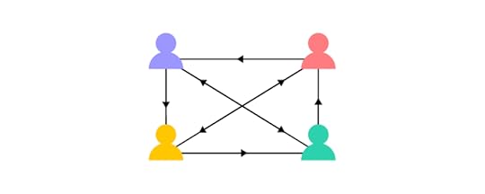
In this article on DesignOps strategy, the four stages of DesignOps maturity. Initially (stage 0), no one is responsible (usually startups and small teams), but the UX team has tools and processes to maximize productivity.
By stage three, the DesignOps team has an established structure with a DesignOps leader and DPMs managing and optimizing operational processes.
The ultimate goal of DesignOps is to remove operation work from UX teams to focus on user experience and solving problems, thus maximizing Design’s effectiveness and productivity.
5. Engineering collaborationPart of the DesignOps role is to facilitate design team and cross-functional collaboration. Even if designers don’t have this operational mechanism in place, creating channels to communicate and collaborate is essential for UX productivity.
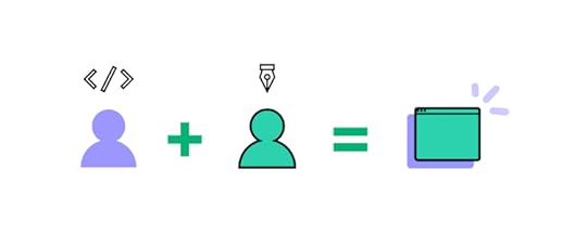
Designer/engineer collaboration is crucial because these teams must work together to deliver projects with different tools and constraints. Poor cooperation between these departments leads to design drift, friction, UX debt/technical debt, chaotic design handoffs, and project delays, to name a few.
Working to increase designer/engineer collaboration will only produce positive outcomes:
Spotify: “Closer collaboration between designers and engineers resulted in smoother and more enjoyable projects.” Airbnb: created the Design Language System–“Since the design language and code are often shared, we can now build and release features on all native platforms at roughly the same time…engineers and designers now share a common language.”Segment: implemented a two-stage product development process where product managers, designers, and engineers play an active role in designing and delivering projects efficiently.6. Go deepIn his book Deep Work, Cal Newport outlines the importance of distraction-free work sessions. Deep Work is the practice of shutting off the outside world to focus on completing tasks and projects.
Cal provides several examples of the most successful people in history using Deep Work. In tech, the most famous example is Microsoft founder Bill Gates. Bill takes regular 7-day sabbaticals (Bill’s “think weeks”), where he retreats to a cabin with books and research materials to think about ideas and solve problems.
Retreating to a cabin is not a luxury most can afford, but there are some things UX designers can do to go deep and achieve comparable results:
Disconnect: set periods (90-180 minutes) of work where you completely disconnect from team members, family, social media, and all digital communications.Plan: to avoid the internet and its many distractions, try to gather the research you’ll need before each session. This planning also limits time wasted trying to find materials, maximizing your focus on the task at hand.Prioritize: set goals for each session with a to-do list. Cal recommends setting challenging goals so that it forces you to push to get things done!Cal also highlights the importance of boredom–even in your personal life. For example, when waiting in a queue or enjoying downtime, our first instinct is to reach for our phones to check social media and other news feeds. Fighting this urge will train your brain to focus better during Deep Work sessions.
7. Optimize your work environmentNeuroscientist and Professor in the Department of Neurobiology at the Stanford University School of Medicine, Andrew Huberman, offers excellent science-based productivity hacks and workspace optimization.
Here is a summary of Andrew’s informative article, 5 Science-Based Steps to Improve Your Workspace:
Sit or stand: switching to sitting and standing every 30 minutes “can reduce neck and shoulder and back pain and even help augment some of the positive effects of exercise.” Time It Right: Andrew outlines three phases your body goes through during the day. Planning the type of work you do during these times can significantly impact performance and productivity. Screen placement: ensuring your screen is straight ahead or slightly elevated will raise your alertness. If you’re constantly looking down, “neurons related to calm and sleepiness are activated,” making it difficult to focus.Background noise: white, pink, or brown noise can help with focus during 45-minute sessions. Binaural beats (with headphones) are also effective in “increasing certain aspects of cognition, including creativity, and may reduce anxiety.”Work environment: different spaces are more optimal for specific types of work, “consider using different locations: rooms, buildings, indoors or outdoors to help access specific brain states and the types of work they favor.”Andrew’s podcast, Huberman Lab, is full of fantastic insights about how the brain works and optimizing your performance, focus, and productivity.
UXPin–The Ultimate Productivity Hack for UX DesignersUXPin’s advanced design and prototyping tool enables design teams to build high-fidelity prototypes that look and feel like the final product.
Better prototypes result in meaningful feedback from usability testing and stakeholders, leading to high-quality design project deliverables and a faster time to market.
Revolutionize your product development workflows with advanced prototyping from UXPin. Introduce reusable components into prototyping and build interactive hi-fi designs faster than ever. That’s the best productivity hack you can implement as a designer. Read more about UXPin Merge.
Discover MergeThe post 7 Productivity Hacks for UX Designers appeared first on Studio by UXPin.
October 5, 2022
Cognitive Friction in UX Design – Good or Bad?
Incorporating cognitive friction to improve user experience sounds like an oxymoron, but it can have positive effects in the right circumstances. Friction is vital for protecting users and ensuring they don’t complete tasks accidentally.
The more familiar users get with a digital product and design patterns, the more likely they are to work on autopilot, leading to errors and nonreversible actions. Cognitive friction is a strategy to avoid these issues and improve the user experience.
Table of contentsWhat is Cognitive Friction?6 Types of User Friction in UX DesignHow to Identify Cognitive Friction?What are Some Examples of Cognitive Friction?Example #1. Broken linksExample #2. Hiding featuresExample #3. Unnecessary stepsWhen is Cognitive Friction Good?Two-Factor AuthenticationConfirmation dialogsUser and task verificationSystem loadingWhen is Cognitive Friction Bad? (And solutions for improvement)Design inconsistencyToo many stepsUnfamiliar patternsPoor communicationReduce Friction During the Design Process With UXPinSolve complex usability issues and create digital experiences your customers love with the world’s most advanced end-to-end design tool. Sign up for a free trial to discover how UXPin can enhance your UX workflows.
What is Cognitive Friction?Cognitive friction in UX occurs when a user interface or feature forces users to stop and think, increasing cognitive load. It can also refer to instances where features aren’t intuitive or don’t function as they’re supposed to.
These “roadblocks” prevent or interrupt users from completing tasks, causing frustration that ultimately leads to product abandonment and fewer conversions.
UX designers are taught to avoid these scenarios and reduce decision-making by creating seamless, uninterrupted user experiences, getting users to an end goal as efficiently as possible.
6 Types of User Friction in UX DesignWe have identified six primary types of user friction in UX design:
UI friction – cluttered user interfaces and incorrect design pattern usageInteraction friction – UI elements aren’t intuitive and don’t function as expectedLanguage friction – incorrect word choice and poor instructionsInput friction – challenges completing formsNavigational friction – poor navigation, unnecessary steps, broken links, etc.System friction – slow load times, crashes, and other performance-related issuesHow to Identify Cognitive Friction?Using Jakob Nielsen’s 10 usability heuristics principles for interaction design is an excellent methodology to incorporate in a UX audit to identify common usability issues that cause friction.
These principles include:
Visibility of system statusMatch between system and the real worldUser control and freedomConsistency and standardsError preventionRecognition rather than recallFlexibility and efficiency of useAesthetic and minimalist designHelp users recognize, diagnose, and recover from errorsHelp and documentationFurther reading: UX Audit – All You Need to Know, Benefits, and Checklist.
What are Some Examples of Cognitive Friction?Here are three common examples where design decisions cause cognitive friction.
Example #1. Broken linksBroken links commonly cause cognitive friction. Users think they’re navigating to a specific feature, but the link either doesn’t work or takes them elsewhere. Frustration compounds when there is no way to navigate back or they must repeat a task.
Example #2. Hiding featuresIt’s not uncommon for companies to make it difficult for users to downgrade a paid plan or delete their accounts entirely. The hope is that the user will give up and keep their subscription. Searching for hidden features is time-consuming and frustrating, leading to distrust in the product and brand.
Example #3. Unnecessary stepsCompanies often collect excessive data or create unnecessary steps for tasks. These additional interactions mean users spend more time completing tasks and forms than they should.
For example, asking for a customer’s age, gender, and income bracket on an eCommerce checkout form might help with future marketing initiatives, but it’s intrusive and creates a point of friction. Additionally, misusing accordions, confirmations, dropdown menus, and other interactive UI elements adds unnecessary steps and interactions.
When is Cognitive Friction Good?Here are four instances where UX designers intentionally create friction to improve user experience.
Two-Factor AuthenticationTwo-factor authentication (2FA) is a fantastic example of designers creating friction to improve cybersecurity. 2FA adds an extra step for user logins or confirming critical functions (like bank payments) to reduce the risk of someone other than the authorized user from completing these tasks.
Many products use apps like Google Authenticator or a one-time pin sent to a user’s email or mobile. The user must enter a six-digit code to complete authentication.
2FA creates additional steps but keeps people safe for high-risk products and tasks.
Confirmation dialogsDesigners often use UI dialogs or modals to confirm critical nonreversible actions–like deleting something or navigating away from a page with unsaved content. For example, “Are you sure you want to delete this project?”
While some people find these dialogs annoying, they’re quickly swayed when it prevents them from accidentally deleting a project that took many hours to create!
In some instances, UX designers create additional steps within the modal to prevent mistakes–like typing “DELETE” to confirm. This added friction forces users to stop and think about what they’re doing to prevent someone from mindlessly completing a critical nonreversible action.
User and task verificationMany products use validation systems to confirm a user has access to a given email address or mobile number. In this example, users are asked to verify their email addresses from UXPin’s sign-up form prototype.
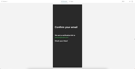
Designers also use friction to verify the user made critical account changes. This example from Netflix shows an email sent after users change their mobile numbers. Users must click “Verify Phone” for the changes to take effect. This friction prevents unauthorized changes to someone’s account details.
 System loading
Many digital products and websites use friction via loading icons and other microinteractions when a system is loading or working. This feedback tells users to wait while the system is busy.
It’s important that UX designers only use these microinteractions when it’s 100% necessary and never allow them to last more than a few seconds. If your product takes more than five seconds to process a task, you might need to work with the engineers on performance optimization.
When is Cognitive Friction Bad? (And solutions for improvement)Cognitive friction is generally bad, and it’s a UX designer’s job to pinpoint these issues and find solutions. Here are four common examples of bad cognitive friction and how to reduce or eliminate them.
Design inconsistencyDesign consistency is an essential UX design component. It helps create familiarity, making user interfaces and interactions more predictable and easier to use.
Design inconsistency creates friction resulting in usability and accessibility issues. For example, if a sign-up sequence uses a green button to proceed to the next step and randomly uses red on one UI, users must stop to think about whether or not this red button will perform the same action as the green.
Creating a design system or UI kit is a trusted methodology for improving design consistency. When product teams use the same library of approved components, there are fewer errors, and designers have to do less thinking (friction) themselves.
Too many stepsDesigners must think of every step in a task, no matter how essential, as a point of friction. UX teams can use usability testing and user interviews to understand the customer journey and identify areas for improvement.
Sometimes these improvements will come from optimizing the UI components and input fields to reduce actions rather than removing steps. For example, is it better to use a dropdown or buttons for a product’s size options?
This example uses a dropdown, meaning users must click/tap twice to choose a size. This process is particularly challenging for users on mobile devices and people with dexterity issues.
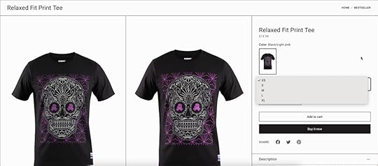
In this second example, designers use buttons, so users only have to click/tap once to make a selection. Different process, same result, one less step, and reduced friction.
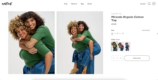
This example might seem like a small change, but finding similar improvements reduces overall friction and gets users to their end goal faster.
Unfamiliar patternsDesigners use internationally recognizable design patterns to solve fundamental usability issues. For example, everyone expects a hamburger icon will open the primary navigation. Using the hamburger to activate another feature or a different icon causes confusion and friction.
These patterns are essential in complex products where users must learn how to use the system. If they also have to learn to use new UI patterns, this adds to the learning curve, creating more cognitive friction.
Poor communicationDesigners communicate with users through text, color, visual hierarchy, UI elements, images, and video, to name a few. Understanding user needs and how they absorb content is critical to effective communication and reducing friction.
A fantastic example is how UXPin uses multiple elements to communicate with users in its documentation.
 The heading, Adding States, describes the task.The explanation uses short sentences and plain language.A blue highlight and text tell users which feature to click while blocks created to look like keys on a keyboard show the shortcut.A video provides added context to help users who learn better through visuals.
UXPin’s docs make it easy for designers to quickly absorb the instructions to apply to their projects.
Effective communication throughout your product, from button labels to documentation tutorials, reduces the mental effort required to complete tasks.
Reduce Friction During the Design Process With UXPinReducing friction during the design process is often challenging for UX teams. Design tools don’t provide the same fidelity and functionality as code, making it hard to prototype and test effectively.
UXPin is powered by code, enabling designers to build complex user interfaces and components that look and feel like the final product. The tools, features, and design canvas look the same as any other design tool, but the results are significantly better.
Higher quality, realistic prototypes result in meaningful feedback from user testing and stakeholders–allowing designers to improve with every iteration.
Designers can test complex user journeys like fully functioning checkouts or forms that capture extensive data with multiple steps–sequences that often cause cognitive friction!
Improve your product design projects, reduce usability issues, and enhance your product’s user experience with quality prototyping and testing in UXPin. Sign up for a free trial to discover all of UXPin’s advanced features.
Try UXPin for freeThe post Cognitive Friction in UX Design – Good or Bad? appeared first on Studio by UXPin.
October 4, 2022
Which Programming Languages Will You Hear About as a UX Designer?

With hundreds of programming languages, it can be overwhelming for UX and product designers to comprehend or decide which one is worth learning. While learning code isn’t essential for a UX designer’s job, it can help them understand technical constraints and improve collaboration with development teams.
This article explores six programming languages for UI/UX designers and why coders use one over the other. We also explain the difference between programming languages, front-end frameworks, and component libraries and how they influence design projects.
Table of contentsWhat are Programming Languages?How do Programming Languages Impact the Product Development Process?Programming Languages vs. Front-End FrameworksWhat is a Component Library?Which Programming Languages Will UX Designers Encounter?Programming Languages1. HTML2. CSS3. Javascript4. Java5. PHP6. PythonFront-End Frameworks1. React2. Ember3. Angular4. VueWhat are the Benefits of Using Programming Languages for UX Design?UXPin Merge – A Design Tool That Renders CodeFaster Prototyping, Better CollaborationScalableEnhanced TestingOur proprietary Merge technology will take your design projects to the next level with component-driven prototyping in UXPin. Visit our Merge page for more details and how to access this revolutionary UX technology.
What are Programming Languages?
Programming languages are the code developers use to write websites, algorithms, and digital products. Each programming language has its own markup, rules, structure, package manager, etc.
There are hundreds of programming languages, most of which product teams will never encounter. We’ve narrowed down a list of essential coding languages, so you know where to start if you wish to research these further.
How do Programming Languages Impact the Product Development Process?A programming language dictates the product’s technical constraints, significantly impacting product development, including the user experience design process.
Design teams must understand these limitations or risk wasting time designing solutions and features that programmers can’t build.
The programming language also influences other product development decisions which ultimately impact UX, for example:
Time-to-marketBack-end technical infrastructure (impacts budgets and performance)Engineering talent (human resource availability and cost)Functionality/scalability through APIs and integrationsProgramming Languages vs. Front-End FrameworksIt’s important to distinguish a programming language from a front-end framework. For example, Javascript is a programming language, while React, Angular, and Vue are all Javascript frameworks.
Frameworks are built using programming languages, offering software engineers automation, tools, libraries, functionality, templates, session management, etc., to develop websites and applications more efficiently than coding from scratch.
What is a Component Library?Component libraries add another layer of confusion for people with a limited code skill set.
Component libraries are code components of a design system featuring ready-made UI elements engineers use to build user interfaces. A popular example is MUI, a React component library built on Google’s Material Design UI.
The designer’s equivalent of a component library is a UI kit that features vector-based graphic elements used in design tools. If you’re still confused, this article explains the difference between design systems, pattern libraries, style guides, and component libraries.
Which Programming Languages Will UX Designers Encounter?This is a tricky question to answer because designers are more likely to encounter front-end frameworks (usually Javascript-based) and component libraries rather than the individual programming languages behind them–which, as we have learned, are entirely different things.
For this reason, we’ve created two categories:
Programming languagesFront-end frameworksProgramming LanguagesHere are six programming languages UX designers will most likely encounter during their careers.
1. HTMLHTML stands for HyperText Markup Language and is the markup used in web browsers. It’s the foundational language every engineer must learn to build websites and web apps. Whether you use a front-end framework or not, a web browser will always render HTML, along with some CSS and Javascript for styling and interactivity.
Learning basic HTML as a UX designer is never a bad idea, as this will give you a foundational understanding of front-end coding.
2. CSSCSS (Cascading Style Sheets) is a style sheet language used to style content with color, layouts, fonts, etc. Without CSS, every website would look identical, featuring the basic styling properties rendered by HTML.
CSS is another essential language for user interface designers because it’s relatively simple to comprehend and significantly impacts UI design.
3. JavascriptJavascript is another core internet language for websites and web applications. Its primary role in web development is providing interactivity and functionality alongside HTML and CSS.
Javascript is also widely used for many front-end frameworks, including React, Vue, Ember, and Angular, to name a few. Companies use these frameworks to build many of the web and mobile apps we use every day.
4. JavaNot to be confused with Javascript, Java is a programming language maintained by software giant Oracle, primarily used to build enterprise applications. Java also powers many hardware devices like smartwatches, fridges, SmartTVs, and wearables, to name a few.
5. PHPPHP is most well known as the programming language behind the popular content management system, WordPress. It was also the original language behind early Facebook before the social media giant developed React, which now powers most of Meta.
6. PythonPython is another popular front-end programming language used by Meta for Instagram. The language is also popular for artificial intelligence and machine learning applications due to its lean code and pre-built algorithm libraries.
Front-End FrameworksFor this article, we’ll focus on four Javascript frameworks commonly used for web and mobile applications.
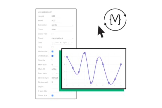
These frameworks are also compatible with UXPin Merge–a technology that enables designers to use ready-made UI components from a design system to build fully functioning prototypes. Check out our Merge page for more details.
1. ReactReact is a popular Javascript framework for developing web and mobile applications (iOS and Android)–although organizations typically use React Native for the latter. The component-based markup and flexibility to create cross-platform applications make React a popular choice for product development worldwide.
2. EmberEmber is a Javascript framework for building web applications. Many popular apps use Ember, including Netflix, Square, LinkedIn, and Twitch, to name a few.
3. AngularDeveloped and maintained by Google, Angular is a popular framework for building cross-platform applications. PayPal, GMail, Upwork, and the Forbes website are just a few platforms that use the front-end framework. Angular’s out-of-the-box interactivity and functionality make this framework popular for complex applications.
4. VueVue is a Javascript framework for building single-page web applications. Vue allows you to encompass HTML, making it an easy framework to learn for people with HTML, CSS, and Javascript coding skills. The framework also offers excellent performance and a comprehensive ecosystem to scale applications.
What are the Benefits of Using Programming Languages for UX Design?Using programming languages during the design and prototyping process is not uncommon. Designers can create live-data prototypes with code, accurately replicating the final product user experience.
These code prototypes allow designers to test features with the same fidelity and functionality as the final product, thus delivering better quality results and feedback.
The problem with using code for prototyping and testing is it adds time to the design process and requires the skills of a front-end developer or UX engineer–valuable resources that increase the project’s costs.
For this reason, organizations reserve code prototyping for solving complex usability issues and typically build a single screen or user flow to save resources.
UXPin Merge – A Design Tool That Renders CodeWith a code-based design tool like UXPin Merge, designers can achieve the same results without writing a single line of code. Merge allows design teams to sync a design system from a repository to UXPin’s editor, so designers and engineers use the same UI elements during the design and development process.
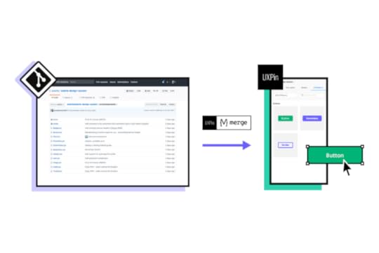
Merge works with many popular front-end frameworks, including React, Vue, Ember, Angular, and more. Designers use these components in any other design tool, but they come ready-made with states, animations, and properties defined by the design system.
Faster Prototyping, Better CollaborationComponent-driven prototyping is significantly faster than image-based design because designers only focus on building UIs rather than designing UI elements from scratch.
This single source of truth improves designer/developer collaboration because everyone speaks the same language and works within the same constraints. Design handoffs in Merge are seamless, almost non-existent because engineers have the same component library–it’s just a matter of matching the designs from UXPin.
ScalableMerge makes it easy to scale and mature a component library with Patterns. Designers can combine multiple elements to build new UI components and patterns. If their design system doesn’t have what they need, designers can use UXPin’s npm integration to import components from open-source libraries to build new patterns.
Enhanced TestingMerge allows design teams to create immersive, dynamic prototypes that accurately replicate the final product experience, resulting in meaningful feedback from user testing and stakeholders.
Design teams can send stakeholders a link to the prototype and receive actionable feedback via UXPin’s Comments feature. Stakeholders can even assign comments to specific team members.
“Our stakeholders are able to provide feedback pretty quickly using UXPin. We can send them a link to play with the prototype in their own time, and UXPin allows them to provide comments directly on the prototypes.” Erica Rider, Senior Manager for UX – Developer tools and platform experience at PayPal.
With UXPin Merge, design teams don’t need to learn a programming language or collaborate with engineers during prototyping to achieve the benefits of code. Visit the UXPin Merge page to learn more about this revolutionary technology and how it can improve your end-to-end product development process.
Discover MergeThe post Which Programming Languages Will You Hear About as a UX Designer? appeared first on Studio by UXPin.
October 3, 2022
Footer Design – Best Practices Together with 6 Examples
Website footers are essential UI patterns. They guide visitors to important content while providing an excellent opportunity to add business value and connect with new customers.
This article explores website footer design, do’s and dont’s, expert examples, and best practices to inspire your next web project.
Table of contentsWhat is a Website Footer?What is the Purpose of a Footer?Marketing BenefitsWhat Should a Footer Include?Navigation LinksBrand Engagement & MessagingTestimonialsCopyright6 Footer Design Examples1. UXPin – Saas Footer Design2. The BBC – News Footer Design3. Asos – eCommerce Footer Design4. Zorro Design – Agency Footer Design5. Alex Lakas – Freelancer Footer Design6. Booking.com – Travel Footer DesignHow to Design a Footer?1. Prioritize Links2. Less is More3. Use a Single CTA4. Make Footers Mobile-Friendly5. Use Hierarchy to Display Importance6. Stay Compliant7. Branding Opportunities8. Be HelpfulDesigning Footers With UXPinPrototype UI designs at higher fidelity and advanced functionality with UXPin. Sign up for a free trial to discover the endless possibilities of code-based design.
What is a Website Footer?A website footer is a UI pattern at the bottom (or footer) of a website or application. Footers are important website components because they display helpful information, including navigational links, contact details, policies, copyright info, and social media links, so users can learn more about your business.
Link the primary header navigation; a website footer appears on every page so users can always access the links and content. Even though it sits at the bottom of a web page, footers are vital components for users and business goals.
What is the Purpose of a Footer?How designers use a website footer depends on the business and content. Most websites use the footer for secondary navigation–important links that can’t fit in the website header like about, product docs, resources, etc.
With GDPR, CCPA, and other legal information, websites must include certain policies, like privacy, terms of use, etc. Designers usually have these links in the footer, so users always know where to find them.
Sales BenefitsMany UI/UX designers also use website footers for business purposes like a product CTA or capturing leads via contact page or a newsletter signup form. Footers help users to navigate to feature pages, best-selling product categories or more information about services.
Marketing BenefitsMany marketers also use website footers for SEO (search engine optimization) purposes. There are a couple of SEO benefits of footers:
Help with boosting pages you want to rankHomepage links carry weight, meaning search engines see these internal links as important and prioritize accordinglyIncreases the likelihood of clicks, thus reducing bounce rates which improve domain authority and rankingsWhat Should a Footer Include?Again, it depends on the website. An eCommerce website will have different priorities for the footer to a blog. Here is a list of items you might include in a footer:
Navigation linksBrand engagement and messagingTestimonialsCopyrightNavigation LinksThere are several types of navigation links businesses include in the footer. These include:
Utility links: contact information, phone number, email address, physical address, customer service contacts, privacy policy, terms of useDoormat navigation: A copy of the main navigation for convenience (might be unnecessary for sticky headers)Secondary task links: job application, investor information, documentation/specifications, press information, affiliate signups, FAQsSitemap: Links to multiple topic/product categoriesBrand Engagement & MessagingAnother common use for a website footer is brand engagement and messaging–links and footer content that encourage people to connect with the company, including:
Social media iconsSocial feeds with several latest posts (usually Instagram or Twitter)Brand logoBrand slogan or vision (1-3 sentences)Email signupTestimonialsSome brands use the footer for testimonials and reviews. They might even include a Google Business or TrustPilot widget displaying their star rating. These UI patterns are excellent for social proof and creating interest in your product or service.
CopyrightThe copyright symbol and notice at the bottom of a footer tell visitors that you own the website’s content. It’s not a legal obligation, but it is common practice to inform people that you plan to protect your rights to the content.
6 Footer Design ExamplesWe’ve chosen six footer design examples from different industries to show how designers create layouts that align with business goals and user needs.
The key takeaway from these examples is how different industries prioritize links and content. Each example also uses a clean, minimalist layout to help visitors find information quickly.
1. UXPin – Saas Footer Design
We decided to use our UXPin website as a SaaS footer example. You’ll notice we use a sticky header, so our primary navigation is always visible to desktop users.
UXPin’s footer includes key company, product, and marketing information. Customers often want to know how UXPin, an advanced tool, compares to popular image-based competitors, so we’ve included several product comparison links.
Other essential footer links for SaaS products are documentation, tutorials, educational content, and other helpful resources. UXPin also includes a language selector, social links, and policy information.
2. The BBC – News Footer Design
The BBC (British Broadcasting Corporation) is one of the largest news and media organizations worldwide.
The media giant primarily uses its footer to display different 30+ language versions of the website with a separate section for popular news topics. The very bottom of the page features links to legal information, policies, contacts, and advertising with the BBC.
The clean layout is easy to read, allowing users to find content and links fast.
3. Asos – eCommerce Footer Design
Global eCommerce brand Asos uses a simple footer design with social media buttons, payment methods, and helpful links. Most important for eCommerce are links for delivery/returns policy, order tracking, and special promotions–in Asos’ case, they promote student discounts, gift cards, and Black Friday.
As a listed company (ASOMY), Asos must provide investor information and corporate responsibility.
Lastly, as a global eCommerce brand, Asos shows customers which store they are viewing and a link to change to another region and currency.
4. Zorro Design – Agency Footer Design
Agencies generally use their websites for two purposes:
Showcase their workGenerate new leadsUS-based Zorro Design uses a black and white footer design with a bright yellow CTA taking users to a contact form. Zorro’s designers have designed the footer perfectly, so the CTA sits in the center of the screen, with lots of surrounding whitespace screaming “CLICK ME!”
Lastly, Zorro places its logo and slogan to the left with several key links, including recent work, contact, about, and social media buttons.
Zorro’s footer design is clean and uncluttered, allowing users to absorb and find content quickly.
5. Alex Lakas – Freelancer Footer Design
Like agencies, freelancers need a portfolio website to showcase their work and get clients. Product Designer Alex Lakas uses his website footer primarily to connect with potential clients/employers and designers through his social channels.
As a remote worker, Alex also uses flashing text to tell visitors where he’s currently working–in this case, it’s Los Angeles.
Alex’s dark/light mode switcher is a nice touch for a UX design portfolio, showing he’s mindful of web accessibility. He also has links to past work and a contact page.
6. Booking.com – Travel Footer Design
Booking.com is one of the world’s biggest online travel agencies, with over 28 million accommodation listings in more than 70 countries. Booking.com’s goal is to sell accommodation, but they also want to onboard new properties, so their primary footer CTA is to “list a property.”
The website’s footer also features its five most important links using a large bold typography to stand out. Customers also have several search categories, including regions and accommodation options, for customers to find their ideal destination faster.
As a listed company (NASDAQ: BKNG), Booking.com includes links to all necessary investor and corporate information.
At the bottom of the page, Booking.com features several logos of the company’s holding group, Booking Holdings Inc.
How to Design a Footer?1. Prioritize LinksThe first step to designing a great footer is prioritizing your links. Designers must consider user needs and business goals to create something meaningful and helpful to visitors.
2. Less is MoreCluttered UIs always perform poorly. They’re difficult to digest and can confuse users. Reducing UI elements, links, and text can help drive traffic to your most important content–which takes us back to point one, prioritize your links properly!
3. Use a Single CTAA single CTA helps guide visitors to your most important task or business goal. Footer designs are usually two-tone, often black and white, providing the perfect background for a bright-colored CTA to pop and grab people’s attention.
4. Make Footers Mobile-FriendlyMobile-first design is crucial for website footers. On a desktop, you may have 3-4 columns, while on a smartphone, you have one. The more columns and links, the more users have to scroll to find content. Place your most important links and content in the first column, so users see this first.
5. Use Hierarchy to Display ImportanceThe examples from Booking.com, Zorro Design, The BBC, and Alex Lakas used visual hierarchy to show users their most important links. Different sizes, colors, and weights are effective techniques for displaying importance.
6. Stay CompliantLegal information like policies and disclaimers are crucial for modern web design. Designers must research their company’s obligations regarding where and how to display these links.
For example, financial and investment products in some countries must display their disclaimer information in the footer, so it’s always visible to customers. See this footer example from Chase Bank.
 7. Branding Opportunities
Your website’s footer is a fantastic opportunity to connect users with your brand’s touchpoints, like social media, newsletter signup, and company links.
8. Be HelpfulUsers often scroll to a website footer looking for help like documentation, tutorials, blog, and other resources. The UXPin footer design is a perfect example of providing multiple resources to educate customers about our products.
Designing Footers With UXPinCreate beautiful, interactive, responsive website footers in UXPin. With UXPin, designers can build prototypes with code-like functionality to improve user testing and get better feedback from stakeholders.
UXPin also includes built-in accessibility tools, including a contrast checker and color blindness simulator to test designs on the flying without leaving the canvas.
Deliver better products faster with UXPin–the world’s most advanced code-based design tool. Sign up for a free trial and deliver better user experiences to your customers with UXPin.
Try UXPin for freeThe post Footer Design – Best Practices Together with 6 Examples appeared first on Studio by UXPin.
UXpin's Blog

- UXpin's profile
- 68 followers

