
UXpin's Blog, page 50
November 2, 2022
5 Mistakes that Kill Collaboration Between Designers and Developers

We’ve looked at how to make it easier for designers and developers to work together. But what roadblocks and workflows work against this collaboration?
We’ve researched common mistakes design teams and product managers make when working with software engineers and how they can collaborate better. Reducing friction and roadblocks creates a smoother product development process while increasing Design’s value.
Enhance collaboration and bridge the gap between design and development with UXPin Merge. With this tech, you can bring your component library’s elements to UXPin and create functional prototypes that we’ll be developed exactly as you designed them. Check more about it. Visit our Merge page.
Reach a new level of prototypingDesign with interactive components coming from your team’s design system.
Discover UXPin Merge .discover-merge { margin: 40px 8px;}.discover-merge__container { display: flex; max-width: 690px; height: 200px; padding: 20px; padding-left: 24px; border-radius: 4px; background-color: black; box-shadow: 10px 10px #9999ff; align-items: center; justify-content: space-between;}.discover-merge__left { width: 50%;}.discover-merge__left p { margin: 10px 0px !important; color: white !important; font-size: 18px !important;}.discover-merge__heading { font-weight: bold !important; color: white !important; font-size: 18px !important;}.discover-merge__text { margin: 0 !important; line-height: 22px !important;}.discover-merge__button { width: 174px; height: 44px; margin: 10px 0px; border: none; border-radius: 2px; background: white; color: black; font-size: 16px; text-align: center;}.discover-merge__button:hover { cursor: pointer;}.discover-merge__image { max-width: 320px !important; height: 200px; margin-right: -19px;}@media (max-width: 760px) { .discover-merge__container { height: auto; margin: 10px; align-items: left; }}@media (max-width: 500px) { .discover-merge__container { flex-direction: column; } .discover-merge__left { width: 100%; align-items: normal; }}1. Using Image-Based Prototypes
Whether you’re an early-stage startup or part of an enterprise software development team, design handoffs are often a time of friction between designers and engineers. One of the biggest causes for this tension is prototype fidelity.
Image-based design tools produce poor prototypes that lack fidelity and functionality, making them hard to interpret and understand–for engineers, stakeholders, and usability participants.
Design teams have two options:
Collaborate with front-end designers or UX engineers to build better prototypesSwitch to a code-based design toolThe latter is a better solution because it removes reliance on engineering teams, significantly enhances prototyping capabilities, improves testing, and facilitates better designer/developer collaboration for smoother design handoffs.
 The benefits of using a code-based design tool
UXPin’s code-based design tool enables designers to build prototypes that accurately replicate the final product experience.
Engineers and stakeholders never have to “imagine” doing something because UXPin’s fully interactive prototypes provide an experience comparable to code.
Here are four UXPin features that enhance prototyping:
States: Apply multiple states to a single element or component, each with different properties, interactions, and animations.Interactions: Create complex interactions with advanced animations and conditional formatting for dynamic user experiences.Variables: Capture and store user inputs and use that information to take actions or personalize a product flow.Expressions: Create fully functioning forms, validate passwords, update shopping carts, and more with Javascript-like functions.Sign up for a free trial to discover these and other advanced UXPin features.
2. Not Clarifying Design DecisionsOne of the biggest mistakes designers can make is not clarifying the why behind design decisions. How can engineers understand or empathize when they don’t know what user problems you’re trying to solve?
The key to clarifying design decisions is to be proactive. Get developers involved throughout the design process and avoid design handoff surprises.

Designer and business leader Antonia Horvath offers excellent advice for improving collaboration and including engineers in design decisions:
Dev/design pairing: designers watch engineers build a feature after design handoff to understand the process and observe engineering challenges. Ideally, this process works best in person, with both team members in front of the same screen asking and answering questions live.Ideate together: bringing engineers into ideation sessions allows them to understand the thought process behind design decisions while leveraging their technical know-how to improve ideas.Design critiques: traditionally a design team ritual, but including engineers in the odd critique can bring new ideas from a fresh perspective. Engineers also benefit by understanding the design thinking process behind decision-making.Designer/engineer retrospectives: an agile software development practice where teams reflect on outcomes from each iteration and discuss improvements. Designers and engineers can conduct retrospectives at the end of every release to identify design handoff’s pain points and solutions. 3. Not Educating Engineers About User ExperienceContrary to popular belief, UX teams are not solely responsible for a product’s user experience–it’s the entire organization’s responsibility. However, without effective design advocacy driven by UX designers, no one willingly learns about user experience.
As Erica Rider, UX Lead EPX at PayPal, pointed out at Design Value Conference 2022, “companies have a significant control/accountability imbalance.”
UX designers have zero control over UX delivered to users but 100% accountability.Engineers have zero accountability for UX delivered to users but 100% control.The UX team’s role is to educate engineers about user experience and for both departments to share the responsibility.
Erica has developed systems to ensure “the UX team works with engineers to deliver a good user experience at PayPal, but the engineers are accountable for the final product.”
One of the biggest hurdles is a shift in thinking. Everyone outside of UX thinks the designer’s role is aesthetics and UI design.
Erica’s education methodology was to shift engineers thinking of user experience away from aesthetically-pleasing user interfaces to problems that cause bottlenecks and roadblocks over which engineers have absolute control. Some examples include:
Latency: If you click a button and it takes too long to load, that’s a poor user experience.Availability: If a URL doesn’t load, that’s a poor user experience.Security: If someone hacks my account, that’s a really bad user experience!Error messages that are not “human-readable” or have no way for the user to resolve them: “Error Code 1578-B1273 – FAILED!” Why do you show users this message without telling them what it means or how to fix it? Another poor user experience.Developing an organization-wide user experience mindset (starting with engineers) will increase empathy for users while sharing the responsibility.
4. Not Sharing User Research FindingsIn a UX Tools article, Taylor Palmer shares insights from interviews with engineers about “how user research helps them create better experiences.”
Engineers care about user research because it helps them understand design decisions and, as one developer puts it, “make sure we’re building the right thing.”
Developers don’t need access to the design team’s entire user research archives, nor do they have time to sit in user interviews. They prefer summaries, notes, and recorded interviews.
 How to share user research with engineering teams
Taylor Palmer put together a list of ideas for sharing UX research with engineers:
Meetings to share research projects and insightsLinking design files with research summaries so engineers can understand the “why”Creating an open-door policy for interviews and usability studiesGetting feedback on all UX artifacts, including wireframes, mockups, and prototypes (low and high-fidelity)Creating and sharing your internal research repository–over and above summaries so engineers can delve deeper into research if necessarySharing notes from design meetings and ideation sessionsCreating a regular user experience newsletter5. Not Having a Single Source of TruthOne of the most significant challenges for product development teams is overcoming the disconnect between designers and engineers.
Designers and engineers speak different languages without a single source of truth from a fully integrated design system. The results?
Poor collaboration, design drift, friction, and other negative consequences adversely impact user experience and product quality.
 How to create a single source of truth
Creating a design system doesn’t guarantee you’ll have a single source of truth. Traditional methods for building design systems mean designers and engineers use separate “truths.”
Designers use a UI kit or image-based design systemEngineers use a code component libraryOf the four stages of design system maturity, this is stage three. Getting to stage four requires a tool to bridge the gap between design and development, where designers and engineers use the same component library.
Nick Elliott, Design System Product Owner and Regional Head of Product Design at Iress, refers to stage four as fully integrated:
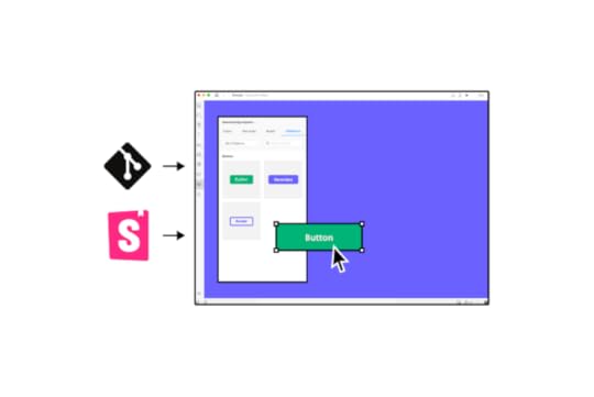
Design in (no) code: designers drag and drop to build UIs using code components from a repository–no designing from scratch.No design drift: UX teams, product designers, and engineers use the exact same components resulting in zero drift and less UX/front-end debt.Consistent design: components include properties and interactivity defined by the design system, so designers don’t have to think about colors, typography, states, etc.Seamless (no) handover: engineers already have exact copies of every component used for prototypes. It’s a matter of copying and pasting from the repository for front-end development, reducing the need to write code.Iress used UXPin Merge to sync design and development. Merge pulls Iress’ component library from a repository into UXPin so designers can build code-based prototypes that look and feel like the final product–and designers don’t need to see or write any code!
This shared single source of truth means designers and engineers speak the same language and work within the same technical constraints. Reducing friction and streamlining workflows in the process. Visit our Merge page for more details and how to request access.
How UXPin Merge Syncs Design and Development for Better CollaborationYou’ve heard the results, but how does UXPin Merge work? Merge allows organizations to sync their design system from a repository to UXPin’s design editor.
Organizations can connect a React design system directly to UXPin using the Git Integration or Storybook for other front-end technologies, including React, Angular, Vue, Ember, and HTML, to name a few.
The component library appears in UXPin’s left sidebar for designers to drag elements onto the canvas to begin prototyping. Each UI component includes properties defined by the design system, like colors, sizing, typography, states, etc.
Designers can switch between these using dropdowns and selectors in the Properties Panel. Any changes render as JSX, making it easy for engineers to copy and paste to begin the development process.
Get your entire product development team to speak the same language with a code-based design solution from UXPin Merge. Visit our Merge page for more details and how to request access to this revolutionary technology.
Discover MergeThe post 5 Mistakes that Kill Collaboration Between Designers and Developers appeared first on Studio by UXPin.


November 1, 2022
How to Design Better Progress Trackers and Control User Expectations

Progress trackers are one of the many ways designers communicate with users. These UI design patterns provide context, track progress, improve usability, and, in some cases, motivate users to complete forms and tasks.
Designing progress trackers requires a comprehensive understanding of the process and empathizing with users–how are they feeling while completing this task, and what can a progress tracker do to alleviate any frustration and anxiety?
Create fully interactive progress tracker prototypes that look and function like the final product. Sign up for a free trial to discover how UXPin can enhance prototyping and testing to create better user experiences for your customers.
Build advanced prototypesDesign better products with States, Variables, Auto Layout and more.
Try UXPin .try-uxpin-banner { margin: 40px 0px;}.try-uxpin__container { display: flex; max-width: 689px; height: 210px; padding: 20px; padding-left: 24px; border: 2px solid black; border-radius: 4px; align-items: center; justify-content: space-between; background-color: white; box-shadow: 10px 10px black;}.try-uxpin__left { width: 54%;}.try-uxpin__left p { margin: 10px 0px !important; color: black !important;}.try-uxpin__heading { font-size: 28px !important; font-weight: bold;}.try-uxpin__text { margin: 0 !important; font-size: 18px !important; line-height: 22px !important;}.try-uxpin__button { width: 135px; height: 44px; background: black; margin: 10px 0px; padding: 10px 20px; border: none; border-radius: 2px; color: white; font-size: 16px; text-align: center;}.try-uxpin__button:hover { cursor: pointer;}.try-uxpin__image { max-width: 320px !important; height: 200px; margin-right: -21px; margin-bottom: -6px;}@media (max-width: 760px) { .try-uxpin__container { height: auto; margin: 10px; align-items: left; }}@media (max-width: 500px) { .try-uxpin__container { flex-direction: column; } .try-uxpin__left { width: 100%; align-items: normal; }}What is a Progress Tracker?
Progress trackers are UX patterns displaying the number of steps, the user’s current status, and overall progress in completing a task. These progress trackers are particularly useful for completing long forms with multiple stages, like eCommerce checkouts, insurance/medical onboarding, visa/passport applications, and other instances where organizations require lots of data.
Breaking forms into manageable chunks reduces cognitive load, which ultimately increases conversions. These steps also allow users to save their progress and return to complete the form later.
Progress trackers vs. Progress indicatorsProgress trackers are step-by-step guides showing users where they are and where they’re going, while progress indicators are animated UI patterns used to indicate a system is loading or processing a request.
This example from Material Design shows the two types of progress indicators designers use, linear and circular.

A progress tracker, on the other hand, communicates a step-by-step process–as seen in this example from Ben Mettler.
 Why are Progress Trackers Important?
According to IBM’s Carbon Design System, progress trackers increase task completion. “Use progress indicators to keep the user on track when completing a specific task. By dividing the end goal into smaller sub-tasks, it increases the percentage of completeness as each task is completed.”
Progress trackers are a way to manage a user’s expectations. It shows that you respect their time by being transparent and helpful, which builds trust in the product and brand.
For example, if you have to complete a 10-page form and only get one page at a time, you’ll have no idea how long it’ll take to complete. You might not have the time or required documentation (payment details, ID, vehicle information, etc.) to complete the form. You become frustrated and lose trust whenever the facilitator hands you another page without feedback.
Suppose the facilitator instead gave you the 10-page stack upfront, highlighting each stage with a descriptive title, and informed you of your progress as you completed each step. In that case, you’d have more trust in the process–which is what progress trackers do for digital products.
A good progress tracker shows the user what steps they must complete, including descriptive labels, i.e.:
CartDelivery addressPayment detailsConfirmationThis simple eCommerce example displays each step and informs users what information they’ll need to complete the checkout process. Users can prepare the information required to complete the checkout efficiently.
When do Designers use Progress Trackers?There are two primary instances where designers use progress trackers:
ProgressStatusThey indicate progressAs described above, forms and processes are the most common UIs where designers use progress trackers. They improve the user experience and are vital UI elements for accessibility, as per WAI UX design guidance: “define visual and non-visual instructions to communicate the total number of steps and the current step in multi-step forms and processes.”
They show statusStatus trackers communicate progress from an organization, so users don’t have to contact support for updates. We also see status trackers in products like productivity apps and project management software informing users of progress towards goals.
Typical status tracker examples include shipping trackers, user application processing, eCommerce orders, error handling, food delivery, and task updates, to name a few.
6 Progress Tracker Design Tips1. Create clear visual cuesWhether you’re designing a progress or status tracker, your design pattern must be explicit, informing the user where they are, what they have completed, and the steps to completion.
A common method is to use color, like this example from Alexander Mochalov via Dribbble.

Alexander uses color and a progress bar with an arrow showing users exactly where they are in the checkout process. A checkmark tells users they have completed the previous step successfully.
2. Use descriptive labelingDisplaying the steps in a multi-stage process is not enough, especially when you have more than three steps. While there are exceptions, designers must use descriptive labels to communicate with users and provide context.
This progress tracker example from Arvind Sathe via Pinterest is visually appealing but doesn’t provide enough feedback about the process.

Conversely, Will Flourance’s example uses explicit labeling to inform users of each stage of the delivery process, including the expected delivery date.
 3. Separate progress trackers from similar UI patterns
Breadcrumbs and header navigation can clash with progress trackers causing cognitive overload and confusion. Breadcrumbs and progress trackers are particularly confusing because they look similar visually.
This example from Gamestation via a Smashing Magazine article shows a progress tracker below a breadcrumb. Designers have used distinctly different UI patterns to differentiate the two.

Instead of using a breadcrumb, Gamestation could provide a “Back” button to return to the previous screen. This button would eliminate confusion while allowing users to stop the transaction if they wanted.
Eliminating distracting UI elements, especially navigational items, helps users focus on completing the task.
3. Provide offrampsMany products and eCommerce checkouts lock users into a process with no offramps. They remove all navigation, so the user’s only option is to complete the process.
Forcing people to complete a process creates a negative user experience and erodes trust in the brand. Designers must offer users offramps, like a Back button (as described above), to exit the process or “Save Progress” functionality to return later.
4. Apply logical progressionProgress trackers must use logical progression towards the final goal. Most languages read from left to right, so it’s logical for designers to create a relevant left-to-right progress sequence. However, some languages read right to left, meaning designers must adjust UIs.
For example, Arabic, Hebrew, Kurdish, and Persian are right-to-left languages. Designers must adjust the logical progression to accommodate these user groups.
5. Use microinteractions to guide usersMicrointeractions are trigger/feedback loops that communicate with users. Designers can use these microinteractions at the end of each step by animating the progress bar, showing movement towards an end goal.
Microinteractions are also helpful for highlighting errors and showing users where they went wrong. A typical example is a jiggle animation on a form field the user hasn’t completed correctly or left empty.
6. Create responsive progress tracker experiencesDesigners must consider the progress tracker user experience across multiple viewports. For example, a horizontal progress tracker might not fit on a mobile device, so using a vertical pattern might be a better option.
This example mockup from Nick Babich shows a vertical progress tracker pattern for a mobile app.
 Designing Progress Trackers in UXPin
UXPin’s advanced features empower designers to create prototypes comparable to the final product. These fully functioning, high-fidelity prototypes improve testing to eliminate usability issues for a better overall user experience.
UX designers can use these four interface design features from UXPin to build better progress trackers and other UI patterns.
InteractionsInteractions are critical for building interactive prototypes. UXPin Interactions offer many desktop and mobile triggers so designers can create interactive experiences with smooth, realistic animations relevant to the user’s device.
Conditional Interactions take interactivity to another level where designers can set “if-then” and “if-else” conditions to create immersive, dynamic user experiences, giving prototypes a code-like quality.
StatesUXPin States allow designers to create multiple states for a single UI element that change with user interactions. For example, a single button can have several states, like default, hover, active, disabled, clicked, etc.
Designers can use UXPin States to create interactive progress trackers that mimic code-like functionality, like animating the progress bar or changing an icon from a number to a checkmark.
VariablesOne of the biggest challenges with prototyping progress trackers and forms is that inputs don’t function in design tools as they do with code–limiting what designers can test accurately during the design process. In UXPin, text fields are fully functional and interactive.
With Variables, designers can capture data from user inputs and use it elsewhere in the prototype. For example, capturing a user’s personal and payment information in a multi-step form and displaying it on the confirmation screen.
ExpressionsExpressions allow users to replicate code functionality, like updating a shopping cart or checking if a password meets specific criteria (i.e., character length, numbers, and symbols).
When building an eCommerce user flow, designers can use Expressions to calculate a customer’s cart and then dynamically adjust the total once the customer chooses a shipping option, accurately replicating a code-like experience.
To explore these advanced features and many more, sign up for a free trial to discover how UXPin can enhance your prototyping and deliver exceptional user experiences to your customers.
Try UXPin for freeThe post How to Design Better Progress Trackers and Control User Expectations appeared first on Studio by UXPin.
October 31, 2022
What is a Design Critique and How Can it Improve Your Designs?

Collecting feedback is an integral part of a product designer’s work – one which allows them to make sure that the product they’re designing is both intuitive and adds value to users’ lives. However, it’s not just about asking fellow designers, stakeholders, and developers for their opinions, per se. It’s about getting the most out of design feedback – and here’s where a design critique procedure is the most effective way of doing this.
Design critiques offer a tried-and-tested approach the opportunity for their prototypes to be explored and for user experience flaws to be quickly identified and fixed.
What is a design critique? How should you structure your design feedback sessions? Why is feedback so important for making better design decisions? In this article, we’ll cover everything you’ll need to know to improve your product designs through targeted design critiques!
UXPin is a design tool that enables real-time collaboration. It’s an end-to-end solution that covers the whole design process, from working on basic user flows to building interactive prototypes that can be easily shared with stakeholders and product managers. Try it for free now.
Build advanced prototypesDesign better products with States, Variables, Auto Layout and more.
Try UXPin .try-uxpin-banner { margin: 40px 0px;}.try-uxpin__container { display: flex; max-width: 689px; height: 210px; padding: 20px; padding-left: 24px; border: 2px solid black; border-radius: 4px; align-items: center; justify-content: space-between; background-color: white; box-shadow: 10px 10px black;}.try-uxpin__left { width: 54%;}.try-uxpin__left p { margin: 10px 0px !important; color: black !important;}.try-uxpin__heading { font-size: 28px !important; font-weight: bold;}.try-uxpin__text { margin: 0 !important; font-size: 18px !important; line-height: 22px !important;}.try-uxpin__button { width: 135px; height: 44px; background: black; margin: 10px 0px; padding: 10px 20px; border: none; border-radius: 2px; color: white; font-size: 16px; text-align: center;}.try-uxpin__button:hover { cursor: pointer;}.try-uxpin__image { max-width: 320px !important; height: 200px; margin-right: -21px; margin-bottom: -6px;}@media (max-width: 760px) { .try-uxpin__container { height: auto; margin: 10px; align-items: left; }}@media (max-width: 500px) { .try-uxpin__container { flex-direction: column; } .try-uxpin__left { width: 100%; align-items: normal; }}What is a Design Critique?In product design, feedback is key. It leads to good design and positive culture in which designers can flourish. Design critique simply refers to the process of analyzing a design or prototype to determine if it meets the criteria and requirements of the project.
What kind of feedback or pointers do designers seek from design critiques?
The design or prototype’s alignment with business objectives: Does it solve the user’s pain points? Has the designer implemented the features and capabilities outlined in the product strategy? Does the design adhere to the company or client’s branding? The usability of the product and user flow: How accessible is this design? Is it intuitive and easy to use? How well does the prototype meet basic usability principles? Is the user flow clear?Judging the technical feasibility of the design project: Simply, can this be built with the development team’s resources and the project timeframe? Will this application be able to run on end-user devices?Remember, design critiques aren’t brainstorming sessions or usability tests. They’re a method for designers to get specific, actionable feedback from stakeholders about prototypes, wireframes, and other deliverables, so they can give constructive feedback and find the perfect design solution.
The primary goal of design critiques is to improve the product design – and so, the discussion should be focused on the objectives of the design project.
What does design critique look like?Design critiques usually take the form of meetings or round-table discussions where designers share their prototypes for discussion. A design critique panel is made up of a handful of designers, developers, analysts, or other key stakeholders.
There are two main types of design critiques. These are:
Standalone critiques: Purpose-planned meetings to gather feedback on one particular aspect of a design.Design reviews: Fuller evaluations of a prototype to judge its success in achieving product design heuristics. These tend to dive deeper into the usability, creative process, and project goals.These days, design critiques don’t need to be held in person, or even at a set time. With real-time collaboration tools like UXPin, design critiques can be delivered asynchronously through iterative feedback.
Why are design critiques important? Can they really help you make better design decisions?Are design critiques worth the hassle? Do they really improve the product’s design and usability?
Absolutely. Design critiques help break down silos, where individual designers or teams are disconnected in their approach from other colleagues and the wider business objectives.
Incorporating stakeholder feedback from the early stages of a product’s design process helps focus the features and objectives of the application. Here’s how:
Critiques reinforce the business objectives and pain points: Many designers get distracted by the visual design and lose sight of its strategic aims. A design critique is a great opportunity for stakeholders and product owners to remind designers what the product should be capable of.Find a consensus between teams: By analyzing a design and sharing actionable feedback, designers can work collaboratively. They also use critiques to reach a consensus with developers on the features and functionality that should be included in a product. This results in a far more seamless development process.Promotes an agile, iterative design ethos: Critiques allow design teams to quickly identify and correct problems. This fast-paced approach to product design helps dramatically cut down development time.Who should be involved in a design critique?What roles are important to implement to ensure a successful design feedback session?
Here are a few key ideas:
Facilitator: They are responsible for conducting the design critique and leading the session. A facilitator will define the scope of the critique and set out what sort of feedback should be collected. This is usually an executive, such as a VP of Design or Lead Designer. Presenter: This is usually the designer that created the prototype or design that’s being critiqued. They’re responsible for showcasing the design, providing the necessary context, and discussing the goals of the prototype. A great presentation results in better feedback.Critiquers: These are the people with the opinions. Remember, critiquers don’t need to be designers. They can be anyone who may have useful feedback on the product design – for example, developers, other executives, or clients. They’ll need to be specific on what’s not working and provide constructive pointers on how to improve.How big should a design critique panel be? It’s important to get a variety of viewpoints, but larger groups are difficult to facilitate. We recommend anywhere between 3 to 7 members.
Step-by-Step: How to Structure a Design CritiqueThere are three key steps to a constructive design critique session. Let’s discuss them:
Step 1: Set out the goals and scope of the design critiqueBefore a design critique session begins, the facilitator should set out clearly what the scope and expectations of the critique are. This should be communicated through a written meeting agenda.
Here’s what it should clarify:
What design is being critiqued? What is the scope of the feedback? What areas of the prototype should the feedback be focused on?How long will the session last? How will feedback be collected and minuted?What specific roles do panel members have? How should critiquers use their expertise to guide their discussions?What are the main goals and business objectives of the product? Who is the primary audience? What are the problems and pain points you’re trying to solve? What KPIs are being measured here?It’s also important for presenters to prepare the presentation and share the prototype with the rest of the panel. before the meeting to gather their thoughts!
Pro tip: We recommend letting critiquers explore the design solution before the session takes place. You can do so by sending over the designs in an interactive, collaborative tool like UXPin. Your participants will be able to easily add notes and ideas they’d like to cover during the meeting.
Step 2: Ask the right questions to encourage relevant feedbackHow can you make sure you’re getting the right feedback? NN Group’s Chief Designer Sarah Gibbons suggests using one of these two key approaches during Q&A sessions:
Round robin: Participants take turns explaining their perspectives and asking questions until everyone has contributed. They can then ask follow-up questions once everyone has had a turn. This ensures that each panel member has a chance to share feedback.Filling feedback quotas: Some participants may struggle to give their point of view, fearing it’s too harsh. A facilitator can transform it into a constructive criticism sessions, asking panel members to share a set number of positive and negative observations. This is a great starting point to find critical points. You should find that a more natural conversation will result where participants will carry on sharing their perspectives freely.Step 3: Don’t forget about follow-upsA key tenant of agile and iterative design is collecting follow-up feedback. Presenters should regularly keep a panel updated on how their feedback is being implemented in design iterations.
Why is it important?
Participants will feel motivated by the use of their feedback. This will boost the overall effectiveness of critiques across your organization.Panel members can provide follow-up pointers if they believe their feedback has been misunderstood or ignored. The iterative changes can generate new feedback – positive or negative.With UXPin, it’s easy to share prototypes and collect feedback directly on your designs. As a result, you’re able to speed up your design iterations.
Among others, UXPin helps team work better together:
enables real-time collaboration – you can see how others interact with your designs as they review themallows easy access to the prototype – you can share the link to the prototype via email. Your design critique participants don’t have to be UXPin users to ick on the link and they can start providing feedbacklets you ping and send email notifications to specific team members to ensure that you’ve collected all insight, so you can derive the highest quality insights. Unlock agile product design and facilitate critiques with UXPinActionable feedback guides to great product design. Many designers struggle to break out of silos and worry about sharing their unfinished work with others.
Design critiques are a brilliant way to formalize this and turn it into a regularity. With good critiques, designers can easily collect relevant and actionable feedback on product prototypes. By incorporating designer and stakeholder feedback into the UX design process, you can reinforce your business goals and design products that better meet user needs.
How should you structure design critiques? The role of the facilitator here is crucial, as defining the scope of exploration can help designers get the most useful feedback from critique sessions.
To support the collaborative approach that design critiques and agile feedback promote, it’s worth using a collaborative design tool. With UXPin, you can build interactive designs easily and invite your team and stakeholders to collaborate on your projects.
Try it out for free and see how it can help you improve your product design process.
Try UXPin for freeThe post What is a Design Critique and How Can it Improve Your Designs? appeared first on Studio by UXPin.
October 27, 2022
What is Design Simplicity and How to Achieve it?

Design simplicity is a term companies use without truly understanding its meaning. As discussed in this article, simpler isn’t always better, and how designers apply simplicity can have positive and negative effects.
This article defines what UX design simplicity is (and isn’t), some common misconceptions, and strategies for implementing its principles.
Table of contentsWhat is Design Simplicity?Simplicity in Design Does NOT Mean…1. Simplicity is not minimalist2. Design simplicity is not about aesthetics3. Simplicity is not simplificationHow to Apply Good Design Simplicity1. Designing only what’s essentialCoherency, consistency, and familiarityOffering the easiest solutionTest, test, and test againConduct routine UX auditsThe progressive disclosure approachJohn Maeda’s 10 Laws of SimplicitySimple UX Design With UXPin MergeSimplify your product design and development process with UXPin Merge–technology that allows you to design prototypes using production-ready components, and thus bridging the gap between design and engineering. Visit our Merge page to learn more about this revolutionary technology and how it can enhance simplicity in design.
Reach a new level of prototypingDesign with interactive components coming from your team’s design system.
Discover UXPin Merge .discover-merge { margin: 40px 8px;}.discover-merge__container { display: flex; max-width: 690px; height: 200px; padding: 20px; padding-left: 24px; border-radius: 4px; background-color: black; box-shadow: 10px 10px #9999ff; align-items: center; justify-content: space-between;}.discover-merge__left { width: 50%;}.discover-merge__left p { margin: 10px 0px !important; color: white !important; font-size: 18px !important;}.discover-merge__heading { font-weight: bold !important; color: white !important; font-size: 18px !important;}.discover-merge__text { margin: 0 !important; line-height: 22px !important;}.discover-merge__button { width: 174px; height: 44px; margin: 10px 0px; border: none; border-radius: 2px; background: white; color: black; font-size: 16px; text-align: center;}.discover-merge__button:hover { cursor: pointer;}.discover-merge__image { max-width: 320px !important; height: 200px; margin-right: -19px;}@media (max-width: 760px) { .discover-merge__container { height: auto; margin: 10px; align-items: left; }}@media (max-width: 500px) { .discover-merge__container { flex-direction: column; } .discover-merge__left { width: 100%; align-items: normal; }}What is Design Simplicity?Design simplicity refers to the UX principle of helping users achieve goals efficiently using intuitive UIs and minimal roadblocks. To achieve this, designers must understand user needs, their end goals, and the tools and features they need to complete tasks.
Simplicity isn’t always the best option. The users, product, context, and environment all play a critical role in balancing design simplicity with usability.
Simplicity in Design Does NOT Mean…Simplicity in design is probably better defined by what it is not. The word simplicity is somewhat subjective, and therefore, open to misinterpretation. Here are three common misconceptions about design simplicity.
1. Simplicity is not minimalistWhen people hear design simplicity, they often think it refers to minimalism–this is an incorrect assumption. Minimal design creates beautiful aesthetics, but that doesn’t mean it’s practical or helpful.
There is always a time and place for minimalism, but designers must present the appropriate tools and UI elements for users to complete tasks efficiently.
For example, this Shopify Theme creates minimalism by hiding the primary navigation behind a hamburger for desktop users. This design looks great, but shoppers must click twice to navigate.
Creating additional steps in the name of minimalism does not conform to the principles of design simplicity. Designers must be mindful of how minimalism impacts the user experience and find an appropriate balance.
2. Design simplicity is not about aestheticsDesign simplicity is not about aesthetics. While it’s crucial to create beautiful UIs, it must not be at the expense of user experience. Aesthetics include static images, video, UI components, styling, and microinteractions.
Designers must always consider the value of design decisions and whether making something look aesthetically pleasing impairs usability. For example, using elaborate, drawn-out animations might seem like an excellent way to impress users, but it slows progression resulting in a poor user experience.
3. Simplicity is not simplificationThis heading might seem contradictory, but it’s another common misconception about design simplicity. Oversimplifying a product or feature can create negative consequences or dull the user experience.
For example, eliminating user verification to simplify onboarding results in bots, spammers, and other criminal elements accessing the product that harm the company and its users. Simplifying this onboard process means:
Making sure the system sends users a verification email immediatelyThe email has minimal text and a clear CTA to complete the verification processThe user can log in and begin using the productCheck how to create a secure user experience in our article Designing for Security.
Designers must also consider when to simplify. For example, simplifying a game, so users always win doesn’t present enough of a challenge, and players will lose interest. The simplification in this scenario lies in the game’s controls–giving players the appropriate tools and features to complete difficult tasks.
How to Apply Good Design SimplicityWith a clear understanding of design simplicity’s misconceptions, it’s time to look at some guiding principles and strategies and how to apply them.
1. Designing only what’s essentialOne of the essential ingredients to design simplicity is only providing the UI elements and features users need to complete a task. Executing this simplicity effectively means designers must have clear objectives while understanding users, their circumstances, and the environment where they’ll use the product.
Delivering what’s essential might seem obvious, but too much reduction leads to minimalism–which we’ve already established we want to avoid. Designers must consider multiple scenarios rather than getting users to a single end goal.

For example, when designing an eCommerce checkout, it’s tempting only to push shoppers in one direction–complete the purchase! What about shoppers who change their minds and want to go back or save their cart for a later date?
The essential elements in this scenario are controls to complete checkout efficiently while providing offramps for shoppers who change their minds.
Complex products and UIs require more thought, UX research, and testing. Designers must reduce and prioritize content as much as possible to avoid cognitive overload, guiding users to complete tasks efficiently.
Coherency, consistency, and familiarityCoherency, consistency, and familiarity are essential design simplicity components. Maintaining these three factors throughout a product requires attention to detail and effective cross-functional collaboration.
A design system is the most effective method to achieve coherency, consistency, and familiarity in product development. Organizations can build a design system from scratch or use an open-source component library to ensure designers and engineers deliver high-quality outputs with minimal errors.
PayPal uses Microsoft’s Fluent UI design system with UXPin Merge for the company’s sixty-plus internal products. When Erica Rider, Senior Manager for UX – Developer tools and platform experience at PayPal, joined the company, PayPal’s products lacked cohesion and consistency, resulting in countless usability issues.
By adopting a design system and using Merge to sync design and development, Erica created a single source of truth that enables PayPal’s product team to deliver projects 8X faster than before with significantly higher quality.
“Rather than separating design, prototyping, and development, UXPin Merge allows us to create an integrated flow where we engage engineering and product teams throughout the process. As a result, the product’s final quality has improved dramatically”–Erica Rider, PayPal
Offering the easiest solutionDesign simplicity requires designers to think of the easiest path to completing a task. Ideally, designers want to reduce friction and obstacles to minimize cognitive load–there are exceptions to this rule, which we describe in this article about good and bad cognitive friction.
Designing an easy-to-use UI includes removing distractions and minimizing options. For example, designers often hide header and foot navigation for eCommerce checkouts and landing pages, so users only have one task to focus their attention.
Test, test, and test againTesting is the best way to understand users and whether a design solution works. Seeing users struggle with a task and identifying the cause allows designers to fix the issue and simplify the process.
Testing is also an ideal space to see how users use a product and identify redundant features. Removing features and elements people don’t use helps minimize UIs and distractions.
Conduct routine UX auditsRoutine UX audits are excellent for identifying usability issues that adversely impact simplicity. User testing and research during the design process often don’t tell the whole story. Designers must review analytics and monitoring tools to understand how users navigate the product and its features.
Designers can use UX audit insights to prioritize content, visual hierarchy, navigation, add/remove features, restructure layouts, and improve information architecture to simplify the user experience.
The progressive disclosure approachProgressive disclosure is an interaction design technique for complex tasks and user flows. The idea is to break tasks into digestible steps to simplify a complicated process.
We commonly encounter progressive disclosure when a company has to capture lots of user data–insurance, visas, medical services, etc. Instead of presenting everything on one screen, designers split the form into multiple steps and categories. This user interface design technique makes forms less intimidating, allowing users to focus on one step at a time.
John Maeda’s 10 Laws of SimplicityGraphic designer, visual artist, and computer scientist, John Maeda is arguably the godfather of simplicity. John’s 2006 book, “The Laws of Simplicity,” outlines 10 principles for design, technology, business, and life.
Reduce: remove what isn’t neededOrganize: makes complex systems easierTime: saving time feels like simplicityLearn: knowledge makes things simpleDifferences: balancing simplicity and complexityContext: “What lies in the periphery of simplicity is not peripheral”Emotion: more emotion is better than lessTrust: simplicity = trustFailure: some things aren’t meant to be simpleThe one: subtract the obvious and add the meaningfulSimple UX Design With UXPin MergeSimple design applies to the UX process as well as user experience. Bridging the gap between design and development enhances collaboration and streamlines handoffs while reducing errors and front-end debt.
UXPin Merge is an end-to-end product design solution that creates a single source of truth between designers and engineers. Merge allows organizations to sync a component library from a repository to UXPin’s design editor so everyone uses the same design system.
These ready-made, interactive components simplify workflows by giving designers the building blocks to create fully functioning prototypes that look and feel like the final product. With no designing from scratch, designers can focus on product development rather than component development.
Merge simplifies the design handoff process because engineers work with the same component library. Devs simply import the components from the design system’s repository and apply the JSX changes from UXPin to start front-end development. Less documentation. Less communictation between departments. Faster time to market!
Simplify your product development process with UXPin Merge. Visit our Merge page for more details and how to request access.
Discover MergeThe post What is Design Simplicity and How to Achieve it? appeared first on Studio by UXPin.
October 26, 2022
6 UX Security Tips for Product Designers

In the second quarter of 2022, internet users worldwide fell victim to around 52 million data privacy breaches. This clearly shows the importance of cybersecurity, and that the role of a UX designer goes beyond making apps user-friendly. It’s about finding balance between usability and security, which need to go hand in hand.
In this piece, we’re going to focus on security UX. We will tell you how to use product design to protect your users’ data and detect vulnerabilities, as well as share a few tips on designing for data privacy and building security features.
Need to design a functionality that can be prone to data breach? UXPin is an end-to-end design tool that will help you with that and much more. You can design wireframes, interactive prototypes, and handle design handoff. Try it for free.
Build advanced prototypesDesign better products with States, Variables, Auto Layout and more.
Try UXPin .try-uxpin-banner { margin: 40px 0px;}.try-uxpin__container { display: flex; max-width: 689px; height: 210px; padding: 20px; padding-left: 24px; border: 2px solid black; border-radius: 4px; align-items: center; justify-content: space-between; background-color: white; box-shadow: 10px 10px black;}.try-uxpin__left { width: 54%;}.try-uxpin__left p { margin: 10px 0px !important; color: black !important;}.try-uxpin__heading { font-size: 28px !important; font-weight: bold;}.try-uxpin__text { margin: 0 !important; font-size: 18px !important; line-height: 22px !important;}.try-uxpin__button { width: 135px; height: 44px; background: black; margin: 10px 0px; padding: 10px 20px; border: none; border-radius: 2px; color: white; font-size: 16px; text-align: center;}.try-uxpin__button:hover { cursor: pointer;}.try-uxpin__image { max-width: 320px !important; height: 200px; margin-right: -21px; margin-bottom: -6px;}@media (max-width: 760px) { .try-uxpin__container { height: auto; margin: 10px; align-items: left; }}@media (max-width: 500px) { .try-uxpin__container { flex-direction: column; } .try-uxpin__left { width: 100%; align-items: normal; }}What Should Designers Know about Cybersecurity?A designer’s job is to make sure that navigating through a digital product is easy and pleasant. They always put users’ needs at the front. However, if we add cybersecurity to the equation, creating a frictionless experience becomes a challenge. At least that’s what a lot of designers might think.
The truth is, designers don’t have to choose one over the other. Making a product secure doesn’t mean it will be hard to use. Usability and security can co-exist, instead of competing. Let’s take a look at three statements that will help us debunk the myth about the relationship between the two.
Most people don’t know what cybersecurity risk is – If you make a product too secure, for example, by including geolocalization to services or notifying that an HTTPS certificate on a site they really want to visit has expired, it will push people into finding a way to bypass it. Think of things like VPNs for the former, or just heading over to the site despite Google’s instructions, for the other.Security doesn’t mean locking everything down – If you want people to stick to your security measures, you should ideally make them invisible. If you can’t, use UX design to make them feel less like obstacles blocking users on their user journeys, and more like advocacy for their data security.Design isn’t only about making things easy – If you find yourself making everything fast and easy, you probably need to understand users’ intent deeper. Sometimes you need to slow people down to highlight what’s important.How can you protect your users’ data with design?We’ve already clarified that both design and UX security are two important elements in the product development process. Still, it might initially seem that they are isolated from one another. After all, doesn’t security relate to the coded app itself, while design in the prototyping stage has nothing to do with security execution? Not quite.

Let’s take UX copy, for one.
With the right prototyping tool, instead of displaying the ubiquitous “lorem ipsum” on your wireframes, you can use real-life copy to inform your user about a number of security areas, like the reason why you require two-factor authentication.
Just think of how important 3DS verification has become for bank apps in recent years. This extra security level isn’t something happening in the backend of the app or website. It requires human action. When you design a 3DS verification module, the screens should show the exact message you want to display to users.
What it says depends on a number of factors – like, whether you’re legally obliged to conduct double identification, or it’s just recommended. In the case of the former, you’ll have to build out a user flow that blocks access unless the user completes the verification process. While, in the latter, you can simply encourage them to use a tool like Google Authenticator for that extra, recommended security layer.
By creating a well-thought-out ID authentication flow and providing the actual copy for it, you’ll collect accurate feedback. You’ll also understand whether the instructions and reasons for each step were clear. If you detect any bottlenecks, you’ll be able to improve your future iterations.
With that in mind, here’s a breakdown of seven tips that will help you ensure the highest cybersecurity and UX security standards in your designs.
7 tips on designing for data privacy and cybersecurity1. Make authentication simpleNo one likes all the formalities related to signing up or logging into an app. Among others, we can fail to remember the password, and might not be able to find our phones when there’s an SMS code we need to enter. Or even CAPTCHA, asking you to click on all images with ships or traffic lights. As mentioned in the previous section, a lot of how frustrating this process is comes down to your design.
Think of how you can simplify two-factor authentication or single sign-ins with the least possible effort.
If you’re designing a web or mobile app, then you could generate a unique URL and deliver it to your user’s email. Once they’ve clicked on it, they’ll already be logged in. No passwords necessary.
Another way to go about it is leveraging what the user always has on them, quite literally. A person who wants to switch on their phone or other device faces the camera, so you could go with Face ID or the simpler fingerprint authentication.
Or, better yet, you can explore automation to run two-factor authentication for the user. A great example comes from the Revolut app. When you want to see your credit card details, the app sends a verification SMS.
Still, you don’t have to do any copy/pasting, because – as soon as your phone receives the message – Revolut automatically draws up the code into the app. This means zero effort on the user’s end. As you can see, there are ways to guarantee the highest security standards while retaining good UX.
2. Let users know that phishing attacks happenData privacy plays an important role in preventing phishing. An online fraud where criminals pretend they’re a legitimate business and undertake steps to steal sensitive information. This can be done via email, phone, text, advertising, or other means. Education is the first step to addressing this problem. UX designers can prevent or at least reduce the probability of security risks by using pop-ups that would inform users of potential security threats. This, however, has to be done in a non-obtrusive way.
Additionally, design teams can go one step further and build security forums and team collaboration tools, which would allow users to report spam. These would help with protecting others from falling victim to cybersecurity and phishing attacks.
3. Introduce easy navigationAn intuitive desktop, mobile app or website is also more likely to be a secure one. After all, if your users know what each step does and are shown alerts for any cybersecurity threats, they’ll be more aware of the risks and use the digital product responsibly. Since intuitiveness is also one of the guiding principles of great UX, you’ll not only make it more secure but also enjoyable for the user.
After you’ve created a step-by-step user journey, try to fill the screens with copy that is both simple and specific about the end result. Anticipate user questions and concerns. Whenever you ask for an atypical piece of personal information, like “what was your mother’s maiden name?”, tell the user why. For example, that you’re only going to use the data to verify your identity if you ever talk to customer service outside the app.
This pledge to transparency will help put the user at ease and make them appreciate your dedication to their data protection.
4. Create a prototype before releasing your appWe know that making design both user-friendly and secure isn’t a piece of cake. That’s why to minimize the risk of getting it wrong, it’s good practice to test your app prior to releasing it. And this involves creating a prototype.
By using a tool like UXPin you will be able to quickly design an app prototype along with a login sequence. You can include features that will positively contribute to security UX such as authentication, and verify how users will respond to them.
Instead of making assumptions, you can observe how users interact with your design, and make adjustments if necessary. UXPin also helps with maintaining UI consistency, which positively impacts user trust.
5. Track long login timesAmong others, cookies observe and count the duration of each individual user session. When a user agrees to cookies, they allow to be identified every time they visit your product or website. When it comes to session duration, the rule of thumb is that the longer you’re logged into a service, the bigger the threat of someone hacking into it.
The risk is particularly high whenever you’re idle in an app, i.e., it’s still running in the background, but you’re not using it. If there’s no automatic logout, then you could stay in the service for weeks on end.
For this reason, designers should create a pop-up or timer that shows when the end user is going to be logged out unless they confirm they want to stay on. An app or website could have an automatic logout timer (for example, 24 hours for an e-commerce store, or even just a few minutes for bank accounts).
If a hacker is successful in breaking into your user’s device, but your app has an automatic logout, then they’re much less likely to access the data stored in your product. It’s a win-win for both you and your user. While you’ll avoid any security breach penalties, your user – if they ever become a victim of an attack on their device– will be grateful that you’ve limited the fallout of the attack.
6. Collect only necessary dataTo guarantee data privacy, you should aim at collecting necessary data only. And when you no longer need it, make sure to destroy it. There is a common belief that the more data you collect, the more personalized user experience you can create. While this statement is true, you should always put data security first. Pay a lot of attention to your data collection methods, and how you frame your questions.
In terms of notifications and permission requests, you should only consider them when you’re certain that end users will accept them. Also, make sure that both opening a user account as well as closing it is easy.
UX designers should also keep an eye out on what data is collected by third parties, and if possible, anonymize personal data. However, in order to do that they have to be aware of data privacy regulations including GDPR, HIPAA, and any other industry-specific ones.
7. Test security UXLast, but not least, you should audit your security regularly. This will mean looking at two things – whether you’re compliant with the highest cyber security standards, and how each element of your interface is advocating for user data protection.
One of the methods you should apply is called regression testing. It’s a quality assurance process that helps you detect any bugs or usability glitches in an app. These might happen after you’ve changed a piece of code or altered an element of the interface. Generally speaking, the more contributors there are to your app’s design and code, the more likely the occurrence of these issues.
Running security audits and so-called bug bash sessions will help you ensure that your product is always easy to use, free of broken elements, and as efficient as can be.
Design Secure Apps in UXPinSecurity and design are not only two important factors in the product development lifecycle – they’re connected in more ways than one. While the roles of software developers and system administrators in security are well established, this can’t be said about the designer. And unrightfully so, as they’re one of the first product team members to set the tone for the app’s security standards, as early as in the wireframing stage.
Designers are not only responsible for building out the security module layout. They’re also in charge of explaining the importance of security to users, and even educating them about how they can minimize the risk of unauthorized access through responsible use.
For this reason, it’s important for designers to use a prototyping tool that allows them to test UX. One of such tools is UXPin. It allows you to create designs with real-life UX copy, collect feedback in an iterative approach, and facilitate better design-developer handoffs. Give it a try, and see how you can set your app for success! Sign up for a free UXPin trial.
Try UXPin for freeThe post 6 UX Security Tips for Product Designers appeared first on Studio by UXPin.
October 25, 2022
What is Aesthetic-Usability Effect?

The aesthetic–usability effect gives UX designers fascinating insights into human behavior and why they must avoid prioritizing usability over visual appeal. Striking the right balance between form and function plays an important role in building a successful product.
A digital product’s aesthetics is the primary driver to entice users, while good user experience and usability retain customers. Apple is a fantastic example of this theory in practice. Apple’s products look sleek and attractive and deliver an exceptional user experience.
Even with Apple’s myriad of issues, including broken cables, terrible customer service, and mediocre product releases, Apple customers are loyal and quick to forgive–the aesthetic–usability effect might be one way to explain this loyalty.
Enhance prototyping and testing with the world’s most advanced design tool. Sign up for a free trial, and design user experiences your customers will love with UXPin.
Build advanced prototypesDesign better products with States, Variables, Auto Layout and more.
Try UXPin .try-uxpin-banner { margin: 40px 0px;}.try-uxpin__container { display: flex; max-width: 689px; height: 210px; padding: 20px; padding-left: 24px; border: 2px solid black; border-radius: 4px; align-items: center; justify-content: space-between; background-color: white; box-shadow: 10px 10px black;}.try-uxpin__left { width: 54%;}.try-uxpin__left p { margin: 10px 0px !important; color: black !important;}.try-uxpin__heading { font-size: 28px !important; font-weight: bold;}.try-uxpin__text { margin: 0 !important; font-size: 18px !important; line-height: 22px !important;}.try-uxpin__button { width: 135px; height: 44px; background: black; margin: 10px 0px; padding: 10px 20px; border: none; border-radius: 2px; color: white; font-size: 16px; text-align: center;}.try-uxpin__button:hover { cursor: pointer;}.try-uxpin__image { max-width: 320px !important; height: 200px; margin-right: -21px; margin-bottom: -6px;}@media (max-width: 760px) { .try-uxpin__container { height: auto; margin: 10px; align-items: left; }}@media (max-width: 500px) { .try-uxpin__container { flex-direction: column; } .try-uxpin__left { width: 100%; align-items: normal; }}What is the Aesthetic-Usability Effect?The aesthetic-usability effect is a psychological occurrence discovered by researchers Masaaki Kurosu and Kaori Kashimura, studying human-computer interaction (HCI) at the Hitachi Design Center in the 90s. Studies found that humans perceived aesthetically-pleasing products with usability problems as more usable than better-performing ones with less appealing visual design aesthetics.
Before prioritizing form over function for your next redesign, it’s crucial to note that the aesthetic-usability effect works on first impressions. As users use a product more, the usability issues (and even aesthetics) become annoying and frustrating.
The aesthetic-usability effect is also limited to minor usability issues–problems that aren’t obvious to users when they first use the product. If your app crashes, takes too long to load, has broken links, or has other frustrating problems, the aesthetic-usability effect probably won’t help.
Don Norman’s Nielsen Norman Group (NN Group) notes a study where users initially found the beautiful hero image on a website appealing, only to revise their opinion to “annoying” the second time when they battled to navigate and complete tasks.
Designers must also consider that beauty is subjective across cultures and demographics. Color schemes, typography, words, symbols, and other UI elements carry different meanings to various user groups. For example, a Korean user might perceive a UI as less appealing to someone in the United States.
The key takeaway is the aesthetic-usability effect works to entice users but won’t retain them if the product is difficult to use. Designers must use UX research to determine what users consider aesthetically pleasing.
Cognitive Style & The Aesthetic-Usability EffectHumans fall into two cognitive style orthogonal dimensions:
Verbalizers: more influenced by words or verbal associationsImagers: more influenced by images and aestheticsA 1999 study on these two groups found that, interestingly, “user preference was significantly different between imagers and verbalizers, but that of the usability factor was not.”
Why Are Aesthetics Important for Interface Design?As we see from the aesthetic-usability effect, great usability is not enough to entice people to use your product or even like it when it performs well. Finding a balance between form and function is crucial for product design, especially for startups or businesses entering a new market.
Competitive advantageThe first thing the aesthetic-usability effect tells us is that visually-appealing products and UI design provide a competitive advantage. Products that look great and perform well have a better chance of attracting new customers.
More tolerant usersAnother key insight from the Hitachi Design Center’s study is that users are more tolerant of beautiful design. As long as you’re making a conscious effort to fix usability problems and communicating this to customers, they’re less likely to abandon your product–but don’t count on this retention lasting!
Positive affectA 1999 study, A Neuropsychological Theory of Positive Affect and Its Influence on Cognition, found that “Positive affect systematically influences performance on many cognitive tasks,” including positively impacting “memories, working memory, and creative problem-solving.”
This “affect” could explain why users are more forgiving of usability issues when experiencing positive feelings toward a beautiful user interface. If designers solve these usability issues, they can leverage the aesthetic-usability effect and positive attitudes to enhance a product’s usability, creating a positive holistic user experience.
The Aesthetic-Usability Effect & User TestingDesigners must be mindful of the aesthetic-usability effect during user testing because it can bias the results. As we saw with the NN Group’s website study example, a user’s first impression was positive but changed the second time they used it.
Designers must observe user behavior carefully during testing because someone’s feedback might be positive, but they struggled at certain moments while completing tasks.
An NN Group article, First Rule of Usability? Don’t Listen to Users states, “To design the best UX, pay attention to what users do, not what they say. Self-reported claims are unreliable, as are user speculations about future behavior. Users do not know what they want.”
The article goes on to say how usability study participants will often rationalize their behavior, which could influence poor design decisions.
To avoid bias from the aesthetic-usability effect and other influences, designers must use multiple data points, including usability testing, interviews, analytics, user research, etc., to get a holistic picture of the design and user pain points.
Designers must also consider how the aesthetic-usability effect will impact stakeholder feedback and the possibility of favoring one design choice over another because it looks better.
How to Apply the Aesthetic-Usability Effect Principle in Product DesignThere is no one thing designers can do to leverage the aesthetic-usability effect. Instead, designers must use a holistic approach to visual design, considering multiple factors influencing a product’s appeal.
Color SchemeYour product or website’s color scheme plays a crucial role in beauty and aesthetics, resulting in positive feedback from users. Conversely, colors that clash immediately elicit negative emotions.
UX agency, Conversation demonstrated how PC World’s mismatched color scheme resulted in 40% of users saying the site looks “botched.” PC World’s designers used colors for a campaign that clashed with the brand’s blue and purple UI elements.

Conversation found, “According to color harmony theory, bright blue and red colors that they use for their promo campaign wouldn’t necessarily match their main brand color, purple.”
While color preferences differ from person to person, colors that clash significantly impact a user’s first impression. Designers must also pay attention to images and other visual content to reduce conflicting contrasts wherever possible.
Cluttered UIsThe ability to read and absorb content plays an essential role in aesthetics. Cluttered UIs, small illegible text, and too many options can overwhelm users, making a user interface less attractive.
Designers must prioritize content, create clear visual hierarchies, and use whitespace to separate UI elements as a foundation for aesthetically-pleasing design.
WhitespaceIf you scroll through Behance or Dribbble, you’ll notice that the best designs use whitespace for aesthetics. Apple uses whitespace to perfection throughout its products and marketing touchpoints.
If you scroll through Apple’s homepage, you’ll notice how the tech giant uses generous whitespace throughout–usually with centered content to focus user attention. Apple also uses a predominantly black and white color scheme, with blue for links/CTAs, and the occasional red accent.
 Consistency
Design consistency plays a vital role in usability and aesthetics. Consistency enables users to think less because they can find UI elements faster and predict outcomes.
Designers can enhance a product’s consistency by creating a design system. Design systems don’t only solve design inconsistencies but improve cross-functional collaboration and reduce time to market.
MotionMicrointeractions and animations are also crucial characteristics of aesthetics and usability. Interactive components breathe life into a digital product, giving users vital feedback as they navigate user interfaces.
Avoid Pitfalls of The Aesthetic-Usability Effect With UXPinOne of the challenges with prototyping is that design tools don’t have the same fidelity or functionality as the final product. Prototypes look beautiful but don’t accurately represent the user experience, adversely impacting the feedback and results during user testing.
The problem is that designers are trying to get accurate user feedback with tools that render vector graphics for a product developed in code. They can design beautiful UIs that deliver excellent results during testing but fail to meet user needs and expectations after release.
With UXPin, designers get the simplicity of a design tool with the fidelity and functionality of code. Instead of vector graphics, UXPin renders code, allowing designers to build prototypes comparable to the final product.
This increased fidelity and functionality mean designers can leverage the benefits of the aesthetic-usability effect using UXPin and avoid the pitfalls user testing might not reveal with an image-based prototype.
Get meaningful feedback at every stage of the design process with UXPin’s high-quality prototypes. Design beautiful UIs and reduce usability issues to deliver positive user experiences to your customers. Sign up for a free trial to explore UXPin’s advanced design, prototyping, and testing features.
Try UXPin for freeThe post What is Aesthetic-Usability Effect? appeared first on Studio by UXPin.
October 24, 2022
How to Deal with FinTech Legacy Systems

Many organizations struggle to free themselves of legacy systems and the headaches they possess. These outdated ecosystems present many challenges, including user experience and digital innovation.
The burdens of legacy technology are why challenger banks can compete with traditional banks, adopt sophisticated technology, and deliver products to customers significantly faster.
This article explores the challenges of legacy systems and their adverse impacts on business and customer experience. We also look at how FinTech companies outperform traditional financial service providers without these legacy burdens and what the latter can do to modernize.
Modernize your UX workflows and create a single source of truth between design and development with UXPin Merge to deliver products faster while reducing time to market. Visit our Merge page for more details and how to request access.
Reach a new level of prototypingDesign with interactive components coming from your team’s design system.
Discover UXPin Merge .discover-merge { margin: 40px 8px;}.discover-merge__container { display: flex; max-width: 690px; height: 200px; padding: 20px; padding-left: 24px; border-radius: 4px; background-color: black; box-shadow: 10px 10px #9999ff; align-items: center; justify-content: space-between;}.discover-merge__left { width: 50%;}.discover-merge__left p { margin: 10px 0px !important; color: white !important; font-size: 18px !important;}.discover-merge__heading { font-weight: bold !important; color: white !important; font-size: 18px !important;}.discover-merge__text { margin: 0 !important; line-height: 22px !important;}.discover-merge__button { width: 174px; height: 44px; margin: 10px 0px; border: none; border-radius: 2px; background: white; color: black; font-size: 16px; text-align: center;}.discover-merge__button:hover { cursor: pointer;}.discover-merge__image { max-width: 320px !important; height: 200px; margin-right: -19px;}@media (max-width: 760px) { .discover-merge__container { height: auto; margin: 10px; align-items: left; }}@media (max-width: 500px) { .discover-merge__container { flex-direction: column; } .discover-merge__left { width: 100%; align-items: normal; }}What are Legacy Systems?Legacy systems are hardware, software, and other outdated technology organizations still use. The company that built the legacy system is usually no longer in business, or they’ve stopped offering updates and support for the product.
Without updates and support, the organization must employ IT experts to maintain and operate the legacy system. The talent pool for these systems is small, so labor is expensive, and they often have to fabricate hardware replacements at high costs because parts aren’t readily available.
Legacy systems also require a significant amount of space. Many organizations operate on systems that are 30-50 years old. The hardware for these legacy systems is bulky, requiring significant real estate to operate and maintain efficiently. Institutions must also worry about data integrity and ensuring they don’t lose everything when a system crashes–and legacy systems do crash!
Legacy systems are still widely used in the banking sector and government institutions. Not only are legacy systems expensive to maintain, but they present significant security risks.
According to a Forbes article, most US Federal Government systems are outdated. The US Treasury is one of the oldest systems at 51 years old, closely followed by Health and Human Services at 50.
Legacy Systems and User ExperienceThese technical issues present a challenge for UX designers trying to design a good user experience for a back-end held together with adhesive tape and bubble gum. Legacy systems offer several critical challenges for product teams:
Poor performance: front-end applications must wait for API (application programming interfaces) calls to legacy systemsScalability limitations: legacy systems impede innovationPoor cross-platform experience: restrictions on what users can do with mobile banking apps vs. desktop applicationsBudget constraints: legacy banking systems are expensive–consuming valuable resources that could go to UX and digital product innovationSilos and bureaucracy: make it challenging to compete with fast-moving FinTech startups and institutions that have embraced technologySecurity constraints: legacy systems are more vulnerable to attack, adding more complexity and limitationsWhat Makes FinTech More Successful?FinTech products solve the same problems as organizations running legacy systems but can compete because they have fewer constraints.
Here are some ways FinTech outcompetes multinational financial institutions with decades of experience and expertise.
1. FinTech moves fastSpeed to market is one of FinTech’s greatest strengths. With modern technologies, efficient workflows, and no silos or bureaucracy, FinTech product teams can innovate and deliver projects fast.
FinTech companies are also free to test and adopt new technology, like machine learning, blockchain, and artificial intelligence, which significantly enhance product quality and customer satisfaction.

This efficiency makes app-first investment products like Robinhood, and digital banking providers like Monzo, Chime, and Nubank, to name a few, successful. They offer clients a comparable financial product through sophisticated applications they continually innovate.
Traditional financial institutions battle to compete because they’re slow to market and are always two steps behind faster, agile FinTech organizations.
2. User-centricFinTech organizations adopt a user-centric mindset for decisions and innovation. They understand user needs better than traditional financial institutions because they’re more in tune with modern digital software development, specifically, user experience and design thinking.

This user-centric approach enables FinTech organizations to prioritize customer needs and focus on core banking products that meet expectations–creating better trust, adoption, and retention.
3. Better data analyticsData integrity and quality are significant issues for legacy system financial institutions. Legacy systems prevent holistic real-time analytics, which slows decision-making and innovation.
Conversely, modern FinTech organizations have high-quality real-time end-to-end analytics allowing them to identify issues and opportunities.

These valuable insights enable stakeholders to make educated decisions aligned with the company’s vision, roadmap, and customer expectations.
4. UX research and user testingUX research and user testing are facets of user-centered design adopted by FinTech organizations. These valuable UX insights, paired with quality analytics, provide FinTech organizations with more detailed, holistic customer personas.
This deeper understanding of customer behavior enables FinTech designers to prioritize products and services that meet user needs while identifying unique business opportunities.
5. Cross-functional product developmentMany successful FinTech organizations use Agile environments and cross-functional product development teams. These modern workflows minimize silos, align teams, reduce errors (UX debt/technical debt), and facilitate faster, more accurate project delivery.
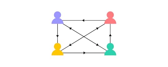
FinTech organizations are also more adept at remote work environments, allowing them to draw from a global talent pool and onboard much faster.
Traditional financial institutions suffer from silos and, due to regulatory requirements and company policies, take longer to onboard talent and build teams.
How Designers Can Help With Modernizing Legacy Systems1. Measuring and reportingMeasuring and reporting are vital components of modernizing legacy systems, including:
UX audits : identify usability issues linked to legacy systems and measure the annual cost of inactionCustomer journey mapping: FinTech Magazine recommends a three-step approach to legacy system modernization which centers around optimizing high-velocity customer journeysUser testing and UX research: invest more time in understanding users through testing, interviews, and research UX competitive analysis : study competitors to learn why customers chose their products Service safari : get team members to use your products and competitors to gain insights from a user’s perspectiveUsing these methodologies is just the first step. Design teams must use these insights to present quantitative data to stakeholders. For example,
what is the cost of poor user experience from legacy systems, and what are the potential returns for modernization?
When Talabat’s product team battled to get investment for a design system, they built a business case around the costs of front-end debt. The team measured the time it took to develop a UI with and without a design system. The results demonstrated significant losses for Talabat’s front-end debt, convincing stakeholders to invest in the product’s design system.
Your problem and solution must include numbers to support your business case. Stakeholders want to see metrics and KPIs to assess:
The state and scale of the issueHow your solution improves these numbers2. Prioritizing effectively using design thinkingDesigners can use design thinking to prioritize projects and identify opportunities that maximize business value. Finding the balance between desirability, viability, and feasibility is an effective research technique for innovative products that deliver sustainable long-term growth and success.
Desirability: what do customers need vs. want? Needs are more valuable because people can’t live without them.Viability: can the company afford it, and does it make business sense?Feasibility: do you have the resources to build it? Is it right for the business? And, how long will it take to deliver?Finding the sweet spot in this trifecta can maximize business value while solving customer needs. To be successful, the entire organization must embrace design thinking and user experience principles.
Design advocacy and design thinking workshops are crucial in getting buy-in from team members and stakeholders and steering them towards a modern, user-centered mindset.
As legacy-constrained institutions adopt these design thinking principles, it gets harder to justify “the old way of doing things” at the expense of users and the business.
3. Creating a single source of truthMany organizations, including those on legacy systems, still operate without a design system. Even the “modern” digital payment giant PayPal only adopted a design system for its internal products in 2019!
Design systems ensure there’s an organization-wide single source of truth. Streamlining product development workflows and maximizing cohesion and consistency reduces usability issues while allowing designers to focus on solving user problems rather than building components for every project.
Although a single source of truth won’t solve your company’s legacy challenges, it’s a step towards modernizing workflows and reducing time-to-market–a significant issue for slow-moving financial institutions.
Digital Transformation With UXPin Merge
UXPin Merge is an excellent tool for modernizing legacy systems and reducing time-to-market. After adopting UXPin Merge in 2019, PayPal’s product designers were able to build UIs 8X faster than before.
Merge also revolutionized PayPal’s development process and scaled design output without employing more UX team members–a key factor for organizations struggling with budget constraints!
Synced design and developmentPayPal’s UX Lead EPX, Erica Rider, chose Microsoft’s Fluent UI design system. The DS team created custom components and templates, so designers only had to drag and drop elements to build user interfaces. As Erica calls it, “a ‘snap-together’ type design.”
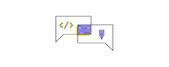
PayPal used Merge to sync its Fluent UI React library to UXPin, so designers had all the same components. They used React props to set styling and interactivity constraints which designers adjust via UXPin’s Properties Panel.
Streamlined design handoffsDesign handoffs in Merge are seamless, almost non-existent–a far cry from the chaotic mess many organizations deal with when releasing new products and features!
With designers and programmers using the same component library, most front-end development is copy/paste and adjusting props to meet designs. UXPin provides JSX code, so designers can copy that too!
Minimal designing and coding from scratch reduce errors, technical debt, and time-to-market while enhancing collaboration and user experience.
Are outdated business processes and legacy systems affecting your UX team’s ability to compete and meet customer expectations? Create a single source of truth to enhance product development workflows and deliver better user experiences to your customers with UXPin Merge. Visit our Merge page for more details and how to request access.
Discover MergeThe post How to Deal with FinTech Legacy Systems appeared first on Studio by UXPin.
October 20, 2022
The Playful Power of Card Design UI

Card UIs appear in many digital products, websites, and enterprise applications. Understanding card layout, visual hierarchy, and basic best practices are crucial for designing great card user interfaces.
This article explores card user interface design, the anatomy of cards, common use cases, and design inspiration for your next project.
Design, prototype, and test card UIs at higher fidelity and functionality with UXPin Merge. Visit our Merge page to learn more about component-driven prototyping and how to request access to this revolutionary user experience technology.
Reach a new level of prototypingDesign with interactive components coming from your team’s design system.
Discover UXPin Merge .discover-merge { margin: 40px 8px;}.discover-merge__container { display: flex; max-width: 690px; height: 200px; padding: 20px; padding-left: 24px; border-radius: 4px; background-color: black; box-shadow: 10px 10px #9999ff; align-items: center; justify-content: space-between;}.discover-merge__left { width: 50%;}.discover-merge__left p { margin: 10px 0px !important; color: white !important; font-size: 18px !important;}.discover-merge__heading { font-weight: bold !important; color: white !important; font-size: 18px !important;}.discover-merge__text { margin: 0 !important; line-height: 22px !important;}.discover-merge__button { width: 174px; height: 44px; margin: 10px 0px; border: none; border-radius: 2px; background: white; color: black; font-size: 16px; text-align: center;}.discover-merge__button:hover { cursor: pointer;}.discover-merge__image { max-width: 320px !important; height: 200px; margin-right: -19px;}@media (max-width: 760px) { .discover-merge__container { height: auto; margin: 10px; align-items: left; }}@media (max-width: 500px) { .discover-merge__container { flex-direction: column; } .discover-merge__left { width: 100%; align-items: normal; }}What is a Card in UI Design?Google’s Material Design succinct description says, “Cards contain content and actions about a single subject.” Cards are design patterns UX teams use to display content so that it’s easy for users to digest.
A card can be as simple as a title and image, such as this one from Google Maps.

Or, more complex, like this card from Instagram with an image, logo, dropdown/overflow menu, multiple actions, a comment section, and a date stamp.

Designers generally use cards to display a collection of content rather than a stand-alone item. These cards tell users that the content is related–like images in your Instagram feed or the latest blog posts on a website’s homepage.
Card AnatomyWe’ve borrowed this helpful dissection from Google’s Material Design depicting a card’s anatomy. Not every card will have these elements in this layout, but it’s an excellent illustration of the typical items designers use to create UI components.
 Container: every card must have a container to house its content. These containers create separation between cards and surrounding content.Thumbnail: an avatar, logo, or icon, usually displaying ownership or relation. Instagram uses this thumbnail for the user’s profile pic.Header text: the card’s name or title. For a blog post, this might be the article’s H1 title.Subheading: a subheading may contain additional information, like the date or location.Media: cards often contain a relevant image or video. The Google Maps card above show pictures of Central Park and The Metropolitan Museum of Art on each card. Cards can have a single media item or carousel with multiple images and videos. Supporting text: a summary or description of the card and its contents.Buttons: CTAs with text (Read more, Add to cart, Buy now, etc.).Icons: actions using icon buttons (like, share, etc.).
Buttons and icons allow users to perform various actions, but cards don’t need these actions to be interactive. Designers can make the entire card a link to a piece of content (a blog post) or embed actions (a double tap to like an Instagram post).
4 Types of Card UI DesignsThere are many advantages of card UI designs, but one of the most important is the ease in recreating them in unique ways that will convey a website’s personality. There are a variety of card types, and when looking at the most popular and effective, the following four styles show up most consistently.
1. PinsBased on the Pinterest platform, Pins are easily the most recognizable card layout. While 72 percent of internet users will access the web solely with smartphones by 2025, Pinterest is already accessed via mobile devices by 80 percent of their users. Unfortunately, the quick growth in popularity of this style of card UI was its downfall. Sites using Pins today often appear unoriginal.
2. Flat DesignMicrosoft took a step away from the skeuomorphism employed in its early software designs and instead embraced bright colors and simple visuals. When looking at popular card patterns, their interface was likely the earliest widespread example most people were introduced to. Since that time, however, these cards have evolved to better reflect modern tastes.
3. Masonry (Grid)One of the easiest card UI patterns to understand and browse is the masonry-style framework. These cards are arranged in a logical order, and they’re typically displayed in neat grids featuring equal spacing between cards.
4. Magazine StyleYou once would only see Magazine Style interfaces on news and entertainment websites, but its popularity has pushed its use into other types of online platforms. Even content-heavy domains – such as portfolios and blogs – have taken to using this type of card. The layout merely features a text tag or teaser image that links to a full article on another page.
Regardless of the style of card UI being utilized, the main point is to showcase a large amount of content in a way that’s easily digestible to users without the potential of overwhelming them.
Common Use Cases for Cards UI DesignWe see cards everywhere, from web design and mobile apps to games and streaming services. Here are some common use cases for card UI design and the problems they aim to solve.
Media cardsDesigners use media cards to display visual content for social media posts or articles. The media (image or video) and title (headline) are prominent to attract attention and engagement. Most news websites use media cards to display their articles–like this example from the BBC’s homepage.
 Modal cards
Modal cards are similar to media cards but present the user with several actions on tap/click. Streaming services, in-flight services, and car infotainment UIs use modal cards to display TV shows, movies, and other content.
These streaming cards generally feature an image of the program’s poster with a title. When the user clicks/taps a card, a modal appears with several options, like play, add to favorites, rate, etc.
Product cardsProduct cards are optimized for selling products and services. They usually have a media item, product title, price, and CTA (Buy Now or Add to Cart).
Product cards might include additional information to create FOMO and entice shoppers, including a sale/discount tag, review score, and availability. This example from the Local Shopify theme displays the typical UI elements designers use for eCommerce product cards.
 List cards
List UIs often use cards to display content like music playlists, contacts, tasks, etc. List cards generally feature a title, subtitle, and image (perhaps a checkbox for task cards). Designers might include a menu icon or swipe interactions to reveal the card’s options (edit, delete, archive, etc.).
This list card example from a Spotify playlist shows the artist/album image, song title, and artist’s name. The three-dot icon to the right opens a menu with several options.
 Data cards
Data cards display analytics, graphics, and statistical information on an app’s dashboard UI. These UI cards are most common in enterprise design, but they also appear in consumer products like activity trackers, budgeting apps, and banking apps, to name a few.
This example from Purrweb UI/UX Studio on Dribbble shows how designers use cards to show users their four recent transfers.
Property cardsReal estate listings and booking platforms like Airbnb and Booking.com use similar UI card layouts:
Listing title: number of rooms or type of accommodationSubtitle: location or distance from the area you’re searchingPrice: purchase/rent/per nightDescription: 1-3 sentences describing the property or icons highlighting key features (rooms, bathrooms, etc.)Star rating (booking apps): guest reviewsFavorite icon button: adds the property to your favoritesCTA: Book or ContactThese property cards allow users to scan many options as quickly as possible. Clicking back and forth is time-consuming, creating a poor user experience. Designers must use UX research and user interviews to find out what data user value most.
Advantages of Card UI DesignAs with any digital tool currently available, you’ll find those who absolutely love user interface cards and those who prefer other methods. If you’re still on the fence, check out the following advantages and why they can help you reach a wider audience while improving the user experience.
1. Intuitive UsabilityClick and drag manipulation makes designing a card user interface simple for you, but the overall concept also provides ease for your users. It’s easy to decipher the information presented on card at a glance, and the variety of projects it can be used for (e.g. art, commerce, literature, etc) is seemingly limitless.
2. Ideal for Aggregated ContentIf your website aggregates any type of content, the card UI is one of the best options on the table. This interface design makes it easy for users to find the information they’re looking for without being bogged down by what appears to be endless content.
3. Easy to BrowseRegardless of the project type, the ease in which card designs allow browsing cannot be disputed. Cards are easily viewed as a page is scrolled, and you can make certain elements stand out by increasing their sizes relative to the surrounding content.
4. ShareablePinterest is the sole case study necessary to prove how shareable card UI designs are. These are essentially the digital equivalent of a business card. The visual design shows users exactly what you want them to see without forcing them to digest unnecessary content.
5. VersatilityYou understand your users better than anyone else, so you know what they expect from your content. Whether they’re looking for minimalist or elaborate displays, these cards can create just that. You can choose the level of complexity that works best.
6. Easy Manipulation for Personal CreativityThe material design of your website or mobile app can be easily manipulated with card patterns. This makes it simpler to add your own personal creativity to the design, and since this allows better brand presentation, it improves the overall user experience.
Disadvantages of Card DesignThere are also drawbacks to card UI design, but understanding these in advance can help you avoid the most common issues. It all comes down to how you implement the usage of the design patterns, so don’t let these potential problems deter you from what could be a great improvement on your website.
1. They Can Be Played OutCard interfaces are a type of experience design, but users have been experiencing them for a while. If you’re not original in your presentation, the people visiting your website could see these as non-creative and played out.
2. Require Nuanced UX DesignYou can do just about anything with card UI tools, but you must remain nuanced in their presentation. It’s great to be able to provide detailed information to your users, but if this isn’t done subtly, the design may seem unprofessional.
3. Risk of Cluttered FeelYour landing pages may have a cluttered feel if you don’t use appropriate negative space. Focus on your design patterns and ensuring the cards don’t bleed over into each other. This can take the potential for a great user experience and completely destroy it.
7 Best Card UI PracticesThere are many strategies used to design effective card user interface patterns, but some of these practices are so essential that every professional will advocate their use. The following were presented by Carrie Cousin in her free ebook on web design trends.
Negative space: Effective card UI designs are all about organization, so make sure to use sufficient negative space (e.g. padding, borders) to avoid a cluttered screen. One card, once concept: The cards you use are meant to simplify your site’s structure. Don’t accidentally undercut this focus by adding too much complexity to your cards. Suitable images: Most images used on cards are small, so only utilize clear pictures. Also make sure they’re cropped to display appropriately where they’ll be used. Simple typography: The text on card UI designs will be small just like the utilized images, so maintain legibility with simple typography. Be unique: Since it’s one of the most popular user interface designs, you need to stand out when using cards. This could include anything from adding video, animated effects or new color schemes. We’ll discuss this more below. Consistent grid: Ensure that your grid has the same spacing between cards while utilizing breakpoints and respecting various card sizes. Apply Fitt’s Law: Check our Interaction Design Best Practices guide for an in-depth explanation of Fitt’s Law. When applied to cards, it dictates that the entirety of the card be clickable rather than just the image or text. This simplifies user interaction.Your job is going to get more difficult as your card UI designs get smaller. This makes it imperative for you to properly apply the fundamentals of design in order to convey your message to users.
Personalizing CardsAs one of the main benefits of user interface card designs, it’s important to know how to take advantage of personalization strategies. It’s possible, for instance, to change the size of any specific card. This can depend upon how much content you want to display or whether the goal is to prioritize one card over another.
By shrinking or expanding any card UI pattern, you can dictate how much information is going to be displayed. You can also control whether just the text or image shows, the size of specific elements, and many other variations. This will greatly influence the overall personal style of the layout.
You’ll also find that many designers opt to play with animation in their cards. Oftentimes the animation only occurs when the user hovers the cursor over a card, and this tells the user that the card is a clickable feature.
Some sites even go as far as letting users manipulate the card UI themselves. This is typically only an option on mobile websites, but desktop sites are increasingly offering the ability. Users can move cards around on their own or even stack various designs on top of each other for easier navigation of a page.
Cards Design UI in ActionHere are five card UI tips and design inspiration for your next project.
1. Create visual hierarchyThe first step for card design is to create a visual hierarchy–what content matters most? It’s a good practice to structure cards with the most important content as high or large as possible. Color, whitespace, and fonts are also effective for creating separation and hierarchy.
For example, most product cards feature a large, attractive image, followed by the title and CTA. The price is slightly smaller, but its proximity to the eye-catching image and surrounding whitespace makes it stand out as the customer scans the card. This information is most likely to get the user to take action.
 2. Minimize content
Too much content results in messy cards and increases cognitive load. Designers must reduce UI elements and, most importantly, keep text to a minimum.
As UX Designer Andrew Coyle states in this article, “The card should provide just enough information to help a user determine if they should further engage.” Andrew shows how reducing text to a maximum of 100 characters, or three lines, creates a cleaner aesthetic that’s easier to digest.
 3. Differentiate actions
Another great tip from Andrew Coyle is clearly differentiating the primary and secondary actions. The best option is to use a filled button for your primary action and a text or flat button for the secondary, as displayed in Andrew’s example.

Material Design calls the primary action the card itself since most cards are clickable and don’t need CTAs. Supplemental actions belong in the card’s footer, including buttons and icons, as displayed below.

If you have more than two supplemental actions, Material Design recommends using an overflow menu to keep the card clean and uncluttered.
 4. Create responsive card layouts
One of the most significant benefits of cards is their responsiveness. Designers can easily create a comparative user experience across multiple viewports.
The key is maintaining visual hierarchy while resizing and aligning cards to fit desktop, tablet, and mobile devices. This example from Material Design shows mobile and desktop/large tablet versions of the same card. Notice how the image, title, and call to action catch the eye in both designs.
 5. Use one swipe gesture per card
Swipe gestures allow designers to hide actions, thus keeping cards clean and minimal. Multiple gestures (including an image carousel) can create confusion and usability/accessibility issues.
This example from Material Design demonstrates how multiple gestures create confusion, particularly for users with cognitive and dexterity disabilities.
Prototyping Cards With UXPin MergeWith UXPin Merge, design teams can import a UI component library from a repository to prototype and test using the same interactive components, including cards, which engineers use to develop the final product.
Merge cards include responsive layouts, buttons, typography, colors, images, icons, interactivity, and other properties defined by the design system so designers can focus on building and testing UIs–avoiding the time-consuming task of designing cards from scratch!
Designers can use UXPin Patterns to combine static UI elements and other Merge components to create new cards and promote them to the design system. Patterns are also helpful for creating multiple card states, allowing for quick changes during user testing or stakeholder meetings.
Discover how component-driven prototyping with UXPin Merge can enhance your card design to create better user experiences for your customers. Visit our Merge page to find out how to request access.
The post The Playful Power of Card Design UI appeared first on Studio by UXPin.
October 19, 2022
Form Input Design Best Practices

Form inputs allow users to engage with digital products, brands, and other users. Choosing the appropriate input field and structure is crucial for designing a good form UX so users can complete tasks efficiently.
This article looks at individual input elements, the problems they solve, and how UX teams use them. We also provide tips on designing form inputs and common mistakes that could introduce usability or accessibility issues.
Increase prototyping speed and testing capabilities with fully functioning form input fields using UXPin. Bring interactive components to UXPin and assemble your prototypes, using those elements as a single source of truth between designers and engineers. Achieve parity between design and code. Explore UXPin Merge.
Reach a new level of prototypingDesign with interactive components coming from your team’s design system.
Discover UXPin Merge .discover-merge { margin: 40px 8px;}.discover-merge__container { display: flex; max-width: 690px; height: 200px; padding: 20px; padding-left: 24px; border-radius: 4px; background-color: black; box-shadow: 10px 10px #9999ff; align-items: center; justify-content: space-between;}.discover-merge__left { width: 50%;}.discover-merge__left p { margin: 10px 0px !important; color: white !important; font-size: 18px !important;}.discover-merge__heading { font-weight: bold !important; color: white !important; font-size: 18px !important;}.discover-merge__text { margin: 0 !important; line-height: 22px !important;}.discover-merge__button { width: 174px; height: 44px; margin: 10px 0px; border: none; border-radius: 2px; background: white; color: black; font-size: 16px; text-align: center;}.discover-merge__button:hover { cursor: pointer;}.discover-merge__image { max-width: 320px !important; height: 200px; margin-right: -19px;}@media (max-width: 760px) { .discover-merge__container { height: auto; margin: 10px; align-items: left; }}@media (max-width: 500px) { .discover-merge__container { flex-direction: column; } .discover-merge__left { width: 100%; align-items: normal; }}What are Form Inputs?A form input (form field) is a UI element for capturing user feedback and data. Input types or form controls include checkboxes, date pickers, radio buttons, text inputs, toggles, and selects/dropdowns. Forms must also have a submission method like a submit button, link, or keyboard action (enter).
What are Form Input Attributes?Form input attributes create rules and context for users. These attributes also provide the appropriate controls–like displaying a numeric keypad on a mobile device for a phone number field.
Five essential HTML form input attributes UX designers must pay attention to:
Required: means the user must complete the input to submit the formDisabled: an input state that prevents a user from making changes–usually until they perform another task or for “readonly” inputsType attribute: the type of input that defines the formatting–for example, a password type hides the characters while an email type requires the @ symbol and domain extension (.com, .co.uk, etc.).Label: tells users what the input is for–i.e., Password, Name, Email, etc.Helper Text: provides an additional label for context and accessibility. Types of Form InputsHere are several common form inputs and how designers use them.
Text InputText inputs (or text input fields) allow designers to capture a wide range of information, most notably names, emails, passwords, addresses, and other text-based user data.
If you need a user to enter information that’s longer than one sentence, it’s better to use a text area over a text field. Text areas are larger and allow more text–like the message section of a contact form.
Date PickersDate pickers provide a format that makes it easy for users to select a day, month, and year. They also ensure that users use the correct separators like commas, backslashes, and dashes.
UX designers have several date picker UI options and configurations. Choosing the right one depends on the user, device, and operating system (iOS, Android, Windows). This article offers helpful tips on designing the perfect date picker.
Selects/DropdownsSelects or dropdowns allow designers to present users with a collection of choices. Dropdowns work best for fixed variations or options–like a list of countries or t-shirt sizes. For long lists like countries or states, providing a search field allows users to find their choice quicker.
These dropdowns give users choices while ensuring they provide an accurate answer. For example, misspelling a country or state could result in an eCommerce order not reaching the customer.
CheckboxesA checkbox performs two primary functions:
Allows users to make two or more selectionsProvides a method to acknowledge legal requirements–like accepting terms and conditions or email newsletter opt-insRadio ButtonsRadio buttons perform a similar function to checkboxes but only allow one choice instead of multiple. For example, choosing a shipping option or answering yes/no questions.
TogglesToggles or toggle switches are basic on/off (boolean) form inputs. Switches offer users a quick method for making yes/no, on/off decisions. If you’re looking for an example, both Android and iOS mobile devices use toggle switches in their settings.
File inputFile inputs allow users to upload images and documents. UX designers must use helper text to tell users which format the file input will accept, i.e., PNG, JPG, PDF, etc.
Understanding Form Input States
Input states allow UX designers to communicate with users through color and messages. The example below from Material Design Form shows how designers can use states for context and guidance.
Inactive: an input where the user has entered informationFocused: highlighted to show the user’s current selectionActivated: a completed inputHover: shows desktop users that this is an interactive input when they move their cursor over itError: alerts the user to a problem–i.e., an incomplete field or incorrect informationDisabled: tells the user they can’t interact with the inputEvery input element offers similar state variations to help users navigate and complete forms.
Using Form Input Prefixes and SuffixesPrefixes and suffixes help users enter the correct information and format. For example, if you need the weight of something, adding lbs or kg suffix tells users explicit instructions for entering the right numbers.
UX designers can also use dropdowns for prefixes and suffixes to allow users to enter the data in a familiar format. For example, United States users might choose lbs and Canadians kg.
Prefixes are most commonly used for county code selection to capture the correct telephone numbers.
Why Good Form UX is Important?Forms offer significant business opportunities, but poor design or too many form inputs can hinder user experience, adversely impacting conversions.
The first rule for good form UX is only requesting the information necessary for users to complete a task. For example, an eCommerce checkout form needs a customer’s full name, delivery address, email, contact number, and payment details (including billing address if different from the delivery address).
While capturing your customer’s age and gender might be valuable for marketing purposes, this additional form data adds to the completion time, is intrusive, and may prevent people from completing it.
The same rule applies to any form. Do you need a user’s name to create a new account, or will an email for verification suffice? UX designers must reduce form inputs and avoid capturing irrelevant data as a foundation for a good form user experience.
How to Design Great Form Inputs1. Use short, descriptive input labelsInput labels must be short, descriptive, and fully visible. This example from Material Design shows how long labels can confuse users.
 2. Use an appropriate color contrast
Form inputs are not the place for branding or creative color schemes. Choose a background color that contrasts nicely with the placeholder and input text.
 3. Convey input requirements
Passports can cause confusion and frustration if UX designers don’t tell users the field’s requirements. UX Designer Salim Ansari shows how to design a password input field with explicit instructions.

Adding a “Show” button allows the user to double-check they have entered everything correctly, avoiding a potential time-wasting error.
4. Distinguish between required and optionalTelling users which fields are required and optional can reduce errors while allowing people to choose what they want to share. The standard practice is to add an asterisk (*) for required fields, but many designers place (required) in brackets next to form labels to be more explicit and help with accessibility.
UX designers must also consider the impact optional fields have on cognitive load and conversions. If a form field is optional, should you include it at all?
5. Put placeholder textThere is some debate about placeholders and their usage. UX Designer Andrew Coyle (formally Google, Flexport, Intuit) outlines several scenarios in this article about the dos and don’ts of placeholder text.
“It is tempting to provide text help for complex forms or omit input labels to improve aesthetics. However, employing placeholder text to do so causes many usability issues.” – wrote Andrew Coyle in the linked article.
Some highlights from Andrew’s article:
Don’t use placeholders or inline labels in place of labelsDon’t use placeholders in place of helper textUse a lighter color shade for placeholder text to differentiate from the entered textPlaceholders should not disappear when a user clicks inside the input field, only once they enter the first character6. Structure inputs to reduce thinkingStructured inputs tell users exactly what data and format you want. It also reduces thinking to complete forms faster. This example from Andrew Coyle shows a typical telephone number input field in a US format with an area code and two parts for the number.
 7. Enable autocomplete
Autocomplete (autofill) allows users to complete forms much faster, especially for addresses–like using the Google Maps API to find an address.
If a user has an account, using this data to autofill a form saves significant time, increasing conversions while creating a positive user experience.
8. Use default values with cautionDefault values offer similar benefits to autocomplete, allowing users to complete forms faster. However, default could result in errors or confusion. For example, location tracking to set a default value for a user’s country might be incorrect if they’re away from home or using a VPN.
9. Design mobile-friendly input fieldsMobile-friendly or responsive design is crucial for good form UX. Designers must use one-column layouts and optimize all form elements for touch/tap interactions.
Design Fully Functioning Form Inputs in UXPinThe problem with using a design tool to prototype input fields is that they don’t provide the same fidelity and functionality as code, limiting what designers can test during the design process.
With UXPin, input fields, including text inputs, function as they do in the final product. Instead of rendering static images like most design tools, UXPin renders HTML, CSS, and Javascript, giving designers the superpowers of code without writing a single line!
These superpowers enable design teams to build form prototypes indiscernible from code for accurate, meaningful feedback from usability studies and stakeholders.
Variables allow designers to capture user input data and use it elsewhere in the prototype, like personalizing a welcome message or populating a user’s account profile.
This example sign-up form created in UXPin shows how designers can use an email variable to personalize the confirmation screen after form submission.


Design teams can take form input testing to the next level with Expressions. In the same example, we see dynamic error messages when users don’t complete a form correctly.
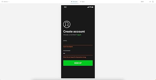
You can also use Expressions for form validation, computational components, and matching password criteria to create realistic prototype experiences.
Use UXPin Merge and Import UI ComponentsStop designing form inputs from scratch. Find ready-made components, such as Material Design forms, and enjoy their full interactivity and function thanks to UXPin Merge. It’s a technology that allows you to share a single source of truth between designers and devs, so the work of putting forms and other UI design elements doesn’t get duplicated by two teams. Visit Merge page to learn more.
Discover MergeThe post Form Input Design Best Practices appeared first on Studio by UXPin.
October 18, 2022
Best Design Feedback Tools – A List of 6 Tools

As an industry, product design has become more interactive than ever before. Whether you’re creating apps, websites, or software, there’s an endless stream of new tools and workflows to help make your design decisions as comprehensive as possible. However, when there are design team members, project managers, and stakeholders who all want to be involved in the project at the same time, things can get messy pretty quickly.
Managing effective feedback process at all stages of the design workflow has become a bit of pain, to say the least.
Fortunately, there are a ton of design feedback tools that can help you gather, organize, and utilize constructive feedback and help keep everyone on the same page. That’s why we’ve compiled a collection of the best design feedback tools to help you find the right one for your specific needs.
Table of contentsHow to Pick the Best Design Feedback Tool? Your tool is interactiveOffers increased functionalityFunctions in real timeAllows effortless communication6 tools for collecting design feedback1. Proofhub2. Atarim3. UXPin4. BugHerd5. Nimbus Capture6. UserbackUse UXPin to Collect Feedback on Prototypes Build advanced prototypesDesign better products with States, Variables, Auto Layout and more.
Try UXPin .try-uxpin-banner { margin: 40px 0px;}.try-uxpin__container { display: flex; max-width: 689px; height: 210px; padding: 20px; padding-left: 24px; border: 2px solid black; border-radius: 4px; align-items: center; justify-content: space-between; background-color: white; box-shadow: 10px 10px black;}.try-uxpin__left { width: 54%;}.try-uxpin__left p { margin: 10px 0px !important; color: black !important;}.try-uxpin__heading { font-size: 28px !important; font-weight: bold;}.try-uxpin__text { margin: 0 !important; font-size: 18px !important; line-height: 22px !important;}.try-uxpin__button { width: 135px; height: 44px; background: black; margin: 10px 0px; padding: 10px 20px; border: none; border-radius: 2px; color: white; font-size: 16px; text-align: center;}.try-uxpin__button:hover { cursor: pointer;}.try-uxpin__image { max-width: 320px !important; height: 200px; margin-right: -21px; margin-bottom: -6px;}@media (max-width: 760px) { .try-uxpin__container { height: auto; margin: 10px; align-items: left; }}@media (max-width: 500px) { .try-uxpin__container { flex-direction: column; } .try-uxpin__left { width: 100%; align-items: normal; }}How to Pick the Best Design Feedback Tool? First off, how do you even know whether a design feedback tool is right for you?
Of course, you need an application that makes collaboration easy and doesn’t do more harm than good. The software and feedback features need to actually benefit your creative efforts, so bear these considerations in mind. This also means that – when choosing the right design collaboration tool – you should check whether it lets you comment on the design when making iterations, or leave feedback on actual, published apps and websites.
Here are a few criteria to search for:
interactivitysatisfying feature setreal-time usercollaborativeYour tool is interactiveProfessional design feedback tools must be as interactive as possible.
In the past, feedback would have been as simple as drawing lines and writing comments on a screenshot, or supplying a designer with a list of things to change, but this just isn’t good enough today.
It wastes so much time having to shift through messy lists of feedback, find what feature a client is referring to, or identify what the bug in question is.
An interactive tool removes these issues and instead displays actionable feedback in the right places in an organized manner. Everything is clean, easy to follow, and intuitive.
There’s no point in getting a feedback tool that ends up causing more problems than improving productivity.
Offers increased functionalityDespite being a feedback tool, your chosen solution should always be far more capable than this baseline feature.
The best tools grant access to other functions, such as being able to generate specs and documentation or even manage the entire design process.
For example, connecting with the prototyping process is essential yet often overlooked.
If colleagues, project leaders, or UX testers provide great design feedback on a certain aspect of the project, you can incorporate it into your prototype, test again, gather more feedback, and then repeat the cycle.
This is a far more effective way to work and will speed up your design process as a whole. Productive design review should be an iterative process that helps to improve the quality of your designs, rather than something that just bogs you down.
Functions in real timeNowadays, especially with the rise of remote and hybrid ways of working, your collaboration tools need to operate in real-time. This includes displaying design previews, adding comments and annotations, and even video and audio notes for highly-detailed responses.
Allows effortless communicationCommunication is everything at all stages of the design process, including when it comes to organizing feedback.
Your design review tool should enable users to add all kinds of comments in any format (text, video, image, GIFs, etc) as well as @mention-specific team members. In order to avoid any confusion, it’s also important that everyone’s on the same page in terms of which tool you’re using and that everyone understands how to use it.
6 tools for collecting design feedbackLet’s now take a look at the design feedback tools that will make the design review more effective and interactive.
1. Proofhub
Proofhub markets itself as a project management application orientated to the needs of designers. Clients or project managers can check in and provide feedback throughout the entire design workflow, annotating the project within the app using a clean overlay approach.
This means designers can eliminate previous issues, like having to search and find feedback in a massive email or Slack threads, access the feedback at any time, and work on a project in real-time.
While fast, effective, and easy to get set up and running, the interface can feel a little clunky and lacks customizability. However, if you can overlook this, it does get the job done.
FeaturesReview all files in any kind of design project with a clickCollaborate with all team members, clients, and managers in real-timeAll past file versions remain accessible simultaneously2. Atarim
Atarim is used by over 5,000+ agencies worldwide, including companies like GoDaddy, Elementor, and WPEngine. If you’re looking for a design feedback tool specifically for website building, then it’s worth considering it.
It’s essentially a WordPress plugin that digital development and design teams can use to track changes across the websites they’re building. Atarim lets you add internal comments, collect feedback from clients, and then use the findings to improve the UX and UI.
This design review app supports screenshots and comments, and can turn any text into a task that can be assigned to a relevant team member.
Atarim can be integrated into other collaboration tools like Trello and Asana, as well as other Kanban boards. While clearly feature-rich, this software can be a little confusing to newcomers, and the learning curve may take some time to climb.
FeaturesSupports internal messages that keep conversations away from clientsGive feedback on non-WordPress sites with a few clicksTurn comments on screenshots into assignable tasks3. UXPin
UXPin allows you to catch positive and negative feedback before it becomes costly, that is during the prototyping phase. Non-designers as well as fellow designers can give approvals or leave their not-so-positive feedback before the prototype gets passed on to engineers.
It’s costly for any business to create entire apps, websites, and features, only to have them redesigned from the ground up once clients, stakeholders or product managers want changes made.
Instead, you can use UXPin to generate robust prototypes of individual design elements, acquire feedback, and then implement the changes until your design is given the green light. Next, prototypes can be shared with developers who will polish it off into the final app, making it effortless to bring the best of collaboration and teamwork to your design projects.
FeaturesCreate, run, and tweak prototypes in real-timeImport Sketch or Figma designs in just a few clicksCreate and share preview links to ensure your prototypes are accessible to everyone who needs accessAnimate between states to create one of the most advanced user testing experiences possibleUse ground-breaking variable data storage to create the most life-like prototyping experienceHand over your designs to the engineering team with autogenerated specs and ready-made code.4. BugHerd
Whatever you’re designing, you’re going to come across bugs and problems that need addressing. Keeping track of everything and being organized can be a challenge, to say the least. BugHerd addresses this pain point with its visual-heavy feedback tool.
The app is simple. Using a visual interface to display code, screenshots, websites, or whatever visuals you want, clients, stakeholders, and team members can place sticky-note-like comments to provide any kind of feedback, highlight issues, and more.
FeaturesThe entire service is hosted in the cloudAll comments and feedback are easily accessible and searchableMark annotations on images provide concise feedback5. Nimbus Capture
Sometimes, you’re not going to want a high-end service but rather something simple, quick, and easy, and that’s where Nimbus Capture comes in. It’s a great tool for startups that provides a range of collaboration tools designed for improving feedback and collaboration efforts, the most notable of which is Nimbus Note.
While quick and easy, it’s important to realize that this design review tool can feel a little restrictive when compared to other tools that offer a more integrated service. The UI is a little dated (especially when using the free Chrome extension), and you don’t actually integrate your work into the app.
This means designers are going to be constantly switching back and forth between windows to make changes and review feedback, rather than just working with everything within a self-contained and accessible place.
FeaturesA free Chrome browser extensionUsers can annotate screenshots using a variety of methodsAutomatically organize notes using a table of contents6. Userback
Reviewing feedback takes time, and it’s time wasted if not handled properly. Userback aims to make things easy with its visual feedback tool. Used by companies like Couchbase, Udacity, and more, Userback works within any kind of project, be it web design, app design, and more, and it allows users, clients, and designers to annotate on the fly.
You can specifically mark areas of the screen with interactive comments, mention specific engineers, highlight bugs and potential issues in the code, and even provide client support in real-time.
The app can fully integrate into an extensive range of major services, including Slack, Trello, Asana, WordPress, ZenDesk, GitHub, and so on, and even supports video feedback.
While this is surely a feature-rich solution, Userback is designed for users to provide their feedback once the product has already been launched. It’s not the best choice if you want to do a design critique of wireframes or prototypes. This means that bugs and glitches are possibly already influencing the usability of your product, and the damage could have already been done to the overall user experience.
FeaturesYou can draw directly on the designUse video feedback to gather feedback from customers fasterA feature request dashboard lets you look at all of the comments and track their statusUse UXPin to Collect Feedback on PrototypesGreat design feedback is an important part of the design process, no matter if it’s a positive feedback or negative, and there are a variety of tools available to help make it as smooth as possible. While some software is more comprehensive than other, each has its own unique set of features that can be tailored to fit your specific needs.
That being said, don’t forget that there’s no stage of feedback more important than prototyping. For this reason, make sure you’re using a tool that allows you to collect feedback early and often, so you can make revisions and create a better design, just like UXPin does.
It can help make a more quality designs for apps and websites. At the end of the day, your apps will make or break depending on your UX design, and designers have the most important role in creating an experience that users will love.
UXPin is designed at its core with this goal in mind. Try it for free, and you’ll see that design work will never be the same again.
Try UXPin for freeThe post Best Design Feedback Tools – A List of 6 Tools appeared first on Studio by UXPin.
UXpin's Blog

- UXpin's profile
- 68 followers

