
UXpin's Blog, page 49
November 21, 2022
Internationalization and Localization – Key Difference in App Design
Internationalization is crucial for startups and companies with global aspirations. If organizations want to succeed in an international market and compete locally, they must create relatable, locally relevant product experiences.
Internationalization and localization go beyond translated text and currency changes. Designing experiences related to users, their cultures, and their environments create the trust necessary to increase adoption and grow in global markets.
Prototyping and testing are vital for delivering positive user experiences for a global market. Sign up for a free trial to explore UXPin’s advanced design, prototyping, and testing features.
Build advanced prototypesDesign better products with States, Variables, Auto Layout and more.
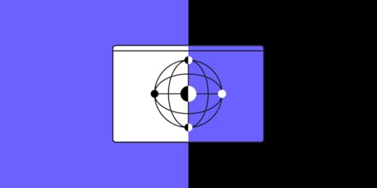
Try UXPin .try-uxpin-banner { margin: 40px 0px;}.try-uxpin__container { display: flex; max-width: 689px; height: 210px; padding: 20px; padding-left: 24px; border: 2px solid black; border-radius: 4px; align-items: center; justify-content: space-between; background-color: white; box-shadow: 10px 10px black;}.try-uxpin__left { width: 54%;}.try-uxpin__left p { margin: 10px 0px !important; color: black !important;}.try-uxpin__heading { font-size: 28px !important; font-weight: bold;}.try-uxpin__text { margin: 0 !important; font-size: 18px !important; line-height: 22px !important;}.try-uxpin__button { width: 135px; height: 44px; background: black; margin: 10px 0px; padding: 10px 20px; border: none; border-radius: 2px; color: white; font-size: 16px; text-align: center;}.try-uxpin__button:hover { cursor: pointer;}.try-uxpin__image { max-width: 320px !important; height: 200px; margin-right: -21px; margin-bottom: -6px;}@media (max-width: 760px) { .try-uxpin__container { height: auto; margin: 10px; align-items: left; }}@media (max-width: 500px) { .try-uxpin__container { flex-direction: column; } .try-uxpin__left { width: 100%; align-items: normal; }}Table of contentsWhat is Internationalization? What is Localization?Legal requirements and complianceInternationalization and AccessibilityA universal source code baseText directionTime zones, currencies, datesCultural norms & expectationsInternationalization and Localization Best Practices1. Avoid metaphors and cultural references2. Design internationally-friendly forms3. Design UIs to accommodate translations4. Prototype with real copy5. Don’t embed text in images6. Use relatable content7. Internationalizing Typography8. Number formats and separatorsInternationalized Product Design With UXPinWhat is Internationalization?
 Internationalization (or what Google calls globalization) is designing and developing digital products to allow language, regional, and cultural adaptations. This flexibility enables companies to adapt products and enter new markets while maintaining the product’s integrity and user experience.
Simple examples of internationalization are language and currency selectors–not specific languages or currency, but the UI design and programming that make it possible.
The Cuber Shopify Theme uses dropdowns for the store’s internationalization design. Shopify store owners can use these internationalization features to localize their eCommerce store for different countries–i.e., A US-based store providing Mexican Peso and Spanish for a Mexico-based target audience.

This eCommerce example leads us to localization.
What is Localization?Localization is the process of adapting a product to meet specific market needs, including translation, currency, and cultural changes.
Localization aims to deliver a user experience that’s relevant and relatable–beyond simply changing the language and currency.
For example, it doesn’t snow in New Zealand over Christmas because it’s summer. Referring to snow and keeping warm during December wouldn’t make sense to New Zealanders as it would to Canadians.
Designers must also adapt user interfaces to meet native language markup and structure, like left-to-right (LTR) (i.e., English) vs. right-to-left languages (RTL) (i.e., Arabic, Hebrew).
Legal requirements and complianceProduct teams must also consider compliance for different locales and legislative impacts on content and user data. GDPR, CCPA, and other data privacy acts dictate how products and websites collect, store, and share user information.
Designers must notify customers in these regions about their cookie policy and allow them to opt out of tracking–like this example from Stack Overflow.
 Internationalization and Accessibility
Internationalization is vital for accessibility, inclusive design, and making products localizable. W3C provides an overview of i18n (industry standard abbreviation for ‘internationalization’) and how to make products more inclusive for a global audience.
 A universal source code base
Product developers must use Unicode for internationalization and architecture. Unicode gives digital products the foundation to translate and serve content in any language.
Engineers must also consider appropriate metadata to support different language structures and markups.
Text directionRight-to-left languages are complicated for digital product design because they often mix directions within a single line of text. This example from W3C demonstrates bidirectional text in Arabic content.
Designers must collaborate with engineers to ensure these directional nuances are correctly addressed.
Names & addressesForms often create confusion for users from different parts of the world. For example, some European countries write the street before the number, whereas in the United States, its number, street.
Some countries don’t have postal codes, so making this a required form field creates a frustrating roadblock for those users.
. Some cultures place their family name (surname/last name) first and “first name” second. A person’s name may also have several words–how do they enter this data?
Time zones, currencies, datesDate formats can cause a lot of confusion and frustration. For example, users can interpret 10/02/2022 as:
October 02, 2022, in the United States10 February 2022, in EuropeA good way around this confusion is to abbreviate the month so everyone can read the date–i.e., Oct 02, 2022. Designers can also separate these fields on forms, so users enter the correct date and databases read and save them correctly.
If your product uses time, it’s crucial to factor in timezones and daylight savings to save and present users with the correct time format.
Currencies present another design challenge. Some currency formats place the symbol before and others after. Thailand, Turkey, Vietnam, and Sweden are four examples where people position the currency symbol after the number.
Cultural norms & expectationsUX teams must do their homework and perhaps hire local UX designers when entering a new market.
For example, thumbs up in the West means good, but it’s insulting in Japan, Bangladesh, and the Middle East! Using thumbs up or thumbs down to rate a service or feature might get mixed results from users in these regions.
Colors, symbols, words, phrases, and metaphors carry different meanings across various languages and cultures. Extensive user and cultural research must be a priority for UX teams, especially when they don’t speak the language.
Further reading and research: W3C provides a list of groups for regional internationalization, including the Americas, Europe, Africa, the Middle East, the Far East, and South East Asia.
Internationalization and Localization Best Practices1. Avoid metaphors and cultural referencesEvery country and culture has metaphors and references, but these often don’t translate to a global audience; in some instances, they might be offensive–like a thumbs up in Bangladesh.
Designers must also use descriptive names rather than “clever” cultural references. Australians are renowned for their hilarious slang, but using these in a product would be confusing rather than entertaining.
2. Design internationally-friendly formsForm field labels, particularly addresses, can create confusion. Designers must design forms that accommodate an international audience.
For example, most countries use “postal code” instead of “zip code.” They also write the entire state/province/county rather than abbreviating it into two letters like the United States (i.e., Florida = FL). An international approach to form labels and field sizes will make forms more globally inclusive.
Further reading:
Web Form Design Best PracticesForm Internationalization TechniquesInternational Address Fields in Web Forms3. Design UIs to accommodate translationsDesigners must avoid designing UIs to accommodate a single language. As designer John Saito points out in a Medium article about internationalization, “Think of the label ‘New!’ for example. In English, it’s 4 characters with the exclamation point. But in French, it’s 9 characters: ‘Nouveau!'”
John recommends creating a Google Sheet and using a Google Translate function to visualize multiple languages and calculate character count.
We compared a standard CTA, “Sign up,” against ten languages. Sign up has seven (including the space), but most languages have ten or more characters, which could create issues if designers don’t leave enough room.
 4. Prototype with real copy
The example above demonstrates the importance of prototyping with real copy. If you’re adapting your product for a new language, translate content on every UI as it would appear in the final product.
As we saw with translations, some words might be longer than the English version requiring the extra UI width.
If your UI element doesn’t have enough space, it will break the text into a new line. This looks unprofessional and might push other components creating usability issues.
5. Don’t embed text in imagesAnother recommendation from John Saito is not to embed text in images. Even if you translate these, it creates multiple assets which adversely impact performance.
Embedding text in images also excludes users with visual impairments and screen readers.
Text overlays are a good alternative, but they create additional CSS and Javascript, so designers must use this method sparingly.
6. Use relatable contentIf you’re going to use content, particularly images and video, make sure it’s culturally relatable. Users must feel like someone from their country or region designed the product specifically for them.
For example, the Google News and Apple News apps use location tracking to present relevant, localized stories. In some instances, this localization might be as changing a picture of NYC for Americans to Nairobi for Kenyan users.
7. Internationalizing TypographyYona Gidalevitz’s interesting UsabilityGeek article looks at language’s impact on typography. Asian languages like Mandarin, Korean, and Japanese have complex characters which don’t translate well into bold typefaces.
These languages also represent multi-character English words as a single character, requiring a large font for legibility which ultimately alters the UI element or the entire screen.
8. Number formats and separatorsNumber formats and separators differ in languages and regions. Microsoft’s number formatting for globalization demonstrates that countries will display the number negative five hundred and twenty-seven in four different ways:
-527527-(527)[527]People also use date and number separators differently. Returning to our example of Oct 02, 2022, we can write this date in at least three ways:
10-02-202210.02.202210/02/2022In the United States, people use a comma (,) to separate the thousands, while Germany uses a period (.).
While these might seem like minor issues, they could severely impact usability. Understanding these nuances will help product teams avoid potential problems.
Internationalized Product Design With UXPinDesigning digital products is challenging. Developing multilingual products for a global audience adds an extra layer of complexity for design teams.
With UXPin’s Design Systems, product teams can create multiple design systems for each language to streamline prototyping and testing. Create a new design system from an existing library and edit the components to meet language/market requirements.
Each design system can have locale-specific components, assets, typography, and documentation, giving designers the tools to build localized prototypes for testing.
Avoid the time-consuming process of prototyping and testing for multiple markets with the world’s most advanced user experience design tool. Iterate faster to build inclusive products capable of competing internationally with UXPin. Sign up for a free trial today.
Try UXPin for freeThe post Internationalization and Localization – Key Difference in App Design appeared first on Studio by UXPin.


November 17, 2022
UX Design Degrees – Which Universities and Courses Are Worth it?
User experience design is an exciting, multi-faceted discipline exploring how human behavior intersects with the digital products we use. UX designers represent the customer within an organization, ensuring products balance user needs with business goals.
This article explores the soft and hard skills you’ll need as a UX designer and the various career paths.
Impress potential employers with a UX portfolio of fully functioning high-fidelity prototypes. Sign up for a free trial to explore advanced design and prototyping with UXPin.
Build advanced prototypesDesign better products with States, Variables, Auto Layout and more.
Try UXPin .try-uxpin-banner { margin: 40px 0px;}.try-uxpin__container { display: flex; max-width: 689px; height: 210px; padding: 20px; padding-left: 24px; border: 2px solid black; border-radius: 4px; align-items: center; justify-content: space-between; background-color: white; box-shadow: 10px 10px black;}.try-uxpin__left { width: 54%;}.try-uxpin__left p { margin: 10px 0px !important; color: black !important;}.try-uxpin__heading { font-size: 28px !important; font-weight: bold;}.try-uxpin__text { margin: 0 !important; font-size: 18px !important; line-height: 22px !important;}.try-uxpin__button { width: 135px; height: 44px; background: black; margin: 10px 0px; padding: 10px 20px; border: none; border-radius: 2px; color: white; font-size: 16px; text-align: center;}.try-uxpin__button:hover { cursor: pointer;}.try-uxpin__image { max-width: 320px !important; height: 200px; margin-right: -21px; margin-bottom: -6px;}@media (max-width: 760px) { .try-uxpin__container { height: auto; margin: 10px; align-items: left; }}@media (max-width: 500px) { .try-uxpin__container { flex-direction: column; } .try-uxpin__left { width: 100%; align-items: normal; }}Table of contentsUX Designer Soft SkillsEmpathyActive listeningCommunication skillsNegotiationCreative thinkingBusinessUX Designer Hard SkillsDesign thinkingDesigning wireframes and mockupsPrototypingUX researchUser interviews and testingInformation ArchitectureBasic programmingUX Career PathsUX designerUX researcherUI DesignerInteraction designerUX writerUX engineerProduct designerWhat are Great UX Design Courses?End-to-End Design With UXPinUX Designer Soft SkillsThe word design in UX design often leads people to confuse the discipline with graphic or visual design. While those are facets of UX design, it’s more about designing experiences rather than beautiful aesthetics.
Here are some soft skills UX designers need to design successful user experiences. Some of these skills may surprise you if you’re unfamiliar with UX design.
EmpathyEmpathy is a vital skill for UX designers and is the first stage of the design thinking process. Most projects UX designers work on will be for products they don’t use themselves. They must use empathy to understand problems from a user’s perspective and design a solution to meet those needs.
Empathy is also a valuable skill for working in teams. Putting yourself in the shoes of product managers, engineers, stakeholders, etc., can reduce friction while seeking ways to improve collaboration.
Active listeningActive listening and empathy are closely related. To empathize effectively, UX designers must listen without developing assumptions, biases, or conclusions that prevent them from getting to someone’s core problems. They’re also not waiting for their turn to talk, leaving “dead air” for someone to think, and not interrupting while they speak are crucial for active listening.
To understand what someone might think, UX designers must also pay attention to non-verbal communication during user testing and interviews, like eye movements and facial expressions. Users often don’t tell you everything because maybe they’re embarrassed or think the information is irrelevant. Identifying these opportunities to ask meaningful questions helps designers become better listeners.
Communication skillsCommunication is another vital UX design soft skill. UX designers must communicate on many levels, probably more than most departments.
UX designers communicate in the following ways:
End users (interviews, testing, etc.)Other designersCross-functional collaboration (product teams, engineers, marketing, customer service, etc.)Stakeholders (reporting, presenting ideas, general feedback)You’ll also have to learn to communicate with clients if you work for an agency.
NegotiationNegotiation is probably not the first thing that comes to mind when you think about UX design, but designers negotiate on many levels:
With stakeholders to get buy-in for ideas and resourcesWorking with other teams and departments when solutions or ideas clashWhen collaborating with engineersAdvocating for usersDesigners must know when to be assertive and when to compromise. Poor negotiation skills could lead to too many compromises, adversely impacting a product’s usability and UX strategy.
Creative thinkingUX designers must be open-minded, creative thinkers. Every project will have constraints, so designers must have excellent problem-solving skills to work within these to find solutions while pushing the limits of innovation to stay competitive.
Most UX design courses and university degrees teach designers how to improve creative thinking through ideation techniques like “how might we,” “crazy eights,” and even coming up with the worst possible idea to get the creative juices flowing.
BusinessEvery design project has a business intent, whether selling products, acquiring/converting leads, increasing userbase/engagement, or getting donations for a non-profit. It’s a designer’s job to marry these business goals when designing the ideal solution.
Understanding business value and organizational complexities will help UX designers manage relationships with stakeholders better while maximizing a product’s value to the organization.
UX designers with managerial, leadership, or even founder aspirations, must understand business management and how a business operates.
UX Designer Hard SkillsThese are the hard skills you’ll need as a UX designer. Most UX design degrees and courses teach these as part of the syllabus. Within these hard skills are different UX frameworks and systems–too many to discuss in this article!
There are also plenty of books, YouTube videos, and other resources for UX designers to develop and hone these hard skills.
Design thinkingDesign thinking is central to the ethos, workflow, and principles behind human-centered design. It prompts designers to focus on the customer at every stage of the design process to deliver products and services that people will want and use.

There are five stages to the design thinking process:
Empathize – Discover what your users needDefine – Determine the problem you want to solveIdeate – Develop possible solutions to users’ problemsPrototype – Create prototypesTest – Test your prototypes with users & stakeholdersDesigning wireframes and mockupsMost designs start with wireframes–basic shapes and outlines of a product or website, usually in black and white. Designers create these wireframes on paper and using design tools.
Wireframing is essential to the design process because it enables designers to design, test, and iterate ideas fast while using the least resources possible.
Designers add basic navigation and connect user flows during the digital wireframing process. Wireframes also give digital products a foundational structure to create mockups.
Mockups are static visual representations of the final product’s appearance, including colors, typography, UI components, etc.
PrototypingPrototypes are functioning replicas of the final product. Designers build prototypes at every stage of the design process, including paper prototypes (low-fidelity prototyping), before they even start working with digital design tools where they create high-fidelity prototypes.

Prototyping is core to a UX designer’s job because these UX artifacts allow them to test ideas with real-world users and stakeholders.
UX researchUX research covers three primary areas:
Customers/usersCompetitorsMarketUX designers consolidate this research to understand user problems, identify opportunities, and ensure solutions meet market benchmarks and expectations.
User interviews and testingInterviews and testing allow UX designers to engage with users, understand their problems, and the environments where they use the final product.
Information ArchitectureInformation Architecture (IA) organizes screen and navigational structure to align with user and business goals. The aim is to prioritize content so that users efficiently navigate products, find features, and complete tasks.
Basic programmingUX designers typically don’t write code, but they design code-based products. Learning programming basics (HTML, CSS, and Javascript) enables designers to understand technical limitations while envisioning how their designs will translate into code.

UX designers who learn code, including popular front-end frameworks like React, Angular, Vue, etc., increase their value to employers (meaning higher salaries) while opening more career opportunities.
UX Career PathsIn startups and small companies, UX designers cover most or all UX design roles and responsibilities. But in larger organizations, you find more specialist roles, including UI designers, researchers, and content designers/UX writers, to name a few.
These are typical career paths and jobs advertised for UX designers.
UX designerIn larger teams with multiple UX specialists, UX designers focus solely on the product’s user experience. They look at user experience holistically rather than focusing on a specific area, like UI or interaction design.
UX researcherUX researchers cover all aspects of UX research and user testing. They also look at product analytics, marketing data, customer service tickets, etc., to understand user behavior across multiple touchpoints.

UX researchers gather research relevant to the project and compile it into various UX research artifacts that drive design decisions.
UI DesignerUI designers are responsible for user interface design, including components and UI patterns customers use to navigate and complete tasks. They are visually creative, and some of a UI designer’s tasks include graphic design, particularly when it comes to iconography and other graphics.
Interaction designerAn interaction designer creates the motion and animation that respond to user interactions like taps, swipes, scrolls, etc. This human-computer interaction (HCI) is crucial for user experience because it gives digital products life and makes them enjoyable.
UX writerUX writers (also referred to as content designers in some organizations) focus on the language and text (including images and video) that appears throughout a digital product, particularly regarding error messages. They must ensure text is on-brand while conveying the right message and instruction.
UX engineerUX engineers work in a hybrid role between UX design and front-end development. They build code prototypes for testing complex user experiences and collaborate with front-end engineers to develop the final product.

They have expert HTML, CSS, and Javascript skills and typically work with at least one front-end framework like React, Angular, Vue, etc. UX engineers also understand the UX design process and how to apply design thinking.
Product designerProduct designers are product custodians. They must maximize a product’s lifecycle by ensuring it remains relevant and competitive. They conduct ongoing user research to improve and optimize a product’s user experience while looking for business opportunities to increase its value.
What are Great UX Design Courses?Here is a list of online courses that will give you the foundational knowledge to start your UX career.
General Assembly: A UX bootcamp with one-on-one coaching to land design jobs Nielsen Norman Group : UX training and events from one of the world’s leading user experience institutions Avocademy : A mentor-focused learning platform for those of you who want to get foundational and advanced knowledge of UX design. It’s core program lasts 8 weeks and will give you a great intro Springboard: A free curriculum covering the topics you would find in a UX design degree program Superhi: An introductory UX design course HackDesign: A comprehensive UX design program created by industry professionals with lots of resources and projects UX DesignEdge : Training and consulting to improve your UX design skills with the latest strategies and trends DesignLab : UX/UI design course with a community of mentors Google UX Design Professional Certificate (Coursera): A UX design certificate program taught by Google employees FutureLearn : A foundational UX and visual design course edX : a range of UX and computer science courses, bachelor’s degrees, and master’s degrees from leading universitiesEnd-to-End Design With UXPinNo matter your UX career path, you’ll need a design tool for prototyping and testing your ideas. UXPin’s advanced features enable designers to build prototypes that look and feel like the final product, resulting in meaningful feedback from usability testing and stakeholders.
With built-in design libraries and common form elements, you can build fully functioning high-fidelity prototypes, test, edit, and iterate much faster than other design tools.
Ready to get started? Sign up for a free trial to build your first prototype with UXPin.
Try UXPin for freeThe post UX Design Degrees – Which Universities and Courses Are Worth it? appeared first on Studio by UXPin.
November 16, 2022
9 Differences Between iOS and Android UI Design

Apple’s iOS and Google’s Android are the two leading operating systems for mobile apps. While app developers have complete autonomy over their product’s aesthetics, native guidelines and design differences exist for each platform.
This article looks at iOS and Android app design differences, which can impact a product’s functionality and aesthetics. Applying these principles to your designs creates a holistic platform experience. Products that seamlessly integrate with the native operating system look professional while creating familiarity and minimizing learning curves.
Table of contentsPlatform-Specific UI Design GuidelinesWhy do Android and iOS Have Guidelines?Android – Material DesigniOS – Human Interface Guidelines (HIG)What is the Difference Between Android and iOS UI Design? 1. Screen sizes2. Unit of measurement and target size3. Navigation4. Floating Action Button (FAB)5. System Fonts6. iOS flat design vs. Material Design elevation7. Date pickers8. Dialogs and Alerts9. TabsAdvanced Mobile Application Design With UXPinFully interactive mobile prototypesUse UXPin’s built-in design libraries for iOS and Material Design to prototype and test for both platforms. Create fully interactive prototypes that accurately replicate iOS and Android user experiences. Sign up for a free trial to discover UXPin’s advanced prototyping features.
Build advanced prototypesDesign better products with States, Variables, Auto Layout and more.
Try UXPin .try-uxpin-banner { margin: 40px 0px;}.try-uxpin__container { display: flex; max-width: 689px; height: 210px; padding: 20px; padding-left: 24px; border: 2px solid black; border-radius: 4px; align-items: center; justify-content: space-between; background-color: white; box-shadow: 10px 10px black;}.try-uxpin__left { width: 54%;}.try-uxpin__left p { margin: 10px 0px !important; color: black !important;}.try-uxpin__heading { font-size: 28px !important; font-weight: bold;}.try-uxpin__text { margin: 0 !important; font-size: 18px !important; line-height: 22px !important;}.try-uxpin__button { width: 135px; height: 44px; background: black; margin: 10px 0px; padding: 10px 20px; border: none; border-radius: 2px; color: white; font-size: 16px; text-align: center;}.try-uxpin__button:hover { cursor: pointer;}.try-uxpin__image { max-width: 320px !important; height: 200px; margin-right: -21px; margin-bottom: -6px;}@media (max-width: 760px) { .try-uxpin__container { height: auto; margin: 10px; align-items: left; }}@media (max-width: 500px) { .try-uxpin__container { flex-direction: column; } .try-uxpin__left { width: 100%; align-items: normal; }}Platform-Specific UI Design GuidelinesiOS and Android each follow different interface design and app development rules and guidelines:
Android = Material Design (Maintained by Google)iOS = Human Interface Guidelines (HIG) (Maintained by Apple)Why do Android and iOS Have Guidelines?Rather than dictating your product’s aesthetics, these guidelines instruct app developers on using components and adapting UIs to meet platform requirements and constraints.
Platform guidelines aim to create a seamless user experience between the device and third-party applications. Without these controls, every app will be wildly different, forcing users to learn a new interface for each product.
As we know from basic user experience design principles and design psychology, making users think increases cognitive load, causing frustration and ultimately leading them to abandon a product–and maybe switch from Android to iOS or vice-versa.
Android – Material DesignAndroid devices follow Google’s Material Design guidelines and principles. What’s unique about Material Design over HIG is that it’s an open-source, themeable library that companies use to build a wide range of digital products, including iOS apps–not only for Android devices.
Google released Material Design 3 in 2022, which included a fresh aesthetic and new features, including design tokens to “streamline the work of building, maintaining, and scaling products with a design system.”
iOS – Human Interface Guidelines (HIG)Apple’s Human Interface Guidelines (HIG) contain guidance and instructions for designing and developing products for Apple’s products.
Apple’s iOS design resources provide designers with design files and templates for Apple products, including iPads, iPhones, Apple Watches, MacOS, etc.
What is the Difference Between Android and iOS UI Design? 1. Screen sizesOne of the benefits of designing for iOS is that Apple controls every device and screen size. Designers can apply designs to various Apple templates and predict how their products look and feel.
On the other hand, Android is the Wild West regarding devices and screen sizes. There are so many viewports it’s impossible to test products on everyone within allowable timeframes and budgets.
2. Unit of measurement and target sizeiOS and Android use different units of measurement and target sizing:
iOS = pt (points) – 1 pixel = 0.75ptAndroid = dp (density-independent pixels/dips) – 1 pixel = 1dpTap target sizes also differ between platforms:
iOS = 44 x 44pt or 59 x 59pxAndroid = 48 x 48dp or 48 x 48px3. NavigationNavigation is one of the most significant differences between the iOS and Android user experience. For one, the always-visible bottom navigation on Android devices doesn’t exist on iOS.
Android’s bottom navigation allows users to:
View all open appsReturn to the home screenAnd go back to the previous screenOn iOS, there is no return to home or back button, but users can view all open apps by swiping up from the bottom left.
The top navigation bar (top app bar on Android) is similar for both platforms, with a back button to the left, a title center, and other action buttons to the right.
iOS will often use text buttons for the top navigation bar’s right actions when there is only one, like “Edit,” whereas Android always uses icons.
4. Floating Action Button (FAB)The Floating Action Button (FAB) is unique to Android devices and rarely featured in iOS applications. The FAB is a screen’s primary call to action. For example, Twitter uses the FAB to create a new Tweet, while Gmail uses it for composing a new email.
iOS’s primary CTA always lives on the far right but moves between the top navigation bar and bottom tab bar, depending on the screen’s layout.
5. System FontsiOS and Android use different san serif system fonts; however, the style and weight are very similar:
iOS: San FranciscoAndroid: RobotoiOS also provides the New York typeface as a serif option.
Developers don’t have to use these system fonts, but many do to imitate the platform’s user experience and optimize performance (fewer files and requests).
Aside from system fonts, HIG and Material Design each have detailed guidelines on typography styles, sizing, weights, and usage/best practices.
6. iOS flat design vs. Material Design elevationAnother key difference between HIG and Material Design is elevation. HIG guidelines recommend a flat design, while Material Design uses shadows.
A great example of this difference is Airbnb’s FAB to open the map. At first glance, these UIs look identical, but you’ll notice the Android version uses a shadow for the FAB, whereas the iOS doesn’t.

 7. Date pickers
Android uses a standard calendar interface for date pickers, while iOS uses three scrolling wheels for day, month, and year. There are exceptions to these rules. For example, iOS often reverts to a calendar for date ranges, and Android uses scrolling wheels for some time selectors.
8. Dialogs and AlertsAlerts and Dialogs are modals that interrupt tasks with critical information, usually with two CTAs to confirm or cancel an action. For example, confirming that the user is sure, they want to delete an item.
HIG calls these modals Alerts, while Material Design refers to them as Dialogs. Each platform has specific guidelines and anatomy that designers must follow.


Material Design uses snackbars to provide low-priority messages that don’t require action, usually informing users of system feedback, like confirming something has been saved to a user’s favorites.
9. TabsTabs allow users to switch views on a screen. Traditionally, Material Design used Tabs, but Google has changed to a Segmented Button in Material Design 3, which now looks more like HIG’s Tab Views component.
Segmented Buttons support three functions:
Selecting optionsSwitching viewsSorting elementsHIG’s Tab View is for switching views only. The platform uses Segmented Controls for option selection.
Advanced Mobile Application Design With UXPinUXPin’s code-based design tool enables designers to take interactive prototyping beyond what’s possible with traditional image-based tools.
With built-in libraries for iOS and Android UI design, UX designers can build fully functioning prototypes to test the user experience for both platforms–in the browser with Adaptive Versions or via UXPin Mirror on mobile devices.
UXPin’s built-in iOS and Material Design libraries include font styles, icons, assets, and components so designers can drag and drop to build native UIs fast!
Designers can customize these native components and save them to a Design System to share with other team members–for example, a custom iOS Alert and Material Design Dialog for testing an app UI on both platforms.
UXPin makes cross-platform prototyping easy with pre-made screens for iOS, Android, and the Web. Three grid styles enable design teams to structure canvases to meet platform-specific layouts and guidelines.
Fully interactive mobile prototypesDesigners can build fully interactive, immersive prototypes using four key UXPin features:
StatesInteractionsVariablesExpressionsUXPin States allows designers to create multiple states for a single component to mimic code-like interactivity. Each state can have different properties and interactions that respond to user engagement and system changes.
For example, a button can have a default, hover, active and disabled state that changes according to mouse or tap interactions. Designers can also use States to build complex components like accordions, dropdown menus, carousels, and more.
With UXPin’s Interactions, designers can add motion to create fully animated prototypes that respond to user engagement. UXPin offers a wide range of mobile-specific triggers, including tap, swipe, press & hold, focus, and more, to enable accurate native testing.
Variables enable designers to capture user inputs and use that data elsewhere in the application to create dynamic, personalized prototype experiences–like personalizing a greeting or instructing the user to confirm the details they’ve entered before checkout.
UXPin’s Expressions take prototyping to the next level with Javascript-like functions that increase prototyping scope and complexity. Designers can validate forms, structure dates, format text from user inputs, check password criteria (symbols, letters, numbers), and more!
Enhance your iOS and Android app design with the world’s most advanced design tool. Build prototypes that accurately replicate the final product experience for improved testing and meaningful, actionable results. Sign up for a free trial to build your first interactive prototype with UXPin today.
Try UXPin for freeThe post 9 Differences Between iOS and Android UI Design appeared first on Studio by UXPin.
November 15, 2022
Ant Design 101 – Introduction to a Design System for Enterprises
Ant Design is a popular design system for developing enterprise products. The comprehensive component library has everything product teams need to solve most modern B2B design problems.
With UXPin Merge, design teams can import Ant Design UI components to build fully functioning prototypes. This article outlines the benefits of working with Ant Design, its vast component library, and how to build Ant Design prototypes that look and feel like the final product.
Create a single source of truth between design and development with UXPin Merge. Visit our Merge page for more details and how to gain access to this advanced prototyping technology.
Reach a new level of prototypingDesign with interactive components coming from your team’s design system.
Discover UXPin Merge .discover-merge { margin: 40px 8px;}.discover-merge__container { display: flex; max-width: 690px; height: 200px; padding: 20px; padding-left: 24px; border-radius: 4px; background-color: black; box-shadow: 10px 10px #9999ff; align-items: center; justify-content: space-between;}.discover-merge__left { width: 50%;}.discover-merge__left p { margin: 10px 0px !important; color: white !important; font-size: 18px !important;}.discover-merge__heading { font-weight: bold !important; color: white !important; font-size: 18px !important;}.discover-merge__text { margin: 0 !important; line-height: 22px !important;}.discover-merge__button { width: 174px; height: 44px; margin: 10px 0px; border: none; border-radius: 2px; background: white; color: black; font-size: 16px; text-align: center;}.discover-merge__button:hover { cursor: pointer;}.discover-merge__image { max-width: 320px !important; height: 200px; margin-right: -19px;}@media (max-width: 760px) { .discover-merge__container { height: auto; margin: 10px; align-items: left; }}@media (max-width: 500px) { .discover-merge__container { flex-direction: column; } .discover-merge__left { width: 100%; align-items: normal; }}What is Ant Design (AntD)?
Ant Design is an open-source design system developed by the Ant Group–parent company of Alibaba, Alipay, Huabei, and MYbank, to name a few. The component library supports React, Vue, and Angular front-end frameworks.
Ant Design includes layouts, iconography, typography, navigation, data entry/forms, data visualizations, and more. Design tokens allow organizations to customize the component library to meet your product requirements.
Key Ant Design BenefitsOne of the primary reasons product developers choose Ant Design is its comprehensive component library and features. You can find just about every type of UI pattern, including data visualizations, making it an excellent choice for enterprise products.
Here are some Ant Design benefits we’ve learned from software developers:
Well maintained: Ant Design’s team continually works to improve the design system with frequent updates. Engineers also report finding little or no bugs. Comprehensive library : Ant Design has a component, pattern, or icon to solve every design problem. Additionally, each element has multiple versions to accommodate any scenario.Native library: Ant Design Mobile offers an extensive library for building native cross-platform applications.Animation library: Ant Motion provides animations for common patterns and microinteractions to complement its native and web component libraries. Third-party libraries: Ant Design’s third-party React libraries include data visualizations, infinite scroll, maps, media queries, and others that increase the design system’s capabilities. Internationalization-ready : Ant Design’s internationalization feature supports languages from around the world with the option for developers to add more.Forms: an extensive form library with excellent form handling. Scaffolds : 100+ template projects for dashboards, reports, tables, admin UIs, chat, logins, and more. Typescript compatible Material Design vs. Ant DesignMaterial Design and Ant Design present more similarities than differences. Both offer comprehensive design systems for building cross-platform applications with excellent documentation and large global communities.
ThemingMaterial Design and Ant Design use design tokens for theming, making it easy for developers to customize UI components and patterns.
AccessibilityAccessibility is one of the most significant differences between the two design systems. Material Design has accessibility “baked-in” to every component with principles and best practices, whereas Ant Design leaves this to developers.
Tech stack compatibilityMaterial Design is the best option for developing cross-platform Flutter applications. Developers can call components with a few lines of code and build user interfaces effortlessly. Material Design is also available for React apps through MUI.
Ant Design accommodates React, Vue, and Angular frameworks, making the design system accessible to more software developers.
Ant Design vs. BootstrapBootstrap is one of the oldest front-end CSS frameworks for building responsive websites and web applications. Many engineers use Bootstrap for prototyping because they can leverage the framework’s CSS and Javascript libraries to develop websites and web applications with little effort.
Like Ant Design, Bootstrap supports React, Vue, and Angular. The biggest difference between these two is that Bootstrap is a framework, whereas Ant Design is a design system.
Bootstrap is a better option for prototyping and building websites, whereas Ant Design offers more features for building web and native cross-platform applications.
What Can You Build With Ant Design?Ant Design’s vast library of components, patterns, templates, and icons makes it possible to develop B2B and B2C digital products. The design system’s form and data visualization patterns make it a popular choice for enterprise applications.
Here are some enterprise companies that use Ant Design: Yuque : knowledge management platform Alibaba : the world’s largest online marketplace Baidu : the Chinese Google equivalent and one of the world’s largest AI and Internet companies with multiple products running Ant Design Fielda : a mobile data collection application for field research Moment : project management software Videsk : video-based customer service platform Solvvy : chatbot software from Zoom Ant Financial : One of China’s leading FinTech organizationsAnt Design’s Design Language 1. Design Language
Ant Design’s Design Values include principles and patterns for solving many usability problems. The design system has four values:
Natural: products and user interfaces must be intuitive to minimize cognitive load.Certain: designers must use components and patterns consistently to enhance collaboration and deliver consistent user experiences.Meaningful: products must have clear goals and provide immediate feedback to each action to help users. Designers must create experiences that enable users to focus on tasks without distraction.Growing: designers must consider the human-computer interaction symbiosis and design for scalability.2. Motion PrinciplesAnt Design has three Motion Principles:
Natural: designers must base motion on the laws of nature with smooth and intuitive animations and transitionsPerformant: animations must have low transition times and not impact a product’s performanceConcise: designers must create justified, meaningful interactions while avoiding excessive animations that don’t add value to the user experience3. Global StylesThe Global Styles section of Ant Design’s docs includes color, layout, font, icons, and dark mode guidelines.
Ant Design’s Palette Generation Tool will generate a ten-shade palette based on your product’s primary color. The tool is somewhat primitive compared to the Material Theme Builder and other palette generators.
The font scale and line height provide helpful guidelines based on user reading efficiency calculated on an average distance of 50cm (20inches) and 0.3-degree angle. The base font is 14 px with a line height of 22 px.
Ant Design’s icons are available as outlined, filled, and two-tone. The are also instructions for creating custom icons that conform to the design system’s iconography principles, ensuring maximum consistency for customizations.
Ant Design ComponentsHere is an overview and key features of the Ant Design component library.
GeneralGeneral components include buttons, icons, and typography. There are five button types:
Primary: main CTADefault: secondary CTADashedText buttonLink buttonAdditionally, there are four button properties:
Danger: high-risk actions like deleteGhost: also called outlined buttonDisabled: when actions are unavailableLoading: adds a spinner and disables the controller to prevent multiple submits Layout
AntD’s layout includes dividers, grids, and space (alignment, direction, size, etc.).
NavigationNavigational patterns include affix (sticky), breadcrumb, dropdown, menu, page header, pagination, and steps.
Data EntryAnt Design’s Data Entry components make the design system a preferred choice for enterprise application development. Product teams can build enterprise UIs fast with Ant Design’s out-of-the-box patterns, including:
Auto Complete input fieldsCascading dropdown menusCheckboxesDate pickersFormsInputs (text and number only)Mentions (tagging users)RadiosRatings (icons and emojis)Select menusSlidersSwitchesTime pickersTransfer select boxesTree selectorsUploadsData displayConnected to data entry is data display–visualizing and presenting data to users.
AvatarsBadgesCalendarsCardsCarouselsCollapse (accordions)Comments (user discussions)Descriptions (tables for orders, transactions, records, etc.)Empty (placeholders for empty components)ImagesListsPopoversSegmentedStatistics (numerical components for dashboards)TablesTabsTagsTimelinesTooltipsTreesFeedbackDesigners use Ant Design’s feedback components to communicate with users.
AlertsDrawersMessages (display system feedback at the top of the screen)ModalsNotificationsPopconfirmProgressResult (success, fail, error, etc.)Skeletons (lazy loading placeholders)Spin (spinners)OtherThe final category includes anchor (table of contents) and back top (back to top), essentially navigational components. There’s also a config provider which enables developers to group components.
Importing Ant Design React Components into UXPinOne of the challenges with any design system is that although there’s “a single source of truth,” designers and engineers still use different UI elements–designers use an image-based UI kit. Engineers use a code-based component library (React, Vue, Angular, etc.).
UXPin Merge creates a real single source of truth. Software developers can bring their product’s design system or open-source component library (like Ant Design) into UXPin, so designers use the same UI elements for prototyping that engineers use to develop the final product.
Merge components are powered by code, giving designers complete interactivity and properties defined by the design system. For example, this Ant Design button includes hover and click interactions by default without changing anything in UXPin!
Designers can access the component’s properties defined by the design system (color, size, type, content, etc.) via the Properties Panel to make changes.
UXPin renders these as JSX so that engineers can copy/paste from Spec Mode to begin development–no drift, 100% consistency every time!
 Ant Design npm integration
UXPin’s npm integration allows designers to import UI elements from open-source component libraries hosted in the npm registry, including Ant Design (antd).
Using the Merge Component Manager, designers simply add Ant Design’s npm details:
Package name: antdAssets location: antd/dist/antd.cssAnd UXPin connects to Ant Design’s GitHub repo via npm. Designers can use Ant Design’s documentation to choose the components and properties they need for prototyping.
Follow this step-by-step guide for importing Ant Design components into UXPin .
You can also watch CoderOne’s YouTube tutorial, which takes you through the setup and building a basic prototype.
Build fully functioning Ant Design prototypes that produce meaningful results during user testing. Increase your design team’s value by solving more problems during the design process while identifying more opportunities. Visit our Merge page to find out more and how to request access.
Discover MergeThe post Ant Design 101 – Introduction to a Design System for Enterprises appeared first on Studio by UXPin.
November 14, 2022
Figma Plugin Tutorial – Copy and Paste Design from Figma to UXPin

Designers are always looking for ways to improve their prototypes–for stakeholder feedback, accurate user testing, and design handoffs. Figma is a fantastic design tool but lacks prototyping features, meaning designers must use external tools.
UXPin launched the UXPin – Copy. Paste. Prototype. Figma plugin, allowing designers to export designs via a copy/paste workflow. This step-by-step guide shows how easy it is to use the plugin and demonstrates why UXPin is the ultimate prototyping tool.
Improve design project delivery and create better user experiences for your customers with the world’s most sophisticated design and prototyping tool. Sign up for a free trial to explore UXPin’s advanced prototyping features.
Build advanced prototypesDesign better products with States, Variables, Auto Layout and more.
Try UXPin .try-uxpin-banner { margin: 40px 0px;}.try-uxpin__container { display: flex; max-width: 689px; height: 210px; padding: 20px; padding-left: 24px; border: 2px solid black; border-radius: 4px; align-items: center; justify-content: space-between; background-color: white; box-shadow: 10px 10px black;}.try-uxpin__left { width: 54%;}.try-uxpin__left p { margin: 10px 0px !important; color: black !important;}.try-uxpin__heading { font-size: 28px !important; font-weight: bold;}.try-uxpin__text { margin: 0 !important; font-size: 18px !important; line-height: 22px !important;}.try-uxpin__button { width: 135px; height: 44px; background: black; margin: 10px 0px; padding: 10px 20px; border: none; border-radius: 2px; color: white; font-size: 16px; text-align: center;}.try-uxpin__button:hover { cursor: pointer;}.try-uxpin__image { max-width: 320px !important; height: 200px; margin-right: -21px; margin-bottom: -6px;}@media (max-width: 760px) { .try-uxpin__container { height: auto; margin: 10px; align-items: left; }}@media (max-width: 500px) { .try-uxpin__container { flex-direction: column; } .try-uxpin__left { width: 100%; align-items: normal; }}Figma and UXPin – What’s the Difference?Unlike Figma, UXPin is a full-stack, end-to-end design tool. What does this mean?
Figma allows designers to design beautiful static mockups but lacks advanced prototyping features. Designers must use additional tools or rely on engineers to build interactive prototypes–adding time and resources to design projects.
UXPin is powered by code, significantly enhancing the tool’s capability for creating high-fidelity, fully functioning prototypes that accurately replicate the final product experience.
Integrate Figma with UXPin for Collaborative Product Design in 7 StepsEven though UXPin is an end-to-end design tool, we recognize that many designers love designing their wireframes and mockups in Figma. So, we created the UXPin – Copy. Paste. Prototype. plugin to allow design teams to export their Figma designs into UXPin for prototyping–the best of both worlds.
This step-by-step guide will demonstrate how to install the UXPin plugin for Figma, copy designs into UXPin, and what they can expect from UXPin’s advanced, interactive prototyping capabilities.
Note: UXPin – Copy. Paste. Prototype. works best with the Chrome browser or when copying from the Figma to UXPin desktop applications .
We’re using the Moood Music App UI Kits, which you can download from the creator, Fabrx’s website.
Step 1: Install the pluginYou’ll find the UXPin – Copy. Paste. Prototype. plugin in Figma’s Community. Click “Try it out” to install.
Step 2: Copy a Figma designOpen a Figma project and select the screen you want to copy. We recommend copying one screen at a time. Select the frame or drag your cursor around the components you want to copy.
Step 3: Activate the pluginRight-click on the design, navigate to Plugins > Saved Plugins > UXPin – Copy. Paste. Prototype.

In Figma’s desktop app, the plugin will copy automatically. In Chrome, you must click “Copy to Clipboard” to trigger the copy process.

A message will appear at the bottom of the screen saying “Copied to clipboard” once complete.
Step 4: Paste into UXPinCreate a project in UXPin, and open it. Use the paste shortcut COMMAND+V or right-click Paste > Paste Here.
Drag the design to position it if necessary.
If you have more than one screen, add a new page and repeat steps 2 & 3.
Note: In Figma, you have multiple screens on a single artboard or view, whereas UXPin uses a single screen per page. You’ll notice this workflow is more intuitive when you create prototypes with interactions and page transitions.
Step 5: Add interactivityOnce you have imported your Figma designs, it’s time to create interactive prototypes in UXPin. We have several example apps and patterns demonstrating UXPin’s prototyping features. You can also follow our example YouTube video for this application.
Here are some examples of UXPin’s prototyping features.
A desktop Carousel example demonstrates three methods for creating animated carousels. One is automatic, while the other two rely on a click/tap trigger.
UXPin’s sign-up form example demonstrates how designers can create fully functioning forms that capture user data (using UXPin’s Variables) and use it elsewhere in the prototype–like a personalized confirmation screen.
https://t.co/C5F639ip4g 🎉 Try UXPin for free and try your hand at interactive prototyping!
— UXPin (@uxpin) November 7, 2022
Here's an example of a #UXPin prototype 👇 pic.twitter.com/XzXgAoscNo
The sign-up form uses a combination of Interactions and Expressions for dynamic error messages that respond to user inputs.

This stepper example shows how you can combine an interactive button with an input field–a standard eCommerce UI pattern. Users can use the + or – buttons to step up or down or use the input field to enter a custom amount.
[INSERT VIDEO]
The bottom line is that design teams can recreate in UXPin most of what engineers can do with HTML, CSS, and Javascript. Designers can connect to APIs using IFTTT (If This, Then That) to go beyond any image-based design tool’s capabilities.
Step 6: Share prototype with stakeholdersStakeholder feedback is an essential part of the design process. The problem with image-based prototyping is that stakeholders battle to interpret designs, adversely impacting the design team’s ideas and buy-in.
UXPin prototypes look and feel like the final product, so there’s no confusion about what the designs should do. Stakeholders can interact with UXPin prototypes, including completing forms, making purchases, upgrading/downgrading plans, and more.
Designers use Preview and Share to share prototypes in the browser or UXPin Mirror for mobile applications. They can also password-protect designs so that only those authorized can view them.
UXPin Comments allow stakeholders to share feedback on prototypes. They can assign comments to team members who can action and mark them as resolved once complete. You can add these extra team members and stakeholders for free, allowing everyone to collaborate in UXPin without purchasing additional users for non-designers.
Step 7: Run usability testsAs with stakeholder feedback, designers can use Preview and Share to test in the browser or UXPin Mirror for native app testing.
With UXPin’s advanced prototypes, design teams receive meaningful, actionable feedback from usability participants, allowing them to identify more problems and opportunities.
UXPin uses a component-based approach to designs, meaning designers create fully interactive components rather than multiple frames as they would in image-based design tools. The result is fewer screens, making it easier and faster to test and iterate.
Step 8: Design handoffDesign handoffs are much smoother with less confusion in UXPin. Prototypes look and feel like the final product, giving engineers an immersive understanding of triggers, interactions, animations, and user flows.
Designers can include prototypes, design files, documentation, assets, and technical specs for engineers to examine. With final product-like functionality and fidelity, prototypes need less explanation and documentation.
Team members can use UXPin Comments to collaborate throughout the design handoff, keeping everything in one location, minimizing errors and “missed” files.
UXPin Features That Enhance PrototypingUXPin’s code-based features enable designers to go beyond what’s capable in image-based design tools like Figma, Adobe XD, InVision, and others.
Design, collaborate, and move fast with UXPin. Try these powerful features for free:
— UXPin (@uxpin) September 22, 2022
⚡️Auto layout
🧠Conditional logic
🎨Design systems
💫Get UI elements' code
Try UXPin for free 🎉 https://t.co/Me1llOBckA pic.twitter.com/qjs41PNl6O
Here are four UXPin features to take your prototyping to the next level.
StatesMany design tools offer features to change component states, but these are limited to basic interactivity, like active, hover, disabled, etc. UXPin’s States enable designers to create complex components, including fully functioning accordions, multilevel dropdown navigation, and carousels.
InteractionsInteractions are the heart of any prototype or digital product. Without interactivity, the prototyping scope is severely limited. UXPin’s Interactions include multiple Triggers, Actions, and Animations to create immersive experiences that respond to user engagement and system changes.
Designers can use Conditional Interactions to design “if-then” and “if-else” conditions (similar to Javascript functions) to recreate dynamic “code-like” outcomes–as the user would experience using the final product.
VariablesUXPin comes with several form elements that respond to user engagement like they would in code. Designers can use UXPin’s Variables to capture user inputs and use that data elsewhere in the prototype.
In the sign-up form example above, the prototype captures data from the email input to tell that an email was sent to the address they entered and to check their inbox–accurately replicating a typical sign-up confirmation screen with dynamic user information.
ExpressionsExpressions allow designers to increase prototype complexity with code-like functionality. Returning to our sign-up form, we used Expressions to ensure the email and password inputs met specific criteria and triggered error messages when they weren’t met.
Some of the data designers can use in Expressions include:
Numbers – matching numerical valuesStrings – text specified in double quotation marks, e.g., “Text”Content of elements – content of an element specified in single quotation marks, e.g., ‘Box’Function – any of the supported functions, e.g., length(string)Boolean values – true or false valueWhen designers combine these features, the possibilities are endless. They’re only constrained by code, thus enhancing prototype capability and developer collaboration.
Don’t let image-based design tools limit prototyping scope. Improve prototypes with UXPin for better stakeholder feedback and user testing. Sign up for a free trial and design the user experiences your customers deserve with the world’s most advanced design tool.
Try UXPin for freeThe post Figma Plugin Tutorial – Copy and Paste Design from Figma to UXPin appeared first on Studio by UXPin.
November 10, 2022
Task Analysis – How to Find UX Flaws

A task analysis is a vital user research method for understanding how users complete tasks, including what triggers them to start, their actions, and how they know when it’s complete.
Mapping these tasks allows designers to empathize with users by analyzing their actions, struggles, and environmental influences while pinpointing opportunities within user flows to improve a product’s user experience.
Table of contentsWhat is Task Analysis?What is the purpose of a task analysis?Types of Task AnalysisHierarchical Task AnalysisCognitive Task AnalysisWhen to Conduct a Task AnalysisHow to Conduct a Task AnalysisPhase 1: ResearchPhase 2: Break the task into subtasksPhase three: Analyze the task and subtasksWhat’s next?Examples of Task AnalysisImprove Task Analysis With UXPinOptimize your user experience with UXPin–the world’s most advanced UX design tool. Sign up for a free trial to explore UXPin’s design and prototyping features.
Build advanced prototypesDesign better products with States, Variables, Auto Layout and more.
Try UXPin .try-uxpin-banner { margin: 40px 0px;}.try-uxpin__container { display: flex; max-width: 689px; height: 210px; padding: 20px; padding-left: 24px; border: 2px solid black; border-radius: 4px; align-items: center; justify-content: space-between; background-color: white; box-shadow: 10px 10px black;}.try-uxpin__left { width: 54%;}.try-uxpin__left p { margin: 10px 0px !important; color: black !important;}.try-uxpin__heading { font-size: 28px !important; font-weight: bold;}.try-uxpin__text { margin: 0 !important; font-size: 18px !important; line-height: 22px !important;}.try-uxpin__button { width: 135px; height: 44px; background: black; margin: 10px 0px; padding: 10px 20px; border: none; border-radius: 2px; color: white; font-size: 16px; text-align: center;}.try-uxpin__button:hover { cursor: pointer;}.try-uxpin__image { max-width: 320px !important; height: 200px; margin-right: -21px; margin-bottom: -6px;}@media (max-width: 760px) { .try-uxpin__container { height: auto; margin: 10px; align-items: left; }}@media (max-width: 500px) { .try-uxpin__container { flex-direction: column; } .try-uxpin__left { width: 100%; align-items: normal; }}What is Task Analysis?Task analysis is a research framework for analyzing users’ steps and behaviors to complete a task. While this is a standard UX research methodology, people use task analysis in many industries, including physical products, industrial design, health and safety, and education, to name a few.
Designers must consider multiple human characteristics, including mindset, emotional state, environment, and limitations (cognitive and physical). They also look at the frequency, complexity, time on task, and other related factors for a holistic map of the task and surrounding influences.
What is the purpose of a task analysis?A task analysis aims to understand tasks and processes from a user’s perspective and the problems the digital product must solve. If a design doesn’t solve these problems or prioritize features correctly, it won’t adequately meet user needs and possibly fail.
For example, an onboarding sequence requires users to upload a profile picture, but during a task analysis, designers realize some people don’t have a profile picture or want to take a fresh pic for the app. Adding a feature to take a selfie using the user’s smartphone camera within the app solves this problem while streamlining the onboarding process.
A task analysis also tells designers what they must not build–features that users won’t need or use. Understanding what a product doesn’t need is just as important because it simplifies the user experience and reduces costs.
Types of Task AnalysisThere are two types of task analysis in UX design:
Hierarchical Task AnalysisCognitive Task AnalysisHierarchical Task AnalysisA hierarchical task analysis breaks an entire process into individual steps and identifies and prioritizes the subtasks within each phase from starting point to completion.
For example, the first step in a user flow is to sign into the app. This first step has three subtasks:
Enter usernameEnter passwordClick/tap “Log In” buttonPrioritization is key during a hierarchical analysis because it identifies what users need and when.
A hierarchical analysis will also tell designers if there are too many subtasks within a step, which may overwhelm users making the task difficult to complete.
Cognitive Task AnalysisWhere a hierarchical task analysis identifies the steps and subtasks, a cognitive task analysis seeks to observe the user’s actions, emotions, and behavior throughout the process.
Designers focus on the mental effort that’s required to complete each step and subtask (smaller steps) to understand the product’s intuitiveness and identify any pain points.
Flowcharts allow designers to map tasks from start to finish, noting each critical decision point. At these decision-making moments, designers note the user’s emotion and behavior, usually with keywords–i.e., angry, frustrated, happy, confused, disengaged, etc.
Often these queues come from how users react, like someone scrunching their face in confusion when trying to complete a task or action. Designers can use these opportunities to ask questions and pinpoint what is wrong.
When to Conduct a Task AnalysisDesign teams conduct task analysis throughout a product’s lifecycle. It’s an essential tool in the early stages of the design process when researchers are trying to frame the problem correctly.
Researchers use task analysis results to create customer journeys, and user flows that guide ideation and prototyping.
How to Conduct a Task AnalysisBelow is a typical task analysis process and the outcomes design teams seek to achieve.
 Phase 1: Research
The research phase involves gathering data to define the specific task and users. Typical UX research methods for a task analysis include:
Field studies: Going to locations where users use a product to understand the environment and external factors–for example, going to an airport to observe travelers using a check-in and boarding app. Diary studies : Users document using your product over a period. This research method is a good alternative to field studies when users don’t typically use a product in one location. User interviews : UX researchers talk to end-users to understand how they complete tasks, including the user’s goal, what triggers them to start, each step, and pain points/frustrations. Usability testing : Designers build a prototype of the user flow (task) and test it with end users, noting each step, behavior/reactions, and how users complete the task (often, there is more than one way).Product analytics: Tools like Google Analytics allow design teams to conduct a User Flow Analysis to understand users’ steps to complete tasks. This analytics data is excellent for pinpointing dropoffs and bottlenecks to research further.Researchers must aim to answer four key questions during the research phase to prepare for the task analysis:
Trigger: what triggers users to start the task? This trigger could be internal (like an emotion) or external (like a time of day or event).Desired outcome (end goal): what does the user want to achieve? How do they know when the task is complete?Knowledge: what skill or knowledge must users have to start and complete the task? For example, if your product is only in English, they must know the language.Artifacts: what tools and information will users need to complete this task? i.e., credit card details, passport number, etc.Phase 2: Break the task into subtasksDesigners break the task into steps and subtasks using a task analysis diagram (hierarchical task-analysis diagram) or flowchart. You can create these artifacts using a whiteboard and sticky notes, a digital tool like Miro, or UXPin’s User Flows built-in library.
UXPin’s User Flows library allows design teams to build task analysis flowcharts and diagrams, including components for:
Flow lines: movement and direction through the taskBlocks: various types and colors to represent steps, actions, and decision-makingIcon blocks: system feedback, including errors, success, info, warning, etc.Labels: for flow lines and stepsDevices: graphical representations for laptops, desktops, smartphones, tablets, etc.Gestures: standard mobile gestures for taps, swipes, and scrollsCreating task analysis flowcharts and diagrams in UXPin keeps all UX artifacts in one tool, making it easier to archive, share and collaborate. UXPin’s Comments allow design teams to collaborate internally or seek input from product managers, engineers, and other stakeholders.
Phase three: Analyze the task and subtasksThe last step is to analyze the task and subtasks and add supplementary data about the process and its impact on users. They may note these details on the flowchart or task analysis diagram or create a separate artifact telling a story–similar to a user journey map.
During this analysis, designers look at the following:
The number of steps and subtasks–are there too many? Are there any redundant tasks? Are there opportunities to reduce and streamline?Time-on-task–how long does it take to complete the task and subtasks? What can designers do to reduce this time?Task frequency–how often do users complete this task ( hourly, daily, monthly, etc.)? Are there any repetitive actions designers can eliminate (adding a feature to save someone’s personal information)?Physical effort–what do users have to do physically to complete tasks? How does this physical effort impact accessibility and users with disabilities?Cognitive effort–the task and subtasks’ impact on cognition and the mental processes required (cognitive task analysis).What’s next?Once design teams complete the task analysis, they’ll have a visualization of the user flow, bottlenecks, and pain points. They can use this research artifact to continue the design process, usually moving into the ideation and low-fidelity prototyping phase.
Examples of Task AnalysisHere are several high-level task analysis examples you can use as experiments to test your knowledge.
Getting car insurance quotesCreating a social media postOrdering food through a food delivery appFinding a plumber to fix a broken pipePurchasing an online courseImprove Task Analysis With UXPinPrototyping is crucial for usability testing and observing user behavior. Without the right tools, designers can’t replicate real-world product experiences, limiting what they can learn through prototyping.
UXPin’s advanced prototyping capability enables designers to build fully functioning replicas of the final product, including mimicking complex tasks like eCommerce checkouts, form validation, and API calls, to name a few.
Usability participants can interact with UXPin prototypes exactly how they would using the final product, resulting in accurate testing and meaningful feedback during the task analysis research phase.
These results allow designers to confidently identify task pain points and opportunities for improvement, thus improving design project outcomes.
Improve your task analysis with accurate prototyping and testing using UXPin. Sign up for a free trial to explore UXPin’s advanced features.
Try UXPin for freeThe post Task Analysis – How to Find UX Flaws appeared first on Studio by UXPin.
November 9, 2022
App Personalization – How to Get it Right?
In 2021, Google and Apple saw around 140 billion downloads in their app stores – a 20% growth in just two years. That’s a lot of demand to cater to! Still, with the multiple options on the market, today’s app users want more than ‘just’ an app that works properly. They want a UX that aligns with their specific, individual needs.
With the “one size fits all” model failing some app designers, how do we ensure that users get the level of personalization and app customization they crave?
Table of contentsWhat is App Personalization?Why is App Personalization Important?Mobile Personalization, Segmentation or CustomizationHow to Personalize any Mobile App1. Leverage user segments2. Refine the onboarding experience3. Craft content that reflects good personalization4. Enable push notifications5. Personalize beyond the appThe best way to approach mobile personalizationUXPin makes it easy to design a prototype that looks and feels like an end-product. With its stellar features, you can build prototypes that your users and stakeholders can actually interact with. It makes user testing a lot smoother. Try UXPin for free and design your first app today!
Build advanced prototypesDesign better products with States, Variables, Auto Layout and more.
Try UXPin .try-uxpin-banner { margin: 40px 0px;}.try-uxpin__container { display: flex; max-width: 689px; height: 210px; padding: 20px; padding-left: 24px; border: 2px solid black; border-radius: 4px; align-items: center; justify-content: space-between; background-color: white; box-shadow: 10px 10px black;}.try-uxpin__left { width: 54%;}.try-uxpin__left p { margin: 10px 0px !important; color: black !important;}.try-uxpin__heading { font-size: 28px !important; font-weight: bold;}.try-uxpin__text { margin: 0 !important; font-size: 18px !important; line-height: 22px !important;}.try-uxpin__button { width: 135px; height: 44px; background: black; margin: 10px 0px; padding: 10px 20px; border: none; border-radius: 2px; color: white; font-size: 16px; text-align: center;}.try-uxpin__button:hover { cursor: pointer;}.try-uxpin__image { max-width: 320px !important; height: 200px; margin-right: -21px; margin-bottom: -6px;}@media (max-width: 760px) { .try-uxpin__container { height: auto; margin: 10px; align-items: left; }}@media (max-width: 500px) { .try-uxpin__container { flex-direction: column; } .try-uxpin__left { width: 100%; align-items: normal; }}What is App Personalization?At its most basic level, app personalization can be defined as the process of building an application that meets the unique needs of a specific audience.
But there’s a little more to it than that. How do we know which personalization elements different audience members want? How do we ensure they’re satisfied with the existing UX? And which app customization elements matter more than others?
Thanks to the ever-growing number of tools and analytics available today, developing an app that features top-shelf customization options and personalization features is getting easier.
Whether enriching the feedback a user receives after signing up or using predictive algorithms to learn about what motivates and interests them, app personalization has evolved into a data-driven art that requires creativity and an innovative mindset.
Why is App Personalization Important?When it comes to mobile apps, the overwhelming majority of consumers are on the hunt for one thing. An app that offers them the products and services they need based on unique user histories, individual interests, and special preferences. Getting personalization wrong can be an app killer.
The customer experience is driven by how we’re able to personalize the journey for them. Generic, cookie-cutter processes are outdated and known to push users away, while apps tailored for convenience, ease, and efficiency are taking center stage.
Studies and research cases all point to some intriguing data driving demand for more app personalization. Nearly 58% of people feel more positive toward companies that remember who they are. Two-thirds expect brands to understand their needs without communicating them, while nearly three-quarters (72%) of customers will only engage with brands that offer personalized messaging.
Businesses are taking notice, too. Marketers are leading the charge, with 60% stating that their content is extensively personalized. As of 2022, 84% of companies agree that personalization is critical to enriching the user experience.
Users want to feel like they matter, that they’re more than just a number on the network. User engagement is key, and being able to do more than simply thanking someone by name for signing up or making a purchase is the secret to getting your mobile app personalization strategy right.
Mobile Personalization, Segmentation or CustomizationBefore diving into what makes for effective mobile app personalization, we must understand our different user app segments and their role in formulating a strategy that works.
While personalization and customization are used interchangeably, they’re different. Both concepts refer to how we can design the user experience to boost engagement, but at the fundamental level, they are responsible for distinct outcomes:
Personalization – involves using data analysis to leverage digital technology and tools to personalize product offers and direct messaging to existing or prospective clients. Personalization happens before something reaches the customer and is the responsibility of the brand or company. Customization – is the process of allowing the customer to input their preferences or requirements in altering a product or service to suit their needs. While app customization happens in real-time, brands must create an environment for the consumer to do so.Here’s an example of personalization versus customization in action:
“ABC Brands sells coffee at outlets around the country, allowing users to order on their app for collection. When you have the option to add cream, sugar, soy milk, or sprinkles to your order, that’s customization . But when you open the app, and it already knows which three coffees you prefer, your favorite outlet, and the time you usually get your caffeine fix – that’s personalization .”
But to ensure that we have access to the data we need to personalize our app offerings and in turn, the level of customization available, we first need to understand whom we’re targeting. We need to know about our user app segments.
The depth of both effective personalization and comprehensive customization is predicated on providing a UX that encourages engagement. But while these require an understanding of the target audience, segmentation gives us a way to do just that.
User segmentation – refers to the process of dividing (or segmenting) the target market into smaller, more manageable groups of customers based on their shared interests, needs, and preferences.Segmentation involves many considerations, criteria, and elements and can be challenging to execute effectively. Always keep your app’s needs and objectives in mind when segmenting your market according to any one of these most prevalent factors.
Demographics – relate to the age, gender, income level, employment status, and even race of your customers. They allow brands to understand what different groups of people are looking for based on easy-to-identify mainstream factors. Geolocation – refers to the physical location of someone. Apps access this information to give us insight into where people live, where they work, and the places they spend most of their time. Lifetime revenue – gives us an understanding of how long a person has been a customer. It also tells us which groups spend more than others, allowing developers to design a UX that affects each group differently. Psychographics – are those parts of your customers’ lives that define who they are. Things like cultural identity, their world view, their political leanings, and even religious factors. Psychographics play a significant role in what people can expect from the brand associated with the app. Behavioral segmentation – provides valuable insight into how people in a market behave. In the case of apps, we’re looking at things like screen time, bounce rates, app retention, and on-screen hotspots. This data is crucial to understanding user behavior and getting app personalization right.
Psychographics and behavioral segmentation are vital to designers looking to nail their app personalization UX since they’re geared specifically to providing you with app-related consumer information. Developers can identify the key user needs and goals from these metrics and can thus customize and personalize the mobile app experience more effectively.
How to Personalize any Mobile AppOnce you have an idea of which user groups you should be focussing on, you’ll have a much clearer picture of how to go about your mobile app design and personalization strategy.
1. Leverage user segmentsOnce you’ve put in the effort of getting a deeper understanding of your app segments, you’ll need to ensure each one gets the attention it deserves. And this is the beauty of app customization and personalization – you get to provide a personalized experience for each.
Your app’s ROI – and longevity – will depend heavily on giving every user the most comprehensive and rewarding UX possible. But resources can only go so far, and you’ll still want to ensure that your most lucrative and valuable customers take priority. So, invest in a personalization strategy that balances out each group’s needs and prospective returns.
2. Refine the onboarding experienceFirst impressions matter, especially with apps, so pay attention to user onboarding. This easily overlooked mobile app personalization component is critical for stable user retention and keeping app engagement rates high.
Ask for the user’s name (but beware of asking too many unnecessary personal questions) from the outset and use it where necessary. Offer free trials of upgrade features, and discounts for early in-app purchases, and remember to gently remind them to keep using it.
3. Craft content that reflects good personalizationThis is where your mobile app personalization efforts really come to the fore. Tailor your app and well-researched digital content to meet your users’ every need. It should reflect previous interactions, their unique interests, and anticipate their desires.
Innovate with different approaches and try to find a way to balance basic personalization with characteristics that’ll impress and please your users. Relevance is all-important, so put your research and segment data to good use.
4. Enable push notificationsPush notifications are your app’s way of getting noticed on devices. But be very careful of how ‘pushy’ you want your app to be, and promoting relevant content.
Mobile users will appreciate relevant notifications that help them, like special offers, product recommendations, highlights from the newsfeed or location-based information, vital information related to the app itself, and current updates linked to their interests. A great tip is adjusting notifications to user preferences.
5. Personalize beyond the appYou can create a personalized app experience beyond the app. This boosts brand loyalty and demonstrates your commitment to effective personalization.
Email marketing that shows the customer that you’re aware of where they are in their app journey is a valuable re-engagement opportunity. Notifications that help an app user pick up where they left off or remind them of a new app feature or product offer are also excellent personalization motivators.
Duolingo, for example, rewards its users for progress and encourages them to keep going through highly personalized emails and reminders.
The best way to approach mobile personalizationBefore you can start personalizing your app, you’ll need a starting point. Prototyping is considered one of the most effective and efficient ways to test, refine and perfect your app before you jump into development – especially on the personalization front.
UXPin is an all-in-one design tool for creating an interactive prototype that will grant you detailed user feedback from users interactions with your prototype. UXPin also have a ton of features that will help you design with live data and user input that will be shared from one screen to another.
Prototyping with UXPin allows you to identify the factors that matter most to your customers, weed out the elements they don’t want and perfect your personalization strategy without wasting valuable time and money on failed versions. Give UXPin a shot by signing up for a free trial.
Try UXPin for freeThe post App Personalization – How to Get it Right? appeared first on Studio by UXPin.
November 8, 2022
What is Content Design?

Content design has evolved to become a crucial role in the UX design process. Teams rely on content designers to ensure products deliver the highest quality content that meets user needs precisely when they need it.
Table of contentsWhat is Content Design?The evolution of content designContent design vs. UX writingWhat Does a Content Designer do?1. Research2. Ideation3. Prototyping and testingContent Design Best PracticesAvoid irrelevant contentDesign, don’t “fit in”Share and encourage feedbackUse simple messagingLearn to use a design toolContent Design ResourcesContent Design With UXPin MergeDo you struggle to build accurate prototypes as a content designer? Build fully functioning prototypes with UXPin Merge, the world’s most advanced user experience design tool. Import your product’s design system to create a drag-and-drop prototyping environment for faster testing and iterations.
Bridge the gap between design and development, get meaningful feedback from stakeholders, and gain accurate results during usability testing. Visit our Merge page for more details and how to request access.
Reach a new level of prototypingDesign with interactive components coming from your team’s design system.
Discover UXPin Merge .discover-merge { margin: 40px 8px;}.discover-merge__container { display: flex; max-width: 690px; height: 200px; padding: 20px; padding-left: 24px; border-radius: 4px; background-color: black; box-shadow: 10px 10px #9999ff; align-items: center; justify-content: space-between;}.discover-merge__left { width: 50%;}.discover-merge__left p { margin: 10px 0px !important; color: white !important; font-size: 18px !important;}.discover-merge__heading { font-weight: bold !important; color: white !important; font-size: 18px !important;}.discover-merge__text { margin: 0 !important; line-height: 22px !important;}.discover-merge__button { width: 174px; height: 44px; margin: 10px 0px; border: none; border-radius: 2px; background: white; color: black; font-size: 16px; text-align: center;}.discover-merge__button:hover { cursor: pointer;}.discover-merge__image { max-width: 320px !important; height: 200px; margin-right: -19px;}@media (max-width: 760px) { .discover-merge__container { height: auto; margin: 10px; align-items: left; }}@media (max-width: 500px) { .discover-merge__container { flex-direction: column; } .discover-merge__left { width: 100%; align-items: normal; }}What is Content Design?Content design encompasses a digital product’s content strategy, including text, images, video, maps, graphs, and other graphics that communicate with users. A content designer’s primary goal is presenting the right content to users when needed–like a helpful error message with explicit instructions to fix a problem.
Although content design falls within the UX realm, content designers often work in cross-functional teams or consult on projects–like helping the sales team craft an email or writing scripts for customer service.
The evolution of content designContent design is a relatively new term coined by Sarah Richards (now Sarah Winters, founder of Content Design London) while working for the UK’s Government Digital Service, which designs and develops the country’s digital products.
Traditionally, organizations tasked UX writers or copywriters with adding words to user interfaces or editing copy. But as the role evolved, UX writers approached their role as a UX designer does. So, UX writers became content designers to reflect this change.
While content design primarily focuses on words, they do sometimes use images, videos, and graphics to communicate with users; therefore, content designer makes more sense than UX writer.
Beyond creating copy, content designers identify where content must go, its hierarchy, and the type (text, image, video) to solve user needs adequately. They rely on user research and data to identify what content a product and user interface needs. Content designers work with UX writers, graphic designers, and other content creation professionals to produce these assets.
Content design vs. UX writingMany organizations use content designer and UX writer interchangeably, but slowly these are becoming different UX specializations.
UX writer: focuses solely on a digital product’s copy.Content designer: a holistic approach to content (text, image, video), including hierarchy, structure, messaging, voice, tone, etc.What Does a Content Designer do?Content designers collaborate with other UX professionals throughout the design process. They must understand user needs, communication, and language to produce helpful and informative content.
Content designers don’t only solve problems; they also collaborate with marketing teams to create user-centered content for landing pages, sales funnels, email nurturing sequences, and other lead/sales touchpoints.
1. ResearchLike any user experience role, research is the core of a content designer’s decision-making. Content marketing design must understand users’ needs, wants, motivations, and desires to increase conversions. In contrast, task-related product content focuses more on solving problems, providing context, and eliminating pain points.
Content design research methods include:
User interviews: an essential content design research method because end-users will tell designers what they need–i.e., a map, graph, written instructions, etc.Desk research: industry reports, case studies, survey data, etc.Competitive analysis: understanding how competitors use contentUX benchmarking: industry, competitor, and product benchmarksProduct tracking & analytics: using tools to learn about customer behavior and identify bottlenecksUser feedback: collect customer service tickets or opinions that highlighted cases in which a product’s language or instructions were unclear to the userContent designers use this research to identify what content users value and how to prioritize accordingly. Examples of the UX artifacts they create to guide ideation, prototyping, and testing, include:
Personas : designed specifically for content, including the language they use, how they communicate, messaging that triggers them, what they value, the content they need, etc. User journey maps : visualizing user journeys to identify motivations, thinking processes, and what information people need at each stepStoryboards/scripting: a deeper dive into the user’s journey, including scripting interactions and conversations User flows : the screens and navigation for the design project–for example, an onboarding sequence2. IdeationNext, content designers collaborate with UX professionals and other team members to ideate solutions that meet user needs. They consider where users will see this content (mobile app, website, ad, social media, etc.) and what medium will impact users most (text, images, video, graphics, etc.).
Content designers explore words and language that will deliver instructions and messaging succinctly. They also consider the content’s voice and tone, which must be coherent and consistent with the rest of the product while following brand guidelines.
Content designers work with other designers ideating on solutions for various design ideas and layouts. They also meet with team members from legal, financial, marketing, customer service, industry experts, etc., to get feedback and make improvements.
3. Prototyping and testingNick Cowan from GOV.UK shares how they used the Page Editor Chrome Extention to test ideas by changing the text on a page–content designers can also use the “inspect” feature available on most browsers, including Chrome and Safari.
They can screenshot these changes to create rudimentary prototypes for testing different content and messaging ideas with the target audience and stakeholders.
Content designers may not have the skills or time to build prototypes. They must rely on other UX designers or engineers for their prototyping needs.
Design tools like UXPin enable content designers to create prototypes that accurately replicate the final product–without the learning curve and complexities of traditional design tools.
UXPin’s built-in design libraries allow content designers to drag and drop UI components to build user interfaces for testing. They can also import Figma, Sketch, or Photoshop files from other designers for prototyping in UXPin. Content designers can collaborate with team members and stakeholders, getting feedback via UXPin’s Comments.
Content Design Best PracticesAvoid irrelevant contentContent designers must keep content relevant to solving a user’s problem and completing tasks. Sometimes well-intentioned content, like providing additional context or information, can cause more harm than good.
Comprehensive research and user interviews are the best way to avoid irrelevant content while giving users only what they need to make a decision.
Design, don’t “fit in”One of content designers’ biggest challenges is “fitting in” to an available space rather than designing. Content designers must involve themselves early in the design process to ensure the team designs around content users’ needs rather than trying to fit in.
A great example of designing around content is Sarah Winters’s redesign of GOV.UK’s bank holiday page, which Giles Turnbull describes in this YouTube video.
During user interviews, Sarah and her team discovered that most users wanted to know the date of the next UK bank holiday. The old page (below) had too much information, which overwhelmed users and took time to find the next bank holiday date.

The redesign prioritized the content users value most, with the next bank holiday in large highlighted text and the following holidays below in chronological order.

By designing rather than fitting in, GOV.UK’s content designers created a page that serves users while eliminating redundant, distracting information.
Share and encourage feedbackSarah Winters shares in a blog post about content design, “We share quickly and easily to get feedback. We know having fresh eyes on a piece of work is generally a good thing.”
Feedback from other designers, product managers, stakeholders, and users is crucial for the content design process. These perspectives help content designers refine ideas and deliver the best solution for users.
Use simple messagingContent must be straightforward to understand and digest with simple language and readability. Some tips to improve messaging include:
Avoid jargon and ambiguityUse short sentences and paragraphsMaintain a consistent voiceFind the best format–use bullet points, italics, bold, etc., to make content easier to readUse an active vs. passive voiceLearn to use a design toolContent design is designing! Content designers must be comfortable using design tools and building prototypes. Relying on other designers will result in compromises.
As Emma Schmidt, Content Designer at Dropbox, notes about design tools, “…in the case of content design, mocking up your writing demonstrates a basic understanding of visual hierarchies and your fluency in design, and it offers perspective.”
Content Design ResourcesA list of books about UX writing and content designContent design events and conferencesThe Content Design Academy for accredited skills developmentContent design coursesA list of content design toolsContent Design With UXPin MergePrototyping and testing are vital for content design testing and iterating. But many content designers and UX writers lack the skills to build quality prototypes. Nick Cowan from GOV.UK and his team used a Chrome extension to create screenshots for prototyping–not a scalable, dynamic, or adaptable methodology!
PayPal faced a similar problem when trying to scale its internal design operations. Erica Rider, Senior Manager for UX – Developer tools and platform experience at PayPal, needed a design tool to enable product teams to design UIs–people with little or no design tool experience.
Erica and her team discovered UXPin Merge, a technology that allowed PayPal to sync its Fluent UI design system hosted in a repository to UXPin’s design editor. Product teams use the design system’s templates (graphs, charts, and other content), components, and patterns to prototype, test, and deliver new products.
One-page prototypes that used to take experienced UX designers more than an hour to build now take product teams less than 10 minutes–with greater fidelity and full functionality.
Content designers are in a similar position to PayPal’s product teams, where prototyping and testing are essential, but they must rely on other designers or engineers to build prototypes. UXPin Merge creates a drag-and-drop design solution that reduces the design tool learning curve, maximizes consistency, and increases prototyping scope.
Switch to the world’s most advanced prototyping tool to increase your content design team’s value to the design process. Visit our Merge page for more details.
Discover MergeThe post What is Content Design? appeared first on Studio by UXPin.
November 7, 2022
What’s the Difference Between UXPin and Merge Technology?

You may wonder what the difference between UXPin and Merge is. And, which one is right for my design team?
To put it simply, UXPin is an all-in-one design software that covers the entire product design process together, including design handoff, while Merge is a technology that allow you to bring interactive components to UXPin and design prototypes using them.
Table of contentsImage-Based vs. Code-Based Design ToolsWhat is UXPin?VariablesInteractions and Conditional InteractionsExpressionsAuto LayoutDesign SystemsCommentsWhat is UXPin used for?What is UXPin Merge?How to Sync a Design System With UXPin MergeKey benefits of MergeUXPin to Merge – The Scalable Design SolutionScaling With MergeUltimately, Merge technology leads to a more collaborative and faster design process in which both designers and developers can share a single source of truth and create consistent UIs. Check more about UXPin Merge here.
Reach a new level of prototypingDesign with interactive components coming from your team’s design system.
Discover UXPin Merge .discover-merge { margin: 40px 8px;}.discover-merge__container { display: flex; max-width: 690px; height: 200px; padding: 20px; padding-left: 24px; border-radius: 4px; background-color: black; box-shadow: 10px 10px #9999ff; align-items: center; justify-content: space-between;}.discover-merge__left { width: 50%;}.discover-merge__left p { margin: 10px 0px !important; color: white !important; font-size: 18px !important;}.discover-merge__heading { font-weight: bold !important; color: white !important; font-size: 18px !important;}.discover-merge__text { margin: 0 !important; line-height: 22px !important;}.discover-merge__button { width: 174px; height: 44px; margin: 10px 0px; border: none; border-radius: 2px; background: white; color: black; font-size: 16px; text-align: center;}.discover-merge__button:hover { cursor: pointer;}.discover-merge__image { max-width: 320px !important; height: 200px; margin-right: -19px;}@media (max-width: 760px) { .discover-merge__container { height: auto; margin: 10px; align-items: left; }}@media (max-width: 500px) { .discover-merge__container { flex-direction: column; } .discover-merge__left { width: 100%; align-items: normal; }}Image-Based vs. Code-Based Design ToolsBefore we get into UXPin and Merge, it’s important to understand the difference between image-based and code-based design tools.
When designers hear code-based design tool, they assume it’s a developer tool or must learn code to use it–both are incorrect.
Code-based refers to how the tool renders what UX designers create on the canvas. Traditional image-based tools produce static vector graphics, whereas code-based tools render code.
Learn more about it: How to Turn Figma Designs into Interactive Prototypes?
For the most part, designers won’t notice much difference when comparing the two interfaces, except that code-based tools generally have more options for interactivity.
For example, if you create an input field using an image-based tool, it’s just a block on the canvas. In UXPin, an input behaves like it would in the final product. When users click the input, a cursor appears, and they can enter text. With UXPin’s various features, designers can then:
Validate inputsCheck password criteria (i.e., letters, numbers, symbols, etc.)Personalize welcome messagesPopulate a user’s profile pageWhat is UXPin?UXPin is an end-to-end code-based design tool for advanced prototyping and testing. Designers can build prototypes that accurately replicate final product interactions and functionality.

UXPin looks and feels like any other design tool but with features that enhance UX workflows, collaboration, prototyping, and testing.
Some of those key features include:
VariablesInteractions and Conditional InteractionsExpressionsAuto LayoutDesign SystemsCommentsVariablesVariables allow designers to capture data from input fields and use it elsewhere in the prototype. This example from our demo sign-up form demonstrates how you can capture a user’s email address to personalize the confirmation page.
Interactions and Conditional Interactionshttps://t.co/C5F639ip4g 🎉 Try UXPin for free and try your hand at interactive prototyping!
— UXPin (@uxpin) November 7, 2022
Here's an example of a #UXPin prototype 👇 pic.twitter.com/XzXgAoscNo
UXPin makes it easy to add Interactions to your prototypes with a few clicks. Designers have an extensive list of Triggers, Actions, and Animations that accurately mimic final product interactivity.
Conditional Interactions take interactivity to another level with if-then and if-else conditions–similar to what Javascript does for devs.
Returning to our demo sign-up form, we see how you can use Conditional Interactions to present users with error messages if they leave the email and password fields blank. Only when the user meets the input’s conditions can they proceed to the confirmation page.
ExpressionsExpressions take prototyping to the next level, allowing designers to create dynamic user experiences comparable to code. In our sign-up form prototype, we use Expressions to define the email and input field criteria:
Email: must have the @ symbol and domain extension (.com, .co.uk, etc.)Password: must be longer than 8 charactersDesigners can add as many Expressions to components and prototypes as they like, achieving results indistinguishable from code.
Auto LayoutMany design tools offer auto layout, but UXPin’s Auto Layout uses Flexbox naming and properties to create realistic expectations and improve designer/developer collaboration.
https://t.co/RwTWfQ3SfM 🚀 Move a couple of elements at once, adjust their size and placement. It's easy. Try Auto Layout.#autolayout #productdesign #designsystem pic.twitter.com/kj0wevAjM4
— UXPin (@uxpin) December 10, 2021
Designers use Auto Layout to automatically resize, fit, distribute, and fill designs, eliminating the time-consuming task of doing this manually.
Further reading: Bringing Auto Layout to UXPin.
Design SystemsDesign Systems allows designers to create a library of reusable components and share these across the organization. It’s a fantastic feature for building a design system from scratch, including documentation and permissions.
UXPin automatically categorizes Design Systems into:
ColorsTypographyAssetsUI PatternsThe entire library appears in the left-hand sidebar, so designers simply drag and drop elements to build user interfaces.
UXPin also provides five Built-in Design Libraries, including OS, Material Design, Bootstrap, Foundation, and User Flows, so teams can build prototypes or MVPs fast to test ideas and hypotheses at every stage of the design process.
CommentsComments allow design teams and stakeholders to collaborate, share feedback, assign tasks, and provide context within design projects and on prototype previews.
UXPin allows anyone to use the Comments on Preview feature, eliminating the need to purchase additional users like stakeholders and developers who don’t need access to UXPin’s canvas. Designers can password-protect designs, so only those authorized can view them.
What is UXPin used for?Design teams use UXPin at every stage of the design process. While high-fidelity prototyping is UXPin’s strongest feature, its ready-made forms make it an excellent wireframing tool.
Here are some examples of where UXPin outperforms its image-based competitors:
Interactive prototypingAPI integrations via IFTTTFast design iterationsCollaborating with design teams, engineers, and stakeholdersSmoother design handoffsBuilding and scaling design systems from scratchFurther reading:
UXPin Docs for info and tutorials about UXPin’s featuresInteractive patterns and app examples showing UXPin’s features in actionReady to see what code-based design is all about? Sign up for a free trial to build your first interactive prototype with UXPin today!
What is UXPin Merge?UXPin Merge is a technology that syncs code components from a repository to UXPin’s design editor. Organizations can use Merge with open-source libraries or import their product’s design system.
Designers use these code components like building blocks, dragging and dropping to build user interfaces. Merge components include properties defined by the design system, including interactions, states, colors, typography, sizing, etc.
These properties appear in UXPin’s Properties Panel, where designers can make adjustments according to prototyping requirements.
This example shows how you can change the color, size, variant, and add an icon using properties defined by MUI’s design system.
Merge pulls these properties from the repository and automatically syncs any changes. For example, if the design system team changes the primary color from blue to red, Merge will detect the update and notify design teams of the new release.
Version Control allows designers to choose when they want to switch to the latest release and can revert to early versions whenever they want.
How to Sync a Design System With UXPin MergeThere are three ways to sync a design system with UXPin Merge:
Git Integration: for React component libraries onlyStorybook Integration: for Storybook libraries (React, Angular, Ember, Vue, and more.)npm Integration: for importing components from open-source libraries available in the npm registry
These three integrations each serve different prototyping and team needs. The Git and Storybook integrations require technical knowledge to set up the components and repository for Merge. UXPin provides a boilerplate for engineers, and our technical team is on hand to guide the setup process.
Storybook is probably the best option for private design systems because engineers can build components in isolation, prototype, and test them before pushing them to UXPin for design teams.
The npm integration and Merge Component Manager give designers more control over the components and properties they want to import. Designers can follow the design system’s docs and don’t need engineers to import UI elements.
Key benefits of MergeMerge’s primary benefit is that it creates a single source of truth between design and development. Designers and engineers use the same component library from the same repository–creating a seamless design handoff process.
Engineers simply import the component library. Copy JSX changes UXPin produces from component properties. And develop the final product according to the design team’s prototype.This streamlined workflow creates many product development efficiencies, including:
Faster prototyping (PayPal scaled by 8X)Faster time to marketNo designing from scratchLittle to no front-end codingNo design driftReduced UX and front-end debtSeamless handoffs with less communication and documentationFlawless cohesion and consistencyHigher quality feedback from stakeholdersMeaningful, actionable results during testingHigh-quality outcomes = better user experienceUXPin to Merge – The Scalable Design SolutionUXPin offers companies a scalable design solution with the tools and features to support your workflow at every stage of maturity.
UXPin Standard is an excellent solution for startups and companies who aren’t using a design system. Designers can build fully-functioning interactive prototypes and MVPs for accurate testing.
UXPin Standard also includes UXPin’s Design Systems feature, so designers can save and share product components, color palettes, typography, and assets.
Scaling With MergeWhether you’re a fast-growing startup or multinational enterprise, Merge enables companies to scale design operations.
FinTech giant PayPal and leading software developer Iress have both experienced enhanced workflow optimization and collaboration from switching to UXPin Merge.
At the enterprise level, Merge enables teams to move faster because they have a single source of truth across the entire product development team. There’s less friction and better collaboration because designers and engineers speak the same language while working within the same constraints.
What Merge designers use in UXPin to create a button or any other UI component is exactly the same button or what have you as which engineers pull from the repository to develop the final product.
We’ve also seen how Merge helps companies at the startup stages. Startup TeamPassword doesn’t have a UX team, so engineers use UXPin Merge for prototyping and testing. Because Merge creates a drag-and-drop environment, the learning curve is significantly reduced compared to traditional design tools.
TeamPassword’s engineers use components they’ve programmed to build prototypes in UXPin, so they can test, make changes, and iterate fast!
Take your prototyping and testing to the next level with the power of Merge. Visit our Merge page for more details and how to request access.
Discover MergeThe post What’s the Difference Between UXPin and Merge Technology? appeared first on Studio by UXPin.
November 3, 2022
Bring Fluent Design System for React into UXPin with Storybook

Open-source design systems offer an opportunity to develop high-quality products at a rapid pace. By solving foundational usability and accessibility challenges, organizations can focus on product development and solving problems.
Fluent UI is an open-source design system favored by companies developing enterprise products. The comprehensive component library allows organizations to build apps for the Microsoft ecosystem while enabling full customization and flexibility through theming for any product.
Import your Fluent UI design system into UXPin using our revolutionary Merge technology to create a single source of truth between design and development. Visit our Merge page for more details and how to request access.
Reach a new level of prototypingDesign with interactive components coming from your team’s design system.
Discover UXPin Merge .discover-merge { margin: 40px 8px;}.discover-merge__container { display: flex; max-width: 690px; height: 200px; padding: 20px; padding-left: 24px; border-radius: 4px; background-color: black; box-shadow: 10px 10px #9999ff; align-items: center; justify-content: space-between;}.discover-merge__left { width: 50%;}.discover-merge__left p { margin: 10px 0px !important; color: white !important; font-size: 18px !important;}.discover-merge__heading { font-weight: bold !important; color: white !important; font-size: 18px !important;}.discover-merge__text { margin: 0 !important; line-height: 22px !important;}.discover-merge__button { width: 174px; height: 44px; margin: 10px 0px; border: none; border-radius: 2px; background: white; color: black; font-size: 16px; text-align: center;}.discover-merge__button:hover { cursor: pointer;}.discover-merge__image { max-width: 320px !important; height: 200px; margin-right: -19px;}@media (max-width: 760px) { .discover-merge__container { height: auto; margin: 10px; align-items: left; }}@media (max-width: 500px) { .discover-merge__container { flex-direction: column; } .discover-merge__left { width: 100%; align-items: normal; }}What is the Fluent UI Design System?Fluent UI is a design system built and maintained by Microsoft. The open-source design system has two functions:
A design language and component library for developing Microsoft 365 products–much like Lightning does for SalesforceA themeable component library for building enterprise applications outside of the Microsoft ecosystemThe comprehensive design system includes components and patterns for building cross-platform applications, including platform-specific UI elements for web, Windows, iOS, Android, and macOS.
Every component and pattern includes basic states and interactivity to enhance cohesion and consistency for cross-platform product development. These features allow organizations to focus on the product and user experience rather than designing, prototyping, testing, and iterating from scratch.
The Benefits of Using Fluent UI Design SystemAside from cohesion and consistency–which you get from most open-source component libraries–Fluent UI has many benefits for B2B and enterprise product developers.
Seamless Microsoft 365 Product ExperiencesIf your company uses Microsoft 365 for email, Excel, Word, Teams, etc., Fluent UI is a fantastic design system for internal products–even if they don’t sync with Microsoft 365.
Creating a seamless UI design from inbox and spreadsheets to warehouse inventory systems and data visualization gives employees a familiar user experience in every workspace, reducing learning curves which ultimately improves collaboration and productivity.
Enterprise Product DevelopmentEnterprise UIs often have more complex architecture, layers, and data than B2C applications. Designing from scratch requires significant resources adding to the burden and complexities of developing and maintaining the final product.
An open-source library like Fluent UI eliminates hundreds (possibly thousands) of hours of building and testing components from scratch. Instead, product teams can effectively drag and drop Fluent UI components to develop new products.
Fluent UI includes a comprehensive library from Basic Inputs to more complex patterns like date pickers, list UIs, navigational components, notifications, modals, and more. The design system is also themeable, making it easy to adapt the library to integrate with other products or meet brand requirements.
Organizations also benefit from free maintenance as the Fluent UI team matures the design system, ensuring products meet foundational usability and accessibility requirements.
Component-Driven Prototyping With Fluent UIComponent-driven prototyping uses ready-made UI elements to build prototypes during the design process rather than designing from scratch.
The benefit of this prototyping methodology is that design teams can go from sketching and paper prototyping straight into high-fidelity prototyping, bypassing the time-consuming process of designing new UI elements.
For example, designing tables from scratch is particularly tricky and time-consuming. Fluent UI comes with many list UIs with implementation instructions and best practices.
Designers can choose an appropriate list for their project, add relevant content, and begin testing immediately. This document library UI, for example, would require many hours of designing, testing, and iterating. Fluent UI eliminates that work, so designers can focus on solving the core user need rather than drawing lines, circles, squares, etc.
While Fluent UI offers many benefits, building prototypes using traditional design tools have constraints that limit testing–like non-functioning inputs, date pickers, and other user controls.
With UXPin Merge , designers achieve code-like fidelity and functionality!
As a code-based design tool, UXPin Merge enables component-driven prototyping, where designers can build exact replicas of the final product without writing a single line of code!
Advanced Component-Driven Prototyping With UXPin MergeUXPin Merge allows organizations to sync a component library from a repository, so designers use the same UI elements as engineers. Instead of using one of Fluent UI’s UI kits, designers use the design system’s React components in UXPin’s design editor.
These Merge components include Fluent UI’s React props defined by the design system, like color, size, interactivity, states, functionality, etc. These props appear in UXPin’s Properties Panel so designers can adjust components to meet product requirements.
How PayPal Uses Fluent UI and UXPin MergeBefore PayPal switched to UXPin Merge, the company’s internal products were inconsistent and fraught with usability issues.
As Erica Rider, Senior Manager for UX – Developer tools and platform experience at PayPal, notes in an interview with UXPin, “None of PayPal’s product teams had experienced UX people or UI developers. The result was a range of usability and design consistency issues—no two products looked the same!”
Erica decided on Fluent UI: “We settled on Microsoft’s Fluent design system with UI controls for our internal tools development because they’re more enterprise-focused and better suited to internal user interfaces.”
Fluent UI gave PayPal the UI controls and consistency to focus on product development rather than building and managing components. The company uses a private GitHub repo to host its themed Fluent UI library, including custom components and user interface templates that minimize any need to design from scratch.
With constraints set by code in the repository, PayPal’s product team completes 90% of design projects. UX designers act as “user experience mentors,” helping with complex usability issues and continuous coaching.
Since the switch to Fluent UI and UXPin Merge, PayPal’s product teams deliver products 8X faster than experienced UX designers could previously using image-based tools.
A Single Source of TruthThe most significant benefit of using a design system like Fluent UI and Merge is that it creates a single source of truth across all product development teams.
With every Fluent UI component coming from a single repository, designers and engineers work within the same limitations and constraints. Any changes to the repo automatically sync to UXPin, notifying design teams of the update. Designers can use UXPin’s Version Control to switch to any version of the design system in any project at any time!
Fast-Track Product MaturityAchieving product and design system maturity takes considerable time and resources. With Fluent UI, a startup can fast-track years of research and development to compete with Fortune500 software companies with their first release!
Instead of worrying about developing components, Fluent UI users can focus on product innovation and solving problems. The design system has all the UI elements to scale a product with little or no design (or programming) from scratch.
How to Import Fluent UI Components Into UXPinDesigners have two options when importing Fluent UI’s React component library. Both options require engineering collaboration to correctly set up the file structure and repository.
Git IntegrationUXPin’s Git Integration only works with React components and connects directly to a repository. Engineers can use UXPin’s boilerplate repo as a template to set everything up. UXPin’s technical support is on hand to guide companies through this process and ensure the design system syncs correctly.
Once the initial connection is complete, UXPin will automatically sync any changes and notify designers of the update.
Storybook IntegrationUXPin’s Storybook Integration also works with React but also enables organizations to sync Fluent UI’s Vue, Angular, and Ember libraries.
Storybook is a fantastic tool for developing and managing UI components in isolation. UXPin’s Storybook best practices ensure organizations get the most out of Storybook and Merge.
Using Storybook Components in UXPinOnce the Storybook setup is complete, the component library will appear in the left sidebar under Design System Libraries. The Storybook icon will appear next to the library’s name, like this Material UI example below (note the MUI library has a different icon for the Git Integration).

Designers drag and drop components from the library to build user interfaces. They can also combine these Storybook components or elements from other libraries using UXPin Patterns.
UXPin Patterns offer two significant benefits:
Creating new UI components and templates to scale the design system (designers can share and use these to continue prototyping while waiting for engineers to add them to the repository)Saving multiple states or versions of a component for faster changes during prototyping and testingUsing Args and PropsOrganizations can use React props or Storybook Args to set component properties that appear in UXPin’s Properties Panel. These props and Args ensure designers stick to the design system’s guidelines for styling, like colors, typography, states, shadows, and other crucial values.
Designers can apply different properties using dropdowns, checkboxes, text fields, etc., to achieve an on-brand result with minimal effort every time.
These properties also help engineers develop the final product faster because they already have the components and styling in the repository–ensuring absolute cohesion and consistency with every release!
Start Designing With Merge and Fluent UI Today!Leverage the power of UXPin Merge and Fluent UI to develop enterprise products that exceed customer expectations with high-quality user experiences. Visit our Merge page for more information and how to request access to sync your design system or open-source component library.
Discover MergeThe post Bring Fluent Design System for React into UXPin with Storybook appeared first on Studio by UXPin.
UXpin's Blog

- UXpin's profile
- 68 followers

