Nicholas Fox Weber's Blog, page 21
September 19, 2013
Josef Albers: Sublime Optics
 26/09/2013 – 06/01/2014
JOSEF ALBERS: SUBLIME OPTICS
First monographic exhibition in Milan, realized from Fondazione Stelline
in collaboration with the Josef and Anni Albers Foundation, it marks the
return to Milan of Josef Albers (Bottrop, March 19th, 1888 – New Haven, March 26th, 1976) after almost eighty years from his exhibition organized
by Wassily Kandinsky.
Raised as a Catholic, Albers incorporated traditional imagery in a lot of his work, and, even when he did not, regarded transformation of color and line as spiritual, even mystical, events.
The exhibition present more than seventy works – including rare early drawings, stained glass assemblages, sandblasted glass constructions,
and a range of pure abstract paintings – from Albers’s early days as an
artist to the final years of his life: from his very first known drawing to
his very last Homage to the Square. Underlying all these works is Albers’s reverence for clear and honest thinking, and his firm belief that devotion
to craftsmanship and truthfulness can transform the everyday
miraculously.
In 1971, Josef Albers was the first living artist to have a retrospective exhibition at the Metropolitan Museum of Art, New York.
Concurrent with this exhibition, from the October 2nd to the December 2013 1st, the Josef and Anni Albers Foundation has
collaborated with the Accademia di Brera to bring Milan an exhibition on Josef Albers’s teaching methods and students’ work:
“Learning to See: Josef Albers as a Teacher, from the Bauhaus to Yale”.
Albers always declared the need to make arts accessible to the greatest possible number of people, including those that cannot
freely enjoy this privilege. Conforming to that, together with the Josef and Anni Albers Foundation, we started collaborating
with the II Prison of Milan-Bollate and with the cooperative E.S.T.I.A. with the aim of helping inmates approach arts through
cultural and artistic activities, open to the public as well.
JOSEF ALBERS. Sublime Optics
26.09.2013 – 06.01.2014
Hours | Tuesday – Sunday, 10 a.m. – 8 p.m. (closed Mondays)


September 18, 2013
Mimosa/ A tapestry by Henri Matisse – The triumph of form
Read Here: Mimosa/ a tapestry by Henri Matisse The triumph of Form

Henri Matisse
Mimosa,1951
Tapisserie en laine et coton
September 17, 2013
Artist Leland Bell – Born on September 17, 1922
 September 17, 1922 was the Date of Birth of
Painter Leland Bell
Leland Bell was The Real Thing
http://www.nicholasfoxweber.com/lelan...
Read about Leland Bell
Buy The Book
September 16, 2013
Foreword, Homage to the Square: Josef Albers, Casa Luis Barragán, Mexico
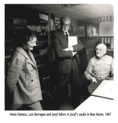 What a perfect concurrence it is for Josef Albers’s Homages
to the Square to be exhibited at the Casa Barragán. Barragán’s
architecture is an impeccably refined, simple, joyous vessel
for human living in all of its complexity: Albers’s squares
are meticulous, pared down, vibrant vessels for the performance
of color; its many surprises and astounding multiplicity Albers
and Barragán loved seeing, revered craftsmanship, and took
immense pleasure in their task of allowing the eyes and soul to
feast in idyllic conditions.
The story of the two men meeting will be told elsewhere. Their encounters were the happy exchanges of soul mates, with
Anni Albers an important player: sharing as she did her husband’s adoration of Mexican culture and Barragán’s splendidly
well-conceived, effective, visually enchanting architecture, his
imaginative deployment of materials, the openness of his forms
and the voice he gave vibrant hues. Naturally Josef and Anni loved having Barragán brought to them, and had that
rare feeling, akin to what they had known with Klee and Kandinsky at the Bauhaus, of having a coreligionist at their side.
READ MORE HERE
Balthus and His Myths Video
 Watch the video Balthus and His Myths
No one bought The Street from the Galerie Pierre. Most of its admirers– young poets, fellow artists, and others on the fringes of Parisian life–could not afford it, while the sort of Parisians who had enough money to purchase such a large painting found it too scandalous.
But even without a purchaser, The Streethad admirers. Antonin Artaud and Pierre Jean Jouve were among the literary figures who soon wrote about its effects on them; Albert Camus eventually followed suit. The Surrealists became so fascinated by the large canvas in the show at the Galerie Pierre that they asked Balthus to let them exhibit it in the Minotaure exhibition held in Paris later that year; they hung it there in the section with work by Picasso, Brancusi, Duchamp, Klee, and Kandinsky.
Then, just over two years after the exhibition closed, The Street was purchased–surprisingly, by an American. James Thrall Soby, just two years older than Balthus, was an adventurous young collector with a taste characterized by Alfred Barr as “bold enough to confront the formidable.” The heir to fortunes made from the machine that returned change on pay telephones and from a tobacco business that sold cigars called “the German lovers,” he had only recently come to discover that what he wanted to do with his life was to acquire, curate, and write about paintings.
Soby had seen The Street in Balthus’s exhibition at the Galerie Pierre in 1934. He had not purchased it then, but neither had he been able to get it out of his mind. For two years, he had “brooded about it almost constantly.” Astonished but relieved to see that it had not been sold by the time he returned to Paris in late 1936, he bought it instantly.
From Balthus The Biography
See the video Balthus and His Myths
September 12, 2013
Balthus eBook
In advance of the Balthus show at the Metropolitan Museum of Art, make sure to read up on the french artist
in Nicholas Fox Weber’s BALTHUS, now available as an ebook for the very first time.


September 4, 2013

August 26, 2013
August 21, 2013
Ruth Asawa and Anni and Josef Albers: Splendid Soulmates
 This exhibition at Christies gave me the occasion to read through the
correspondence between Ruth Asawa and Josef and Anni Albers.
Read More…here
August 20, 2013
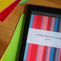
Wired Magazine on The Interaction of Color
 A Masterpiece Book on Color Theory Is Now on the iPad
BY LIZ STINSON
The Interaction of Color iPad app adapts Josef Albers famous 1963 book. Image: Potion Design
 When Josef Albers published Interaction of Color in 1963, it was nothing less than the gateway to an entire way of thinking. First, there was its size: The original edition was massive (about as big as a turntable and as heavy as a 20-pound dumbbell) and it wasn’t really a book. Interaction of Color was more a hands-on kit, with its collection of more than 150 printed silkscreen color studies, a corresponding book of commentary and second book delving into Albers’ famous color philosophy, that were all meant to be sprawled out on a table and interacted with as a way for students to learn about the relationships between colors.
For anyone without a color theory background, it will blow your mind.
Fifty years later the book’s guts still hold up—the theories Albers developed during his time at the Bauhaus continue to be taught at art schools around the world. But the physical version of the book, which has been circulated primarily in paperback for the last four decades, needed an update. Yale University Press has just done that, by releasing a new iPad version of Albers’ famous texts and color studies. Designed by New York City-based Potion Design, the Interaction of Color app is about as close as most of us will get to the original version of Albers’ masterpiece, which today primarily lives in special collections and museums. The app is nearly an exact digital replica of the 1963 version of the book, down to the original Baskerville typeface and layout of the text columns—but with some 21st century upgrades. “We were really thinking, how can we go back to the original intent of Albers’ book, and make something that he would’ve made today,” says Phillip Tiongson, one of the founders of Potion.
The app features more than 125 color plates, 60 interactive studies and two hours of video interviews with designers, artists and architects as well as commentary from Albers himself. The coolest, or at least the most enlightening, of the app’s features are the interactive studies, which simulate the cut paper exercises Albers’ students used to learn theories like how two seemingly different colors are actually exactly the same. “For me it was really important that you felt there was a tactile quality,” Tiongson says. “It’s as if you had seen the original studies the students had made with cut paper.” Users can drag, lift and manipulate the plates’ flaps and pieces to reveal the relationships between colors that are usually invisible to the untrained eye.
“Something very interesting happens between the factual, what we know is there, and how we actually see it,” says Michelle Komie, a senior editor at Yale University Press who has worked on previous print editions of Interaction of Color and oversaw the book-to-app process. For anyone without a color theory background, it will blow your mind to drag a little salmon-colored square next to a darker pink square only to realize it’s the exact same color. “It feels like a trick, right?” says Tiongson of the plates’ ability to alter your perception. “It feels like, are they changing a color on me?”
“That was a revelation to us, that this is how powerful these principles are.”
The Interaction of Color app comes with a palette of more than 250 swatches for users to create their own studies. The idea is that after creating a custom plate, you can export the study and color pairings (with RGB values) and use them in your own design software like Illustrator or Photoshop. Tiongson aimed to make the colors available on the app as close to the cut paper colors used in the 1963 edition, but it was inevitable that there would be some variation in the tint and richness of colors as it switched from print to digital.
“Color is this moving target,” he says, explaining that the colors you see as pixels on your screen are very different than the colors you see in a book of construction paper. Still, he continues, “All of the principals work, even if you have to use slightly different colors. That was a revelation to us, that this is how powerful these principles are—that they work across all media.”