
Robert Atkins's Blog, page 48
August 2, 2012
Snow Job...
Here is another little section of this monster cover. Snow Job is an awesome character, if anyone disagrees....you can bring it up with Gary Godsoe over at the What's on Joe Mind? Podcast. I've only had the chance to draw SnowJob 1 time...in 6 Years 1 time! It's ludicrous! And that was because I got to pick and choose with Joes made the covers for the Special Missions trade collections that IDW published. Those covers were really a "who's who" of the Joes I wanted to draw in the main title but never had a chance to.
I'll be seeing Gary this weekend up in Toronto for the Canadian Joe Con, and I've got a Snow Job convention sketch for him, which technically makes that my 3rd Snow Job drawing. But on this cover, again I got to pick and choose who made the cut. And in my mind, it wouldn't be a proper GI JOE montage cover without Snow Job sniping some Snow Vipers!
Snow Job - GI JOE Cover sneak peek - 389

This is a pretty zoomed in shot. Again, like that last sneak peek, this is only about 3 inches across. I would have loved to have made it a Snow Job solo cover....but only Gary would have been happy about that.
I can't wait to show this whole 3 page spread wrap around cover that will be on the #18 issues of the GI JOE, Cobra and Snake Eyes books in October. Not sure when I'll get to show the whole image, but I don't think I'm giving too much away with these tiny vignettes.
For Questions and Comments email me atRobert@RobertAtkinsArt.com
[image error]


August 1, 2012
Stan "the Man" Lee....
This was a very fun commission to work on. I don't normally like to do any kind of caricature or likeness in my art. I just don't find it enjoyable, but man Stan Lee is such a caricature himself, you just can't miss.
Jason, the guy who commissioned this, is going to meet Stan Lee this weekend at the Chicago Convention and wanted something special for Stan to sign. I left the word balloon blank on the original, so Stan can write in his patented "Excelsior!" and sign it. It was a lot of fun talking with my son about Stan Lee as I was drawing this. He asked who it was, and I said don't you recognize him from the "Marvel Action Hour" cartoons. (Iron man and Fantastic Four cartoons from the 90's had Stan introduce each show in person!)
And my son knew immediately who it was. I said Stan helped create all of these superheroes, and started listing off the classic characters that my son loves. He couldn't believe that one guy had a part in creating all of them, and he said"....man...*sigh* I love that guy"
So there you have it folks, Stan Lee, capturing the hearts of 6 year olds everywhere!
Stan Lee - 388

[image error]
July 31, 2012
GI JOE cover sneak peek...
I've really been busy with covers lately. I've show the process from the Canadian Joe Con cover that I did recently. I have another cover for GI JOE that hasn't been shown yet, so I'll spotlight that when it comes out.
What's really kept me busy is what I'm currently finishing up. For the month of Oct. for issues 18 of GI JOE, Cobra and Snake Eyes and Storm Shadow there will be a 3 part connected cover. It's one ENORMOUS image that's broken up into three parts split between the three titles.
It was the kind of images I've wanted a good excuse to do for a couple of years now. I obviously can't show it off yet, but I can take a tiny section of it. I wanted it to encompass everything that is cool about GI JOE to me. I'll go into much more detail when the cover is shown and announced by IDW. Until then I wanted to at least show a bit of what's kept me up during my recent all-nighters.
GI JOE cover sneak peek - 387

Just to give you some perspective on the scope of this image, the final cover is a total of 33 inches wide by 17 inches tall. This section I'm showing you a bit of is only 6 inches wide by 4 inches tall. Each figure here is only about 2 inches tall at the most.
For Questions and Comments email me at Robert@RobertAtkinsArt.com[image error]
July 29, 2012
Canadian Joe Con Cover part IV...
Alright, so the last step of the cover process. Here are the colors by Simon Gough, my partner in crime and comics.
Canadian Joe Con Comic Cover Colors (alliteration much?) - 386
 At the con, there will be 50 limited edition signed and numbered prints of the cover without the logo!
And here is the final cover with the Awesome Canadian Joe logo across the top!
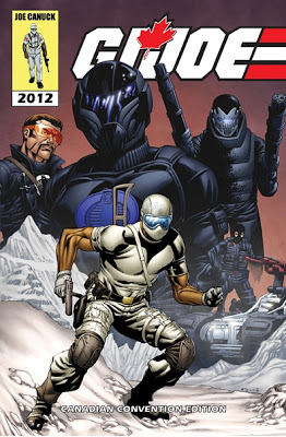
You can also go check out the Joe Canuck website for more info and updates on the con and it's exclusives!!
www.joecanuck.comOr go to their facebook page and "like" them here
https://www.facebook.com/canjoecon
For Questions and Comments email me at Robert@RobertAtkinsArt.com
[image error]
Canadian Joe Con Cover part III....
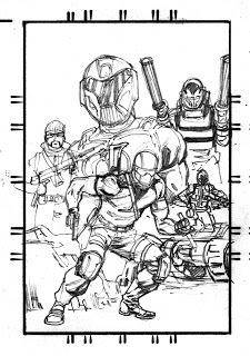
Here we go, this is the last step of the process for me. Like I mentioned in the last post, I do a lot of the fine detail work in the ink stage. I need to try and be even more loose in the pencil stage to save time, but it's something I'm working on. Here I work out these last details, line weights, and textures all throughout.
While I suggested various shadows and light sources in the pencils, it gets nailed down here. I chose to use two different light sources on this piece. You can see the shadows on the main character JOE CANUCK there in front, has all the shadows being cast to the right, where as in the background the shadows are being cast to the left. Just a subtle touch to show they aren't in the same environment. These "move poster" style covers can be difficult that way. Trying to coordinate the figures and their various sizes, but not make someone just look like a giant is tough.
Canadian Joe Con Comic Cover - Inks - 385

This was inked with Copic Mulitliner tech pens for all the weapons, the vehicle and small elements like faces. The rest was inked with a brush and Speedball Black India Ink. Tomorrow I'll post Simon Gough's colors for this cover!
You can also go check out the Joe Canuck website for more info and updates on the con and it's exclusives!!
www.joecanuck.comOr go to their facebook page and "like" them here
https://www.facebook.com/canjoecon
For Questions and Comments email me at Robert@RobertAtkinsArt.com
[image error]
July 28, 2012
Canadian Joe Con Cover part II....
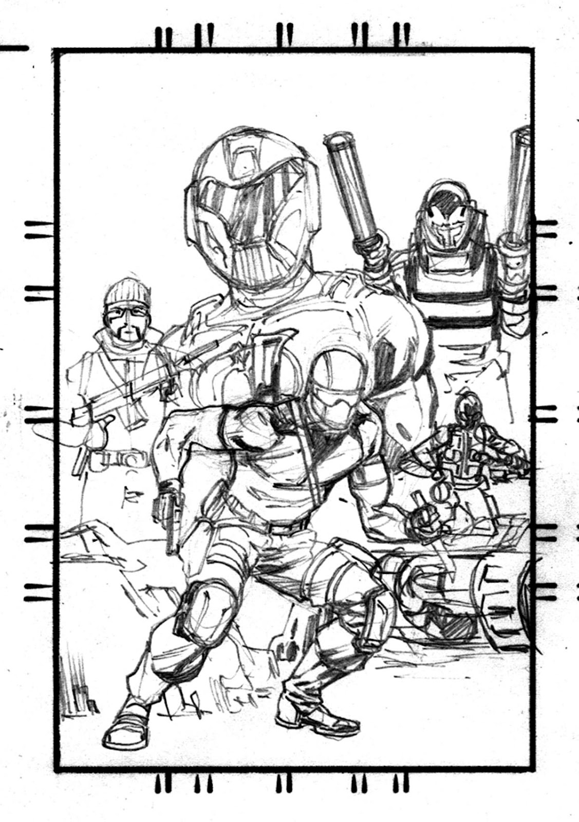
After I had the layout done and Mike approved it I was set to pencil this thing full size. My layouts are done on pre ruled paper and the little hash marks on it help me re draw it full size and keep things fairly accurate for the composition. I almost always make a few changes as I look at it more just to tweek the figures, or composition a bit.
Here was the pencils that I turned in for approval.
Canadian Joe Con - Comic Cover (pencils) - 384

You can see when compared to the layouts, the biggest change was repositioning Retrofit in the upper left.
I felt he was a little too "flat" for the composition and it created a dead space above his head. By twisting his body and raising him up it also helped separate him from the foreground. Pushing him behind Black Ice also gave prominence to the main bad guy.
In this stage, most of my details are gestural. It might look "tightly" penciled, but you can see in areas like Retrofit's knife, The Hate Scout tank details and the mountains, I didn't need to make it exact yet. I leave that for the inking stage to save time.
The pencils are mostly to make sure lighting is established, and the figures are proportional and the uniforms are at least indicated correctly.
The next post I'll show the inking stage and talk more about the process there.
For Questions and Comments email me atRobert@RobertAtkinsArt.com
[image error]
Here was the pencils that I turned in for approval.
Canadian Joe Con - Comic Cover (pencils) - 384

You can see when compared to the layouts, the biggest change was repositioning Retrofit in the upper left.

I felt he was a little too "flat" for the composition and it created a dead space above his head. By twisting his body and raising him up it also helped separate him from the foreground. Pushing him behind Black Ice also gave prominence to the main bad guy.
In this stage, most of my details are gestural. It might look "tightly" penciled, but you can see in areas like Retrofit's knife, The Hate Scout tank details and the mountains, I didn't need to make it exact yet. I leave that for the inking stage to save time.
The pencils are mostly to make sure lighting is established, and the figures are proportional and the uniforms are at least indicated correctly.
The next post I'll show the inking stage and talk more about the process there.
For Questions and Comments email me atRobert@RobertAtkinsArt.com
[image error]
July 27, 2012
Canadian Joe Con!!!
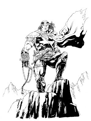
I will be attending this year's Canadian Joe Con Aug. 11th up in Toronto for the first time! Mike Heddle (the show runner/owner) has been gracious enough to have me as a guest and I've been getting really excited as we're leading up to it. For all you old school Joe fans, this isn't anything new, but I've really started getting into the exclusive GI Joe figures that are made specific to the shows. These toys are called "Con Exclusives" for those who aren't familiar. They can either be pre-existing characters, variants of those character, or sometimes even completely new characters designed using pre-existing molds.
I've been really impressed with the previous sets and for the upcoming Joe Con. I was also asked to do the comic cover for the Canadian Joe Con that would spotlight their new figures that appear in the story and will be available at the show.
For this process I always start with reference of the figures. Mike sent me along some pictures and was great in giving me reference on the spot when I needed something specific. He seemed to be available at all hours of the day and night. I'd send him an email, and within minutes I'd have a snap shot from his phone emailed back. This guy is on the ball, and I think he sleeps about as much as I do...
Here are this year's figures.
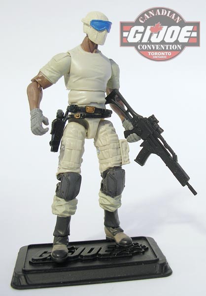
 Joe Canuck: our only good guy this year
 H.A.G.A.R.: Android with death for arms.
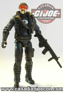 Retrofit: I believe he built HAGAR, he's a weapons specialist
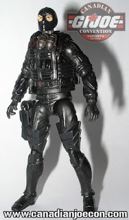 Traction, Hate Scout driver, Explosives specialist
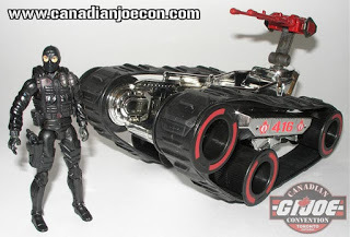 Tractions pimped out Hate Scout tank:
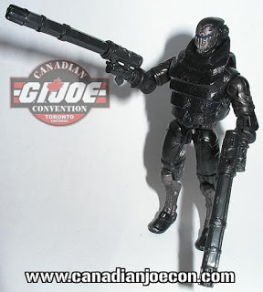
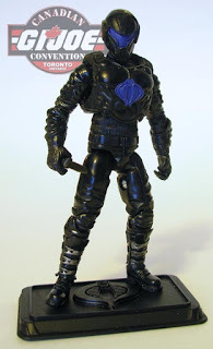 Black Ice: He's one bad dude
So going from there I work up a layout for the comic cover
Canadian Joe Con Cover Layouts - 383
 I'll post the finished cover shortly!
For Comments and Questions email me at Robert@RobertAtkinsArt.com
[image error]
I've been really impressed with the previous sets and for the upcoming Joe Con. I was also asked to do the comic cover for the Canadian Joe Con that would spotlight their new figures that appear in the story and will be available at the show.
For this process I always start with reference of the figures. Mike sent me along some pictures and was great in giving me reference on the spot when I needed something specific. He seemed to be available at all hours of the day and night. I'd send him an email, and within minutes I'd have a snap shot from his phone emailed back. This guy is on the ball, and I think he sleeps about as much as I do...
Here are this year's figures.
 Joe Canuck: our only good guy this year
 H.A.G.A.R.: Android with death for arms.
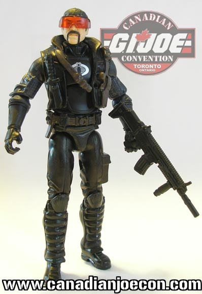 Retrofit: I believe he built HAGAR, he's a weapons specialist
 Traction, Hate Scout driver, Explosives specialist
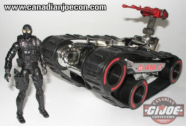 Tractions pimped out Hate Scout tank:
  Black Ice: He's one bad dude
So going from there I work up a layout for the comic cover
Canadian Joe Con Cover Layouts - 383
 I'll post the finished cover shortly!
For Comments and Questions email me at Robert@RobertAtkinsArt.com
[image error]
July 26, 2012
Sypha...Castlevania colors...
This was a very fun sketch to do. I talk about it a lot in my original post of the line art how I focused on the "line" and didn't add any shadows or "spot blacks" as it's called in the comic industry. This was purposeful to make sure it had an ethereal quality and lightness to it.
Here's my original post of the line art where I talk about he sketch more.
http://robertatkinsart.blogspot.com/2011/10/witchy-woman.html
Simon Gough has been doing the colors on all of these Castlevania pieces, and he carried that ethereal quality perfectly over into the colors. I especially love the hair and face, that it has such a softness to it. high-five Simon!
Castlevania Colors - Sypha - 382

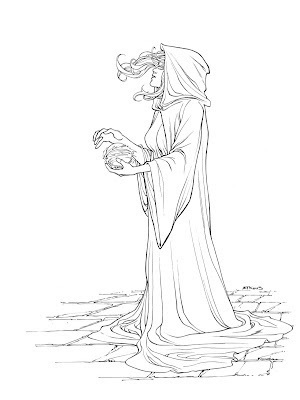
For Comments and Questions email me atRobert@RobertAtkinsArt.com
[image error]
July 25, 2012
Death...More Castlevania colors...
This was a very interesting sketch to do. I didn't do any preliminary designs, I didn't have anything in my head before I started. I simply drew his head in first, the worked out the skeleton so I knew how long his arms would be, then very organically worked out his cloak. To make it look inky and wet on the bottom came out of an accident where I dropped my pen and it left a mark that I thought looked cool. Now that is one of my favorite parts of this sketch.
The skull scythe I think I did take from some kind of reference or influence. I forget now where, but I did add the neck to transform into the handle which I thought was fun. The idea of the floating skulls came from a reference sheet I have of about a dozen skulls from different angles that I use periodically as reference. As I was looking at that sheet I wanted to practice more skulls and thought to add them to the mist. I really liked distorting them which made them look more in agony or something.
I don't typically draw anything this dark, I don't find it particularly fun. But this sketch was a cool exercise in instinctual sketching. Just putting pen to paper and seeing what happens.
Here is my initial sketch post during my first Castlevania week.
http://robertatkinsart.blogspot.com/2011/10/castlevania-weekor-atleast-condensed.html
Of course, once again amazing colors by my partner in crime, Simon Gough.
Castlevania Colors - Death - 381

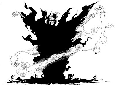
For Questions or Comments email me atRobert@RobertAtkinsArt.com
[image error]
July 24, 2012
Trevor the Barbarian....
Here's the Trevor Belmont sketch colored up. He is the main character in Quinn's Castlevania pitch, and I really enjoyed his take on the character and seeing him go through the "hero's quest" throughout the story. Colors once again done by Simon Gough
Below is the link to my original post with the black and white sketch with more info about the character.
http://robertatkinsart.blogspot.com/2011/10/trevor-belmontthe-manly-version.html
Castlevania Colors - Trevor Belmont - 380

For Questions or Comments email me atRobert@RobertAtkinsArt.com
[image error]
Below is the link to my original post with the black and white sketch with more info about the character.
http://robertatkinsart.blogspot.com/2011/10/trevor-belmontthe-manly-version.html
Castlevania Colors - Trevor Belmont - 380


For Questions or Comments email me atRobert@RobertAtkinsArt.com
[image error]
Robert Atkins's Blog

- Robert Atkins's profile
- 11 followers
Robert Atkins isn't a Goodreads Author
(yet),
but they
do have a blog,
so here are some recent posts imported from
their feed.

