
Leslie Sinclair's Blog, page 20
July 16, 2018
My Favorite Game of “I Spy”!!
Hi Friends!! Remember those I Spy books we looked at when we were young! I still love playing that game in my job. One of my talented artists makes his living making things disappear!!

See it you can find the switch plate in the brick which previously looked like a white beacon, distracting from the beautiful fireplace accent wall that designer Brook McGuyer composed!!

With her new SegretoStone countertops installed I was happy that we were also asked to paint our the light plates on the tile!!–What light plates???

Here is my artistic magician in action. You can see the speaker on the left, but the one to the right and all of those white trims around the canned lighting?? Now you see it, now you don’t! Designer Donna Lewis loved the effect so much Alex was challenged to disguise all the plugs, speakers and vents throughout the home no matter what surface they were on.

He has to blend away light plates on so many different surfaces, mixing paints to match the exact color and grain.

He seems to be up to any challenge-this flat plate even looks dimensional like the raised mosaic stones it is inset into.

In this ceiling and beam combination the large white grills and can lights really stood out, now they go almost unnoticeable!!

Even these vents in the brick go away—if it were not for the slits, these necessary eye sores would be hard to spy!

I know it seems like a small thing but I really want to give tribute to Alex, these tiles and stones are very pricy and as you can see with no special tools he has been able to match any surface.

This wallcovering on the ceiling, was in a home designed by Triangle Interiors and built by Goodchild Builders. Wanting only the artwork to stand out……………..

Alex was challenged to paint all the rims around the lights and the vents to blend. Now you see them…………

Now you don’t!!!

There are two plugs painted over on this hand-painted tile design. Can you find them?

How about here?

Even over a gold leafed glass they are hard to detect.

I hope you loved out little game today! With decorative painting sometimes hiding what you don’t want to see is more important than enhancing what you do. Please all enjoy your week! Think of something to do for someone this week that will make their day!! A smile, a compliment a little bit of encouragement, a thank you–we all need that! xo Leslie
The post My Favorite Game of “I Spy”!! appeared first on Segreto Finishes.


July 9, 2018
From Eclectic to Soft Contemporary & Let’s Name Some Paints!
Hi Friends!! I have seen and met so many of you over the last month just out and about!! It has been so fun for me! I have some wonderful rooms to show you this week, so let’s get started!

I had the pleasure of working with designer Diana Humphrey on her last home. Traditional with an eclectic flair, we applied a stencil to the ceiling to blend with her silk wallcovering. I loved the off-center shell in the middle of her dining table- so unexpected, I did the same thing at my own home.

Notice that instead of bringing the stencil to the molding we inset it into a line detail which added a bit more interest. This technique also works beautifully in bathrooms under the stairs where it is difficult to match up patterns onto a slanted ceiling.

Moving into a high-rise, she decided to stay eclectic but move to the soft contemporary! It was so interesting seeing the home evolve. I will photograph this home when it is completely finished but wanted to show you a few special things now. Her master bedroom was plastered first, and then an accent wall was fashioned behind the bed.

The design is dimensional, and , yes crafted from plaster. I love the subtle architectural effect it created! Soft and contemporary– perfect for this master retreat!!

This was her previous master. Notice how she grouped the art on the mantle. It is not symmetrical but definitely balanced and adds a bit of the unexpected to this traditional space.

She does the same thing in her new space. Instead of hanging all of her art directly on the wall, she installed a ledge and grouped some complementary pieces together. Again not symmetrical, but definitely balanced. Love that!
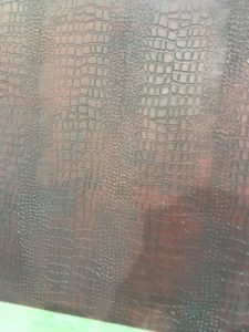
Diana has so many special features in her home. Her bar counters (bottom) were embossed with a crocodile design-super cool! It reminds me of a pattern we are doing in a man’s bath–sample top. I get inspiration from all that I see. Imagination is our only limits!!

This is a wall in her elevator Lobby. We installed a floating bench from SegretoStone under her art piece. Noticed the angled edge! She thinks of every single detail.

The reason I was back it to work on phase two of the project– her elevator door wall . the main issue is that the plate right in the middle of the wall cannon be painted or removed and it is such an eyesore.

Across from the elevator wall is her front door and through that is a marvelous quilt which is framed as art!! In designing this space we had to be very careful not to distract from her existing art collection.

Diana came to me with lots of ideas. The first being this paper installation in a project by Studio Munge . Their website is worth a visit!! Simply stunning, we felt this concept would not interfere with her existing art. The complicated part is that the center panel is small and would this concept work if the middle was sculpture and the design was hand painted on the doors so they could open and close.

Another concept she introduced are painted elements inspired by Artist Sarah Crowner’s pieces.

Because she blocks out colors, it would be easy to come up with a graphic that would have a dark gray where the plaque is on the elevator wall.

Here is another works of hers that we liked. Which concept do you feel would work best in her space, not distract from her existing art, and mask the metal plaque that is an eyesore in the middle of the wall? I look forward to hearing your thoughts!
Exciting news from Segreto!!

Our paints shipped this week!! Yayyyyyyyyyyy!!! Wanting to have an affordable line which fits in everyone’s budget, we have hand formulated 42 signature colors which will give softness and depth and sophistication to your rooms at home!!

Here is 1-10–Pardon my computer drawing-not easy for me as I am best with a real pencil and piece of paper!! You can email your thoughts to Leslie@segretofinishes.com or leave a message in comments. It could be European names, soothing names, themed names etc!! YOur imagination is the limit!! I can’t wait to see what you come up with!!
Till next week! xo Leslie
The post appeared first on Segreto Finishes.
July 2, 2018
Infuse a Bit of Hollywood Glam Into Your Interiors!
Hi Friends! I hope you have had a wonderful week!! The 1920’s and 30’s Hollywood Regency era- always one of my favorite interior styles– is making a huge resurgence in design today. The arrangement focuses on how people enjoy and feel in a space. After all there were no TV’s or devices, but lots of glamour on the big screen , so infusing a room with some sophisticated glitz, and carefully selecting comfortable furnishings, encouraged martini hour and conversations at home!

Kara Childress, known for her European interiors, has exceptionally designed this transitional home with strong influences of the Hollywood Regency Era. Teamed with Newberry Architecture, the walls were coated with slick white plaster, luxurious black and white marble flooring installed, and modern solid marble fireplaces built. This coupled with the eclectic furnishings, high sheen consoles, and infusions of gold, might be found in some of the Hollywood greats’ homes such as Joan Crawford and Carol Lombard.
How do your infuse a bit of Hollywood Glam into your own home?
Decorate with Blacks, Whites and Geometric Patterns!

The homeowners who owned this home, have recently moved to a new one!! Loving the glitz that the silver leaf ceiling added to the space-she wanted to incorporate a bit of this in the entry of her new home! The above home, truly beautiful was featured in my post-Going, Going, Gone!
Before: I don’t have a picture, so……close your eyes and imagine a smaller entry which is a separate room all of its own. It had a dark green grass cloth floral wall covering, stained wooden floors and a white ceiling. Wanting a dramatic, contemporary but light entrance with a bit of Hollywood’s forgone era, we went to work.

By painting the wooden floors with a s high gloss black graphic design, the illusion of inlaid marble was formed.

The ceiling and the banding were then silver leafed, giving height to the space and marrying well with the new Lucite lighting. The walls, painted white, were lightly stenciled over the grass cloth. I loved the texture, and the silver design ties in the ceiling. Can’t wait to see it when their art is hung.

What do your think? Glamorous? Yes! The space feels much larger and whispers “Welcome to our home” when you enter.
Add Metallic Details to Your Cabinetry!

This era is all in the details! By adding metal papers to the bead detail of your cabinetry, both your hardware is enhanced and glitz subtly added at a minimal cost!

Letting your molding detail determine glazing embellishments and color choices. Doors and casements can add that bit of Regency to your interiors as well!

I have a bit of authentic 1920’s in my master bath! The mirrors over my master vanity and hardware on the dressing vanity are both from my favorite bygone era. Although I am not a fussy person, this bit of opulence does make me feel a bit prettier when getting dressed. Isn’t that what the era is all about?
Add a Dash of Chinoiserie to Your Décor!

From old Hollywood and before, though current times, Chinoiserie inspired designs still are a major part of “Glam interiors”. Mix these beautifully painted walls with high sheen moldings and doors!

Remember the Jazz age of the roaring 20’s was happening all at the same time. Soft pastels and timeless neutrals became a backdrop for striking accents of bold, dramatic colors and vibrant metallic accents. By adding gold leaf to this Asian influenced design the pattern becomes lavish!
Use High Sheen Paints and mirrored surfaces!

High drama is definitely all the rage both in the 20’s 30’s and certainly today! Use high sheen paints in unexpected areas and embellish it with brass or leafing!! Although Lacquer definitely provides the Luster, Fine Paints of Europe, creates a similar look with less toxicity and can be applied at a fraction of the price. Just remember in painting any surface with a high sheen to have perfect prep work underneath–any imperfection will show!! We have also been testing a new super sheen paint from Sherwin Williams with great success! Not available in all areas, ask your local store.

This French style cabinet, painted in a high gloss with gold embellishment now leans towards the Regency Era!! Designer Ellie Bale definitely had the vision for this powder. Feel free to experiment. Any furniture style, painted in a high sheen will infuse a bit of Americas most glamorous time into your home. Mix that with a mirrored wall or a zebra rub and Hollywood will come to life.

My friend Nancy from Marcus Design used one of Hollywood greats–Dorothy Draper’s furniture designs in her IKEA hack project. It turned out beautifully. To find out more go here.
Use Luscious Textiles!!!

Hollywood’s best dressed stars in their incredible gowns may have been the inspiration for the lush textiles used for upholstery. Rich velvets were all the rage and mixed with finishes that employ metallic or high sheen, a piece from any era can be reinvented to infuse Hollywood Glam into any interior.
The Hollywood Regency style was brought to life by the design greats of the times. Dorothy Draper was master of commercial interiors while William Haines, the top billing actor of the 20’s and 30’s became king of the residential interior design world. Being the first openly gay male of the time, he was ousted from films at his prime, opened an antique store and began designing homes for all the young starlets. With Hollywood sets in the back of his mind, he mixed different styles, creating interiors which focused on glamorous, comfortable, entertaining spaces. His legacy is still alive today with his furniture designs.
Remember it is all about entertaining so one of the era’s most popular drinks is the Bee Sting, recipe found here! I hope you enjoyed this article and have a glamorous week!! Its time again to nominate your favorite blogs for the Amara Interior blog awards. Ya’ll have been so supportive in the past. Click here to nominate your favorite blogs!
Till next time, xo Leslie


The post Infuse a Bit of Hollywood Glam Into Your Interiors! appeared first on Segreto Finishes.
June 25, 2018
Summer Entertaining and Happy 4th!
Hi Friends!! It’s summer time and perfect for in prompt to dinner or lunch get togethers!! I wanted to share with you a fun dinner I put together for my sweet Mom’s birthday and the hit of the Segreto BBQ-both with great tips that can translate into your summer events!!

I couldn’t get this image from Crate and Barrel out of my head. I loved the mix of galvanized metal and basket liners. I posted last year on my favorite 4th of the July table décor and was able to pick this tableware up after the holiday at a fraction of the price. Although the plates aren’t available today, I did talk about other great alternatives in this post which can still be purchased.

These basket liners come in lots of colors and will work for any theme. Here is a source for the red white and blue! With all the different colors to pull from, I used yellow, my Mom’s favorite color, as the accent!! These flowers came from my shopping favorite-Trader Joes!!! Remember if you get there at 8:00, you have a great selection!! I also picked up these potted plants for the table and send her home with them! I am a pack rat-or a collector I like to say. I found these hand carved wood horses years ago and thought they might come in handy for a craft project one day! Buying lots (they were .5 cents a piece), I was happy to finally use them to make napkin rings and insert into the floral arrangement!!

I am kinda a last minute table setter so I always look around the house to see what I can use the day of the event! My Mom loves family pictures and my cousin Cathy gives us all these thank you notes made with family pictures for Christmas each year. Always a crowd pleaser, and so fun to look at, they were perfect for Mom’s big day! Look how beautiful my Grandmother was at her graduation and how cute Mom was as a baby!!

You can get these printed anywhere-just google photo thank you cards. They were perfect to include on the table and were an awesome way to encourage stories of the past!!

To make it easy I sent hubby John to pick up BBQ. Always look for party packs– they are much less expensive and always feed more than they say! This was from Goode Company BBQ! Thinking sliders would fit perfectly in the galvanized dishware, I picked up some little Hawaiian buns when at Trader Joes.

Fits perfectly and so festive!! I love the cups too, which were really for French fries, I used them as holders for ice tea! This was an easy clean up!! Most things just were thrown away, but the look was much more special than paper plates!!

Here is my Mom and cousin Cathy!! She still gives the most thoughtful gifts! My Mom was a ballerina and still dances. Talented Cathy-a fab artist– painted her a beautiful ballerina for her big Birthday!!

We love to have company events at Segreto-so fun to get the team together away from work. We always have lots of games-volleyball, soccer, corn host throw contests and more, but this time my operations manager Isai had a big surprise for us all!! A water balloon fight! What I didn’t know is how he blew them up so fast!

These are from Walmart! They sell them at Amazon as well! This three pack( $5.99) will blow up 111 balloons in minutes!! Just connect the hose to the packet and turn on. Click on the link below to see our balloon fun!
It definitely was the hit of the event and no more hours of filling and tying off. It’s one of the most amazing things I have ever seen!! We had Fajitas Pete’s deliver and the food was reasonable and delish!
BIG NEWS FROM SEGRETO!


Something years in the making, Segreto is close to introducing its new paint line! All the colors are inspired from our favorite finishes. Priced reasonably, now everyone can have that soothing pallet in their own homes. This is half the pallet.

We had all the colors laid out and our team had the opportunity to name the colors!! I need your help as well! In two weeks I will post all the colors for you to see and help name!! The authors’ of the chosen names will not only forever be a part of our Segreto family’s new venture, but also will receive a gallon of free paint!! So gather your friends with some bubbly and have a paint naming party!

Remember when entertaining, just visiting and being with people you care for is life’s greatest gift. I try not to get so overwhelmed with the planning of these events, that I can’t really enjoy them!! Send me some of your simple tablescapes and food ideas!! We would all love to see! For more 4th of July inspiration go here and here and here. Happy 4th to all!! xo Leslie
The post Summer Entertaining and Happy 4th! appeared first on Segreto Finishes.
June 18, 2018
Tabletops, Tabletops-Segreto Loves Tabletops!
Hi Friends!! I hope everyone had a wonderful Father’s Day!! We were lucky enough to have two of the three with us yesterday for John’s favorite–steak! We have some fun projects to show you this week!!

Daughter Kirby is busy creating her unique Lucite bases with our SegretoStone tops!! This one’s new home is in a breakfast room for one of my favorite clients!! Recently moving, she wanted to mix in some more modern elements with her antique furnishings.

This is a shot of her past home. See those incredible chairs from her dining room? This home in which we collaborated with design firm Creative Tonic was featured in its entirety in Segreto Style. Sweet Melissa, the homeowner, was so happy she had a bound version of her past home as a keepsake!! It is beautiful and the project was a super fun one.

Coincidentally, when the home sold, Designer Meg Lonergan hired our team to create a different backdrop for what she had envisioned. This is the same dining room reinvented right before the new homeowners moved in. I do love the waxed plaster ceiling with those amazing contemporary fixtures!! The ceiling is a mint green. I can’t wait to see the furnishings!!
Now…………let’s see how those French beauties look around a contemporary table.

A totally new perspective and a beautiful combination!!

Beautiful Dining room? Absolutely! We plastered it for these homeowners about 10 years ago. Since, Julie has turned more transitional vs traditional in her style, she felt her dark stained table didn’t work as well with her new furnishings. Sooooooo we were called in to lighten it up.

What a major transformation and I really love how now you can see the grain more. We stripped and bleached this table to bring back the natural wood tone and then applied a milky wash a top to counteract the yellow tones and give it an aged patina!!

A whole new look to this room!!

Here is the before and after! If you do like the before, no worries this can be stripped and re-stained just like it was before.

They are just moving in so the space isn’t fluffed yet, but we were so excited that Elizabeth Garrett Interiors chose our SegretoStone top for her new offices that we couldn’t wait to share!! I just checked out her new website and she has some beautiful work. It’s a treat to take a peak!!!

Elizabeth has been a SegretoStone enthusiast since she specified our product for this 20ft. by 8 ft. seamless island she did for a lux showcase home with Cupic Custom Homes!!

This is a picture we took right after install! Now designer Jennifer Barron can finish the room. A table this size, with a concrete core would weigh about 1400 lbs.! We tried our process over a different substrate which made this table moveable!! We are so excited about it that we are trying many more applications–this week I got a new door in my office– blush pink SegretoStone! The possibilities are endless! What Tables do you have that could use a bit of Segreto magic?

A bit off topic but I wanted to share what my daughter had sent me Sunday from church. This is such a wonderful reminder that we are all Gods creations, and all equal in his eyes. Many immigrants are kind, hardworking, wonderful people who contribute to our society in a positive way. They are children, mothers, fathers, brothers and sisters. I hope we all will remember that each of our families came from different countries with diverse backgrounds and keep kindness, empathy and humanity in our heart when dealing with the issues of today.
I hope each of you have a wonderful wonderful week!! Till next time! xo Leslie
The post Tabletops, Tabletops-Segreto Loves Tabletops! appeared first on Segreto Finishes.
June 11, 2018
Artist Spotlight José-Maria Cundin
Hi Friends! I hope you had a great weekend! Today I am thrilled to feature the amazing Spanish painter and sculptor José-Maria Cundin! His exceptional abstracts, portraits, murals and sculptures are truly inspiring.

When taking photographs for my latest book, SEGRETOvignettes, I was enamored by this beautiful painting in my client’s home, whose designer was Susan Blankenship, and wanted to know more about the artist who created it. I love his bold use of colors that seamlessly blend together in such a natural, soothing way.

photo by Eugenia Uhl
Born in Spain, José-Maria has lived all over the world and came back to New Orleans in 2004 with his lovely wife Marion looking for a large studio space. With no luck, they crossed the lake and in the Northern vastness of terra incognita (St. Tammany Parish), and found a house on an acre and a half of land with room to build his studio and have been there ever since. Marion from Dublin and José-Maria from Spain–how did they meet?
José-Maria and I met in New Orleans just before Mardi Gras. I was visiting my sister who had married a young lawyer from there, and after meeting José-Maria that was it! –says Marion. Three weeks later we moved to the Basque Country in Spain and that was 39 years ago! How time flies! Although born and raised in Dublin, Ireland, Marion says she felt completely at home in Spain and now loves Louisiana. This is a cute family pic of them and their son on a visit.

José-Maria was gracious enough to answer some of my questions about his evolution as an artist, and what inspires him to create such unforgettable pieces and he in turn has inspired me. I hope you enjoy getting to know the remarkable José-Maria Cundin as much as I have!
Leslie Sinclair: When did you discover your passion for painting and what inspired you to be an artist?
José-Maria Cundin: As a young child (9 or 10), I received a prize from the local newspaper for a submission to a drawing contest and that became a constant that endures today. One of my father’s friends was an artist and he took time to nurture in me a love for the arts. As an artist this gentleman never made it but inspired me to carry on. I am probably his best work by proxy. I believe that in every artist there exists a pulsating desire to create, as an homage to The Almighty, but in any case, this subject is pretty mysterious and intimate.

LS: Have you always painted? What other jobs have you had?
JMC: Yes, I have always painted and that has been my only occupation for the past 65 years. At times I have extended this activity imparting classes at The University of Bilbao, at INBA (National Institute of Fine Arts, San Miguel de Allende, Mexico), and NOAFA (New Orleans Academy of Fine Arts). I should mention that in my youth I relapsed and took jobs to relieve precarious situations: I spent one summer together with a companion of the Academy of Art (Bilbao), painting huge advertisements on the sides of the local buses and humongous washing machine on the wall of a building. I also worked as a watch-dog (barking included) on a farm not far from Paris.
LS: Where do you find your inspiration?
JMC: I believe inspiration must find you. You only have to supply the medium.

LS: How long will a custom painting take?
JMC: That all depends on the scope and emotional commitment….it is a matter of time and my experience tells me that a larger size work (50”X 60”) should be finished in three months.
LS: I so admire your use of color – bold yet soothing. This is something that I have struggled with in my own canvas art. Any tips?
JMC: One must consider that a painting offers a narrative consistent in color, lines, rhythms and the conversation between these elements will only be fluid and convincing through their own organization. For example, a color should not contradict its neighbor, a line should be allowed to singularize itself, a rhythm must be allowed its course without antagonism. The rest is luck.

LS: What are your hobbies besides painting?
JMC: If I have any time left to waste after painting, I watch birds, squirrels and little creeping critters.
LS: If you had an entire day to do just what you wanted what would it be?
JMC: Such a day in Utopia would be consumed sitting and daydreaming.
LS: Where is your favorite place to travel?
JMC: I have done plenty of travelling in my life but since the invention of the Internet I travel on this ‘appliance’.

LS: Your frames are beautiful, I know they are custom as well. What inspires the wording?
JMC: The texts are an explanatory part of some of the paintings, However, to accommodate and formally justify their “awkward” presence I go to the extent of handling them as a peripheral part of the composition. Let me add that I always try to fight to end the space of a painting abruptly. I use the frame as a transitory zone to dilute the radicalism of the edge of a canvas. My inclusion of legends on the frames is a nostalgic use of a recurring manner in the Spanish Baroque tradition

LS: How did your childhood in Spain inspire your art?
JMC: I left the Basque Country when I had barely learned to shave. Since then, my beard has grown thick and grey, I forgot how to shave and at times I still feel melancholic about the Old Land. I have several identities, Basque, Spanish, American, Mexican, Colombian…. all perfect and emotionally compatible which represents different circumstances in my life. First and foremost I still recognize the Basque in myself, and this means that I see and face life as a mysterious and ancient existential commitment.
For many years, although living in America, I had the opportunity to participate in cultural events and historical developments affecting the Basque Country and I am proud of that. Also I am aware of and committed to my American reality. I like to believe that my work transcends a limiting nationality. Today, Art is liberated from the constraints of cultural neighborhood boundaries; seeking instead a universal realm for its’ basic human context, and that is wonderful.

LS: You have enjoyed such a long career. What do you see in your future?
JMC: Our future is made today. As I look around the studio at the many tasks in progression, projects that sooner or later will gain definition and completion, I find it difficult, if not impossible, to condense all this effort with a short statement. Nevertheless, all these works (paintings, drawings, constructions, bibelots, etc…) point to a dynamic of continual experimentation and renovation, with constant desire and aim for the best expression. I must confess that I am considering a re-encounter with my earlier work (many paintings, themes, ideas that I never completed are now calling my attention). I’m working to arrive, in a fluid, coherent and meaningful way, to reach that point. We will see!

José-Maria shows at The Callan Contemporary Gallery in New Orleans. You also can pull up his work on his own website here.

José-Maria you are certainly a true inspiration on never giving up on your dreams and a reminder to always do what you love. You definitely inspire me to keep on PAINTING! Thank you José-Maria and Marion for taking the time to share a little of yourselves with us!
Have a wonderful week! Till next Monday!
xo Leslie
The post Artist Spotlight José-Maria Cundin appeared first on Segreto Finishes.
June 4, 2018
Father’s Day – A Favorite Theme Day!!!
Hi Friends!! Father’s Day is coming soon and what better way to celebrate him than to create a day around his favorite interests – a favorite theme day! So what does the special man in your life love to do?

For the man who loves to fish:

My husband is always expanding his hobbies and his newest venture is learning to fish! You can see that all of us except Sammy, my baby girl, still have a lot to learn! I found a wonderful article from Field & Stream Fishing Editor Joe Cermele and Editor-At-Large Kirk Deeter that lists 30 of their top-tested picks that would be great gifts for fishermen of all skill levels and fit any budget!

Here are four things I had my eye on, but you can see the full list and links to the merchandise at Field & Stream.

Mancrates is a super cool website that has all sorts of unique themed gifts for Dads! I thought this smash and grab gift card (I choose Bass Pro shop to go with my theme) would be a fun addition to his day. It’s solid concrete and not easy to smash! I thought that some coaching would be a welcome gift too! I am lucky that Maureen, who works for Segreto, has a son who is a professional fishing guide, so I am signing John up to go out with Captain Carsey Manning. He works out of Galveston and can be reached at 713-824-3715, but there are guides in every area.

Now to grill his catch!! If you are a novice like me, How to Grill Everything literally has a recipe for anything possible to grill- even fish on infused cedar planks!! The book and the planks — a cute gift in itself!! Mancrates has the perfect all-in-one box with everything your fisherman will need for the grill!
For the man who loves his bar:

When doing interiors these days I am finding that the man of the house is not always interested in all design decisions, but when it comes to the bar he likes to weigh in!! This beautifully done tequila bar in a wine cellar by Architectural Consultant Sarah West gives hints of every man’s perfect gift! This home in its entirety will be featured in Southern Home! This is a house tour you do not want to miss!

Uncommon Goods is a great place to shop for unique bar gifts for Dad. From custom family crested wine crates to his favorite liquor infused toothpicks, there is a lot to choose from here. You can even test his knowledge in this trivia beer playing deck!

If he is a red wine drinker, here are some great picks in every price range. “Troublemaker” (maybe a more appropriate name for one of your kids instead of Dad!) retails for $13.99. “Prisoner,” a smooth red, retails for $36. Caymus is an excellent choice, and at $74, it’s a perfect splurge!
For the man who loves to grill:

This has been one of the best gifts I have given for men who love to grill. Perfect for dads, husbands, sons or sons-in-law, it’s not only our favorite seasoning, but it always elicits a big laugh! You can find it on Amazon now, but it originates from Big Cock Ranch here in Texas. “Special Shit” is our family favorite but they all have their own flair!

Mancrates has a grilling package for any type of cooking adventure! I thought this pizza one was kinda cool!!

Cooking together as a family might be the perfect day for the man who loves to be hands-on in the kitchen. This tri -tip recipe is by Marcia Smart, who is a cooking instructor, recipe developer and food writer! Her blog is wonderful and she teaches cooking classes at Central Market, your home and hers. If you are more of a YouTube follower Love to Eat and Travel lists the top mini workshops you can view on line! They collected their Top Five FREE BBQ Grilling Videos at BBQ Grilling (YouTube) Videos, and also recommend Weber Nation Free Video Training who have teamed up with some of the finest BBQ Grilling Experts in the U.S. to create FREE BBQ Grilling Mini-Workshops on the Web.
I hope these tips were helpful!! Please send me any special ideas you come up with! Have a great week!
xo Leslie
The post Father’s Day – A Favorite Theme Day!!! appeared first on Segreto Finishes.
May 28, 2018
A Renovation with a Fresh New Look!
Hi Friends! I found some before photographs of this home which was published in Segreto Style and thought it would be fun to revisit!! When the homeowners found this gorgeous house, originally built in 1937, they loved its close proximity to school and activities for their three children. But to accommodate their family of five, the home needed some updates and changes. They enlisted the help of seasoned designer Sarah Brooks Eilers of Lucas/Eilers Design Associates, architect Marshall Porterfield and builder Jim Bob Taylor with Doyle Construction to transform this abode into a calm, serene living space that counterbalances their hectic lifestyle. Going back and forth on whether to tear down or remodel, the design team and homeowners eventually settled on the latter, crafting this remarkable, timeless home with the authenticity of the past and the modern conveniences of today. I think the extensive remodel over the course of 18 months truly paid off!

The warm, neutral tones give such a welcoming feel as you enter the home! Instantly inviting, this space was furnished with a pair of chairs from Adams Furniture , a wonderful console of antique iron railing and reclaimed limestone from Chateau Domingue and great antique iron leaf fragments turned into lamps that Sarah found at The Gray Door – fantastic!

Here is the living room before!

With over 30 years of design experience, Sarah believes that it’s best to always start with the rug. This new Sultanbad from Matt Camron Rugs sets the tone for the room. The wonderful Fortuny pillows atop the Kravet sofa bring a little hint of something special to the living area and add an elegant pop of color! Sarah incorporated some of the homeowners’ existing furniture while creating a new look – the antique chairs from Joyce Horn Antiques had been purchased for their previous home and the secretary was inherited from their parents. The homeowner was in college when Sarah first met her while working with her parents, so it’s no wonder that she’s able to really understand and translate this homeowner’s personal tastes and style!

The bar is such a successful blend of textures, with grass cloth wallpaper, handmade terra cotta tiles from Country Floors of America LLC , countertops from the Cosmos Collection and glazed cabinets by Segreto!

The before and after’s of the kitchen really show with proper planning how you can really re-create a space!!

The homeowners wanted their kitchen to be a warm and casual environment to enjoy with their young children. The kitchen was created by combining several smaller spaces while still maintaining the integrity of the 1930s house. The remodel transformed it into an open interior with a large archway connecting it to the den. Sarah enhanced the light and airy feel with a 50% formula of BM HC-83 Grant Beige on the walls and SW 7012 Creamy for the trim and ceiling. I adore the two light fixtures from Brown – they complement one another perfectly! This dream kitchen serves as the hub of the house – perfect for cooking, entertaining, homework and family gatherings!

The Calcutta White marble on the counters are also used for the cutting boards by the sink. “With the natural properties of white marble staining and scratching, it’s great to have additional prep surfaces” Sarah said. The lovely custom drapery treatment adds so much personality. Loving the furniture finish look that Segreto had handcrafted in their previous kitchen, the homeowners wanted me to come up with a cabinet finish to blend with these new selections.

This shot of the butler’s pantry really shows the cabinet finish we did! This glaze technique brings in an antiqued character to the new cabinets and defines the lines of the doors so that the cabinetry becomes an extension of the living area! Sarah heightened interest by changing the pattern of the tiles from that of the kitchen, differentiating the two rooms.

The breakfast area is so charming! I love the chairs from Pearson Furniture Company that lend a bit of that French Country feel. This one-of-a-kind zinc top table with a white-washed trestle base from Vieux Interiors is fab! Lucas/Eilers always does such a beautiful job incorporating classic forms into their imaginative and forward-thinking designs.

The den with its relaxed, casual style is absolutely beautiful. I love the patina on these amazing antique doors from Chateau Domingue – a brilliant way to hide the TV! The homeowner found these beautiful pillows at Boxwood Interiors – they perfectly draw out the tones from the Oushak rug from Carol Piper Rugs. Sarah’s favorite thing in the room is the coffee table she found at Brendan Bass, a Dallas antique store… I have to agree! I’ve always been impressed by the way Lucas/Eilers creates dynamic spaces that revolve around their clients’ lifestyles.

This room was photographed at two different times! Can you spy the differences? I can just imagine curling up and reading a book or watching a movie with the fam!

These built-ins were constructed during the remodel and glazed like the kitchen. They’re beautifully accessorized with old books and antique white pottery from Barrevald International! The drapes are operable Roman shades in a Lee Jofa fabric with a Duralee flat tape trim. Wonderful!!

This powder room mixes old world with a bit of shimmer!! Stenciling with a thinned layer of metallic paint over plaster gave the walls a worn look that’s subtly glamorous. The French Louis Philippe silver gilt mirror and pair of Italian sconces both from Joyce Horn Antiques are a perfect balance to the Lagos Azul limestone counters and sink from Hollywood Builders Hardware – just lovely!

The upstairs landing provides a perfect place for a reading nook! Thinking out of the box for the cabinetry, the glass front doors were finished differently than their perimeters. It makes such and interesting display for all of their kids trophy’s!!

The upstairs master was also a big transformation!

Changing the position of the windows, the bed was able to be places on the opposite side of the room, creating such a lovely focal point when you walk in, and a more functional sitting area. Segreto’s artist Debbie Mosley painted the wonderful landscape for the room!
This home was completed 6 years ago and still remains current today!! Thank you, Sarah, Jim Bob and the sweet homeowners for letting me showcase this incredible renovation… I always have such a fun time working with you and the rest of the Lucas/Eilers team! Till next week! xo, Leslie
The post A Renovation with a Fresh New Look! appeared first on Segreto Finishes.
May 21, 2018
A Dining Room with the Wow Factor!!!
Hi Friends! I hope you had a wonderful week!! As you might be able to tell from the magazines which we all read, the use of hand-blocked papers for walls and ceilings seems to be a growing trend. You know the beautiful ones with birds and trees that we all adore including me!! Two of my favorites are Gracie and de Gournay. Although they are artistry at its best, they are also very expensive and hand painting in most cases is much more affordable. All of these well done papers have served as great inspiration for me in creating original wall murals! Today we will see the “wow “hand-painting these designs made in Designer Chandler Sulton’s dining room!

This is Chandler and cute daughter Emory–a designer in training. With lots to tackle, Chandler decided to begin in the dining room because you could see it from almost every room in the house. She wanted a “wow”–spectacular, formal, sophisticated, but in a way that she would never tire of. The home has an open floor plan and currently is painted the same neutral gold tone throughout!!

Here is the “before” photo of the dining room. The formal living room is to the left and there is a hallway in front of the room that leads to the more casual den and kitchen area. Her decorating style is traditional but she loves color and contemporary art and accessories, giving her designs somewhat of an eclectic feel. Eventually, she wants to paint all the walls in her home, but for now, her focus is the front area of the house. The new colors had to flow with what was already there. For the entrance and living room, SW 6170 Techno gray was painted, and the dining room received a coat of SW 6200 Link Gray. Chandler had found some Gracie Wallpaper that she fell in love with but after crunching the numbers decided to call me to see if we could achieve the feel for much less money.

Gracie papers come in panels which are 30″wide. 22 panels would be needed which would be $28,000 dollars not including installation!! These panels are all hand done and do have the look of silver leaf squares behind them. They are absolutely beautiful, but were not in her budget. We decided to hand paint a simpler version using a solid paint color for the background rather than the silver leaf squares, a much less expensive application. Segreto’s muralist Allan is painting away to create Chandler’s dream room!!!

The outcome was stunning–warm and dramatic without competing with the art and furniture in surrounding rooms!!

The ceiling color was left the same that was originally painted throughout the house. This ties together the old with the new and creates a flow. Eventually she wants to change the chairs to a persimmon-colored linen velvet.

“We love to entertain and host our friends and family. At our dinner party Saturday night, one of the guests said she never wanted to leave my dining room-she’d like to just live there!” Chandler exclaims, “Leslie, I never thought I’d say it, but you’re a bargain!!!!”

I wanted to share these oh-so-simple appetizers with you that my sister-in-law made when we were recently visiting. Creating the spread which was so delish in 10 minutes, I said “You must share!!” Just mixing these two items together from Trader Joes made such a tasty dip!!

She added in dishes, olives, a cheese platter and these dried apricots and truffle Almonds!!

I am going to start keeping these things on hand! Heather is always the hostess with the mostest and I think loves Trader Joe’s as much as I do!! I hope you all have a wonderful week! Till next time!! xo Leslie
The post A Dining Room with the Wow Factor!!! appeared first on Segreto Finishes.
May 14, 2018
Why Do We Love Gray?
Hi Friends!! I hope everyone had a Happy Mother’s Day!! People always ask me is gray here to stay-no one really knows but there are some pretty cool attributes about gray that may make it more lasting than other neutral trends. I love all the gray rooms and accessories that are in home design today. But, at first glance when looking at the meaning of gray, it’s a little perplexing why the color is so popular and how it manages to work with so many different design styles.

As a true neutral, gray communicates a void of movement, emotions, warmth or any identifying characteristics. Yikes!! But, somehow, I have also incorporated gray into my own home! My media room plastered in a color similar to SW Repose Gray, feels calm, soothing and elegant to me. Why is this?

It’s this very lack of emotions that makes gray so calming! Because gray isn’t expressing much of anything, the color remains simply restful, quiet, and tranquil. It allows vibrant colors to pop while also cooling their intensity. Oh I get it!! Look how the colors in this art piece pop in a gray white plastered dining room designed by Sarah West!

Every color seems to perfectly complement some shade of gray – just take a look in this inviting room designed by Ellie Bale. All of her accent colors combine beautifully with a warm gray backdrop!

Dark, charcoal gray imparts the strength and mystery of black without its negative connotations. It’s a smart choice for this bar considering how this part of the home appeals to both men and women!

Grays look great with both silver and ……………………………..

………….Golds!!! One of my favorite new finishing trends is adding gold or silver leaf detail to blend with the hardware choice. Super affordable it adds that bit of glam to any cabinet.

While gray goes wonderfully with most colors, picking the right gray to complement your accents can be tricky. Boxwood Interiors had a great eye working with us in creating the plaster in that perfect shade of gray!

I place grays in two main categories! Warm grays like the plastered powder above by Designer Trisha McGaw have a bit more green in their undertones.

Cool grays like the cabinet we finished for Ken Kehoe & Co. have more blue in them. This powder shows a cool gray door-(green undertones) with a cooler cabinet (blue undertones). I love the way both finishes turned out–the door was accidentally painted white, and we added the graining with paint to infer it was of old stained wood!
So… put some gray in your home if you want:
• to create an environment where compromise is encouraged
• a neutral, non-invasive feeling
• to reduce the intensity of another color, while still including it
• to create an isolated getaway
Jerry Garcia says it well- “Every Silver lining has a touch of gray.”
Have a great week! xo Leslie
The post Why Do We Love Gray? appeared first on Segreto Finishes.


