
Erica Jurus's Blog, page 8
June 4, 2024
How do I write thee, let me count the ways
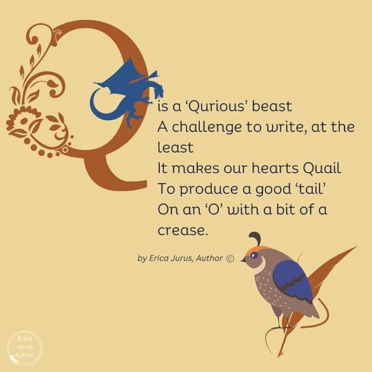
If I was producing an alphabet book, and in a rather silly, Edward Lear kind of mood, I might put this in about the strange letter Q:
Where did the alphabet come from, anyway? An alphabet is a set of letters used in a specific order to produce words, which can then be strung together to make sentences, then paragraphs, then entire books, or blogs 
Before the alphabet was invented, records were made in a form that could be produced and read consistently, i.e. in the form of pictures, known as hieroglyphics. They’re believed to have originated around 3100 BCE in Mesopotamia as a way to document business transactions when communities grew large enough to make such things necessary.
However, as archeologists discovered thousands of years later, hieroglyphics weren’t easy to read. There were thousands of images used to represent words, and selected people trained intensively to become scribes to be able to write and decipher them.
 The Seated Scribe, 4th Dynasty Egypt; Source: By Rama, CC BY-SA 3.0 fr, https://commons.wikimedia.org/w/index.php?curid=73338717
It’s believed that sometime between 1900 and 1700 BCE an alphabet system was developed that brought reading and writing to more people, and simplified record-keeping considerably. Why or by who isn’t currently known, but at some point someone conceived of the idea of creating symbols to denote consonants, instead of pictures. These consonants could then more easily be strung together to make words.
The consonant symbol represents a massive leap in writing, even though it may seem simple/obvious today.
Curiously, early written forms of languages, including Egyptian and Phoenician, didn’t use anything to represent vowels. When modern Egyptologists translate hieroglyphs, they’re guessing at how the resulting words actually sounded, as there are no vowels included to help out. Think of our word for “banana” – in Egyptian style, it would have been inscribed as ‘bnn’, and we’d have no idea what sounds came between the consonants. What if the Egyptians pronounced it like ‘binini’, or just ‘binin’?
Symbols representing vowels were only added around the 8th century BCE, 1000 years later, when the alphabet made its way to ancient Greece. Scholars feel that this began the development of the first “true” alphabet, because the addition of vowels removed the uncertainty of how words were spoken.
The Greek alphabet gave rise to a number of other alphabets, including Latin, which was the basis of the English alphabet we use today.
Development of alphabets allowed histories to be written and tales – oral traditions handed down for generations – to be recorded for posterity. All of the wonderful legends in cultures around the world are available to us today because of the alphabet, and the development of methods to transcribe them onto different media, beginning with clay tablets long, long ago.
Writing as we know it allowed people to create new stories, built on old legends, stories about the world around us and all the amazing phenomena in it, how people interacted with each other, strange mysteries, and then speculation about things that didn’t exist in nature (Mary Shelley’s Frankenstein was an expression of developing technology and how it could be misused if someone had a mind and a way to do it).

All books and stories used to be handwritten, for centuries – actually millennia – before our modern computer era. Some authors still prefer to write instead of type into a computer. Personally I love using computer software (I use MS Word, myself) because I can see exactly how my words look on a ‘printed’ page, and easily make revisions until they read just the way I want them to. But I’m of an era that learned how to write with a beautiful script, and I appreciate the use of different fonts and typefaces when I create graphics for my book covers, blogs and even Facebook posts.
The art of lettering is just that, an artform that’s been practised and perfected ever since writing was first invented.
When I was in elementary school, early on we began to be taught how to write cursive script. We had to use pencils (yes, totally dating myself, but I have lots of contemporaries who’ll know exactly what I’m talking about), and it wasn’t until we could prove ourselves proficient in handwriting that we could reach the Holy Grail of elementary school: being allowed to use a pen! I was the first person in my class to achieve pen usage. I was very proud
To this day, when I have to handwrite something, like my signature, people tell me how much they like my writing. If I want to write something formally, it comes out fundamentally as we were taught decades ago, which some might say isn’t very imaginative, but I don’t mind the compliments.
For jotting down something quickly, though, I do what most people do: print-write, often using short forms that I developed in university trying to jot down lecture notes as fast as possible. (I’m sure I sound like a dinosaur to any Gen Z or even Millennials who might be reading this). I never liked the letter “Q”, though; in formal cursive script it’s easy, but in print-writing it just doesn’t flow.
Writing and lettering have gone through many transformations over the centuries. It’s a matter of irony, and some bemusement, that Ontario elementary schools are reintroducing cursive handwriting in the curriculum. Hubby and I don’t have kids, so we never knew that they’d taken it out. Apparently teaching it became optional in 2006, I’m not sure why. From what I’ve been reading, it does take a fairly complex set of motor skills to be able to learn, but according to the research done so far, just doing the hand writing helps students think more about the words they’re writing down and improves their overall literacy. It’s felt that it’s a critical life skill while still in school and then when moving out into society afterward.
I don’t think beautiful penmanship is the ultimate outcome, and it’s not an easy end-result to achieve. I actually know far more people who don’t have ‘pretty’ writing/signatures than those who do. When I worked as a pharmacy assistant, prescriptions were all handwritten, and trying to decipher what a physician had written was a skill in itself. (Doctors all used short forms specific to the industry, but if we had any doubts about what was on the prescription, we called the doctor for clarification.) In this case, having prescriptions entered into a computer and faxed electronically is probably a far better idea
Interestingly, print-writing requires more working memory than cursive writing, but it seems to be the easier option for a lot of people, and it actually became a method of teaching writing that was developed in the late 1960s, called the D’Nealian Method.
Donald Neal Thurber created a form of print-writing, with a more flowing cursive version, in Michigan because he thought it was easier for students to pick up. But the bulk of it was still based on the method that was most popular through the bulk of the 20th century, the Palmer Method – the one that I and my schoolmates were taught, as best as I can tell based on the shape of the letters. It was a method developed in the US, and I can’t find confirmation of its use here in Canada.
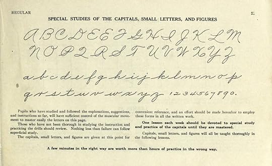 Alphabet and numerals from The Palmer Method of Business Writing; Source: Alphabet and numerals from The Palmer Method of Business Writing; Source: By A. N. Palmer – The Palmer Method of Business Writing https://archive.org/stream/palmermethodofbu00palmrich#page/n3/mode/2up, Public Domain, https://commons.wikimedia.org/w/index.php?curid=38006706
My writing is very much like this, although a few of my capitals are different, subject to other influences as I grew up. The Palmer “P” and “R”, for example, have too many strokes for my taste – but my “Q” is almost identical.
Thank goodness we weren’t subjected to learning the earlier style of handwriting, the Spencerian Script, in use from approximately 1850 to 1925.
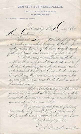 Example of Spencerian script from 1884 from the president of Gem City Business College of Quincy, Illinois; Source: By D.L. Musselman – http://www.iampeth.com/lessons.php#spencerian, Public Domain, https://commons.wikimedia.org/w/index.php?curid=7199905
Named for Platt Rogers Spencer, it was created to be legible for use in business correspondence but still elegant for personal letter-writing, all using a quill pen. Spencer was inspired by the forms of smooth pebbles in a stream and tried to create a graceful script resembling the shapes. I’ll admit to the gracefulness and flow, but for us today it’s not an easy read. However, it was a somewhat less flowery version of Copperplate, a script that was widespread throughout the 17th and 18th centuries, and is still heavily used in classical Western calligraphy.
In Spencerian Script, letters were written in a series of strokes without moving the pen away from the paper, even the complicated capitals. It was meant to be rhythmic and comfortable.
 Ford logo from 1911, predating the simplifications of 1927; Source: By Unknown author – http://www.fordfreundesuedharz.de/wissenswertes/fordlogo1910_1927.jpg, Public Domain, https://commons.wikimedia.org/w/index.php?curid=32885814
Here’s something you probably never thought about: Spencerian is written with a slant of 52 degrees, which was also used in Palmer script. (The ‘slant’ is measured counterclockwise from the baseline.)
That’s the way most of us were taught to write, but not everyone does. Some people don’t write with a slant at all – their letters are upright, and in Graphology, that denotes self-confidence and objectivity.
A backward slant is thought to be characteristic of left-handed writers, but apparently that’s not always the case. It may indicate someone exhibiting ”emotional withdrawal and a degree of introspection and self-interest”.
Forward-slanted writing, aside from the obvious influence of school-taught styles, is said to show “emotional responsiveness and expressiveness”.
Extreme slants supposedly represent extreme personalities in either direction, but professional graphologists are required to measure the slants of at least 100 pieces of lettering, and there are other factors about someone’s handwriting that they also consider.
A graphologist who was doing a session at an event I attended many years ago saw my handwriting on a note I’d provided to the person who introduced her (I was one of the organizers) and said it was “extremely interesting”, but never explained what she meant; I continue to live in analysis limbo, sadly.
But learning to write, or even print, is preceded by learning our alphabet, and teaching alphabets to children has a long history of its own.
Alphabet books have been around since Shakespeare’s time. They were called ‘syllabaries’, because they also included a list of syllables, as well as pronunciation of vowels and combinations of vowels and consonants. Eventually these books progressed to words and easy sentences, often in cute rhymes.
Early alphabet books were called ‘hornbooks’ because they consisted of a piece of parchment or paper pasted on a wooden board, with the paper protected by a transparent sheet of animal horn.
The next style of alphabet book was the ‘battledore’, which came from the small, racket-like instrument used for playing badminton. Similar wooden or cardboard tablets were developed to be used for the teaching books. However, in these books, entertainment was provided by the addition of illustrations – a brilliant idea, because we all learn much better when we’re having fun at it.
Along with that came the use of word associations, like A is for Apple. ‘Apple’ was a great word for illustrative purposes: the fruit’s widespread familiarity in North America going back to colonial days, its distinctive shape and colour(s), that apples could be made into apple pie (another meaningful word association), and that they had many cultural connotations, such as the ‘forbidden fruit’ in the Bible or the fruit that caused the Trojan War, allowing the inclusion of a little theology or mythology.
[Eris, the Greek goddess of Discord and something of a troublemaker, was unhappy about being excluded from a banquet on Mount Olympus to celebrate the wedding of Peleus and Thetis. She tossed in a golden apple that was provocatively inscribed with the words “For the most beautiful one”. Three of the goddesses in attendance claimed the apple: Aphrodite, Athena, and the chronically jealous Hera. Zeus, the host, wisely avoided an enormous trap and decided that the Greek hero Paris, of Troy, would be given the rather thankless task of choosing who the apple should go to. All three goddesses offered him bribes, but Aphrodite had the best one: the woman considered the most beautiful in the world, Helen of Sparta. Paris accepted the bribe and awarded the apple to Aphrodite. However, Aphrodite hadn’t bothered to mention that Helen was already married to the King of Sparta, and Paris had to steal Helen from him (although he was handsome and she may have left willingly). The rest, as they say, was history.]
The development of the alphabet lent itself to imaginative and often elaborate artistic depictions of the different letters. In the Middle Ages, scribe monks took this to the nth degree to create spectacular illuminated manuscripts for wealthy patrons. There were even pattern books for those scribes to help them in their task.
Illustrators of the slightly more humble alphabet books for children didn’t neglect the opportunity to engage their readers with whimsy. It wasn’t always an easy task, though: some letters were a bit of a stumper to connect to a good illustratable word. The letter ‘X’, for example, before the fortuitous invention of X-rays, was relegated to an ancient Persian king of dubious repute because his name happened to start with it.
That may seem like an odd choice for a children’s book, but Xerxes was also known as Ahasuerus, the king made ultra-famous in the biblical story of Esther, so not as much of a stretch as at first glance.
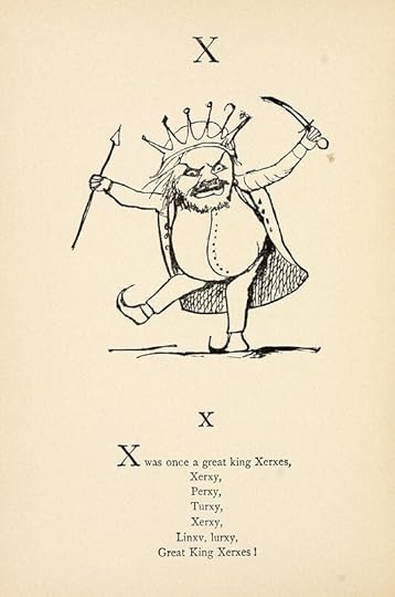 Edward Lear illustration for the letter X; Source: Nonsense Books (1888) by Edward Lear — Source. https://archive.org/details/nonsensebooks00lear2, in public domain
 The letter ‘Q’, my personal bête noire, was, I will admit, beautifully drawn and lavishly decorated in a series of prints in the 17th century titled Libellus Novus Elementorum Latinorum. I’ve always found the capital (uppercase) version of the letter Q to be very awkward when hand-writing it – it’s impossible to make it look nice. So this typographic version intrigues me with its delightful embellishments that solve the problem, and most specifically the fantastic sea beast that forms the weird tail.
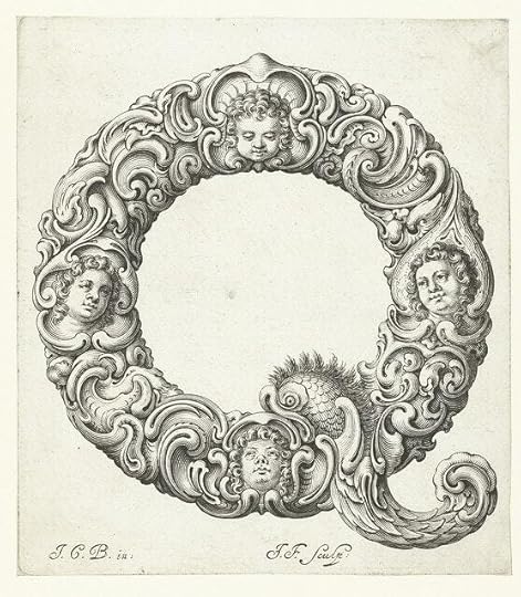 The letter Q from a series of 17th c prints titled Libellus Novus Elementorum Latinorum; Source: https://www.rijksmuseum.nl/nl/zoeken?v=&s=&q=Libellus+Novus+Elementorum+Latinorum, public domain
And just where did that tail come from, you may wonder? (Or not, but I have.)
It comes from ancient alphabets, as illustrated on Wikipedia:
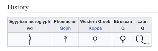
Q has been around a long time. It’s the 17th letter in the Latin alphabet, and thus in our modern alphabet, but its origins go much farther back. Its shape is speculated to have come from a knot, the eye of a needle, or a monkey with its tail hanging down. I wonder what prompted some ancient scribe to choose such an odd depiction – perhaps sitting one day with a clay tablet and a stylus and looking around for inspiration, eyes lighting upon a knotted rope, or a frisky pet monkey. We’ll likely never know, but it’s fun to imagine.
The tail of the ‘Q’ may either bisect its “bowl”, meet the bowl, or lie completely outside the bowl, depending on the typeface, which is a relatively modern invention that went hand in hand with the development of printing presses. Typefaces are more commonly called Fonts with the advent of computerized ‘type’. But that’s mostly a whole other blog post I’ll just mention that most books are set and printed, either in hard copy or electronic copy, in either Times New Roman or Garamond fonts – just an industry standard. However, cove designers go to great lengths to choose a font that evokes the genre of the book.
Sci-fi fonts tend to be very blocky and futuristic looking, like these:

…whereas Fantasy fonts are more flowery or medieval-looking, such as these:

The font I used for my book cover is called Inlander Texture. I chose it because my novels include elements of both urban fantasy and science fiction, and I felt that this font has some of the blockiness of sci-fi, with elaborations on the letters that aren’t quite serifs but have a slightly medieval look. The roughness of the interiors of the letters evokes a bit of mystery.

Your collection of books, whether fiction or non-fiction, have covers that were very carefully designed to grab your interest as well as give you a feeling for what type of book they are. The annals of lettering and alphabets go far back in history, and no longer just provide information, but entertain/provoke/calm/romanticize/thrill or any other emotions that prompt readers, like you, to look more closely. Check your own books out for fun!
The post How do I write thee, let me count the ways first appeared on Erica Jurus, author.


May 28, 2024
Better travellers, better planet(s)
 Tourists ‘vamping’ with the somber marker at the Trinity bomb test site in New Mexico – photo by E. Jurus, all rights reserved
I’ve always loved reading books that featured travel to exotic places. It was Agatha Christie’s murder mystery Death on the Nile, or more specifically the magnificently-filmed movie version in 1978, that cemented my desire to actually go to a country I’d been dreaming about since I was a child.
Adding those elements to my novels – urban fantasy grounded in our real world – was a natural extension of that, bringing the adventure to my own readers.
My hubby and I have been fortunate to be able to visit six continents and twenty-four countries, and I’m proud to say that we’ve never once disgraced ourselves or Canada. But we’ve seen bad travellers throughout our journeys.
When my hubby and I travelled to Egypt for our 10th anniversary, locally we were like rock stars (yes, Billy Idol, I hear you ). Not many people from the area we live in travelled abroad back then, and a trip to Egypt was practically unheard of – suddenly we were the modern version of Indiana and Marian.
We’d booked a tour through a company that no longer exists, unfortunately. It was called Transglobal, and had been recommended by acquaintances who were very widely travelled and had used it themselves to go to the same destination.
I found a 15-day excursion that we liked, and in the preparation, we read the travel info guide the company sent us from cover to cover and back.
One of the things covered in the booklet was etiquette in visiting a predominantly Muslim country – valuable information because we wanted to have a good time but also be respectful. We were careful to keep our shoulders and knees covered, and I made sure that my buttoned shirts weren’t undone very far. On one of the days I’d neglected to do enough buttons up, and I got a lot of attention – not exactly hostile, but less than happy.
While out and about on our second day in Cairo, our tour guide took us to a great restaurant downtown with assortments of kebabs and mezze for lunch – massive skillets sizzling with food and sending great billows of smoke toward the ceiling. We watched with our mouths open as another group came in shortly after and sat down, with one young female dressed in a black lace cropped top and mini-skirt. We wondered, did she realize what country she was in (or even what planet she was on)?
At the Citadel in Cairo, a historic fortification built by Saladin and containing his tomb, we all had to either take off our shoes, which are considered unclean in several cultures, or ‘rent’ little striped cloth shoe covers (what we did). Inside the beautiful main chamber, there were a number of men on carpets quietly conducting their afternoon prayers along the walls, and we were appalled to see some tourists running right up to them and snapping their photos as if they were Disney exhibits.
For a long time, there weren’t a lot of bad tourists because there weren’t so many tourists in general, but in the 21st century a lot more people have begun travelling around the world, and treating both local and foreign destinations like their own personal theme park.
I saw an article last year on National Geographic, Nudity, sex, and disrespect: Bali looks to rein in bad tourist behavior. I read it, but didn’t need to. Even back in 1994 when my hubby and I were there, we saw some of it – mostly nudity on the wide beach in Denpasar, which, if the perpetrators had read anything about their destination before hand, is considered really disrespectful by the Balinese people.
Last December, a gondola in Venice capsized when a group of travellers refused their gondolier’s instructions to stop taking photos and sit down.
Here in Ontario in 2018, inconsiderate tourists trampled an entire sunflower field so badly trying to get the perfect selfie that the police made the owners shut the event down for safety reasons, then verbally abused the owners. It made the news in other countries.
Sunflower farm bans visitors after being inundated with selfie-seekers
Recently, when we visited the Trinity Bomb site in New Mexico just a few months before the Oppenheimer movie came out, some people were posing with the black obelisk that marks the locus of the blast laughing and smiling as if they were posing with Mickey Mouse. It was bizarre. They weren’t hurting anyone, but they seem to have missed the point of both the import of the development of such a terrible weapon as well as the protestors at the head of the road leading into the site campaigning for the rights of the many local residents who’d become ill because of the bomb test (something that wasn’t mentioned in the movie either).
An article this month on the BBC site, The world’s revolt against ‘bad tourists’, describes how quite a few destinations are putting their foot down. I recall reading another article in 2019 about how Ayers Rock, more correctly called Uluru, was being completely shut down to tourists because it’s sacred to the local Anangu people – and yet one woman who was interviewed said that she was aware of the restriction and why, but was going to do it anyway ‘because she wanted to’. How selfish!
When we were in New Orleans, we visited Bourbon Street, of course. Its roaming denizens are entirely tourists – the locals just work there, then go to other parts of the city when they want to let their hair down. We saw some very strange street performers, watched the spectacle for a short while, and had a fabulous meal at one of the restaurants. But a lot of people were simply flat-out drunk. While we were waiting for our evening ghost tour to begin, we watched one gentleman come lurching down the street, leaning entirely on his wife because he was so plastered he couldn’t walk on his own. He had a glass of wine in one hand and dropped it, shattering the pieces all over the sidewalk, while the locals looked at him in frank disgust.
Now, in the interest of fairness, a lot of destinations, like Fort Lauderdale, heavily marketed to attract tourist traffic over the decades, and are now paying the price as thousands of drunken partyers create havoc, so they have their share of culpability.
Our world is a wonderful place to travel around, to enjoy other cultures, other landscapes, but in order for everyone to have a good experience, we have to be respectful guests! I want to ask some of these transgressors if they would go to a friend’s house and trash it in such a way? (Sadly, some of them might.)
Last fall we visited a farm in eastern Ontario for a festival. The farm includes a large field of sunflowers, with trails among them to walk around, and I was very pleasantly surprised to see visitors keeping to the paths and enjoying the beautiful bright heads on a gorgeous autumn day – not a single stalk was trampled in a selfie frenzy. That’s what happens when people behave themselves: everyone gets to enjoy a place, and so do succeeding groups of visitors.
 Glorious, undamaged sunflowers in autumn, photo by E. Jurus, all rights reserved
My hubby and I have never been treated badly through any of our travels – in fact, some the best parts have been our interactions with the people who live in the places we’ve gone to. We’ve sat on the banks of the Nile river to share campfire songs with our guide and a local farmer, had an entire group of schoolgirls practice their English with us at a temple in Bangkok, gotten hugged by a school principal in Botswana, had a hotel concierge entertain us in Alabama with his description of “Southern” road directions, had a British barkeep explain how to tell if other barkeeps aren’t doing a correct ‘pour’ of beer.
These are the things that great travel is made of. If you can come home from a trip with those kinds of memories, not of pissing off the locals and damaging the place you’ve been to, then you’ve done it right.
The post Better travellers, better planet(s) first appeared on Erica Jurus, author.
May 21, 2024
Master storyteller Roger Corman passes away
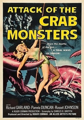 Attack of the Crab Monsters (1957) poster
By Allied Artists – https://gallery4collectors.com/products/attack-of-the-crab-monsters-movie-poster, Fair use, https://en.wikipedia.org/w/index.php?curid=73125336
I want Dr. Scarabus’ house for a Halloween party. If you’re a fan of Roger Corman’s The Raven (1963), you’ll know exactly what I mean – massive front door that creaks ominously, floor-sized black candelabra with red candles (that apparently never drip down to make a mess), plenty of watchful gargoyles (we actually have several of those), a huge fire pit in the foyer with towering flames surrounded by big toothy gargoyles to warm up a dark and creepy night.
The ability to create a great, crashing storm for atmosphere would be lovely too.
A great master of the B-movie genre passed away last week, and we’ve lost the creative mind behind that made so many films for fans for decades.
Corman was called “the king of B movies” and “low-budget cinema maestro”. He made a variety of films in his lengthy career. His work wasn’t meant to be high-brow, (although some movies were quite serious), just entertaining. He knew how to tell stories.
He earned a Bachelor of Science degree in industrial engineering from Stanford University and worked briefly (four days) at U.S. Electrical Motors, but quit to become a mail-room messenger at 20th Century Fox movie studio.
Working his way up to the position of story reader, and the property he really like was made into a movie with the esteemed Gregory Peck. When Corman didn’t receive any credit for that, he left Fox and tried various things, including studying English Literature at Oxford University, a stint as a stagehand at KLAC-TV, and an assistant to literary agent Dick Hyland.
In his spare time, he wrote a script, sold it and saw it made into a movie called Highway Dragnet in 1954. He used the money he earned from that to produce his first feature, Monster from the Ocean Floor.
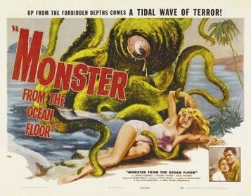 Monster from the Ocean Floor Film Poster: Source: The cover art can be obtained from Movieposterdb.com., Fair use, https://en.wikipedia.org/w/index.php?curid=33866967
That little movie did well enough for Corman to continue producing, but he went in a completely different direction with a thriller involving a jail break and a car race called The Fast and the Furious the following year. (Yes, the same title was licensed by Universal Pictures in 2001 for the beginning movie in their F&F franchise.)
That same year he also made a Western, directed The Beast with a Million Eyes, made another western, and then another sci-fi called Day the World Ended.
Corman had a lot of ideas and a prolific work ethic.
My favourites were all his many sci-fi and horror movies. They’re a blast to watch for a Halloween movie night with a good supply of popcorn and maybe a Bloody Mary or two ;).
Corman got a lot of inspiration from the tales by Edgar Allan Poe, who’s one of my favourite authors, so those films were a marriage made in heaven. The House of Usher (1960) was a really good one, straight Gothic horror, while at the other end of the spectrum was 1963’s The Raven, very loosely based on Poe’s famous poem. Both movies starred Vincent Price, as did many of Corman’ horror films. The Masque of the Red Death (1964), also with Price, belies its somewhat lurid-sounding name with an interesting style and a character study of its big-bad, Prince Prospero.
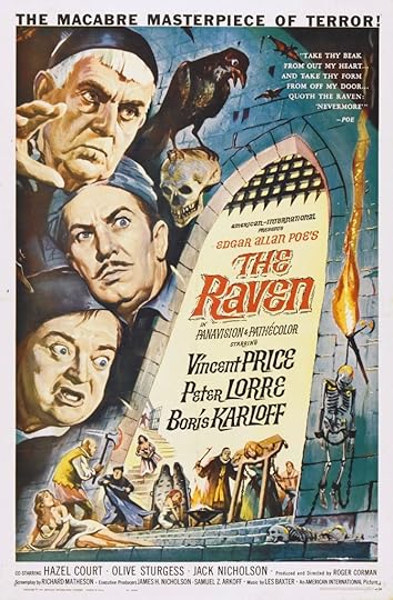 Advertising poster for the film The Raven (1963), By Reynold Brown – The Raven. Wrong Side of the Art. Retrieved on 2013-02-21. See The art of Reynold Brown. for additional film posters by Brown, Public Domain, https://commons.wikimedia.org/w/index.php?curid=4727190
But The Raven is my favourite, a very tongue-in-cheek stretch around the titular bird, who comes tapping on retiring and melancholy sorcerer Dr. Erasmus Craven’s door (Vincent Price), and turns out to be a bespelled bumbling sorcerer named Dr. Adolphus Bedlo (played by veteran actor Peter Lorre). Bedlo asks Craven for help in breaking the spell, and wants Craven to accompany him to the house of the perpetrator, the sketchy Dr. Scarabus (Boris Karloff).
Craven steadfastly refuses, until Bedlo tells him that he’s recently seen Craven’s supposedly dead wife, Lenore, there. This is a bait Craven can’t resist and off they go, accompanied by Craven’s pretty daughter and Bedlo’s more sensible son (played by a very young Jack Nicholson). I won’t reveal the rest of the plot, other than to say that the actors all seemed to be having a great time – although apparently both Peter Lorre and Jack Nicholson liked to ad-lib some of their lines, which drove Karloff crazy. As one example, when Craven asked Bedlo if he’d ever see Lenore again, Lorre grumbled out “How the hell should I know?”
Some of the other silliness included Craven’s inability to avoid repeatedly running into his oversized telescope at the start of the movie, and Bedlo’s various ‘spells’, which were all made of famous Latin phrases, like “Veni, vidi, vici” (I came, I saw, I conquered, proclaimed by Julius Caesar after he won a fast victory at the Battle of Zela), and “Cave canem” (Beware of the dog). The movie was nominated for the Top 100 Funniest American Movies in the American Film Institute’s 2000 list – it won’t have you falling off your chair (or sofa) laughing, it’s just good, atmospheric fun.
“Jim Jr.,” the raven appearing in the title role, was nominated for a Patsy Award, along with several other animal actors, despite the fact that behind the scenes it kept pooping on Jack Nicholson’s shoulder. Nicholson and Lorre didn’t get along on the set, Karloff hated being strung up in the air on chairs for the big duel, and Hazel Court, the buxom actress who played Lenore, Craven’s not-so-dead wife, complained that, after the film came out, the critics focused more on her chest than her acting. Apparently one critic for Time magazine wrote, “The sexy, lusty redhead is played by the English actress Miss Hazel Court, in whose cleavage you can sink the entire works of Edgar Allan Poe plus a bottle of his favorite booze.”
Corman produced more than 300 films and directed over 50. He mentored the careers of some very big names in the movie industry: Peter Bogdanovich, Francis Ford Coppola, Jonathan Demme, Martin Scorsese, and gave early career breaks to future stars like Jack Nicholson, as well as Sandra Bullock, Peter Fonda, Dennis Hopper, Robert De Niro, William Shatner, Talia Shire and Sylvester Stallone.
He would produce up to seven films a year. The Little Shop of Horrors (1960), was shot in two days. Corman saved time by using the same sets as A Bucket of Blood (1959), and once joked that he could make an epic about the fall of the Roman empire with two extras and a sagebrush.
Corman was highly cultured, despite his fondness for making B-movies, and was the U.S. distributor of international arthouse films by directors Ingmar Bergman, Federico Fellini, Akira Kurosawa, François Truffaut and more.
He was given an honorary lifetime Academy Award in 2009 for his “rich engendering of films and filmmakers.” When presenting the award, Quentin Tarantino said, “Roger, for everything you have done for cinema, the academy thanks you, Hollywood thanks you, independent film-making thanks you. But, most importantly, for all the weird, cool, crazy moments you’ve put on screen, the movie lovers of planet Earth thank you.”
When asked once how he wanted to be remembered, he said, ‘I was a filmmaker, just that”.
Networks Turner Classic Movies and Silver Screen often show Corman’s films, and The Raven is currently available on Tubi.
Once upon a midnight dreary, while I pondered, weak and weary,
Over many a quaint and curious volume of forgotten lore—
While I nodded, nearly napping, suddenly there came a tapping,
As of some one gently rapping, rapping at my chamber door.
From The Raven, by Edgar Allan Poe
The post Master storyteller Roger Corman passes away first appeared on Erica Jurus, author.
May 14, 2024
The shadowy world of noir mystery stories – Laura (1944)

I love immersing myself into the atmosphere of a mystery novel or movie. The stories are set in milieu that I can only experience through their pages or onscreen drama, but if they’re well done they draw me inside for a few hours.
My favourite authors are all British – Dorothy Sayers, Agatha Christie, Daphne DuMaurier, Arthur Conan Doyle – so whenever I want to read their works I feel the need for a steaming cup of freshly-brewed tea beside me on my lamp table.
But to watch some of my favourite mystery films, I always have the urge to pull out a glass pitcher and long-handled cocktail spoon, or a cocktail shaker, and mix a slinky, smoky cocktail that evokes the ambience of 1940s film noir. Perhaps a Sidecar, which, since it includes citrus, should be shaken, not stirred. A little brandy, a little Cointreau, a squeeze of lemon juice and some ice, shaken and poured into a classic stemmed cocktail glass and garnished with a twist of lemon to give it flair.
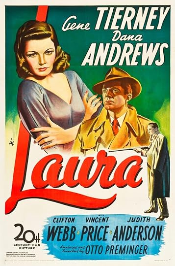
The other day Silver Screen was showing one of my all-time favourite movies, Laura, released in 1944. The movie is a classic in cinema, for its style and its startling twist partway through (which I won’t give away).
 Source: Wikipedia; “Copyright 1944 by Twentieth Century–Fox Film Corp.” – Scan via Heritage Auctions. Cropped from original image; “The poster included a valid copyright notice, seen at bottom left. However, the copyright for the artwork was not renewed, as was required by American copyright law to extend/maintain protection for works published 1963 or earlier.”
Set in the high-society world of New York in the 1940s, where people who behaved perfectly in public at things like cocktail soirées, following the dictates of ‘polite’ society, hid seething passions behind their impeccable facades.
In the movie, Detective Mark McPherson, played with a certain crime-weariness by the great , is called in to investigate the brutal murder of Laura Hunt, found dead just inside the doorway of her apartment in a very personal way by a shotgun blast to the face.
Laura was a highly successful advertising executive. She was young and very beautiful in life, as evidenced by a large and haunting portrait of her in her apartment.
She was played by the actress , who studio head Darryl Zanuck called “unquestionably the most beautiful woman in movie history”. Since her contemporary female stars included Ava Gardner and Rita Hayworth, that was a considerable compliment.
Tierney was the perfect woman to play Laura, whose chic but aloof personality, played out in flashbacks as the detective talks to people who knew her, was perfectly embodied by the actress with exotic, cat-like blue eyes and such a symmetrical face that it was almost unreal, as well as a coolly-elegant persona in real life that translated directly onto the screen.
We watch McPherson interview her mentor, an overly-refined older man named Waldo Lydecker. He’s a famous newspaper columnist who Laura approached for help in securing an endorsement for an ad she was working on. At first put off by her brashness, Lydecker was entranced by both her beauty and her self-possession, and decided to take her under his wing, guiding her style and introducing her to all the right people. They became almost inseparable as Laura allowed him to direct her upward mobility. Ironically, as time went on, and Laura became more well-known among his social circles, Lydecker became jealous of Laura’s various suitors, and used his influence to keep them at bay.
There seemed to be a turning point when Laura became engaged to a handsome playboy, Shelby Carpenter, who she met in his tenure as a ‘kept man’ of her wealthy, middle-aged socialite aunt, Ann Treadwell. Carpenter became infatuated with Laura, something tolerated by Treadwell, at least on the surface. Carpenter was played by a younger , who perfectly portrayed Carpenter’s lazy, louche demeanor, and his assumption that his charm and looks would get him through any situation. (If you’re only familiar with Price as a horror movie villain, this role will be quite a surprise for you.)
Laura’s maid/housekeeper, Bessie Clary, also interviewed by McPherson, is also almost obsessively attached to Laura.
As the investigation proceeds, McPherson himself appears to develop the same obsession with the victim, and becomes part of the tangle of passions and mysterious activities that he’s trying to puzzle out. And then something happens that casts everything in a new light.
Lydecker was personified by , another veteran actor whose career was also most defined by this movie, which gave him his first screen success at the age of 55. Early in his life he was a ballroom dancer. Apparently he was inseparable from his overbearing mother, and both of these influences probably added a certain flavour to his work in this role.
The story was taken from a serialized novel in Collier’s magazine written by author Vera Caspary called Ring Twice for Laura. Caspary was also an activist, and wrote many novels about women’s journeys for identity and love, usually with an element of murder – all of which are strong themes in Laura. And as with most interactions with Hollywood, the production of the movie version didn’t go smoothly.
Director Otto Preminger was looking for a theatrical project and became aware of the novel when her agent offered him the first draft of a play by the same name. He liked the high-society setting and the unusual plot twist. However, Caspary and he disagreed about the direction they should take it for an adaptation to film, and she opted to collaborate with writer George Sklar instead. She was unable to find a producer willing to finance it and abandoned the project, eventually selling the play to 20th Century Fox.
At Fox, interim studio head William Goetz, covering while Darryl F. Zanuck was on military duty, brought Preminger back on board to develop the books for the screen. Preminger felt that the more interesting character was not Laura herself, but Waldo Lydecker, and expanded his role, which Caspary wasn’t pleased with.
When Zanuck, with whom Preminger previously had clashed, returned to the studio, he was unhappy, and announced that Preminger could produce Laura but not direct it. Several directors were offered and rejected the helm until Rouben Mamoulian finally agreed to take it on.
Mamoulian immediately ignored all of Preminger’s directives as producer and began to rewrite the script. To Preminger’s dismay, he cast Laird Cregar, known for his portrayal of Jack the Ripper, as Lydecker. Preminger felt that Cregar, who came from a society background himself, but who had a reputation for playing such sinister roles, gave the wrong ‘cast’ to the role (forgive my pun ). Cregar, by the 1940s, was middle-aged and looking very much like a ‘heavy’ in a gangster film. Preminger preferred Clifton Webb, by then a noted Broadway actor, but both Zanuck and the Fox casting director thought that Webb’s mannerisms were too effeminate. Preminger filmed Webb delivering a monologue from a Noel Coward play, which ended up convincing Zanuck that Webb was perfect for the role as society journalist.
Zanuck wanted actor to play the role of Shelby. If you’re a fan of movies from the era, you’ll be familiar with Gardiner – many roles of, as IMDB puts it, ‘ “silly ass” upper-crust English twits’. Not really the image of a New York playboy. Fox contract player Vincent Price finally got the role.
Apparently Mamoulian had problems with his cast from the start, and when Preminger convinced Zanuck that the material needed a more subtle approach than Mamoulian was willing to give it, Zanuck allowed Preminger to dismiss Mamoulian and direct the film himself.
Once the principal photography was done, Preminger hired David Raksin to score the film, but wanted him to use “Sophisticated Lady” by Duke Ellington for the main theme. Raksin objected to the choice, and Alfred Newman, music director for Fox, convinced Preminger to give Raksin a weekend to compose an original tune. Raksin was inspired by a “Dear John” letter he’d received from his wife while they separated, and composed the unforgettable “Laura” theme.
Preminger was so pleased with the end result that he collaborated with Raksin on four additional films. The American Film Institute voted the Laura theme the No. 7 greatest of all time, superseded only by, in order upward: Jaws, The Godfather, Psycho, Lawrence of Arabia, Gone with the Wind, and (no. 1) Star Wars. Amazingly, it didn’t receive even a nomination for an Oscar. Actress Hedy Lamarr, who turned down the leading role for the movie, said, “They sent me the script, not the score.”
Laura received an Academy Award for Best Cinematography (Black and White). It was nominated for: Best Direction, Best Screenplay, Best Art Direction (Black and White) and Best Supporting Actor (Clifton Webb).
The movie got mixed reviews upon its release, but its legacy is long and speaks for itself. It was voted the No. 4 Greatest Mystery of All Time by the American Film Institute, and has inspired artists in countless ways, from the theme song to shows paying homage with a similar plot, including Star Trek: The Next Generation, in an episode called Aquiel (the 139th episode) in which Geordie La Forge investigates the mysterious disappearance of two personnel at a Federation relay station, Lieutenants Aquiel Uhnari and Rocha. Geordie becomes fascinated with Aquiel when he examines her personal logs during the investigation.
The success of the movie Laura rested heavily on the beauty and mystique of the character, as portrayed so effectively by Gene Tierney, and her enigmatic portrait that dominated her living room. It had to be remarkable, to so entrance Detective McPherson that he became obsessed with a dead woman, and so it was.
 Detective McPherson hypnotized by the portrait of the victim, Laura. Source: This image seems to be floating around all over the internet; I wasn’t able to find provenance for it. EJ
The wife of the original director, Mamoulian, was an artist who painted the original portrait of Laura, but Preminger scrapped it. He felt that portraits didn’t photograph well, and had a photograph of Tierney enlarged and smeared with oil paint until it looked like a painting. It was an interesting solution that worked extremely well, and the impact of the portrait was one of the reasons the film earned an Oscar nomination for Interior Set Decoration.
All three stars of the movie, although they made many other films, are best-know for this moody outing.
Gene Tierney’s career had its ups and downs, due to her struggles with bipolar disease. She acquired her carriage and remote elegance from finishing school in Switzerland and Connecticut. She made her society debut when she was 17 years old, but soon became bored with that life and decided to become an actress.
Becoming an actress in Hollywood in that era wasn’t easy.
At the time, Hollywood had a strict ‘starlet grooming’ system, managing its actresses’ physical appearance, behaviour in public, and even personal life (some contracts included a ‘no-marriage’ clause). The ideal of attractive femininity was narrow and biased: white, thin, coiffed, manicured, even with no visible freckles. The all-male studio heads had battalions of make-up artists to reshape faces with items like putty for fixing imperfections, meticulously coiffed hair, and any amount of makeup necessary to make a star look like she wasn’t wearing any. Tierney was famous for her ‘natural face’, as were other actresses, even though that wasn’t the case at all.
A cameraman advised Tierney to lose a little weight, to maintain that glamorous hourglass shape that showed off the couture clothing actresses wore both onscreen and off. Accordingly, she wrote to Harper’s Bazaar magazine for a diet, which she followed for the next 25 years. Tierney said that she was hungry for 20 years because “a certain thinness would add attractive contours to my face”.
She reportedly took up smoking to lower her voice after seeing a screening of her first movie – she thought she sounded like “an angry Minnie Mouse”.
In later years, she wrote in her memoir, Self-Portrait, about her appearance and her time in mental health facilities: “I have always needed to believe that my career survived on more than how I looked. I have no deeper meaning to plumb, no point to make about beauty and craziness. A friend once asked a doctor if he thought my life might have been easier, if I might not have needed confining, if I had been less pretty. ‘No,’ he said bluntly. ‘They have ugly people in there, too.’ ”
Laura is a movie that draws you in, and like the famous portrait in it, haunts you afterward. So pull up a chair, make yourself a cocktail (or mocktail, as you choose), and see if you can figure out who the murderer is while you navigate the deep and murky waters of chic 1940s society.
The post The shadowy world of noir mystery stories – Laura (1944) first appeared on Erica Jurus, author.
May 7, 2024
What is biophilia and why is it trending

My hubby and I don’t have a lot of natural green in our house, largely because I can’t grow anything. People who give me plants do so at their own risk, so to speak – I usually warn them that their gift probably won’t survive. I do have one plant that’s still hanging in there, a curly bamboo given to me years ago by my hubby in a fit of optimism.
This may explain why I compensate by going for lots of walks in gardens and forests, in effect getting my ‘greens’ from an external source. Disclaimer: I can grow shrubbery, i.e. anything that’s self-sufficient once it’s been planted.
But there’s a trending theory about why we’re drawn to green, natural spaces: it’s called “biophilia”. The word literally means ‘love of life’, and it encompasses all things living, from the plants in nature to the soil they grown in and the animals that make outdoor places their home. The theory is that since we evolved in nature, we’re genetically tuned to feeling most comfortable in that environment.
Our modern society seems to have forgotten that, encasing us in brick and concrete jungles, but the concept is being reintroduced as a way to save both our health and our sanity. Living apart from nature isn’t good for us – it leads to stress, anxiety, stress-related illnesses and poor mental health.
 Surrounded by vivid spring green at Heartland Forest, Niagara Falls
In the 1980s the Japanese came up with the idea of shinrin-yoku, aka “forest bathing”, which means immersing yourself in a forest atmosphere – not just going for a hike, but being in the moments, observing all the small, wonderful things that a forest has to offer. Tiny flowers at the bases of trees, squirrels scampering through, frogs squeaking in ponds, intricate fungi on logs, a haze of joyous green surrounding you.
 Tiny bees flooding the cherry blossoms at the Royal Botanic Gardens, Hamilton
Last week a friend and I made a pilgrimage to the Arboretum of the Royal Botanic Gardens in Hamilton to view the cherry blossoms. It was a man-made forest, to be sure, but still a gorgeous stroll through masses of exuberantly blooming trees. The sky was a deep, cloudless blue, and the flowers were both opening up their petals and letting soft breezes shower them upon visitors. Butterflies flitted happily from tree to tree, and at one busy tree I stopped my friend and asked, “Do you hear that, or am I imagining it?” She heard it too: a susurrus of gentle buzzing from hundreds of tiny bees all gathering nectar among the branches. We stood by the tree, entering its ‘home’ for a while, and felt privileged for the experience.
 A froth of yellow celandine poppies in the Niagara Falls Botanic Garden
Man-made gardens have the same effect on me as walking in the woods, and a lot of it has to do with colour psychology. Green is well-known to bring up feelings of hope, growth and freshness, and underpins everything in a garden, especially in springtime. Walking among the flowers, we look at the pink ones as blooms of softness, while vibrant red flowers, like spring tulips, are exciting and passionate. My favourite flowers are all yellow – daffodils, yellow roses – and make people think of joy (although, because of the colour’s visibility, humans use it to denote danger). Orange flowers offer warmth, and symbolize kindness. Blue flowers look peaceful, while purple blooms have an air of glamour about them, and black ones denote mystery. White flowers make us think of purity and truth. A garden stroll engulfs us in a living piece of artwork where we can bathe in all of those colours and emotions, and the remarkable beauty of each flower’s form.

Ancient cultures, including Egyptian and Chinese, practiced chromotherapy – using colors for healing – and it’s still in use today as a holistic practice, following many of the same principles as colour psychology: red to stimulate the mind and body and increase circulation, yellow to stimulate the nerves, blue to soothe and treat pain, and so on. Interestingly, in modern medicine colours also play a role: pills coloured white are associated with greater pain relief, while red ones are associated with having greater stimulant properties. Think of all the analgesics you can buy over the counter – they’re often white or have a red coating or a blue tint.
Colour psychology is a fascinating subject, and in a later post we’ll look at it in more detail, but for now we’ll concentrate on the effects of spending time in natural environments. Hotels, lodges and resorts are starting to offer programs or ‘opportunities’ to get you out into their lovely surroundings, which isn’t a bad idea at all, but you don’t need to spend that amount of money. In Ontario we’re blessed with plenty of gardens and wooded areas, and even things like golf courses, which (apart from the frustrations of the game) are often incredibly peaceful places. My hubby and I have seen all kinds of wildlife on a golf outing – walk by a pond and there might be ducks or a great blue heron or muskrats, or dragonflies and butterflies darting about. (In Africa there were crocodiles, but we kept a safe distance from those.)
Walking through nature doesn’t just feel good psychologically, though. It’s been found to be very healthful for our bodies.
Trees release chemicals into the air in a fine mist, and these aerosols have antibiotic, anti-fungal and anti-rheumatic effects. They improve our circulation, decrease blood pressure, boost our immune systems, even help fight cancer. Some tree aerosols even suppress the flow of the stress hormone cortisol. During the pandemic, and still today, going for a walk in a garden or woods has always been helpful in reducing my anxieties and frustrations.

Studies have shown that people who live in communities with lots of trees feel healthier and have fewer heart conditions than those who live in less green areas. Research into links between nature and dementia have been promising: during a 10-week woodland activity program for patients with early stage dementia, being in the woods was found to improve spatial awareness and promote mental well-being, two things that erode significantly in those suffering from the disease.
Plants and flowers oxygenate the air, boosting our brain cells and improving memory, clarity and concentration. Even having them in your home has an effect, but how much better to surround yourself by them in a beautiful garden on a beautiful day. Research has shown that being around plants helps you concentrate better, both at home and at work, and can improve attention span and memory performance by as much as 20%. Studies with children revealed that their attention and memories improve when they’re exposed to greenery.
 A beautiful Purple Trillium flower
When we’re exposed to nature, even for just a short time, our parasympathetic nervous system, which operates in quiet, resting conditions, gradually takes control, lowering our blood pressure and pulse rate, reducing cortisol levels and even inflammation, and elevating our mood. Just being in forests helps us be relaxed, well and happy.
We can also embed biophilia in our homes in a number of ways, even if we aren’t lucky enough to live out in the country or on a lakeshore. Bringing in representations of nature, whether artwork or even natural materials; creating ways to interact with nature (one of the reasons I love to open the windows when the weather gets warm enough, to let in the sounds and scents of the outdoors); having household plants (I do my best) – these are all ways to both connect with nature as much as we can and remember why that’s so important to us.
But there’s still nothing better than getting right out into it. So what are you waiting for?
 Wandering through the burgeoning lilac blossoms in the Centennial Lilac Garden, Niagara Falls
The post What is biophilia and why is it trending first appeared on Erica Jurus, author.
April 30, 2024
Taking a post-income tax break

We are lying around the rec room, spent after the annual tussle with submitting our income tax claims. Surely there must be a less anxiety-inducing way of doing this, although Turbo Tax does make things easier (no affiliation links). We’re watching a fun British quiz show called Pointless that we first saw on the ‘tellie’ while we were in Ireland. Anyway, the blog will return next week, after my brain has recovered
The post Taking a post-income tax break first appeared on Erica Jurus, author.
April 24, 2024
Classic murder and mayhem
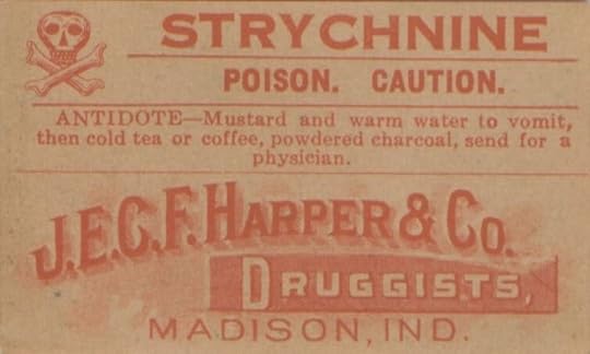 J.E.C.F. Harper & Co. Strychnine Advertisement. Life and Health; source: https://theconversation.com/strychnine-at-the-savoy-was-agatha-christies-mysterious-affair-at-styles-inspired-by-an-indian-murder-73326
It seemed to be the middle of the night when I was awakened by Lawrence Cavendish. He had a candle in his hand, and the agitation of his face told me at once that something was seriously wrong.
Agatha Christie. The Mysterious Affair at Styles
Ever wonder where writers get their ideas? Especially crime/murder mystery writers?
There’s plenty of material out there in real life – hence the plethora of real-crime books, podcasts and series that are so popular now. That’s a sad commentary on either our unhappy society or on the ability of the internet to spread such news instantaneously and far and wide.
Personally I love the murder mysteries that came out the Golden Age of Detective Fiction, i.e. written mainly in the 1920s and 30s. Authors Margery Allingham (sleuth Albert Campion), Agatha Christie (main sleuths Hercule Poirot and Jane Marple), Dorothy L. Sayers (Lord Peter Wimsey), and Ngaio Marsh (British CID detective Roderick Alleyn) were considered the “Queens of Crime’. They produced classic “whodunits”, stylish mysteries where the settings were an essential part of the stories, and the tales followed a fairly established set of ‘rules’ systematized by Ronald Knox, a British Catholic priest, theologian and radio broadcaster who produced quite a few religious and philosophical books as well as dabbling in detective fiction.
Allowing the reader get more out of the reading experience by trying to solve the mystery before the fictional detective reveals it, he stipulated that such novels must:
Mention the criminal early in the story, but he/she can’t be a character whose thoughts are revealed to the reader. (Makes sense – if the writer did reveal the killer’s thoughts, it would have to be very skillfully done to not give everything away.)Not include supernatural or preternatural agencies in the crime. (A popular addition these days, but the reader has to know that something unusual is going on.)Not include more than one secret room or passage. (Aww…)Not have previously undiscovered poisons, or any appliance that would need a long scientific explanation to understand it. (Being fair to the reader’s problem-solving ability.)Not contain any “Chinaman” characters. (A reference to the ridiculously stereotyped Asian characters that were in common use in detective fiction of the time.)Not have the detective solve the mystery by accident, nor feature some inexplicable “intuition” that proves to be right. (Totally unfair to the reader to throw that curve in.)Not have the detective be the killer. (Creative novelists have challenged that rule quite effectively since then.)Allow the detective to declare any clues discovered along the way. (Another fairness rule.)Make the detective’s sidekick share with the reader any thoughts he/she has AND be just slightly less smart than the average reader. (I suppose that might explain the dumb-ass version of Dr. Watson in some Sherlock Holmes movies.)Not use twins unless the reader has been prepared for them. (I take that to mean that, if one of them is the murderer, their existence doesn’t appear out of the clear blue sky.)Lavish country houses owned by someone wealthy who likely didn’t survive the first couple of chapters were popular settings for a lot of these novels, often by bringing all the suspects together during a weekend house party. The board game Clue was built around just such a locale
My favourite Golden Age author was Dorothy Sayers, with her aristocratic sleuth Lord Peter Wimsey, who was charmingly disarming and able to conceal his sharp intelligence behind a silly man-about-town facade. He had bad shell-shock from serving in World War I, and was helped out of it by his comrade Bunter, who then served as his butler and sometime sidekick. What I liked about Wimsey was his lack of pretentiousness and the fascinating portrayal of 1930s Britain, teetering once more on the brink of another war.
However, you can’t argue with the success of Agatha Christie – 66 books, 14 short stories, and the longest-running play in history, The Mousetrap (performed in the West End of London since 1952; if you visit the city, you should go see it).
Christie made her debut on the detective-novel scene in 1920 with The Mysterious Affair at Styles, a classic locked-room mystery that was apparently based on a real crime in a popular hill station (cooler air retreat in the hills) in Northern India called Mussoorie.
In September 1911, a woman named Frances Garnett Orme, visiting with a friend of hers, Eva Mount Mountstephens, was found dead in her room at the Savoy, a very popular luxury at the time. She’d been poisoned with prussic acid – a poison derived from cyanide. Eva Mountstephens was accused of murdering her.
The case made global headlines because of the “peculiarity of the circumstances surrounding it. The room in which Orme’s body was found was locked from the inside. Mountstephens was a spiritualist from the city of Lucknow who’d taught Orme crystal-gazing and other occult practices, and had predicted Orme’s death six months previously. She’d also expressed concern about Orme marrying a physician she was engaged to and leaving all her wealth to him.
These were the arguments offered by the prosecution in Mountstephens’ trial. They accused her of administering poison to Orme to benefit from her will, which left her a substantial sum of money, three necklaces and other jewellery.
But the defense pointed out that Mountstephens had left to return to Lucknow before Orme had died, and that there was no proof that she’d either bought or administered the poison to her friend. They characterized her as a “most devoted companion” to Orme. They claimed that Frances Orme killed herself because of the “unceasing grief” she experienced after her fiancé died.
However, although a bottle of sleeping pills, and two other bottles – labelled arsenic and prussic acid – were found in Orme’s room, at the chemist’s where the drugs would have been bought and signed for (a legal requirement), the signature for the prussic acid didn’t match the one on Orme’s letters.
But poisoning cases were common in India in the 19th c. The sale of toxic substances, particularly arsenic, was unregulated, and eventually the number of arsenic poisonings led to the creation of the Indian Poisons Act in 1904 to provide necessary regulation.
Interestingly, Eva applied for probate of her friend’s will, but the Garnett-Orme family in England sent out Frances’ brother to contest it. The judge denied Eva’s application on grounds of ‘fraud and undue influence in connection with spiritualism and crystal gazing’.
British newspapers carried accounts of the sensational trial with headlines like ‘Mussoorie murder trial’, ‘hotel mystery’ and the ‘crystal gazing trial’. In the end, though, Eva Mountstephens was acquitted due to lack of evidence. The Allahabad High Court eventually declared the case as homicide done by person(s) unknown and closed the it.
The presiding judge remarked that the “true circumstances of Ms Orme’s death would probably never be known”. He was right; the case was never solved, along with another murder – that of the doctor who performed the autopsy. He was found dead a few months later from strychnine poisoning! That news resulted in people not visiting the hotel for several months afterward. I think I might have stayed away too.
How did Frances Orme’s death morph into Agatha Christie’s first novel. Well, apparently word of the case reached Rudyard Kipling, who was living in India. Kipling passed it to his friend Sir Arthur Conan Doyle, suggesting that perhaps the already immensely famous detective Sherlock Holmes could solve the case in another SH novel. Sir Arthur Conan Doyle didn’t want to touch the case for possible litigation issues, and is believe to have passed the story along to Agatha Christie instead.
That version has been somewhat disputed. Christie had a friend, and neighbour, Eden Philpotts, who was born in India, was friends with Conan Doyle, and helped her with her early writing. It seems likely that he passed the details of the case, and the impetus for the debut novel, to Agatha.
In Christie’s book, the poison of choice was, which was used both to poison mice, and also as a tonic (diluted with other ingredients, to induce sleep. (Now there’s a terrifying thought. Agatha’s murder victim, Emily Inglethorp, suffered from insomnia. Strychnine’s presence in a household wouldn’t have been considered suspicious in the 1920s.
Christie worked as a nurse during WWI at the Torquay War Hospital, and learned a great deal about chemicals. She was able to use that to great advantage in crafting her first published murder mystery. Strychnine was well-known at the time due to its use by serial killer Dr Thomas Neill Cream, who used it to kill a number of women in both Britain and Canada. He was finally caught and executed in 1892. Allegedly, his final words were, “I am Jack the…” (The timeline would have worked.)
It was in this novel that Christie introduced one of the most famous sleuths ever created, Hercule Poirot.
Poirot was an extraordinary looking little man. He was hardly more than five feet, four inches, but carried himself with great dignity. His head was exactly the shape of an egg, and he always perched it a little on one side. His moustache was very stiff and military. The neatness of his attire was almost incredible. I believe a speck of dust would have caused him more pain than a bullet wound. Yet this quaint dandified little man who, I was sorry to see, now limped badly, had been in his time one of the most celebrated members of the Belgian police. As a detective, his flair had been extraordinary, and he had achieved triumphs by unravelling some of the most baffling cases of the day.
Christie, Agatha. The Mysterious Affair at Styles
The novel was published to a fair amount of acclaim. The New York Times Book Review (December 26, 1920), wrote “Though this may be the first published book of Miss Agatha Christie, she betrays the cunning of an old hand… You must wait for the last-but-one chapter in the book for the last link in the chain of evidence that enabled Mr. Poirot to unravel the whole complicated plot and lay the guilt where it really belonged. And you may safely make a wager with yourself that until you have heard M. Poirot’s final word on the mysterious affair at Styles, you will be kept guessing at its solution and will most certainly never lay down this most entertaining book.”
The Times Literary Supplement (February 3, 1921) printed: “The only fault this story has is that it is almost too ingenious…It is said to be the author’s first book, and the result of a bet about the possibility of writing a detective story in which the reader would not be able to spot the criminal. Every reader must admit that the bet was won.”
While some people may consider Christie’s style more in the nature of what’s now referred to as “cosy” mysteries, her stories do make great reads with a cup of tea, embodying what’s become everyone’s vision of classic vintage British ambience. The long-running television Poirot series, with David Suchet as the fastidious detective, was enormously popular, and quite a few movies have been made of the stories. Christie’s enduring legacy speaks for itself.
The ghost of Lady Frances Garnett-Orme apparently haunts the now run-down hotel’s lobby, corridors and roof. Guests have reported hearing things like random toilet flushes and doors opening mysteriously. People who claim to have seen her describe her as a “serene, calm” woman dressed in white, looking lost while wandering around – perhaps trying to close her own case. Given the spirituality involved, the locked room, and other mysteries, maybe a modern writer will be inspired to come up with a version steeped in the supernatural – wouldn’t that be fun!
The post Classic murder and mayhem first appeared on Erica Jurus, author.
April 23, 2024
April 16, 2024
Book progress and a new version of storytelling
“Don’t tell me what happens – la la la la la.”
“I’m not going to tell you. I’m just organizing the order of events. That’s all I’m saying.”
That was my hubby’s response when I talked about the progress of the third book in my trilogy on the weekend.
Writing Book 3 – News Flash: the official title is Out of Time – has been slow. It’s very different from putting out the first book, Through the Monster-glass, which was an experiment in whether I could assemble an entire novel out of all the ideas I jotted down over many years.
Book 2, Into the Forbidden Fire, was a complete joy to write. I had the success and excitement of my first book launch to give me energy, knew exactly where the second book was headed, and felt secure in my writing ability.
With the third book, I’m very conscious of finishing the story in a way that satisfies my readers’ expectations. I’ve invited them on this amazing journey, and I don’t want to disappoint them. I can tell you my one guiding principle: everything that happens is authentic and has a purpose. There’s not a single detail or event that was put in just for effect.
Without giving anything away, I can tell you that things are not going to happen the way anyone expects. Many ends will be tied up, but there are others that won’t – not because I’m leaving things open for a sequel, but because that’s the way life actually is. Not all mysteries get explained, and I love that.
I’ll be publishing Book 2 soon – readers are practically banging down my door, I’m delighted to say  But there are pesky things like Income Tax and a crappy Kitchen Aid gas cooktop (we’ll never buy one again) to deal with – life has a persistent way of intruding on the delightful fantasy worlds we’d much rather immerse ourselves in.
In the meantime, I’ve been looking into a new storytelling format available for smart phones that combines short stories with animated visuals to enhance some of the scenes. If you haven’t heard of it, it’s called Storiaverse. I saw an ad for it in one of the literary newsletters I get, and was intrigued enough by descriptions of some of the stories to check it out.
The first one I watched, Blood Moon Curse, was set at Halloween on a college campus, with a scary urban legend, so right up my alley Storiaverse works with writers of short stories, and a coterie of animators who create short video clips to illustrate certain parts of the plots. Each story you access has blocks of text interspersed with videos and music. I was curious as to how well the various media were going to meld.
At first I found the rapid animation of this story a little disconcerting, but once I got into it, I found myself looking forward to the next segment. The free app is easy to use, and you can scroll back and forth between parts of the story if you missed something or want to rewatch a video. I thought the striking visuals enhanced the story, providing a creepy atmosphere (in this case) to a good but not complex horror tale.
The Storiaverse site calls its format “Read-Watching”. They elaborate: “We’ve created a new patent-pending format that redefines storytelling. Designed to pull you deeper into plots and characters, ensuring every story not only looks visually distinct but delivers a unique and engaging experience.”
The stories aren’t lengthy – it probably took me about 15 minutes to scroll through Blood Moon Curse. The preferred genres you’ll find are those that work well with visuals, i.e. Horror, Fantasy, Sci-Fi, Mystery and Adventure, but the site states that story submissions in all genres are welcome, so do check out their Stories tab. Just browsing quickly through it, I found categories for War, Magic, Comedy, Western (with a creepy twist)…
Not all the stories are well-written (I got through just a couple of minutes of The Tarot Card before bowing out), but the overall format is engaging and I look forward to exploring more titles.
Will you ever find one of my stories on there? Short stories aren’t really my forte, but I thought the format was quite engaging, so you never know, maybe I’ll try submitting something one day
The post Book progress and a new version of storytelling first appeared on Erica Jurus, author.
April 10, 2024
Falls frenzy over the decades
My parents honeymooned at Niagara Falls. I have a photo of them leaning against the scrolled metal guardrail that covers large sections of the walkways along the falls and gorge, my dad in a dark suit, my mom in a matching skirt and jacket with a pretty blouse, smiling for the camera. Despite all of its kitsch and over-development, the Ontario side of the Falls is still pretty stunning, if you know where to look.
My family moved down to the Niagara Peninsula when I turned eight years old. For my birthday, my dad took us all to see the Falls, which were a big deal (and still are). It was a beautiful spring day, and afterward we had ice-cream cake, a really popular treat at the time.
The city of Niagara Falls has been famous for a variety of things over the decades – the Falls themselves, of course, and the crowds that have always clogged the streets in the summertime; the location of one of Marilyn Monroe’s films, Niagara (1953); the Skylon Tower, opening in 1965 with its revolving restaurant (kinda cool); where Christopher Reeve’s Superman saved a kid who’d fallen over the guard rail and bemused Lois Lane in Superman II (1980); the myriad stunt performers, from people trying to survive a trip over the Falls in all manner of contraptions (all the residents in the region thought they were nuts), to Nik Wallenda completing a high-wire walk across.
There’s something about the Falls that seems to make visitors lost their common sense. Our modern curse is all the tourists who decide they need to climb over the guard rail, needing to be rescued at great expense when they fall into the Gorge.
As a teenager growing up in the area, we were all used to the Falls as a famous attraction and often took it for granted, but it had the best entertainment around for restless youth. After exhausting the somewhat cheesy museums (like Ripley’s Believe It or Not) on Clifton Hill (the original tourist face of the city), the other options were the Skylon Tower, and the bars.
The view from the top of the Tower was nice enough, but it was the shops at the bottom that fascinated me. They were as ‘exotic’ as our region had at the time, and I loved browsing. There was a pervasive aroma of lavender, which I’ve loved ever since, and in another shop featuring imported goods, I bought a teak cane carved with a snake’s head as a gift for one of my boyfriends.
An eclectic selection of bars dotted the downtown section. The Rathskeller was a popular place if you wanted lots of noise and company, but if you were looking for something sophisticated for a date, with a Vegas lounge kind of vibe, you might have gone to the Thunderbird Room in the Fallsview Hotel. There was a good bar called the Sundowner on a road leading into the Falls, with live performers. (It still has live performers, but they remove all their clothing now.)
For those of us lucky enough to live in proximity, we’ve long been able to go border-hopping at our whim (except during the COVID pandemic) – shopping, restaurants, some great bars for the more…adventurous…of us. Our high school graduation featured a Ball (in tux and long white gowns) at a place overlooking the Falls now called Queen Victoria Place. At the time the main level was called The Refectory, and at 17-18 years old, we all felt very glamorous in our finery sipping cocktails and standing on the balcony to watch the night-time illuminations. Once the main festivities wound down, our grad class (those whose parents had agreed to let us stay out all night) headed out in several directions to continue partying. The car I was in spent over an hour across the border trying to find a famous bar somewhere along mostly empty dark roads between Niagara Falls NY and Buffalo. We finally gave up and returned to Canada to find one of the house parties going on. The night wrapped up with a 6 a.m. breakfast at our school, where we celebrated our transition to adulthood, then went home to let our parents nurse us through some hangovers.
The traffic across the four border bridges (three in Niagara Falls and one in Fort Erie) has always gone both ways; we have a very friendly relationship with our American comrades on the other side of the Niagara Strait (it’s actually a strait, not a river). My hubby and I continue to go ‘over the river’ on many occasions to watch football and baseball games, or to attend music concerts. On July 4th many Canadians gather on our side of the strait to watch the fireworks across the water.
Niagara travellers have the option of flying out of Buffalo International Airport, which is very handy when visiting parts of the U.S. and southward.
We’re shielded from Buffalo’s intense winter weather by the influence of Lake Ontario and Lake Erie, although the town of Fort Erie does get some of it. However, we shared in the ‘Great Power Outage’ of 2003.
That was a strange few days. I was at work at Niagara College in the late afternoon, about a half-hour from finishing for the day, when all the power went out. That wasn’t in itself an unusual occurrence; there was a hydro pole at the intersection where the campus sits in the town of Niagara-on-the-Lake that for some reason seemed to be a magnet for big trucks to bang into. I continued working on whatever I could that didn’t involve my computer, but a few minutes later our divisional director came into our office and told us to go home – the campus was being closed down. That got our attention, but we weren’t going to turn down a shortened work day.
On the drive home, all the traffic lights were out near the campus, so it was clearly a significant outage, but it wasn’t until I arrived in my home city that I realized how massive it actually was. Reports began coming in on the 4:00 p.m. news on my car radio about more and more locations, and all the power was out where I lived as well, in the entire city. I’d been heading for our nearest grocery store to pick up a few things, but had no cash on me to buy anything, and diverted back to my house.
We managed to save most of the food in our refrigerator and freezer, and cooked our meals on the backyard grill while we tried to stay cool without air-con in August, typically our hottest month. We listened to news on the radio, where every power facility from Ohio to southern Ontario flung blame at each other. We were indignant that in Niagara Falls, where our major power plant is located, hotels and casinos were taking advantage of what power the city had to light themselves up, while the majority of our region were sweltering and could barely cook a meal.
Our power was out for about 3 days. We managed to survive. All in all, over 50 million people in eight U.S. states and a large swathe of Ontario were affected. It was the largest blackout in North American history.
Casinos and enough wineries to sink us if our Great Lakes were prone to flooding have changed the landscape considerably since I was a Singapore Sling-drinking teenager. Niagara Falls has become both more kitschy and more refined. One of the lesser-known facts about Niagara Falls is its association with Nicola Tesla, who brought alternating current to our grand old power plant. The original plant was opened up to tours a few years ago, and celebrates one of the great heritages of the city with a terrific light show and very cool shop.
 Masses of glorious red roses in the Niagara Falls Botanic Garden – photo by E Jurus, all rights reserved
My favourite place to visit is the Botanic Garden, which is really beautiful and not very touristed. I discovered its appeal during our first COVID lockdown when I just needed to get out of the house for a while. Driving along the winding Niagara Parkway that hugs the lower section of the Niagara Strait, I found the Garden’s gate wide open. The Butterfly Conservatory inside was closed, as were other indoor attractions, but anyone was free to wander the Garden’s lawns and many paths. It became my sanity-saviour when I needed fresh air and a change of scenery, or when our new neighbours were driving me crazy. I still go there often to recharge my serenity.
Eclipse mania has been remarkable over the past month, arguably to be laid at the door of National Geographic when it placed eclipse-viewing in Niagara Falls in its list of Top 20 Travel Experiences for 2024. Hotels booked up quickly at grossly-inflated prices, and some of the hotels weren’t honouring bookings made earlier at normal prices. The Regional Council decided to declare a State of Emergency, and residents were told to stock enough supplies to survive a blizzard. COWs, aka cells on wheels (portable mobile cellular sites) were brought in to the area to manage an expected heavy load on local cell towers. The media in southern Ontario reported anything and everything associated with the coming event, from whether pets would be safe (yes) and if birds were going to fall out of the sky (no).
The frenzy wasn’t nearly as bad as feared. My hubby and I stayed away from Niagara Falls, but from photos in the media the crowds weren’t overwhelming. But what a lot of tourists seemed to be unaware of was our ridiculously variable weather, which can turn from sunny to stormy on a dime. Weather reports leading up to April 8th were gloomy, and the day dawned full of clouds. My brother, who lives in Waterloo outside the totality, had his skies clear in time to witness the entire progression from start to finish, while here in Niagara we scowled at the persistent greyness over our heads.
 Full darkness in Niagara during the Eclipse – photo by E Jurus, all rights reserved
My hubby and I had made a last-minute decision to go for a drive, trying to find any opening in the cloud cover. Abruptly I spotted the eclipse just before totality, and we pulled over with fingers crossed. Finally, perhaps with intervention from On High, all of us hopeful Niagara viewers got enough tiny breaks in the heavy clouds to see the totality at 3:18 p.m., a flash of the Diamond Ring, and the remarkable darkness that descended, making all the street lights come on and the birds raise a ruckus for a little over 3 minutes.
 I was very lucky to be able to capture the totality, flaring corona and all, without the use of a tripod – photo by E Jurus, all rights reserved
As the eclipse waned, the clouds began to part, and by 5 p.m. our skies were completely clear and the sun was shining mockingly. It was very annoying. Nevertheless, for anyone outside paying attention, one of the most famous locations of totality in the world was able to witness just a bit of a great historic event.
 The waning Eclipse, taken with a tripod – photo by E Jurus, all rights reserved
There will always be a certain magic around Niagara Falls and outwards, and a lot of attractions to amuse visitors, from gardens (the Centennial Lilac Garden is also lovely) to picnics along the winding Strait to golf courses to fireworks and Christmas lights. My recommendation is to visit in late September to October, when the tourist crowds have thinned and the weather is crisp and sunny. In October the trees that line the gorge carved by the Niagara Strait change colour, creating a gorgeous backdrop to the greenish waters flowing between them.
 Autumn along the Niagara Gorge – photo by E Jurus, all rights reserved
There are numerous fall festivals to enjoy, farm markets full of fresh fruit and pumpkins, lots of wine and artisanal distilled spirits to sample, some good restaurants, the famous Shaw Theatre, two haunted forts and an abundance of beautiful drives.
 Fresh apple fritters at Pioneer Day in Jordan in September – photo by E Jurus, all rights reserved
Overrated attractions: the helicopter ride (expensive and too short to be effective); a plethora of cheesy souvenir shops; most of the restaurants clamoring to be ‘experiences’ as opposed to just serving good food.
For those of us who live in the vicinity, we watch all the craziness from a distance and enjoy the benefits as we can.
The post Falls frenzy over the decades first appeared on Erica Jurus, author.


