Sawyer Paul's Blog, page 57
May 7, 2015
Writing Practice, May 7 2015

The watch's crown winds ten to fifteen times before it snaps and never works again without repair by a man I would never track down. The watch will work so long as I don't wind it too hard, and it'll more or less work forever. It holds time for around 8 hours, which means that to keep anywhere near accurate time (and the watch will never be accurate, no matter the amount of effort and care) winding the watch has to be the last action made before bed and the first when I wake up. The watch will not wake me up. The watch will only show the correct date if I wind the hour hands properly. There is no secondary input for the date. It is tied to the same wind as the hour and the minute.
I cannot go backwards in time. I think I used to be able to, but I'm not entirely sure. Someone else owned this watch when that feature worked. Now, if I try to wind backwards, the crown comes loose and eventually is removed. That means the every time the time is wrong (and it is wrong multiple times per day) I have to be careful with how far forward to move the minute hand. It only matters so much, though. If the time is wrong, it'll only be so until the next time the watch stops. And then it won't be even close.


May 6, 2015
Writing Practice, May 6 2015
Jamie stood on both feet, his back arched, his neck cranked, looking way up, his focus on a balcony the floors up jutting out from a thirty story apartment building. Jamie wanted a response. He had no other way in but to yell.
"I want my money," he said to the air above, in the hopes it would carry.
Jamie felt the cool breeze old the end of a storm. The concrete beneath him was still that darker, muddy grey. The building was forty years old, made of unaffordable materials today, heavy brick and premium plasters. Out was a ruin of optimism. If they put a nice building here, the neighborhood will improve. But Jamie knew the second he confirmed the address that had been given to him (that he had taken) that nobody's money was in this building.
(nobody answers)
May 5, 2015
Writing Practice, May 5 2015

Murray dug his ass deep in the bench. He was sick of waiting, and he didn't want a tan. It blazed and he roasted, and if he had any say he'd never come down to the water in the afternoon. His arms took up all the surface they could. The fish was that big.
The bench creaked under his weight. The back of the thing was painted a different colour than the seat, and both needed redoing. It was too early in the spring. The people who would do this work hadn’t yet been hired. There was still threat of snow, even as the sun cooked Murray as he waited. Murray thought about his cat at home and how he’d overfed it in case he had to wait a long time. He didn’t know what might happen. He left a key with his neighbour, to check on the cat in case he didn’t come home that night.
Murray thought about getting this over with, getting on with his day, going home and watching his new TV, maybe sending Denise a message. He’d watch Denver get destroyed and it’d be fine after three beers. Murray felt a bead of sweat hit his eyebrow. It wasn’t even terribly warm, just deadly bright. He’d call the man if he knew the number. He’d get it over with faster if he could.
Murray looked at his watch. It was all scratched to hell, a cheap timepiece from before everything connected. It barely did what it advertised. It was seven minutes late all the time, and no amount of winding or smashing helped. In the brightness, he could barely make out the time.
“I’m here,” he heard behind him. “Let’s do this.”
May 4, 2015
Writing Practice, May 4 2015

Aine peered upwards, through her closed eyelids. She opened them slightly, saw sunlight, the long lines of daylight, and rocked to the side. Her eyes rested[Do eyes rest?] on the view of his night table. The alarm clock had dust on it; two months worth of real dedicated laziness on the cleaning front there. She hadn’t set it once, and she hadn’t turned on the radio. It just told the time, and it was beginning to get hard to read.
Next to the alarm clock was a cup of coffee, prepared the night before. Mostly empty, filmed-over and pale, Aine grabbed it and held it under her nose. Lies, she thought. This coffee was three nights old. Where was the coffee from the other night? Another cup sat behind the alarm clock. Aine inspected its contents. Instead of coffee it was gin. Or at least it smelled like gin. Moving both cups kicked up clots of dust from the nightstand counter. She coughed. She smacked her pillow. She was going to get up, and move, and remember what it is she was supposed to do that day. But then she did not, and the dust settled on the floor beside her.
Aine moved the cups to the floor. She’d pick them up if they were in her way. She’d learned that in a seminar. Not with cups, just anything you’d want to remember. “Put it in front of you,” the man with the microphone told her and two thousand other people. The man took his laptop out of his bag and put it in front of him on the stage. He took a few steps back and pretended to be an idiot. “I won’t step on this. That’d be crazy!” And then he stepped on it, and two thousand people laughed and groaned. “Well, maybe with some practice. It doesn’t come easy!” Aine felt practiced with this trick. She used it all the time. Her over the shoulder bag currently sat leaning against the door down the hall, filled with printed resumes. Her beautiful black flats kept it company. These things were ready for her on the day she decided to leave her apartment again.
April 27, 2015
Recent podcast appearances
2015 may be my lightest year of podcasting yet, but it's definitely my lightest year of not shutting up about podcasting. So I was naturally excited to get invited on two podcasts in the last few weeks that let me do just that. First up, I was interviewed by Mike Beasterfeld on the excellent Better Know a Jackal. The interview is ostensibly about how I got into enjoying podcasts, but we go into all sorts of topics surrounding the medium.
Then, only last week I was on Chris Enns' Show Me Your Mic. There, I talked about what happened with my failed attempt at creating a podcast network. Show Me Your Mic is a great show, but it's mostly filled with people with lots of talent who have done amazing things. I figured I'd just go ahead and wreck the curve.
Trying something new
So once again, Merlin Mann’s voice got to me. On a recent Back to Work episode, he talked about the “verbing” of what you say you do, vs what you actually do. This isn't a new talking point for him, but he came around to a new way of saying it. To roughly paraphrase, if you’re not writing every day, how many days do you have to go without writing before you're not longer a writer?
It's been too many days without writing for me.
I've been inspired by other writers and their daily writing habits. A post on Seth Gotin's blog reminded me about re-making habits out of fears. I don't have to have a plan for a novel every time I sit down to write, and I don't need to bang out 3,000 perfect words to call it a "session." So, yesterday I wrote 200 words. Today, I wrote 500. Tomorrow, I hope to write more than ten. I'm trying to be realistic, but I also know I’m only really happy when I’m writing, and I owe it to the people around me to try to be happy.
I’m going to put what I can on this blog. I’m going to be shooting for everyday, but not everything I write is going to be suitable for even undiscerning readers. For now, I’m going to have a week delay in what I write vs what I put up. It’s mostly going to be shit, but that’s part of the point.
April 25, 2015
Structuring thoughts
I want to come up with a writing style that works with both writing on computers and on paper, that allows for versioning of sentences (perhaps with footnotes?) as well as a rating system for how far along a sentence might be.
It would look something like a two-column setup you might see in Scrivener (and, in fact, Scrivener might be perfect for this while on the computer, but I'd rather it work with any app in plain text), where there's the text itself, and then meta-information that connected first-draft stuff with extra thoughts and options.
Does anyone else do something like this already? I'm not looking to come up with something new just because I think that's important. I'm curious to find out how other writers structure their free-flowing writing (or, if this is just idealistic thinking).
I really want to just get back into writing. But my methods in the last two years have left me with three half-finished novels about women in peril. I didn't actively set out to write any of them that way, and I certainly didn't set out to quit halfway through.
Layout Thoughts: Men's Health April 2015
About the blur: I'm only writing about these pages based on details in layout. I don't want to accidentally infringe on anyone's copyright, hence the "content" itself is blurred whenever there's a paragraph or more. If you are the content owner and want me to take these down, I completely understand.
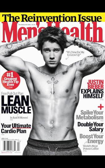
I'm fascinated with the layout of Men's Health and other periodicals like it. They may be loud and gauche and not exactly "timeless," but the design isn't meant to act like a coffee table book in a white minimalist fantasy. If design is how it works, then Men's Health is going for a very specific kind of functionality. It absolutely has to be a pain in the ass to design Men's Health every month, so they must make it the way they do for a reason. The cover is hyperbolic in every inch, every word not only selected for maximum impact, so is the colour and formatting. Spike, boost, ultimate, most, greatest, grow, reinvent. It doesn't matter if you're Justin freakin' Bieber, you're not good enough. Men's Health has received lots of flack for its utterly lazy cover design in recent years, (and they've deserved it), but this cover isn't supposed to be attractive. It's supposed to make you feel like you need it in order to improve.
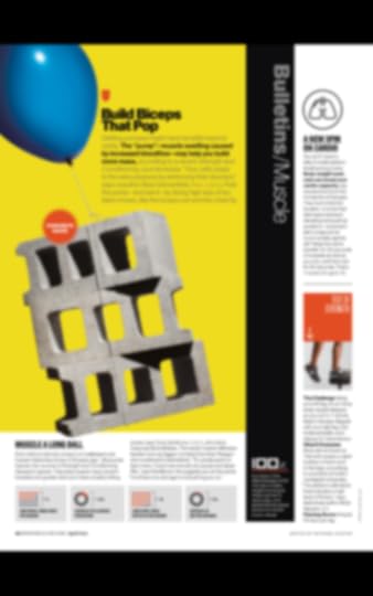
I'd love to see the Men's Health stock object library. I'd love to talk to the designer who thought an image of cinderblocks floating away would convey "biceps that pop" or that someone would want biceps that "pop" or that you can somehow get "biceps" that pop without also doing all the other things. It bothers me that Men's Health segments itself into such tiny chunks. Look at how the text is laid out on this page: each section is walled off, but takes only a few seconds to complete. I can't concentrate when I read it. I don't think it's meant to be read like other magazines. I feel like there's good data-based reasons they design it like this, but they're not good as in wholesome.
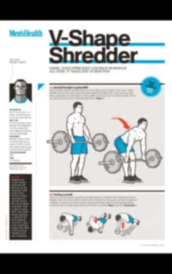
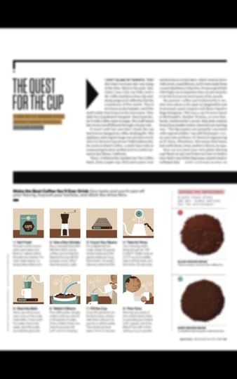
But if the point of the magazine is functionality, education, and assistance, their animated workout sections are fine. They're attractive, even! I like the arrows, and the colour scheme, and the light Wii-Fit gray in the background of the images.
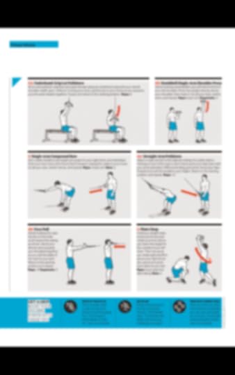
These kinds of pages are helpful, though, and I wish they'd do this more often. Sometimes, it's just better to explain an exercise visually, simply, and with bright orange motion arrows. It's all well and good to show good looking people being more healthy than you'll ever be, but this Wii-fIt-looking guy here? I can get there. Just gotta follow the orange motion arrows.
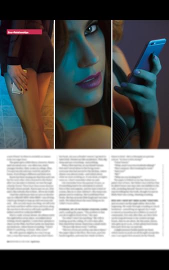
It wouldn't be Men's Health if there weren't a good amount of Playboy-lite material. It's often in between Esquire and Maxim for tastlessness, and the layouts of these pages tend to be the laziest in the whole book. It's not bad here but obvious, formulaic, and without any of the zeal that a great sexy ("sexy") ["""sexy"""] article should carry.
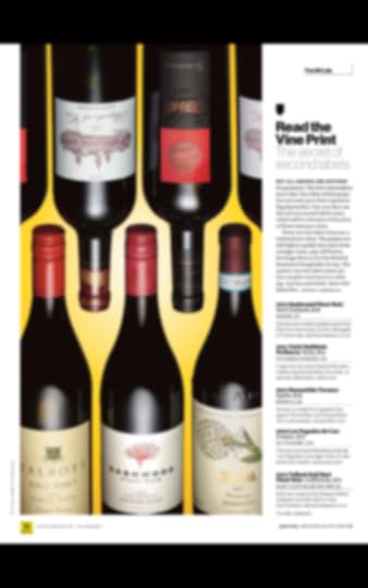
How do we fit five wine bottles in four inches of space? In a way that'll make you have to flip the magazine around to see two, that's how. Perhaps I'm just incredibly lucky to have the LCBO's "Food & Drink" in my proximity, but this is just about the most basic way to layout a wine list. Good background colour selection, though.
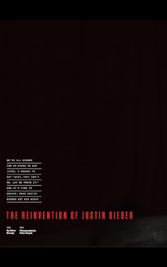
"Cover" pages in Men's Health often show flair. With Bieber, they went decidedly low-key. In magazines full of loud content like these, introduction pages like this almost have to act as white space, where the eye can finally relax for a second before the excess can continue.
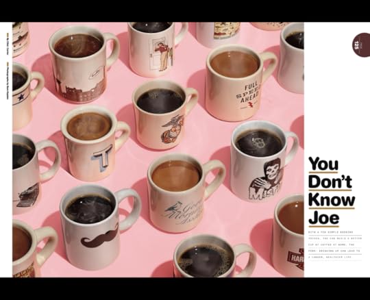
Speaking of excess, here's a million coffee cups, arranged isometrically. It's fun. I like this kind of thing. But just because you're talking about coffee doesn't mean it's okay to underline things in brown. Cripes.
The little flat designs are adorable here. This piece on coffee was why I even opened up the magazine, and the touches of animation and grid layout is good enough to be in a better publication.
All in all, there isn't a lot of inspiring layout in regards to Men's Health. What I do see are a lot of work just getting the content all to fit, and allowing for flourishes of colour and space only when they can absolutely get away with it. It's a strange magazine in that it knows what it wants to be--truckloads of information that may or may not actually help you--and looking good might come in fourth on the priority list. Still, every now and then while flipping through I see things I wish I'd thought of.
April 11, 2015
If you have to ask
In The Psychopath Test, Jon Ronson writes about a very quick safety on the worry that there may be something wrong with you in this regard. "If you think you might be a psychopath," he says, I think. I'm quoting from memory. "You aren't one."
The trigger on that defense is largely about empathy. The book goes into much greater detail about how psychopaths more or less lack any of it, and this allows them to succeed in cuthroat businesses (or, you know, murder) without the blocks that usually come with morality.
I think the opposite can be said for internet addiction. If you think, even for a moment, that you might be addicted to the internet, you are. I am. I need to work on it. I will work on it.
April 6, 2015
Sync footnote body and reference number in InDesign
A client recently asked me to make the footnotes numbers in both the body text and in the reference to look the same. Since the footnote in the body is superscript, they wanted the reference number to also be superscript. There isn't necessarily an automatic way to make this happen in the footnote panel, and the reference number usually goes with the paragraph style designated for footnotes. Here's how I made this happen.
So as you can see here, the footnote reference is not superscripted, and followed the same style as the rest of the footnote. This is the standard way InDesign creates this number.
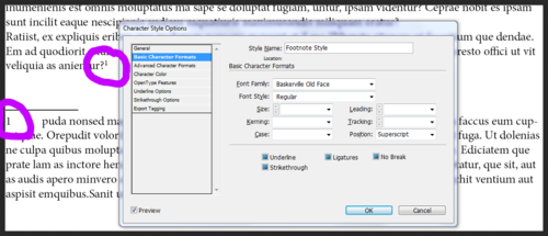
Make a "footnote style" character style, and a "footnote style" paragraph style. The paragraph style should contain the formatting you want for the footnote body. The only thing you should do with the character style here is make sure that it's superscript (or any difference you want from the reference number and the footnote text). As with all character styles, it should exist only as an exception to the paragraph style. Because my client wanted the footnote numbers in the body and the reference to match, I added in the font, formatting, and size.
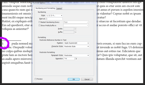
In the footnote panel, apply the character style you made as the character style, and the paragraph style you made as the paragraph style. Even after doing this, however, you'll notice no change in the footnote reference number. To make that work, I added the "footnote style" character style to the paragraph style as a nested style.
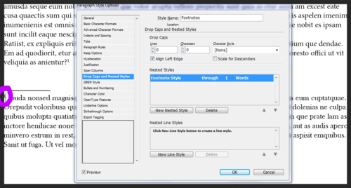
By adding the character style to the paragraph style via nested styles, the first word (in this case) will show up as the character style, which is however your footnote number in the body looks like. I find this to be a good solution, since the footnote body and reference numbers are now linked by formatting, so changing the footnote character style will update both.