David Clinton's Blog, page 2
November 29, 2021
A Data Analysis of IT Career Training Tools
How you train for your career is one of the most consequential decisions you’ll ever make. But it’s hard to narrow down your options for a career in software development or IT.
Medicine is easy: pick a medical school and apply.
But programming?
Will what you learn in a four year computer science degree be outdated by the time you graduate?Does one college deliver better results than another?Do intensive (and expensive) bootcamps really work?Is it possible to learn everything you’ll need on your own using free online resources?Program costs can range from free to many hundreds of thousands of dollars. And they can get you in and out in a few months, or drag on for a decade or longer.
At the same time, the payout in terms of your lifetime income will also vary widely.
It’s not enough to just go with what all your friends are doing or what “everyone says” is good enough. You’re going to need some data.
In this analysis, I’m going to introduce you to a couple of super useful data tools that are designed to help you assess both individual institutions and broad vocational training categories.
The first is the US government’s Postsecondary Value Commission’s data tool. You can download the complete dataset as a CSV from this page. And the second dataset comes from freeCodeCamp’s very own 2018 Developer’s Survey – whose data is publicly available.
Unfortunately, for purely practical reasons, the data I used for this article is all US-based. I know that many of you don’t live and work in the US. (I’m a Canadian myself.) But those were my constraints.
Nevertheless, most of the basic principles we’ll discuss here are universal. And your own country probably has its own set of similar resources that can bring you up to speed with whatever is unique to your part of the world.
You can find nearly all the tools I used in the analysis in the curriculum of my Teach Yourself Data Analytics in 30 Days curriculum. So there’s that.
I should note that all the insights you’ll see here are based on numbers, and incomplete numbers at that. The insights are interesting and, I believe, helpful. But they’re not guaranteed to be objectively correct. Data analytics has its limits. Its goal is to faithfully represent the real world, but numbers can be tricky.
The Postsecondary Value CommissionThere are, from the rich store of publicly available data on the PostSecondary Value website, three metrics that interest us:
The T-Zero (T0) thresholdCompletion ratesLoan default ratesTogether these can give us a pretty good idea of what kind of results you can expect from four-year colleges in general, and from individual institutions.
The T0 is designed to describe the real cost of a bachelors degree. That is, the estimated net cumulative cost of tuition and other related expenses in addition to the opportunity costs of not working full time during your student years.
They do that using the median earnings for high school graduates in a college’s home state. In other words, the income you could have expected to earn had you not gone to college.
How to Calculate T-Zero (T0) thresholdTo illustrate, let’s say that the cumulative total cost of a four year bachelors program is $200,000, but the average student can expect to receive Pell grants and scholarships of $80,000.
Therefore, the cumulative net total cost of the degree is $120,000. To get the T0, this number is amortized (spread) over ten years, giving us a yearly value of $12,000.
We then add the median yearly earnings for high school graduates in that state – let’s say that’s $30,000. Well, $12,000 + $30,000 gives us a yearly T0 value of $42,000.
For your college investment to be worthwhile, you should expect to be earning at least in excess of $42,000 by ten years after you begin your studies. If a large number of a college’s students are earning significantly less than the T0, then you should be concerned about the quality and value of their programs.
What is Degree Completion Rate?Degree Completion Rate is the percentage of students who enroll in a college and go on to graduate with a bachelors degree within 150% of the “expected time to completion”.
For a school where it’s expected for a bachelors to be earned within four years, 150% would be six years. Completion rates do not take into account students who transfer out and graduate at different institutions.
A school where 80% of its students graduate is probably on the right track. But a college with a 20% completion rate is definitely doing something wrong.
What is Loan Default Rate?The Loan Default Rate is the percentage of a school’s students who eventually fail to keep up with their student loan repayments. A school with a high default rate among its students is probably not doing enough to ensure their financial success.
Interestingly, I found a clear correlation between program cost and completion rates, and between program cost and loan default rates. But it wasn’t the correlation I’d expected.
Take a look at this scatter plot where the x-axis represents the average cumulative net price of collages and the y-axis represents completion rates. The OLS trendline is clearly rising along with costs. Meaning that the higher the cost, the more likely students will see it through.
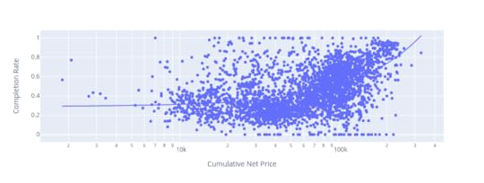 There’s a clear positive correlation between cumulative net price of colleges and the rates by which students complete their programs
Similarly, this next plot shows that student loan default rates go down as program costs rise:
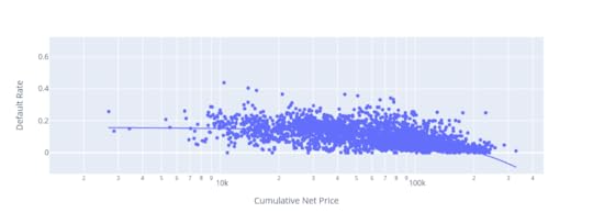 Student loan default rates drop as program costs rise
I guess we can say that the higher the stakes, the more seriously people take the challenge.
How to Know Whether a School is GoodBefore looking at any one school, you really need a sense of how the entire industry is doing. The median earnings relative to T0 across all 5,877 colleges being measured is $13,909.
That means that, among students who attended all US colleges in the system, half are earning $13,909 more than their T0 thresholds.
At the same time, 75% of students are earning less than $22,595 above the T0.
(Note that these numbers aren’t quite accurate – they’re actually averages derived from individual median values – but they’re close enough.)
The average completion rate across all 5,877 colleges is 54.8%. That means that just over 45% of all students who enroll at US colleges fail to graduate. That’s actually a stunning figure. It suggests that a very large proportion of all students give up (or fail to finish for some reason) without earning their degrees.
But what about the tens of thousands of dollars and years of work? All gone. In fact, 11% of students in the average US college end up defaulting on their education loans.
What’s going on here? On the one hand, many schools seem to accept students who are unprepared for the challenge of college. Colleges do, after all, earn a lot of money for each new enrollment. In other cases the schools might simply have failed to properly teach their students.
Just imagine if you ran a business that charged many thousands of dollars for a product that broke down 45% of the time and drove 11% of your customers into financial insolvency. Do you think you’d be running that business for very long?
The data explorer lets you search for any college in the system. Check out schools in your area and pay particular attention to the relationship between the median income (a number representing the income actual students of that school are earning ten years after initial enrollment) and the T0.
If the T0 is higher, it means that most students are actually losing money on their education.
The 2018 freeCodeCamp New Coder SurveyEven though it’s still an excellent representation of the state of the industry, this three year old data isn’t getting any younger. So let’s get started.
First, a few general observations. The 1,643 US-based freeCodeCamp respondents who reported having outstanding student debt held an average $36,171 of it. That’s very close to the latest (November, 2021) national figure of $39,351 reported by Education Data. I think this suggests that the freeCodeCamp data is largely representative of real world conditions.
How Much Do College Graduates Earn?What do those students get in exchange for their investment? The average annual income of all 3,645 US-based respondents who reported earnings was $41,874.
The 137 of those who had trade, technical, or vocational training earned a bit less: $39,897.
The 1,399 with a bachelors degree (in any field) earned $45,818.
And the 139 who had achieved a professional degree (MBA, MD, JD, etc.) averaged $71,151.
Running up $36k of student debt can make sense if there’s a very strong chance the program you’re taking will return income at a level that will eventually cover and surpass all of your costs. If your own research doesn’t leave you so confident on that score, then you should explore cheaper alternatives.
Are Coding Bootcamps Worth it?When it comes to coding, one of those cheaper alternatives is one of the many intensive bootcamps that have appeared in recent years.
Bootcamp course lengths tend to be measured in months rather than years, so they obviously require a smaller investment. But they’re not exactly cheap. Tuition for many bootcamps will cost $10,000 or more and, since they’re generally full time. You’ll need money for food and housing while you’re enrolled.
Does the bootcamp experience translate to higher income? The 3,411 US-based survey respondents who had never attended a bootcamp and reported their previous year’s income, earned an average of $42,018.
Surprisingly, the 234 respondents who had attended a bootcamp reported earning only $39,771. In addition, 102 of those bootcamp students who also had never attended college nevertheless reported an average of $22,941 in student debt.
Now I won’t claim that this figure is a true and absolute representation of the entire bootcamp world. There are certainly many individuals for whom bootcamps work wonderfully. But 234 is not an insignificant number. This is something to keep in mind.
freeCodeCamp, on the other hand, is designed with busy adult learners in mind. As such, the learning resources require learners to do more of the legwork than traditional schools would.
The curriculum is made up of comprehensive video and text content, interactive coding environments, and projects and challenges. And campers can find support among study groups around the world.
freeCodeCamp even offers extensive job interview preparation. And, of course, it’s all available in the comfort of your home and for free.
Besides bootcamps, however, there’s another category of technology learning resource: online courseware.
Do Online Courses Work? Insights from Data AnalysisSome online learning resources (like Khan Academy and, of course, freeCodeCamp) are available for free.
Others, like the four year college-affiliated Coursera or edX, charge for making certificates available at the end of their courses, but their content can usually be accessed for free.
And the content provided by platforms like Pluralsight can be accessed through monthly subscriptions. The costs of all of these options are significantly less expensive than either colleges or bootcamps.
So how do these resources compare to colleges and bootcamps when it comes to increased income? The chart below lays out some of the numbers from the freeCodeCamp survey.
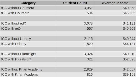 fCC stands for freeCodeCamp.org. freeCodeCamp paired with Pluralsight yielded the highest average income, followed by Coursera and EdX.
As you can see, income increased by around $6k for the 594 students who added Coursera content to their education portfolio. 567 edX students enjoyed nearly $5k extra income. The 1,529 freeCodeCamp students who also used Udemy saw nearly $4k extra. Inexplicably, you stood to lose $3.5k for using Khan Academy resources.
But what about those Pluralsight numbers? Now, I should come clean and confess that I’m a content author for Pluralsight, so I have a horse in this race. But there’s no missing the fact that Pluralsight delivered an average income premium of $12k over users accessing only freeCodeCamp. That’s a whopping 24% bump.
Again, all of those numbers are just statistical assumptions. They’re not hard, reliable predictions of what you’ll actually experience, and they won’t apply equally to everyone.
But they are tools that can help you think more productively about how you should be planning your education. Use them to give some thought to your plans and hopes within the context of what may be affordable now…and in ten years. But also try to go past the recruitment hype to see the true underlying value.
Now it’s your turn.


July 29, 2021
Data Analytics, Machine Learning, and Artificial Intelligence: the Differences
Because there is some overlap between them – and plenty of confusion – here’s a quick post to show you how data analytics, machine learning, and artificial intelligence fit into the larger scheme of things.
First, though, let’s define data itself:
Data is any digital information that is generated by, or used for, your compute operations. That will include log messages produced by a compute device, weather information relayed through remote sensors to a server, digital imaging files (like CT, tomography and ultrasound scans), and the numbers you enter into a spreadsheet. And everything in between.
Data analytics is the art (and science) of using programming tools or spreadsheets to parse large volumes of that data so it can be better understood and exploited. Typically, a data analyst will load a data set into an appropriate environment where it can be cleaned of unnecessary “noise”, shaped, visualized, and interpreted.
I describe this process in all its gory detail in my “Teach Yourself Data Analytics in 30 Days” project. But at its core, analytics is about understanding the world as the data presents it.
Machine learning (ML), on the other hand, is about using some of that same data – although often in much larger quantities – to predict what the world is going to look like. Like data analytics, machine learning looks for patterns in historical data sets. But rather than just trying to understand what happened, ML engineers seek to design (or “train”) software models to extend those historical patterns into the future.
A successful ML model might accurately predict which products will most interest the customers on your website, for instance. This will allow you to individualize each user’s experience. As a (slightly) less creepy example, think how banks use ML models to flag suspicious transactions that suggest someone’s trying to illegally use your credit card.
Finally, artificial intelligence (AI) is a cluster of tools for combining data – and often ML models – with computers to enable real-time interaction with the physical world. The trick is to get AI to the point where its autonomous machine performance is as good or better than that of humans.
The countless – and constantly expanding – range of AI applications include self-driving cars, digital assistants (like Alexa or Siri), and complex industrial control systems.
That’ll hopefully get you started in the right direction. There’s plenty more “executive briefing”-level information like this available in my Keeping Up: Backgrounders to all the big technology trends you can’t afford to ignore book.
July 15, 2021
An Interview on Security Fundamentals
I was recently interviewed by Kyle Johnson for Tech Target. Kyle did a good job hitting a nice range of timely and important topics as we discussed my Wiley book: Linux Security Fundamentals. We discussed ransomware, automated failover backups, and general security hygiene.
You can read a transcript of the interview here.
It turns out that, despite the title, the book isn’t really about Linux. It was originally intended to be an exam guide for a platform-neutral certification that, in the end, never happened. On Wiley’s request, I added a handful of Linux projects in appropriate chapters, and we rebranded the book “Linux.”
But 90% of the content is applicable no matter what OS you’re running.

June 24, 2021
Why You Really Need to Learn Data Analytics
Ok. I’m not suggesting that everyone needs to become a fully-credentialed data scientist. But these days, learning core data skills may provide as much value as basic financial literacy or knowledge of a simple coding language.
This isn’t just about your career: data has grown far beyond the world of IT professionals. It’s getting harder to imagine any significant life events that analytics can’t help secure and enhance.
And the good news is that acquiring those basic data skills doesn’t have to cost you any money or take much time. There’s a lot of sophisticated number crunching going on using plain old spreadsheets, for instance.
But even getting up to speed with the far more versatile world of Python and Jupyter Notebooks can happen faster than you might think. freeCodeCamp’s YouTube channel is host to a quick and dirty course of my own that’ll get you started. The rest of the course curriculum that’s available (for free) on my website can finish the job.
But why should you bother?
Who needs data analytics?Operations and business decision making of all kinds depend heavily on understanding data. Professionals in the security, administration, business intelligence, scientific research, insurance, and engineering fields would accomplish precious little without their data insights.
There’s a constant torrent of data being automatically generated daily by billions of events executed through millions of devices. Whether the data comes from credit card transactions, environmental sensors installed in cars, or system activity on your laptop, there’s no end to the stories it could be telling us.
It’s the job of an analyst to capture and manipulate data until it yields useful interpretations. That might mean:
Identifying and blocking suspicious behavior on distributed IT system infrastructureUnderstanding and fixing performance choke points within complex multi-level business processesDiscovering drug interactions with biological pathogensDetecting patterns and predicting events within financial marketsIntegrating online data with real-world operations (through technologies like augmented reality)…Or countless other applications, most of which haven’t yet been imagined.
How will data fit into your life?Smart use of publicly-accessible data can help you with important decisions. Searching for the right career? Try crunching government data, like that of the US Bureau of Labor Statistics – something I partially demonstrate here.
Facing some salary negotiation with your boss? You’d be surprised how much helpful geo-specific salary information there is available.
Not sure which way housing availability and prices in your city are likely to move in the next couple of years? You guessed it, there’s almost certainly a public data source to answer all your questions.
Sometimes, of course, the data you’re after won’t exist in exactly the format you need. Rather than give up, you can crowd source the problem. That, for example, is what’s behind my online “Consumer Product Durability” survey. If I’m successful in that particular project, I’ll be able to convert the actual experiences of thousands of living, breathing consumers into practical guidance, to help people know when to pay the big bucks for name brands, and when “no-name” is just as good.
The bottom line is that endless streams of data are sitting there, waiting for you to capitalize on them. Whether your goals are personal or professional, if you don’t use your data, rest assured, the competition (other people fighting for your job or other organizations fighting for your company’s profits) will.
One more thought. You shouldn’t think that data analytics is an all or nothing thing: perhaps because – on a basic level – they’re so accessible, learning to use some analytics tools can be a powerful addition to your technology portfolio. Think how much more you’ll be worth to your employer or business once you can tame their data.
June 3, 2021
Time for Another Look at Your Privacy Choices?
Some months back, I created this: “Is Good Internet Connectivity Always a Good Thing?” video on YouTube Today, ZDNet’s Adrian Kingsley-Hughes published an article he called “Yes, I trust Amazon to share my internet connection with my neighbors” and it provides a bit of a counterpoint. Kingsley-Hughs makes some good points. He notes that Amazon is probably as good as anyone when it comes to nailing secure connectivity and might even lead to improved home networks. He also observes:
“If you’re concerned about Amazon’s privacy and security credentials, then I’d question why you have Amazon hardware connected to your network in the first place. I mean, these devices have deep hooks into your life, home, and surroundings, and this hardware is bristling with microphones and cameras that are always ready to start listening and watching.”
All of which is correct. But it assumes you should be comfortable with those deep hooks latching on to and recording all your digital activities. I’m not. I had an Amazon Echo device in my home for a month or two but, after thinking about how much of our lives it was absorbing, I unplugged it. It’s been sitting in a drawer ever since.
I have no right to tell you how you should organize your own digital lives, but it is probably healthy to at least reassess your decisions every few months.
April 30, 2021
When Digital Marketing Fails
Not every business model will work for every business need. And business models that once worked, may not always work.
I recently came face to face with those truths as I moved through the steps of a digital marketing campaign. I won’t identify the specific digital marketing company I’d hired because they were an honest and hard working bunch. Though their results were disappointing (to put it mildly), they certainly weren’t out to mistreat me.
It was all about my “Keeping Up: Backgrounders to All the Big Technology Trends You Can’t Afford to Ignore“, a book that I’d just published independently. Since, unlike many of my other titles, this book didn’t have a traditional publisher with its own in-house marketing team, it was obviously up to me to take charge.
I briefly experimented with a number of advertising platforms used by the independent book industry with little success. But it was the openness, savvy, and enthusiasm of one particular digital marketing company that persuaded me to invest in a significant campaign.
The process, I was told, would first require me to create flashy landing pages on my website for both the book and my own profile. I would then need to build up accounts on Facebook (including the purchase of expensive – and in hindsight largely useless – Facebook ads) and Instagram in addition to my existing LinkedIn and Twitter presence. There were two reasons for this: to generate greater “brand recognition” for me as an author, and because potential influencer partners would expect it.
Social media influencersJust what is an “influencer partner?” That would be someone who’s well known and respected within his or her professional field. The goal is that an influencer who promotes your product can increase your visibility on social media in ways you could never do on your own.
This isn’t a new idea. Major brands have been using celebrities to represent them forever. What is relatively new is an entire industry filled with thousands of lesser-known individuals who have built up social media accounts with tens or hundreds of thousands of followers.
Owners of such accounts are, it seems, qualified to call themselves “influencers.” And those of us looking to sell products (like my book) can hire the services of an influencer who will, in exchange, promote the product through the usual social media channels and even host an “Instragram live” interview.
There’s certainly nothing wrong with all this. Due to the nature of the medium, fraud or material misrepresentation is rare or perhaps even impossible. I have no problem with people trying to make a living this way.
But does it work? I’m sure it sometimes does. A “tier one” influencer like a sports megastar or a public figure on the Elon Musk level is going to attract serious attention. Without a doubt, a promotion from a tier one influencer will drive the masses to your door. Of course, you probably can’t afford Elon Musk (even if he were for sale).
That leaves us with the tier two influencers, whose ability to drive your success is decidedly less certain. In my case, the influencer campaigns and interviews the team at my marketing company organized for me drew reasonable levels of viewer attention and engagement. The influencers themselves were professional and supportive. The whole process progressed pretty much according to plan.
What actually happenedBut it all failed miserably. Perhaps, as my marketing company suggested, my “brand recognition” and “market reach” has grown. I won’t dispute it because there’s simply no way to know. But the only metric that mattered to me was book sales. And, as far as I can tell, all of our efforts only managed to increase sales by 31 copies.
I spent close to $16,000 on the campaign, which means I would have needed to sell around 3,500 copies just to break even. The fact that I sold only 31 leaves me facing an overall loss in the neighborhood of 99%. (Although I won’t complain quite so loudly in a few months while enjoying my tax write off.)
What went wrong? Perhaps it was the product: my book. Perhaps digital marketing is less a science than a lottery. It can work, but whether it actually will requires intricate coordination between a number of independently moving parts. Or, in other words, luck.
Or perhaps the influencer model is just plain broken.
Have you had your own positive or negative experiences with digital marketing? Do you have insights from the “other side?” Why not share them here.
March 11, 2021
Establishing the Authenticity of Online Sources
Keeping your stuff secure in your digital life isn’t simple. This is, of course, true for your code, scripts, and financial accounts. But you can also be undone by bad information sources. That’s actually one topic in my Wiley/Sybex book, Linux Security Fundamentals, from which this article is excerpted.
You’ve got a strong and active interest in distinguishing between what’s real and what’s fake. Considering how much unreliable content is out there, making such distinctions might not be so simple. Many of the choices you make about your money, property, and attitudes will at least partly rely on information you encounter online, and you certainly don’t want to choose badly. So here’s where we’ll talk about ways you can test and validate content to avoid being a victim.
Think About the SourceAlways carefully consider the source of the information you want to use. Be aware that businesses – both legitimate and not – will often populate web pages with content designed to channel readers toward a transaction of some kind. The kind of page content that’ll inspire the most transactions is not necessarily the same as content that will provide honest and accurate information. That’s not to say that private business websites are always inaccurate – or that nonprofit organizations always produce reliable content – but that you should take the source into account.
With that in mind, I suggest that you’re more likely to get accurate and helpful health information, for example, from the website of a well-known government agency like the UK’s Department of Health and Social Care or an academic health provider like the Mayo Clinic (https://www.mayoclinic.org/ ) than from a site called CheapCureZone.com (a fictitious name but representative of hundreds of real sites).
Similarly, you should consider the context of information you’re consuming. Did it come in an email message from someone you know? Were you expecting the email? Did you get to a particular web page based on a link in a different site? Do you trust that site?
By the way, I personally consider Wikipedia to be a mostly accurate and reliable information site that generally includes useful links to source material. Biased or flat-out wrong information will sometimes turn up on pages, but it’s rare, and, more often than not, problematic pages will contain warnings indicating that the content in its current state is being contested. And if you do find errors? Fix ’em yourself.
Be Aware of Common Threat CategoriesSpam – unsolicited messages sent to your email address or phone – is a major problem. Besides the fact that the billions of spam messages transmitted daily consume a fortune in network bandwidth, they also carry thousands of varieties of dangerous malware and just plain waste our time.
Your first line of defense against spam is to make sure your email service’s spam filter is active. Your next step: educate yourself about the ways spammers use social engineering as part of their strategy.
Spoofing involves email messages that misrepresent the sender’s address and identity. You probably wouldn’t respond to an email from suspiciousguy@darkw3b.com , but if he presented himself as b.gates@microsoft.com , you might reconsider. At the least, recognize that email and web addresses can be faked. Organizations using DomainKeys Identified Mail (DKIM) to confirm the actual source of each email message can be effective in the fight against spoofing.
Phishing attacks, which are often packaged with spoofed emails, involve criminals claiming to represent legitimate organizations like banks. A phishing email might contain a link to a website that looks like it belongs to, perhaps, your bank, but doesn’t. When you enter your credentials to log in, those credentials are captured by the website backend and then used to authenticate to the actual banking or service site using your identity. I don’t have to tell you how that can end.
Always carefully read the actual web address you’re following before clicking – or at the least, before providing authentication details. Spelling counts: gmall.com is not the same as gmail.com . Consider using multifactor authentication (MFA) for all your account logins. That way, besides protecting you from the unauthorized use of your passwords, you should ideally notice when you’re not prompted for the secondary authentication method and back away.
In general, be deeply suspicious of desperate requests for help and unsolicited job offers. Scammers often pretend to be relatives or close friends who have gotten into trouble while traveling and require a quick wire transfer. Job offers can sometimes mask attempts to access your bank account or launder fake checks written against legitimate businesses.
It’s a nasty and dangerous world out there. Think carefully. Ask questions. Seek a second opinion. Always remember this wise rule: “If it’s too good to be true, it probably isn’t.” And remember, the widow of Nigeria’s former defense minister does not want you to keep $34.54 million safe for her in your bank account. Really.
As I said, this article is an excerpt from my Wiley/Sybex Linux Security Fundamentals book . I’ve got plenty more tech goodness available through my books , courses , and articles .
February 15, 2021
What Is Personal Data?
We’re all hearing a lot about how important it is to protect our personal data. But just what is personal data? This article comes from my Wiley/Sybex Linux Security Fundamentals book – which happens to be about much more than just Linux.
Your personal data is any information that relates to your health, employment, banking activities, close relationships, and interactions with government agencies. In most cases, you should have the legal right to expect that such information remains inaccessible to anyone without your permission.
But “personal data” could also be anything that you contributed with the reasonable expectation that it would remain private. That could include exchanges of emails and messages or recordings and transcripts of phone conversations. It should also include data—like your browser search history—saved to the storage devices used by your compute devices.
Governments, citing national interest concerns, will reserve the right for their security and enforcement agencies to forcibly access your personal data where legally required. Of course, different governments will set the circumstances defining “legally required” according to their own standards. When you disagree, some jurisdictions permit legal appeal.
Where Might My Personal Data Be Hanging Out?The short answer to that question is “Probably a whole lot of places you wouldn’t approve.” The long answer will begin with something like “I can tell you, but expect to become and remain deeply stressed and anxious.” In other words, it won’t be pretty. But since you asked, here are some things to consider.
Browsing HistoriesThe digital history of the sites you’ve visited on your browser can take more than one form. Your browser can maintain its own log of the URLs of all the pages you’ve opened. Your browser’s cache will hold some of the actual page elements (like graphic images) and state information from those websites. Online services like Google will have their own records of your history, both as part of the way they integrate your various online activities and through the functionality of website usage analyzers that might be installed in the code of the sites you visit.
Some of that data will be anonymized, making it impossible to associate with any one user, and some is, by design, traceable. A third category is meant to be anonymized but can, in practice, be decoded by third parties and traced back to you. Given the right (or wrong) circumstances, any of that data can be acquired by criminals and used against your interests.
E-commerce and Social Media Account DataEverything you’ve ever done on an online platform—every comment you’ve posted, every password you’ve entered, every transaction you’ve made—is written to databases and, at some point, used for purposes you didn’t anticipate. Even if there was room for doubt in the past, we now know with absolute certainty that companies in possession of massive data stores will always seek ways to use them to make money. In many cases, there’s absolutely nothing negative or illegal about that. As an example, it can’t be denied that Google has leveraged much of its data to provide us with mostly free services that greatly improve our lives and productivity.
But there are also concerning aspects to the ways our data is used. Besides the possibility that your social media or online service provider might one day go “dark side” and abuse their access to your data, many of them—perhaps most infamously, Facebook—have sold identifiable user data to external companies.
An even more common scenario has been the outright theft of private user data from insufficiently protected servers. This is something that’s already happened to countless companies over the past few years. Either way, there’s little you can do to even track, much less control, the exciting adventures your private data may be enjoying—and what other exotic destinations it might reach one, five, or ten years down the road.
Government DatabasesNational and regional government agencies also control vast stores of data covering many levels of their citizens’ behavior. We would certainly hope that such agencies would respect their own laws governing the use of personal data, but you can never be sure that government-held data will never be stolen—or shared with foreign agencies that aren’t bound by the same standards. It also isn’t rare for rogue government agencies or individual employees to abuse their obligations to you and your data.
Public ArchivesThe internet never forgets. Consider that website you quickly threw together a decade ago as an expression of your undying loyalty to your favorite movie called…wait, what was its name again? A year later, when you realized how silly it all looked, you deleted the whole
thing. Nothing to be embarrassed about now, right? Except that there’s a good chance your site content is currently being stored and publicly displayed by the Internet Archive on its Wayback Machine. It’s also not uncommon for online profiles you’ve created on social networking sites like Facebook or LinkedIn to survive in one form or another long after deletion.
As we’ll learn in Chapter 6, “Encrypting Your Moving Data,” information can be transferred securely and anonymously through the use of a particular class of encrypted connections known as a virtual private network (VPN). VPNs are tools for communicating across public, insecure networks without disclosing your identifying information. That’s a powerful security tool. But the same features that make VPNs secure also give them so much value inside the foggy world of the internet’s criminal underground.
A popular way to describe places where you can engage in untraceable activities is using the phrase dark web. The dark web is made up of content that, as a rule, can’t be found using mainstream internet search engines and can be accessed only through tools using specially configured network settings.
The private or hidden networks where all this happens are collectively known as the darknet. The tools used to access this content include the Tor anonymity network that uses connections that are provided and maintained by thousands of participants. Tor users can often obscure their movement across the internet, making their operations effectively anonymous.
Like VPNs, the dark web is often used to hide criminal activity, but it’s also popular among groups of political dissidents seeking to avoid detection and journalists who communicate with whistleblowers. A great deal of the data that’s stolen from servers and private devices eventually finds its way to the dark web.
February 5, 2021
How to Use Python and Pandas to Map Major Storms, Pessimism, and Hard Data
Sometimes it can be somehow comforting to reflect on how much worse everything is now than it was in the good old days.
“Kids have no respect.”
“Everything costs way too much.”
“Public officials don’t inspire trust.”
“And what about the weather? We never used to get so many devastating hurricanes, did we?”
Well I’m old enough to have been around the block a few times and I’m not sure. I wasn’t exactly angelic as a child, things always cost more than we wanted them to, and public officials were never the most loved creatures on the planet. But major storms? I haven’t a clue.
It turns out that there’s a lot of excellent storm data out there, so there’s no reason why we shouldn’t at least search for some clues. And my attempts to add data analytics to my existing stock of professional tools might help, here.
First, though, we should carefully define some terms and fill in some background details.
What Is a Major Storm?Hurricanes – or, more accurately, tropical cyclones – are “tropical” in the sense that they form over oceans within tropical regions. The term “tropics” refers to the area of the earth’s surface that falls within 23 degrees (or so) of the equator, to both its north and south.
The storms are called “cyclones” because the movement of their winds is cyclical (clockwise in the Southern Hemisphere and counterclockwise in the Northern Hemisphere).
Cyclones are fed by evaporated ocean water and leave torrential and often violent thunderstorms in their wake – especially after drifting over habited land areas.
In broad terms, a storm producing sustained winds of between around 34 and 63 knots (or between 39 and 72 miles per hour) is considered a tropical storm. Storms with winds above 64 knots (73 mph) are hurricanes (or, in the Western Pacific or North Indian Oceans, typhoons).
Hurricanes are measured by categories between one and five, where category five hurricanes are the most violent and dangerous.
Where Does Major Storm Data Come From?Reliable and largely consistent historical storm data exists, at least in the US, for the past century and a half. But properly understanding the context of that data will require some knowledge of how those observations were made over the years.
Until the 1940’s, most observations were made by the crews of ocean-going ships. But ship’s crews can only observe and report what they see, and what they see will be determined by where they go.
Before the opening of the Panama Canal in 1914, ships traveling between Europe and the Pacific ocean would follow a route around the southern tip of South America that largely missed US coastal areas. As a result, it’s likely that a significant percentage of weather events were simply missed.
Similarly, the advent of aircraft reconnaissance in the 1940s would have allowed scientists to catch more events that would have earlier been missed. And the use of weather satellites from the 1960s on has allowed us to catch just about all ocean activity.
These changes, and their impact on storm data, are neatly summarized on this page from the US government National Oceanic and Atmospheric Administration (NOAA) site, based on a data analysis study performed for the Geophysical Fluid Dynamics Laboratory (GFDL).
What Does the Historical Record Show?So after all that background, what does the data actually say? Are serious hurricanes more common now than in the past? Well, according to the NOAA website, the answer is: “No.” Here’s how they put it:
“Atlantic tropical storms lasting more than 2 days have not increased in number. Storms lasting less than two days have increased sharply, but this is likely due to better observations…We are unaware of a climate change signal that would result in an increase of only the shortest duration storms, while such an increase is qualitatively consistent with what one would expect from improvements with observational practices.”
You’ll get the whole story, including a nice explanation for the data manipulation choices they made, by reading the study itself. In fact, I encourage you to read that study, because it’s a great example of how the professionals approach data problems.
From here on in, however, you’ll be stuck with my amateur and simplified attempts to visualize the raw, unadjusted data record.
US Hurricane Data: 1851-2019Our source for “Continental United States Hurricane Impacts/Landfalls” data is this NOAA webpage.
To download the data, I simply copied it by clicking my mouse at the top left (the “Year” heading field) and dragging all the way down to the bottom-right. I then pasted it into a plain-text editor on my local computer and saved it to a file with the extension .csv.
How to Clean Up the Hurricane DataIf you quickly look through the webpage itself you’ll see some formatting that’ll need cleaning up. Each decade is introduced with a single row containing nothing but a string looking like: 1850s. We’ll want to just drop those rows. Years with no events contain the string none in the second column. Those, too, will need to go.
There are some events that apparently have no data for their Max Wind speeds. Instead of a number (measured in knots), the speed values for those events are represented by five dashes (-----). We’ll have to convert that to something we can work with.
And finally, while months are generally represented by three-letter abbreviations, there were a couple of events that stretched across two months. So we’ll be able to properly process those, I’ll therefore convert Sp-Oc and Jl-Au to Sep and Jul respectively.
The fact is that we won’t actually be using the month column, so this won’t really make any difference. But it’s a good tool to know.
Here’s how we set things up in Jupyter:
import pandas as pdimport matplotlib as pltimport matplotlib.pyplot as plt import numpy as npdf = pd.read_csv('all-us-hurricanes-noaa.csv')Let’s look at the data types for each column. We can ignore the strings in the States and Name column – we’re not interested in those anyway. But we will need to do something with the date and Max Wind columns – they won’t do us any good as object.
df.dtypesYear objectMonth objectStates Affected and Category by States objectHighest\nSaffir-\nSimpson\nU.S. Category float64Central Pressure\n(mb) float64Max Wind\n(kt) objectName objectdtype: objectSo I’ll filter all rows in the Year column for the letter s and simply drop them (== False). That will take care of all the decade headers (that is, those rows containing an s as part of something like 1850s).
I’ll similarly drop rows containing the string None in the Month column to eliminate years without storm events.
While quiet years could have some impact on our visualizations, I suspect that including them with some kind of null value would probably skew things even more the other way. They’d also greatly complicate our visualizations.
Finally, I’ll replace those two multi-month rows.
df = df[(df.Year.str.contains("s")) == False]df = df[(df.Month.str.contains("None")) == False]df = df.replace('Sp-Oc','Sep')df = df.replace('Jl-Au','Jul')Next, I’ll use the handy Pandas to-datetime method to convert the three-letter month abbreviations to numbers between 1 and 12. The format code %b is one of Python’s legal date-related designations and tells Python that we’re working with a three-letter abbreviation. For the full list, see this page.
df.Month = pd.to_datetime(df.Month, format='%b').dt.monthI’d like to tighten up the headers a bit so they’re a little easier to both read and reference in our code. df.columns will change all column header values to the list I specify here:
df.columns =['Year', 'Month', 'States', 'Category', 'Pressure', 'Max Wind', 'Name']I’ll have to convert the Year data from string objects to integers, or Python won’t know how to work with them appropriately. That’s done using astype.
As advertised, I’ll also convert the null (-----) values in Max Wind to NaN – which NumPy will read as “not a number.” I’ll then convert the data in Max Wind from object to float.
df = df.astype({'Year': 'int'})df = df.replace('-----',np.NaN)df = df.astype({'Max Wind': 'float'})Let’s see how all that looks now:
df.dtypesYear int64Month int64States objectCategory float64Pressure float64Max Wind float64Name objectdtype: objectMuch better.
How to Present the Hurricane DataNow, looking at our data, I’m going to suggest that we break out the three metrics: hurricane category, barometric pressure, and maximum wind speeds.
My thinking is that there’s little to gain from the added complication by lumping them together, and we risk losing sight of important differences between incidents of lighter and more serious storms.
Of course, I can always isolate individual metrics to see what their distributions would look like. Using value_counts against the Category column, for instance, shows me that the lighter category 1 and 2 hurricanes are far more frequent than the more dangerous events.
df['Category'].value_counts()1.0 1212.0 833.0 624.0 255.0 4Name: Category, dtype: int64And plotting a single histogram of the complete data set does give us a nice overview of the number of events (represented on the y-axis) through history, but we might be losing some of the finer details in the process.
From this histogram, it’s obvious that there’s been no noticeable change in storm frequency over time. To be sure that my choice of the number of bins we’re using isn’t unintentionally masking important trends, experiment with other values besides 25.
df.hist(column='Year', bins=25)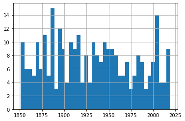 All Hurricane Events
But to allow us to focus on each metric, I’ll plot three separate graphs. To do that, I’ll create three new dataframes and populate each one with the contents of the Year column and the respective data column.
df_category = df[['Year','Category']]df_wind = df[['Year','Max Wind']]df_pressure = df[['Year','Pressure']]Sending each of those dataframes straight to a plot will miss the point, because it won’t distinguish between the severity of storms. So I’ll show you how we can break out the data by category (1-5). This for loop will iterate through the numbers 1-6 (which is “Python” for returning the numbers between 1 and 5) and uses each of those numbers in turn to search for hurricanes of that category.
Rows whose category matches the number will be written to a new (temporary) dataframe called df1 which will, in turn, be used to plot a histogram. The plt.title line applies a title for the printed graph that will include the category number (the current value of converted_num).
The loop will work through the process five times, each time writing the number of events the current category to df1. All five histograms will be printed, one after the other.
for x in range(1, 6): cat_num = x converted_num = str(cat_num) dfcat = df_category['Category']==(x) df1 = df_category[dfcat] df1.hist(column='Year', bins=20) plt.title("Total Category " (converted_num) " Events")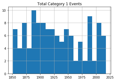 Category 1 Hurricanes
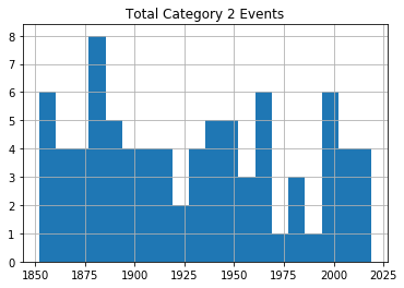 Category 2 Hurricanes
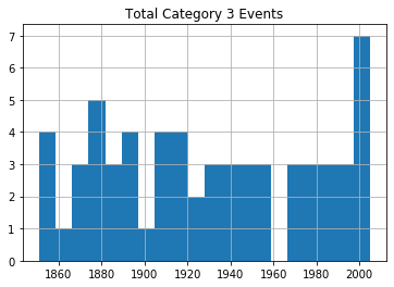 Category 3 Hurricanes
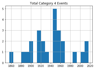 Category 4 Hurricanes
 Category 5 Hurricanes
As you can see, there’s no noticeable evidence of significantly rising storm frequency over time.
As always, scan your data (using tools like value_counts()) to confirm that the plots make sense in the real world.
US Tropical Storm Data: 1851-1965, 1983-2019Hurricanes (or cyclones) are, of course, only one part of the story. A rise in the frequency of destructive tropical storms would also be cause for concern.
Fortunately, NOAA makes relevant data available in much the same format as their hurricane data. Here’s the webpage where you’ll find the chart. Copy the data into a .csv file the same way as before.
Note, however, how there’s no data for the years 1966-1982. Don’t ask me why. There just isn’t. Funny thing, weather.
I would create a new Jupyter notebook for this part of the project, as there’s nothing we’ll need from the hurricane version. Therefore, you’ll set things up as always:
import pandas as pdimport matplotlib as pltimport numpy as npdf = pd.read_csv('all-us-tropical-storms-noaa.csv')Let’s Clean Up the Tropical Storm DataThe rows representing years without events should, again, be removed:
df = df[(df.Date.str.contains("None")) == False]The Date column in this dataset has characters pointing to five footnotes: $, *, #, %, and &. The footnotes contain important information, but those characters will give us grief if we don’t remove them.
These commands will get that done, replacing all such strings in the Date column with nothing:
df['Date'] = df.Date.str.replace('\$', '')df['Date'] = df.Date.str.replace('\*', '')df['Date'] = df.Date.str.replace('\#', '')df['Date'] = df.Date.str.replace('\%', '')df['Date'] = df.Date.str.replace('\&', '')Next, I’ll reset the column headers. First, because it will be easier to work with nice, short names. But primarily because, as a Linux sysadmin, I find spaces in filenames or headings morally offensive.
df.columns =['Storm#', 'Date', 'Time', 'Lat', 'Lon', 'MaxWinds', 'LandfallState', 'StormName']The column data types are going to need some work:
df.dtypesStorm# objectDate objectTime objectLat objectLon objectMaxWinds float64LandfallState objectStormName objectdtype: objectLet’s see what our data looks like:
df.head()Storm# Date Time Lat Lon MaxWindsLandfallState StormName6 10/19/1851 1500Z 41.1N 71.7W 50.0 NY NaN3 8/19/1856 1100Z 34.8 76.4 50.0 NC NaN4 9/30/1857 1000Z 25.8 97 50.0 TX NaN3 9/14/1858 1500Z 27.6 82.7 60.0 FL NaN3 9/16/1858 0300Z 35.2 75.2 50.0 NC NaNI’m actually not sure what those Storm # values are all about, but they’re not hurting anyone. The dates are formatted much better than they were for the hurricane data. But I will need to convert them to a new format. Let’s do it right and go with datetime.
df.Date = pd.to_datetime(df.Date)How to Present the Tropical Storm DataFor our purposes, the only data column that really matters is MaxWinds – as that is what defines the intensity of the storm. This command will create a new dataframe made up of the Date and MaxWinds columns:
df1 = df[['Date','MaxWinds']]No reason to push this off: we might as well fire up a histogram right away. You’ll immediately see the gap around 1970 where there was no data. You’ll also see that, again, there doesn’t seem to be much of an upward trend.
df1['Date'].hist()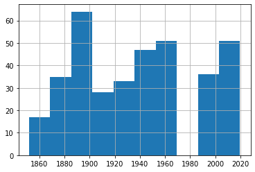 Histogram of All Tropical Storms
But we really should drill down a bit deeper here. After all, this data just mixes together 30 knot with 75 knot storms. We’ll definitely want to know whether or not they’re happening at similar rates.
Let’s find out how many rows of data we’ve got. shape tells us that we’ve got 362 events altogether.
print(df1.shape)(362, 2)Printing our dataframe shows us that the MaxWinds values are all multiples of 5. If you scan the data for yourself, you’ll see that they range between 30 and 70 or so.
df1 Date MaxWinds1 1851-10-19 50.06 1856-08-19 50.07 1857-09-30 50.08 1858-09-14 60.09 1858-09-16 50.0... ... ...391 2017-09-27 45.0392 2018-05-28 40.0393 2018-09-03 45.0394 2018-09-03 45.0395 2019-09-17 40.0362 rows × 2 columnsSo let’s divide our data into four smaller sets as reasonable proxies for storms of various levels of intensity. I’ve created four dataframes and populated them with events falling in their narrower ranges (that is between 30 and 39 knots, 40 and 49, 50 and 59, and 60 and 79). This should give us a reasonable frame of reference for our events.
df_30 = df1[df1['MaxWinds'].between(30, 39)]df_40 = df1[df1['MaxWinds'].between(40, 49)]df_50 = df1[df1['MaxWinds'].between(50, 59)]df_60 = df1[df1['MaxWinds'].between(60, 79)]Let’s confirm that the cut-off points we’ve chosen make sense. This code will attractively print the number of rows in the index of each of our four dataforms.
st1 = len(df_30.index)print('The number of storms between 30 and 39: ', st1)st2 = len(df_40.index)print('The number of storms between 40 and 49: ', st2)st3 = len(df_50.index)print('The number of storms between 50 and 59: ', st3)st4 = len(df_60.index)print('The number of storms between 60 and 79: ', st4)The number of storms between 30 and 39: 51The number of storms between 40 and 49: 113The number of storms between 50 and 59: 142The number of storms between 60 and 79: 56There probably is an elegant way to combine those four commands into one. But my philosophy is that syntax that would take me an hour to figure out will never outweigh the simplicity of five seconds of cutting and pasting. Ever.
We could also look just a bit deeper into the data using our old friend, value_counts(). This will show us that there were 71 40 knot events and 42 45 knot events throughout our time range.
df_40['MaxWinds'].value_counts()40.0 7145.0 42Name: MaxWinds, dtype: int64We can plot a single line graph to display all four of our subsets together. This plot adds axis and plot labels and a legend to make the data easier to understand. The subplot(111) value controls the size of the figure.
import matplotlib.pyplot as pltfig = plt.figure()ax = plt.subplot(111)df_30['MaxWinds'].plot(ax=ax, label='df_30')df_40['MaxWinds'].plot(ax=ax, label='df_40')df_50['MaxWinds'].plot(ax=ax, label='df_50')df_60['MaxWinds'].plot(ax=ax, label='df_60')ax.set_ylabel('Wind Speed In Knots')ax.set_xlabel('Time Between 1851 and 2019')plt.title('Tropical Storms by Maximum Wind Speeds (knots)')ax.legend()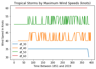 All Tropical Storms
This can be helpful for confirming that we’re not making a mess of the data itself. Checking visually will show, for instance, that there was, indeed, only a single 30 knot event in our dataset and that it took place towards the end of our time frame in 2016. But it’s not a great way to show us changes in event frequency.
For that, we’ll look at the data held in each of our dataframes.
df_30['Date'].hist(bins=20)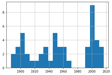 30-39 Knot Eventsdf_40['Date'].hist(bins=20)
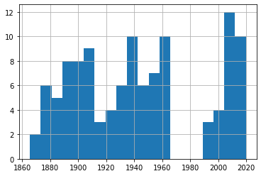 40-49 Knot Eventsdf_50['Date'].hist(bins=20)
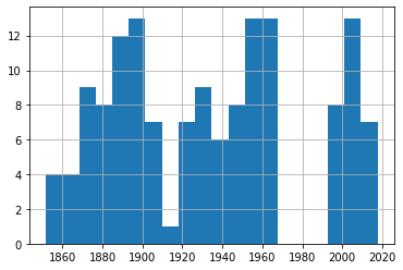 50-59 Knot Eventsdf_60['Date'].hist(bins=20)
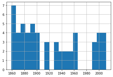 60-79 Knot Events
A quick glance through those four plots shows us fairly consistent event frequency through the 150 years or so of our data. Again, try it yourself using different numbers of bins to make sure we’re not missing some important trends.
You can find much more technology content by David Clinton through his website. In particular, you might enjoy his new book, Keeping Up: Backgrounders to all the big technology trends you can’t afford to ignore .
January 12, 2021
So Malcolm Gladwell got the data all wrong…or did he?
In this article, I’ll share some newbie explorations I’ve made in the areas of data analytics and pro hockey.
I recently embarked on a crazy journey into the world of data analytics. There’s nothing all that crazy about data analytics, mind you. It’s my journey that’s a bit odd.
You see, I’ve built myself a nice career in cloud and Linux administration, but I’m no developer. And, besides some obvious overlap, data is a whole universe apart from administration – a universe where programming on some level just can’t be avoided.
But parts of my work require me to closely follow the big developing trends in technology. And data is big. For years I’ve watched all the (un)cool kids playing around with the numbers that make the modern world work and, frankly, I’m jealous.
So here I go. I’m going to fumble my way through some very unfamiliar territory, make some dumb mistakes, and have fun. Want to join me?
This article won’t start with the absolute basic basics. If you’re still looking to take your first steps in Python, check this out. And if you want to know how to get started with a programming environment like the Jupyter notebooks I use, look over here. I’ll assume you’re already comfortable with all that.
Do Birthdays Matter in Sports?I’ll begin with the question I’m going to try to answer:
Are you more likely to succeed as an elite athlete if your birthday happens to fall early in the calendar year?
It’s been claimed that youth sports that divide participants by age and set the yearly cut off at December 31 unwittingly make it harder for second-half-of-the-year players to succeed. That’s because they’ll be competing against players who are many months older.
At younger ages, those months can make a very big difference in physical strength, size, and coordination. If you were a minor league coach looking to invest in talent for a better team in a stronger league, who would you choose? And who would benefit over the long term from your extra attention?
This is where the well-known writer, thinker, (and fellow Canadian) Malcolm Gladwell comes in. Gladwell wasn’t actually the original source of this insight, although he’s the one most often associated with it.
Rather, those honors fall to the psychologist Roger Barnesly who noticed an oddly distributed birthdate pattern among players at an elite junior hockey game he was attending. Why were so many of those talented athletes born early in the year? Gladwell just mentioned Barnesly’s insight in his book Outliers, which was where I came across it.
But is all that true? Was Barnesly’s observation just an intriguing guess, or does real-world data bear him out?
Where Does the NHL Hide Its Data?A couple of my kids are still teenagers so, for better or for worse, there’s no escaping the long shadow of hockey fandom in my house. To feed their bottomless appetites for such things, I discovered the existence of a robust official but undocumented API maintained by the National Hockey League. This URL:
https://statsapi.web.nhl.com/api/v1/t...…for instance, will produce a JSON-formatted dataset containing the official current roster of the Washington Capitals. Changing that 15 in the URL to, say, 10, would give you the same information about the Toronto Maple Leafs.
There are many, many such endpoints as part of the API. Many of those endpoints can, in addition, be modified using URL expansion syntax.
How to Use Python to Scrape NHL StatisticsFun fact: if you look at the site icon in the browser tab while on an NHL API-generated web page, you’ll see the Major League Baseball trademark. How did that happen?
Knowing all that, I could scrape the endpoint for each team’s roster for each player’s ID number, and then use those IDs to query each player’s unique endpoint and read his birthdate. I could then extract the birth month from each NHL player into a Pandas DataFrame where the entire set could be computed and displayed as a histogram.
Here’s the code I wrote to make all that happen. I’m not going to discuss it in detail here, although that might happen sometime later.
import pandas as pdimport requestsimport jsonimport matplotlib.pyplot as pltimport numpy as npdf3 = pd.DataFrame(columns=['months'])for team_id in range(1, 11, 1): url = 'https://statsapi.web.nhl.com/api/v1/t... r = requests.get(url) roster_data = r.json() df = pd.json_normalize(roster_data['roster']) for index, row in df.iterrows(): newrow = row['person.id'] url = 'https://statsapi.web.nhl.com/api/v1/p... newerdata = requests.get(url) player_stats = newerdata.json() birthday = (player_stats['people'][0]['birthDate']) newmonth = int(birthday.split('-')[1]) df3 = df3.append({'months': newmonth}, ignore_index=True)df3.months.hist()Before moving on, I should add a few notes:
Be careful how and how often you use this code. There are nested for/loops, so running the script even once will hit the NHL’s API with more than a thousand queries. And that’s assuming everything goes the way it should. If you make a mistake, you could end up really annoying people you don’t want to annoy.This code (for team_id in range(1, 11, 1):) actually only scrapes data from 11 of the NHL’s 30 teams. For some reason, certain API roster endpoints failed to respond to my queries and actually crashed the script. So, to get as much data as I could, I ran the script multiple times. This one was the first of those runs. If you want to try this yourself, remove the df3 = pd.DataFrame(columns=['months']) line from subsequent iterations so you don’t inadvertently reset the value of your DataFrame to zero.Once you’ve successfully scraped your data, use something like df3.to_csv('player_data.csv') to copy your data to a CSV file, allowing you to further analyze the contents even if the original DataFrame is lost. It’s always good to avoid placing an unnecessary load on the API origin.How to Visualize the Raw DataOk. Where was I? Right. I’ve got my data – the birth months of nearly 1,100 current NHL players – and I want to see what it looks like. Well wait no longer, here it is in all its glory:
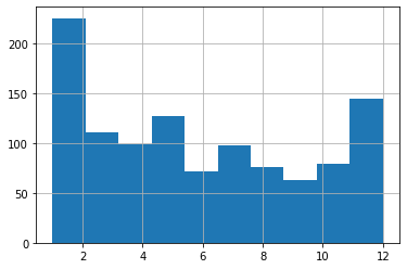
What have we got here? Looks to me like January births do, indeed, account for a disproportionately high number of players but, then, so do December births. And, overall, I just don’t see the pattern that Gladwell’s idea predicted. Aha! Shot down in flames. Never, ever trust an intellectual!
Err. Not so fast there, youngster. Are we sure we’re reading this histogram correctly? Remember: I’m just starting out in this field and learning on the “job.”
The default settings may not actually have given us what we thought they would. Note, for instance, how we’re measuring the frequency of births over 12 months, but there are only ten bars in the chart!
What’s going on here?
What Do Histograms Really Tell Us?Let’s look at the actual numbers behind this histogram. You can get those numbers by loading the CSV file you might have earlier exported using df3.to_csv('player_data.csv'). Here’s how you might go about getting that done:
import pandas as pddf = pd.read_csv('player_data.csv')df['months'].value_counts()And here’s what my output looked like (I added the column headers manually):
Month Frequecy5 1272 1213 1111 1044 997 9810 798 7612 756 7111 699 63Looks like there were 127 births in May, 121 in February, and 111 in March. December had only 75.
Whoops. Sorry Malcolm. I should have had more faith. See how the five months with the highest birth frequencies are the first five months of the year? Now that’s exactly what Gladwell’s prediction would expect. So then what’s up with the histogram?
Let’s run it again, but this time, I’ll specify 12 bins rather than the default ten.
import pandas as pddf = pd.read_csv('player_data.csv')df.hist(column='months', bins=12);A “bin” is actually an approximation of a statistically appropriate interval between sets of your data. Bins attempt to guess at the probability density function (PDF) that will best represent the values you’re actually using. But they may not display exactly the way you’d think – especially when you go with the defaults. Here’s what we’re shown using 12 bins:
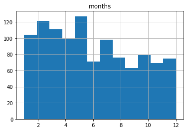
This one probably shows us an accurate representation of our data the way we’d expect to see it. I say “probably,” because there could be some idiosyncrasies with the way histograms divide their bins I’m not aware of.
Make Sure to Use the Right Tools For the JobBut it turns out that the humble histogram was actually the wrong visualization tool for our needs.
Histograms are great for showing frequency distributions by grouping data points together into bins. This can help us quickly visualize the state of a very large dataset where granular precision will get in the way. But it can be misleading for use-cases like ours.
Instead, let’s go with a plain old bar graph that incorporates the groupby and count arguments.
df.groupby('months').count().plot(kind='bar')Running that will give us something a bit easier to read that’s also more intuitively reliable:
That’s better, no? We can see that the five months with the highest birth month frequencies are at the start of the year.
The moral of the story? Data is good. Histograms are good. But it’s also good to know how to read them and when to use them.
There’s much more administration goodness in the form of books, courses, and articles available at my site: bootstrap-it.com.