
Chris Gavaler's Blog, page 30
June 22, 2020
The Horrors of Pre-pandemic Dating
I keep seeing articles about being single during the pandemic, which makes this review from March improbably outdated. How could so much have changed almost literally overnight?

Goblin Girl opens with a partial nude. Moa is swiping through a dating app in bed. Her facial features are cartoonishly flat: single curved lines for mouth and nose, straight lines for eyebrows, ovals for eyes. Her body is simplistic too, mostly outline with an occasional squiggle to suggest naval or elbow dent, but those contours are distorted in a mostly proportional sense, leaving her tiny head and impossibly massive ears marooned atop almost realistically curving shoulders. She is an amalgam of slightly contradictory styles.

Romanova is from Stockholm, so it’s hard to trace the direction of influences, but her body is a pleasantly improbable combination of Canadian artst Michael DeForge’s hyper-cartoonish faces and U.S. artist Eleanor Davis’ not-so-feminine female forms. There’s something paradoxically attractive about a female artist drawing herself unattractively. Though attractive/unattractive is the wrong dichotomy. The image is neither erotic nor non-erotic. Her bare breast is brightened with the same pink as her annoyed cheeks and the scattered objects accenting the otherwise black and white art. Moa’s body simply is.
But that’s not quite true either. “Moa” isn’t necessarily even Moa. The publisher identifies Goblin Girl as “semi-auto-bio,” making “Moa” another kind of stylistic amalgam, a character marooned between the fiction/nonfiction dichotomy. Like the details within the images, her story events vacillate between the mostly realistic and the cartoonishly absurd. And what better place could Romanova explore the realistically absurd world of contemporary dating?
 PopMatters.]


June 15, 2020
Washington and Lee and Floyd
From my Washington and Lee English Department:
Dear Members of our Community,
In September of 2017, the English Department published a statement to our students in which we condemned the neo-Nazi rhetoric and violence on display in Charlottesville earlier that summer. We still denounce white supremacy and the overt and insidious ways it operates, on our own campus and throughout the United States. This includes state-sanctioned white supremacist police violence, the deadly consequences of which resulted in the recent killings of Breonna Taylor, Manuel Ellis, Tony McDade, and George Floyd. The alarming frequency of these murders—to say nothing of the gross lack of accountability—must end. The clear inequities experienced by members of underrepresented and vulnerable groups, which are deliberate in a world organized by white supremacy, must end. The stakes are too dear to wait any longer. The current protests around the US and the globe show that we are not alone in this call for a more just world.
As educators, we are responsible for curating and protecting spaces of learning. As such, we have a responsibility to eradicate racism and prejudice from such spaces. We encourage our students to understand the world as a consequence of violent histories of race and racism, of slavery, of settler colonialism, and of prejudice on the basis of color, nation, custom, religion, gender, sexuality, and ability. In short, we challenge them to consider the many forms that policing can take. As literary critics and creative writers, we know that language holds the potential for disrupting racist ideologies, but we should not ignore the threat that language and hateful rhetoric pose in perpetuating racist systems and beliefs. We teach our students to be careful readers, to be thoughtful in their critiques, and to recognize the impact that they can have on their world.
We affirm the moral bare minimum: Black lives matter. But such an affirmation must only be the beginning of a more thorough process of dismantling the systems of oppression. We recognize and support those who take stands against racial injustice and demand another world. This includes protesters, of course, but also those who engage in the quotidian, unglamorous work of organizing, of providing care for the marginalized, of holding things together while so many go on about their lives. Indeed, care-work holds great potential to imagine a way forward. All of us will need to play roles in bringing forth a new world, but we honor those who have risked everything to show the way.
When we teach writing, we often tell our students that a conclusion is an excellent place to imagine what comes next. And in crafting this statement, we aim for it to be backed by action and for it to outline our next steps. Because lasting change arises only from group efforts, we wish to recognize and to support the work being done by members of our Lexington community, the greater Rockbridge area, and the state of Virginia.
To that end, we have collected more than $1000 for the Rockbridge County NAACP and their recently launched Irma Thompson Educators of Color Initiative. This decision is motivated by our wish to aid people who are already engaged in our community, have assessed a need, and have facilitated a response. Established in 2020, the Irma Thompson Initiative assists teachers, counselors, school psychologists and administrators of color with moving expenses, housing, or other job-related expenditures. It is offered as part of a broader effort to help recruit and support educators of color moving to the area, and to promote diversity in the county and cities’ schools.
We have also collected more than $1000 for the Richmond Community Bail Fund. Data concerning pretrial detention and cash bail system demonstrates stark inequity. On a given day, nearly half a million people sit in pretrial detention, separated from their communities and unable to live their lives despite not being convicted of a crime—all because they are unable to pay for the privilege of awaiting trial at home. The cash bail system contributes to the prison industrial complex and does irrevocable, long-term harm. When you take into account Black men ages 18-29 receive significantly higher bail than all other ethnic and racial groups for comparable offenses, the consequences are staggering. The Richmond Community Bail Fund works to help those a system has failed.
While we have opted for donation, there are many ways to respond to this crisis. We have included links below if you would like to learn more about these organizations. Change comes when we work at multiple scales, and we have chosen to respond at the local and state level. If you would like to learn more at a national level and find ways to get involved, we encourage you to visit blacklivesmatter.com as a place to start. And if you would like to make a donation of your own, we suggest starting with local grassroots efforts and looking for organizations that have expressed need.
Another world is possible.
Richmond Community Bail Fund (rvabailfund.org)
Rockbridge NAACP (rockbridgenaacp.com)
June 8, 2020
Are you not reading the news, Chris?
There’s nothing far-fetched about violent racism in the United States. The fact is so horrifically obvious, it’s disturbing to receive an email from an editor asking if I am aware of it. This was in February. I had just submitted a review of Ben Passmore’s graphic novel Sports is Hell. The email began with a request for revisions, followed by a page of bolded comments between my sentences.
February seems like a decade ago. CV-19 was more theory than tragedy, no states had issued executive-order lockdowns, and George Floyd was still alive.
So was Ahmaud Arbery.
So was Breonna Taylor.
Four months ago, it was unimaginable that the square in front of the White House could be renamed “Black Lives Matters Plaza” and the street-wide letters painted in fluorescent yellow down two blocks.
It was unimaginable that the NFL could declare: “We, the National Football League, admit we were wrong for not listening to NFL players earlier and encourage all to speak out and peacefully protest. We, the National Football League, believe black lives matter.”
That fact makes Sports is Hell startlingly prescient, since the take-a-knee controversy was the novel’s inspiration.

I’d tried to describe the tone of Passmore’s parody accurately, but there’s a gulf between cartoon reality and actual reality.
I wrote: “a man carrying a We The People sign is trying to catch a bus to a Black Lives Matter protest. Seems plausible enough, until a couple at the bus stop start talking. First, the white woman asks the black stranger if he wants some money, and then her boyfriend exclaims, ‘We love black people!’”
But outside of the novel’s fictional context, does that sound implausible?
I wrote: “The tone is already farcical”
Yet a summary of the novel might sound disturbingly real and not farcical at all.
I wrote: “The ambiguous merging of political protest, pointless vandalism, and football party seems about right too—but would a protest organizer really start shouting for the city to unite behind the leadership of Birds wide receiver, Collins?”
Yes, if he were viewed symbolically like Kaepernick.
I wrote: “Of course the police soon open fire on the unarmed crowd, but Passmore doesn’t plunge into full farce until the Nord Football Club for Racial Purity starts shooting too, followed by the Holy Nation of Second-String Quarterback Sherman Muck.”
Of course police have been violently dispersing crowds long before the George Floyd protests started.
I wrote: “the white characters are on the receiving end of most the humor.”
Which is appropriate. My editor suggested I read Reni Eddo-Lodge’s Why I’m No Longer Talking to White People About Race.
I responded in an email: “Clearly I didn’t adequately describe in words the VISUAL tone that Passmore creates. The graphic novel IS unquestionably farce, though I accept that my verbal description didn’t convey that to you. I am indeed deeply aware of everything you listed (though, no, the four students who died at Kent State fifty years ago were not shot by riot police but members of the National Guard, and the scene Passmore draws is nothing even remotely like that in either tone or substance) but I appreciate your editorial concerns.”
I made the changes.
The problem was mostly miscommunication. An image tells a very different story than a sentence, and Passmore’s images are darkly cartoonish. Like any cartoon, they are simplified and exaggerated. His white characters are distorted caricatures reflecting an accurate critique of U.S. race relations. That’s the point.
But the miscommunication was mine.
I’m a white writer. I don’t get to be anything but precise when writing about race because I don’t have the right to the benefit of the doubt. My editor assumed I was suffering from garden-variety liberal racism. And that’s a fair assumption. If I want someone to not assume that, I need to demonstrate that it’s not true. I can’t expect it as a default setting. Just the opposite. If the topic is race, readers should second guess me, and I should work twice as hard knowing that.
So I’m lucky to have a good editor.
Here’s the review at is appeared a thousand years ago in February:

“I am not going to stand up to show pride in a flag for a country that oppresses black people and people of color,” said 49ers quarterback Colin Kaepernick after not standing for the pre-game national anthem for the first time in 2016. “To me,” continued Kaepernick, “this is bigger than football and it would be selfish on my part to look the other way.”
Kapernick’s fictional counterpart in Ben Passmore’s graphic novella Sports Is Hell is less eloquent. When asked by a reporter, “Do you intend to kneel during the national anthem, despite many people calling it disrespectful?” Birds wide receiver Marshall Quandary Collins simply answers, “Yes.”
Passmore’s sportscasters (who have logos for heads) call that single response “inflammatory.” Collins seems anything but.
Passmore draws oversized beads of sweat across Collins’ face. His eyes shift with every noise rising from the stadium crowd. On the field, Collins looks like a man who’s afraid he’s about to be shot. Since Kaepernick was taunted with death threats, this is one of the least farfetched things about this apocalyptic parody of racism in the US.

Passmore’s Sports Is Hell is about football in the sense that Melville’s Moby Dick is about seafood. Which means there’s plenty of football, including Collins’ Super-Bowl-winning touchdown reception. There’s also a later post-penalty reenactment performed at gunpoint in the courtyard of an all-white condo complex while militias battle in the burning streets. As one of Passmore’s anarchist characters explains: “Football teams are just a stand-in for identity.”
Despite the cover image—a weapon-toting football player standing in a field of skulls and debris—Passmore begins the novella with a few roughly realistic vignettes that imply that the story world is our world, only slightly more so. Children shoot pretend guns in the street until a bowtie-clad neighbor scolds them. But with his warning he points at a police car and says, “You don’t play with them. If you point something at them make sure it’s real.”
A page later, a man carrying a “We The People” sign is trying to catch a bus to a Black Lives Matter protest. A white woman asks the black stranger if he wants some money, and then her boyfriend exclaims, “We love black people!”
Turn the page and we’re with a different couple in a bedroom planning for the after-game celebration. Only they’re packing hammers and spray paint in hopes of a literal riot, not that “dusty nonviolence shit” of Black Lives Matter.
Though the tone is already moving toward farce, the ensuing riot begins realistically enough, with roving street crowds and a toppled can of burning trash. The ambiguous merging of political protest, pointless vandalism, and football party seems about right too—even when a protest organizer starts shouting for the city to unite behind the leadership of Birds wide receiver Collins.
Of course the police soon open fire on the unarmed crowd. The police retreat before the Nord Football Club for Racial Purity starts shooting too, followed by another team of neo-Nazis, the Holy Nation of Second-String Quarterback Sherman Muck. Did I mention the other Super Bowl team is named the Whites?
Like most cartoon commentary, Passmore’s doesn’t suffer from subtlety. Though the cast is mostly black (all those folks we met in the opening pages get thrown together like zombie survivors in a boarded-up mall) the white characters are on the receiving end of most the humor.
Passmore’s two-tone color scheme—black and an oddly appropriate beige—reduces but doesn’t obscure the increasing gore. His characters are also only mildly exaggerated, and since their universe obeys the same basic laws of physics as ours, cartoon bullets do non-cartoonish damage to their almost-proportional bodies. Yet still, most of the cast survives.
To say the novella’s ending is abrupt would be an understatement. That’s clearly Passmore’s intent. This is just another day living under US racial dystopia. Basketball season probably won’t be any different.
Meanwhile the real-world Kaepernick still isn’t playing football even though it’s been a year since he came to a confidential settlement and withdrew his lawsuit. The lawsuit accused the NFL of colluding to prevent his being hired after he became a free agent in 2017. According to the President of the United States, Colin and other players who take a knee during the anthem are at fault: “They’re ruining the game.”
With that kind of cartoon-like reality for a national backdrop, farce may have been Passmore’s most realistic option.
June 4, 2020
Talentlessly Untalented

There’s something pleasantly perverse about an internationally acclaimed autobiographical novel centered on a supposedly “talentless” main character. The Man Without Talent was so successful, manga artist Yoshiharu Tsuge was able to retire not long after publishing it in 1986. The 1991 movie adaptation must have helped.
If Tsuge was anything like his Talentless narrator, comics were never his passion anyway, even during his pioneering days in the 60s and 70s. He stopped making them in 1981, but returned three years later, apparently heeding the pleas of his narrator’s wife:
“Comics are the only thing you’re good at! Please, just draw.”
Though the graphic novel has been reprinted many many times in Japan, Ryan Holmberg’s is the first English translation, and the new New York Review of Books’ edition is the first available in the U.S. Any manga enthusiast needs a copy—if only to dispel wrong impressions about the limits of the genre. Tsuge found his initial success in Garo, the same magazine that published Seiichi Hayashi’s Red Colored Elegy, which Drawn & Quarterly published in 2018 with an essay by Holmberg. His opening essay in The Man Without Talent is equally helpful, establishing the novel’s context and its autobiographical parallels.

Tsuge was a leading voice in the genre of “I-novels” (Holmberg’s translation of “shishosetsu”), which offered diary-like presentations of their author-narrator’s own meandering lives. Or at least they appeared to be. Each of Tsuge’s chapters focuses on one of his hapless narrator’s failed attempts to start a business. Though Holmberg assures us Tsuge never set up a ramshackle shop beside a river to sell rocks to the occasional and deeply uninterested passerby, the Tamagawa River and its sluice gates and the town of Chofu it borders, including the Tamagawa Housing Block and the Fuda Tenjin Shrine flea market, these are all accurately depicted.

The character and the author also both enjoyed a briefly booming business repairing and reselling second-hand cameras, before the flea market supply of broken cameras ran dry. But the camera business is revealing because it actually was a success, and so not an attempt by either Tsuge or his narrator to “evaporate,” or as the lazy owner of a used book store observes to the narrator:
“It’s the same as doing nothing … you serve no purpose. Your very existence is worthless … Be useless, and society will abandon you. Thus abandoned, I practically cease to exist. Present yet nowhere, that’s me.”
Each chapter meanders into the life of one of these fellow nowhere men. The assistant to the last remaining stone expert and auction scam-artist can recite his pseudo-employer’s lectures by heart. If that’s not sufficiently pathetic, the expert wooed his wife from him first. The owner of the depressing-looking bird shop behind the velodrome sells only Japanese birds, but no “vulgar” parrots and myna that customers want. Though his business is a failure, he at least “understands what riches lie in crushing the ego.” The 19th-century poet Seigutsu literally walked away from fame, wandering the countryside in poverty until he collapsed in his lice-infested and shit-stained clothes. But like Tsuge, Seigutsu was far from talentless, and according to Holmberg, Tsuge’s homage rescued him from obscurity to join the haiku cannon.
The nowhere-man aesthetic is reminiscent of slackers of U.S. pop culture. Though Richard Linklatter’s film Slacker appeared a year before the film adaptation of The Man Without Talent, the Japenese I-novel tradition is decades older. The pseudo-autobiographical approach also has its western parallels, since the author-narrator blurring metafiction of authors like Kurt Vonnegut was making it onto best-seller lists around the time of Tsuge’s early successes.
Holmberg’s meticulously researched parallels and contradictions between Tsuge and his narrator ultimately suggest that the two are distinct, and Tsuge is only pretending to present a thinly-veiled version of himself. His narrator’s mustache is no more convincing a disguise than Superman’s Clark Kent glasses—which is the paradoxical point. “I thought,” the author explains in an interview Holmberg quotes, “perhaps I could use the style of shishosetsu to confuse fact and fiction, mislead people about what the artist is like, and thereby hide my true identity.”
Hopefully, Tsuge’s actual marriage was less horrific than the one he portrays in his novel. The wife (whose face goes noticeably unseen for the first three chapters) complains viciously, and though her criticism seems accurate, the point-of-view favors the husband, making her seem shrewish rather than suffering. The unsympathetic portrayal also aligns with an underlying misogynistic tone. The stone expert’ wife is “an easy piece of ass,” according to her ex-husband, and Tsuge draws her crotch in a revealing close-up crouch as she begins her campaign to seduce the narrator. When the bird salesman “socked” his wife after he caught her lying, he complains: “Arrested for assault. I had to eat prison slop for a week.”
The narrator is incredulous: “For a domestic dispute?”
“Even between a man and a wife, if the victim doesn’t forgive the assailant, it’s still a crime, that’s what they said. What’s the world coming to?”
It’s hard to gauge the scene, since the fact of the arrest and jail time suggest that the narrator and his fellow nowhere man are the ones out of sync with their culture and certainly its laws. But, again, Tsuge’s I-novel conceit and his narrator’s developing philosophy of Buddhist-like self-negation seem to want to place these lying, complaining, easy-ass wives outside reader sympathy. I also suspect that the presumably unintended discomfort I felt reading has less to do with cultural differences than with the three and half decades since Tsuge drew the novel. I know essentially nothing about the gender norms of early 80s Japanese culture, but I do recall early 80s U.S culture wasn’t much better than the world of the novel.

So Tsuge and Holmberg offer a much-appreciated if occasionally problematic time capsule in the form of a manga classic that is utterly unlike the teen fantasy genres that have come to define the form in the U.S. and U.K. And I predict these wandering and supposedly talentless nowhere men will continue to outlive their competitors.

[A version of this post and my other recent reviews appear in the Books section of PopMatters.]
June 1, 2020
Adapting Adoption to the Comics Form

Imagine finding out that you’ve been mispronouncing your own name your whole life.
Lisa Wool-Rim Sjöblom, author and artist of the graphic memoir Palimpsest, received her first and last names when she was adopted by a Swedish couple as a baby, but her middle name was given to her by her birth mother in Korea. It means “forest echo,” and when she heard it pronounced “Oolim” for the first time over the phone, she realized it wasn’t “harsh and ugly” at all. It probably helped that it was her sobbing birth mother saying it during their very first long-distance conversation. Sjöblom had spent her childhood and most of her adult life believing the false information fabricated by the organizations that arranged her adoption. It was only after she had her own child that she began searching for the truth.
Sjöblom’s subtitle is significant. Though Palimpsest is unquestionably a graphic memoir, “Documents from” connotes an atypical approach and aesthetic to the genre. The opening two pages feature a complete letter from a government official whom the author’s adopted father contacted for more information about her adoption. Though verbose, the official provides remarkably little.
Sjöblom includes several other similarly full- and partial-page letters throughout her narrative. Most are reformatted and typeset in the same font as Sjöblom’s narration, emphasizing that they are not the actual documents but recreations. She redraws other documents too, including an online form for “Post-adoption Services” and a hand-printed letter that she wrote herself early in her quest to find her birth mother.
One page also includes actual photocopied reproductions of two sheets from her adoption file. The sheets are critical because they contain contradictions that serve as the first clues in Sjöblom’s detective-like search. The sheets also provide the literal background of the memoir: the yellow-gray of the paper is the same yellow-gray that Sjöblom uses as the background of every panel, layering her cartoon figures and text boxes over it. Though her colors vary, all are grounded and unified in a palate inspired by those two life-changing pieces of paper.

The second half of her subtitle, “A Korean Adoption,” is equally revealing. While accurately describing her subject matter, Sjöblom’s use of the article “A” rather than the personal pronoun “My” distances her from her own story. She prefers plural pronouns, writing: “It’s no wonder we adoptees forget that we were ever born” and “Many of us actually believe our lives started with a flight.”
While this is atypical of any memoir, Palimpsest is visually unlike most graphic memoirs too. Though images accompany most of the text, their image-text relationship is sometimes purposely inexact. A woman leans over a child in bed with the talk balloon: “It was as if you’d been away on a trip and then came back to us.” On my first read, I assumed the child was Sjöblom and the woman her adoptive mother, but then I noticed that other images of what could be the same mother didn’t entirely match, especially in hair color. Sjöblom’s cartoon style is particularly stripped-down, making all of her characters generically similar, but the ambiguity seems intentional, as if Sjöblom is drawing “A” adoptive mother but not necessarily her own.
Those distancing and reading effects continue. Though she introduces her husband visually on page 17, she doesn’t refer to him by name until 41: “Rickey googles the address he finds in my Social Study, but he keeps coming back to a place which seems to be the City Hall.” A map appears below the captioned narration and a talk balloon pointing out of frame: “When I search for the address of the hospital I only end up at City Hall.” Since the previous image is of Rickey seated at a computer, if the narration were removed, little if any information would be lost. This matches Sjöblom’s generally word-heavy approach.
While I personally prefer a visual style that emphasizes images as the main force driving a narrative, Sjöblom’s emphasis on expository prose matches her purpose. Five of the six authors quoted on the back and inside covers have expertise in adoption, Asian studies, or both, while only one is a comics artist. Again, the subtitle, “Documents from a Korean Adoption,” establishes her priorities. Had she placed “graphic memoir” in the subtitle instead, readers might expect a work more deeply invested in its visual form.
Still, I wonder about the opportunities of the title. A palimpsest, as Sjöblom’s epigraph explains, is a document “in which writing has been removed and covered or replaced by new writing.” This is an excellent metaphor for adoption generally and especially the literally erased and rewritten documents that define many Korean adoptions. But it is also a visual metaphor. Sjöblom develops it in her cover image that beautifully features a child in utero, seemingly gestating inside the paper of the cover, with a thin layer of untranslated Korean words crosshatching the baby’s body.

One page of the memoir also includes a photocopied document with talk balloons over it. The interior of the balloons are opaque, so the words of the document and its text are not visible through them, but the page is still a palimpsest. Given the importance of palimpsests both literally and metaphorically to the memoir, Sjöblom might have explored the visual form beyond these two instances.
But Sjöblom does explore the minute details of her search for and reunion with her birth mother, moving from doctored documents to live phone conversations to physical reunions in the country she left when she was far too young to remember. While anyone interested in adoption should enjoy the memoir, it is particularly revealing of the abuses of the transnational adoption system that not only obscured her history when she was a child, but continued to resist Sjöblom’s attempts to find the truth as an adult.

[A version of this post and my other recent reviews appear in the Books section of PopMatters.]
May 25, 2020
My Novel Coronavirus Graphic Novel
Did I mention that I co-wrote a graphic novel about a pandemic?
My collaborator, Carolyn Capps, and I finished it in November, as the very first CV-19 cases were occurring in China. Our pandemic has a supernatural edge, so the coincidence feels disturbingly non-coincidental. In our defense, we’d been working on the book for five years. The inspiration was Ebola and the epidemic that devastated West Africa through 2015. We originally planned our story to take place there, but then moved it to Charlottesville, Virginia. Last I checked Albemarle county has had nineteen hospitalized CV-19 cases, including nine deaths. Our graphic novel depicts something significantly worse.
Still, it’s more than a little weird to look at the images of our patient zero (who I played in the photo shoots Carolyn later used as source material for her drawings) emanating swirls of infection as he wanders Charlottesville’s not-yet-empty streets. Unlike with CV-19, our version of the Charlottesville hospital did get swamped with patients, including the doctor leading the response (played by Carolyn in those same photo shoots). The images of the walking mall returning to post-pandemic business hasn’t quite happened yet, but at least we are in phase one of reopening. Our fictional virus didn’t need a vaccine, just the recognition of the God-like entity accidentally inflicting it on us. It was just trying to say a cosmic hello.
Our main character is a recluse who only leaves her home to shop when her kitchen is empty. Unfortunately we all can relate to that now too. A literary agent in London has taken an interest in the project and is planning to show it to some UK publishers. Of course London is still largely in lockdown, so that wheel is moving very very slowly too.
The novel has gone through several massive mutations, but here are some two-page spreads from a draft we mocked-up before incorporating words. I shot the pages on my phone to get an early sense of how the pages paired. They’re not in order, but they give you a sense of the parallel pandemic that’s been in my head for several years now:
May 18, 2020
My Unbecoming Spouse
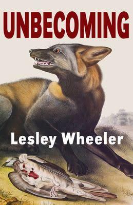
This is not the cover to Lesley Wheeler’s new novel Unbecoming:
Except it kinda is. I mean that is the John Audubon illustration of an American Cross-Fox from his 1851 The Viviparous Quadrupeds of North America that Lesley researched and selected for her cover art. The font is the same too — or it almost is. The proportions and placement of Lesley’s name are a little off from the actual cover, and the fox isn’t framed inside the title letters there either.
The actual book’s design is by Aqueduct Press’s Kathryn Wilham, and it’s a lot more legible, especially when viewed online as a thumbnail, which is how book covers tend to be viewed these days. The above design is my own arty tinkering, done while Lesley was revising the final draft. It’s such an exciting book, I wanted to be part of it.
Of course I was already part of it. For me reading Unbecoming is like gazing into a funhouse mirror. The parts are familiar, but their placement and proportions are off. The novel is most definitely not autobiographical, and yet it does take place in a small southern town that isn’t entirely unlike Lexington, VA. The main characters work at a liberal arts college that isn’t entirely unlike W&L University. The narrator’s English department isn’t entirely unlike our English department — though that’s probably true of any small liberal arts English department?
The narrator really really isn’t Lesley, but she is a new department chair — a position Lesley suffered through a few years ago. She also has a daughter and son, similar ages as our son and daughter those same few years ago. Her husband is also struggling to establish his own foothold in academia, same as me before switching from adjunct to tenure-stream not so long ago. His name is Sylvio, which is nothing like Chris, and he’s in psychology, which is nothing like creative writing, let alone comics studies. Lesley sends him off to teach for a year out of state, a fate I’ve somehow avoided, despite the improbability of our both securing tenure in the same department. Supernatural forces may well have been involved.
Oh, that’s another difference. Lesley’s narrator has superpowers. Like Lesley, she’s a magical thinker — only with more definitive results. Though I don’t discount the possibility, I’m not aware of my wife ever stopping a careening car with her mind. It’s such a smart, superhero-reversing premise. Instead of her mutant abilities blossoming with puberty, the narrator’s erupt with menopause.
Or perimenopause, since I recall the first scene of the first draft opened with a menstrual blood bath. Those opening pages evolved the most during her multiple revisions. I miss the bathroom scene–because why shouldn’t that kind of blood be front and center in a supernatural thriller?–but it’s probably best that she blotted it down to a couple far less horror-soaked sentences now buried several pages in.
The whole novel is haunted that way for me. Not just by our own parallel universe, but by all of the shifting scenes and sentences I read as she revised, fine-tuned, re-revised, and revised again, and again. I tell my creative writing students that revising is writing, that a first draft is just manufacturing clay so you have something to work with. I think Lesley’s first draft took six weeks — same as William Faulkner’s As I Lay Dying. Jack Kerouac claimed that On the Road only took three and that he didn’t revise a word. He was lying. It took ten years and six drafts.
The old title was The Changeling Professor, which I liked plenty, but the new title is even better. It has it’s own haunting real-world origin story, which is not mine to tell. I’ll just say it’s the best repurposing of a gratuitous insult I’ve ever witnessed.
I also have to admit that my funhouse vertigo is fair comeuppance, since I subjected Lesley to the same for years. When I started writing short stories nearly twenty years ago, my first batch featured a married couple with a similar resemblance/non-resemblance to us. I strung them through about ten stories, thought I was done with them, but then discovered another ten — all disturbingly focused on the wife’s adultery and subsequent pregnancy. Sorry about that, Les. And thank you thank you thank you for not making Sylvio cheat while away in the Carolinas.
After almost getting that novel-in-stories published, I switched to another parallel universe set in yet another small college town within easy driving range of DC. Lesley hasn’t named the college in Unbecoming, so I’ve decided it’s the same as in my long-time but still current novel-in-progress, The Patron Saint of Superheroes. Maybe it will become our not-so-private Yoknapatawpha county.
Meanwhile, check out Lesley’s starred review at Publishers Weekly The last sentence is the best: “Readers will be taken with this powerful and deeply satisfying tale.” That’s not magical thinking. That’s just plain true.
This, by the way, is the cover of Lesley Wheeler’s new novel Unbecoming:
May 11, 2020
Why Script-based Writing is Bad for Comics
A description of an image is an unexecuted idea, and visual art produced primarily from the verbal descriptions of ideas is comparatively limited. Even the most visually adept, artistically attentive scripter cannot describe in words what an artist discovers and achieves through the drawing process.

Alan Moore and Dave Gibbons’ Watchmen, the most acclaimed graphic novel of the 20th century, is an illustrated script drawn in the semi-naturalistic style of the superhero art codified by Marvel and DC during the 1970s. The additional color art of John Higgins, while innovative for the mainstream genre and time period, is so limited by the production necessities of color separation boards that most viewers outside of comics would probably consider it unaesthetic. A black and white Watchmen might be a superior work of art.

Watchmen drawn in a less derivative style would likely be superior too (unless you argue that Gibbons’ largely standardized style produces visual commentary on the genre that parallels the story’s deconstruction of superhero norms). But in literary terms—which is the way in which the novel has been read and appreciated—all rendered versions would be equal. Watchmen, in other words, is a great novel, but as a work of visual art, it is unremarkable.
Comics writer Kurt Busiek rightfully considers his story “The Nearness of You” possibly “the best piece I’ve ever written,” and while in literary terms it deserves praise as “the best to appear in [Busiek’s series] Astro City” (Gertler 2002: 106), it is visually less effective because of penciller Brent Anderson’s necessary adherence to Busiek’s script. The comic’s opening page captions are striking for their use of non-visual sensations and out-of-scene details:
“She has a low, throaty laugh, and a capped tooth from a bicycle accident when she was eight years old.
“Her shampoo makes her hair smell likes apples and wildflowers.”
But Busiek’s visual description “THE BACKGROUND IS MISTY, INDISTINCT” is an idea not an image and it prompts Anderson toward the literal indistinctness of a white background and a visually generic swirl of mist. Busiek describes “MIKE” as only “A YOUNG MAN IN HIS LATE TWENTIES,” a name and age range that Anderson adorns with short, non-descript hair and a generic tuxedo.
When Busiek describes him later wearing “BOXERS AND A T-SHIRT,” Anderson draws a white t-shirt and boxers with no pattern or other distinguishing characteristics. Busiek labels Mike’s BEDROOM but offers no details, and so Anderson gives it rectangular furniture that suggests Platonic ideals more than physical objects with individual histories of manufacturing and use by specific people in specific circumstances. The scripted MIKE is “GLUM,” an idea translated into the same pose twice, his head slumped into his open palm as he stares down. Busiek’s visual descriptions also produce redundant images, as when the captioned words “and then she’s gone” accompany an image of Mike suddenly alone as his arms sweep the dissipating swirl of mist, an accurate rendering of the scripted instructions: “SUDDENLY, SHE’S GONE, AND HE’S PANICKY, GRASPING AT NOTHING” (109).

Anderson in short draws what he’s told to draw, making additions to the extent required to form the impression of physical reality. That reality, however, reproduces the visual vagueness of written language. It is derived from ideas rather than things. This is why Ivan Brunetti warns that when “form and content diverge, only a specter remains, and nothing solid can be built,” and so images must “organically evolve” rather than be “imposed by an external force” (2011: 6).
Compare “The Nearness of You” to a similar moment from David Mazzucchelli’s Asterios Polyp.
Like MIKE, the main character, Asterios, sits in his underwear on the edge of a bed while staring off, haunted by the memory of a lost lover. Asterios is rendered more cartoonishly than MIKE—no human skull could ever produce a head of that shape—yet the odd specificity of his pose, the way he’s examining a blister on the sole of his upturned foot that he’s holding in both hands, creates a more grounded reality. The furnishing—the pineapple-shaped bedposts, the zigzag-patterned comforter, the claw-footed dresser, the ornate base of the lamp set inexplicably on the floor, let alone all of the individual candles and decorations—these all create a sense of a specific reality, even though Mazzucchelli renders each in minimal detail.
A prose writer works in prose, literally thinks on paper, producing specific words in an order that she revises, subtracting old worlds, substituting in new words, adding new sentences, repeatedly, until arriving at a finished product: the set of final words in the final order. Through that process, she discovers, tests, throws out, adds, and refines thousands of details about her characters and the world they inhabit and the events they experience. The story still may be conceptual—it happens in her and her readers’ heads—but those concepts are shaped by and evolved through specific words. It all happens on paper.
Comics should happen on paper too. But the paper of comics is not the kind that rolls into a typewriter. A comics script is not a necessary stage in the process of writing a comic. It’s often a creative detour, a side road that adds miles to the speedometer but through the wrong terrain. Instead of a script, Ivan Brunetti recommends writing “a text summary” but only to “get them out of your system,” since your “story will begin to change the second you put pencil to paper,” a point Chris Ware further stresses:
“letting stories grow at their own momentum was a more natural and sympathetic way of working than carpentering them out of ideas and plans. And the images suggested the stories, not the other way around. I believe that allowing one’s drawings to suggest the direction of a story is comics’ single greatest formal advantage.” (Brunetti 2011: 66)
The continuing development of the comics form requires further steps in such visual writing, allowing image to not only guide story but to determine it.
Busiek is the author of “The Nearness of You” and Anderson is, to quote Brian Michael Bendis, his “art monkey”—which does not describe Anderson’s skill, only his industry’s creative process. Its emphasis on visual storytelling over visual aesthetics also means that, as Pascal Lefévre observes, “a lot of artists use stereotypical icons (like the Statue of Liberty for New York or the pyramids for Egypt) because such famous buildings or monuments can be easily recognized” (2009: 357).
Could Busiek’s script be rendered as a non-stereotypical work of art? Anderson would need to explore and articulate his own visual dialect, one that did not rely so fully on the customs of superhero comics art specifically and icons generally—something the commercial publishing needs of Astro City likely prohibited. He would also have to leave the role of assistant to become a co-writer by developing a visual universe rich with his own imaginings. Where did Mike buy that tux? Was it a rental? Was it his first choice? His fifth? Did he splurge? Did he go for a cheaper one and regret it later—or does he prefer off-brands? Are the shoulders a little too tight, the pant legs a little too long? How old are those boxers anyway? How did he rip the bottom seam of the t-shirt? Or is that crease from the package he pulled it out of yesterday? Was that dent in the bottom bookcase shelf there when he bought it second-hand at Goodwill or did he do that himself while following the Ikea assembly directions?
Those answers could come in part form real-world props—an actual bookcase and an actual tuxedo, ones the artist positions by hand, though a composite of internet images might suffice if the Google search unearths more than catalogues and advertisements. Generic images produce generic worlds. While readers and scripters might visualize surprisingly little, a comics artist must visualize a universe as palpable and specific as her own world and then render it in expressive lines as equally rich. That richness will emerge not from ideas, but from physical marks on a physical page.
May 7, 2020
Quarantining Depression
When I first read this graphic novel in January, the notion of a woman self-confined in her apartment as she battles depression was novel. Four months later it’s an international norm. Gg’s portrayal of isolation suddenly speaks to millions of us. Her battle is against a different invisible enemy, but the dark specter of her depression looks a lot like our monstrous fears of CV-19. I’ve never seen a story altered so drastically and so quickly by context before.

Gg is a master of the graphic short story. Stop by her website and you’ll see most of her works fall under fifty pages. (The 2017 graphic novel I’m Not Here is the happy exception.) They also all feature a young, Asian-looking protagonist who I find hard not to identify with gg herself—though who knows? The enigmatically brief bio included on the back flap of I’m Not Here, “gg lives and works in a small prairie city in Canada,” is replaced by a blank space in Constantly.
Because I assume the author has never been held prisoner in a desert asylum or worked a corporate job in a dystopian future or battled a monster made from her own cut-off hair, I think of her as a graphic novelist rather than a graphic memoirist. Still, her portrayal of a second-generation immigrant struggling to simultaneously love and escape her dysfunctional parents gave I’m Not Here a thoroughly realistic grounding—even though the mother’s arm seems to be held on by tape, and it was never entirely clear whether the protagonist dreamed she stole another woman’s life or if she somehow became her own doppelganger.
Constantly could continue that story, with gg’s avatar suffering the isolation of the same but now prison-like apartment. She literally can’t get out. All of the story’s forty-eight pages take place in the stark interiors of her new home and the even starker interior of her depression. Where I’m Not Here found its force in ambiguity and the maybe-fantastical, Constantly is comparatively straightforward in its portrayal of the protagonist’s sometimes literal battle with her own psyche. That struggle is made physical with the visual metaphor of black, half-translucent hands spinning her in her sleep, tugging her to the floor, shoving her from a doorway.

Those dark forearms could belong to the hair monster gg’s earlier protagonist fought to the death in her 2015 A Mysterious Process. Though the battle apparently continues, much has changed in those four years. gg’s style has evolved into an ever-sharper array of texture-less shapes that somehow evoke photographic realism despite teetering toward total abstraction. It took me several blinks to decode the close-up jumble of upside-down limbs on the cover, an image that extends into the opening pages as the protagonist floats in the half-dark of dreams before tumbling awake on her mattress.

Like her protagonist’s world, gg’s palette is strikingly limited: the dusty gradations of a sometimes almost imperceptible pink, and an equally thin gray that at times thickens to purplish black. The white at the gutter edge often penetrates panels to dominate images. Each page is a balance of shape and color, holding the eye long past the point of narrative necessity. gg’s style is further evidence that the comics form is not foremost literature but visual art, requiring readers to become viewers willing to pause and flip backwards and pause again, worrying less about the grammar of visual storytelling and more about the haunting connotations of images.

Layouts vary between full-page panels and sets of three equally divided full-widths. That visual rhythm creates a kind of narrative logic too, with each three-step process (trying to stand up from a yoga mat, trying to make food in a blender, trying to turn the doorknob to leave) followed by the failed and enlarged consequence (her collapsed body, a puddle across floor tiles, her slumped head before the still-closed door). Most appear as self-enclosed two-page spreads, creating tiny micro-plots floating within the large arc of the novella.
Unlike most of gg’s other works, Constantly is silent, further emphasizing the protagonist’s isolation. There’s literally no other person in her world to talk to. The novella isn’t wordless though. gg spaces a memo pad list throughout the pages, each new entry continuing the repeated phrase “I don’t want …” Things she doesn’t want include: to eat, sleep, live, die, laugh, cry, leave, be forgotten, be different, be normal.

Most poignantly, she also writes that she doesn’t want “a body.” This is ironic since Constantly is a study of the protagonist’s (and presumably the author’s) body. There’s no nudity, but the form-fitting clothes and underwear highlight rather than obscure, creating a double intimacy when coupled with the emotionally charged subject matter. The novella keeps the viewer at the protagonist’s round shoulder, peering into her sealed-in life. Though gg’s drawing are never sexualized, they do evoke pleasure in the human (and specifically female) form, creating a paradoxical even disturbing beauty through a portrayal of mental suffering.
The visual motifs of a clock (dark fingers keep pushing the mechanical hands backwards) and a set of cell-like window blinds (that quietly echo the horizontal lines of the memo pad) add to the feeling of enclosure—though not claustrophobia. Despite the story’s psychic darkness, gg’s pages are oddly light, as if inching slowly toward the intangible. Other than the almost-black comforter threatening to swallow her in her sleep, the protagonist’s world and body are in greater danger of fading into an opposite kind of nothingness. Those black hands might be the only things keeping her on the page. In the end I’m not so certain who was writing on the memo pad or who tore it up. “Who are you? What do you want?” are exactly the questions someone needs to be asking.
But Constantly offers no easy answers and certainly no plot-closing solutions to depression. The older gg apparently no longer believes monsters can be battled to the death. They move in with you. Escaping the struggles of an old home means facing the struggles of a new home. Struggle is the constant.
[A version of this post and my other recent reviews appear in the Books section of PopMatters.]
May 4, 2020
Unpainting My Family Photo Album
I’ve been leaning harder into the absurdity of making digital art with the “deprecated” software MS Paint. Lately that’s meant taking family photographs and unphotographing them: incrementally distorting each through an idiosyncratic set of processes until I arrive at something radically different from the original photo. The image above began its existence as this photograph:
That’s my daughter, and I’m pretty sure she’s sitting in the hallway outside the gift shop of the Carnegie museum in Pittsburgh. Though I’m not sure which trip this would have been. It used to happen fairly regularly while my pre-Alzheimer’s mother was still alive and living in her Pittsburgh condo.
Converting the image involved a gob ton of incremental effects, before I arrived at something I thought was both the end point and, alas, artistically mediocre:
But then I returned to the file with a fresh set of ideas (including merging it with gray scale fragments made in Illustrator, my first minor venture outside Paint):
And though I again thought the image was done (and I think less mediocre), I eventually went back in for one more round. The image at the top is the same only cropped into a square again and flipped because I liked the direction of the hair:
This experiment opened the door to a dozen more, all based on my family members (and selfies too). I posted a sequence of Cameron in March, but here’s another of Madeleine, beginning with this disaster:
I think the CV-19 context was overwhelming my sensibilities, so I started over and eventually finished with a very different final image:
Both images began as this photograph:
The disastrous path diverged here:
And the corrective take-two instead turned here:
Which I think reveals something about abstraction and the acceptable bounds of aesthetic distortion. Micro-level distortion (think Seurat’s pointillist spray of dots or Van Gogh’s butterknife-like brushstrokes) is fine, but macro-level (here the larger facial proportions) is trickier. Also not all macro-level proportions are created equal. The final second version is plenty distorted at both levels, but while the forehead and jaw are impossibly square, the central eyes-nose-mouth keep relatively close to the source image. The disastrous first version loses sense of those most crucial features.
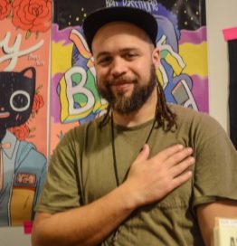
In addition to the questions of what kind and how much distortion is too much, how little is too little is key too. Here’s an unpainting of my spouse distorted at (mostly) micro-level only:
The effect is not unlike “soft focus.” If you squint or step a few feet away from the screen, it looks like the original photograph.
What’s not clear is how much macro-level facial distortion an image can hold before it crosses the aesthetic divide. Here’s another adaptation of the same source image:
Maybe I have weird taste, but I prefer the second.
Chris Gavaler's Blog

- Chris Gavaler's profile
- 3 followers

