
Janine Ashbless's Blog, page 104
December 4, 2013
Wassup?

Okay, a round-up of what's going on in World of Ashbless:
I have seen the final cover art (give or take) for Cover Him With Darkness. And it's okay! (If you knew how hard I fought for "okay" and how goddamn picky and awkward I am, you'd be able to tell how pleased I sound typing this). I will reveal it ... next week!Regarding publication dates for that novel, I haven't been given anything official, but I have to get my marketing questionaire filled in and back to Cleis by March 1st, so I'm guessing April or May 2014.I have been asked to write a horror story (under my other name) for an anthology to be launched at FantasyCon UK next year. Yay! Time to flex the old Grim & Grisly muscles again... Today I signed a contract for a short story to be written for a Sweetmeats anthology on the theme of "Drenched" - out next year. My story will be called Melusine .An extract from Jump or Fall, one of my fave kinky stories, is to be used (subject to publisher approval) in a non-fiction BDSM project of Shanna Germain's. I think it's still a bit sekrit so I will say no more for the moment...Assuming a break before another angel novel, my next project will be writing a contemporary shortish D/s which will go to Ellora's Cave. I've had this story outline for years and I want to do it... plus I have contractual obligations to fulfil ...


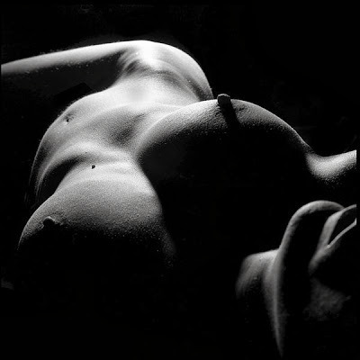
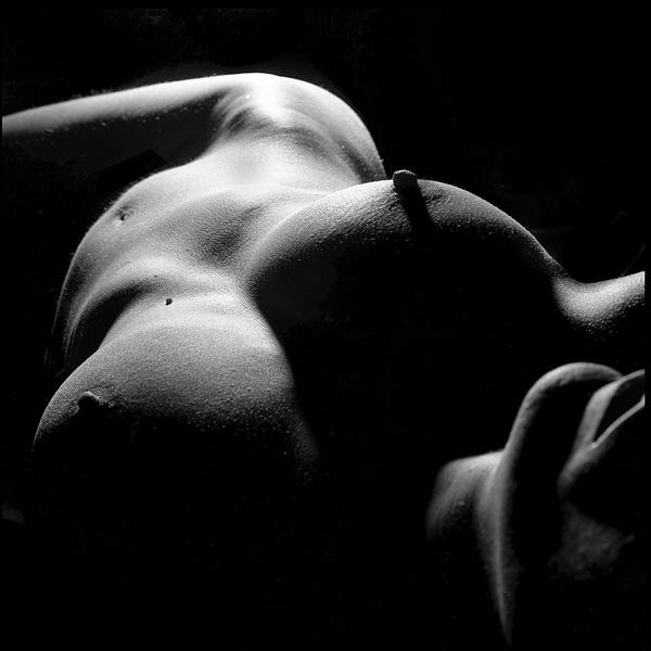
December 2, 2013
Eyecandy Monday

Bump goes the hip on the car door ... and I'm back - two flights, several boat rides, and one (thankfully very minor) car accident later.
I have a list of Urgent Things to Do that's 17 items long ... and it doesn't even get as far as "buy food for the house," "shop for Xmas," or "laundry!"
One at a time; that's the way to do it.
Eyecandy for you guys first though ;-)
November 24, 2013
Wormhole
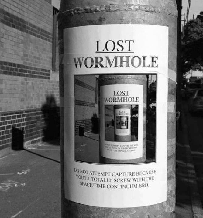
That's where I've disappeared to...
Back in December!
November 22, 2013
Simply beastly
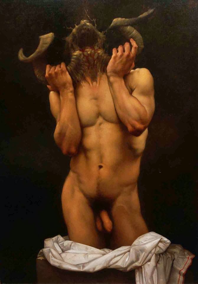
Well, it's been a while...
November 20, 2013
Cara Sutra

Cara Sutra - winner of the Erotic Trade Organisation "Blog of the Year" 2013 - is a real fan of my writing! She loved Named and Shamed, and has asked me to take part in her Erotic Author Spotlight series on her blog.
So here it is, including an excerpt from Red Grow the Roses.
Thank you so much, Cara!
xxx
November 18, 2013
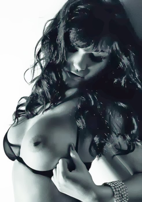
Eyecandy Monday
Boobs...

or Bum, folks?

Boobs -
... or Bum?

That's the perpetual dilemma I face when I come to post an Eyecandy Monday!
or Bum, folks?

Boobs -
... or Bum?
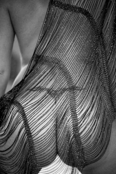
That's the perpetual dilemma I face when I come to post an Eyecandy Monday!
November 17, 2013
Beauty ...
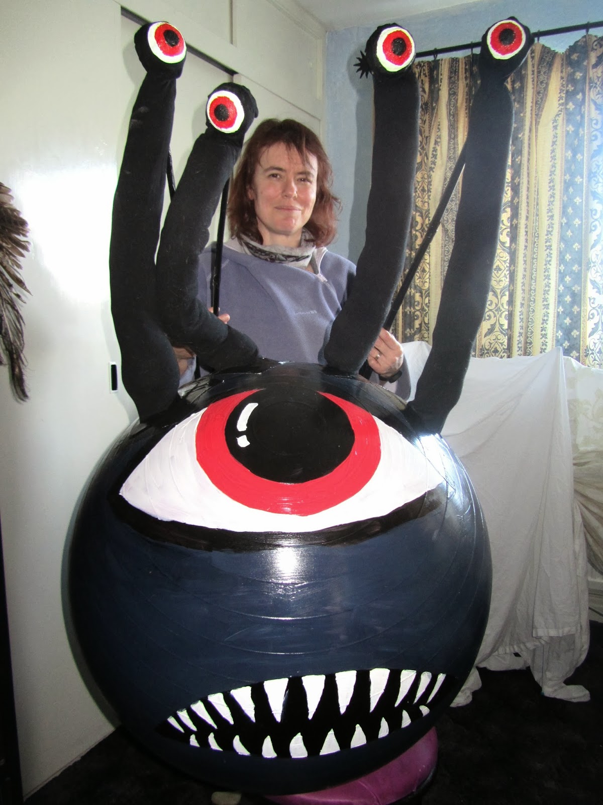
... is in the eye of the Beholder.
I made this monster back in March, and it's been sitting at the foot of my bed ever since, waiting to be used. It went down rather well on Friday :-)
November 15, 2013
Mutually. Assured. Destruction.
One of the (many) reasons I have been running round like a headless chicken recently and not getting any work done, was last weekend's overnight lock-in at a nuclear war bunker.
 It's Bigger On The Inside. And not in a good way.
This is Kelvedon Hatch. In the event of a nuclear strike, they were going to run the British government from a reinforced hole in the ground, just north of Greater London. It is three floors deep, with huge air-filtration devices, and has enough space for 600 people to live for 3 months, packed in like battery hens, before emerging into the radioactive devastation and anarchy above.
I'm old enough to remember the fear of nuclear annihilation. I was actually a member of CND so I'm probably still on an official file somewhere. I remember this:
 Possibly the worst-received publication in history. Worse reviews than Fifty Shades.
 This is a joke ... right? Right?
Kelvedon Hatch is open to the public most days, so I did the audio tour before the main event of the weekend. It brought it all back, in horrible creepy detail. I felt physically sick at points.
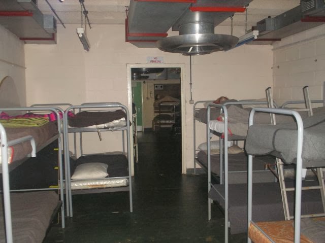 Accommodation - an 8-hour shift in a bunk before giving way to the next person
If you're too young to recall the era, you've no idea what the pessimism was like. In fact, I don't even know the worst - I'm only old enough to remember the tail end of the Cold War. My parents were there for the Cuban Missile Crisis and say they went to bed each night literally not knowing whether they'd be alive in the morning.
Some things get better.
I'd rather live with the War on Terror.
What was I doing there? Well, we were taking part in a Cthulhu-themed horror LARP set in the 1950s.
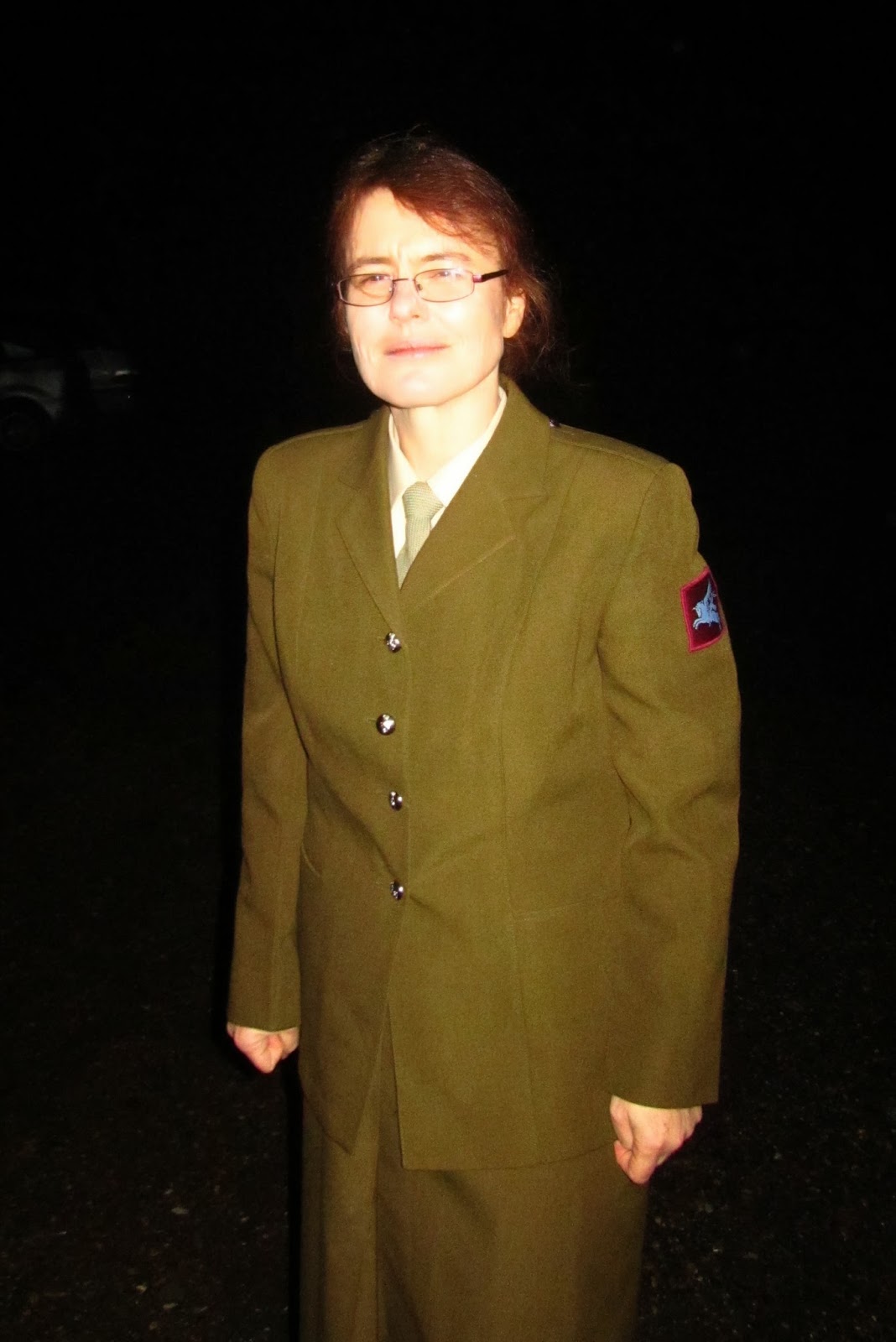 Genuine army surplus uniform, concealed firearm, heart of a ruthless and batshit-crazy cultist.It was tremendous fun.
And we all died.
But that's okay. It was only a game.
:-)
November 13, 2013
... A book by its cover
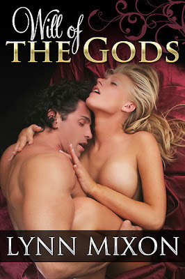
Recent events have made me face up to the fact that I am very very opinionated about book covers. They strongly affect whether I bother to read the blurb or to risk buying the book, and that's a crying shame, because so often books are horribly let down by their covers. I've been there myself:
 You can tell it's a swords-n-sandals epic of vast deserts, clashing armies, and the ancient temples of dark gods, can't you?Book covers should tell the reader something about what lies within, and they should be enticing. That is their job. If they're not doing that, we might as well have plain covers with nice fonts.
 To be honest, that works just fine.
So I thought I'd write about what I, as a reader, like and dislike about book covers ... though I'm mostly going to stick to heterosexual romance/crossover genres just to keep it focused. It's entirely about my personal taste. And I want to make it clear that none of the examples I'm going to cite in any way reflect on the text content of the story within!
So here's what I hate.
I hate anything that looks like it was photographed or painted back in the 1970s:

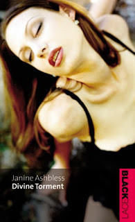
 Would you believe this was published in 2012? Sorry Madelynne, but I think this is the worst cover I've seen in a decade.
I hate bloated guys with hairless chests.
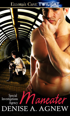 "Gym Bunny ... standing naked in a tunnel. Huh?"
FFS, grown men have body-hair! Fact! Baby-bald chests look preened at best, and downright stupid at worst. Over-muscled cover models look similarly artificial - and I don't want to read about guys who spend all their life in the gym in order to maintain a narcissistic ideal. I like muscle, but it needs to look like it belongs on a human being, not a bullock.
 "Oh god no. I actually feel embarrassed looking at this."
I hate (almost) anything with faces on.
 "Oh god, he looks like Starsky."
I'm going to have to explain that. The problem with romance and erotic romance, in particular, is that people depicted on the cover are implicitly understood by the reader (though, Christ knows, not by the publisher) to REPRESENT THE CHARACTERS IN THE STORY. As a reader you're being told: "these are the people you will root for, and feel for, and fall in love with." Now, if I take one look at the cover models and think "Not my type," or "Ewwwww!" then no matter how likely I am to enjoy the written story, I have already been put off investing emotionally or financially in the book. End of.
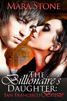 "He might be okay in ten years time. Ugh: she won't..."Since my primary romantic alignment is to men, I'm fussier about male faces than female. But what attacts me may not attract the next reader.
So if you are going to show faces - show partial faces. Leave room for the imagination!
So what do I like?
It turns out that I like arty, but not painted. Digitally manipulated is best. I like books where it looks like the publisher and art editor gave a shit, and didn't just pull a stock photo out of a drawer.I like symbolic covers that leave room for the reader's imagination.I like eyes, and body-parts, but not whole faces.Unless you're really good, less is more.
Enough complaining! Here are some (mostly) genre cover pics I love!
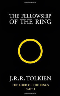
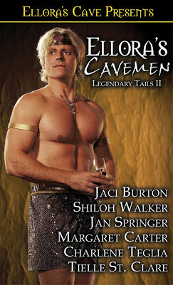
 Seriously: great cover. Haven't read the books.
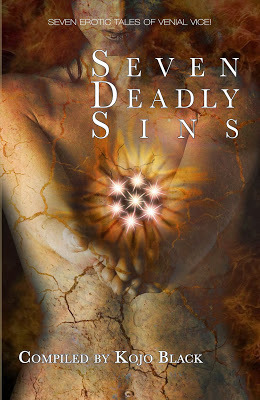
 Text and marginal art, no central image. Terrific.
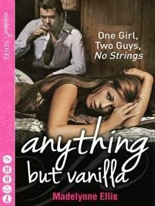
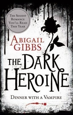
 Simple, evocative.
 Hopefully Madelynne will have forgiven me by now.
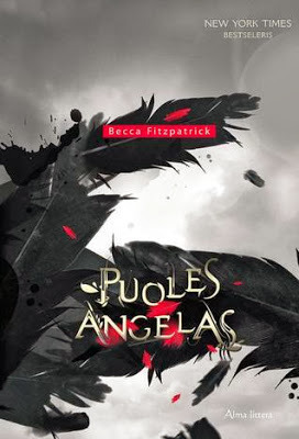
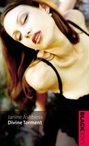
 Again - no face!
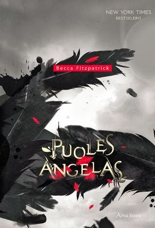
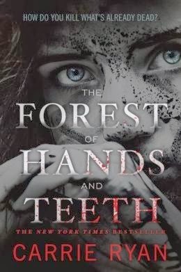 Technically a YA zombie novel with romantic elements...

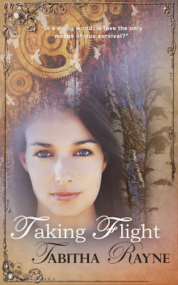
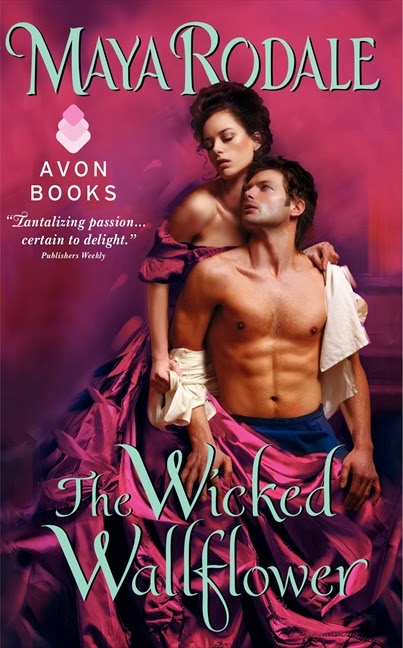
These two are examples of a genre-standard design type: the layered montage. Yet somehow - and almost uniquely - Tabitha Rayne has managed to get a look that's classy and expensive, and could pass for a mainstream historical novel. I can even forgive the faces.
And it's not actually romance, but ... I love this too:
 You can tell it's a swords-n-sandals epic of vast deserts, clashing armies, and the ancient temples of dark gods, can't you?Book covers should tell the reader something about what lies within, and they should be enticing. That is their job. If they're not doing that, we might as well have plain covers with nice fonts.
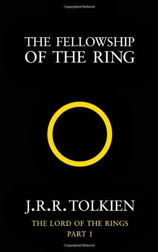 To be honest, that works just fine.
So I thought I'd write about what I, as a reader, like and dislike about book covers ... though I'm mostly going to stick to heterosexual romance/crossover genres just to keep it focused. It's entirely about my personal taste. And I want to make it clear that none of the examples I'm going to cite in any way reflect on the text content of the story within!
So here's what I hate.
I hate anything that looks like it was photographed or painted back in the 1970s:
 Would you believe this was published in 2012? Sorry Madelynne, but I think this is the worst cover I've seen in a decade.
I hate bloated guys with hairless chests.
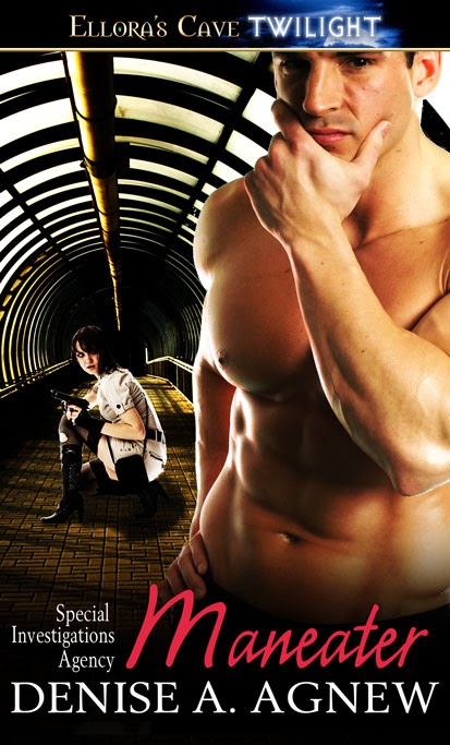 "Gym Bunny ... standing naked in a tunnel. Huh?"
FFS, grown men have body-hair! Fact! Baby-bald chests look preened at best, and downright stupid at worst. Over-muscled cover models look similarly artificial - and I don't want to read about guys who spend all their life in the gym in order to maintain a narcissistic ideal. I like muscle, but it needs to look like it belongs on a human being, not a bullock.
 "Oh god no. I actually feel embarrassed looking at this."
I hate (almost) anything with faces on.
 "Oh god, he looks like Starsky."
I'm going to have to explain that. The problem with romance and erotic romance, in particular, is that people depicted on the cover are implicitly understood by the reader (though, Christ knows, not by the publisher) to REPRESENT THE CHARACTERS IN THE STORY. As a reader you're being told: "these are the people you will root for, and feel for, and fall in love with." Now, if I take one look at the cover models and think "Not my type," or "Ewwwww!" then no matter how likely I am to enjoy the written story, I have already been put off investing emotionally or financially in the book. End of.
 "He might be okay in ten years time. Ugh: she won't..."Since my primary romantic alignment is to men, I'm fussier about male faces than female. But what attacts me may not attract the next reader.
So if you are going to show faces - show partial faces. Leave room for the imagination!
So what do I like?
It turns out that I like arty, but not painted. Digitally manipulated is best. I like books where it looks like the publisher and art editor gave a shit, and didn't just pull a stock photo out of a drawer.I like symbolic covers that leave room for the reader's imagination.I like eyes, and body-parts, but not whole faces.Unless you're really good, less is more.
Enough complaining! Here are some (mostly) genre cover pics I love!
 Seriously: great cover. Haven't read the books.
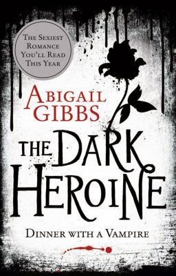 Text and marginal art, no central image. Terrific.
 Simple, evocative.
 Hopefully Madelynne will have forgiven me by now.
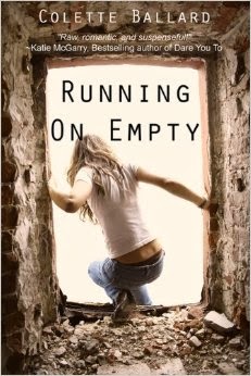 Again - no face!
 Technically a YA zombie novel with romantic elements...
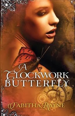
These two are examples of a genre-standard design type: the layered montage. Yet somehow - and almost uniquely - Tabitha Rayne has managed to get a look that's classy and expensive, and could pass for a mainstream historical novel. I can even forgive the faces.

And it's not actually romance, but ... I love this too:

November 11, 2013
Eyecandy Monday

I've had a frantic weekend. Now I'm catching my breath before ... the next one.
Seems like a good moment for staring thoughtfully out of the window in zen contemplation of the rainy world at a truly magnificent cleavage.
Everything's alright now, world.


