How to Make a Quick But Usable Cover in Publisher
Well, here we are with part-two of The Joy of Making Covers with Rich Meyer. Today, we’re going to make a happy little squirrel for your … sorry. Had a Bob Ross moment there. Anyway, hopefully this article will give you some more ideas and the confidence to try making your own covers, so you aren’t stuck using something like this: 
After Paint, another program that is useful for cover creations and is often on new computers (sometimes in limited trial versions) is Publisher. It was once a standalone program but has now been integrated into the Microsoft Office product suite.
When you open up Publisher to create a new file, you just have to pick a blank page size. I usually pick one that’s close to what the book I’m writing would be in print form. For this one, we’re using the B5 paper size blank, which is a little less than 10” x 7”. 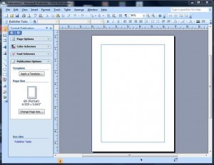
The blue outlined rectangle in the middle is normally what would be the available print area for this blank page. Since this won’t be printed at this time, you can choose to ignore it and use the whole page area if you like. For simplicity’s sake in this example, we’ll be only using the printable area.
The first thing you want to do is insert your picture (Insert > Picture > From File). Once again, I’m using the picture my wife Mona took of a sunset over Tamaqua, PA. 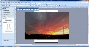
As you can see, this photo is much bigger than the printable area. Publisher has some image editing options. Clicking once on the photo brings up the Picture options tool bar. The next thing you want to click on is the icon that’s eighth from the left (or seventh from the right), which looks kind of like three “X’s” in a diagonal row. This is the “Crop” icon and it will bring up small lines in the corners and on the edges of the image. Both are indicated on the pic below with the green arrows. 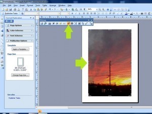
Clicking and dragging those lines will hide the portions of the image you don’t want to see. In this example, I’ve hidden the parts of the photo that would lie outside of the print area rectangle.
Now that we have what will be the background of our cover, it is time to add the lettering for the title. On the far left side bar of the Publisher window, there’s an “A” which is on a slant. Clicking this brings up the WordArt menu. Anyone familiar with Word will know that WordArt is a versatile gadget for doing logos and the like.
You simply have to click the basic style of WordArt you want. The green arrow shows which one I picked for this example (they probably have names, but I honestly never learned them; I taught myself most of this stuff). 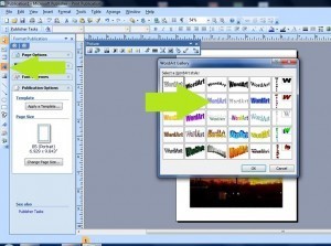
Now you have the Edit WordArt Text prompt. This is where you type in the words you want to use, of course, i.e., your title. You can experiment with what font you want, as it will give you the basic font. You can always change it later if you don’t like it. You can also choose the Font Size and if you want to bold or italicize it.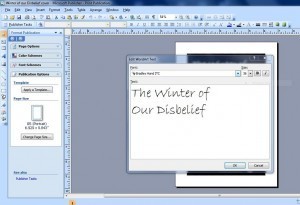
After you place it, you can edit the colors and add textures and the like by clicking the WordArt object and clicking the “Format Word Art” icon. I can’t get that tool bar to stay up to get a screen shot of it, but this is the window it opens:  You can use this to shade the colors of the letters, change line colors, make the title look metallic, wooden, etc., etc.
  After getting the colors the way you want them for the title logo, I notice that I think for this short story collection, this is a bit too cheery of a cover. I want something a little more foreboding, so I click on the background and then click the “Less Brightness” icon a few times to make the background look like this:
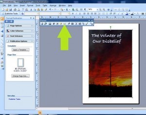
Now since I’ve already got the color scheme I want in the title, I click on the WordArt object, do a quick copy (CTRL-C) and a quick paste (CTRL-V) and drag the second title down to the bottom of the page. 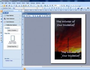
From there I just edit the text into my name, position it correctly, and save it as a JPG file. I also save it at 300 dpi, as it is always easier to get rid of detail than it is to bring it back.
Also, save your Publication as a publication file. It’s a relatively small file and you never know when you might want to come back and do some editing to it. I saved mine and did some changes after reconsidering the font for this project and this is what the final product looks like:  I hope some of you have found this helpful. Making your book’s cover is not necessarily something you want to do for your own book, if you aren’t artistically inclined, but it is something you CAN do. My motto is “If I can do it, ANYONE can do it.”